- A mobile app development roadmap is a 7-stage framework from idea validation to post-launch scaling.
- Get the sequence right: validate before you design, design before you build.
- Skipping validation and going straight to development is the single mistake that kills otherwise good apps.
Founders who skip the mobile app development roadmap don't just lose time. They lose the budget saved for launch, the market window they were racing toward, and the first thousand users they never retained.
Building a mobile app without a clear sequence of stages is the reason so many apps get rebuilt from scratch inside their first year. Per Localytics mobile research, 25% of apps are opened once and never again not because the idea was bad, but because the execution had no structure.
A mobile app development roadmap is a sequential framework that guides your product from raw idea to scalable app. It covers every stage: validation, strategy, design, tech stack selection, development, testing, launch, and post-launch growth. Following it in the right order is what separates apps that compound into businesses from apps that become expensive lessons.
By the end of this guide, you'll know every stage, the decisions that belong to each one, the right tools to use, and the three shortcuts that guarantee a costly rebuild.
Before you start what the roadmap actually covers
A mobile app development roadmap is not a Gantt chart. It's a decision sequence, a logic chain that tells you what to build, when to build it, and what signal to look for before moving forward.
Get the sequence wrong and you pay for rework at every stage. Skip validation and you spend three months building features your users never wanted. Jump to code without a design phase and developers interpret requirements differently on every sprint, costing you weeks of back-and-forth that wireframes would have caught in three hours.
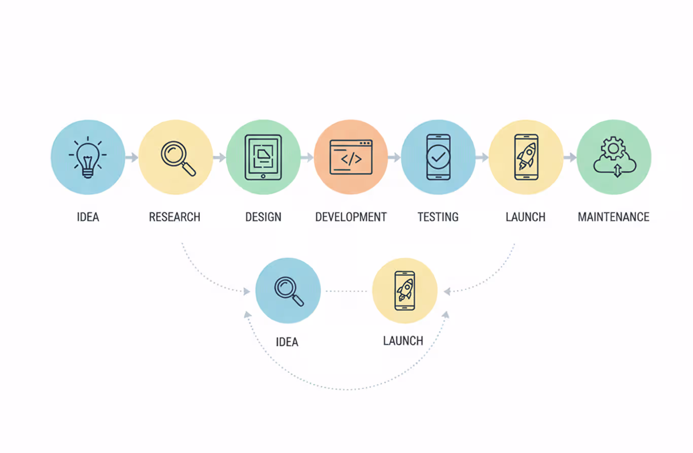
Seven stages make up the complete sequence. Each stage feeds the next. Rushing ahead collapses the foundation under you.
One rule to hold before you start: no stage is optional. Founders who say "we'll validate after launch" are saying "we'll spend $80,000 before we know if anyone wants this." Validate first. Always.
Here's exactly what each stage involves.
The mobile app development roadmap: all 7 stages
A complete mobile app development roadmap runs from raw idea to live product to growing user base. Each stage has a defined input, a defined output, and a specific signal that tells you when you're ready to move on.
Stage 1: Validate the idea before you build anything
Idea validation is the stage that determines whether your app should exist. Skip it and you're building a solution to a problem you invented in your own head.
Start by finding five to eight people who have the problem you're trying to solve. Not friends. Not family. Actual users in the target market. Ask how they currently handle the problem, what they've already tried, and what failing to solve it costs them every week.
Run a competitor audit in parallel. Search both the App Store and Google Play for apps in your category. Read the one-star reviews carefully. Those reviews are your product brief — they show exactly what current users hate and what they'd pay to switch away from.
Uber's founders didn't validate with a survey or a focus group. They opened the app in San Francisco with three drivers and watched whether people would actually pay. Real-world demand testing not hypothetical questions.
Before moving to Stage 2, confirm three things: a defined target user, a named problem they experience, and evidence they're actively looking for a solution. Without all three, you're guessing.
Stage 2: Define your app development strategy
Strategy means making the upstream decisions that all later decisions depend on. Get them wrong here and every stage downstream inherits the damage.
Four decisions define your strategy.
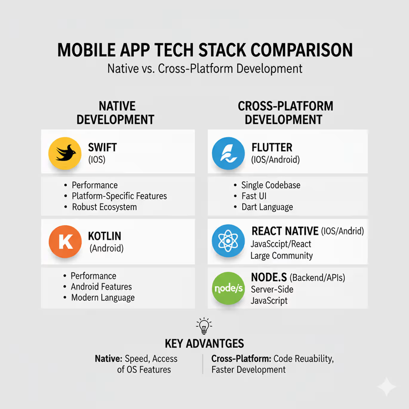
Platform choice. Native apps (Swift for iOS, Kotlin for Android) deliver the best performance but require two separate codebases. Cross-platform frameworks like Flutter and React Native let you write once and ship to both platforms with 70–80% code reuse. Hybrid apps combine web and native elements and work best for simple internal tools.
Monetization model. Freemium, subscription, one-time purchase, or ad-supported — each one changes how you structure onboarding and what metrics matter after launch. A subscription model means activation is everything. An ad-supported model means retention is everything.
Timeline and budget. A simple app with three to five screens takes four to six months from design to launch. A complex app with backend services, user accounts, and third-party integrations takes eight to fourteen months. The budget follows from the timeline, not the reverse. For a full breakdown of what each feature category costs across different development models, read our mobile app development cost guide.
Development model. In-house, agency, or freelance each carries different cost, speed, and quality trade-offs. In-house moves slowly but accumulates institutional knowledge. Agencies move fast but require tight briefing. Freelance works for isolated tasks, not full product builds.
Document every decision in a brief before moving to the design stage. Misaligned strategy decisions don't surface as strategy problems they surface as design conflicts and engineering delays two months later.
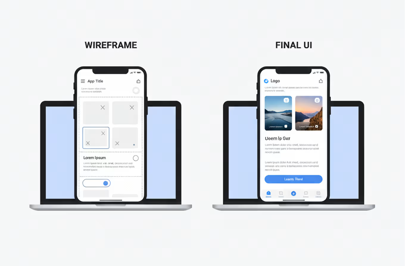
Stage 3: Design the ui/ux before writing a single line of code
Design is not decoration. Design is the stage where you define exactly what the app does and how users move through it before any developer touches a keyboard.
Start with user flows. Write out every path a user can take through your app as a numbered sequence of screens. Define what triggers each transition. Capture what happens when a user takes a wrong turn. Do all of this before opening Figma.
From user flows, build wireframes. Wireframes are low-fidelity layouts, grey boxes and basic typography that show structure without visual distraction. Figma is the industry default for this stage. Its collaboration features, auto-layout system, and component libraries make it the fastest prototyping tool available for mobile. For a step-by-step walkthrough of the full Figma workflow from first wireframe to developer handoff read our Figma mobile app design guide.
From wireframes, produce a clickable prototype. Share it with five real users and ask each one to complete a specific task without any instruction from you. Watch where they hesitate. Watch where they tap the wrong thing. Airbnb rebuilt its search flow after exactly this kind of prototype testing session. The change took three weeks. Rebuilding it post-launch after users complained would have taken four months and cost the team public trust.
User testing at the prototype stage is the highest-return activity in the entire roadmap. Do it before code, not after. For the full set of UX principles governing each screen type from empty states to error flows see our mobile app UX best practices guide.
Stage 4: Choose the right tech stack
Tech stack selection defines your app's performance ceiling, your hiring requirements, and your long-term maintenance cost. Choose based on your team's actual skills and your app's actual requirements not on what a blog post or conference talk recommended.
Here's a direct comparison:
For the backend, Node.js handles high-concurrency loads well and lets you share JavaScript across both layers. Django suits teams with Python experience. Firebase gives you a managed backend with real-time database, authentication, and cloud functions the right choice for an MVP that needs to ship in weeks rather than months.
Spotify runs its recommendation engine, playlist data, and user accounts as independent microservices. That architecture works for hundreds of millions of users. For your first version, pick the stack your team moves fastest in. Optimize for speed to launch, not architectural prestige. For a deeper look at how platform choice affects the actual user experience not just the codebase, our cross-platform UX design guide breaks down the interface trade-offs between native and cross-platform in real app screens.
Stage 5: Development and agile execution
Development is where the plan becomes a working product. Structure this stage without discipline and it becomes where scope creep, missed deadlines, and budget overruns live.
Agile methodology divides development into two-week sprints. Each sprint delivers a set of working, tested features. Sprints keep focus tight, cap scope before it expands, and give you a clear checkpoint every two weeks to measure progress against the original design intent.
Use GitHub for version control from day one. Every developer works in branches, code gets reviewed before merging, and nothing ships to staging without passing a review. Teams that skip version control discipline spend the equivalent of 20–30% of their development budget on debugging, conflict resolution, and rollback.
Break your full feature list into a core MVP and a post-launch backlog. The MVP is the smallest version of your app that delivers the core value to a real user. Instagram launched with photo sharing and filters only. Slack launched with group messaging and zero integrations. Both stripped away everything that wasn't essential to the first user moment.
Every sprint ends with a review session. Features that don't pass testing don't ship. A delay in one sprint is always cheaper than a bug that reaches production.
Stage 6: Testing, qa, and app store submission
Shipping a broken app costs more than delaying the launch. A one-star review on day one stays public for years.
Testing runs in four layers. Unit testing checks individual code functions in isolation. Integration testing checks that modules work correctly together. User acceptance testing puts the full app in front of real users doing real tasks and watches what breaks. Performance testing checks load times, battery usage, and behavior under poor network conditions the scenario your users will encounter more often than you expect.
Run beta testing before any public launch. Apple TestFlight lets you distribute iOS builds to up to 10,000 external testers before App Store submission. Google Play's internal testing and open testing tracks give you equivalent pre-release channels on Android.
App Store and Google Play submission each have specific requirements. Apple's review process takes 24 to 48 hours on average. Google Play typically reviews within a few hours. Both platforms require a published privacy policy, store screenshots at exact pixel dimensions, and a keyword-optimized app description for store search.
Pass every layer before submitting. A rejection from either store resets your timeline and collapses the momentum you built with your early adopter list.
Stage 7: Post-launch maintenance and scaling
Launch is not the finish line. Launch is the moment real data starts arriving.
Set up analytics before your first user session. Mixpanel and Amplitude both track user behavior at the event level: what screens users visit, where they drop off, and which features they return to. Connect a crash reporting tool like Firebase Crashlytics at the same time. Crashes you don't know about are the ones that appear in your one-star reviews.
Watch two numbers above everything else in the first 30 days: day-1 retention and day-7 retention. Day-1 retention measures the percentage of users who return the day after first use. Per AppsFlyer's mobile benchmarks, a strong day-1 retention for a consumer app sits above 25%. Day-7 above 10%. Numbers below those thresholds point to an onboarding flow that isn't delivering value fast enough. Our UX patterns for mobile app retention covers the specific design changes that move day-1 and day-7 numbers.
User reviews are your fastest feedback channel. Read every review in the first 30 days. Negative reviews about a specific screen or a crash point tell you exactly what your next update fixes.
WhatsApp scaled from thousands of users to hundreds of millions by continuously optimizing its infrastructure without redesigning the core product. Scale infrastructure decisions should follow actual usage data and don't over-engineer a backend before the traffic justifies it.
Plan your first post-launch update before you submit to the stores. Apps that go 90 days without a visible improvement show measurably higher uninstall rates. Users are watching to see if the product is alive.

Tools for every stage of the mobile app development roadmap
Every stage of the roadmap has specific tools that reduce risk and accelerate output. Here's a stage-by-stage breakdown of what's worth using and when:
Don't stack tools before you need them. Founders who configure five analytics tools at launch spend more time managing dashboards than reading user behavior. Start with one analytics platform and Crashlytics. Add from there as the product and team grow.
Three shortcuts that guarantee a rebuild
Every shortcut in the mobile app development roadmap creates debt you pay back later usually at twice the cost and three times the disruption. Here are the three that consistently produce rebuilds.
Skipping validation to move faster. Building without validating feels like momentum. A team that spends four months building an app nobody wants starts over from scratch. Validation takes two weeks. A rebuild takes four months. The shortcut costs ten times what it saved.
Designing visuals before user flows. Screens built on top of broken user flows produce apps that look sharp in a pitch deck and confuse real users on day one. Slack went through eighteen internal design iterations before its interface settled and the vast majority of those iterations were flow changes, not visual redesigns. Flows define the product. Visuals finish it.
Choosing a tech stack for prestige instead of fit. Flutter and React Native are both excellent. A team with no JavaScript experience chose React Native because a conference talk recommended it will spend the first six weeks learning the framework instead of shipping features. Pick the stack your team already moves fast in. Speed to launch matters more than architectural popularity.
Each of these shortcuts delays the launch date and increases the final cost. Build from the roadmap in sequence.
How to know your mobile app development roadmap is working
A mobile app development roadmap succeeds when it produces clear signals at each stage. Here's what to watch for at every transition point.
Validation stage: Five or more real users describe the same problem in similar language without prompting. If they describe it differently, you haven't found a shared problem yet go back and talk to more users.
Design stage: Five users complete the core task in your prototype without asking for help or tapping the wrong element. If they can't, the flow has a structural problem that code won't fix.
Development stage: Every sprint closes with all committed features tested and approved. Sprints that regularly slip point to scope that's too large, a design brief that wasn't specific enough, or a backlog that wasn't properly prioritized before the sprint started.
Launch stage: Day-1 retention above 20%. If it drops below that number, the onboarding flow isn't reaching the user's first moment of value quickly enough.
90-day mark: At Orbix Studio, when we review early-stage apps, the pattern that separates growing products from declining ones is consistent teams that shipped a meaningful update in the first 30 days after launch kept users. Teams that didn't lose to them.
A working roadmap produces a clear pass or fail at each stage. Pass signals let you move forward. Fail signals send you back one stage not to the beginning.
Frequently asked questions
What is a mobile app development roadmap?
A mobile app development roadmap is a sequential plan covering every stage of building a mobile app from idea validation and strategy through UI/UX design, tech stack selection, development, testing, launch, and post-launch scaling. It defines what decisions belong to each stage and what signal confirms you're ready to move to the next.
How long does it take to build a mobile app?
A simple app with three to five screens takes four to six months from design to launch. A complex app with backend services, user accounts, multiple platforms, and third-party integrations takes eight to fourteen months. Timeline depends on feature count, platform choice, team size, and whether a design phase precedes development.
What is the difference between native and cross-platform app development?
Native app development uses platform-specific languages Swift for iOS and Kotlin for Android and produces two separate codebases. Cross-platform development uses frameworks like Flutter or React Native to write one codebase that deploys to both platforms, typically with 70–80% code reuse. Native delivers better performance. Cross-platform delivers faster time to market.
What happens during the app testing phase?
App testing covers four layers: unit testing for individual code functions, integration testing for how modules work together, user acceptance testing with real users completing real tasks, and performance testing under load and poor network conditions. Beta testing distributes a pre-release build through TestFlight or Google Play's testing tracks before public submission.
How much does mobile app development cost?
App development cost ranges widely. A simple app with a single platform, basic UI, and no backend typically costs $15,000 to $40,000. A complex app with two platforms, custom backend, and advanced features ranges from $80,000 to $250,000 or more. Ongoing maintenance, updates, and server costs add 15–20% of the original build cost annually.
What should I track after launching a mobile app?
Track day-1 retention (percentage of users who return the following day), day-7 retention, and session length in the first 30 days. Per AppsFlyer mobile benchmarks, strong day-1 retention sits above 25% for consumer apps. Connect crash reporting from day one. Read every user review in the first month they're your fastest signal for what to fix next.
What is the mobile app development lifecycle?
The mobile app development lifecycle covers six phases: planning and validation, design and prototyping, development and testing, deployment to app stores, post-launch maintenance, and scaling. Each phase has defined inputs and outputs. The lifecycle is cyclical after launch, feedback from users feeds back into planning for the next version.
Conclusion
One insight runs through every stage of this roadmap: sequence matters more than speed. Founders who validate before they design and design before they build reach launch faster, with fewer rebuilds, and with a product real users actually want to return to.
Start today with one concrete action: write a two-sentence problem statement for your app idea. One sentence describes the target user. One sentence names the specific problem they have. If you can't write both sentences clearly, validation is where your roadmap begins.
Want to go deeper on mobile product design and development? Orbix Studio works with SaaS founders and startups on exactly this kind of product work from early-stage UX strategy to full development delivery. Explore our work →
Schedule Your Free Consultation
.avif)