

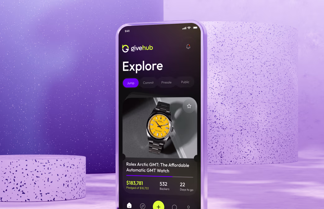
GiveHub – Transparent Donation & Charity Platform
Reimagining charitable giving with verified NGOs, real-time impact tracking, and complete donation transparency
About the project
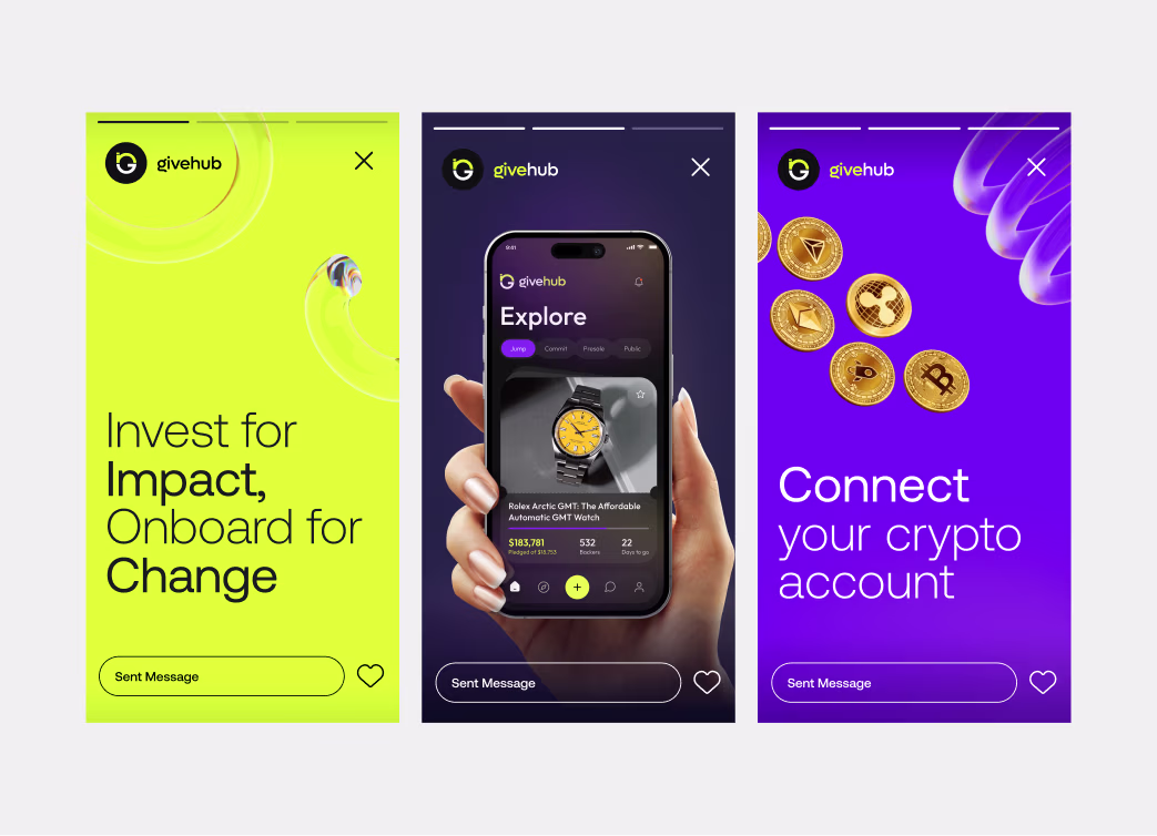
GiveHub is a fintech platform connecting individual donors with verified nonprofits and NGOs. The challenge was designing an interface that could communicate trust and transparency in the sensitive philanthropic space. We developed both web and mobile applications with integrated verification systems, real-time impact dashboards, and donor journey optimization. The platform increased donation completion rates by 58% and donor satisfaction scores by 71% within three months of launch.
Problems
Online donation platforms faced significant trust barriers: donors feared funds wouldn't reach intended recipients, organizations lacked verifiable credentials, users couldn't see concrete impact from donations, lack of transparency in fund allocation created skepticism, and the donation process felt transactional rather than meaningful. Industry data showed 62% of potential donors abandoned platforms due to trust concerns. Users frequently requested donation receipts, fund allocation details, and specific project outcomes—but original platforms provided minimal information.
Challenges
The core challenge was designing visual systems that communicated organizational legitimacy and fund transparency without overwhelming users with data. We needed to create a platform where verified nonprofits built trust through design, where donors could see real-time impact, and where the entire donation ecosystem felt secure and meaningful. A secondary challenge was simplifying complex financial data (administration costs, program allocation percentages, fund dispersal timelines) into intuitive visualizations.
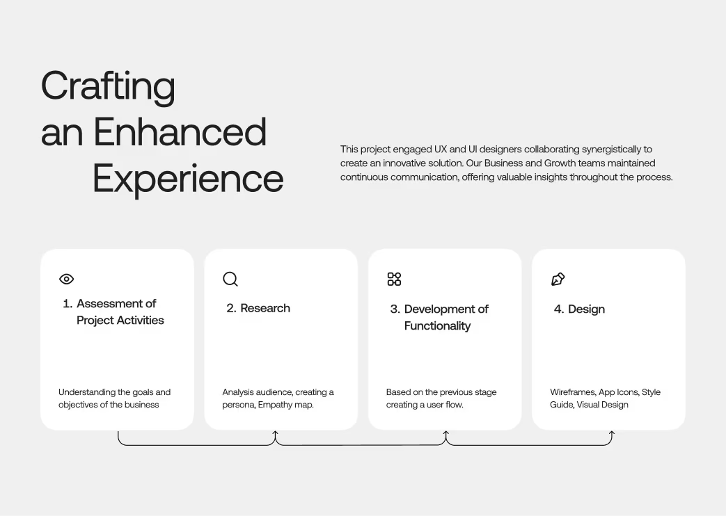
Our Approach
We implemented a comprehensive verification system integrated into the visual identity: verified organization badges, transparent fee structures displayed upfront, and detailed impact tracking dashboards. The methodology involved stakeholder interviews with 30 nonprofits and 200+ donors, competitive analysis of international donation platforms, and extensive prototyping of trust-building interface elements. We designed a real-time impact page showing exactly how donations were deployed, created visual fund allocation breakdowns, and built a donor verification system to reassure organizations. The information architecture prioritized transparency—no hidden fees, no surprises, all information available without clicking through multiple screens.
Our Approach


Project Timeline
Discovery & Stakeholder Research (Weeks 1–3): Interviews with nonprofits and donors, competitive benchmarking, regulatory requirements review. Trust System Design (Weeks 4–6): Verification framework design, badge systems, transparency standards documentation. Platform Architecture & Wireframing (Weeks 7–9): Core flows for donors and nonprofit admins, real-time data visualization planning. High-Fidelity Design (Weeks 10–13): Visual design system, donation flows, nonprofit admin dashboards, impact pages. Testing & Optimization (Weeks 14–15): Usability testing with 80+ donors, nonprofit feedback implementation, A/B testing final flows.
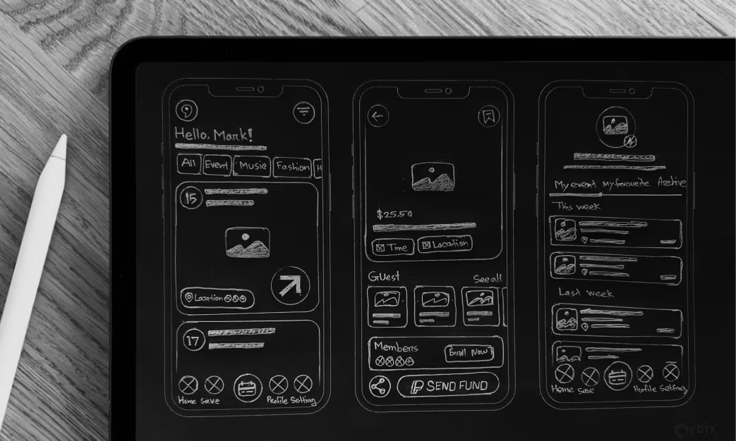
Sketch
Initial sketches focused on visually conveying trust and transparency. Concepts explored badge placement, verification indicators, and clear fund allocation visuals. Pie charts were too complex, while bar charts proved clearer and progress circles more modern but less precise. Transparent fee placement surprisingly boosted completion rates as users valued honesty. Impact page sketches used timelines to show donation effects over time, revealing donors preferred seeing their direct impact rather than generic metrics.
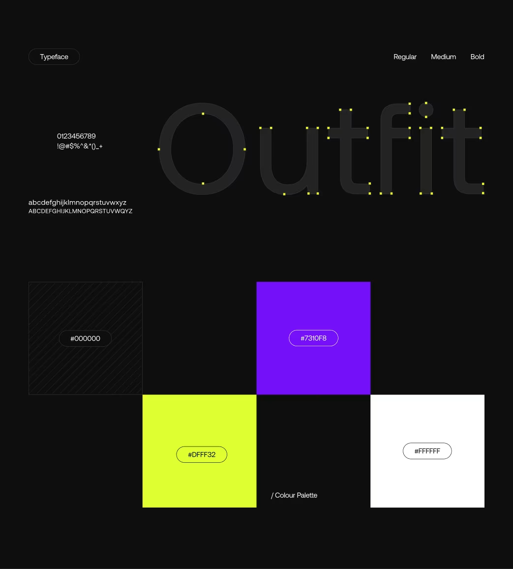
Style Guide
The visual identity emphasized trust, transparency, and social impact. A green (#2ECC71) palette symbolized growth, paired with earthy browns and clean grays for balance and readability. Red (#E74C3C) was used only for urgent alerts. Nunito, a friendly sans-serif, maintained approachability and credibility. Custom icons of hands, hearts, and growth humanized the brand, while verified badges and transparent fee displays reinforced trust. Generous spacing enhanced clarity and readability.
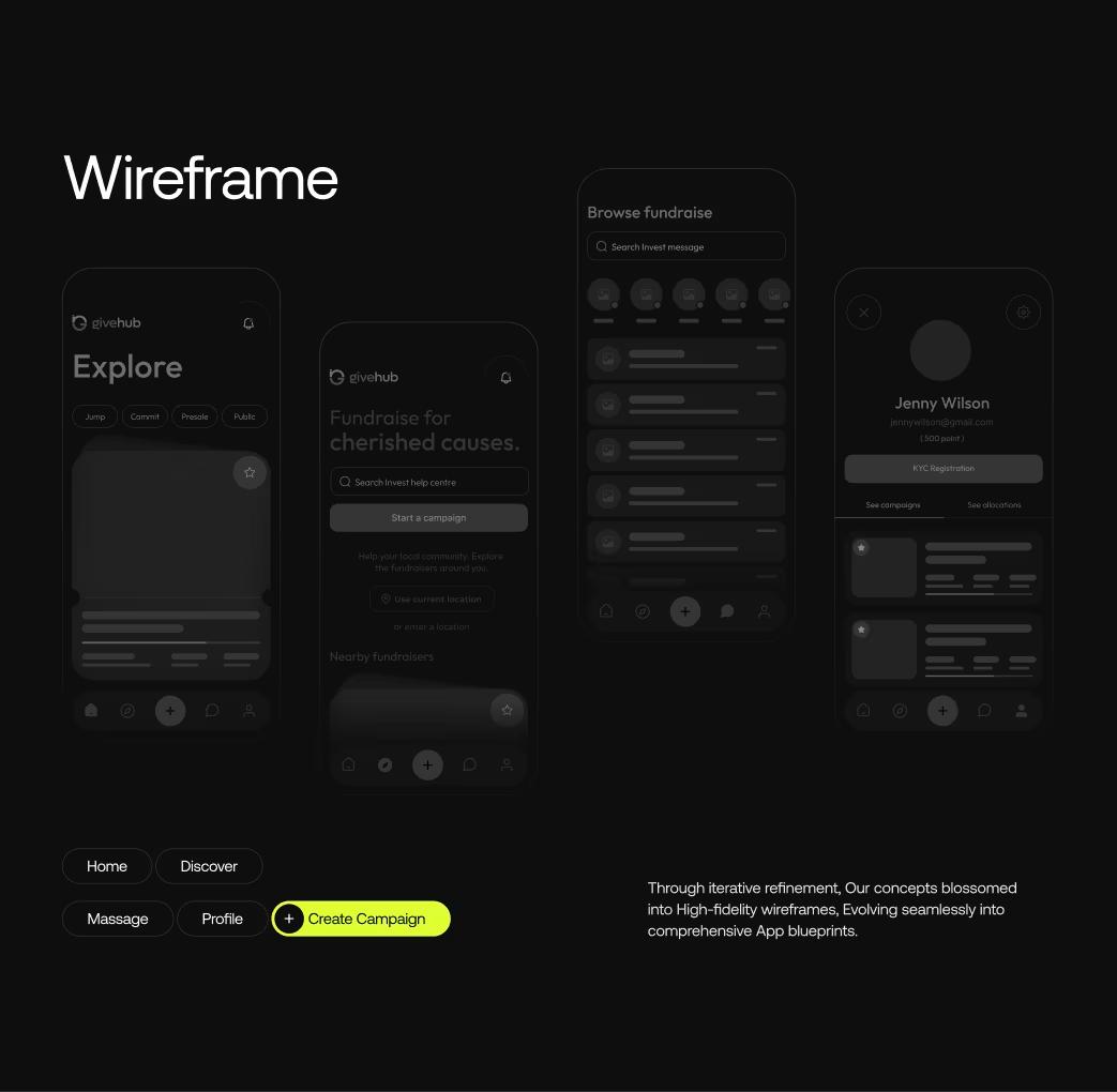
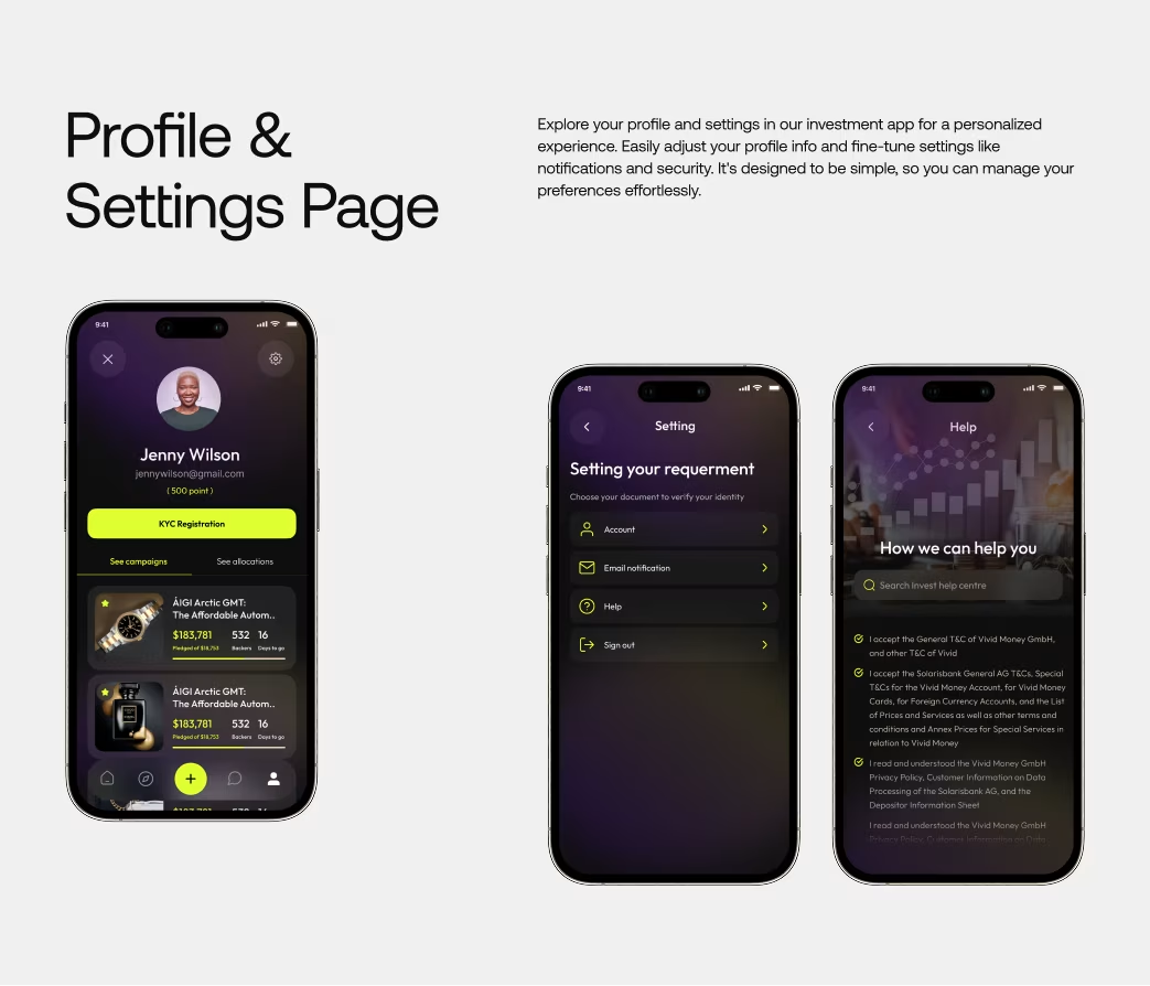
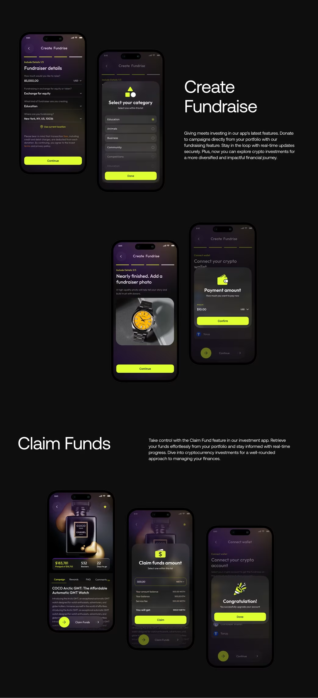
Wireframes & User Flows
Core wireframes defined journeys for donors and nonprofit admins, focusing on transparency at every step—organization selection, fund overview, donation, fee display, and impact tracking. Nonprofit dashboards managed verification, campaigns, and fund allocation. A transparency-first design made all data visible by default, improving trust and repeat giving. Testing with 40 users showed clear fee disclosure increased donations.
Animations
Micro-interactions reinforced positivity and trust. Subtle confetti celebrated donations, pulse animations highlighted new impact data, and smooth transitions made fund progress feel dynamic yet calm. Accessible motion settings ensured inclusivity.

Multi screen
The platform spanned 52 responsive screens across donor, nonprofit, and admin flows—each maintaining consistent patterns and readability across devices.

Visual Identity and Brand Story
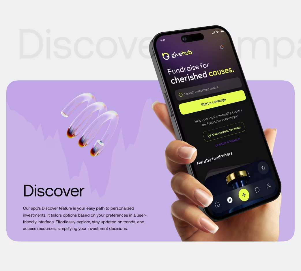
GiveHub positioned itself as the transparent bridge between goodwill and real impact. A warm, human-centered aesthetic replaced typical nonprofit formality. Real photography, diverse illustrations, and a heart-arrow logo embodied growth through giving. Clear typography, trust signals, and empathetic microcopy made giving feel both rational and emotional.


Results & Outcomes
After launch, donation completions rose 58%, average donation value 34%, and repeat giving 80%. 87% of users cited transparency as the key reason for trust. Support queries dropped 73%, and over $2.1M was donated in the first quarter. The key insight: radical transparency builds measurable trust and loyalty—turning honesty into a strategic advantage.
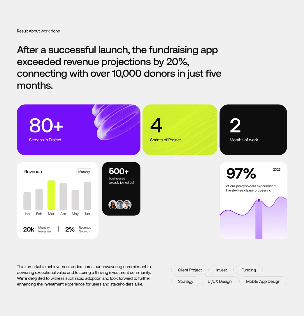
The Results
Our rebranding efforts delivered measurable success:

“Feedback gathered through surveys, interviews to measure impact and identify areas for improvement. Helps increase app's reputation and contributes to longterm success identify areas for improvement. ”


