

Pxgen – AI Generator UX/UI Case Study
Designing an intuitive AI-powered creative tool for next-gen creators.

About the project
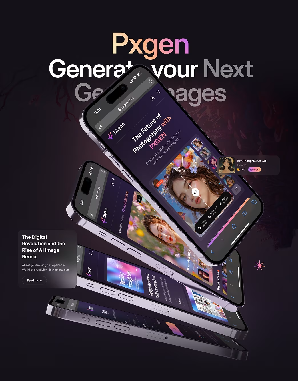
PXGEN is an AI image generation app that turns ideas into visuals in seconds. The Orbix Studio team was tasked to design a frictionless, creative-first user interface optimized for both speed and usability.
The Challenges
Early users struggled with control parameters and visual outputs. The interface was overly technical, leading to low retention rates among non-technical users.
Our Solutions
We focused on a clean, minimalist design with a clear information hierarchy. We implemented advanced filtering options and an interactive map view to make the search process more efficient. A streamlined favorites feature and an in-app messaging system were also integrated to improve communication between users and agents.
Our Approach


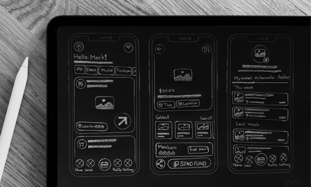
Sketch
We started with hand-drawn sketches to quickly explore different layout possibilities for key screens like the home page, search results, and property details. This helped us identify the most efficient user flow before moving to digital tools.
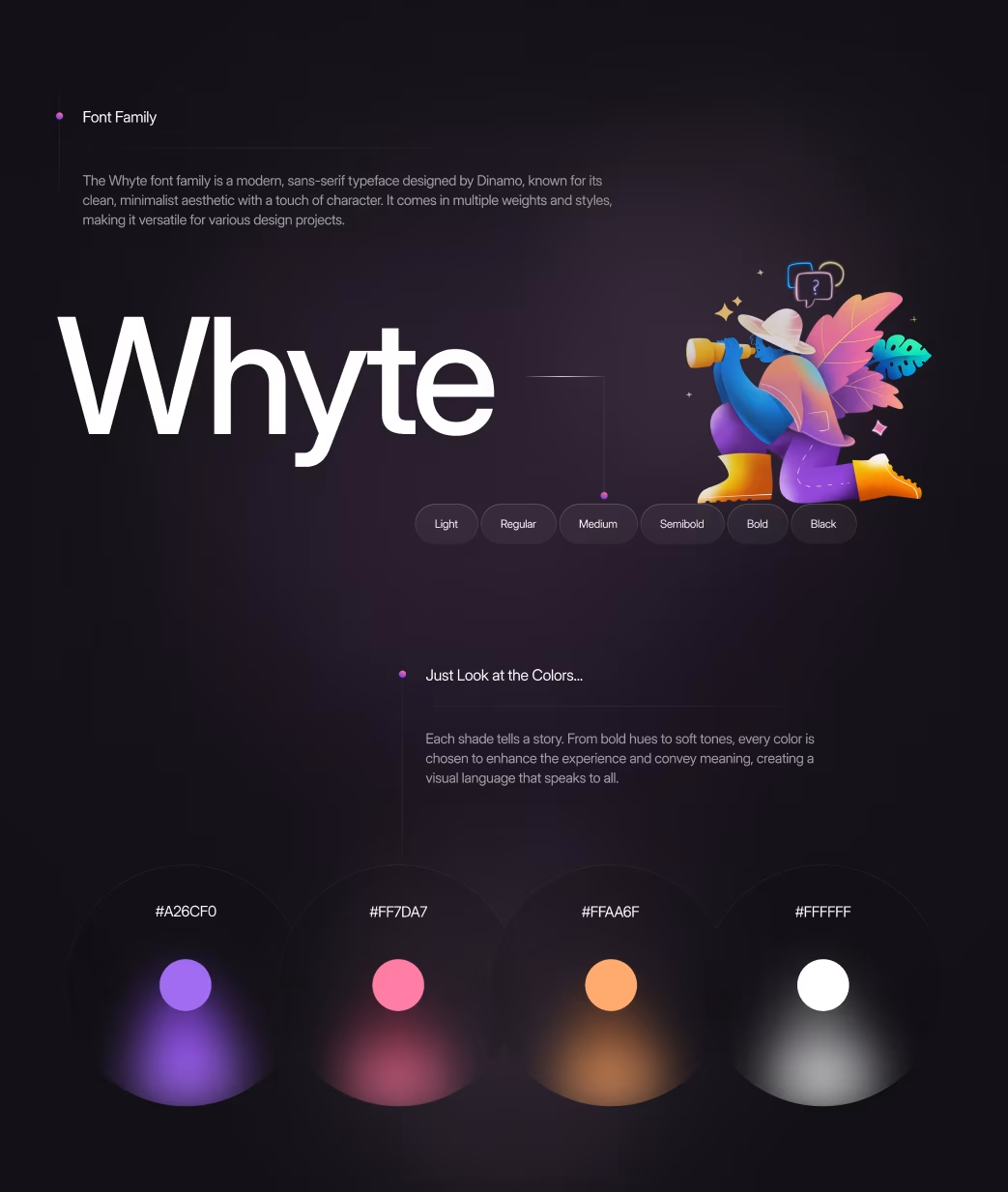
Style Guide
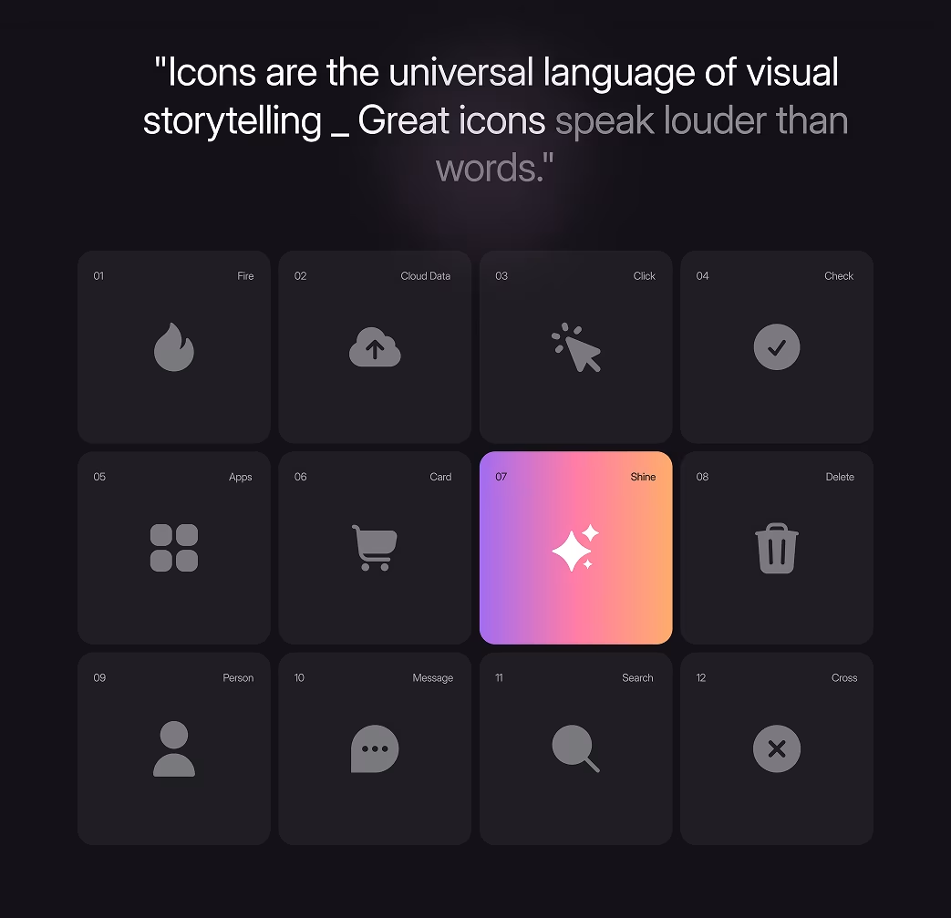
We developed a comprehensive style guide that included a modern color palette, a clean sans-serif typography, and a set of custom icons. This guide ensured visual consistency across the entire application, giving Rezo a cohesive and professional brand identity.
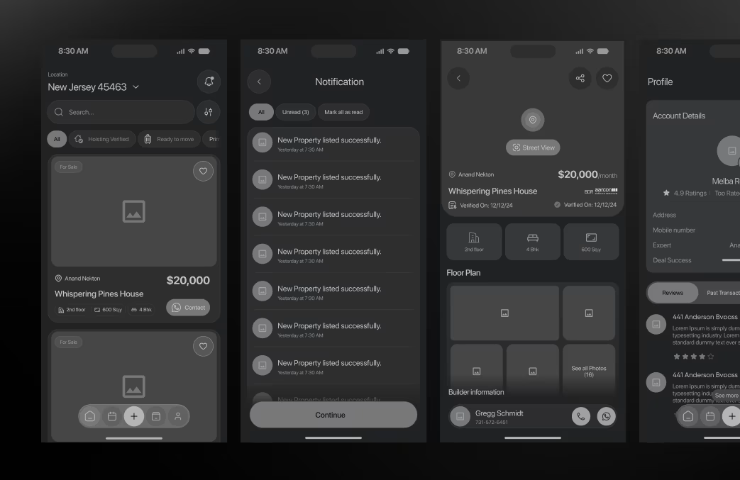
Wireframe
Our digital wireframes focused on the core functionality and structure of the app. We created low-fidelity prototypes to test user flows, ensuring that users could navigate from search to inquiry with minimal friction. This stage was crucial for identifying and fixing usability issues early on.
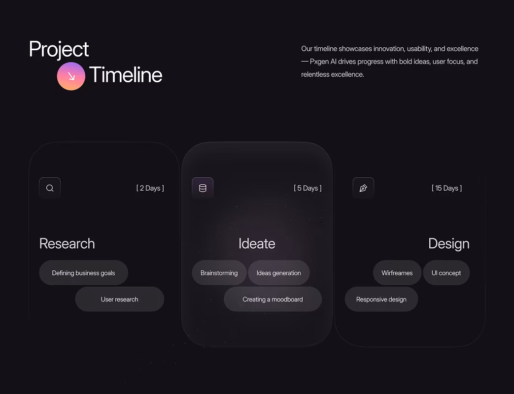
UI & Dashboard Experience
Intuitive 2-step flow: Type → Generate → Refine.
Floating side menu for parameter adjustment ensures seamless experimentation.
Responsive Experience
Optimized for tablets and mobiles to support users generating art on the go.
Visual Identity and Brand Story
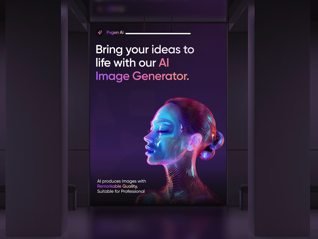
PXGEN’s visual identity merges technology with imagination. Every color gradient and motion accent represents creative freedom and the evolution of AI design. The brand speaks in the language of possibility — bold, futuristic, and empowering.

Results & Outcomes
Our digital wireframes and final design iterations focused on clarity, performance, and intuitive navigation. We validated the experience with multiple usability tests to ensure that users could complete key actions — from discovery to conversion — with minimal friction. The outcome is a high-performing digital product that feels effortless, engaging, and reliable across all touchpoints.
The Results
Our rebranding efforts delivered measurable success:

“We've had a great experience working with Orbix Agency. Their workflow is very structured and professional. They focus not just purely on design but also deeply on UX/UI components. Highly recommend if you want the best looking design for your product!”


