


Imagine trying to build a house without a blueprint. You just start laying bricks and hammering wood without a plan. It would be a mess, right? Designing a website or an app is the same. If you don't have a plan, you end up with a digital mess that frustrates your users.
To avoid that, you need a solid plan, a blueprint. In the world of design, that blueprint is called the UX Honeycomb. It breaks down your design into 7 pillars: useful, usable, findable, credible, desirable, accessible, and valuable. Think of these pillars as your checklist for making sure every design decision is the right one.
Today, we’re going to talk about the 7 pillars of UX design in detail. You’ll also know exactly how to apply them to your own projects, so you can build things users actually love.
What is the UX Honeycomb?
The UX Honeycomb is a famous framework that helps designers build better products. It was introduced in 2004 by Peter Morville, a pioneer in information architecture.
Before this framework, the design world mostly focused on just one question: "Is this easy to use?" That’s usability. But Morville realized that wasn't enough. A website can be easy to click but still be useless or untrustworthy. He created the honeycomb to solve this problem by showing that great design needs to be many things at once, not just functional.
The honeycomb shape is key. It shows that all the cells are connected. You can't have a strong design without supporting every pillar. It’s a system where everything works together to support the user.
That is why, even in 2026, this diagram is still taught in almost every UX course. It remains the perfect blueprint for looking at the big picture of user experience.
The 7 Pillars of UX Design by Peter Morville

These 7 factors of user experience come from Peter Morville’s UX Honeycomb. It is a map that shows us every way a user connects with a design. Here are the 7 pillars of UX design that will guide your next project.
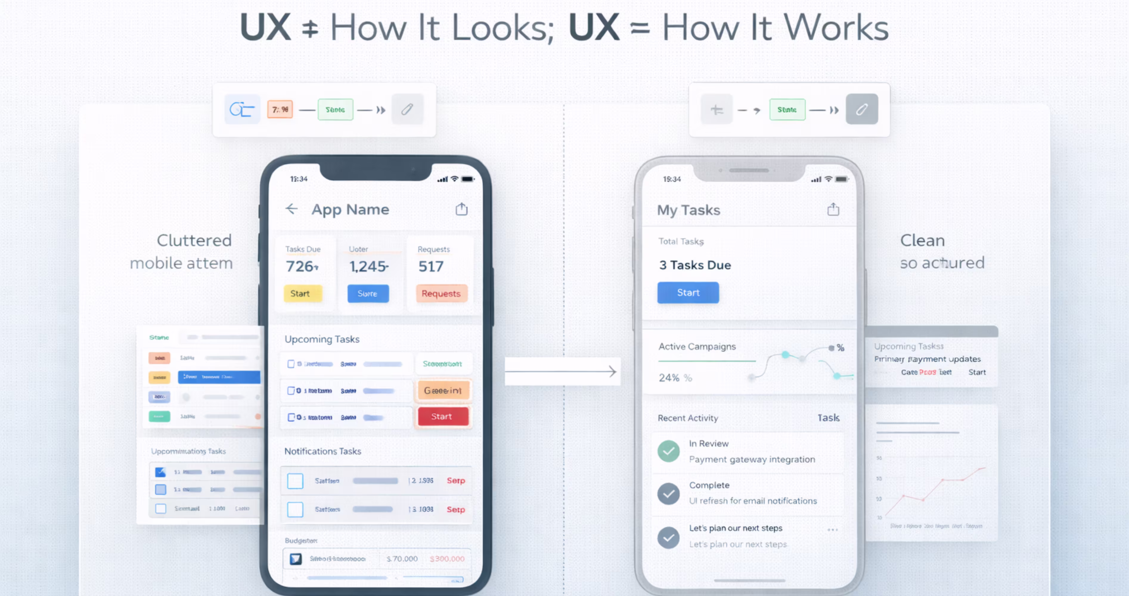
1. Usefulness - Does the Product Solve a Real Problem?
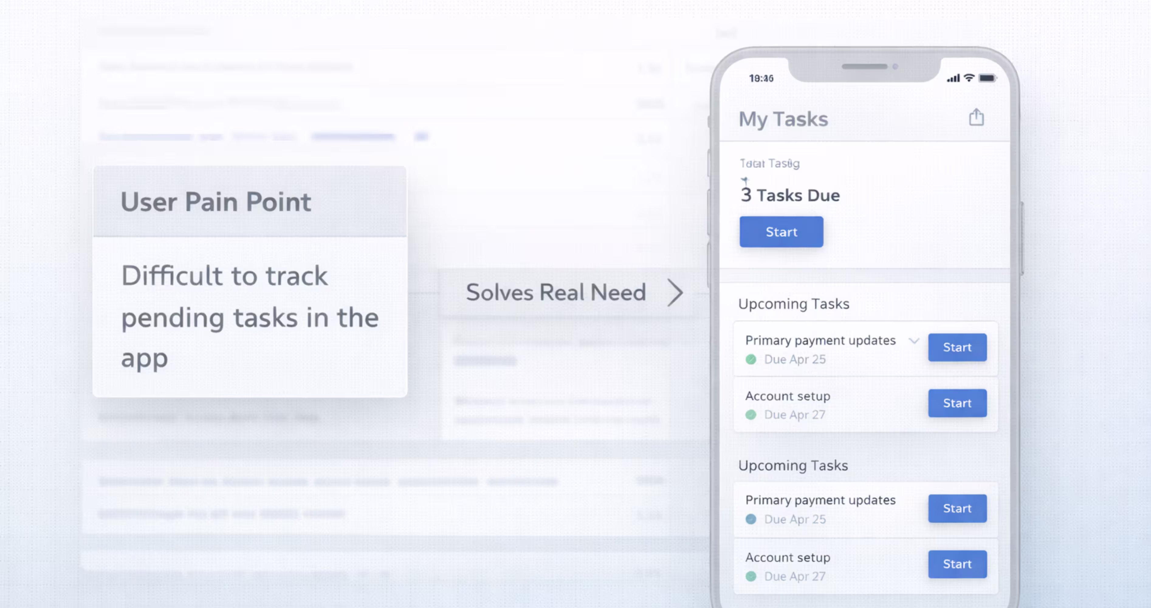
A product is useful when it solves a real problem users actually have - not one the product team assumes they have.
Think of usefulness as the non-negotiable foundation of the user experience honeycomb. Before you worry about how the product looks, you have to prove that it needs to exist. Many teams fall into a trap known as the feature factory pattern. This occurs when teams continuously ship new features based on internal ideas rather than validated user needs, essentially building tools that nobody asked for.
The important thing to know is that adding more features does not make a product more useful. In fact, data suggests the opposite. According to Pendo research, 80% of SaaS features are rarely or never used.
This statistic highlights a major gap between what teams build and what users actually need. A feature that isn't used isn't just a waste of code; it’s clutter that makes the product harder to navigate for everyone else.
To make sure you aren't falling into this trap, you have to validate needs before design begins. You can do this by creating a simple User Need Map in FigJam. List your proposed features in one column and the specific, validated user pain point they solve in another.
If a feature doesn't solve a real problem, it shouldn't be in your design.
2. Usability - Can Users Accomplish Goals Efficiently?
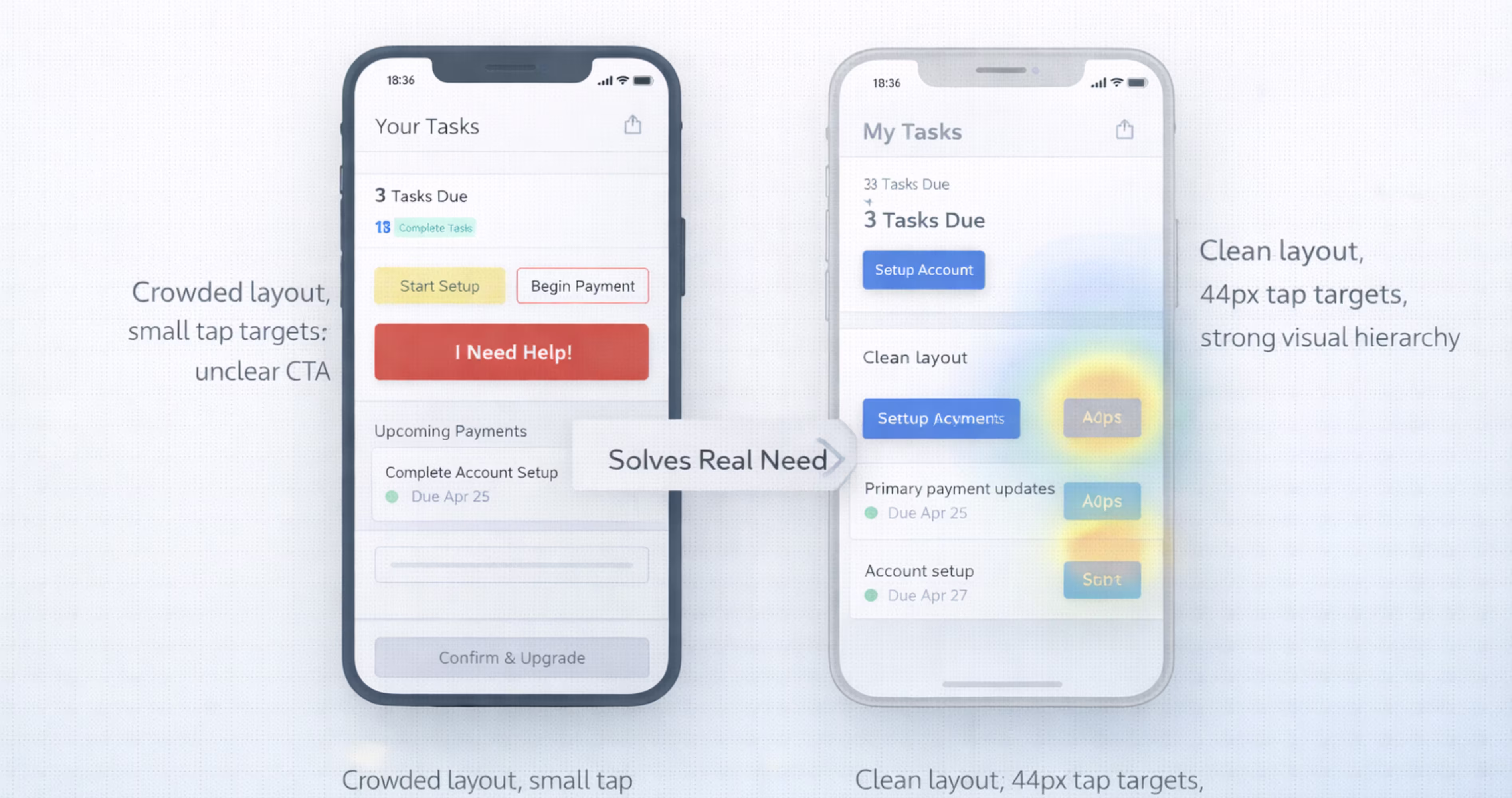
Usability measures how easily and effectively users can achieve their goals within your product. A useful product that is difficult to use will lose users to competitors who solve the same problem with less friction.
To make sure that your design is usable, you can evaluate it against Jakob Nielsen’s five components of usability:
- Learnability: How easy is it for users to accomplish basic tasks the first time they encounter the design?
- Efficiency: Once users have learned the design, how quickly can they perform tasks?
- Memorability: When users return to the design after a period of not using it, how easily can they reestablish proficiency?
- Errors: How many errors do users make, how severe are these errors, and how easily can they recover?
- Satisfaction: How pleasant is it to use the design?
The important thing to know is that poor usability is a primary driver of churn. Users will not stick around to figure out a confusing interface. According to Hotjar, 75% of SaaS users churn within the first week.
The main reason isn't missing features; it is confusing navigation and complex workflows.
Usability lives in the flow, not in the frame. A common mistake is designing beautiful screens in isolation that create confusing transitions when linked together. You need to build complete user flows to see the full picture.
To catch these issues early, you don't need a massive budget. Research from the Nielsen Norman Group found that testing with just five users is enough to uncover 85% of usability problems.
The goal is to test real flows with real people, not just colleagues who already know how the product works.
3. Findability - Can Users Locate What They Need?
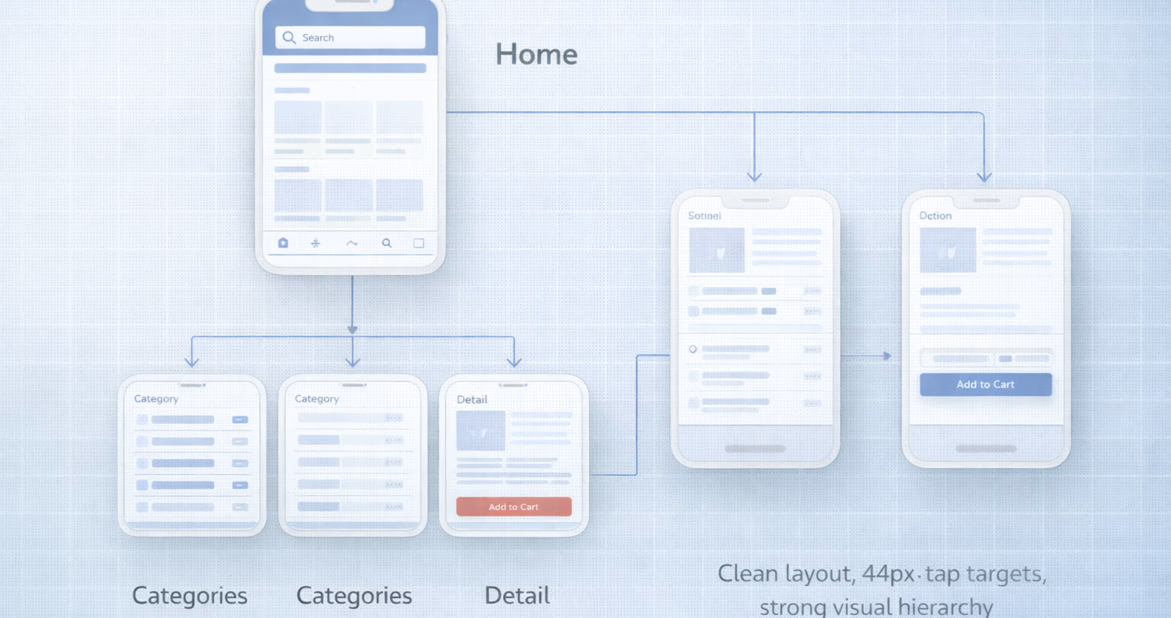
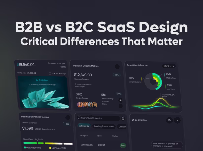
Findability addresses whether users can navigate to the content, features, or tools they need without frustration. This is particularly critical for complex products with deep feature sets.
If a feature exists but users cannot find it, it effectively does not exist. Findability failures are also invisible to analytics. You cannot measure how many users gave up looking for something that was technically available.
To illustrate this, consider a logistics SaaS client we worked with. An audit revealed that three critical reporting features had no visible navigation path. Users had to guess URLs or rely on bookmarks just to access them.
We restructured the navigation to a 2-tier hierarchy with contextual breadcrumbs. The result? Feature engagement increased 41% in the first 30 days.
The features themselves did not change. Only their discoverability did. This proves that investing in information architecture is just as important as building the features themselves.
Here is how you can validate findability before you build:
- Card Sorting: Ask users to group topics into categories that make sense to them. This reveals how they mentally organize information.
- Tree Testing: Give users a task and a simplified text-only version of your navigation to see if they can find the correct path. This validates your structure before you design a single pixel.
The goal is to make sure users never have to guess where to click.
Further Reading: SaaS Dashboard Design Guide
4. Credibility - Do Users Trust Your Product?
Credibility determines whether users trust your product enough to engage with it. This isn't just about visual polish; it is about the perceived reliability of your entire system.
According to research by BJ Fogg at Stanford, users evaluate credibility unconsciously within seconds. They are looking for specific markers that indicate your product is safe, professional, and accurate.
A key insight here is that consistency equals credibility. When buttons behave differently across pages, or error states look inconsistent, users perceive the entire product as unreliable - even if the core function works perfectly. A product that looks credible but behaves unpredictably will lose trust faster than a simple product that works reliably.
To build trust, make sure that your product includes these essential credibility markers:
- Professional visual design: A polished interface signals competence.
- Up-to-date content: Fresh information shows the product is maintained.
- Clear contact information: Users need to know who is behind the product.
- Third-party endorsements: Social proof, reviews, and badges build authority.
- Absence of errors: Typos and broken links damage trust immediately.
- Transparent changelogs: Show users that the product is actively improving.
- Responsive support: Accessible help signals that you care about customers.
The best way to ensure this consistency is through building a design system. A well-maintained design system enforces visual and interaction standards across every screen. It also eliminates the small inconsistencies that make a product feel "sketchy."
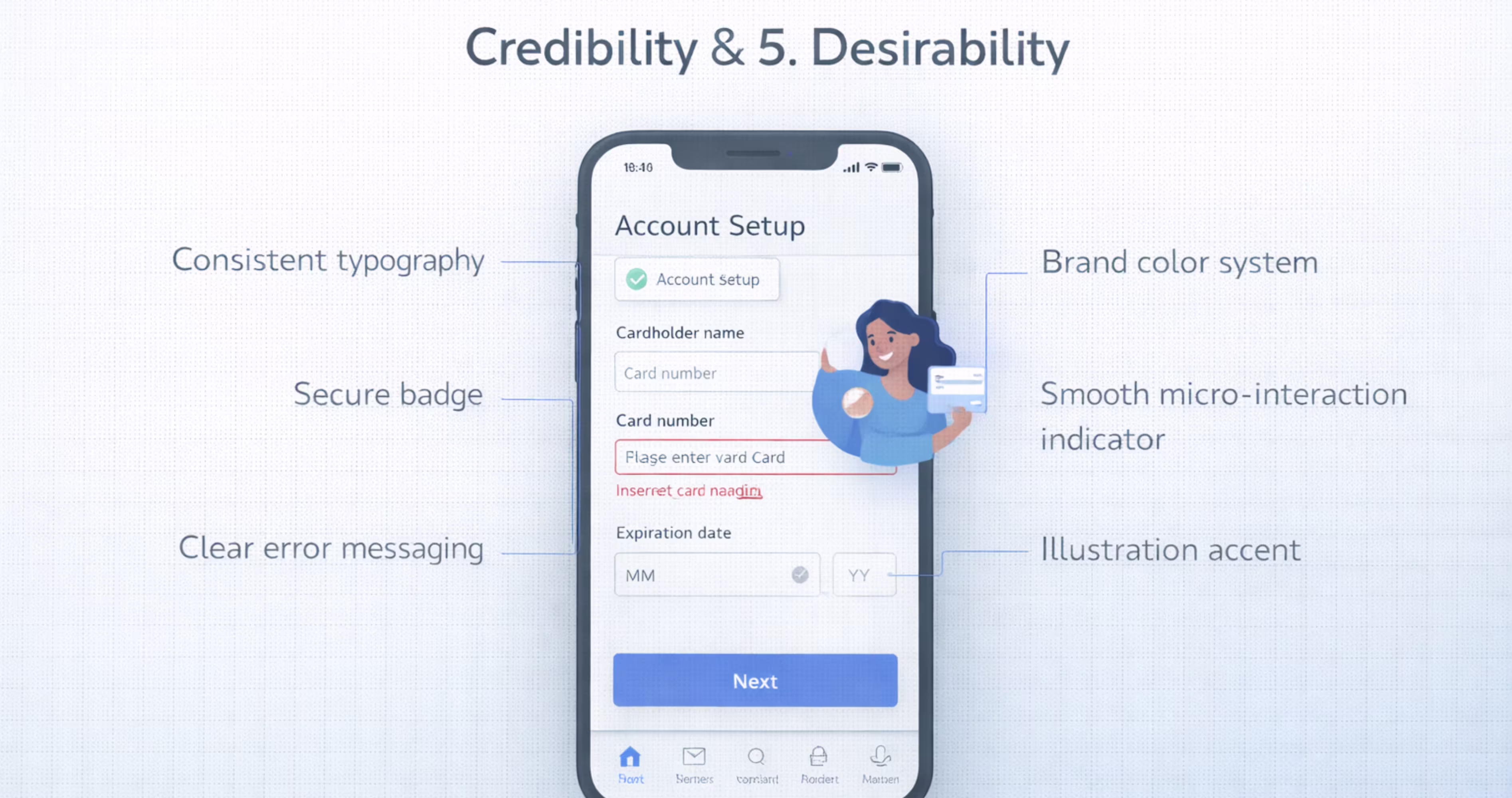
5. Desirability - Does it Create an Emotional Connection?
Desirability is the emotional dimension of user experience. While the previous pillars focus on function, this one focuses on feeling. It answers the question: Do users want to use this product, or do they merely tolerate it?
To understand desirability, it helps to look at Don Norman’s three levels of emotional design:
- Visceral: The immediate emotional reaction to the product's look and feel.
- Behavioral: The satisfaction derived from using the product effectively.
- Reflective: How users feel about the product after the interaction, including its impact on their self-image.
Products like Notion, Linear, and Figma succeed because they hit all three levels. They look beautiful, they work smoothly, and they make users feel professional and organized. This emotional connection leads to higher loyalty and lower churn.
A common mistake is investing heavily in visual polish while ignoring usefulness. A product that wins design awards but frustrates users will eventually lose them. You must build a functional product before you build a beautiful one.
To introduce desirability into your design without overwhelming the user, you can apply the 60-30-10 color rule:
- 60% dominant neutral: Use white, gray, or black for the background to keep the interface clean.
- 30% secondary color: Use your brand color for headers, sidebars, and larger elements to provide structure.
- 10% accent color: Use a bright, contrasting color strictly for calls-to-action (CTAs) and key emphasis points.
This creates visual harmony and guides the user’s eye to what matters most.
6. Accessibility - Can Everyone Use It?
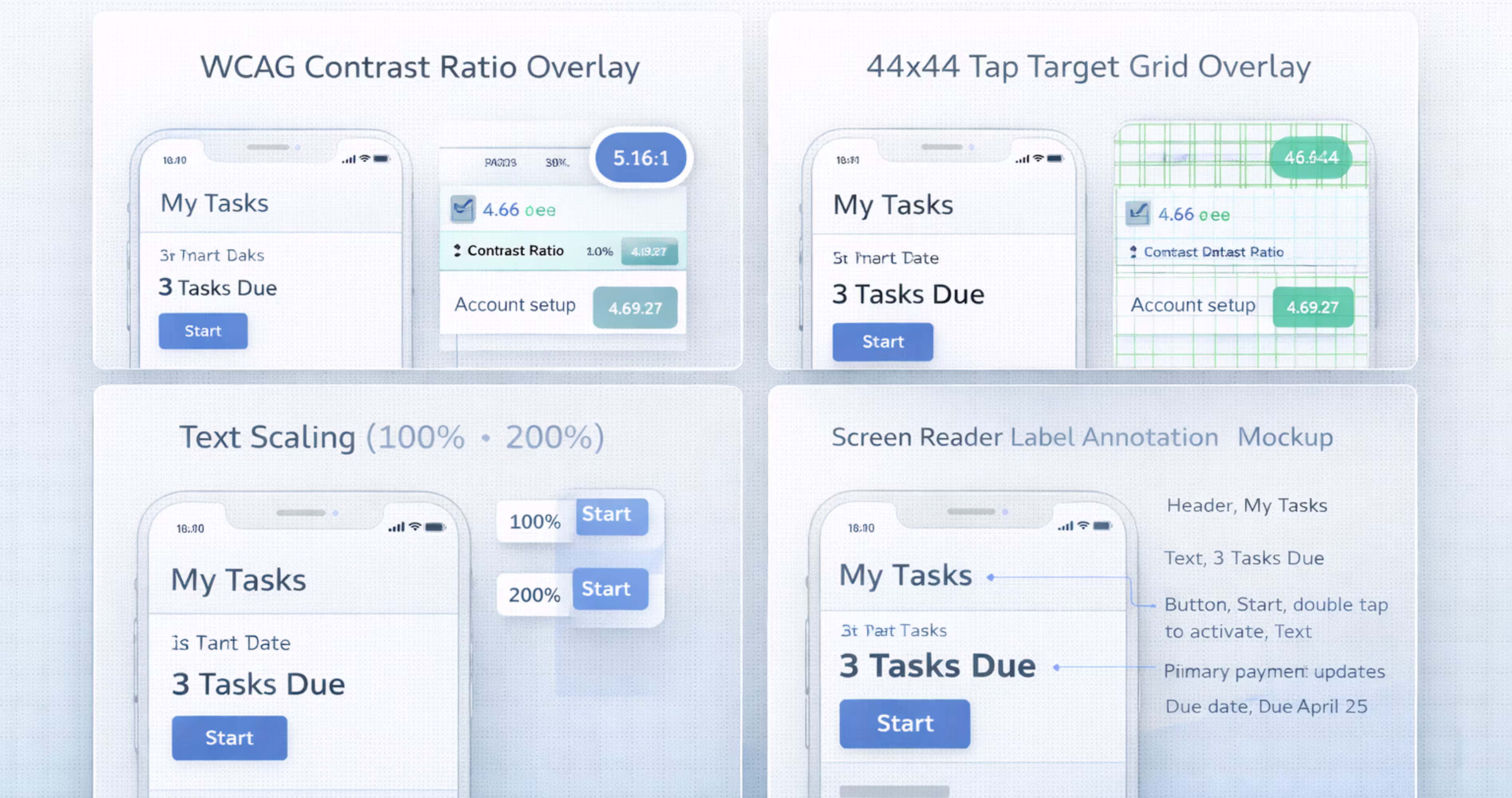
Accessibility ensures that your product can be used by people of all abilities, including those with visual, auditory, motor, or cognitive impairments. This is not a "nice-to-have" feature or a secondary concern. It is a baseline standard and, in many places, a legal requirement.
The scale of this audience is massive. The World Health Organization estimates that over 1 billion people worldwide live with some form of disability. If your product isn't accessible, you are effectively excluding a huge portion of the population.
Think about how Apple handles this. They don't treat accessibility as an afterthought or a hidden menu. Features like VoiceOver, Dynamic Text, and Switch Control are core to the iOS experience. This approach allows millions of people to use technology that would otherwise be locked away from them.
The important thing to know is that accessible design is better design for everyone. Features meant to help users with disabilities - like high-contrast text or larger touch targets - also help users holding a phone with one hand or looking at a screen in bright sunlight.
A common mistake designers make is relying on color alone to communicate meaning. For example, using only red to show an error and green to show success. Roughly 1 in 12 men has some form of color vision deficiency and won't see the difference. Always pair color with text labels or icons.
The best way to approach this is to fix issues during the design phase. We run WCAG audits on every project because fixing a contrast error or a missing label in Figma takes minutes. Fixing it after you have launched can take weeks of developer time.
7. Value - Does it Create Real Value?
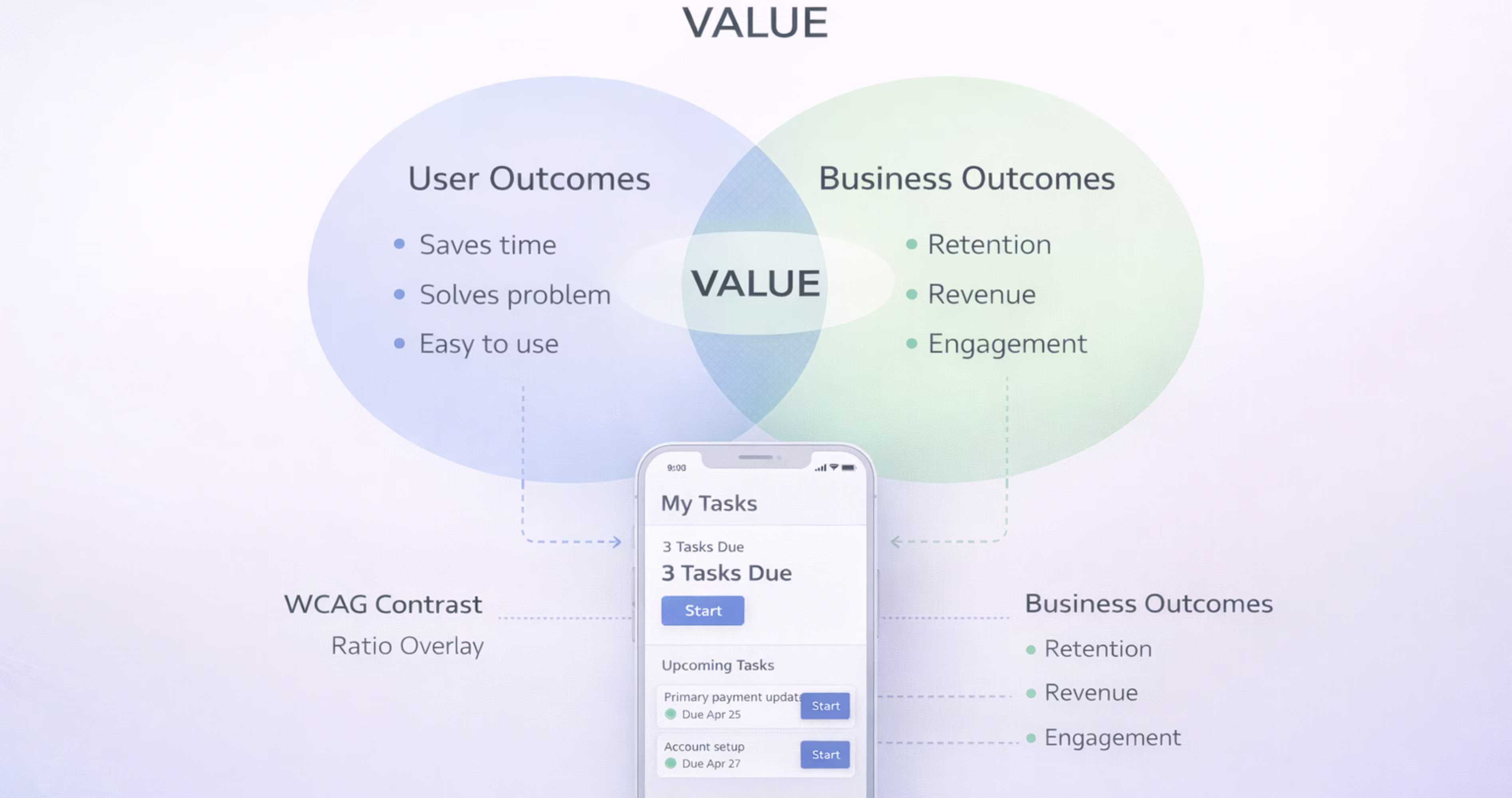
Value sits at the center of the UX Honeycomb because it is the sum of all the other pillars. A product is valuable when it delivers enough benefit to justify the time, money, or effort a user invests - and when it also serves the business's goals. Both sides must win.
This is where user experience meets business strategy. A product can be useful, usable, and beautiful, but if it doesn't generate revenue, reduce costs, or advance the organization's mission, it will not survive.
Here is how you can identify and measure value:
- User Value: Solving a real problem, saving time, or providing an enjoyable experience.
- Business Value: Driving revenue growth, increasing customer retention, and reducing support costs.
- Metrics: Tracking conversion rates, Net Promoter Score (NPS), and Customer Lifetime Value (CLTV).
The goal isn’t just to create user delight while ignoring the bottom line. Long-term value requires a balance between user needs and business goals.
Forrester Research found that every dollar invested in UX returns $100 in value. That represents a 9,900% ROI.
Why? Because when design effectively solves user problems, it increases adoption and loyalty, which directly drives revenue.
To make sure you are creating value, define success before you design. Ask: "What does success look like in 6 months?" Use metrics like task completion rates and user error rates to prove that your design decisions are moving the needle.
Further Reading: UX/UI Design Cost Guide

How We Apply These 7 Pillars at Orbix
Traditional agencies focus on delivering a project and moving on, while Orbix Studio focuses on maintaining design quality through a continuous subscription model.
Think of the 7 pillars of UX design not as a one-time checklist, but as a living standard for your product. Core principles like usefulness, usability, and credibility must be upheld continuously, not just at launch.
But product quality degrades over time. New features are added, user needs evolve, and technical standards like WCAG update. How a product performs six months after launch often depends on how well the design adapts to these changes.
The important thing to know is that a design audit at project kickoff does not guarantee success in the long run.
To illustrate this, we evaluate every new feature against the UX Honeycomb in every single sprint. We catch issues like broken accessibility or confusing navigation before they reach your users. Our subscription UX design model allows us to treat these seven pillars as a permanent standard for your product, so the value is maintained month after month.
5 Common Mistakes Teams Make with the 7 Pillars
The UX Honeycomb is a powerful tool, but applying it incorrectly can lead to bad design decisions. Here are 5 common mistakes teams make when trying to implement these pillars.
Treating Pillars as Sequential Steps
Don't treat the pillars like a checklist that you finish one by one. You don't complete "useful" and then move on to "usable." You need to look at all seven at once. A change that makes a product more usable might actually make it less accessible. You have to balance them together.
Prioritizing Desirability Over Usefulness
Visual design is the easiest thing to see, so teams often spend too much time making things look pretty. But a product that wins design awards but doesn't solve a real problem will lose users. Focus on how it works before you worry about how it looks.
Treating Accessibility as a Final Checkpoint
Don't leave accessibility for the end of the project. You can't just "test" for it right before you launch. Research shows that fixing accessibility issues after a product is built costs 3x to 5x more time than building it in from the start.
Measuring Value Only at Launch
Don't measure value just once when you release the product. A product that is valuable today might not be valuable in six months because user needs change. You need to set up a way to track your metrics continuously.
Using the Framework Without User Research
The 7 pillars tell you what to measure, but they don't tell you what to build. If you use this fUX honeycomb framework without talking to real users, you are just evaluating your own guesses. You need research to make sure your design decisions are based on real needs.
Further Reading: Golden Rules of UX Design
Final Thoughts
The 7 pillars of UX design, usefulness, usability, findability, credibility, desirability, accessibility, and value, provide a complete framework for evaluating and improving every digital product you build. They move UX conversations beyond subjective opinions and into structured, measurable criteria that designers, founders, and developers can all align around.
For teams designing mobile apps in Figma, these pillars are practical tools, not academic concepts. They inform your research, shape your components, guide your prototypes, and strengthen your handoff. When every design decision maps back to a clear UX principle, the entire product development process becomes more focused and more effective.
We build mobile apps grounded in these principles every day. At Orbix Studio, we help startups and product teams turn ideas into polished, user-centric digital experiences, from brand identity and UX strategy through Figma design, prototyping, and production-ready development. If you are ready to build a mobile app that gets the fundamentals right, let's talk.
Frequently Asked Questions
How do I know if my design is failing one of the 7 pillars?
You can spot failure by looking at your data and user feedback. If you have a high bounce rate, your product might not be findable. If you get complaints about confusion, it might not be usable. You can also request a UX audit from us to identify exactly where your design is falling short.
Do the 7 pillars apply to mobile apps too, or just websites?
Yes, the 7 pillars apply to all digital products. This includes websites, mobile apps, and software dashboards. While the pillars stay the same, they look a bit different on mobile.
What tools do UX designers use to apply these pillars?
Designers use specific tools to check each pillar. They use Figma to work on usability and desirability. Tools like Maze or Hotjar help test how users interact with a design. For accessibility, designers use tools like Axe or Lighthouse to check for issues. For planning, they use FigJam or Notion.
Can a product have good UX but bad UI, or vice versa?
Yes, this happens all the time. A product can look beautiful, which is good UI, but be very hard to use, which is bad UX. On the other hand, a product can be very easy to use but look plain or outdated. The best products have both great UI and great UX.
Is accessibility a legal requirement?
Yes, accessibility is a legal requirement in many countries. In the United States, websites must often comply with the ADA. In Europe, there are standards like EN 301 549. If your website is inaccessible, you could face legal risks or lawsuits.
How do the 7 UX pillars connect to business growth?
Good UX design directly impacts your bottom line. When a product is usable and credible, it leads to higher conversion rates and lower customer support costs.
How do the 7 UX pillars apply to mobile app design?
Every pillar directly impacts mobile app quality. Usability determines whether users can navigate small screens efficiently. Accessibility ensures the app works for users with disabilities. Findability governs how quickly users locate features. Applying all seven pillars during mobile design prevents common usability failures.
How can I apply UX design pillars in Figma?
Map each pillar to a stage in your Figma workflow. Use journey maps for usefulness, wireframes for usability, sitemaps for findability, design systems for credibility, visual design for desirability, accessibility plugins for accessibility, and user testing on prototypes for value.
Schedule Your Free Consultation
.avif)


.avif)
