
Table of Contents
- Understanding the 60/30/10 Rule in UI/UX Design
- How the 60/30/10 Rule Works in UI Design
- How to Apply the 60/30/10 Rule in Figma
- 60/30/10 Rule Examples in Mobile App Design
- 60/30/10 Rule vs. Other Color Frameworks in UI Design
- Tips for Adapting the 60/30/10 Rule to Complex Interfaces
- Conclusion
- Frequently Asked Questions

The 60/30/10 rule is a color proportion framework that splits your interface into 60% dominant color, 30% secondary color, and 10% accent color to create visual balance and hierarchy. This simple ratio prevents chaotic color decisions and gives every screen a clear, intentional structure.
This guide breaks down how each percentage works in mobile UI, how to set it up in Figma, real app examples in light and dark mode, common mistakes to avoid, and how to adapt the rule for complex design systems.
Understanding the 60/30/10 Rule in UI/UX Design
The 60/30/10 rule is a proportional color guideline that tells designers exactly how much visual weight each color should carry across an interface. Instead of guessing which colors go where, you assign a clear role to each: one color dominates, one supports, and one draws attention.
In UI/UX design, this translates directly to usability. The dominant color creates a consistent backdrop. The secondary color differentiates sections, cards, or navigation. The accent color highlights interactive elements like buttons, toggles, and links. When these proportions hold, users process screens faster because the visual hierarchy does the cognitive work for them.
The rule is not about limiting creativity. It is about giving color decisions a structural backbone so that every screen in your mobile app feels cohesive, scannable, and intentional.
Where Does the 60/30/10 Rule Come From?
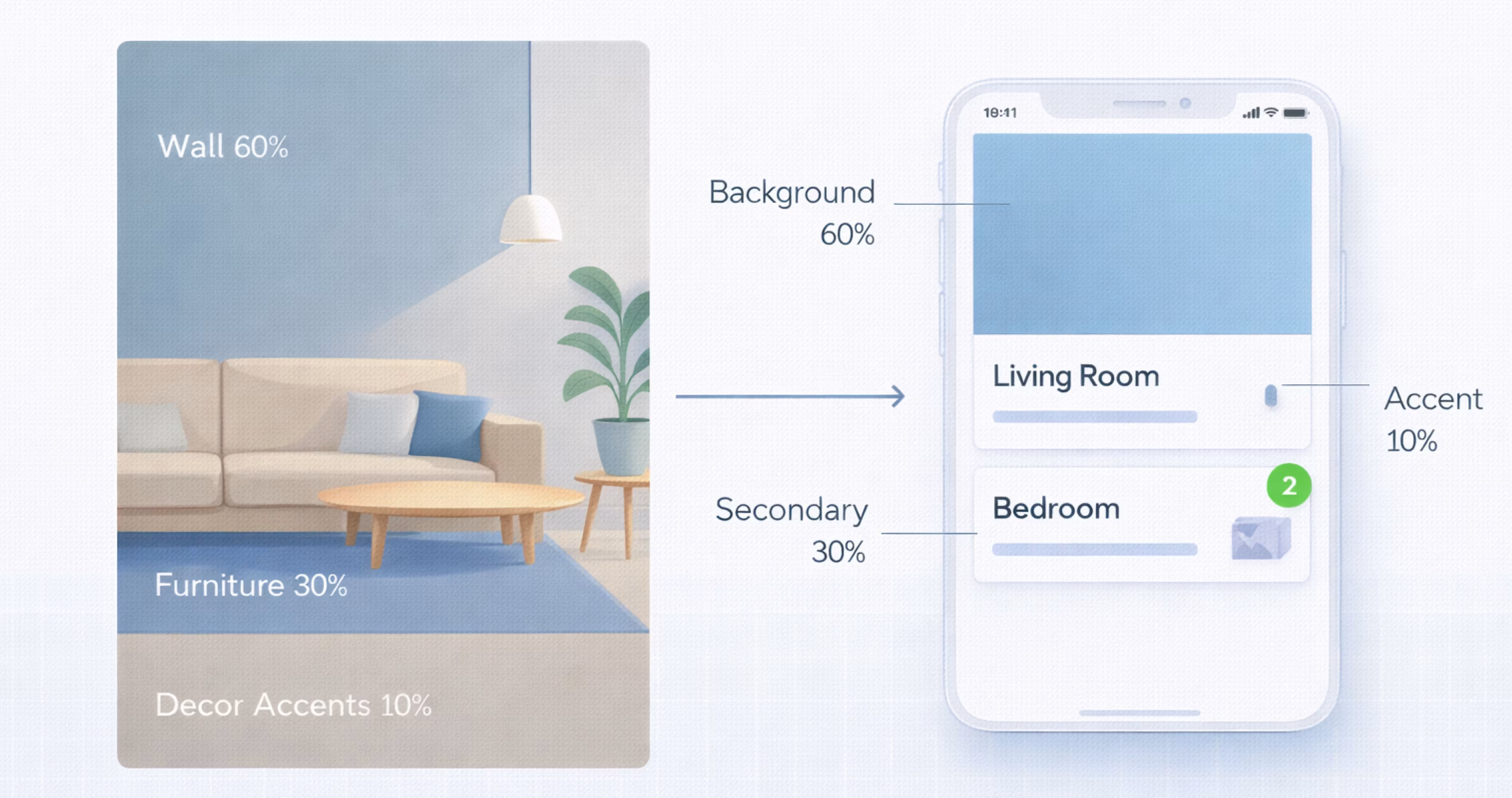
The 60/30/10 rule originated in interior design. Decorators used it to balance wall color, furniture, and accessories in a room so that no single element overwhelmed the space. The principle migrated into fashion, graphic design, and eventually digital product design because the underlying logic is universal: human eyes prefer structured visual proportion.
In UI/UX, the rule gained traction as design systems matured. Teams building apps in Figma and other tools needed a repeatable method to assign color roles across dozens of screens without losing consistency. The 60/30/10 split offered that method with minimal complexity.
Why Color Proportions Matter in Interface Design
Color proportion directly affects how users navigate an interface. When every element competes for attention, nothing stands out. When proportions are balanced, the eye moves naturally from background to content to action.
Research in visual perception supports this. Users form first impressions of a digital product in milliseconds, and color is the primary driver of that impression. A well-proportioned color system reduces cognitive load, improves readability, and makes interactive elements immediately recognizable.
For mobile apps specifically, screen real estate is limited. Poor color distribution wastes that space by confusing the visual hierarchy. The 60/30/10 rule solves this by enforcing a ratio that scales across every screen size and component.

How the 60/30/10 Rule Works in UI Design
The rule divides your interface color usage into three tiers. Each tier has a specific function, and the percentage reflects how much of the total visible screen area that color occupies. Here is how each tier operates in practice.
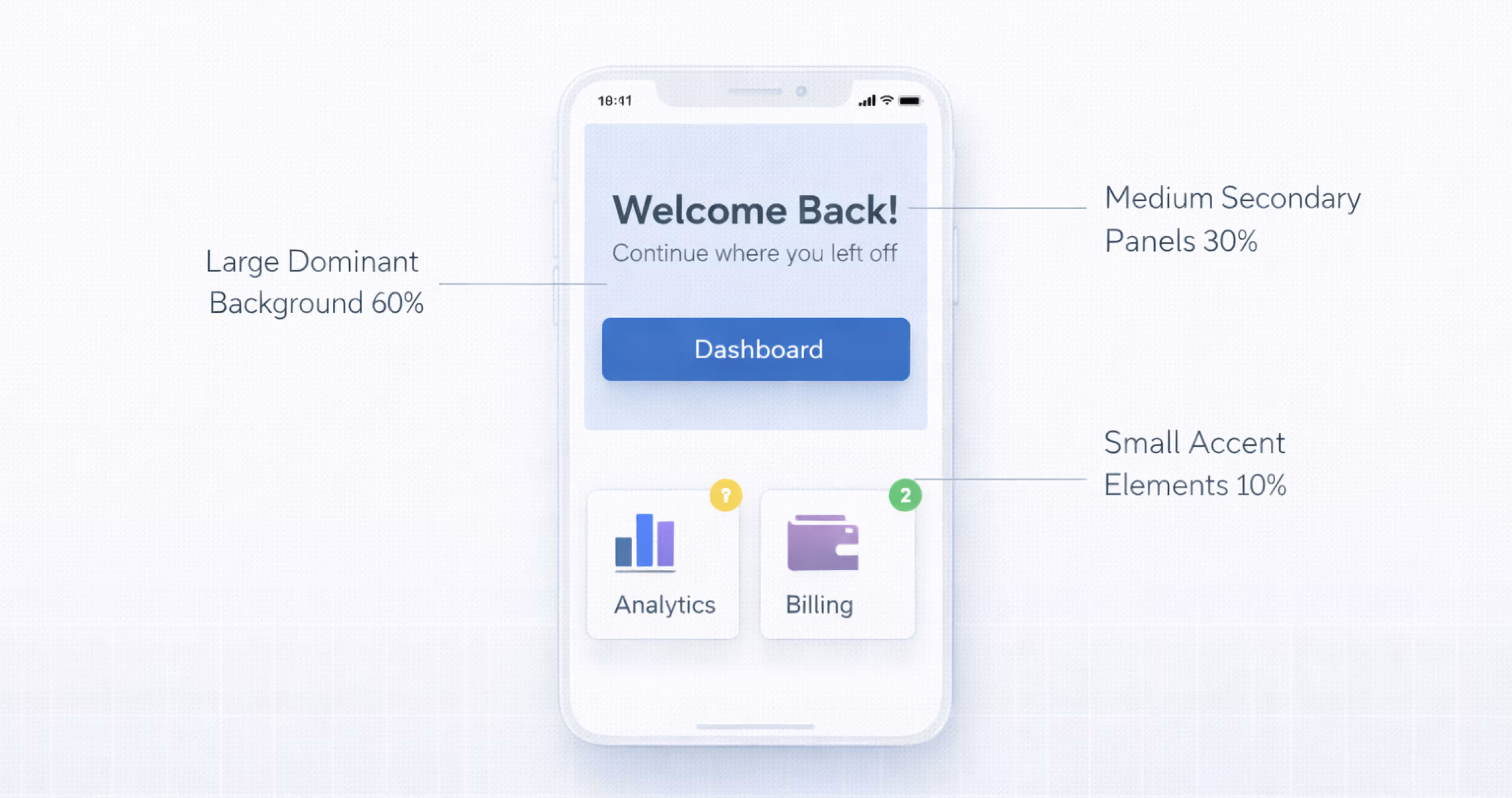
The 60% Dominant Color (Primary Background)
The dominant color covers the largest surface area of your interface. In most mobile apps, this is the background color of screens, cards, and content areas. It sets the overall tone and mood of the product.
For light mode apps, this is typically white or a very light neutral. For dark mode, it is a deep gray or near-black. The dominant color should be the least attention-grabbing color in your palette because its job is to recede and let content breathe.
In Figma, you would apply this color to your base frames, screen backgrounds, and large container components. It should feel invisible. If users notice the background color before the content, the dominant color is too strong.
The 30% Secondary Color (Supporting Elements)
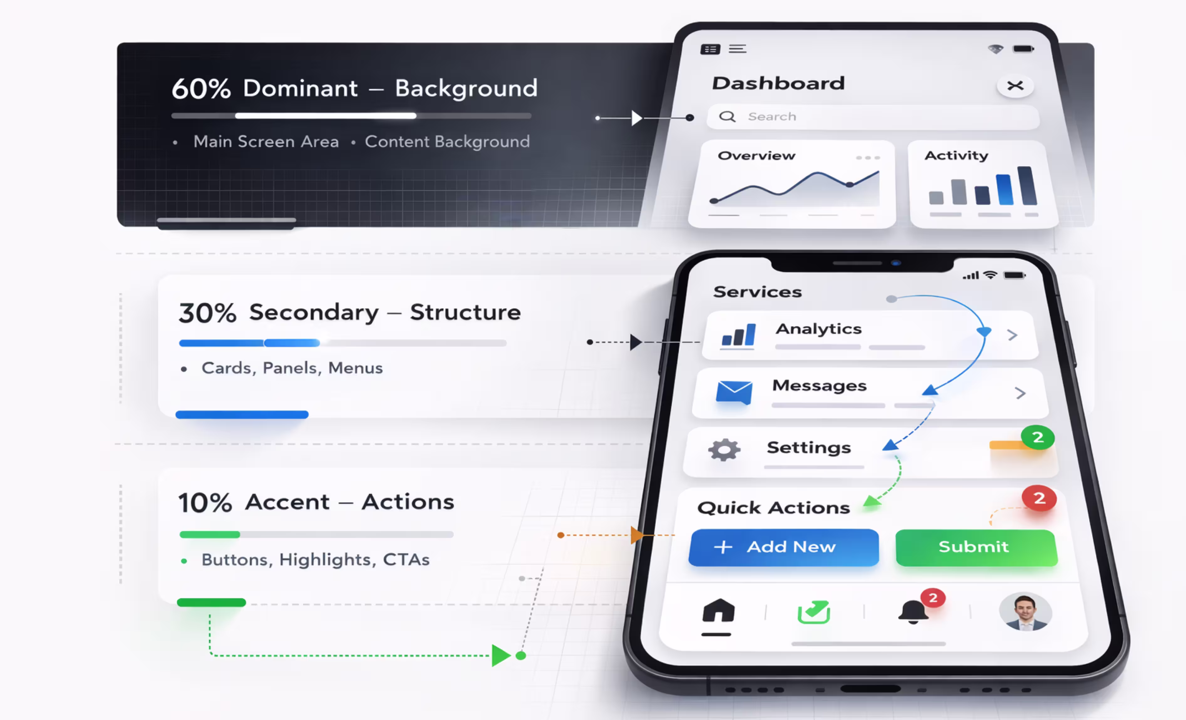
The secondary color occupies roughly a third of the visible interface. It appears on navigation bars, side panels, card headers, input fields, and section dividers. Its role is to create visual grouping and separation without competing with the dominant color.
This is where brand personality often lives. A secondary color can carry more saturation or warmth than the dominant color while still remaining supportive. Think of it as the structural layer that organizes content into digestible sections.
In mobile app design, the secondary color commonly appears on toolbars, tab bars, grouped list backgrounds, and modal overlays. It should contrast enough with the dominant color to create clear boundaries but not so much that it fragments the layout.
The 10% Accent Color (Call-to-Action and Highlights)
The accent color is the smallest proportion but carries the most visual weight. It marks interactive elements: primary buttons, links, toggles, notification badges, selected states, and progress indicators.
Because it occupies only 10% of the screen, the accent color can be bold, saturated, and high-contrast. This scarcity is what makes it effective. When users see the accent color, they immediately understand that element is tappable, important, or active.
Choosing the right accent color is critical. It must pass accessibility contrast ratios against both the dominant and secondary colors. It should align with your brand but prioritize function over aesthetics. A beautiful accent color that fails WCAG 2.1 contrast requirements is a usability liability.
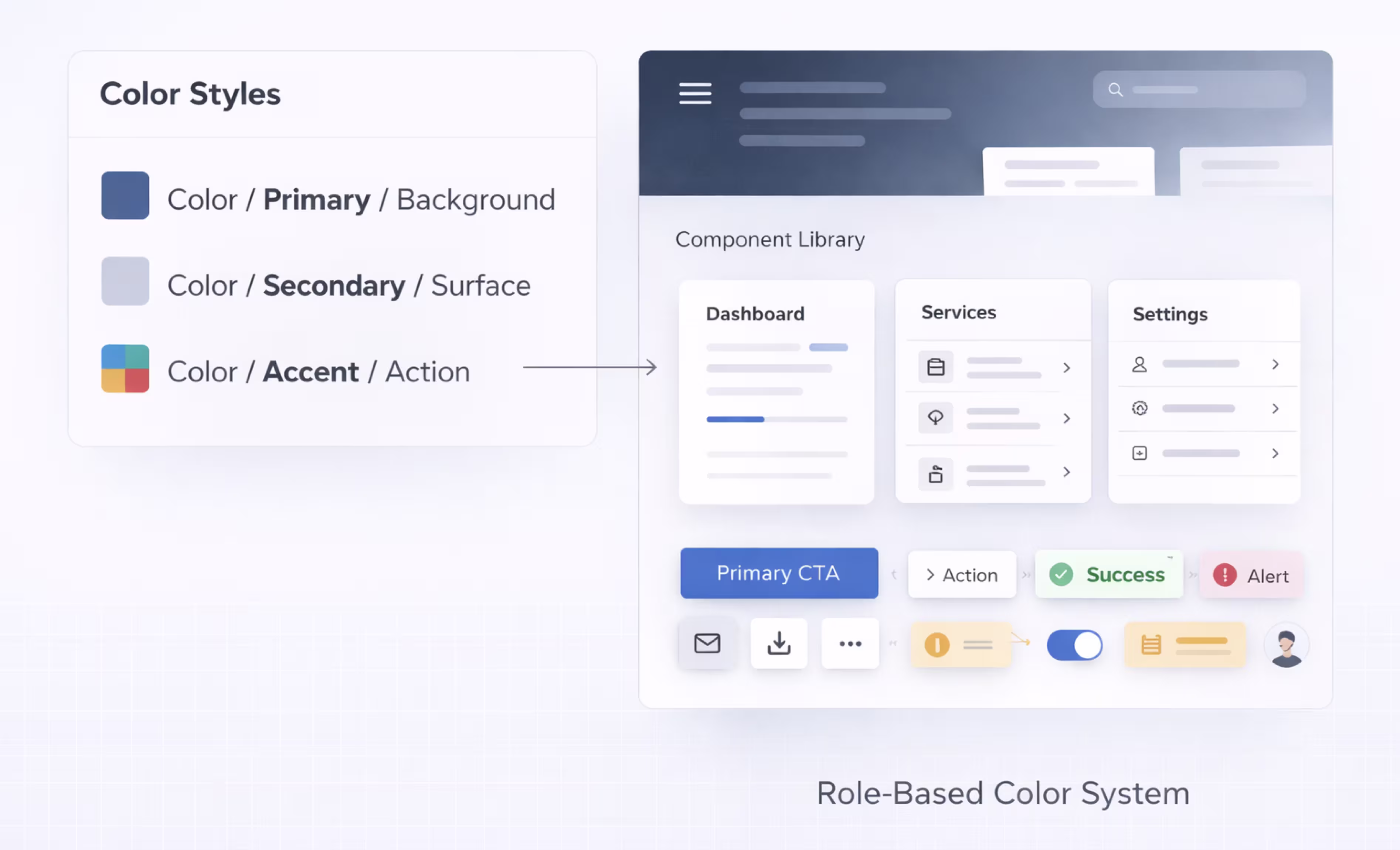
How to Apply the 60/30/10 Rule in Figma
Figma makes it straightforward to implement and maintain the 60/30/10 rule across an entire mobile app project. The key is building color into your design system from the start rather than applying it ad hoc to individual screens.
Setting Up a Color System in Figma
Start by defining your three color tiers as Figma color styles or variables. Create a clear naming convention that reflects the role, not the hue. For example:
- Color/Primary/Background (60% dominant)
- Color/Secondary/Surface (30% supporting)
- Color/Accent/Action (10% highlight)
If you are using Figma's variables feature, set up color tokens at the primitive level (raw hex values) and semantic level (role-based names). This lets you swap entire themes, like light to dark mode, without manually recoloring components.
Add tint and shade variations for each tier. Your dominant color might need a slightly darker variant for hover states or dividers. Your secondary color might need a lighter variant for subtle backgrounds. Your accent color might need a muted variant for disabled states.
Mapping Colors to UI Components
Once your color styles exist, assign them to components systematically. Here is a practical mapping:
60% Dominant Color applies to: Screen backgrounds, card bodies, content areas, list item backgrounds, modal backgrounds, and empty states.
30% Secondary Color applies to: Navigation bars, tab bars, headers, card headers, input field backgrounds, section separators, sidebar backgrounds, and grouped container surfaces.
10% Accent Color applies to: Primary buttons, floating action buttons, active tab indicators, toggle switches (on state), links, selected checkboxes, progress bars, and notification badges.
Build this mapping into your Figma component library. When every component references the correct color style, new screens automatically inherit the 60/30/10 balance.
Testing Color Balance Across Screens
After building several screens, zoom out in Figma and review the overall color distribution. Squint at your designs or blur them slightly. You should see a clear dominant tone with secondary areas creating structure and small pops of accent color guiding the eye.
If the accent color appears too frequently, it loses its power. If the secondary color is barely visible, the layout may feel flat. Adjust component usage or color assignments until the ratio feels balanced.
Use Figma plugins like Contrast or A11y to verify that your color combinations meet accessibility standards. Test your screens at actual device resolution, not just zoomed-in artboard views, because color perception changes at different scales.
60/30/10 Rule Examples in Mobile App Design
Seeing the rule in action clarifies how abstract percentages translate to real screens. Below are two practical examples showing how the 60/30/10 split works in both light and dark mode mobile interfaces.
Light Mode Application Example
Consider a task management app in light mode:
60% Dominant: White (#FFFFFF) covers the screen background, card bodies, and list item areas. It creates an open, clean canvas that lets content take center stage.
30% Secondary: Light gray (#F2F2F7) fills the navigation bar, tab bar background, section headers, and grouped card containers. It provides subtle separation between content blocks without introducing visual noise.
10% Accent: A vibrant blue (#007AFF) marks the primary action button, active tab indicator, due date highlights, and completed task checkmarks. Every instance of blue signals interactivity or status.
When you view this screen at arm's length, the white dominates, gray structures the layout, and blue guides the eye to actions. That is the 60/30/10 rule working correctly.
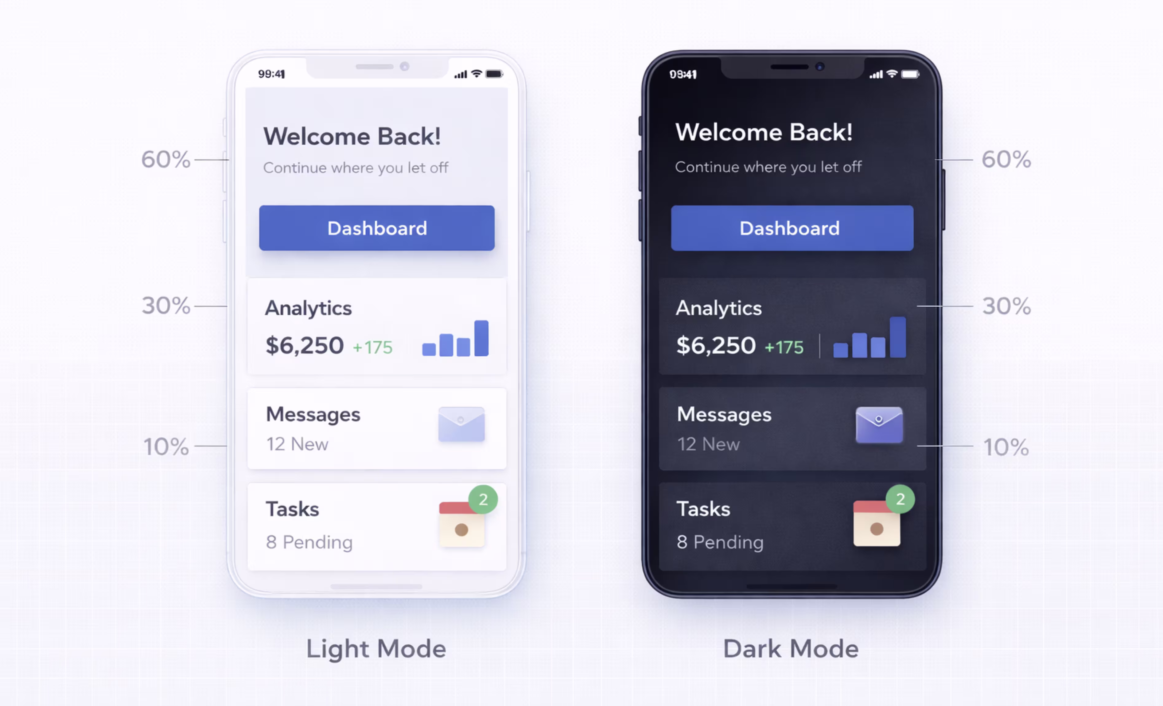
Dark Mode Application Example
The same task management app in dark mode:
60% Dominant: Dark gray (#1C1C1E) replaces white as the screen background and card body color. It reduces eye strain in low-light environments while maintaining the same spatial hierarchy.
30% Secondary: Medium gray (#2C2C2E) fills navigation surfaces, card headers, and section dividers. The contrast between the two grays is subtle but enough to define boundaries.
10% Accent: The same vibrant blue (#0A84FF, adjusted for dark backgrounds) highlights buttons, active states, and interactive elements. The accent color may need slight saturation or brightness adjustments to maintain contrast ratios against dark surfaces.
Dark mode does not change the rule. It changes the palette. The proportional logic stays identical.
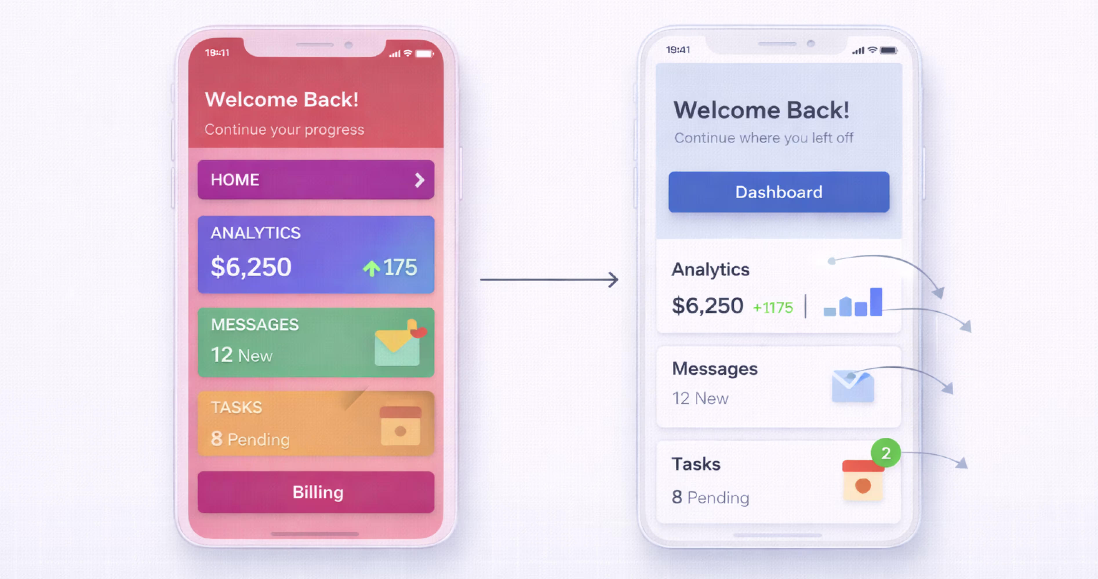
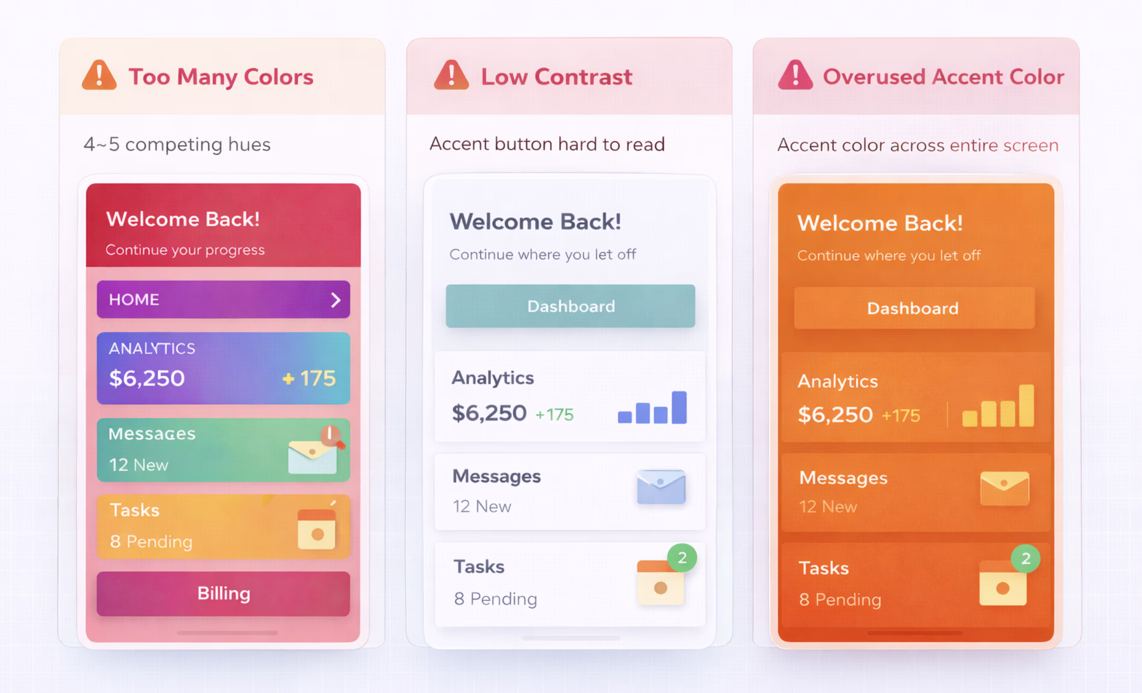
Common Mistakes When Using the 60/30/10 Rule
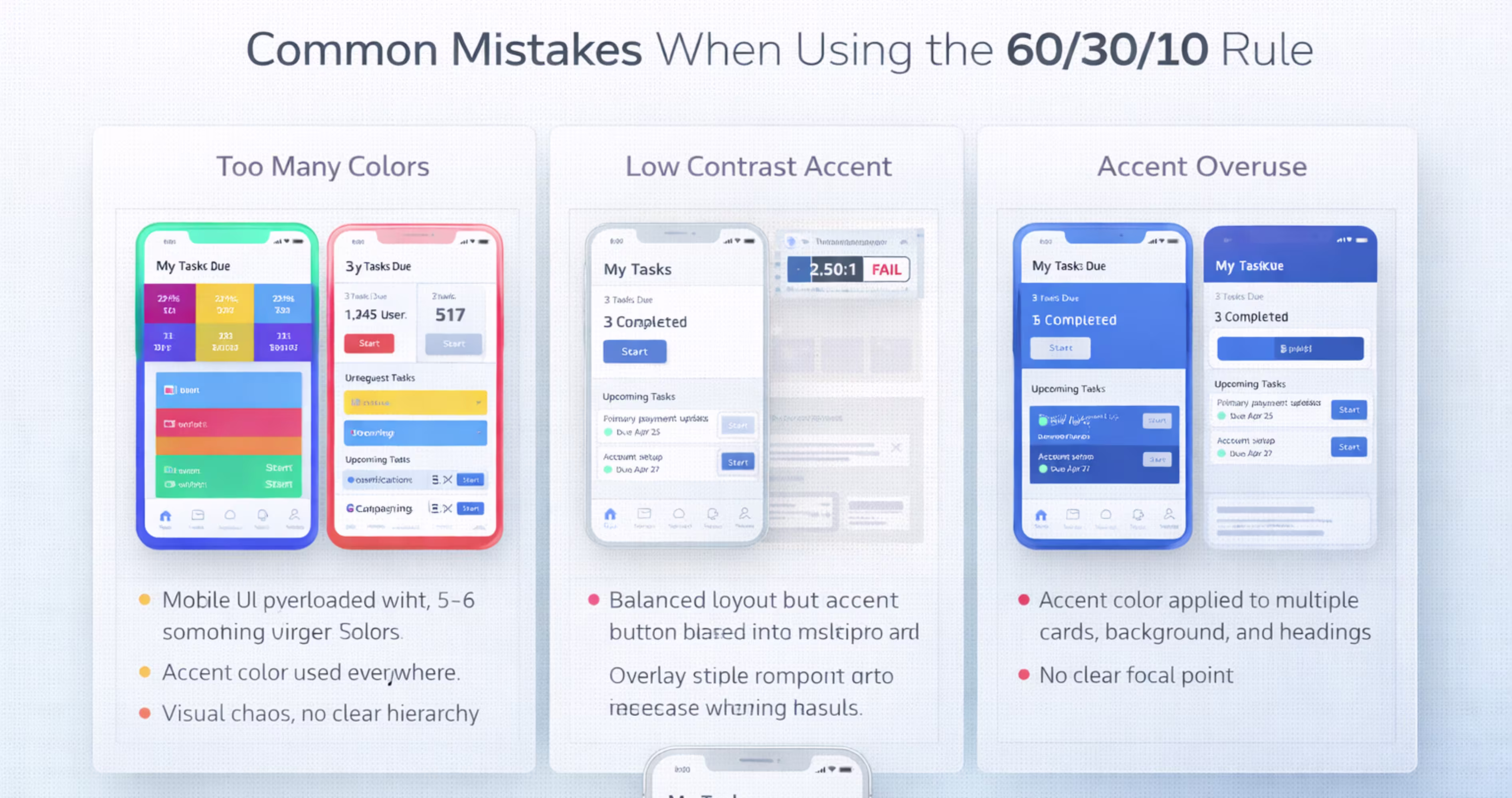
The rule is simple, but misapplication is common. These are the mistakes that most frequently undermine color balance in mobile app interfaces.
Using Too Many Colors
Adding a fourth or fifth color without adjusting proportions breaks the system. Each additional color dilutes the accent's impact and creates competing focal points. If your design requires more colors, for example, semantic colors for success, warning, and error states, treat them as sub-categories within the 10% accent tier, not as new tiers.
Keep your core palette to three colors. Use tints, shades, and opacity variations to create range within each tier rather than introducing entirely new hues.
Ignoring Accessibility and Contrast
A color ratio that looks balanced visually can still fail users with low vision or color blindness. The 60/30/10 rule does not automatically guarantee accessible contrast. You must verify that text on the dominant color, text on the secondary color, and accent elements against both backgrounds all meet WCAG 2.1 AA contrast minimums of 4.5:1 for body text and 3:1 for large text.
In Figma, use the Stark or Contrast plugins to audit every color pairing. Do not assume that because your palette looks good on your monitor, it works for all users.
Applying the Rule Without Considering Brand Identity
The 60/30/10 rule is a structural guideline, not a brand strategy. If you pick colors purely based on proportion without aligning them to your brand's visual identity, the product will feel generic or disconnected from the broader brand experience.
Start with your brand's color palette. Then assign those brand colors to the 60/30/10 tiers based on their visual weight and function. A bold brand color works best as the 10% accent. A neutral brand color works best as the 60% dominant. The rule should serve the brand, not override it.
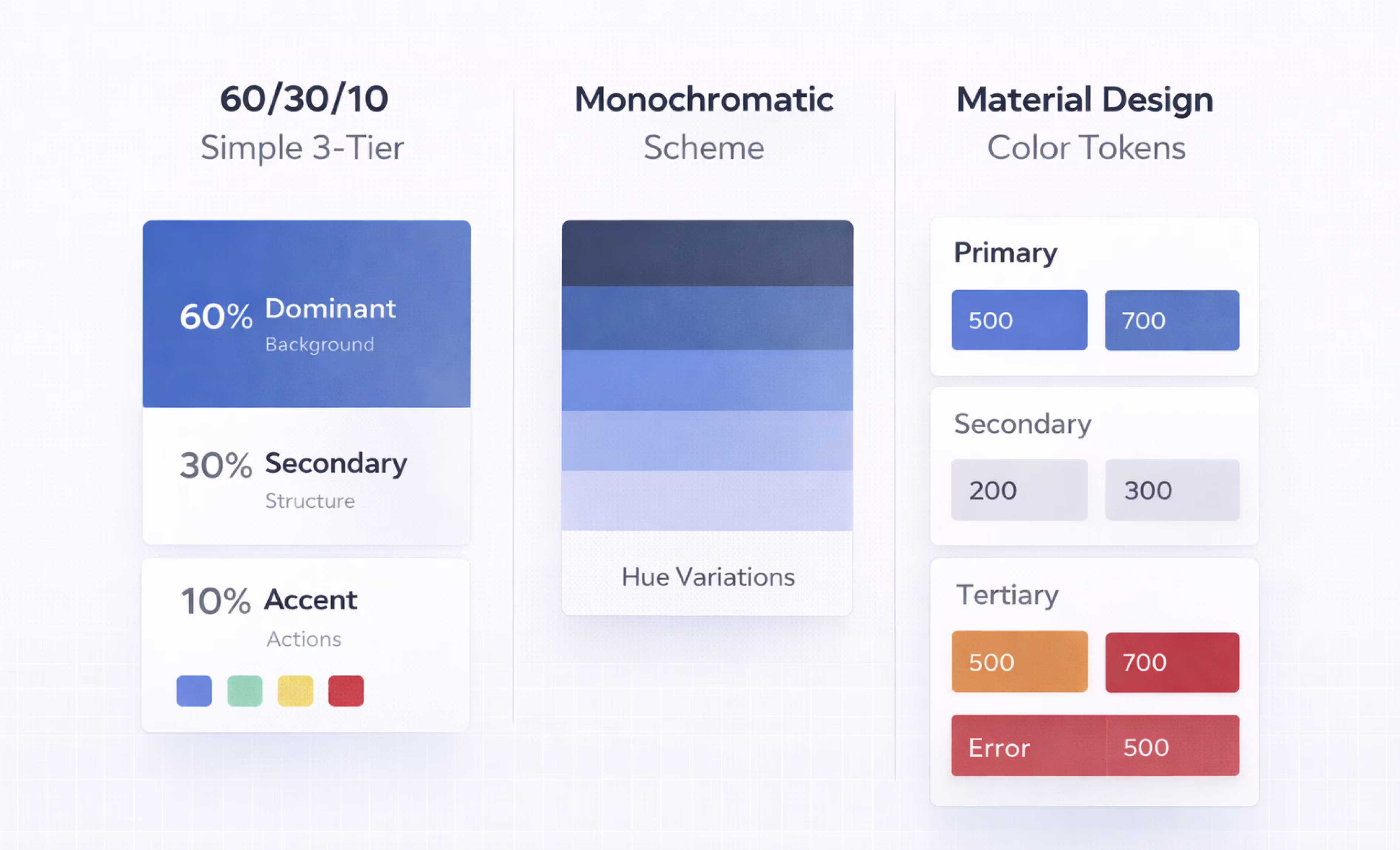
60/30/10 Rule vs. Other Color Frameworks in UI Design
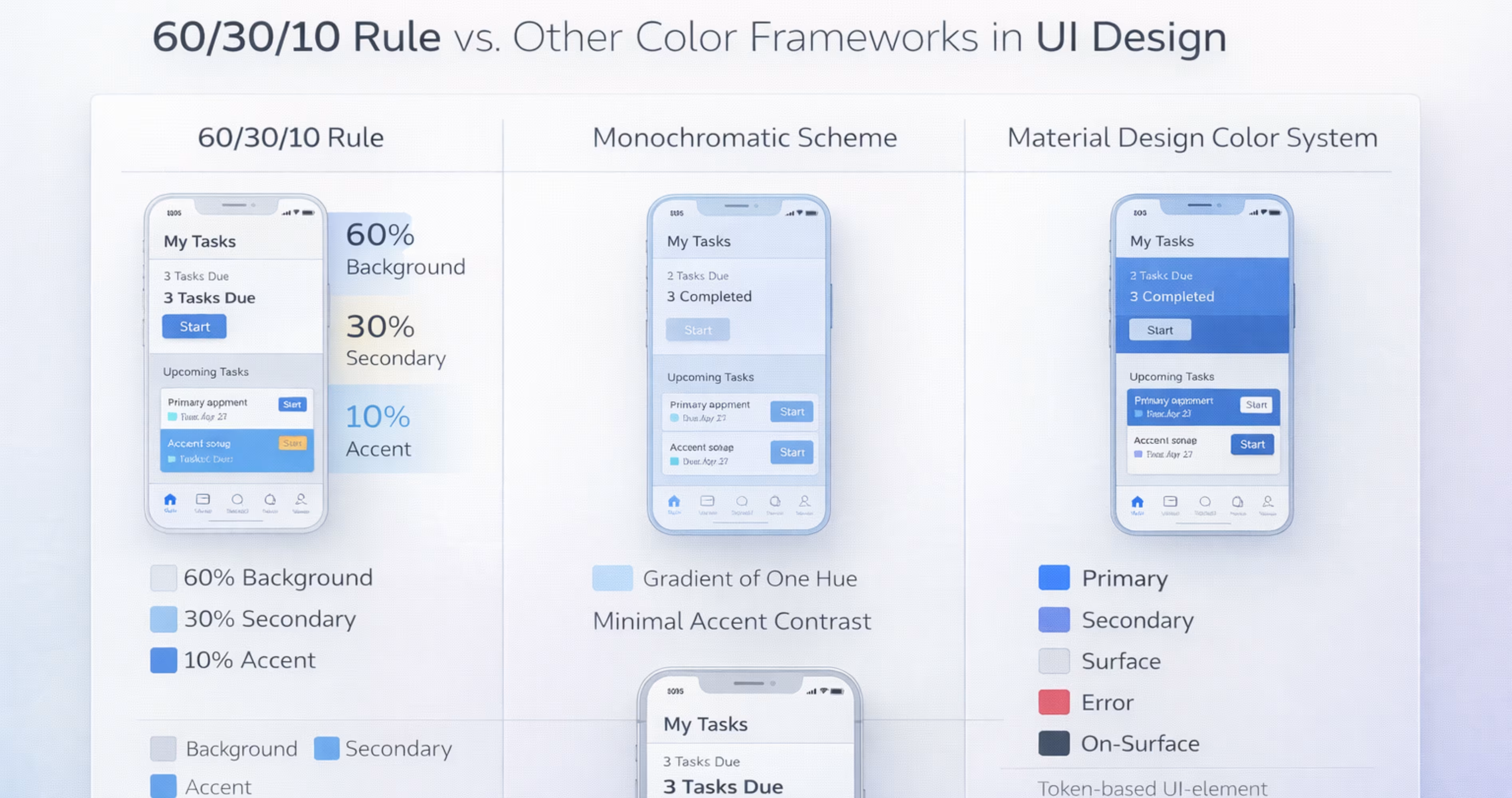
The 60/30/10 rule is one of several approaches to color in UI. Understanding how it compares to alternatives helps you decide when to use it and when another framework might serve better.
60/30/10 Rule vs. Monochromatic Schemes
A monochromatic color scheme uses a single hue with variations in lightness and saturation. It creates a unified, minimal aesthetic but can lack the clear action hierarchy that the 60/30/10 rule provides.
The 60/30/10 rule works well with a monochromatic base. You can use a monochromatic palette for the 60% and 30% tiers and introduce a contrasting accent for the 10%. This hybrid approach gives you the cohesion of monochromatic design with the functional clarity of proportional color distribution.
60/30/10 Rule vs. Material Design Color System
Google's Material Design color system uses a more granular token-based approach with primary, secondary, tertiary, error, surface, and on-surface color roles. It is more complex than the 60/30/10 rule but serves a similar purpose: assigning functional roles to colors.
The 60/30/10 rule can operate inside Material Design. Material's surface colors map to the 60% tier. Secondary container colors map to the 30% tier. Primary and tertiary colors map to the 10% tier. The frameworks are complementary, not competing. Use the 60/30/10 rule as a mental model for proportion, and Material Design tokens for implementation specifics.
Tips for Adapting the 60/30/10 Rule to Complex Interfaces
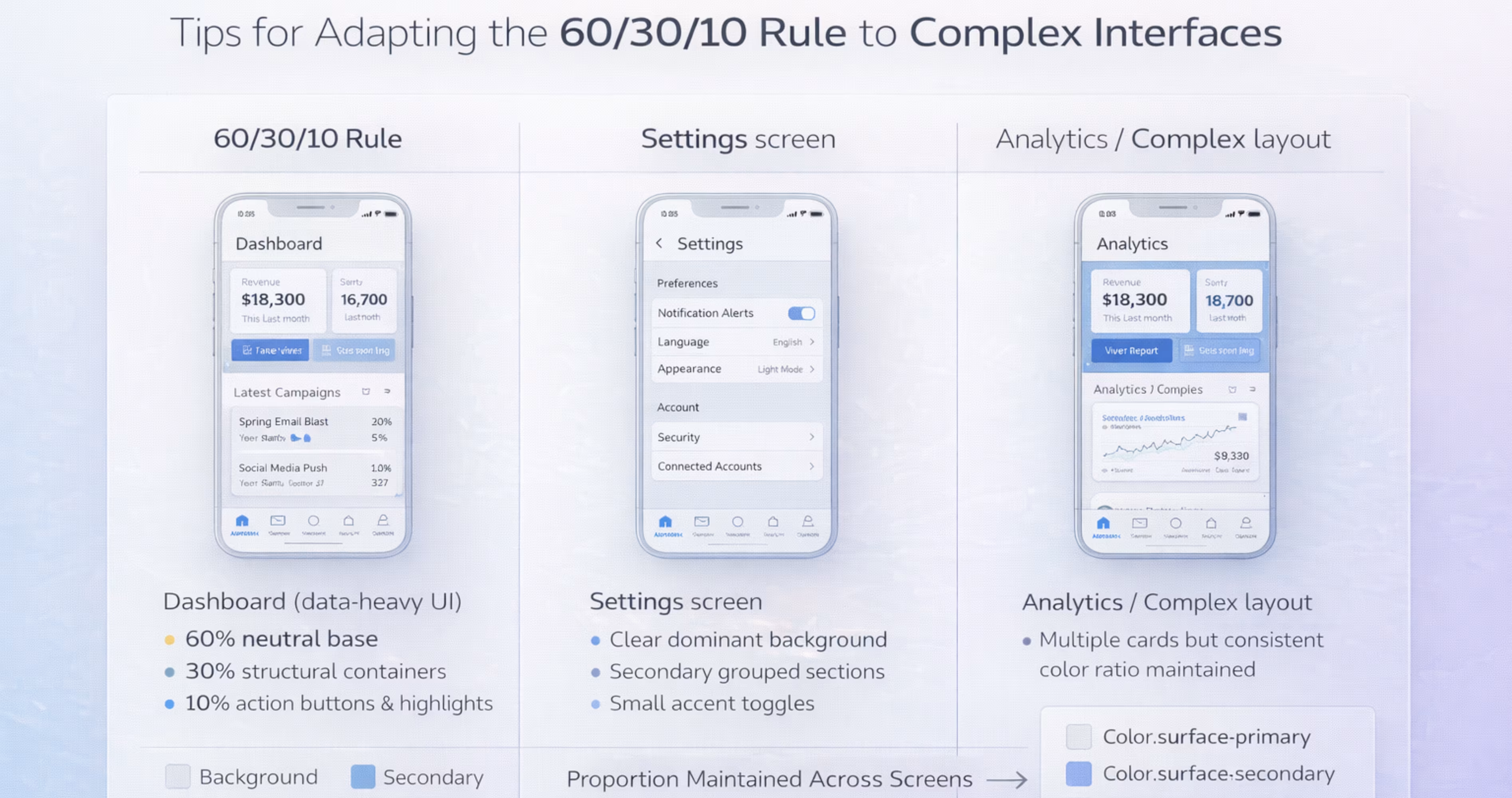
Simple apps with a few screens follow the rule easily. Complex products with dozens of screen types, nested navigation, and data-dense layouts require more deliberate adaptation.
Multi-Screen Consistency in Mobile Apps
The 60/30/10 ratio should hold across your entire app, not just on individual screens. A settings screen, a dashboard, and an onboarding flow should all feel like they belong to the same product.
Achieve this by locking your color assignments at the design system level. If every component references the same color tokens, new screens inherit the correct proportions automatically. Review your app as a flow, not as isolated artboards. Swipe through prototype screens in Figma and check whether the color rhythm stays consistent from screen to screen.
Balancing Color Ratios with Design System Tokens
Design tokens let you abstract color decisions from individual components. Instead of assigning hex values directly, you assign semantic tokens like color.surface.primary or color.action.default. These tokens reference your 60/30/10 palette and can be updated globally.
In Figma, use variables to create token layers. A primitive layer holds raw color values. A semantic layer maps those values to roles. A component layer consumes the semantic tokens. This architecture means changing your accent color from blue to green updates every button, link, and active state across your entire file in seconds.
Tokens also simplify theming. Light mode and dark mode become two sets of primitive values mapped to the same semantic tokens. The 60/30/10 proportions stay locked because the component layer never changes, only the underlying values do.
Conclusion
The 60/30/10 rule gives designers a reliable, repeatable framework for distributing color across mobile app interfaces. It creates visual hierarchy, supports usability, and scales cleanly from a single screen to an entire design system in Figma.
Color decisions should never be arbitrary. By anchoring your palette to clear proportions and functional roles, you build products that feel intentional, accessible, and aligned with your brand from the first screen to the last.
At Orbix Studio, we help startups and product teams design mobile apps with structured, scalable design systems. If you need expert support turning your product vision into a polished, production-ready experience, let's build it together.
Frequently Asked Questions
Can I use more than three colors with the 60/30/10 rule?
Yes, but additional colors should fit within the existing tiers. Semantic colors like red for errors or green for success fall under the 10% accent tier. Keep your core palette to three roles to maintain clarity.
Does the 60/30/10 rule apply to dark mode UI?
Absolutely. The proportions stay the same. Only the palette values change. Your dominant color shifts from light to dark, your secondary color adjusts accordingly, and your accent color may need brightness tweaks for contrast.
How do I choose the right colors for the 60/30/10 split?
Start with your brand palette. Assign the most neutral color to the 60% tier, a mid-weight color to the 30% tier, and your most vibrant or distinctive color to the 10% tier. Test contrast ratios before finalizing.
Is the 60/30/10 rule mandatory for good UI design?
No. It is a guideline, not a requirement. Many successful apps use different color strategies. However, the rule provides a strong starting point, especially for teams without a dedicated color specialist.
How does the 60/30/10 rule affect accessibility?
The rule helps accessibility by limiting color complexity, but it does not guarantee compliance. You must still verify that every color combination meets WCAG contrast minimums using tools like Stark or Figma's built-in contrast checker.
Can I apply the 60/30/10 rule in Figma design systems?
Yes. Define your three color tiers as Figma color styles or variables. Assign them to components at the design system level so every new screen automatically inherits the correct proportions.
What is the difference between the 60/30/10 rule and color theory?
Color theory is a broad discipline covering hue relationships, contrast, harmony, and psychology. The 60/30/10 rule is a specific proportional guideline within that discipline. It tells you how much of each color to use, not which colors to pick.


