Table of Contents
- What Are the 5 Planes of UX Design and Why Do They Matter
- The Strategy Plane - Defining User Needs and Product Objectives
- The Scope Plane - Turning Strategy into Features and Content
- The Structure Plane - Organizing Information and Interaction
- The Skeleton Plane - Laying Out Interface and Navigation
- The Surface Plane - Visual Design and Brand Expression
- How the 5 Planes Work Together in a Real Design Workflow
- Conclusion

The 5 planes of UX design are Strategy, Scope, Structure, Skeleton, and Surface. Introduced by Jesse James Garrett, this framework moves from abstract decisions about user needs and business goals to the concrete visual interface users actually touch. Each plane builds on the one below it, creating a layered system for designing digital products that work.
For designers, founders, and product teams building mobile apps in Figma, the 5 planes provide a structured way to make better decisions at every stage. Skip a plane, and problems compound. Nail each one, and the result is an app that feels intuitive, looks polished, and scales without breaking.
This guide breaks down each plane with practical definitions, explains how they connect in a real design workflow, and shows you exactly how to apply them inside Figma, from strategy research all the way through developer handoff.
What Are the 5 Planes of UX Design and Why Do They Matter
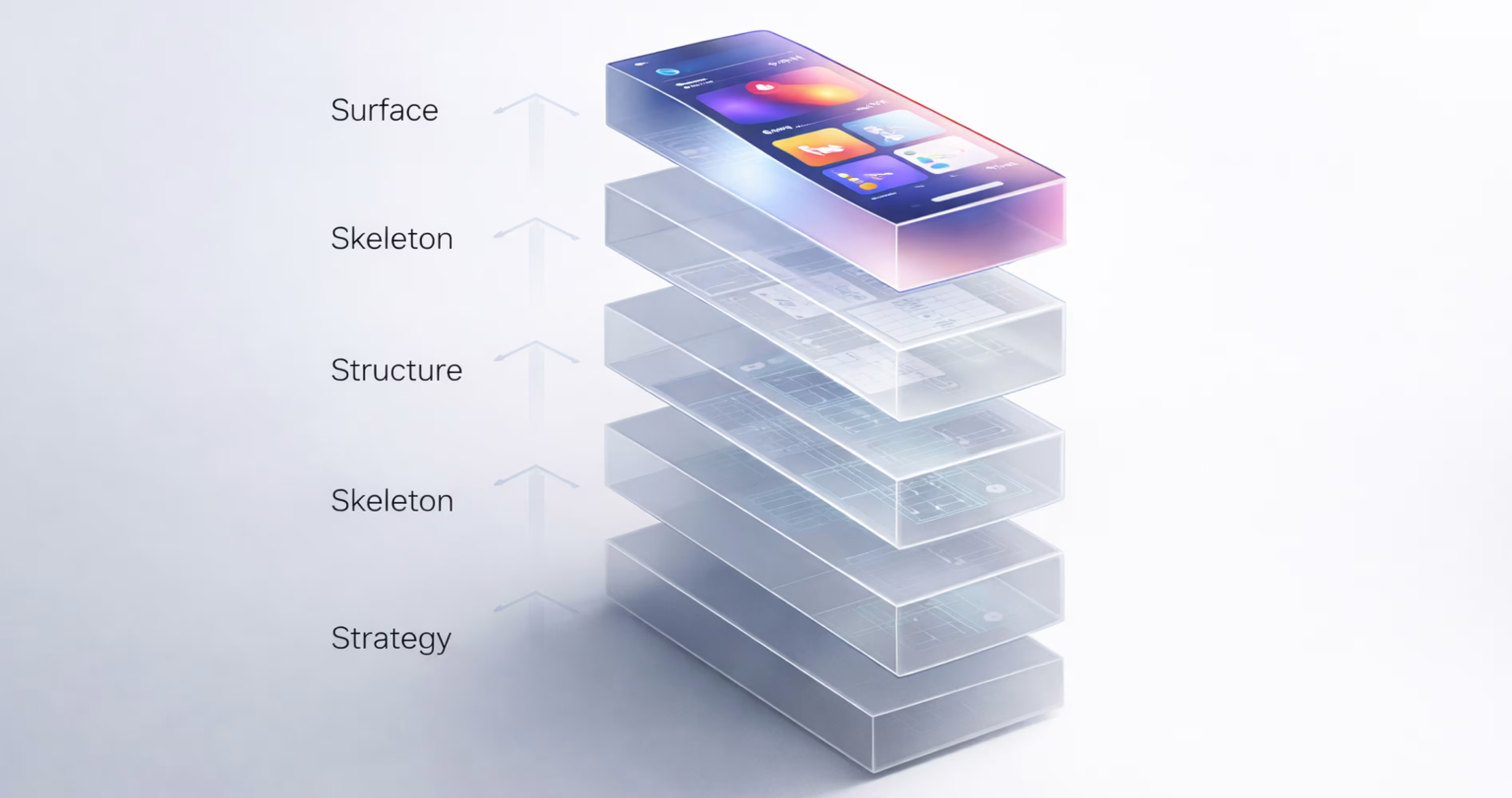
The 5 planes of UX design are a conceptual framework that organizes the entire design process into five distinct layers. Each plane represents a level of decision-making, starting with the most abstract (why are we building this?) and ending with the most concrete (what does it look like?).
The five planes, from bottom to top, are:
- Strategy — User needs and business objectives
- Scope — Features and content requirements
- Structure — Information architecture and interaction design
- Skeleton — Layout, navigation, and interface design
- Surface — Visual design, branding, and sensory experience
Each plane depends on the decisions made in the plane below it. You cannot design a meaningful layout (Skeleton) without first organizing your information (Structure). You cannot organize information without knowing what features you are building (Scope). And you cannot define features without understanding why the product exists (Strategy).
This bottom-up dependency is what makes the framework so effective. It forces teams to solve foundational problems before moving to visual details, which is exactly where most mobile app projects go wrong.
The Origin of the 5 Planes Framework
Jesse James Garrett introduced the 5 planes model in his 2002 book The Elements of User Experience. At the time, web design was still a young discipline. Teams often jumped straight into visual mockups without defining user needs, content strategy, or information architecture. The result was products that looked fine but failed users.
Garrett's contribution was to give designers and product teams a shared vocabulary and a clear sequence. The framework drew from multiple disciplines, including information architecture, interaction design, and visual design, and organized them into a single coherent model. It bridged the gap between business stakeholders who cared about goals and designers who cared about pixels.
More than two decades later, the model remains one of the most widely taught UX frameworks in design education and professional practice. Its simplicity is its strength. Five layers. One direction. Every decision traceable.
Why the 5 Planes Model Still Guides Modern UX
Design tools have changed dramatically since 2002. Figma, collaborative design systems, auto-layout, and real-time prototyping have transformed how teams work. But the underlying problem the 5 planes solve has not changed: teams still need a structured way to move from "what are we building and why" to "here is the finished interface."
The framework is tool-agnostic. It works whether you are designing in Figma, Sketch, or on a whiteboard. What it provides is a thinking structure, not a production process. That distinction matters because modern design teams often confuse having powerful tools with having a clear process.
For mobile app design specifically, the 5 planes are especially relevant. Mobile screens are small. Interactions are constrained. Every pixel and every tap carries more weight than on desktop. Without a layered approach to decision-making, mobile apps quickly become cluttered, confusing, or structurally fragile. The 5 planes prevent that by ensuring each design decision has a foundation beneath it.

The Strategy Plane - Defining User Needs and Product Objectives
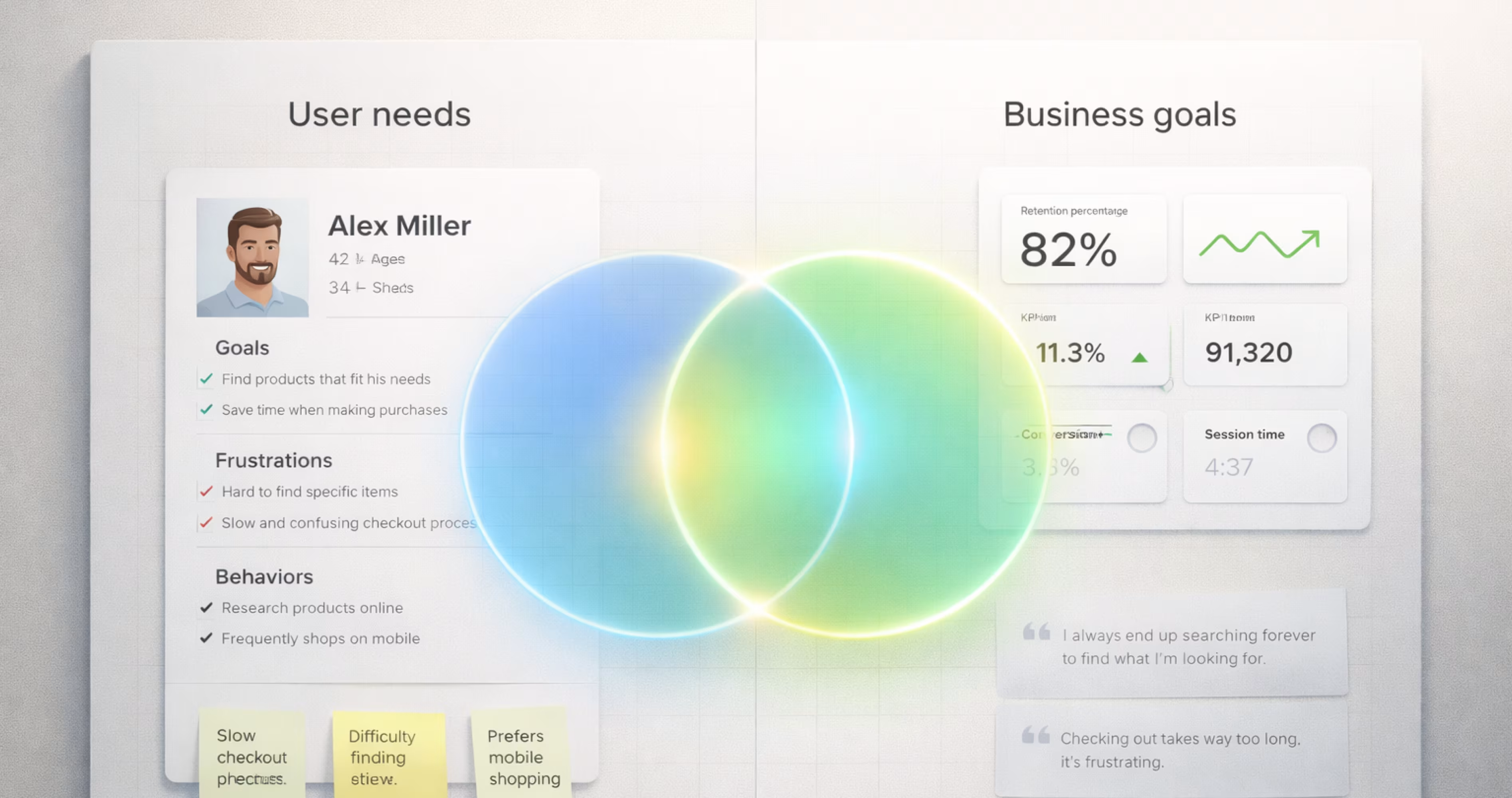
The Strategy plane is the foundation of the entire framework. It answers two questions: What do users need from this product? And what does the business need from this product?
These two questions sound simple. In practice, they are where most mobile app projects either succeed or fail. A product built on unclear strategy will produce scope creep, misaligned features, and an interface that tries to do everything for everyone.
At the Strategy level, you are not designing screens. You are defining purpose. You are identifying who your users are, what problems they face, and what outcomes the business needs to achieve. Everything above this plane, every feature, every screen, every button, traces back to decisions made here.
How to Identify User Needs at the Strategy Level
User needs are not assumptions. They are observable patterns in behavior, stated frustrations, and measurable gaps between what users want and what currently exists.
To identify user needs for a mobile app, start with these methods:
User research interviews. Talk to 5 to 10 people who represent your target audience. Ask open-ended questions about their current workflows, pain points, and what they wish existed. Do not ask them to design solutions. Ask them to describe problems.
Competitive analysis. Download and use 3 to 5 competing apps. Document what they do well, where they frustrate users, and what features are missing. Pay attention to app store reviews. One-star and two-star reviews reveal unmet needs faster than any survey.
Analytics and behavioral data. If you have an existing product, study where users drop off, which features they ignore, and which paths they repeat. Behavioral data reveals what users actually do, not what they say they do.
User personas. Synthesize your research into 2 to 3 personas that represent distinct user types. Each persona should include goals, frustrations, technical comfort level, and context of use (when and where they use the app).
The output of this step is a clear, documented understanding of who you are designing for and what they need. This becomes the reference point for every decision on every plane above.
Aligning Business Goals with UX Strategy in Figma
Business goals at the Strategy plane are not vague aspirations like "grow the business." They are specific, measurable outcomes the product must support. Examples include increasing user retention by a defined percentage, reducing support tickets for a specific workflow, or converting free users to paid subscribers.
In Figma, you can document Strategy-level decisions using a dedicated page at the beginning of your project file. Create a "Strategy" page that includes:
- User personas as visual cards with goals, frustrations, and context
- Business objectives listed with success metrics
- Problem statements written in the format: "[User type] needs a way to [action] because [reason]"
- Assumptions and risks that need validation
This page becomes a living reference. When a stakeholder requests a new feature three weeks into the project, the team can check it against the Strategy page. Does it serve a documented user need? Does it support a business objective? If not, it goes to the backlog, not the current sprint.
Aligning business goals with user needs is not about compromise. It is about finding the overlap. The best mobile apps serve users so well that business outcomes follow naturally. The Strategy plane is where you find that overlap and make it explicit.
The Scope Plane - Turning Strategy into Features and Content
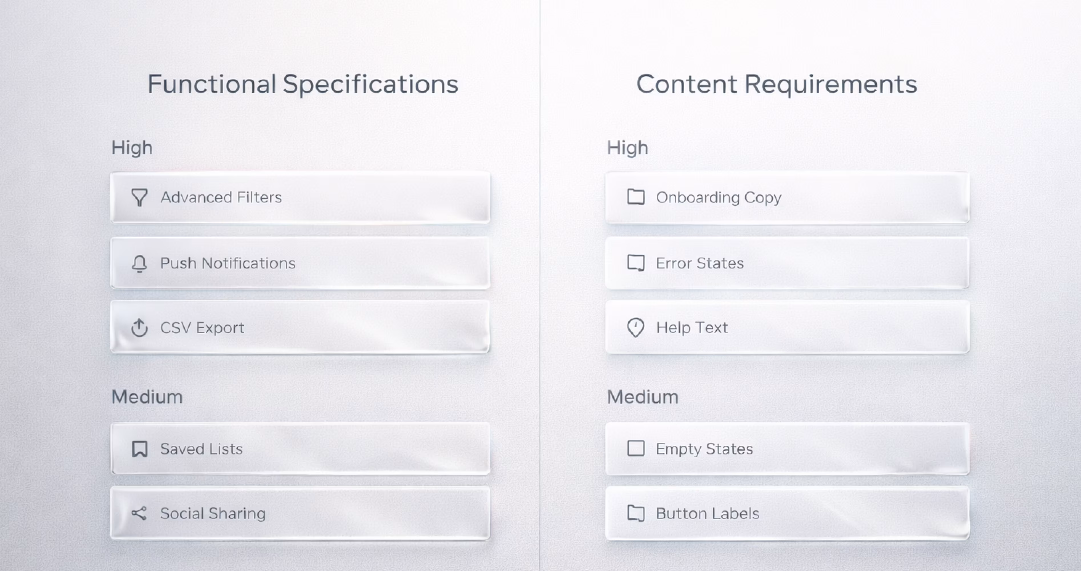
The Scope plane translates strategy into specifics. Once you know what users need and what the business requires, the next question is: What exactly will this product include?
Scope defines the boundaries of the product. It determines which features make the cut and which do not. It also defines what content the product needs to communicate, from onboarding copy to error messages to help documentation.
For mobile apps, scope discipline is critical. Screen real estate is limited. Attention spans are short. Every feature you add increases complexity, and complexity is the enemy of usability on small screens. The Scope plane is where you make hard choices about what to build now, what to build later, and what to never build at all.
Functional Specifications vs Content Requirements
Scope has two components that teams often conflate but should treat separately.
Functional specifications describe what the product does. These are features, interactions, and capabilities. Examples: "Users can filter search results by date," "The app sends a push notification 24 hours before a scheduled event," "Users can export data as a CSV file."
Content requirements describe what the product says. These are the information assets the product needs. Examples: "Each product listing includes a title, description, price, and two images," "The onboarding flow includes three screens explaining core features," "Error states include a description of the problem and a suggested action."
Both must be defined at the Scope plane. A feature without content is a skeleton without skin. Content without a feature to house it is information with no home.
Prioritizing Features for Mobile App Design
Not every feature belongs in version one. Mobile app design demands ruthless prioritization because every addition affects performance, cognitive load, and development timelines.
Use a prioritization framework that maps features against two axes: user value (how much does this solve a real user problem?) and effort (how complex is this to design and build?).
High value, low effort features ship first. These are your quick wins. A well-designed search bar. A clear onboarding flow. A simple settings page.
High value, high effort features go into the roadmap. These are the features that differentiate your app but require significant design and engineering investment. Plan them, but do not let them block your launch.
Low value, low effort features are traps. They seem harmless because they are easy to build, but they add clutter. Every low-value feature you add makes your high-value features harder to find.
Low value, high effort features get cut. No exceptions.
In Figma, document your scope decisions on a dedicated "Scope" page. Use a simple table or card layout that lists each feature, its priority tier, its user story, and its status. This becomes the single source of truth for what is in and what is out.
The Structure Plane - Organizing Information and Interaction
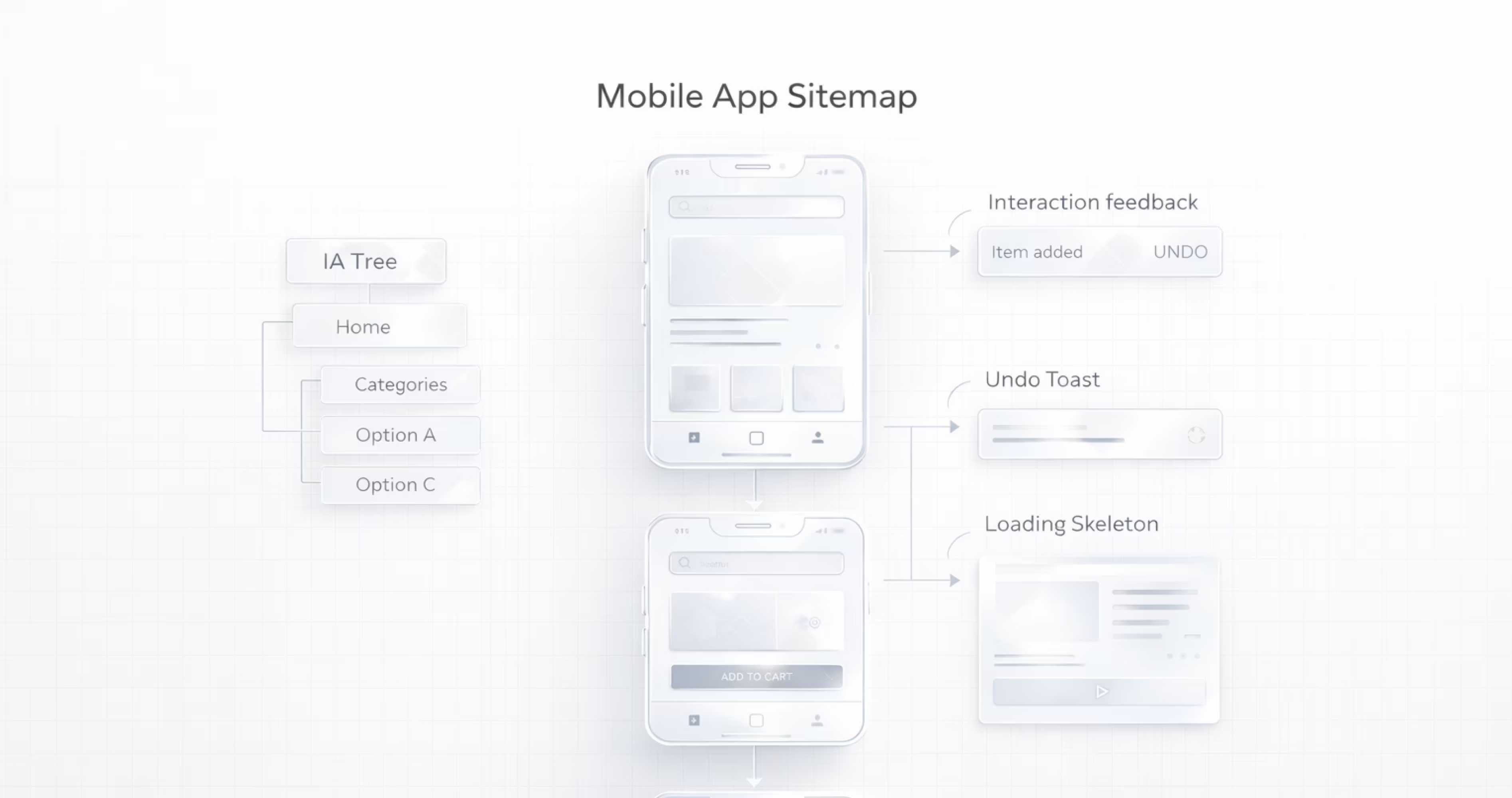
The Structure plane takes your defined features and content and organizes them into a coherent system. It answers: How is information grouped? How do users move through the product? What happens when a user takes an action?
Structure has two components: information architecture (how content is organized and labeled) and interaction design (how the system responds to user behavior). Both must work together. A perfectly organized app with confusing interactions will frustrate users. A responsive, well-animated app with poor information architecture will leave users lost.
For mobile apps, structure decisions have outsized impact. Users cannot see the full sitemap. They navigate through small windows, one screen at a time. If the structure is unclear, users tap back, abandon tasks, and uninstall.
Information Architecture for Mobile Apps
Information architecture (IA) is the practice of organizing, labeling, and structuring content so users can find what they need and understand where they are.
For mobile apps, effective IA follows these principles:
Shallow hierarchies. Mobile users should reach any core feature within 2 to 3 taps from the home screen. Deep navigation trees create frustration and abandonment. If users need to tap through five screens to reach a common action, the architecture needs restructuring.
Clear labeling. Navigation labels should use words users already know. Test your labels with real users. If more than one person hesitates or misinterprets a label, change it. "Activity" is ambiguous. "Your Orders" is clear.
Consistent grouping. Related items belong together. Settings should not be split across three different sections. Account-related actions should live under one parent. Users build mental models based on grouping. Break the grouping, and you break the mental model.
Progressive disclosure. Show users what they need at each step, not everything at once. A settings screen does not need to display every option on load. Group settings into categories. Let users drill into the category they need.
In Figma, you can build IA artifacts directly in your project file. Create a "Structure" page with a sitemap showing every screen and its relationship to other screens. Use simple rectangles connected by arrows. Label each rectangle with the screen name and its primary purpose. This visual map becomes the blueprint for your wireframes.
Interaction Design Patterns That Improve Usability
Interaction design defines what happens when users take actions. It covers transitions, feedback, error handling, and system responses.
For mobile apps, these interaction patterns consistently improve usability:
Immediate feedback. When a user taps a button, something should happen within 100 milliseconds. A color change, a loading indicator, a subtle animation. Silence after a tap makes users tap again, which creates errors.
Undo over confirmation. Instead of asking "Are you sure you want to delete this?" let users delete and then offer an undo option. Confirmation dialogs interrupt flow. Undo preserves it.
Gestural consistency. If swiping left deletes an item in one list, it should delete items in every list. Inconsistent gestures force users to relearn interactions on every screen.
Error prevention over error messages. Disable the "Submit" button until all required fields are valid. Gray out unavailable options instead of letting users select them and then showing an error. The best error message is the one users never see.
Loading states that communicate progress. Skeleton screens (placeholder shapes that mimic the layout of incoming content) outperform spinners. They set expectations for what is coming and reduce perceived wait time.
Document your interaction patterns in Figma using a component library. Create reusable components for loading states, error states, empty states, and success confirmations. When every screen uses the same interaction patterns, the app feels cohesive and predictable.
The Skeleton Plane - Laying Out Interface and Navigation
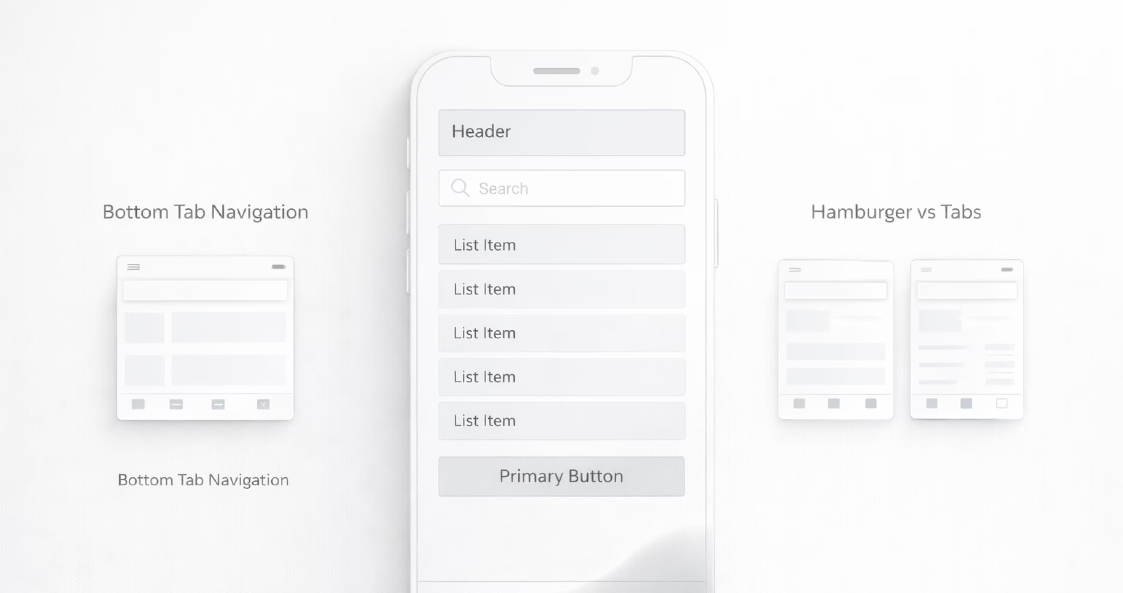
The Skeleton plane is where the abstract structure becomes a visible layout. It defines where elements appear on each screen, how navigation is presented, and how information is arranged within individual views.
Skeleton is not a visual design. It is spatial design. At this plane, you are not choosing colors or typefaces. You are deciding that the primary action button sits at the bottom of the screen, that the navigation bar has four tabs, that the search field appears at the top of the list view. You are arranging bones, not applying skin.
For mobile apps, skeleton decisions directly affect usability. A button placed in the wrong zone of the screen becomes unreachable with one hand. A navigation pattern that works on desktop becomes unusable on a 6-inch display. The Skeleton plane is where you solve these spatial problems.
Wireframing Mobile Screens in Figma
Wireframes are the primary artifact of the Skeleton plane. They are low-fidelity layouts that show element placement, hierarchy, and flow without visual styling.
In Figma, effective wireframing follows a specific workflow:
Start with a mobile frame. Use Figma's built-in device frames (iPhone 15, Pixel 8, or a generic 390 x 844 frame). Designing at actual device dimensions forces you to confront real constraints from the start.
Use grayscale only. Wireframes should use black, white, and shades of gray. No brand colors. No images. No icons with detail. The goal is to evaluate layout and hierarchy without visual design influencing your judgment.
Block out content zones. Use rectangles to represent content areas. A large rectangle at the top for the header. A medium rectangle for the hero content. Smaller rectangles for list items. Label each block with its content type: "Product Image," "Title," "Price," "Add to Cart Button."
Apply auto-layout. Figma's auto-layout feature lets you build wireframes that respond to content changes. Set up vertical auto-layout for screen-level stacking and horizontal auto-layout for row-level elements. This makes your wireframes structurally accurate, not just visually approximate.
Create a wireframe component library. Build reusable wireframe components for common elements: navigation bars, tab bars, cards, list items, buttons, input fields, modals. Store them in a shared Figma library. This speeds up wireframing and ensures consistency across screens.
Link screens into flows. Use Figma's prototyping features to connect wireframe screens. This lets you tap through the flow and test whether the navigation structure and screen sequence make sense before investing in visual design.
Navigation Design and Component Placement
Navigation is the single most important skeleton-level decision in mobile app design. It determines how users move between sections, access features, and orient themselves within the product.
The most common mobile navigation patterns include:
Bottom tab bar. Best for apps with 3 to 5 top-level sections that users switch between frequently. The bottom tab bar keeps primary navigation within thumb reach and visible at all times. This is the dominant pattern for consumer apps.
Hamburger menu (drawer navigation). Hides navigation behind a menu icon. Useful for apps with many sections but lower switching frequency. The tradeoff is discoverability. Features hidden in a hamburger menu get used less.
Top tab bar. Best for content that users swipe between horizontally, such as categories or filters within a single section. Often combined with a bottom tab bar for global navigation.
Hub-and-spoke. Users start at a central screen and navigate to individual sections, then return to the hub. Common in utility apps and dashboards.
For component placement, follow established mobile conventions:
- Primary actions go at the bottom of the screen, within natural thumb reach
- Destructive actions (delete, cancel) go to the left; constructive actions (save, confirm) go to the right
- Search bars sit at the top of list views
- Back buttons occupy the top-left corner
- Contextual menus use the top-right corner (three-dot or ellipsis icon)
Breaking these conventions is possible but costly. Users bring expectations from every other app they use. Deviating from standard placement forces users to relearn basic interactions, which increases cognitive load and error rates.
The Surface Plane - Visual Design and Brand Expression
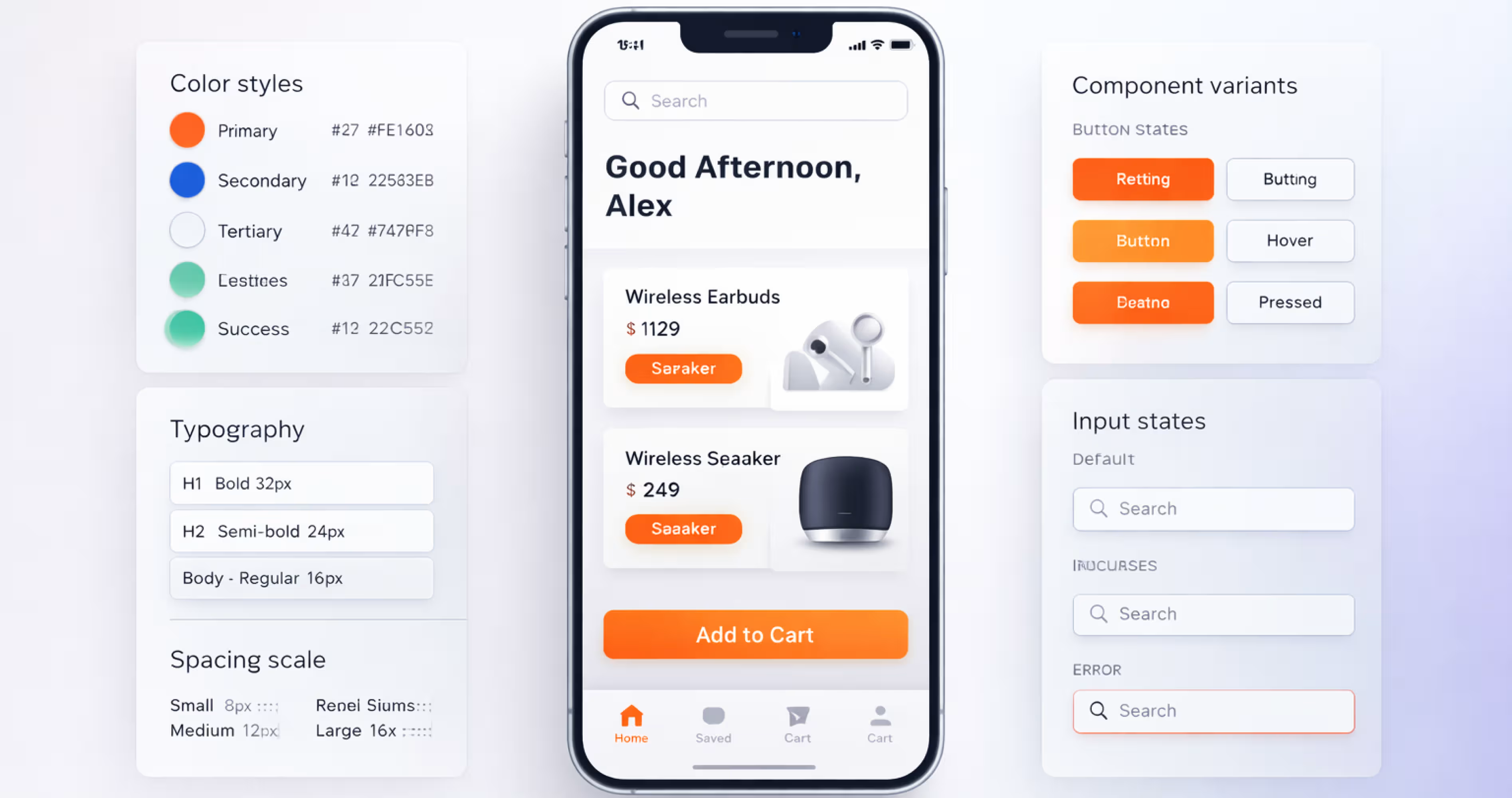
The Surface plane is the top layer of the framework. It is what users see, touch, and emotionally respond to. Color, typography, iconography, imagery, spacing, and motion all live here.
The surface is not decoration. It is communication. Every visual choice sends a signal. A bold sans-serif typeface communicates modernity and confidence. A muted color palette communicates calm and professionalism. Generous white space communicates clarity and focus. Cluttered layouts with competing colors communicate chaos, even if the underlying structure is sound.
For mobile apps, the Surface plane carries extra weight because the screen is the entire product experience. There is no physical packaging, no store environment, no salesperson. The visual interface is the brand. It is the first impression, the ongoing experience, and the lasting memory.
Typography, Color, and Iconography in Mobile UI
Typography. Mobile screens demand typefaces that are legible at small sizes. Use a maximum of two typeface families: one for headings and one for body text. Set body text at a minimum of 16px (or equivalent in your design system). Line height should be 1.4 to 1.6 times the font size. Avoid light font weights below 18px. They disappear on lower-resolution screens and in bright outdoor lighting.
Color. Define a color system with clear roles: primary action color, secondary color, background color, text color, error color, success color, and warning color. Ensure all text-to-background combinations meet WCAG 2.1 contrast requirements at a minimum ratio of 4.5:1 for body text and 3:1 for large text. Test your colors in both light and dark mode.
Iconography. Use a single icon set with a consistent style (outlined, filled, or duotone, but not mixed). Icons should be recognizable without labels at 24px. If an icon needs a label to be understood, it needs a label. Do not rely on icons alone for critical navigation. Pair icons with text labels in tab bars and primary navigation.
In Figma, define all Surface-level decisions as design tokens. Create color styles, text styles, and effect styles in your shared library. When a stakeholder requests a color change, you update one style and it propagates across every screen. This is the difference between a design system and a collection of screens.
Building a Consistent Design System in Figma
A design system is the operational expression of the Surface plane. It codifies every visual and interactive decision into reusable, documented components that ensure consistency across screens, features, and team members.
In Figma, build your design system with these layers:
Tokens. These are the atomic values: colors, font sizes, spacing units, border radii, shadow values. Define them as Figma styles or use the variables feature for more advanced token management. Name them semantically (e.g., "color/primary/action" not "blue-500").
Components. Build every UI element as a Figma component with variants. A button component should include variants for primary, secondary, and tertiary styles, each with states for default, hover, pressed, disabled, and loading. Use auto-layout inside every component so they resize correctly.
Patterns. Combine components into common patterns: a card pattern (image + title + description + action), a form pattern (label + input + helper text + error state), a list pattern (avatar + text + secondary action). Document when to use each pattern.
Documentation. Add a documentation page to your Figma library that explains naming conventions, spacing rules, component usage guidelines, and do/don't examples. A design system without documentation is a component library that only its creator understands.
A well-built design system in Figma reduces design time, eliminates inconsistency, and makes developer handoff dramatically smoother. Developers can inspect components, extract tokens, and understand the system's logic without guessing.
How the 5 Planes Work Together in a Real Design Workflow
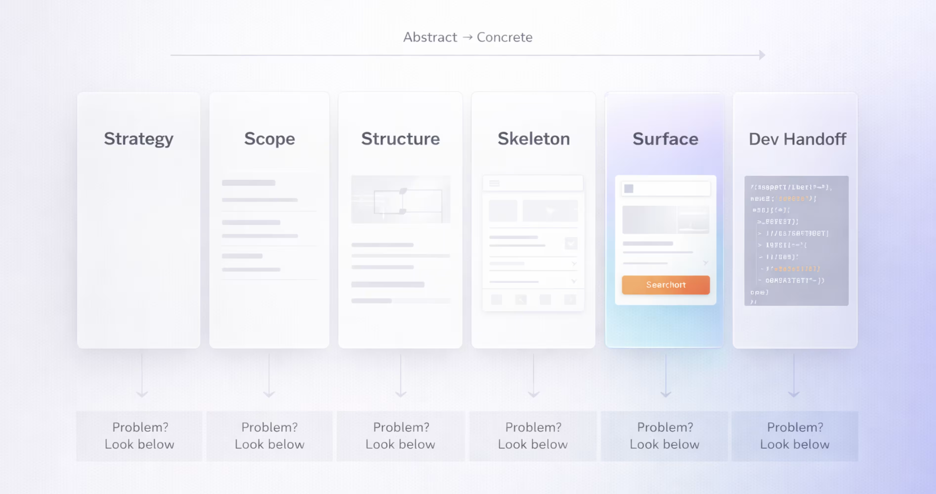
The 5 planes are not five separate phases that you complete and never revisit. They are five lenses that you apply throughout the design process. In practice, work on the planes overlaps. You might be refining Structure while still validating Strategy assumptions. You might discover a Scope problem while wireframing at the Skeleton level.
The key principle is dependency direction. Decisions flow upward. Strategy informs Scope. Scope informs Structure. Structure informs Skeleton. Skeleton informs Surface. When you encounter a problem at a higher plane, the solution almost always lives at a lower plane.
If the visual design feels cluttered (Surface), the problem is likely in the layout (Skeleton). If the layout feels forced, the problem is likely in the information architecture (Structure). If the architecture does not make sense, the problem is likely in the feature set (Scope). If the features do not align, the problem is in the strategy (Strategy).
This diagnostic chain is one of the most practical benefits of the framework. It gives teams a systematic way to trace problems to their root cause instead of applying surface-level fixes that do not hold.
Moving from Abstract to Concrete in Figma Projects
In a Figma-based workflow, the 5 planes map naturally to project phases and file structure.
Strategy lives on a dedicated Figma page or in a linked FigJam board. Personas, problem statements, business objectives, and competitive screenshots all belong here. This page is created first and referenced throughout the project.
Scope becomes a feature matrix or user story map, also in Figma or FigJam. Each feature is a card with its priority, user story, and acceptance criteria. This is the bridge between research and design.
Structure becomes a sitemap and user flow diagram. In Figma, use simple shapes and connectors to map every screen and its relationships. This is the blueprint that wireframes are built from.
Skeleton becomes wireframes. Low-fidelity screens built with grayscale components, linked into clickable prototypes for testing.
Surface becomes the final high-fidelity design. Wireframes are "dressed" with the design system's visual layer: real colors, real typography, real icons, real content.
Organizing your Figma file with a page for each plane creates a clear audit trail. Anyone joining the project can start at the Strategy page and understand why every design decision was made.
Common Mistakes When Applying the 5 Planes
Starting at the Surface. The most common mistake. Teams open Figma and start picking colors and typefaces before defining who the product is for. The result is a beautiful interface that solves the wrong problem.
Skipping the Scope plane. Teams jump from "we know what users need" to "here is the sitemap" without explicitly defining which features and content will address those needs. This creates scope creep because there is no documented boundary for what is in and what is out.
Treating the planes as waterfall phases. The 5 planes are not a rigid sequence where you finish one before starting the next. They are iterative. You will revisit lower planes as you learn from higher ones. The framework provides direction, not a timeline.
Confusing Skeleton with Surface. Wireframes that include brand colors, real images, and styled typography are not wireframes. They are high-fidelity mockups disguised as wireframes. This conflation prevents teams from evaluating layout and hierarchy independently from visual design.
Ignoring Structure for mobile. Desktop information architecture does not translate directly to mobile. A sidebar navigation that works on a 1440px screen becomes unusable on a 390px screen. Structure decisions must be made specifically for the mobile context, not adapted from desktop after the fact.
How to Apply the 5 Planes of UX Design in Figma
Figma is uniquely suited to the 5 planes framework because it supports every artifact type the framework requires, from research documentation to interactive prototypes, in a single collaborative environment.
The practical value of applying the 5 planes in Figma is traceability. Every design decision can be traced back through the planes to a documented user need or business objective. When a stakeholder asks "why does this screen look like this?" the answer is never "because the designer liked it." The answer is a chain of decisions that starts at Strategy and flows through every plane.
Mapping Each Plane to Figma Tools and Features
Each plane has a natural home in Figma. The key is to create separate pages for each plane within your project file and to build artifacts in the correct order. Start with Strategy. End with Surface. Link everything together with Figma's prototyping and cross-page navigation features.
From Prototype to Developer Handoff Using the 5 Planes
Developer handoff is where the 5 planes framework pays its highest dividend. When a design system is built correctly across all five planes, developers receive not just pixel-perfect screens but a complete understanding of the product's logic.
Strategy context. Share the Strategy page with developers so they understand the user needs and business goals behind the design. This context helps developers make better micro-decisions during implementation, especially for edge cases the design does not explicitly cover.
Scope documentation. Developers need to know what is in scope and what is not. Share the feature matrix so they can prioritize their work and push back on undocumented feature requests.
Structure maps. Sitemaps and user flows help developers understand the navigation architecture before they write a single line of routing code. This prevents structural rework later.
Skeleton specifications. Wireframes with auto-layout provide developers with spacing, alignment, and responsive behavior information. Figma's inspect panel shows exact measurements, padding values, and component properties.
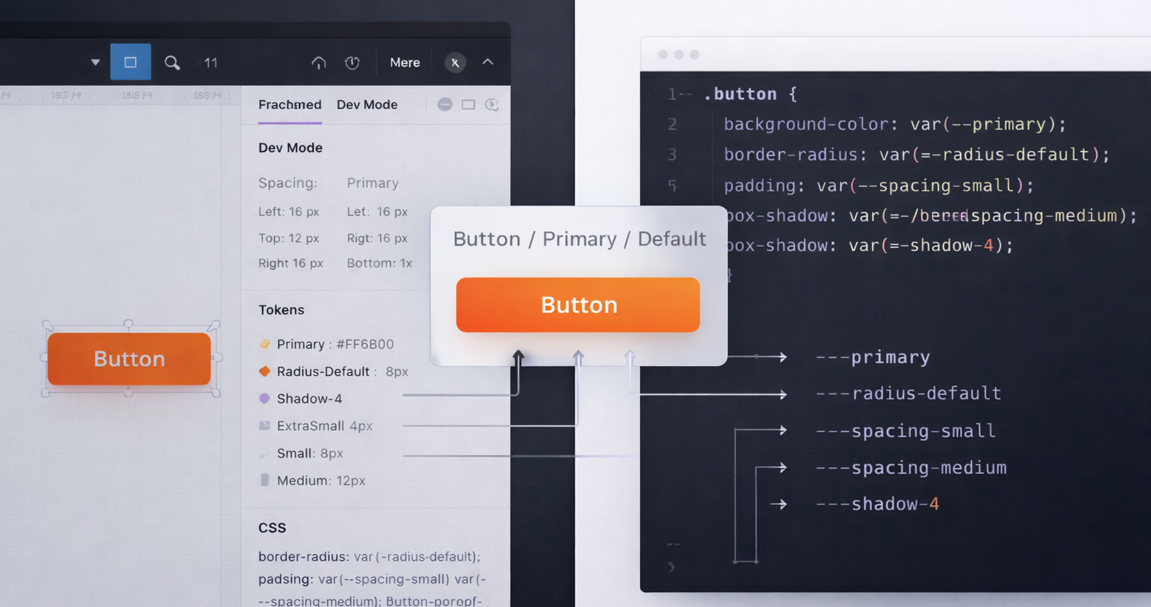
Surface assets. The design system's tokens (colors, typography, spacing) translate directly into CSS variables or platform-specific style constants. Components with clearly named variants map to development components. Consistent naming between design and code eliminates translation errors.
Use Figma's Dev Mode to streamline this process. Dev Mode lets developers inspect designs, copy CSS or platform-specific code snippets, and view component properties without switching tools. Combined with a well-structured 5 planes file, handoff becomes a conversation about implementation details rather than a debate about what to build.
Conclusion
The 5 planes of UX design, Strategy, Scope, Structure, Skeleton, and Surface, provide a proven framework for building mobile apps that are grounded in user needs, logically organized, and visually compelling. Each plane solves a specific category of design problem, and together they create a traceable path from abstract goals to a finished, functional interface.
For designers, founders, and product teams working in Figma, the framework transforms how projects are structured, documented, and communicated. It replaces guesswork with a systematic process that scales across team sizes, project complexities, and product stages.
We at Orbix Studio apply the 5 planes framework across every mobile app project we deliver, from initial strategy research through Figma design systems and developer handoff. If you are building a mobile app and want a design partner who brings structure, clarity, and craft to every layer of the experience, reach out to our team and let us turn your idea into a product users love.
Frequently Asked Questions
Who created the 5 planes of UX design?
Jesse James Garrett created the 5 planes of UX design and published the framework in his 2002 book The Elements of User Experience. The model organizes the design process into five layers that move from abstract strategy to concrete visual design.
What is the difference between the Skeleton plane and the Surface plane?
The Skeleton plane defines where elements are placed on a screen, including layout, navigation, and component positioning. The Surface plane defines how those elements look, including color, typography, iconography, and visual styling. Skeleton is about arrangement. Surface is about appearance.
Can you apply the 5 planes of UX design in Figma?
Yes. Figma supports every artifact the 5 planes require. You can document strategy on dedicated pages, build scope matrices with auto-layout, create sitemaps for structure, wireframe at the skeleton level, and design high-fidelity screens with a full design system at the surface level.
Do you have to follow the 5 planes in order?
The planes are designed to be worked on from bottom (Strategy) to top (Surface) because each plane depends on decisions made below it. In practice, the process is iterative. You will revisit lower planes as you learn from higher ones. The order provides direction, not a rigid sequence.
How does the Strategy plane affect mobile app design?
The Strategy plane defines who the app is for and what it needs to achieve. Without clear user needs and business objectives, design teams make decisions based on assumptions. For mobile apps, where screen space and user attention are limited, a strong strategy prevents feature bloat and ensures every screen serves a purpose.
What is information architecture in the context of the 5 planes?
Information architecture sits within the Structure plane. It is the practice of organizing, labeling, and grouping content so users can find what they need and understand where they are within the app. For mobile apps, effective information architecture means shallow navigation hierarchies and clear, familiar labels.
How do the 5 planes of UX design improve developer handoff?
When a project is structured across all five planes, developers receive context at every level: why the product exists (Strategy), what it includes (Scope), how it is organized (Structure), where elements are placed (Skeleton), and how it looks (Surface). This reduces miscommunication, eliminates guesswork, and speeds up implementation.


