Table of Contents

The four core UX frameworks are Design Thinking, Lean UX, the Double Diamond, and Jesse James Garrett's Five Elements of UX. Each provides a structured approach to solving user problems, validating design decisions, and building digital products that people actually want to use.
Whether you are a solo freelancer wireframing screens in Figma or a product team shipping a mobile app at scale, choosing the right framework shapes every decision from research through developer handoff. The wrong approach wastes sprints. The right one keeps your team aligned and your users satisfied.
This guide breaks down each framework in detail, shows how they apply to real mobile app design workflows in Figma, and helps you decide which one fits your project, team, and stage of growth.
What is a UX Framework
A UX framework is a structured, repeatable process that guides how designers and product teams research, define, design, prototype, and validate user experiences. It is not a set of UI components or a style guide. It is a decision-making system that tells you what to do, in what order, and why each step matters before pixels ever hit the canvas.
Frameworks give teams a shared language. When a startup founder asks "why are we doing user interviews before wireframing," the framework provides the answer. When a product designer needs to justify a design direction to engineering, the framework supplies the logic. Without one, design decisions become subjective, inconsistent, and difficult to defend.
For mobile app projects in Figma, a UX framework acts as the backbone that connects early-stage discovery to final prototyping and handoff. It ensures that the screens you build solve validated problems rather than assumptions.
UX Framework vs UX Methodology
These terms get used interchangeably, but they serve different functions. A UX framework is the overarching structure. It defines phases, principles, and the sequence of activities. A methodology is the specific set of techniques you use within that structure.
Design Thinking is a framework. Card sorting, usability testing, and affinity mapping are methodologies you might use inside it. The Double Diamond is a framework. Jobs-to-be-done interviews and A/B testing are methodologies that fit within its phases.
Think of the framework as the blueprint for a building. Methodologies are the tools and materials you use during construction. You need both, but the framework comes first because it determines which methodologies are appropriate at each stage.
Why UX Frameworks Matter for Mobile App Design
Mobile app design carries constraints that web design does not. Smaller screens demand tighter information hierarchy. Touch targets require precise sizing. Navigation patterns differ across iOS and Android. Users form opinions about an app within seconds.
A UX framework forces you to address these constraints systematically rather than reactively. It prevents the common trap of jumping straight into high-fidelity Figma mockups before understanding user needs, business goals, or technical limitations.
Teams that skip frameworks often face expensive rework. They build features nobody asked for, design flows that confuse users, and hand off specs that developers cannot implement efficiently. A framework reduces that risk by front-loading research and validation into the process.
For early-stage startups especially, frameworks provide discipline without bureaucracy. You do not need a 40-person research team. You need a clear process that scales with your resources.

The 4 Frameworks of UX Explained
Each of the four major UX frameworks approaches the design process from a different angle. Some prioritize empathy and ideation. Others focus on speed and iteration. Understanding their differences helps you pick the right one for your project context, team structure, and timeline.
1. Design Thinking
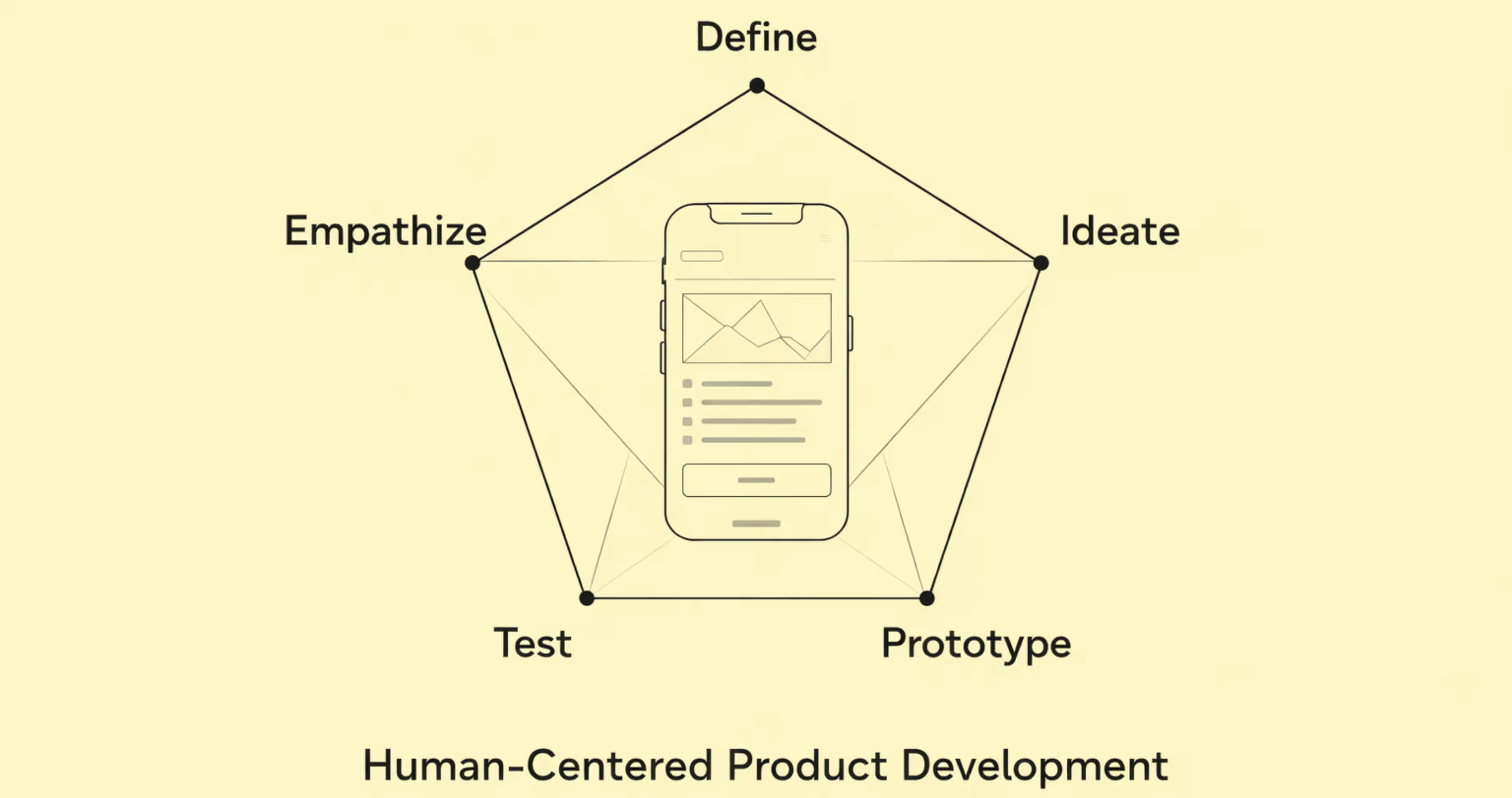
Design Thinking is a human-centered framework developed at Stanford's d.school and popularized by IDEO. It organizes the design process into five phases: Empathize, Define, Ideate, Prototype, and Test. The core principle is that great products start with deep understanding of the people who will use them.
Empathize involves observing and interviewing real users to understand their behaviors, pain points, and motivations. You are not guessing what users want. You are watching what they do and listening to what they say.
Define takes the research from the empathy phase and distills it into a clear problem statement. A well-written problem statement looks like this: "Young professionals need a faster way to split group expenses because existing apps require too many steps and cause friction among friends."
Ideate is where the team generates a wide range of potential solutions. Quantity matters more than quality at this stage. Sketching, brainstorming, and "how might we" exercises push the team past obvious solutions toward creative ones.
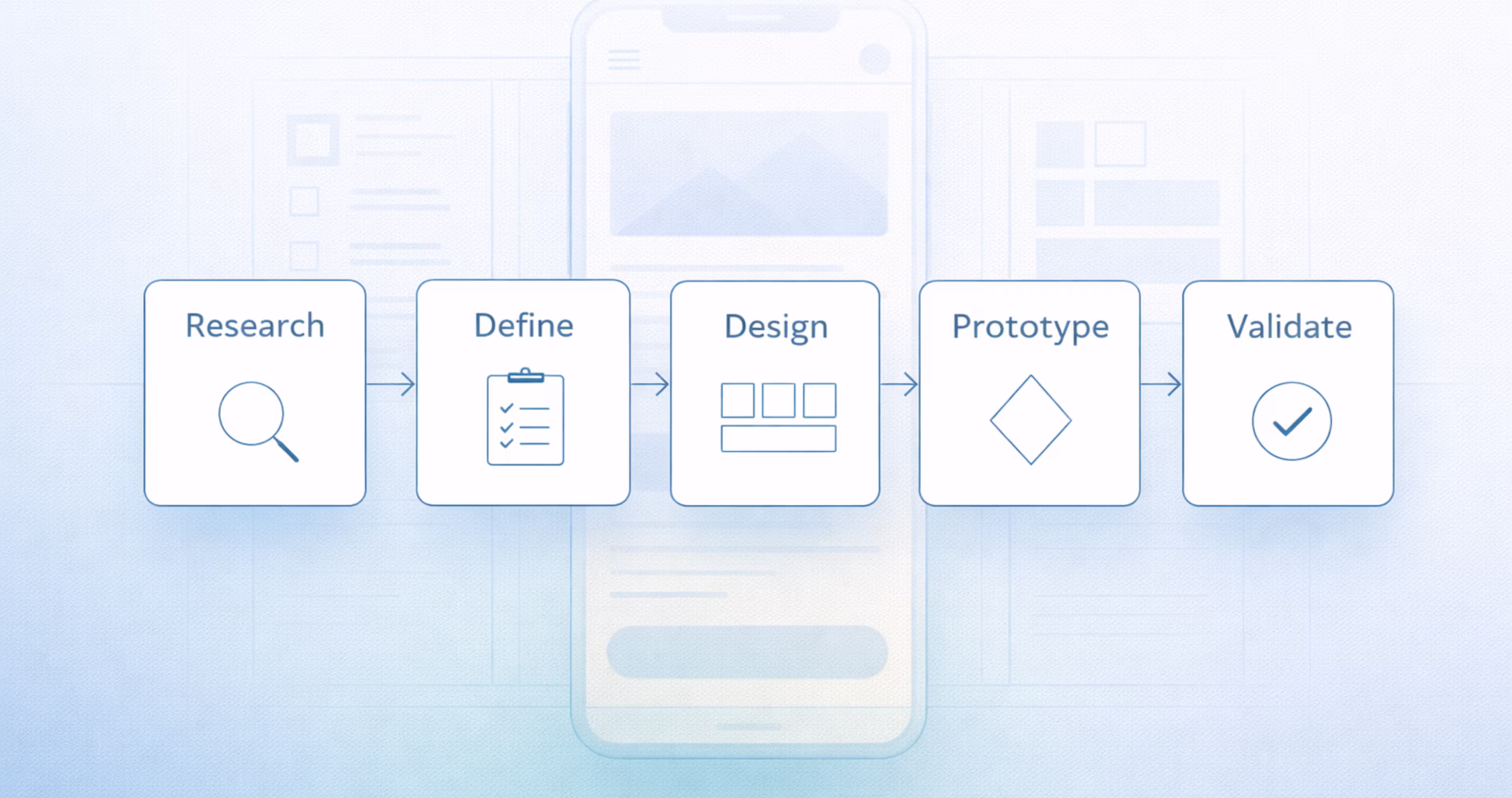
Prototype turns the strongest ideas into tangible artifacts. In mobile app design, this usually means low-fidelity wireframes or clickable prototypes in Figma. The goal is speed, not polish.
Test puts prototypes in front of real users to gather feedback. What works? What confuses them? What did you miss? The insights loop back into earlier phases, making Design Thinking an iterative process rather than a linear one.
How Design Thinking Works in Figma
Figma supports every phase of Design Thinking. During Empathize and Define, teams use FigJam boards to organize interview notes, create empathy maps, and build affinity diagrams collaboratively in real time.
During Ideate, designers sketch rough concepts directly on Figma frames. Low-fidelity wireframe kits available in the Figma Community speed up this process. The goal is to explore multiple directions quickly without committing to visual design.
Prototyping in Figma connects wireframe screens with interactive flows. You can set tap targets, transitions, and conditional logic to simulate real app behavior. This lets you test navigation patterns, onboarding flows, and core interactions before writing a single line of code.
For testing, Figma prototypes can be shared via link with users or stakeholders. Pair this with tools like Maze or UserTesting to capture task completion rates, heatmaps, and qualitative feedback. The results feed directly back into your Figma file for iteration.
2. Lean UX
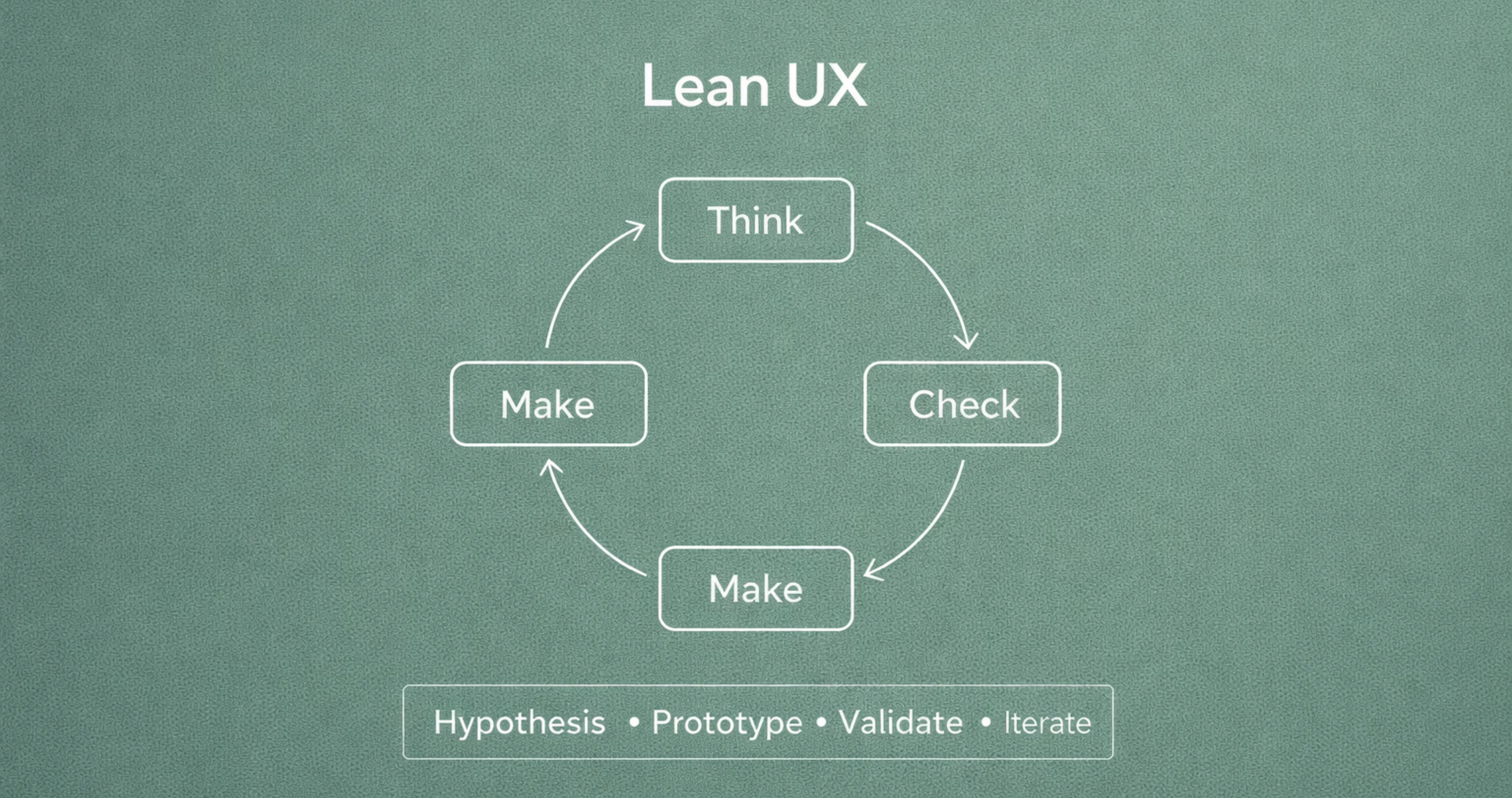
Lean UX borrows from Lean Startup methodology and applies it to design. Created by Jeff Gothelf and Josh Seiden, this framework prioritizes speed, collaboration, and validated learning over comprehensive documentation. The core loop is Think, Make, Check.
Think starts with assumptions, not research reports. The team identifies what they believe about the user, the problem, and the solution. These assumptions become hypotheses written in a testable format: "We believe that [adding a quick-add button] will [reduce task completion time by 30%] for [new users]."
Make produces the minimum viable design needed to test the hypothesis. This is not a polished prototype. It might be a paper sketch, a single Figma screen, or a clickable flow with placeholder content. The emphasis is on creating just enough to learn.
Check validates or invalidates the hypothesis through user feedback, analytics, or usability tests. If the hypothesis fails, the team pivots. If it succeeds, they build on it. Every cycle generates learning that informs the next iteration.
Lean UX works exceptionally well for teams operating under tight timelines and limited budgets. It eliminates the waste of building features that nobody validates. It also breaks down silos between design, product, and engineering because all three participate in hypothesis creation and testing.
Applying Lean UX to Mobile App Projects
For mobile app teams using Figma, Lean UX changes how you structure your design sprints. Instead of spending two weeks on a complete screen set, you spend two days on a hypothesis-driven experiment.
Start by listing your riskiest assumptions. For a fitness app, that might be: "Users will complete onboarding if we limit it to three screens." Build those three screens in Figma. Prototype the flow. Test it with five users. Measure completion rates.
Figma's component system supports Lean UX by letting you swap elements quickly. If testing reveals that users miss a CTA, you duplicate the frame, adjust the component, and retest within hours. Auto Layout and component variants make these iterations fast and consistent.
The key discipline in Lean UX is resisting the urge to polish. A pixel-perfect mockup tested once teaches you less than a rough prototype tested three times. Save the visual refinement for after you have validated the interaction model.
3. Double Diamond
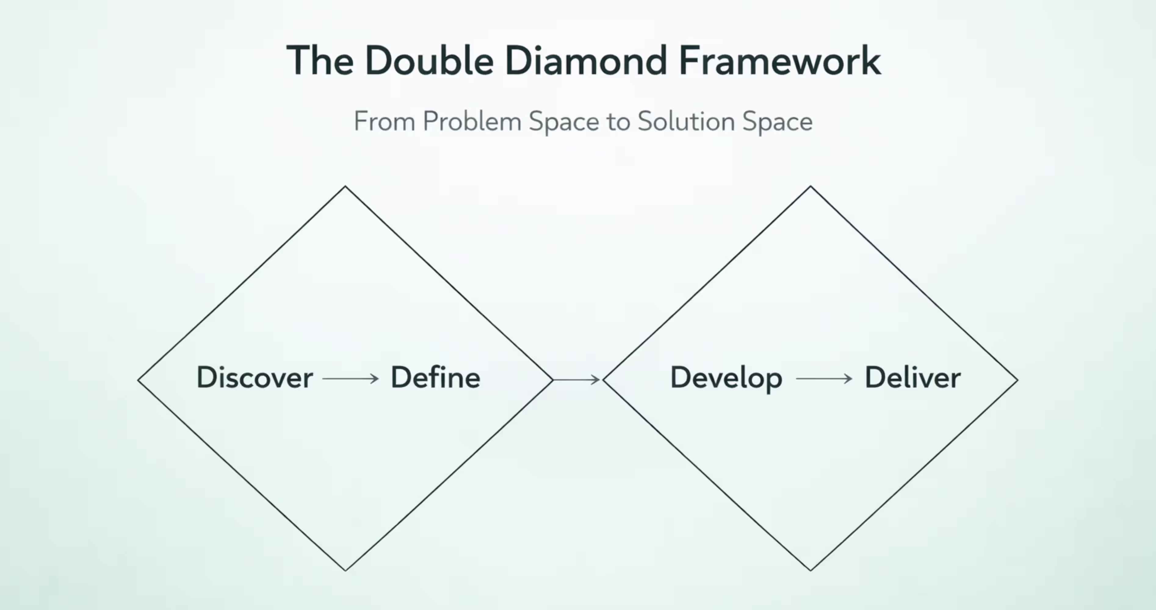
The Double Diamond framework was developed by the British Design Council in 2005 and updated in 2019. It visualizes the design process as two connected diamonds, each representing a phase of divergent and convergent thinking.
Diamond 1: Discover and Define. The first diamond opens with Discover, where the team explores the problem space broadly. You research users, analyze competitors, review analytics, and gather qualitative data. The goal is to understand the full landscape before narrowing focus.
Define is the convergent phase. You synthesize research into specific insights, personas, and a focused problem statement. The first diamond closes when the team agrees on exactly what problem they are solving.
Diamond 2: Develop and Deliver. The second diamond opens with Develop, where the team generates multiple potential solutions. Sketching, prototyping, and co-design sessions produce a range of concepts.
Deliver is the final convergent phase. The team selects the strongest solution, refines it, tests it, and prepares it for implementation. The second diamond closes with a validated, production-ready design.
The Double Diamond's strength is its explicit separation of problem space and solution space. Many teams jump to solutions before fully understanding the problem. This framework prevents that by requiring a complete first diamond before the second one begins.
Using the Double Diamond for Product Design Decisions
In practice, the Double Diamond helps product teams make better prioritization decisions. During Discover, you might identify fifteen user pain points. During Define, you narrow those to the three that align with business goals and technical feasibility.
For mobile app projects in Figma, the first diamond maps to research and strategy work. Use FigJam to run collaborative workshops, map user journeys, and prioritize problems. Document personas and problem statements directly in your Figma project file so they stay connected to the design work.
The second diamond maps to design and validation. Develop multiple layout concepts for key screens. Use Figma's branching feature to explore different directions without overwriting your main file. During Deliver, converge on the final design system, build high-fidelity prototypes, and prepare specs for developer handoff using Figma's Dev Mode.
The Double Diamond works well for teams that need stakeholder alignment. Each phase transition is a natural checkpoint where leadership can review progress, ask questions, and approve direction before the team moves forward.
4. The Five Elements of UX (Jesse James Garrett Model)
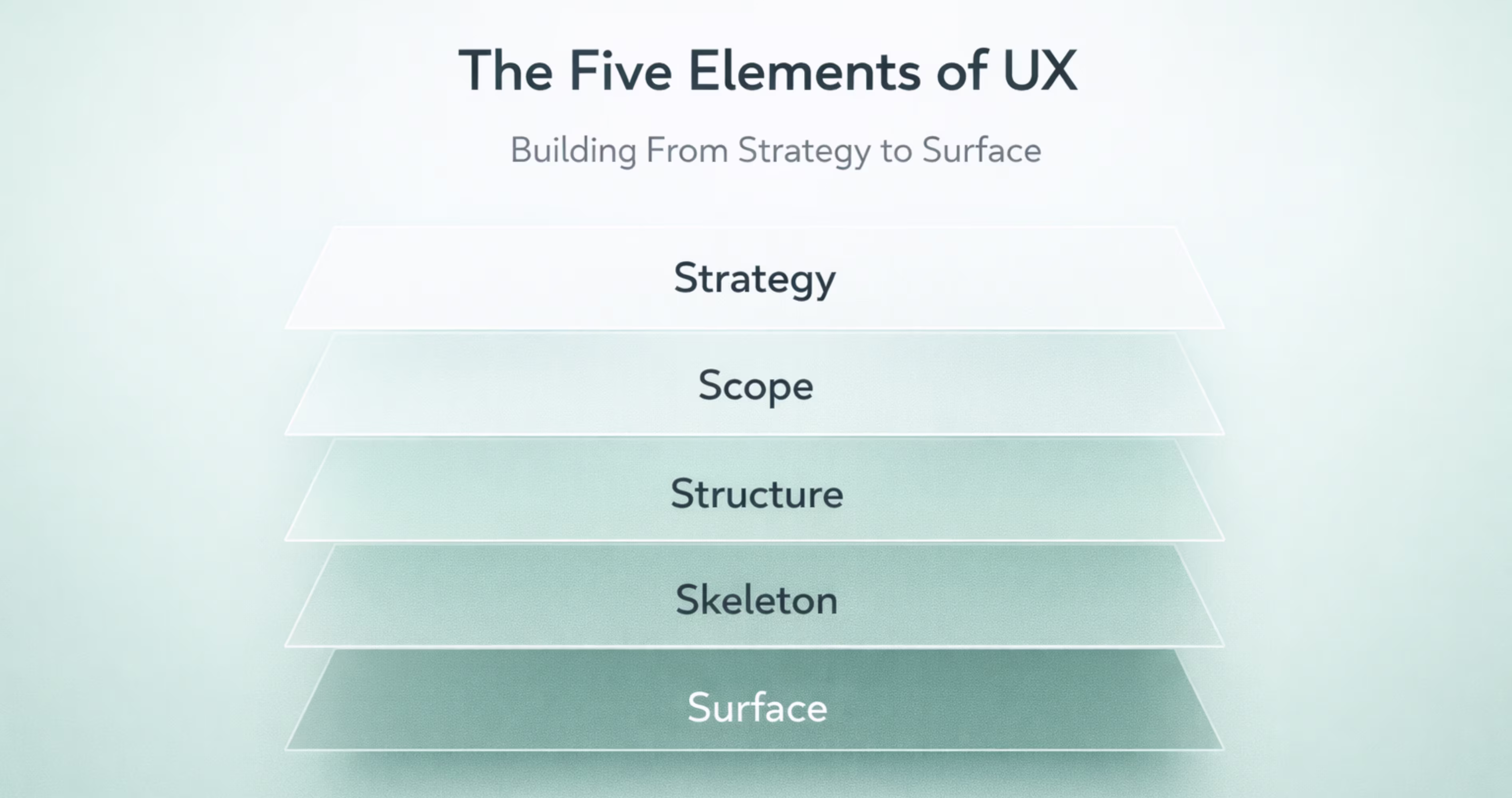
Jesse James Garrett introduced the Five Elements of UX in his 2002 book The Elements of User Experience. This framework organizes UX design into five interdependent planes, each building on the one below it: Strategy, Scope, Structure, Skeleton, and Surface.
Strategy is the foundation. It answers two questions: What do users need? What does the business need? Aligning these two creates the strategic direction for the entire product. For a mobile banking app, user needs might include quick balance checks and easy transfers. Business needs might include increasing daily active users and reducing support calls.
Scope translates strategy into specific features and content requirements. This is where you define what the product will and will not do. A feature matrix or prioritized backlog captures scope decisions. Saying no to features is as important as saying yes.
Structure defines how features are organized and how users move through them. Information architecture and interaction design live here. For a mobile app, this means defining navigation patterns, screen hierarchy, and the logic that connects user actions to system responses.
Skeleton is the layout layer. It determines where elements appear on each screen. Wireframes, button placement, content zones, and navigation bars take shape here. The skeleton makes the structure tangible without applying visual design.
Surface is the visual layer. Typography, color, iconography, imagery, and motion design come together to create the final look and feel. This is what users see and interact with directly.
The Five Elements model is valuable because it enforces a bottom-up approach. You cannot design a beautiful Surface if the Strategy is unclear. You cannot build a usable Skeleton if the Structure is broken. Each plane depends on the one beneath it.
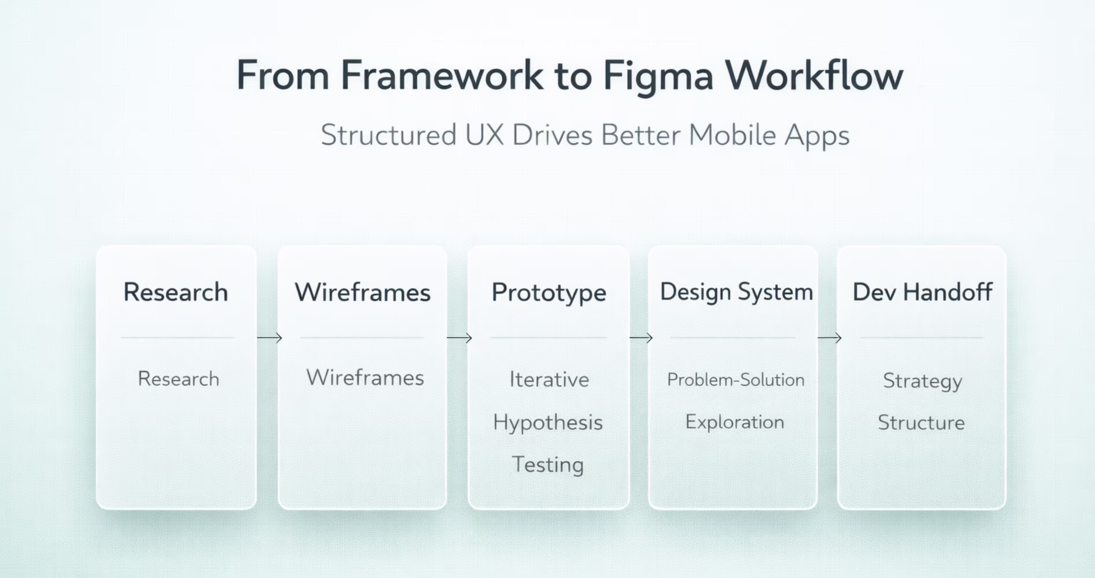
Mapping the Five Planes to Mobile UI in Figma
Figma supports each plane of Garrett's model when you structure your project intentionally.
Strategy lives in your project documentation. Create a dedicated Figma page called "Strategy" and include user personas, business objectives, and success metrics. This keeps strategic context visible to every team member who opens the file.
Scope translates into a feature map. Use a Figma frame to list confirmed features, deferred features, and out-of-scope items. Link each feature to the user need and business goal it serves.
Structure becomes your app's sitemap and user flow diagrams. Build these in Figma using simple shapes and connectors. Map every screen, decision point, and navigation path before designing any individual screen.
Skeleton is your wireframe phase. Use Figma's Auto Layout and component system to build low-fidelity wireframes that establish layout patterns, content hierarchy, and interaction zones. Test these wireframes as prototypes before adding visual design.
Surface is where your design system comes alive. Apply typography scales, color tokens, icon libraries, and spacing rules to transform wireframes into high-fidelity screens. Figma's design tokens and component variants ensure consistency across every screen in your mobile app.
How to Choose the Right UX Framework for Your Project
.avif)
No single framework is universally best. The right choice depends on your team's size, your project's stage, your timeline, and the type of problem you are solving.
Matching Frameworks to Team Size and Stage
Startups building their first MVP often benefit from Lean UX because it prioritizes speed and learning. Teams redesigning an existing product with known usability issues might choose Design Thinking to rebuild empathy with users. Enterprise teams launching a new product line often prefer the Double Diamond for its structured checkpoints. Product teams building complex, multi-feature apps find the Five Elements model useful for maintaining architectural integrity.
Combining UX Frameworks for Better Results
Experienced teams rarely use a single framework in isolation. They blend elements based on project needs.
A common combination is using the Double Diamond's first diamond for discovery and definition, then switching to Lean UX for the second diamond's develop and deliver phases. This gives you rigorous problem definition followed by rapid solution iteration.
Another effective blend is using the Five Elements as your structural backbone while applying Design Thinking methods within each plane. Strategy uses empathy interviews. Scope uses ideation workshops. Structure uses prototype testing. The framework provides the architecture. The methods fill each layer.
The key is intentionality. Know why you are borrowing from each framework. Document your hybrid approach so the team follows the same process. A framework only works if everyone on the team understands and follows it.
How UX Frameworks Improve Mobile App Design in Figma
Frameworks are not abstract theory. They directly improve the quality, consistency, and efficiency of mobile app design work inside Figma.
Building Design Systems with a Framework-First Approach
A design system built without a framework often becomes a collection of disconnected components. Buttons exist, but there is no logic governing when to use a primary button versus a secondary one. Colors are defined, but there is no rationale connecting them to user actions or emotional states.
When you build your design system through the lens of the Five Elements model, every component traces back to a strategic decision. Your primary button color connects to your brand strategy. Your navigation pattern connects to your information architecture. Your typography scale connects to your content hierarchy.
In Figma, this means organizing your component library by function rather than appearance. Group components by the user action they support: navigation components, input components, feedback components, content display components. Each group maps to a structural decision in your framework.
Use Figma's component properties and variants to encode framework decisions directly into your design system. A button component might have variants for primary, secondary, and destructive actions. Each variant reflects a scope decision about what actions the app supports and how important each one is.
From Prototyping to Developer Handoff Using UX Frameworks
Frameworks improve handoff because they create shared understanding between design and development. When a developer receives a Figma file built on the Five Elements model, they can trace any screen back to the structural and strategic decisions that shaped it. This reduces "why is it designed this way" questions and speeds up implementation.
Figma's Dev Mode surfaces the specifications developers need: spacing values, color tokens, typography styles, and component properties. But specifications alone do not explain intent. A framework-informed Figma file includes documentation pages that explain the user flows, interaction logic, and design rationale behind each screen.
For Lean UX teams, handoff happens incrementally. You are not delivering a complete app design in one package. You are handing off validated experiments one at a time. Figma's page and section organization supports this by letting you structure your file around sprints or experiments rather than a monolithic screen inventory.
Common Mistakes When Applying UX Frameworks
Frameworks improve outcomes only when applied correctly. Misapplication creates its own set of problems.
Skipping Research and Jumping to UI
The most common mistake is treating the framework's early phases as optional. Teams adopt Design Thinking but skip the Empathize phase because "we already know our users." They use the Double Diamond but rush through Discover because stakeholders want to see screens.
Every framework front-loads research for a reason. The cost of fixing a usability problem increases exponentially the later you catch it. A problem identified during user interviews costs nothing to fix. The same problem identified after development costs weeks of rework.
In Figma, this mistake manifests as beautiful high-fidelity screens that solve the wrong problem. The file looks impressive, but user testing reveals fundamental navigation issues, missing features, or confusing flows that require structural redesign.
Protect your research phases. Schedule them. Timebox them. But do not skip them.
Treating Frameworks as Rigid Rules
The opposite mistake is following a framework so rigidly that it becomes a bottleneck. Design Thinking does not require five separate workshops for five phases. Lean UX does not mean you never create documentation. The Double Diamond does not demand that you complete every activity in every phase.
Frameworks are guides, not scripts. Adapt them to your context. A two-person startup does not need the same process as a 50-person product team. A simple feature update does not need the same rigor as a ground-up product design.
The best teams internalize the principles behind each framework and apply them flexibly. They understand that Design Thinking is about empathy, not about following five steps in order. They understand that Lean UX is about reducing waste, not about avoiding all documentation. Use the framework as a thinking tool. Adjust the process to fit your reality.
Conclusion
The four UX frameworks, Design Thinking, Lean UX, Double Diamond, and the Five Elements of UX, each offer a proven structure for turning user needs into effective mobile app experiences. Choosing and applying the right framework keeps your Figma workflow focused, your team aligned, and your product decisions grounded in real user insight.
Understanding these frameworks is the first step. Applying them consistently across research, prototyping, design systems, and developer handoff is what separates good mobile apps from forgettable ones. The framework you choose shapes every screen you ship.
At Orbix Studio, we build mobile apps using framework-driven UX processes from first research session to final handoff. If your team needs expert guidance turning ideas into scalable, user-centered products, reach out to start your project with us.
Frequently Asked Questions
What are the 4 frameworks of UX in simple terms?
The four frameworks are Design Thinking, Lean UX, Double Diamond, and the Five Elements of UX. Each provides a step-by-step structure for researching user needs, generating solutions, and validating designs before development begins.
Which UX framework is best for mobile app design?
No single framework is universally best. Lean UX works well for fast-moving startup teams building MVPs. The Five Elements model suits complex apps that need strong information architecture. Choose based on your team size, timeline, and project complexity.
Can you combine multiple UX frameworks in one project?
Yes. Many experienced teams blend frameworks. A common approach uses the Double Diamond for problem discovery and Lean UX for rapid solution testing. The key is documenting your hybrid process so the entire team follows the same structure.
How does Design Thinking differ from Lean UX?
Design Thinking emphasizes deep user empathy and broad ideation before prototyping. Lean UX prioritizes speed and hypothesis-driven experiments with minimal documentation. Design Thinking invests more time in understanding the problem. Lean UX invests more time in testing solutions quickly.
What is the Five Elements of UX model?
Jesse James Garrett's Five Elements model organizes UX into five planes: Strategy, Scope, Structure, Skeleton, and Surface. Each plane builds on the one below it, ensuring that visual design decisions are grounded in strategic and structural foundations.
How do UX frameworks apply to Figma workflows?
Figma supports every phase of UX frameworks. FigJam handles research synthesis and workshops. Wireframe kits support rapid prototyping. Component systems and design tokens enforce consistency. Dev Mode enables structured handoff. The framework determines how you organize and sequence this work.
Do small teams or freelancers need a UX framework?
Yes. Small teams benefit the most because frameworks prevent wasted effort. A solo freelancer using Lean UX avoids building features nobody validated. A two-person team using the Five Elements model ensures their app has solid structure before they invest in visual polish.