Table of Contents

The 4 C's of UX design are Consistency, Clarity, Content, and Context. Together, they form a practical framework that helps designers create mobile app interfaces that feel intuitive, readable, and purposeful across every screen and interaction.
Whether you are building your first mobile app in Figma or refining an existing product, these four principles solve the most common usability problems before they reach your users. They give product teams a shared language for making design decisions that scale.
This guide breaks down each of the 4 C's, shows you how they work together, and walks you through applying them inside Figma with a real design system, prototyping, and handoff strategies.
What Are the 4 C's of UX Design and Why Do They Matter
The 4 C's of UX design represent four foundational principles that guide how users perceive, navigate, and interact with digital products. Each principle addresses a different layer of the user experience. Consistency ensures predictability. Clarity removes confusion. Content delivers value. Context makes everything relevant.
These are not abstract theories. They are working principles that product designers, UI/UX teams, and founders use daily to evaluate whether a screen, flow, or component actually serves the user. When one of the 4 C's breaks down, users notice immediately, even if they cannot articulate why something feels wrong.
A Quick Overview of the 4 C's Framework
Here is what each C covers at a high level:
Consistency means every element in your interface behaves and looks the way users expect based on patterns they have already learned. Buttons, typography, spacing, and interactions follow the same rules across every screen.
Clarity means users can understand what they are looking at and what they should do next without extra effort. Visual hierarchy, labeling, and layout all serve comprehension.
Content means the words, images, and data on each screen are useful, structured, and written for the user rather than the business. Content drives the actual value of the experience.
Context means the design accounts for who the user is, where they are, what device they are using, and what they are trying to accomplish at that specific moment.
Why the 4 C's Matter for Mobile App Design in Figma

Mobile screens are small. Attention spans are short. Users switch between apps constantly. In this environment, the 4 C's become non-negotiable.
Figma gives you the tools to enforce all four principles systematically. Design tokens handle consistency. Auto layout and component variants support clarity. Content placeholders and text styles structure real content early. Prototyping with device-specific frames lets you test context before a single line of code ships.
For startup founders and product teams working at speed, the 4 C's act as a quality filter. Before asking "does this look good," you ask: is it consistent, clear, content-driven, and contextually appropriate? That question saves redesign cycles and prevents usability debt.

Consistency in UX Design
Consistency is the first C because it sets the foundation for everything else. A consistent interface reduces cognitive load. Users do not have to relearn how your app works every time they open a new screen.
What Consistency Means in UX
Consistency in UX design means that similar elements look similar, behave similarly, and appear in predictable locations throughout the product. It operates on three levels:
Visual consistency covers colors, typography, spacing, iconography, and component styling. If your primary button is blue and rounded on the home screen, it should be blue and rounded on every screen.
Functional consistency means interactive elements do what users expect. A swipe gesture that deletes an item in one list should not archive an item in another list.
External consistency aligns your app with platform conventions. iOS users expect tab bars at the bottom. Android users expect material design patterns. Breaking these conventions without a strong reason creates friction.
How to Build Consistency Using Figma Design Systems
Figma is built for consistency. The key is setting up your design system before you start designing screens.
Start with design tokens. Define your color palette, type scale, spacing grid, and elevation values as Figma styles. Every component you build should reference these tokens, not hard-coded values. When your brand evolves, you update the token once and every instance updates automatically.
Build components with variants. A single button component should include variants for primary, secondary, ghost, disabled, and loading states. Use component properties in Figma to toggle between sizes, icon placements, and label visibility without creating separate components.
Use auto layout for spacing rules. Auto layout enforces consistent padding and gap values. When you nest auto layout frames, your screens maintain spatial consistency even as content changes length.
Create a shared library. Publish your design system as a Figma team library. Every designer on the project pulls from the same source of truth. This eliminates the "which version is correct" problem that plagues growing teams.
Common Consistency Mistakes to Avoid
Inconsistent icon styles. Mixing outlined and filled icons on the same screen breaks visual harmony. Pick one style and apply it everywhere, or use filled for active states and outlined for inactive states with a clear rule.
Typography drift. Using 14 different font sizes across an app because each screen was designed in isolation. Limit your type scale to 5 to 7 sizes and assign each a clear role: caption, body, subtitle, title, display.
Spacing guesswork. Eyeballing padding instead of using a spacing scale (4px, 8px, 12px, 16px, 24px, 32px, 48px) leads to screens that feel slightly off without anyone knowing why.
Ignoring platform guidelines. Designing a single UI for both iOS and Android without accounting for navigation patterns, gesture conventions, or system font differences.
Clarity in UX Design
Clarity is the second C. If consistency makes your app predictable, clarity makes it understandable. A clear interface communicates its purpose, structure, and available actions without requiring the user to think.
What Clarity Means for User Interfaces
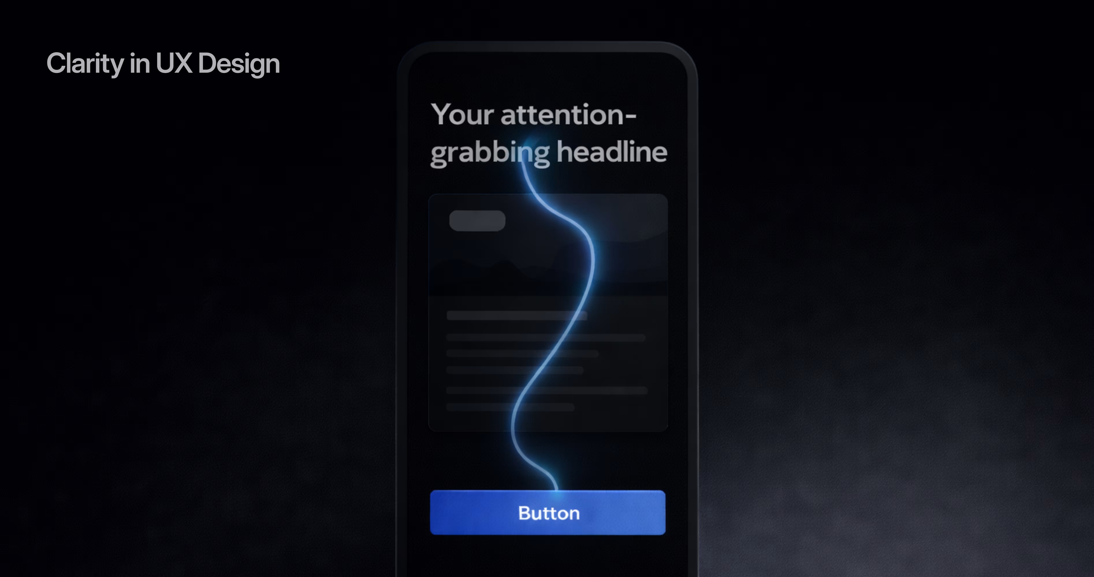
Clarity in UX means that every screen answers three questions instantly: Where am I? What can I do here? What happens if I take this action?
This is achieved through visual hierarchy, meaningful labels, appropriate contrast, and deliberate layout. Clarity is not about minimalism for its own sake. A screen with ten elements can be perfectly clear if those elements are organized with intention.
Nielsen Norman Group's research has consistently shown that users scan rather than read. They look for visual anchors, headings, and actionable elements. Clarity means designing for that scanning behavior.
Designing for Clarity in Mobile Apps
Establish a clear visual hierarchy. The most important element on each screen should be the most visually prominent. Use size, weight, color, and position to guide the eye. In Figma, test your hierarchy by squinting at the screen. If you cannot tell what matters most, neither can your users.
Write labels that describe actions, not features. "Save draft" is clearer than "Save." "Continue to payment" is clearer than "Next." Every button, link, and menu item should tell users exactly what will happen.
Use whitespace as a design tool. Whitespace is not empty space. It is a signal that separates groups of related content and gives the eye room to process information. On mobile, where screen real estate is limited, strategic whitespace prevents the interface from feeling cramped.
Design clear navigation patterns. Bottom tab bars for primary navigation. Stack navigation for drill-down flows. Modal sheets for focused tasks. Each pattern communicates a different relationship between screens. Mixing them without logic confuses users about where they are in the app.
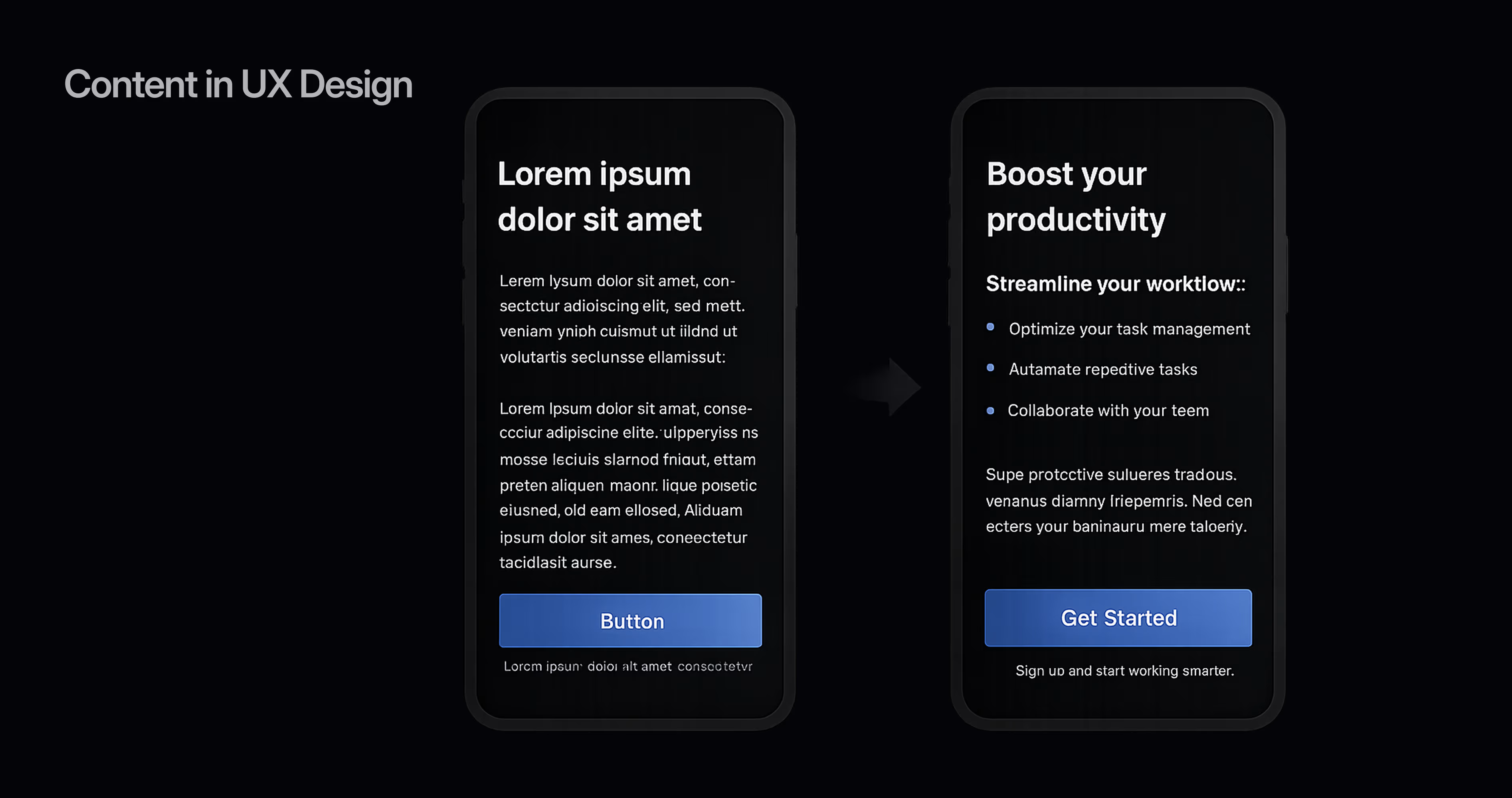
Test with real content. Placeholder text like "Lorem ipsum" hides clarity problems. A heading that works at three words might break at twelve. Design with realistic content lengths from the start.
Clarity Pitfalls That Hurt Usability
Ambiguous icons without labels. A hamburger menu icon is widely recognized. A custom icon for "insights" is not. When in doubt, pair icons with text labels, especially in bottom navigation.
Low contrast text. Light gray text on a white background might look elegant in a Figma mockup, but it fails accessibility standards and frustrates users in bright environments. Aim for a minimum contrast ratio of 4.5:1 for body text, as defined by WCAG 2.1 guidelines.
Overloaded screens. Trying to show everything at once instead of progressive disclosure. If a screen has more than one primary action, it has zero primary actions.
Hidden functionality. Gestures, long-press menus, and swipe actions that are not visually indicated. If users have to discover a feature by accident, it is not clear.
Content in UX Design
Content is the third C, and it is often the most underestimated. Designers focus on layout, color, and interaction, but the words, images, and data on each screen are what users actually came for. Content is not decoration. It is the product.
Why Content Is a Core UX Principle
Users do not open your app to admire your design system. They open it to check a balance, send a message, find a restaurant, or complete a task. The content on each screen either helps them do that or gets in the way.
Treating content as a UX principle means involving content strategy early in the design process, not after screens are already built. It means designing around real copy, real data, and real user needs rather than filling boxes with placeholder text and hoping a copywriter fixes it later.
Structuring Content for Mobile Screens
Prioritize ruthlessly. Mobile screens show roughly 30 to 40 words at a time above the fold. Every word competes for attention. Lead with the most important information. Push secondary details below the fold or behind a "show more" interaction.
Use progressive disclosure. Show users what they need at each step and reveal additional detail on demand. A product card shows the name, price, and rating. Tapping it reveals the full description, reviews, and specifications. This keeps each screen focused.
Structure content in scannable chunks. Short paragraphs. Clear headings. Bulleted lists for features or steps. Bold key terms. On mobile, a wall of text is a wall users will not read.
Design for dynamic content. Names, titles, and descriptions vary in length. A username might be 4 characters or 24. Design components that handle both gracefully using auto layout and text truncation rules in Figma.
Writing UX Content That Guides Users
Use the user's language. If your analytics show users search for "cheap flights," do not label your filter "economy fares." Match the vocabulary your audience actually uses.
Write microcopy that reduces anxiety. "Your card will not be charged yet" next to a payment button. "You can change this later" next to a settings choice. Small reassurances prevent drop-offs at critical moments.
Error messages should explain and resolve. "Something went wrong" is useless. "Your password needs at least 8 characters and one number" is actionable. Every error state is a content design opportunity.
Keep CTAs specific. "Get started" is vague. "Start your free 14-day trial" is clear. The more specific your call to action, the more confident users feel tapping it.
Context in UX Design

Context is the fourth C. It is the principle that makes the other three adaptive rather than static. Context means designing for the real conditions in which people use your app.
What Context Means for User Experience
Context in UX design refers to the circumstances surrounding a user's interaction with your product. This includes:
Device context. Screen size, input method (touch vs. mouse), operating system, and hardware capabilities.
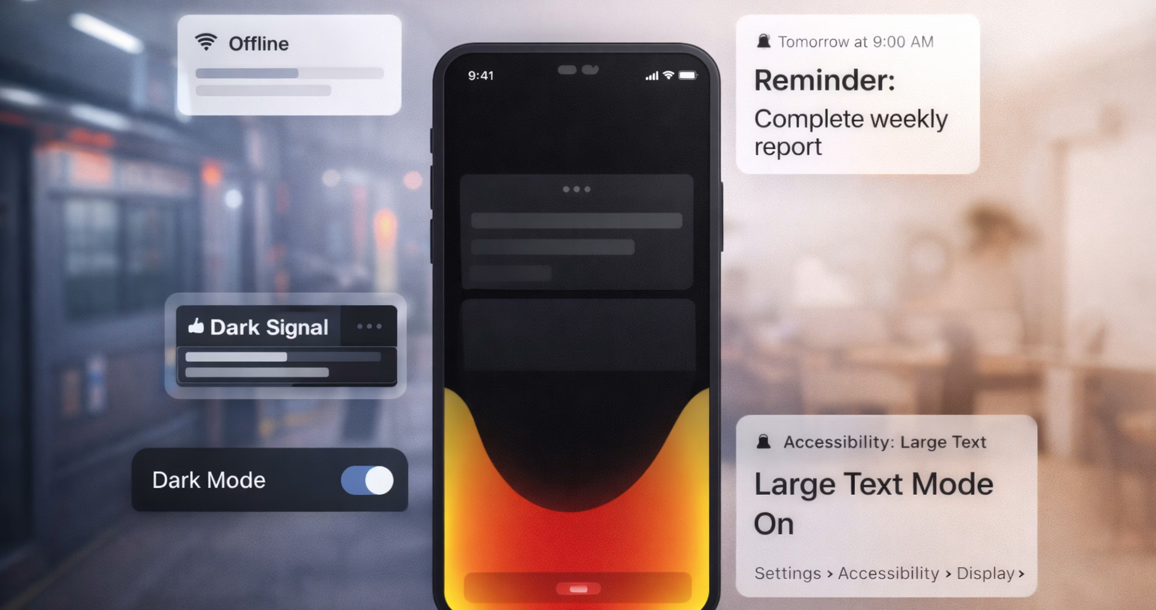
Environmental context. Is the user on a crowded train, in a quiet office, or walking down the street? Lighting conditions, noise levels, and available attention all affect how they interact with your app.
Task context. What is the user trying to accomplish right now? Are they browsing casually or completing an urgent task? The same app might need to serve both modes.
User context. Is this a first-time user or a power user? What do they already know? What permissions have they granted? What data do you have about their preferences?
Designing for Context in Mobile Applications
Respect the device. Mobile users interact with thumbs. Place primary actions within the thumb zone, the lower third of the screen. Avoid placing critical buttons in the top corners where they require a grip change.
Design for interruption. Mobile sessions are frequently interrupted. Auto-save form progress. Let users resume where they left off. Never force users to restart a multi-step flow because they switched to another app.
Adapt to connectivity. Not every user has fast, stable internet. Design offline states, loading skeletons, and graceful degradation for slow connections. Show cached content when fresh data is unavailable.
Use location and time intelligently. A food delivery app showing breakfast options at 7 AM and dinner options at 6 PM is context-aware. A fitness app suggesting indoor workouts when it is raining uses context to add value. But always give users control. Context-aware defaults are helpful. Context-forced restrictions are frustrating.
Account for accessibility context. Users with visual, motor, or cognitive differences interact with your app differently. Support dynamic type, VoiceOver and TalkBack, reduced motion preferences, and sufficient touch targets (minimum 44x44 points per Apple's Human Interface Guidelines).
How Context Shapes Figma Prototyping Decisions
Figma prototyping lets you simulate context before development. Use device frames to test how your design feels on specific screen sizes. Create prototype flows for different user states: first-time onboarding, returning user, error recovery, and empty states.
Build separate prototype variants for key contextual scenarios. A checkout flow for a user with a saved payment method looks different from one for a new user entering card details for the first time. Prototyping both in Figma lets you validate that your design handles real-world variation.
Use Figma's conditional logic and variables to simulate personalized states. Show different content based on user type, toggle between light and dark mode, or switch between languages. The closer your prototype matches real context, the fewer surprises appear in development.
How the 4 C's Work Together in the UX Design Process
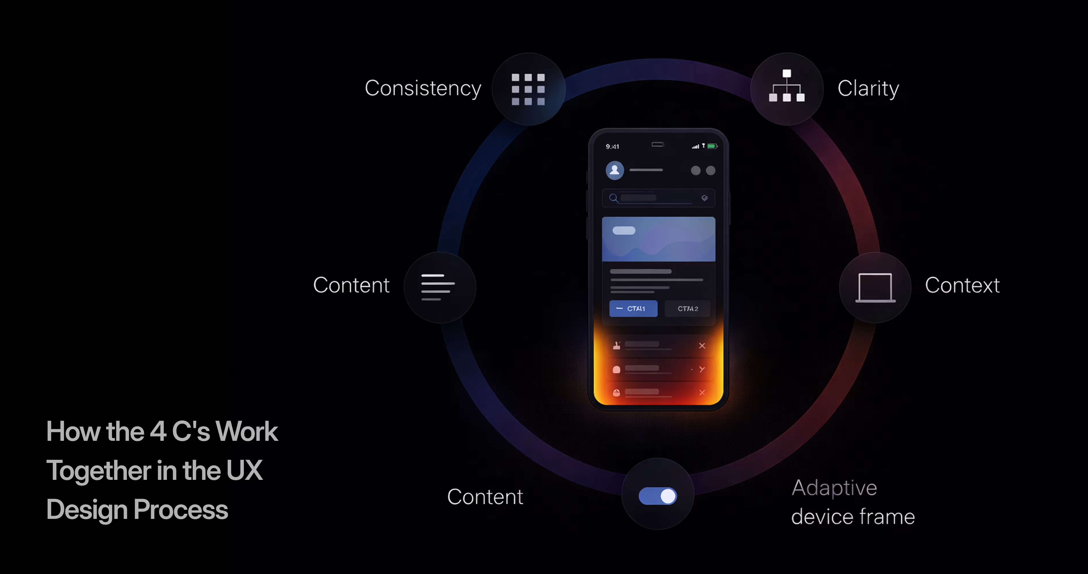
The 4 C's are not a checklist you apply one at a time. They interact constantly. Consistency without clarity produces a uniform but confusing interface. Clarity without content produces a well-organized screen with nothing useful on it. Content without context delivers the right information at the wrong time.
The power of the framework is in the overlap. When all four principles align, users experience something that feels effortless. They do not notice the consistency, clarity, content, or context individually. They just feel that the app works.
Mapping the 4 C's to Your Figma Workflow
Each C maps to a specific phase of your Figma workflow:
Consistency maps to your design system setup. Before designing any screens, define your tokens, components, and patterns. This is your foundation layer.
Clarity maps to your layout and information architecture phase. When you arrange elements on a screen, you are making clarity decisions. Hierarchy, grouping, labeling, and navigation all happen here.
Content maps to your content-first design approach. Populate screens with real or realistic content before finalizing layouts. Content determines how much space elements need, how long labels run, and where truncation occurs.
Context maps to your prototyping and testing phase. Simulate different devices, user states, and scenarios. Test whether your design holds up when conditions change.
A Practical Example of the 4 C's in a Mobile App Project
Imagine you are designing a mobile banking app in Figma for a startup.
Consistency: You build a design system with a 4px spacing grid, a type scale from 12px to 32px, a color palette with semantic tokens (success-green, error-red, primary-blue), and component variants for buttons, cards, inputs, and navigation. Every screen references this system.
Clarity: Your home screen shows the account balance prominently at the top, recent transactions below, and quick actions (send, request, pay) in a clearly labeled row. Users know exactly where they are and what they can do.
Content: Transaction descriptions use plain language ("Coffee at Blue Bottle" not "POS DEBIT 4829 BLUE BOTTLE"). Amounts are formatted with currency symbols and decimal places. Dates use relative time ("Yesterday" not "2025-01-14").
Context: The app detects that the user has a pending bill due tomorrow and surfaces a reminder card on the home screen. When the user opens the app on a new device, it triggers a security verification flow. When connectivity drops, it shows the last cached balance with a "Last updated 5 minutes ago" label.
All four C's working together create an experience that feels trustworthy, usable, and intelligent.
How to Apply the 4 C's of UX Design in Figma
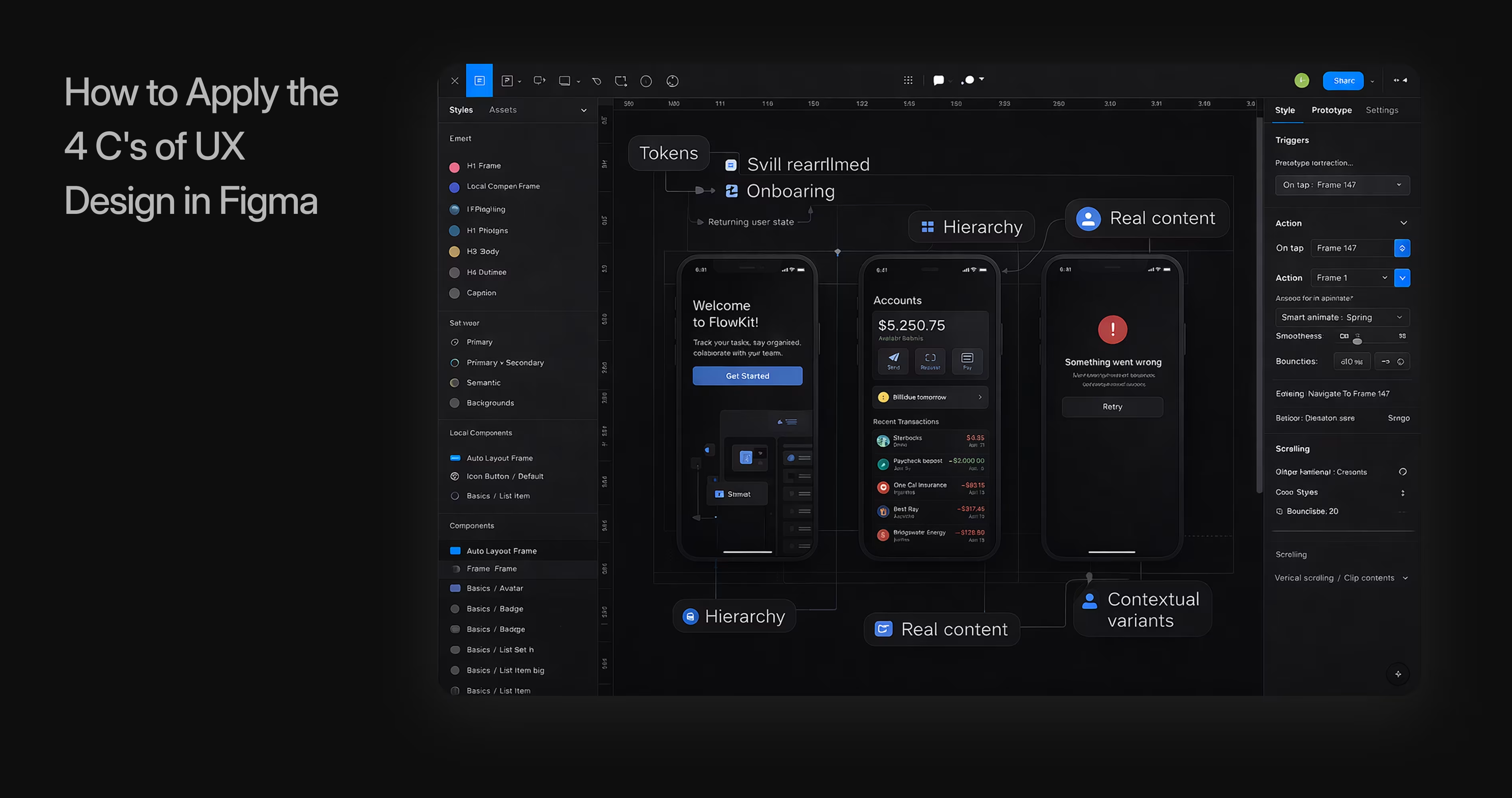
Knowing the 4 C's is one thing. Embedding them into your daily Figma workflow is what turns theory into better products.
Setting Up a Design System Around the 4 C's
Your Figma design system is your consistency engine. Structure it with the 4 C's in mind:
Foundation layer (Consistency): Color styles, text styles, effect styles, spacing variables, and grid systems. These are your design tokens. Name them semantically: color/primary, spacing/md, text/body-default.
Component layer (Clarity): Build components that enforce clear hierarchy. A card component should have a defined title area, body area, and action area. A form input should include label, placeholder, helper text, and error state. Each component variant should represent a real UI state.
Content layer (Content): Create text components with realistic placeholder content. Build content templates for common patterns: onboarding screens, empty states, error messages, success confirmations. Store approved microcopy in a Figma page dedicated to content guidelines.
Context layer (Context): Set up device frames for your target platforms. Create user persona frames that show how the same screen adapts for different user types. Build a page for edge cases: long names, missing data, slow loading, no connectivity.
Prototyping With the 4 C's in Mind
When you prototype in Figma, test each C deliberately:
Test consistency by clicking through your entire flow and checking whether buttons, headers, and spacing feel uniform. If something looks "off" on one screen, compare it to your design system components.
Test clarity by asking someone unfamiliar with the project to use your prototype. Watch where they hesitate, tap the wrong element, or ask "what does this do?" Every hesitation is a clarity failure.
Test content by replacing placeholder text with real content. Does the layout break? Do labels truncate awkwardly? Does the content hierarchy still make sense with actual data?
Test context by running the prototype on a real device. Tap targets that felt fine on a desktop monitor might feel too small on a phone. Scrolling behavior, keyboard interactions, and gesture navigation all reveal context issues that static mockups hide.
Design-to-Development Handoff Using the 4 C's
The 4 C's framework improves handoff because it gives developers a shared vocabulary for design decisions.
For consistency: Export your design tokens as a structured reference. Developers can map Figma styles directly to CSS variables, Swift constants, or Kotlin values. When a developer asks "which blue?" the answer is always color/primary.
For clarity: Annotate your Figma files with interaction notes. Specify what happens on tap, long press, swipe, and error. Developers should not have to guess how a component behaves.
For content: Provide final copy in your Figma files, not in a separate document. Use Figma's inspect panel to let developers copy text directly. Flag dynamic content that comes from an API versus static content that is hard-coded.
For context: Document responsive behavior, adaptive layouts, and conditional logic. If a component changes based on user state, device type, or data availability, annotate those conditions clearly. Use Figma's dev mode to add implementation notes.
Common Mistakes When Ignoring the 4 C's of UX Design
Teams that skip the 4 C's framework tend to make the same mistakes repeatedly:
Designing screens in isolation. Each screen looks fine on its own, but the app feels disjointed when you navigate between them. This is a consistency failure.
Prioritizing aesthetics over comprehension. Beautiful gradients and custom animations that make users unsure where to tap. This is a clarity failure.
Designing layouts before writing content. Screens built around "Lorem ipsum" that break when real content arrives. Headlines that do not fit. Descriptions that need three lines instead of one. This is a content failure.
Assuming all users have the same conditions. Designing only for the latest iPhone on fast Wi-Fi in a well-lit room. Ignoring accessibility, slow connections, older devices, and diverse user environments. This is a context failure.
Skipping the design system. Jumping straight into screen design without establishing tokens, components, and patterns. This guarantees inconsistency and creates exponential rework as the product grows.
Treating UX principles as a one-time checklist. The 4 C's are not something you apply once and forget. They are evaluation criteria you return to at every design review, every sprint, and every iteration.
Conclusion
The 4 C's of UX design give designers, founders, and product teams a reliable framework for building mobile apps that work. Consistency, Clarity, Content, and Context are not abstract ideals. They are practical lenses you apply in Figma every time you create a component, structure a screen, write a label, or prototype a flow.
When these four principles guide your design decisions, you build products that feel intuitive from the first tap. You reduce usability debt, speed up development handoff, and create experiences that scale as your product and team grow.
We build mobile apps grounded in these principles every day. Orbix Studio helps startups and product teams turn ideas into polished, user-centric digital experiences, from brand identity and UI/UX design in Figma to scalable development and launch. If you are ready to design a mobile app that gets the fundamentals right, let's build it together.
Frequently Asked Questions
What do the 4 C's of UX design stand for?
The 4 C's stand for Consistency, Clarity, Content, and Context. They form a framework that helps designers create user interfaces that are predictable, understandable, valuable, and adapted to real user conditions.
How are the 4 C's different from other UX design principles?
The 4 C's focus specifically on the qualities that make an interface usable and scalable. While broader frameworks like Nielsen's heuristics cover ten or more principles, the 4 C's distill the most actionable priorities into four categories that are easy to evaluate during design reviews.
Can I apply the 4 C's of UX design in Figma?
Yes. Figma supports all four principles directly. Design systems and component libraries enforce consistency. Auto layout and clear hierarchy support clarity. Real content in frames addresses the content principle. Device frames and prototype variables let you design for context.
Which of the 4 C's is most important?
All four are essential, but consistency is typically the foundation. Without consistent components, styles, and patterns, the other three C's become harder to maintain across a growing product. Start with your design system, then layer in clarity, content, and context.
How do the 4 C's help with design-to-development handoff?
The 4 C's give designers and developers a shared language. Consistency maps to design tokens. Clarity maps to interaction specifications. Content maps to finalized copy in Figma files. Context maps to documented responsive behavior and conditional states. This reduces ambiguity and rework.
Are the 4 C's relevant for mobile app design specifically?
They apply to all digital products, but they are especially critical for mobile. Small screens, touch input, variable connectivity, and short attention spans make consistency, clarity, content structure, and contextual awareness non-negotiable for a good mobile experience.
How do I evaluate my existing app against the 4 C's?
Review each screen and flow against each C individually. Check consistency by comparing components across screens. Test clarity by watching new users navigate without guidance. Audit content by replacing placeholders with real data. Evaluate context by testing on different devices, connection speeds, and user states.


