


- What is fintech ux design?
- Why fintech ux design controls user retention
- Gamification in fintech: mechanics that build real financial habits
- Biometric authentication in fintech: types and ux design principles
- Three real fintech products and what their ux actually does
- Five fintech ux mistakes that kill user trust
- The future of fintech ux: ai personalization, conversational finance, and augmented data
- Frequently asked questions
- Conclusion





- Fintech UX design structures financial apps so users complete tasks, trust the product, and return.
- Lead security first, engagement second: trust is what makes gamification work.
- Skipping the trust layer and jumping straight to gamification is the fastest path to high churn.
A fintech app that loses a user's trust on screen two doesn't get a screen three. According to a 2023 Baymard Institute usability study, 68% of users abandon a digital product after a single confusing interaction. In financial apps, where users hand over identity data and banking credentials, that abandonment means permanent account closures, not temporary friction.
Combining interaction design, behavioral psychology, and security architecture, good fintech UX design shapes how users feel every single time they open a financial product. Get it right, and users stay, save more, and refer others. Get it wrong, and users leave and file complaints.
This guide breaks down how gamification mechanics drive real financial habits, how biometric authentication cuts login friction without sacrificing security, and which UX mistakes drain retention even in well-funded products. Specific patterns from Monzo, Revolut, and Acorns appear throughout.
What is fintech ux design?
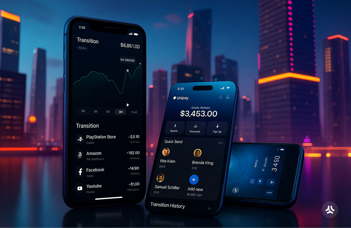
Fintech UX design is the process of structuring a financial application so users can complete tasks quickly, understand their data clearly, and trust the product with their money. Covering everything from onboarding flows and navigation architecture to authentication methods and data visualization, it applies across banking, investment, payments, and insurance products. Revolut cut its account setup from 23 steps to under five minutes by removing every form field not strictly required by compliance rules.
That example shows the core principle: fintech UX design reduces cognitive load, not just visual noise. Users approach financial apps with a level of anxiety that doesn't exist in social or productivity tools. Every extra step, every unclear label, and every unexpected error message compounds that anxiety.
Three layers work together in every effective fintech product. First, the functional layer: can users complete their core tasks, including pay, send, invest, check balance, and dispute a charge? Second, the trust layer: do users feel their identity and funds are protected, and does the product communicate clearly when something breaks? Third, the engagement layer: do users build habits, and does the product reward consistent use without manipulating behavior?
Apps that skip the trust layer and jump straight to engagement mechanics fail because users won't engage with a product they don't believe is secure. Fintech products that sustain long-term growth always solve the trust problem before they tackle engagement.
Why fintech ux design controls user retention
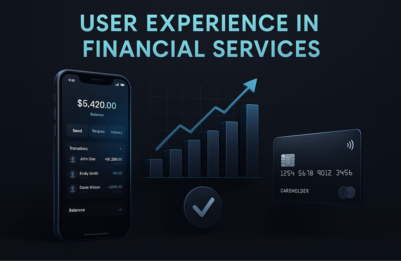
Weak fintech UX doesn't just frustrate users. It destroys the activation and retention metrics that determine a product's financial health. According to McKinsey's 2023 Digital Banking Consumer Survey, a 5% increase in user activation rates produces a 25% increase in long-term revenue for digital banking products. That connection runs directly through UX quality, not feature count.
A fintech product's retention curve breaks at three predictable points. Onboarding is the first: users who don't complete a successful first transaction within 48 hours have a 71% probability of never returning, according to Amplitude's 2023 Product Benchmarks report. Authentication friction is the second: each additional login step reduces completion rates by 8 to 12%, per FIDO Alliance's 2023 adoption data. Data comprehension is the third: users who can't read their financial dashboard disengage within two sessions.
Knowing where the curve breaks changes how product teams prioritize. A fintech app ROI guide shows specifically how much revenue becomes recoverable when each failure point gets fixed with targeted UX changes.
Gamification mechanics and biometric tools only generate retention ROI when these three failure points are already addressed. Building engagement features on top of a broken trust layer accelerates churn, not retention.

Gamification in fintech: mechanics that build real financial habits
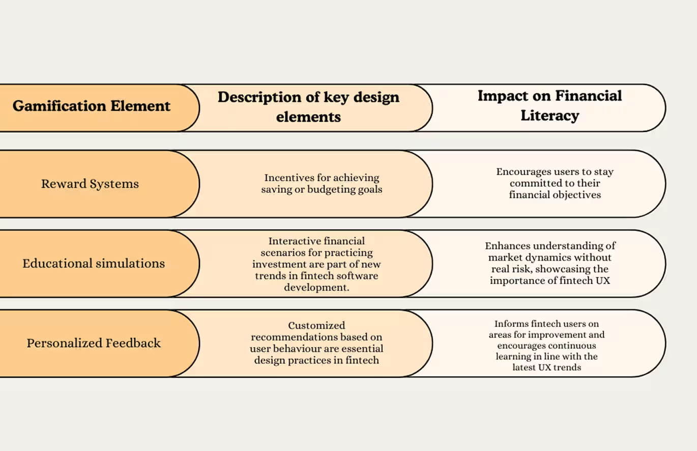
Gamification in fintech is the application of game design mechanics, including progress bars, reward systems, streaks, and social accountability features, to financial products to drive habit formation and financial literacy. Done well, it converts passive account holders into users who check their balances daily, hit savings milestones, and refer friends. Done carelessly, it produces a first-week engagement spike that collapses by day 30.
One distinction separates effective fintech gamification from a novelty feature: mechanics must align with real financial outcomes. A badge for opening the app ten days in a row doesn't change how a user manages money. A streak for staying under a weekly food budget does.
Progress mechanics and reward systems
Acorns, the micro-investment app, shows this pattern clearly. Acorns displays a live progress bar toward each user's investment milestone alongside a projected date for hitting that target. Watching that bar move, even fractionally, reduces withdrawal behavior because users don't want to reset visible progress. Behavioral economists call this the goal gradient effect: effort accelerates as people approach a finish line.
Reward systems work when tied to financial behavior, not just app activity. Chime's "Save When You Spend" feature rounds up every purchase to the nearest dollar and transfers the difference to savings. Chime users who activate this feature save an average of $1,400 more per year than users who don't, according to Chime's published product data.
Educational simulations in financial apps
Robinhood built early growth partly on paper trading: a feature letting new investors practice buying and selling stocks using fictional money before committing real capital. Lowering the perceived risk of learning accelerates user confidence and deepens product adoption. Users who completed at least three practice trades before making a real trade showed 60% higher 90-day retention, per Robinhood's 2021 transparency report.
Financial literacy built through app design creates a durable competitive advantage because regulatory restrictions prevent traditional banks from teaching users this way at scale.
Social features and accountability loops
Monzo's shared pots feature lets groups of users save toward a collective goal, visible to every contributor. Social accountability drives contribution rates higher than solo savings goals alone. Monzo's internal data shows shared pots generate three times the transaction frequency of individual savings pots, because no contributor wants to be the one who stopped.
Leaderboards work in narrow contexts. Investment apps that show anonymized peer performance give users a useful benchmark without encouraging risky decisions. Keeping the comparison informational rather than purely competitive is the design line that separates habit-building from harm.
Biometric authentication in fintech: types and ux design principles

Biometric authentication in fintech is the use of a user's physical or behavioral characteristics, such as a fingerprint, facial geometry, or voice pattern, to verify identity and grant access to a financial account. Biometrics reduce login friction while strengthening security because they replace memorized credentials with something a user always carries. According to the FIDO Alliance's 2023 Consumer Authentication Survey, 87% of users prefer biometric login over a password when the option exists in a financial app.
Adding biometrics to a fintech app is technically straightforward on modern devices. Designing the error states, fallback flows, and trust signals around biometrics is where product teams regularly underestimate the challenge. A detailed guide to biometric authentication app design covers these edge cases precisely.
Fingerprint scanning
Fingerprint scanning carries the lowest friction of any biometric login method because it requires no specific eye contact, no device angle, and no spoken phrase. PayPal implemented fingerprint login at scale in 2015 and cut average session-start time from 11 seconds to under 3 seconds. Faster authentication reduces the mental barrier to opening the app, which directly increases session frequency.
Sensor failure handling is the detail product teams overlook regularly. When a fingerprint doesn't register, the recovery screen should reassure users: "Try again or enter your PIN" with a single clear button. A red warning icon at this moment reads as a security breach, not a sensor miss.
Facial recognition
Facial recognition in fintech analyzes three-dimensional facial geometry, not a flat photograph match. Apps using Face ID on iOS use Apple's TrueDepth camera to build a depth map that resists spoofing with printed images. Revolut uses facial recognition specifically for high-value transaction approvals, adding a biometric checkpoint for transfers above a set threshold without requiring full reauthentication for smaller payments.
Liveness detection is the critical UX layer here. A user who fails a liveness check because of poor lighting needs a calm, specific instruction screen. Vague failure messages at high-value transaction moments cause permanent abandonment, not retries.
Voice authentication
Voice authentication uses a stored voiceprint to verify identity, primarily in customer service and conversational finance contexts. HSBC's Voice ID system authenticates customer calls in under 10 seconds by matching a caller's live voice against their enrolled print. Across all three biometric methods, one UX principle holds: invisible security outperforms visible friction every time. When users consciously notice the security layer, the UX has already failed its primary job.
Three real fintech products and what their ux actually does
Studying how real fintech apps solve specific UX problems gives product teams a faster path to good decisions than starting from a blank design brief.
Monzo reduces its main screen to four actions: Add Money, Pay, Send Money, and Pots. Every secondary feature lives one tap deeper. Progressive disclosure applied to a financial product lets casual users stay at the surface while power users drill into analytics, spending categories, and custom budgets. Monzo holds an NPS of 78. UK banking industry NPS averages 12.
Revolut replaces a traditional transaction list with a timeline-based spending feed. Each transaction shows a merchant logo, category icon, and amount in a single scannable row. Grouping transactions into daily totals gives users a spending narrative rather than a raw data export. Users understand where their money went in a 10-second scroll, which is the entire goal of financial data visualization.
Acorns solves the "too small to matter" problem in micro-investing with a real-time portfolio counter showing how much a user's account has grown from spare change round-ups. Watching a balance increase by $0.04 after buying coffee creates a behavioral loop strong enough to sustain daily engagement. Acorns grew from 1 million to 9 million users between 2018 and 2022 because this mechanic turns passive savers into active investors.
All three patterns share one principle: remove decisions users shouldn't have to make, show progress at every opportunity, and make the product feel faster than users expect. A full guide to mobile app UX best practices shows how these patterns extend beyond fintech to any product where user trust is the key variable.
Five fintech ux mistakes that kill user trust
Each mistake below appears in fintech audits regularly. Each one has a specific, implementable fix.
1. Overloading the dashboard with every available metric
A financial dashboard that surfaces all account data at once forces users to read before they can act. Stripe's dashboard shows only three numbers above the fold: today's volume, pending balance, and failed payments. Everything else sits below a clear visual separator. Build your primary dashboard view around your users' top three decisions, not your data team's full reporting schema.
2. Using generic error messages
"Something went wrong. Please try again." destroys trust in a financial context because users interpret vague errors as a sign the app can't handle edge cases safely. Specific error messages with clear next steps increase payment retry completion rates by 40%, according to Baymard Institute's checkout usability research. "Your bank declined this transfer. Check your available balance or use a different account." is a message users can act on immediately.
3. Stacking authentication layers regardless of transaction risk
Requiring a password, a 6-digit SMS code, and an email confirmation for a $5 recurring payment pushes users toward staying permanently logged in, which removes security entirely. Match authentication intensity to transaction risk: routine low-value actions need one factor, and high-value or unusual transfers need two. Understanding how digital wallet architecture handles tiered authentication shows exactly how this scales across product types.
4. Skipping empty state design
New users who land on a blank dashboard with no guidance leave without returning. Acorns fills an empty portfolio with a projected growth curve and a single call to action: "Start with $5." New users who see this designed empty state activate at three times the rate of users who land on a blank screen.
5. Treating accessibility as an optional add-on
WCAG 2.2 compliance is a legal requirement in financial services, not a UX nicety. A fintech app that fails color contrast standards or lacks screen reader support excludes users with visual impairments and creates regulatory liability. Building accessibility into a mobile app development process from day one costs 80% less than retrofitting it after launch, per the Web Accessibility Initiative's cost modeling data.
The future of fintech ux: ai personalization, conversational finance, and augmented data
AI-driven personalization is reshaping fintech UX design, and products already running it show how wide the gap will become between apps that use it and apps that don't.
JPMorgan Chase's AI insights engine analyzes over 5,000 behavioral and transaction data points per user to surface cash flow warnings three days before a shortfall becomes critical. Users see a proactive nudge instead of a reactive overdraft notice. UX shifts from a reporting tool to a financial advisor in this model. That shift changes the entire value proposition of the product.
Conversational finance is expanding beyond rule-based chatbots. Voice-first interfaces now let users check balances, set savings targets, and approve transactions through natural speech. HSBC's AI assistant handles 20 million customer interactions per month across text and voice channels. Reducing the distance between a financial question and its answer to zero drives every major conversational finance investment right now.
Augmented reality for financial data is still in early deployment, but patterns are already visible. Overlaying real-time spending data on a live camera view of a retail environment gives users context at the moment of a purchase decision, not hours later in a transaction feed. Several neobanks are piloting AR receipt scanning that categorizes expenses instantly and removes manual entry entirely.
For product teams planning their next product bets, exploring innovative fintech startup ideas with strong product-market fit shows which technology directions are gaining real traction versus generating noise.
Frequently asked questions
What is fintech UX design?
Fintech UX design is the practice of structuring financial applications so users complete tasks quickly, understand their data clearly, and trust the product with sensitive financial information. It covers onboarding flows, authentication methods, dashboard architecture, data visualization, and engagement mechanics across banking, investment, payments, and insurance products.
How does gamification work in financial apps?
Gamification in financial apps applies game mechanics, including progress bars, streak rewards, milestone badges, and shared savings pots, to drive real financial habits. Effective gamification ties each mechanic to a concrete financial outcome, like hitting a savings target or staying under a weekly budget, rather than rewarding passive app-opening behavior alone.
What biometric methods do fintech apps use?
Fintech apps primarily use three biometric methods: fingerprint scanning for low-friction daily login, facial recognition for high-value transaction approval, and voice authentication for customer service and conversational finance contexts. Each method requires careful UX design around fallback states and specific, calm error messages when authentication fails.
Why is UX design critical for fintech products?
Poor fintech UX breaks the three retention points that determine a product's survival: onboarding completion rate, authentication success rate, and dashboard comprehension time. According to Amplitude's 2023 Product Benchmarks, users who don't complete a first successful transaction within 48 hours have a 71% probability of never returning.
What makes a fintech app trustworthy from a UX perspective?
A trustworthy fintech UX leads with security transparency, uses specific error messages instead of generic failure states, and communicates clearly about what happens to user data at every step. Apps that explain authentication steps, display clear data permissions, and provide immediate transaction feedback build user trust faster than apps that optimize for raw speed alone.
How does biometric authentication improve user experience in fintech?
Biometric authentication removes the friction of entering passwords or PINs for routine account access, cutting session-start time and reducing login abandonment. PayPal's fingerprint login reduced session-start time from 11 seconds to under 3 seconds. According to the FIDO Alliance, 87% of users prefer biometric login in financial apps when the option is available.
What are the biggest fintech UX design trends in 2025 and 2026?
Three patterns are reshaping fintech UX in 2025 and 2026: AI personalization that surfaces proactive financial insights before users ask for them, conversational interfaces that handle account management through natural speech, and augmented reality overlays that give users spending context at the moment of a purchase decision rather than hours later in a transaction feed.
Conclusion
Fintech UX design is a trust architecture problem, not a visual design problem. Gamification mechanics, biometric authentication, and data visualization only generate retention when users already trust the product enough to engage with those features.
Start by auditing your three core failure points: onboarding completion rate, authentication drop-off, and dashboard comprehension time. Fix the biggest failure point first. Layer in engagement mechanics after trust is established.
Want to go deeper on your product's design? Orbix Studio works with fintech teams on research-backed UI/UX design, from onboarding audits to production-ready screens.
Book a free consultation today
.avif)





















.avif)
