
Table of Contents

In design bootcamp, you were taught to chase "pixel-perfect" as the gold standard. But in the real world of early-stage startups, that advice is actually dangerous. It leads to scope creep, late nights, and designers polishing the wrong things.
You can fix this by applying the 80/20 Rule to your daily routine. This principle suggests that you get 80% of the desired impact by focusing on just 20% of the effort. It’s about ruthless prioritization: shipping the right work first, and realizing that not all pixels are created equal.
In this guide, we’ll walk you through the specific steps to apply the 80/20 rule in UX design. You’ll learn exactly how to build a "Vital Few" list in Google Sheets and separate the critical paths from the noise.
What the 80/20 Rule Actually Means in UX

Imagine looking at your to-do list and realizing you can cross off 80% of it without anyone noticing. Sounds crazy? It is actually the secret to working smarter, not harder. The 80/20 rule states that a tiny amount of your effort creates most of your results.
In UX, this means that 80% of your user’s happiness comes from just 20% of your features.
Think about an app like Instagram. Millions of people use it every day, but what do they actually do? They scroll the feed, they post a photo, and they maybe send a message. That is maybe 5% of the code. But that tiny part is the only reason they open the app.
The numbers are not always exact. Sometimes it is 90/10, and sometimes it is 70/30. The specific ratio does not matter here. What matters is the imbalance. Not all pixels are created equal.
Now, I know what you are thinking. "If I ignore the small stuff, am I just being lazy? Am I shipping half-baked work?" Let’s be clear. This is not an excuse to do a bad job. It is not about ignoring your users. It is about ruthless prioritization.
The goal is not to make every pixel perfect. The goal is to make the vital pixels perfect.

The 4-Step Pareto Process for UX Teams
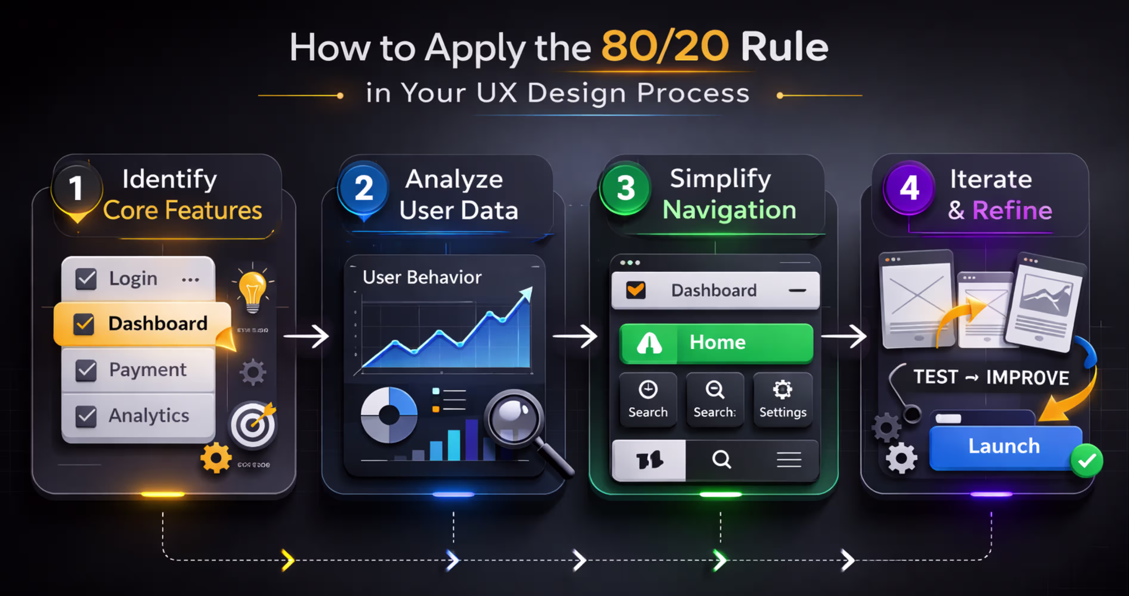
Applying the 80/20 rule to your product requires a systematic approach. Here is a four-step process that any product team can execute, whether you are a 3-person startup or a 50-person enterprise team.
Step 1: Audit Feature Usage
You need to start with the facts, not your gut feeling. Open your analytics tool, like Mixpanel or Amplitude, and look at the data from the last 90 days. You want to see how people are actually using your product.
Once you have the numbers, sort the list. You will quickly see that a few features have huge numbers and the rest have very small ones.
But what if you do not have fancy analytics tools? You can still find the answers. Look at your support tickets to see which features cause the most questions. Check your search logs to see what people are trying to find. You can even send a simple five-question survey to your users.
Just remember that imperfect data is better than no data at all. You need a starting point to make smart decisions.
For every feature, write down four numbers:
- How many people use it daily?
- How often do they click it?
- Do they finish the task?
- How much time do they spend there?
Step 2: Map User Value
Just because people use a feature does not mean it is valuable. They might visit a "Settings" page often because it is confusing, not because it helps them. You need to combine your usage numbers with how users actually feel.
Look at your interview notes, satisfaction surveys, and feedback scores. You are looking for the features that people use often and actually love. Those are your critical 20%.
To make this clear, you can map your features into a simple list. This helps you see exactly where to focus your energy.
Step 3: Prioritize the Critical 20%
Look at the list you just made. You will likely find that only about 5 to 8 features are doing the heavy lifting. Even if you have 50 features in your app, these few are the ones driving most of the value.
These are your new primary targets. You need to shift your time and budget to focus on them. Allocate 80% of your design and engineering resources to making these specific features exceptional.
This does not mean you ignore the rest of your product. You still fix bugs and keep things running. But you must choose where to invest your deepest effort. You are deciding what to make perfect and what to simply keep functional.
Step 4: Optimize Relentlessly
Now that you know your critical features, you need to make them perfect. Do not just settle for "good enough." Run usability tests specifically on these flows to find where users get stuck.
You should measure everything. Look at load times, error rates, and how many people finish the task. Then, make changes and test again. Iterate weekly instead of waiting months for a big launch.
The goal is to make these features so good that users cannot imagine leaving your app.
Where Else the 80/20 Rule Applies in UX
The Pareto Principle extends far beyond feature prioritization. Experienced UX teams apply it across multiple dimensions of product design to find the biggest levers for improvement.
Once you stop treating every screen and interaction as equal, you can spot high-impact opportunities everywhere.
Navigation Paths
Typically, 80% of user navigation flows through just 20% of your pages or screens. You need to find those high-traffic paths and make them as frictionless as possible. If you shave one click off a path that 10,000 users use daily, you have eliminated 10,000 moments of frustration every single day.
Support Issues
You might find that 80% of your support tickets are generated by just 20% of your usability problems. Fix the top 5 issues and you will dramatically reduce your support costs. This is one of the easiest wins because the data is already sitting right there in your ticket system.
Conversion Drivers
Usually, 80% of your conversions are driven by just 20% of your onboarding touchpoints. You need to identify which specific moments in the user journey make people sign up. Invest your time and testing budget into those specific experiences. You can leave the low-impact pages alone while you A/B test the critical ones.
Error Types
Most of the time, 80% of user errors are caused by 20% of your interface elements. Things like confusing form validation, ambiguous buttons, and unclear labels are usually the culprits. Fix these repeat offenders and your overall error rates will drop quickly.
Common Mistakes When Applying the 80/20 Rule
The Pareto Principle is powerful but frequently misapplied. It is easy to misunderstand math or use the rule as an excuse for laziness. Here are the most common mistakes designers make and how to avoid them.
Treating 80/20 as exact numbers: The ratio is directional, not mathematical. Your product might actually show a 70/30 split or even a 90/10 split. The principle is simply that a small percentage of inputs drives a large percentage of outputs. Do not waste time arguing about whether the numbers are exactly 80 and 20. Focus on the imbalance instead.
Ignoring the long tail: Just because a feature is used by only 5% of users does not mean it should be removed. That feature might be the exact reason those 5% chose your product over a competitor. API integrations, accessibility features, and enterprise compliance tools often sit in the long tail but serve critical user segments. Always validate with qualitative research before you deprioritize them.
Applying pareto to aesthetics: The 80/20 rule applies to functionality and user value, not to visual design. You cannot skip designing 80% of your screens just because they are not in the top tier of importance. Every screen a user encounters must meet basic quality standards. The Pareto Principle guides where you invest the most effort, not where you invest zero effort.
One-time analysis: Your 80/20 distribution shifts as your product evolves and your user base grows. You need to run this analysis quarterly, not just once. Features that were niche at launch may become critical as your market expands. What was in your top 20% two years ago might have been replaced by newer capabilities today.
How Orbix Studio Uses the 80/20 Rule to Design Better Mobile Apps
At Orbix Studio, the 80/20 rule is embedded in how we approach every mobile app project. When a startup or business comes to us with an idea, our first step is identifying the core value proposition and the smallest set of features needed to deliver it.
We run discovery workshops to map out the full feature landscape, then use data, user research, and competitive analysis to isolate the critical 20%. Our Figma design process starts there. We build and prototype the core experience first, test it with real users, and iterate before expanding to secondary features.
Our design systems in Figma are built around high-impact components. Our handoff process flags priority levels for developers. And our product strategy sessions always start with the same question: what is the 20% that will make this app indispensable?
This approach helps our clients launch faster, spend smarter, and build products that users actually love. It is not about doing less. It is about doing the right things exceptionally well.
Final Thoughts
The 80/20 rule for feature prioritization pairs perfectly with the 60/30/10 rule for visual design. Where Pareto tells you what to prioritize functionally, the 60/30/10 rule tells you how to allocate visual weight. Together, they ensure that your most important features receive both the deepest UX investment and the strongest visual emphasis.
In practice, this means your critical 20% of features should command the primary screen real estate. These features get the consistent patterns and the bright accent colors that guide the user’s eye. Meanwhile, the long-tail features can live in secondary navigation with muted styling. They are available when needed, but they do not distract from what matters most.
You do not have to boil the ocean to build a great product. Focus your energy on the vital few, make them beautiful, and let the rest fall into place.
Frequently Asked Questions
What does the 80/20 rule mean in UX design?
The 80/20 rule in UX design means that approximately 80% of user activity and value comes from 20% of an app's features or screens. It guides designers to prioritize the most impactful elements and give them the most prominent placement, polish, and usability attention.
How do I find the 20% of features that matter most?
Use analytics tools like Mixpanel or Amplitude to identify which screens and actions users engage with most frequently. If you are pre-launch, conduct user interviews, study competitor apps, and run usability tests to form a hypothesis about core features.
Can I use the 80/20 rule for content strategy, not just features?
Yes, absolutely. Usually, 20% of your blog posts or help articles will bring in 80% of your traffic. Focus your writing efforts on those high-performing topics. Update your best content regularly instead of writing new posts that nobody reads.
Does the 80/20 rule work for B2B enterprise software?
It works even better for enterprise tools because power users often rely on specific workflows. Identify the key reports or data views that executives check daily. Optimize those specific views for speed and clarity, and you will keep your biggest clients happy.
How do I convince my boss to focus on fewer features?
Show them the data. Create a simple chart showing that a few features drive most of the engagement. Explain that polishing these vital features will increase retention more than building ten new ones that nobody will use.
Should I apply the 80/20 rule to my design system components?
Definitely. You likely use 20% of your components - like buttons, inputs, and cards, on 80% of your screens. Make sure these core components are flawless and accessible. The obscure components can wait until you actually need them.
What if my data is messy and I cannot run a full analysis?
You do not need perfect data to start. Talk to your customer support team and ask what users complain about most. Fixing the top three complaints will usually solve the majority of your user experience problems.


.avif)