


.svg)

%201%201.svg)
Biometric Authentication in Apps: The Complete UX Design Guide

- Your fingerprint never leaves your device — apps only get a pass or fail signal from iOS or Android, never your biometric data.
- Ask users to enable biometric login after their first successful login, not during signup opt-in rates are significantly higher.
- Always include a password or PIN fallback biometrics fail regularly due to lighting, wet fingers, and sensor issues.
- The OS controls the biometric prompt, not your app your design job is the timing, framing, and fallback, not the screen itself.
Biometric authentication in apps uses your fingerprint or face to verify your identity instead of a password. It is best added after a user's first login, should always be optional, and must include a password or PIN as a fallback. The biometric data never leaves the user's device the app only receives a pass or fail signal from the operating system.
If you design mobile apps, you’ve already worked with biometric login. Fingerprint and face authentication are everywhere now, and users expect them to just work.
The problem is, biometric authentication is easy to add and easy to mess up. It lives right at the start of the experience, where users decide whether an app feels fast, safe, or broken. Small UX decisions here make a big difference.
This guide is about designing biometric authentication in apps the right way. We’ll cover how it works at a high level and how to design login flows .
Why do apps use biometric authentication?
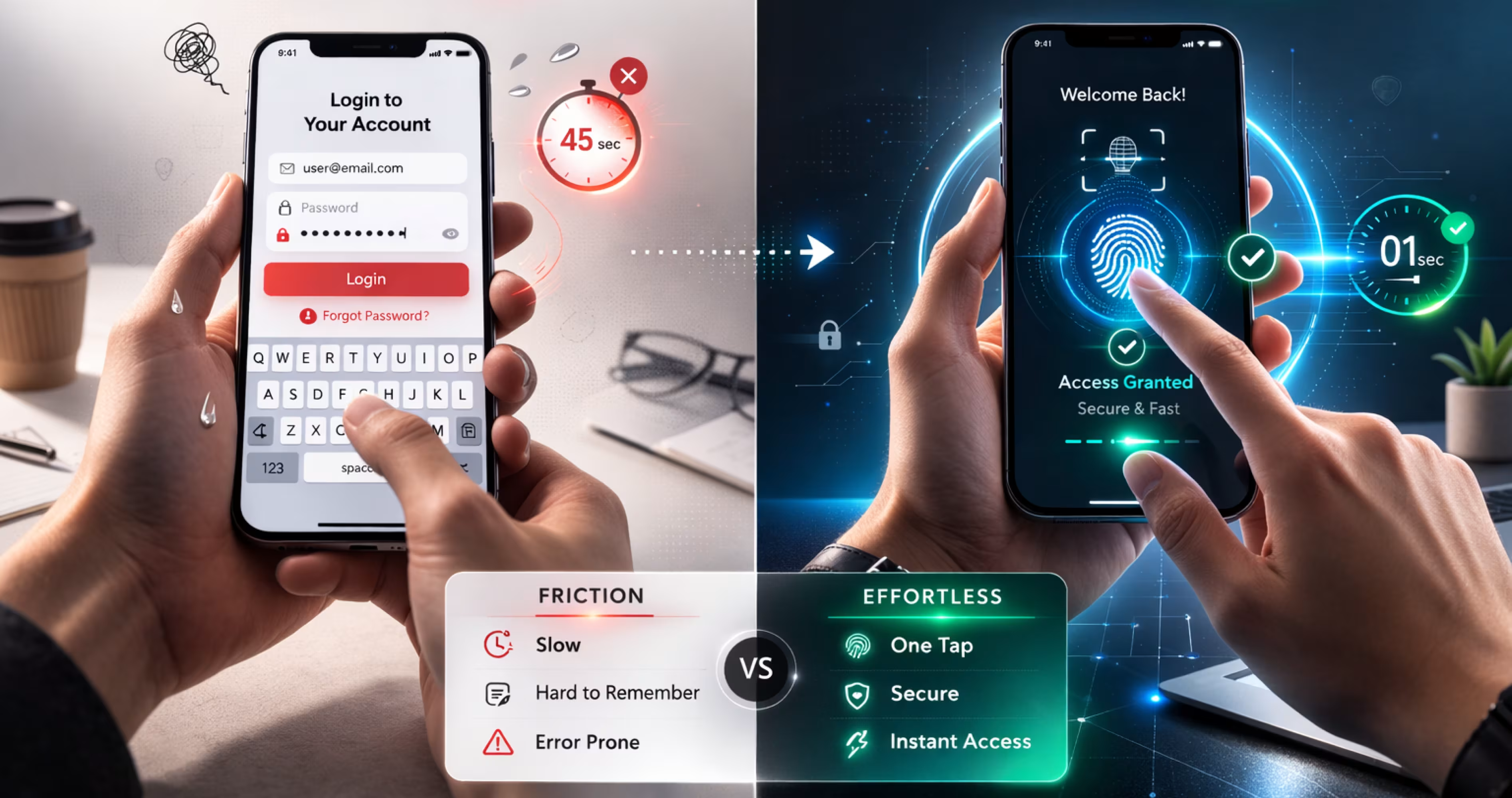
Biometric authentication replaces passwords with physical traits fingerprint, face scan, or iris that the device verifies entirely on-device. The app never receives your biometric data; it only receives a pass or fail signal from the iOS or Android operating system. This is why biometric login is both faster and structurally more secure than a password for repeat access.
Biometric authentication is a way to confirm who someone is by using their body, not their memory. This usually means a fingerprint or face scan. Instead of typing a password or PIN, the device checks these signals and decides if access should be allowed.
Passwords don’t work well in daily life. People forget them, reuse them, or choose weak ones. PINs and patterns add extra steps but don’t always make things safer. When security feels hard, people look for shortcuts.
Biometric authentication reduces this problem. It lets people unlock devices and apps quickly without needing to remember anything. This makes secure actions easier to complete, and security only works when people actually use it.
Why do some users distrust biometric login?
Even when biometric authentication works perfectly from a technical standpoint, some users still resist enabling it. Understanding why is essential for designing an onboarding experience that actually converts.The most common fear is data storage.
Many users believe their fingerprint or face scan is being uploaded to a company server somewhere. This is not how it works, but the misunderstanding is widespread. Your design has to address this directly, not assume users know the technical reality.A second concern is permanence. Passwords can be changed if they are compromised.
A fingerprint or face cannot. Users who understand this are often more hesitant than those who do not think about it at all.The third concern is surveillance. Particularly for users in certain regions or demographics, providing biometric data even to an app they trust feels like a step they cannot take back.
How to design for this: The answer is not to explain the technology in detail. It is to show users they are in control. Make enabling biometrics opt-in, show a one-sentence plain-language assurance at the moment of decision, and make it just as easy to turn off as it was to turn on. Trust is built by giving control, not by providing documentation.
Why do some users distrust biometric login?
Most users who resist enabling biometric login fear their fingerprint or face scan is being uploaded to a server it isn't. The operating system handles the match on-device. Designing for this means surfacing a plain one-sentence assurance at the moment of decision: "Your fingerprint stays on your phone. We never see it." Not in a settings menu. Right there, before they decide.
Even when biometric authentication works perfectly from a technical standpoint, some users still resist enabling it. Understanding why is essential for designing an onboarding experience that actually converts.The most common fear is data storage.
Many users believe their fingerprint or face scan is being uploaded to a company server somewhere. This is not how it works, but the misunderstanding is widespread. Your design has to address this directly, not assume users know the technical reality.A second concern is permanence. Passwords can be changed if they are compromised.
A fingerprint or face cannot. Users who understand this are often more hesitant than those who do not think about it at all.The third concern is surveillance. Particularly for users in certain regions or demographics, providing biometric data even to an app they trust feels like a step they cannot take back.
How to design for this: The answer is not to explain the technology in detail. It is to show users they are in control. Make enabling biometrics opt-in, show a one-sentence plain-language assurance at the moment of decision, and make it just as easy to turn off as it was to turn on. Trust is built by giving control, not by providing documentation.
Biometric authentication types used in mobile apps today
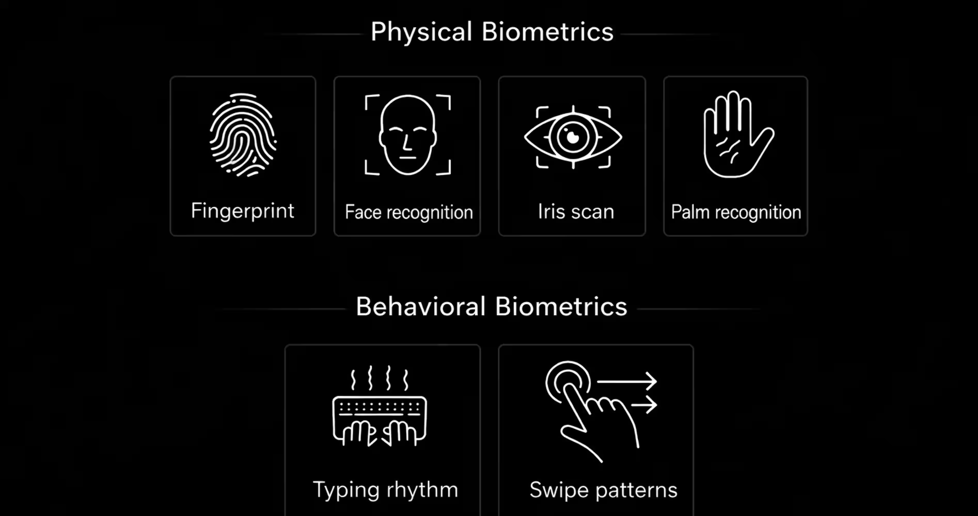
This four biometric authentication types used in consumer apps are fingerprint recognition, face recognition, voice recognition, and iris scanning. Fingerprint and face ID dominate because they require no special hardware beyond a standard smartphone sensor. Voice and iris scanning appear in niche high-security or accessibility contexts, not everyday app login flows.
Biometric authentication is not just one method. There are different types, and each one works in its own way. Usually, biometrics fall into two main groups: physical biometrics and behavioral biometrics. Both are used to confirm who someone is, but they rely on different kinds of signals.
Here is a quick comparison of the most common biometric methods used in mobile apps today:
Physical biometrics
Physical biometrics use physical characteristics of a person. These are traits that stay mostly the same over time and are easy for devices to capture. This is the most common type of biometric authentication used on phones and personal devices.
Fingerprint Recognition: Fingerprint authentication scans the patterns on a person’s finger and compares them to a stored reference. It’s fast, familiar, and works well for everyday use. That’s why it’s widely used for unlocking phones, apps, and payments.
Face Recognition: Face recognition uses the structure of a person’s face to confirm identity. Modern systems don’t just look at a photo, then analyze the depth, shape, and movement. This method works well when hands-free access is needed, but it depends more on lighting and camera quality.
Iris or Eye Scanning: Iris recognition uses patterns in the eye that are highly unique. It’s very accurate, but less common in consumer devices. This is because it requires specific hardware and careful positioning. You’ll usually see this in high-security environments rather than everyday apps.
Hand or Palm Recognition: Some systems use the shape of the hand or palm veins to identify users. These are reliable but less practical for mobile devices. That’s why they’re not widely used in phones.
Behavioral biometrics
Behavioral biometrics focus on how a person behaves, rather than how they look. These signals are gathered over time instead of in a single scan.
Typing and Interaction Patterns: Some systems look at how a person types, swipes, or interacts with a device. Speed, pressure, and rhythm can form a behavioral pattern that helps detect unusual activity. This is often used quietly in the background to spot potential fraud.
Designing biometric authentication in apps
The three rules of biometric authentication UX design: offer it after the first successful login not during signup make enabling it a single opt-in ask, and always show a visible fallback to password or PIN. Apps that prompt for biometrics during signup see measurably higher abandonment than those that introduce it after the user already has an account and understands the app.
Now that the basics are clear, we can focus on what actually matters: designing biometric authentication in real apps. This is where security, usability, and trust meet, and small design decisions start to have a big impact on user experience.
When should an app use biometric login?
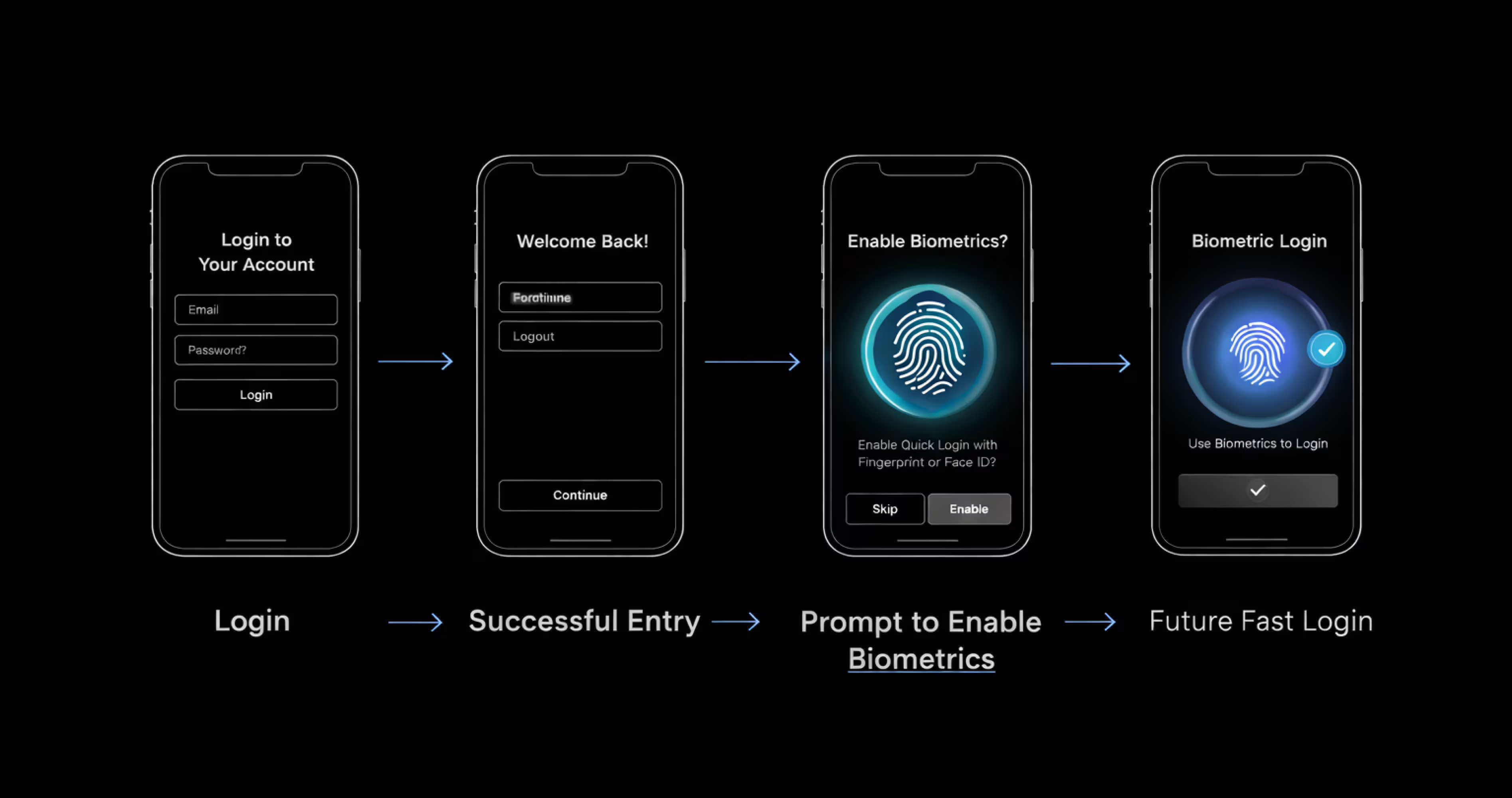
If you’re planning to add biometric login to your app, it helps to understand one simple thing first: Biometric login is primarily about reducing friction. While it can give a sense of security, its main value in apps is helping users get back in quickly once trust is already established.
During the first login, users are still deciding if they trust the app. They expect clear steps like passwords, OTPs, or verification messages. At this stage, biometric login usually doesn’t help because users want to see what’s happening and feel in control.
Biometric login works best after that first login. Once users already have an account and know the app, they don’t want to repeat the same steps every time. Using a fingerprint or face scan makes getting back in faster and easier.
Security level matters here, too. For simple, everyday actions, biometric login works well. But for sensitive actions like changing account details, users often expect extra security. Using only biometrics in those cases can make people feel uncomfortable.
Always make biometric login optional
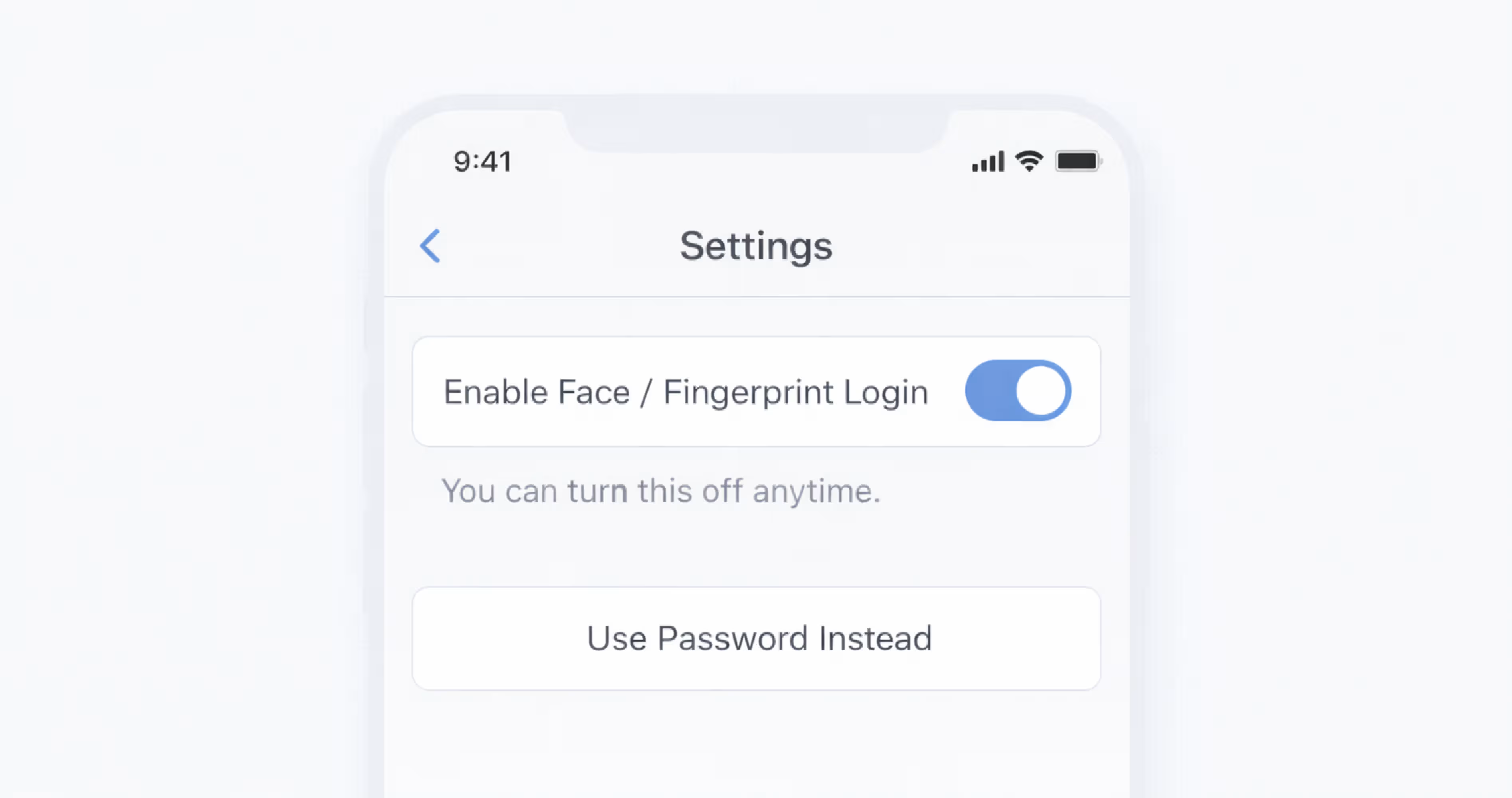
Biometric login should never be the only way to access an app. From a design perspective, forcing biometrics almost always creates more problems than it solves.
Some users don’t want to use biometrics at all. They may worry about privacy, or they may simply prefer using a password or PIN. When users feel forced to use biometrics, trust goes down instead of up.
Biometrics also don’t work for everyone. Some people can’t use fingerprints or face recognition reliably because of physical reasons. A good design makes sure these users can still log in without trouble.
Even when users want to use biometrics, devices don’t always work perfectly. Sensors fail, lighting changes, or the system doesn’t recognize the user. When that happens, users need another clear way to log in.
That’s why apps should always offer another option, like a password or PIN. This keeps users in control and makes login feel reliable instead of restrictive.
How to ask users to turn on biometric login
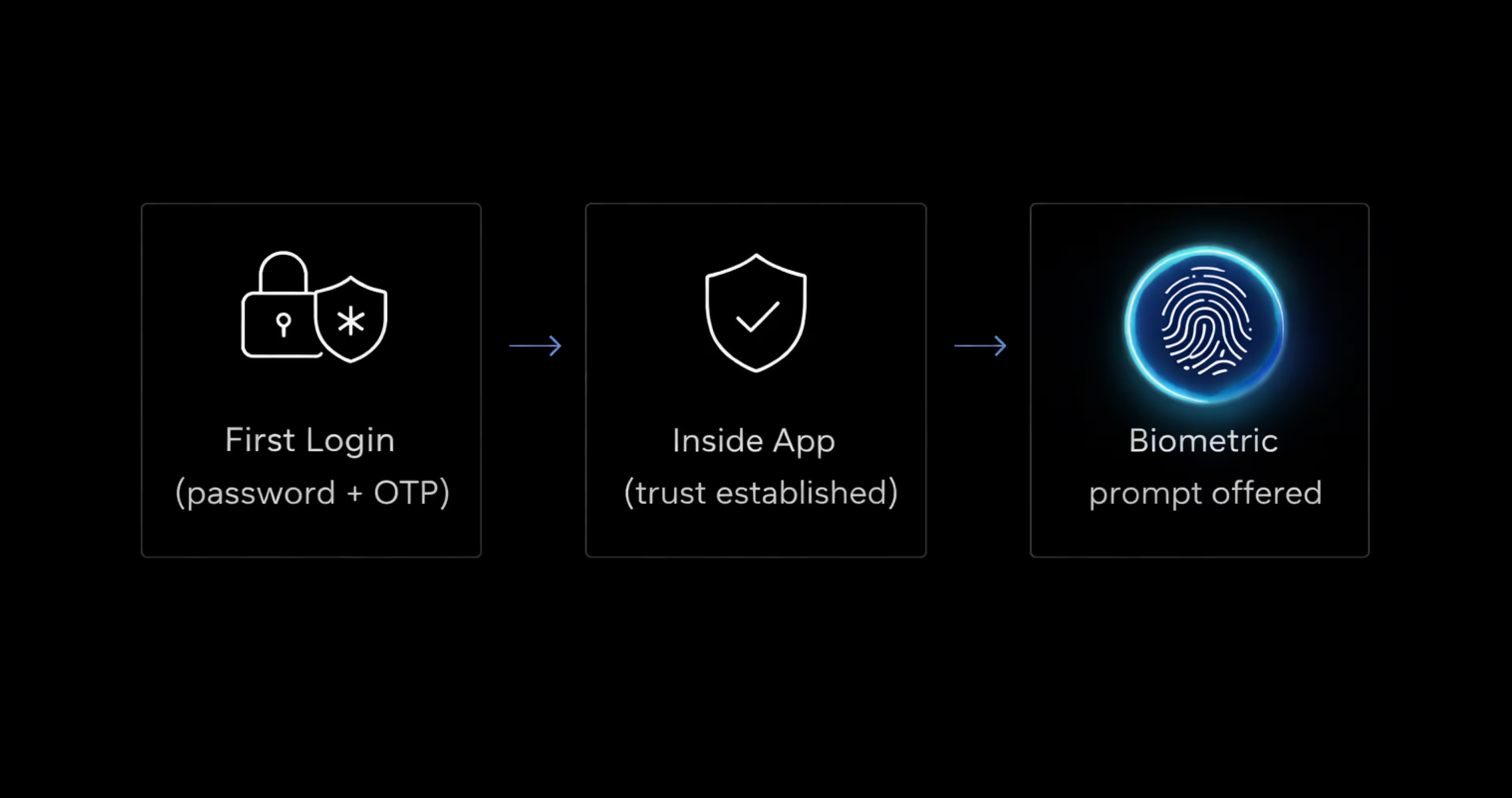
The best time to ask users to turn on biometric login is after they’ve logged in successfully. At that point, they understand the app and can clearly see why faster login would be useful.
Asking too early doesn’t work well. During sign-up, before login, or right after an error, users are still figuring things out. In those moments, a biometric request can feel confusing or pushy instead of helpful.
When you ask, keep the message short and optional. Users should feel like they’re choosing this, not being forced into it. Simple wording works best, like:
- “Use fingerprint or face login to sign in faster next time?”
- “Turn on biometric login for quicker access.”
- “You can change this later.”
The main goal is to give users control. When the timing feels right and the choice is clear, users are much more likely to enable biometric login.
What to do when biometric login fails
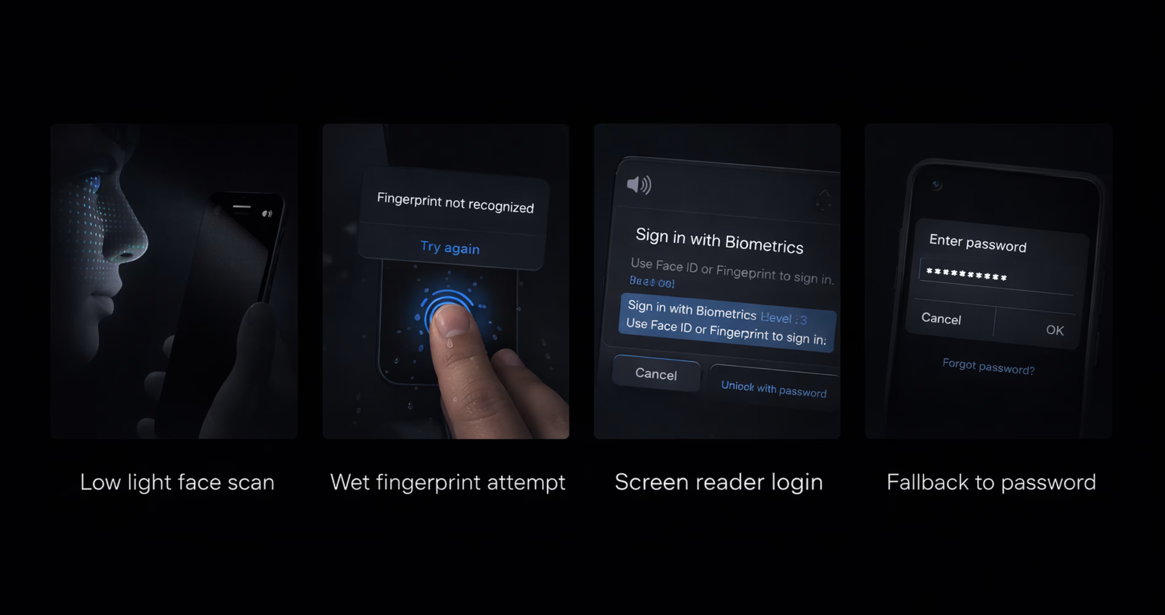
Biometric login can fail due to various reasons, such as fingers not scanning correctly, faces not being detected, or changes in lighting. None of this means that something is broken. It just means the system couldn’t be sure this time.
Because failure is expected, the design has to assume it will happen. Let users retry once or twice, but don’t trap them in a loop. Repeated retries feel frustrating fast and make the app feel unreliable.
What matters most is the fallback. When biometrics don’t work, users should immediately see another way in - a password, a PIN, or an email link. This option shouldn’t be hidden or treated like a last resort. It’s part of the normal flow.
Using biometrics for different security levels
Not everything in an app needs the same level of security. Some actions are low risk, while others need a bit more protection. Biometrics work best when they’re used only where they actually add value.
For simple things like browsing content or checking information, asking for biometrics again usually isn’t needed. Once users are inside the app, stopping them repeatedly can feel annoying.
For actions like updating profile details or changing settings, a quick fingerprint or face check can make sense. It confirms it’s really the user without slowing them down too much.
For sensitive actions like payments or changing important account details, extra confirmation is expected. In these moments, biometrics work well because users already expect an extra step for safety.
Designing biometric login with privacy in mind
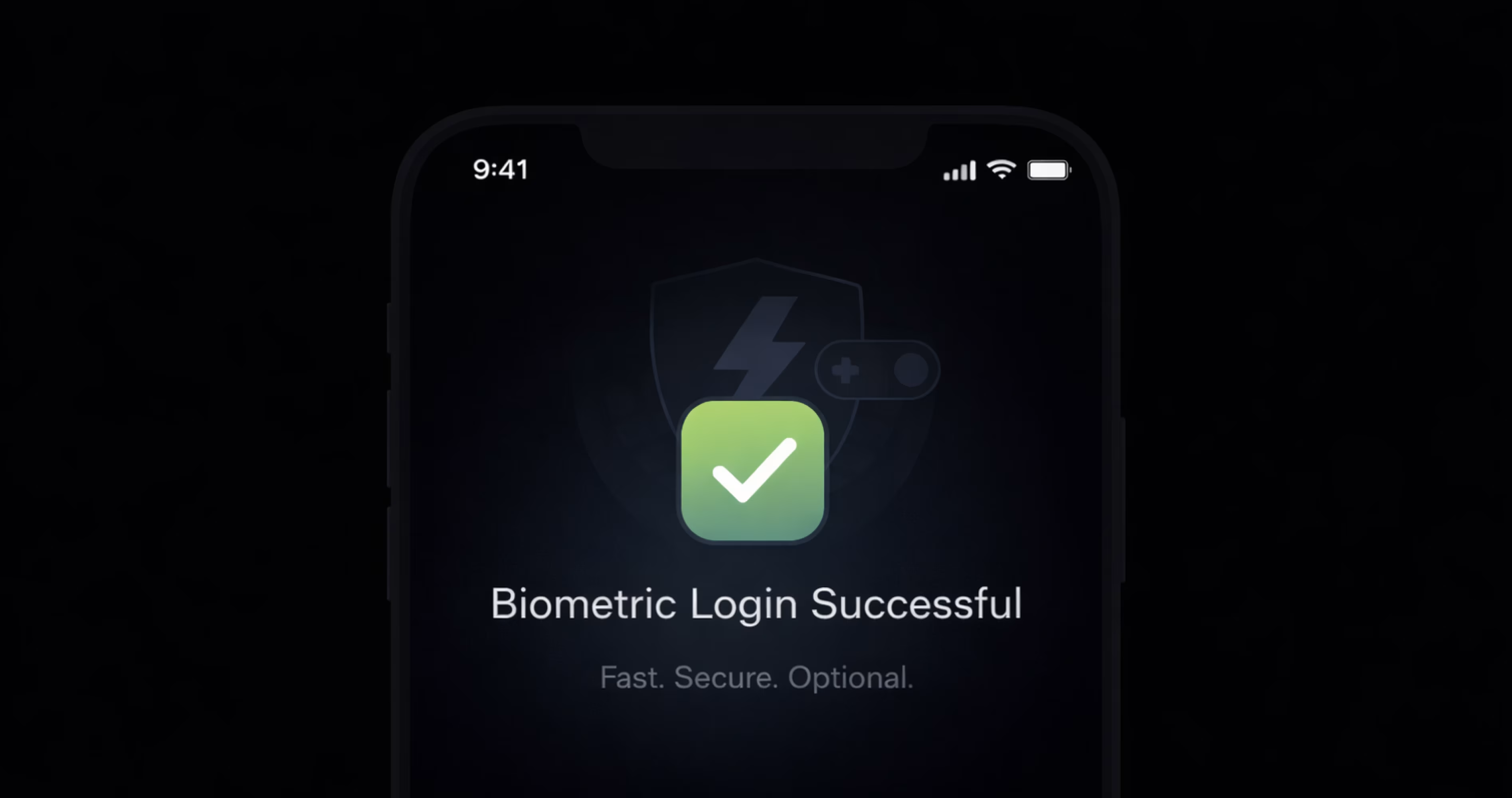
When apps ask for biometric login, many users worry about one thing: what happens to their fingerprint or face data. They don’t think about how technology works. They just want to know if their data is safe.
Designers don’t need to explain technical details. What matters is explaining things in a way users can easily understand. Users want clear answers, not long explanations or legal language.
A short, direct message builds trust quickly. Something like, “Your fingerprint stays on your phone. We never see it,” is often enough to remove doubt. It tells users what they care about in plain words.
Privacy information should appear at the moment users are deciding, not hidden in settings or policies. When users understand what’s happening, they feel more comfortable turning biometric login on.
Make biometric login accessible for everyone
Biometric login is convenient, but it doesn’t work for everyone all the time. Some users can’t use fingerprint or face recognition because of physical conditions, injuries, or temporary situations.
Others may struggle because sensors fail, or the lighting is poor. A good design assumes these cases will happen.
Accessibility also means thinking about how different users move through the login flow. People using screen readers still need to understand what’s happening and how to continue. If the login flow relies too heavily on biometric interactions, it quickly becomes confusing or unusable.
This is why visible alternatives matter. Passwords, PINs, or email links should always be easy to find and easy to use. When biometric login doesn’t work, users should be able to continue without stopping to figure out what went wrong.
Common biometric ux mistakes that cost you users
The common biometric UX mistake is hiding the fallback treating the password or PIN option as a last resort rather than a visible, normal path. When users can't immediately find an alternative after a failed fingerprint or face scan, trust drops and session abandonment follows. The fallback should be one tap away, always visible, never labeled as "having trouble?"
Biometric UX problems don’t come from technology. They come from design decisions that ignore how people actually behave when logging in. These mistakes show up again and again, and once you see them, they’re hard to unsee.
Common mistakes designers should avoid:
- Forcing users to set up biometrics: Pushing users to enable biometrics during sign-up or blocking progress until they do usually backfires. It creates pressure instead of trust and makes users defensive.
- Hiding fallback options: Making passwords or PINs hard to find sends the wrong message. Fallbacks aren’t a failure - they’re part of a healthy login flow. If users can’t see them easily, frustration builds fast.
- Repeating failed biometric prompts: Showing the same biometric prompt over and over after failure feels broken. A couple of retries is fine. After that, users need a clear way forward.
- Locking users out too quickly: Aggressive lockouts after a few failures punish normal behavior. Biometrics fail for many harmless reasons. Lockouts should be rare, not the default response.
iOS vs Android biometric ux: platform rules designers must follow
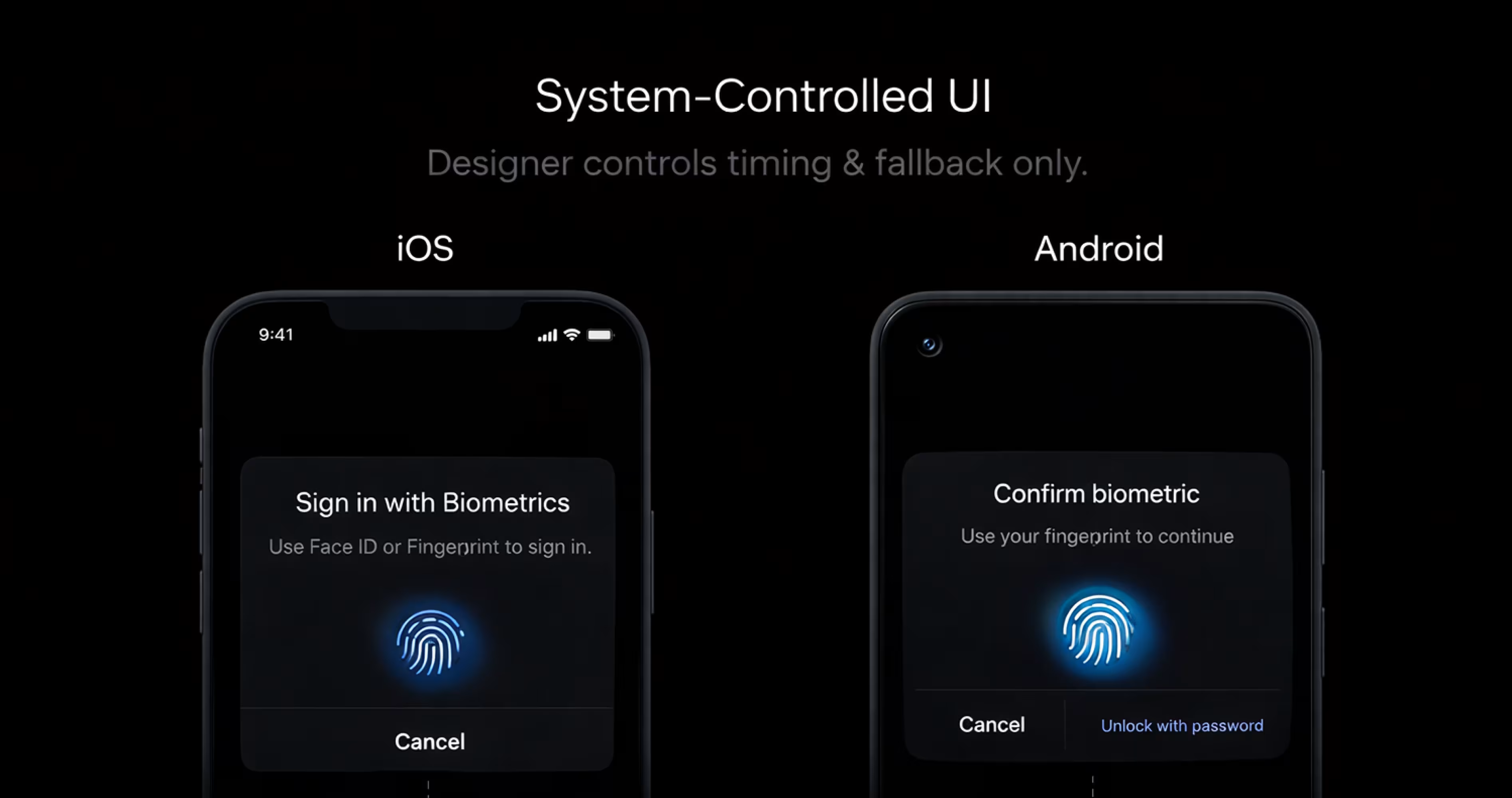
Biometric authentication doesn’t work the same way across platforms, and designers don’t have full control over it. Most of the biometric experience is owned by the operating system, not the app. Knowing these rules helps you design flows that feel correct instead of fighting the platform.
iOS for face id and touch id
On iOS, the Face ID and Touch ID biometric prompt is entirely controlled by Apple's system designers choose when to trigger it, not what it looks like. Android uses the Biometric Prompt API the same way. Neither platform allows custom biometric UI overlays; apps that attempt to replace the system prompt risk App Store rejection.
Your design work is in the setup, the fallback, and the framing not the prompt itself. That setup, fallback, and framing is also where most of the UI/UX design effort goes in a biometric login project.
As a designer, you’re not expected to design the biometric screen itself. Apple wants users to see the same trusted system prompt everywhere. Custom biometric screens on iOS usually raise trust issues and can even get rejected during review.
Your role on iOS is to decide:
- When the system prompt appears
- How do you explain biometrics before asking
- What happens after success or failure
Android: biometric prompt
Android works in a similar way but with more device variety. Apps use the Google Android Biometric Prompt, which provides a system-level biometric dialog.
The prompt may look slightly different depending on the device, but the rules are the same. Designers shouldn’t replace it with a custom UI. Users trust the system prompt because it feels consistent across apps.
On Android, designers should focus on:
- preparing users before the prompt appears
- handling different outcomes clearly
- making fallback options easy to access
How to test biometric authentication ux
The important biometric UX test is deliberate failure trigger failed scans on purpose and verify the fallback path appears within two taps. Test in poor lighting, with wet fingers, at unusual angles. Biometric UX failures are discovered in failure states, not success states. If users hesitate for more than two seconds after a failed scan, the fallback isn't visible enough.
Biometric login often looks fine in ideal conditions, but real users don’t live in ideal conditions. Testing is about finding the moments where things break, confuse users, or slow them down. That’s where most biometric UX problems actually come from.
Things to test before shipping:
Testing failure cases on purpose: Let biometric login fail and see what the user sees. Check whether messages make sense, retries feel reasonable, and the next option is obvious
Testing in bad lighting or noisy places: Try low light, bright light, background noise, awkward angles, or wet fingers. These situations happen all the time and often reveal problems hidden in clean test environments.
Accessibility testing: Some users can’t use fingerprint or face recognition reliably. Make sure the app still works smoothly with other login methods and doesn’t block or frustrate them.
Testing fallback flows: When biometrics don’t work, users should move to passwords, PINs, or email links without hesitation. If fallback feels hidden or slow, the experience breaks quickly.
Testing recovery after errors: Watch what users do after something goes wrong. Do they know what to try next, or do they pause and hesitate? That moment tells you a lot about your design.
Frequently Asked Questions
Is biometric authentication safe?
Yes, for everyday use, it’s considered safe. It adds a layer of protection and makes access harder for someone else, especially compared to weak or reused passwords.
Does an app store my fingerprint or face?
No. Apps don’t receive your fingerprint or face data. The system only tells the app whether authentication succeeded
What happens if the biometric login fails?
If it fails, the app should offer another way to log in, like a password or PIN. Biometric failure is normal and expected, so a fallback is always part of the design.
Can users turn biometric login off later?
Yes. Users should always be able to turn it off from app settings or device settings. Biometric login is meant to be optional, not permanent.
Is biometric login better than passwords?
It’s not better in every situation. Biometrics are great for quick access, while passwords are still important for first-time login and account recovery. Most apps use both together.
When should an app first prompt users to enable biometric login?
After the first successful login, not during signup or onboarding. At that point users understand the app and can see why faster re-entry is useful. Prompting during signup before trust is established consistently produces lower opt-in rates and higher abandonment than a post-login ask.
How does biometric authentication work differently on iOS and Android?
On iOS, Face ID and Touch ID use Apple's LocalAuthentication framework the system prompt is standardized and cannot be customized. Android uses the BiometricPrompt API with similar constraints. On both platforms the app receives only a pass or fail result; your biometric data never leaves the device operating system.
Final Thoughts
Designing biometric authentication is mostly about the edge cases. We talked through when to use it, when to avoid it, how to handle failure, and how to keep users in control. Getting these right makes a big difference in how trustworthy the app feels.
The main idea is simple: biometric authentication works best when it saves time without taking control away from users. It should help users get back into the app quickly, not make them stop and think.
If you’re designing or improving a biometric login, start small. Add it after the first login, keep the wording clear, test what happens when it fails, and always include a fallback. Try it yourself in real situations and see how it feels.







.svg)
.svg)


.svg)







.avif)



.svg)

