
Table of Contents

Using a bad app feels like trying to open a door that says "pull" when you really need to "push." It’s frustrating, and it makes you want to close the app forever. But using a great app? It feels like magic. You just tap, swipe, and get done exactly what you want.
That invisible "magic" is called UX (User Experience). UX is simply about making things work perfectly for normal humans. And the best apps in the world, like Spotify, Airbnb, and Google, use a set of golden rules of UX design to build products that feel completely effortless to use.
In this guide, we’ll walk through the 10 golden rules of UX design. You’ll see how top apps use them every single day, and how you can steal these same tricks to make your own designs make sense
What is UX Design?
UX (User Experience) is the process of making sure a website or app works perfectly and makes sense for real humans. It’s about the logic and the flow, not just how it looks.
People often mix up UX and UI, but they are two totally different things:
- UI (User Interface) is how a product looks - think colors, buttons, and pretty fonts.
- UX (User Experience) is how a product works - like where those buttons go and what happens when you tap them.
You can have an app with a beautiful UI, but if the checkout button is hidden and it takes ten minutes to buy something, the UX is terrible.
Think of building an app like building a house. UI is the paint on the walls and the fancy furniture. UX is the floor plan. Without a good floor plan, you're just sitting in a pretty room with no doors. Now that we've got that out of the way, let's get to the rules.

Where Do the Golden Rules of UX Come From?
These rules aren't just random tips from modern designers. They are based on decades of research on how human brains actually process information.
Back in the 1980s, computers were incredibly difficult to use. A researcher named Ben Shneiderman watched people struggle with clunky early software and wrote down 8 basic rules to fix the chaos. Later in the 1990s, a usability expert named Jakob Nielsen created a famous 10-point checklist for good design.
Think about it: the technology we use has thoroughly changed since then. We went from giant desktop monitors to tiny touchscreens in our pockets. But human brains? They haven't changed at all. We still get confused by the same things, we still make the same mistakes, and we still hate feeling lost.
That’s why Nielsen and Shneiderman golden rules are still the gold standard today. Their original lists are brilliant, but they use some pretty heavy academic words. In this guide, we took their science and translated it into plain English.
The 10 Golden Rules of UX Design
Good user-centered design takes all the guesswork out of using a product so people can achieve their goals without a headache. Here are the 10 golden rules to help you build apps and websites that feel completely effortless.
1. Strive for Consistency
Human brains are pattern-matching machines. They expect things to work the same way every single time.
When buttons, colors, and words behave consistently across an app, users don't have to relearn the interface on every new page. They build a mental model fast and feel confident navigating without thinking.
To get this right, you need to keep your visuals, words, and layouts completely predictable. The same color should always trigger the same action. The same word should always mean the same thing. and your navigation menus should always live in the same spot.
The goal isn’t just to make things look neat. It’s about reducing the mental effort required to use your product.
Case in point:
Look at Spotify. Every single play button across the entire app is a green circle with a white triangle. It looks the same whether you are looking at a song, a podcast, or a massive playlist.
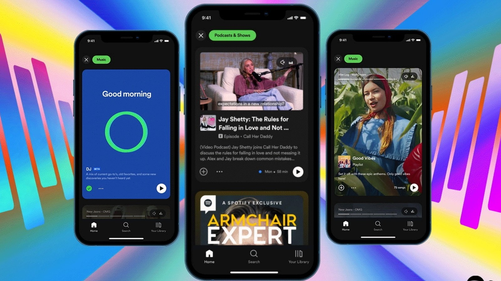
Because the design never changes, users never have to guess how to start their music. They just tap and go.
Why?
Consistency builds deep trust. When an app behaves as expected, users feel safe and controlling their experience.
What goes wrong without it:
Users lose trust and start second-guessing every click. Imagine a banking app that says "Transfer" on one screen and "Send Money" on the next. It creates instant anxiety - even if the button does the same thing behind the scenes.
2. Enable Shortcuts for Power Users
When you first open an app, you need easy steps to help you learn. But once you use it every day, you just want to go fast.
Great design gives both types of people exactly what they need. You do this by hiding "fast tracks" under the normal buttons. Think of keyboard shortcuts, swiping, or saved templates. The trick is to keep these fast tracks hidden so new users don't get confused, but keep them there for daily users who want to skip the slow steps.
Think about an app you use all the time. On day one, clicking through menus is fine because you are just learning. But by day one hundred, clicking those same menus just feels slow and annoying. Gmail does a great job with this.
New users will use their mouse to click the "archive" button to clear an email. But someone who uses Gmail every day just presses the "E" key on their keyboard. Gmail hides over 30 keyboard shortcuts behind a little "?" button.
A beginner doesn't even notice it. But a daily user relies on it to finish their emails ten times faster. Both people get the same thing done, but the daily user gets to skip the slow parts.
What goes wrong without it:
Without shortcuts, you force people who use your app every day to do slow, beginner clicks forever. They will get frustrated and eventually leave to find a different app that doesn't waste their time.
3. Offer Informative Feedback
Every action a user takes needs a clear response. If someone clicks a button, the app needs to immediately tell them what happened.
Silence is incredibly confusing. When you press an elevator button, it lights up so you know the system heard you. Digital products need to do the same thing.
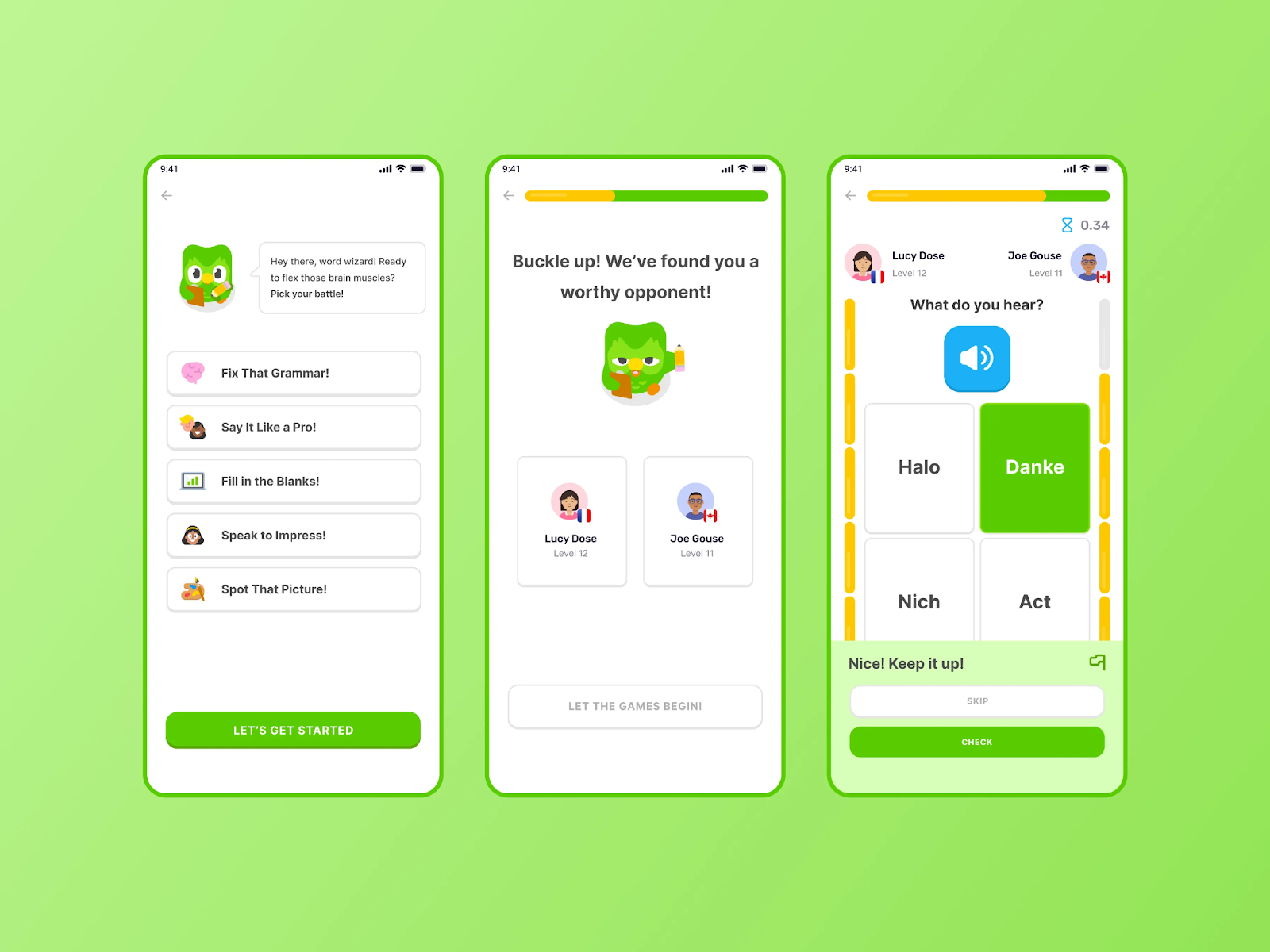
Whether a file is uploaded, a payment is processed, or a password is typed wrong, the system should always show what is happening and what to expect next. This can be a simple loading spinner, a green checkmark, or a clear error message. Duolingo does an amazing job of making you feel heard.
When you get an answer right, the screen instantly flashes green and plays a happy sound. When you get it wrong, the box gently shakes and shows you the correct answer. You never have to guess if your click is registered. Even your XP counter animates at the end of a lesson so you physically feel your progress, instead of just seeing a number change.
What goes wrong without it:
Users click buttons twice, submit forms multiple times, or just leave. Imagine clicking "Place Order" on a checkout page and nothing happens for three seconds. You will probably click it again out of panic, which can easily lead to a double charge on your credit card.
4. Design for Error Prevention
The best error message is the one that never shows up. Instead of yelling at users when they make a mistake, good design stops the mistake from happening in the first place.
Think about baby-proofing a house. You don't wait for a toddler to touch a hot stove and then say, "No!" You put a guard on it so they can't reach it in the first place. Digital products need the same kind of guardrails.
You can do this by limiting the choices people can make. If a box only takes numbers, don't let them type letters. If an action is permanent, like deleting an account, ask, "Are you sure?" before it happens. You can even use smart defaults to pre-fill boring stuff, like their country or currency, so they have fewer chances to mess up. Google Forms does a brilliant job of stopping mistakes before they happen.
If you create a date field, it gives the user a calendar popup. They physically cannot type "February 30th" because that day doesn't exist on the calendar.
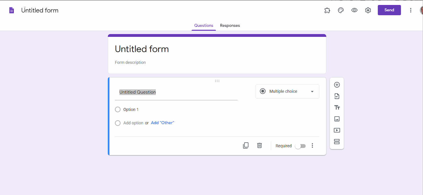
If you mark a question as "required," the submit button stays grayed out and unclickable until they actually type an answer. The app gently forces them to do it right the first time.
What goes wrong without it:
Users make costly mistakes and blame your app. Imagine typing out your whole shipping address and credit card info, hitting "Pay," and then seeing a red error message because you forgot to add your zip code. That kind of frustration is enough to make people abandon their cart entirely.
5. Make Actions Reversible
People are terrified of making permanent mistakes. The easiest way to fix that fear is to make every important action reversible.
When users know they can easily undo something, they stop being scared. They explore more, they click more buttons, and they feel much safer using your product.
Think about it like drawing a picture. If you are using a permanent marker, you draw very slowly and carefully because one slip-up ruins the whole page. But if you are using a pencil with a good eraser, you draw freely and confidently because you know you can always correct a mistake. Apps need to act like a pencil.
Sending an email used to feel like using a permanent marker. Hitting that "send" button was a moment of panic. What if you forgot to attach the file? What if you sent it to the wrong person? Gmail completely removed that panic with "Undo Send."
After you hit send, Gmail gives you a short window of time to take it back. That tiny little button turns a terrifying action into a completely safe one. It doesn't just help you correct mistakes - it actually gives you the confidence to write and send emails faster in the first place.
What goes wrong without it:
Users become overly cautious and hesitant. If deleting a file means it's gone forever with no trash can to recover it from, people will be too scared to organize their files at all. Or worse, they accidentally delete something important, lose their data, and never trust your app again.
6. Keep Users in Control
Nobody likes being trapped. If you walk into a store and the doors lock behind you, you instantly panic. Digital products should never feel like that. Your user should always feel like they are driving, not just along for the ride.
This means they always need a clear way out. If they start filling out a long form, there needs to be a highly visible "Cancel" button. If they sign up for your emails, the "Unsubscribe" link should be easy to find. Good design gives people the freedom to change their mind, tweak their settings, and leave whenever they want.
Some apps try to force you to do things their way. Notion takes the opposite approach. Instead of giving you a rigid, pre-built layout, Notion hands you a blank screen. You decide how to organize your pages, what goes in your sidebar, and what notifications you actually want to see.
If you don't like something, you can hide it, move it, or delete it. That feeling of total ownership over your own workspace is a huge reason why people love the app so much.
What goes wrong without it:
You end up using what designers call "dark patterns." This is when an app makes it intentionally challenging to cancel a subscription or impossible to exit a screen. You might trick a few people into staying, but it destroys your brand's trust forever. Users feel manipulated, and they will go straight to social media to warn others to never use your product.
7. Reduce Cognitive Load
The human brain can only handle a few pieces of information at once. Great UX strips away the noise so users don't have to think too hard to figure things out.
Think of your brain like a computer with very little RAM. If you open 20 heavy tabs at the same time, the computer freezes. The same thing happens to people when they open an app and see a massive wall of text, dozens of buttons, and complicated menus. Their brain freezes, and they leave.
The solution is to show less stuff at a time. You can break long forms into tiny steps, hide complex settings until they are needed, and leave plenty of space so the screen feels easy to read. Apple is the absolute master of this.
When you set up a new iPhone, you aren't hit with a giant checklist of 20 things to do. Instead, Apple gives you one single question per screen. "What's your name?" Tap next. "Pick a Wi-Fi network?" Tap next. It’s the same 20-step process, but it feels completely effortless because your brain only has to process one small thing at a time.
What goes wrong without it:
Decision paralysis. If you put 15 form fields on a checkout page all at once, people will stare at it, feel overwhelmed, and abandon their cart. They probably would have bought the product if you just asked for their email first, and their credit card later.
8. Design for Accessibility
Good UX means making sure everyone can use your product, no matter how they interact with it.
Accessibility isn't a special bonus feature you add at the very end of a project. It is the foundation of good design. You have to plan for people who might be colorblind, have trouble reading small text, or can't use a mouse.
There is a famous design concept called the "curb cut effect." A curb cut is that little ramp carved into the edge of a sidewalk. It was originally built to help people in wheelchairs cross the street. But it also massively helps parents pushing strollers, delivery workers pulling heavy carts, and kids riding bicycles. Everyone benefits from the ramp.
Digital products work the same way. Take video captions on social media. They were created for people who are deaf or hard of hearing. But today, a huge number of people use them just because they are sitting in a quiet room or scrolling on a crowded train without headphones.
If you make your text easy to read and your buttons big enough for someone with shaky hands to tap, you aren't just helping a specific group. You are secretly making the app easier for every single person to use while holding a coffee or walking down the street.
What goes wrong without it:
You accidentally lock out a massive amount of people. About 1 in 4 adults lives with some sort of disability. If your app is hard to read or impossible to navigate without a mouse, you lose those users forever. Beyond just being bad for business, it can actually get you into legal trouble in many countries.
9. Use Visual Hierarchy
When someone opens your app, they aren't going to read every single word. They are going to scan it. Visual hierarchy is how you guide their eyes to the most important thing on the page without making them think.
Think of it like a tour guide for your eyes. You use size, color, and spacing to say, "Look here first, then look here, and ignore this part." The biggest, brightest thing on the screen should always be the most important action the user needs to take.
Imagine opening an online shoe store. If the "Buy Now" button is the same size and gray color as the "Read our shipping policy" link at the bottom of the page, your brain freezes for a second. You have to manually look around and figure out what to do next.
But if that "Buy Now" button is a giant, bright pink block, and the shipping policy is tiny, light-gray text, you instantly know what to click. The design did the heavy lifting for you.
What goes wrong without it:
Users scan the page, get overwhelmed, and leave. When everything looks the same size and weight, nothing feels important. It's like walking into a room where ten people are shouting at you at once - you just want to walk out.
10. Design for the User, Not Yourself
You are not your user. It doesn't matter whether you think a feature looks cool or makes perfect sense to you. If the person using it gets confused, the design is wrong.
Founders and designers often fall in love with their own ideas. They build things based on what they would want, using words they understand. But users don't care about your vision. They just want to solve their problem as fast as possible and get on with their day.
Good design means leaving your ego at the door. You have to stop guessing what people want, and start watching what they actually do. Instagram is a great example of putting the user first, even when it stings.
A while back, the Instagram team decided to change the feed so it wasn't in chronological order anymore. They thought it was a great idea. But real users hated it - they just wanted to see their friends' newest posts first.
Instead of ignoring the complaints, Instagram listened. They eventually added back the chronological feed. They didn't let their own internal pride win. Not only that, but they let the users win.
What goes wrong without it:
You end up with a beautiful product that nobody actually uses. You might spend months building a fancy feature that you think is brilliant, but if your users ignore it or find it annoying, it's completely useless. Users don't care how hard you worked on it - they only care if it makes their life easier.
Common Mistakes Beginners Make and How to Fix Them
Even if you memorize the UX design rules, it’s easy to stumble when you actually start building. At Orbix, we see the same beginner mistakes ruin good products all the time.
Here are the most common ones and how to fix them:
Designing for yourself instead of the user: You assume people will "just get it" because you built it. You can fix this by watching three real people try to use your app before you launch it. You will be shocked by where they get stuck.
Skipping feedback states: A user clicks a button and nothing happens, so they click it five more times. To fix this, add simple loading spinners, color changes, or success messages so they know the app heard them.
Ignoring mobile users: You build a beautiful design on a large computer screen, but the buttons are way too tiny for a phone. Fix this by starting with designing for the smallest screen first. Make sure every button is easy to tap with a thumb.
Cramming too much on one screen: You try to put all your important information "above the fold" and end up with a messy wall of text. The fix: Use more white space. Give your elements room to breathe, and let users scroll.
Using clever jargon: You use fancy internal company words instead of plain English. Fix this by writing your buttons and menus using the words your customers actually say in real life.
How to Apply These Rules in Your Own Project
You don't need to be a professional designer to start using these rules today. You just need to change how you look at your product. Here is a simple, step-by-step way to apply these rules to your own website or app:
1. Watch Real People Use It
Don't just ask your friends if your app looks good. Ask them to complete a specific task, like finding a product or signing up, and don't help them. You will instantly see where they get confused and which buttons they miss. That confusion is where you need to start fixing things.
2. Delete the Clutter
Look at your main screen and ask yourself, what is the one thing I want the user to do? Once you figure that out, remove everything else that doesn't help them do it. More space and fewer options instantly make an app feel easier to use.
3. Check for Silence
Go through your product and click every single button. Does the screen change? Does a loading spinner appear? If nothing happens to tell you the click worked, you need to add visual feedback so users don't panic and click it five times.
4. Rewrite Your Text Out Loud
Read your buttons, menus, and error messages out loud. If you sound like a robot or a legal document, rewrite it. Use the plain-English words your customers would use in a normal conversation.
Final Thoughts
The golden rules of UX design provide a reliable framework for building mobile apps that are intuitive, consistent, and genuinely useful. From user-centered research to accessible interfaces, consistent design systems, and data-driven iteration, each rule addresses a specific dimension of what makes digital products succeed.
These principles become most powerful when they are embedded into your workflow, your Figma files, and your team culture. They are not theoretical ideals. They are practical tools that reduce rework, improve user satisfaction, and accelerate product growth.
At Orbix Studio, we help startups and product teams apply these principles from concept to launch. Reach out to build a mobile app experience your users will love.
Frequently Asked Questions
Do the golden rules ever conflict with each other?
Yes, frequently. For example, adding power-user shortcuts can clutter the interface for beginners. When rules conflict, prioritize based on your specific user: daily professionals need speed, while first-time users need clarity.
Are these rules still relevant in the age of AI-driven interfaces?
Absolutely. Technology changes, but human psychology doesn't. In AI, "feedback" means confirming it heard you, and "error prevention" means suggesting corrections. The rules are about human behavior, not just pixels.
How do you know which golden rules your product is currently breaking?
Run a silent user test and watch for hesitation, or do a screen-by-screen heuristic audit. For a faster, expert diagnosis, Orbix Studio offers professional UX audits to catch blind spots you might miss.
Do the golden rules apply differently depending on the industry?
The rules are universal, but their priority shifts. Fintech needs heavy error prevention to avoid costly mistakes. Healthcare needs extreme clarity. E-commerce needs a strict visual hierarchy to drive sales.
What is the most commonly broken golden rule?
"Design for the user, not yourself." Creators suffer from the "curse of knowledge" - you know your app too well to see what's confusing. It requires external user testing to fix this blind spot.
If you could only follow three of the golden rules, which three matter most?
Design for the user (don't build the wrong thing), offer informative feedback (silence feels broken), and use visual hierarchy (make the next step obvious). These three prevent the biggest product failures.
How do UX design rules apply to mobile app design?
Mobile apps have unique constraints like smaller screens, touch-based interaction, and variable network conditions. UX design rules help mobile designers prioritize content, simplify navigation, ensure accessible touch targets, and create interfaces that work within these constraints while remaining intuitive.
What is the difference between UX design rules and UI design guidelines?
UX design rules focus on the overall user experience, including research, usability, information architecture, and interaction design. UI design guidelines focus specifically on visual presentation, including typography, color, spacing, and component styling. Both work together to create effective products.


