Helion
.svg)
Simplifying Parcel Shipping with Modern Tracking and Management
Our task was to add longevity to two of Roland's lead gen campaigns, 'Sounds like me' and 'Find your rhythm'. To keep audiences engaged and click-through rates high, they needed new creative assets for performance testing but had limited resources.
A solar brand that felt harder to connect with
Helion stood for innovation, trust, and sustainability, but the brand didn’t make those qualities feel clear right away.
- Too technical: The brand language leaned more toward complex solar tech.
- Not warm enough: It lacked the kind of visual warmth that helps a clean energy feel welcoming.
- Trust wasn’t immediate: Since solar is a serious investment, the identity needed to create confidence.
- The system felt incomplete: The brand needed a clearer visual system that could carry consistently
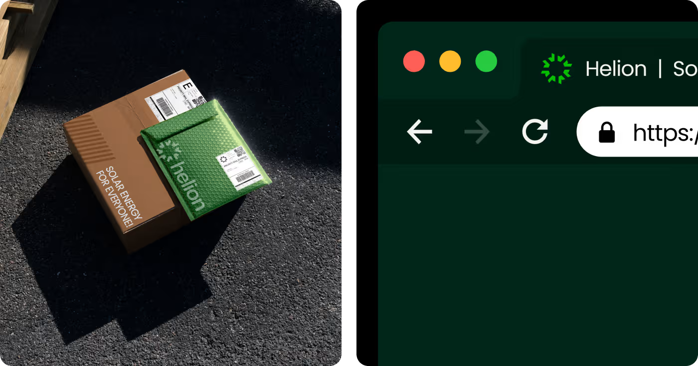
Turning a technical category into something people could connect with
We built Helion’s identity around clarity, warmth, and recognition, so the brand could feel more approachable without losing its sense of innovation.
- Changed the tone of the category: Instead of leaning into a cold solar-tech look, we gave the brand a more open and human presence.
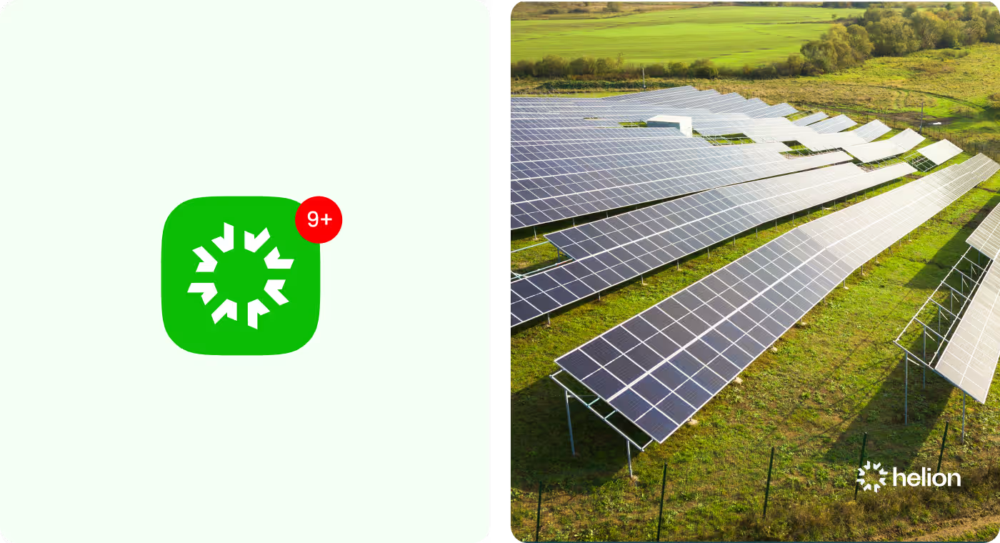
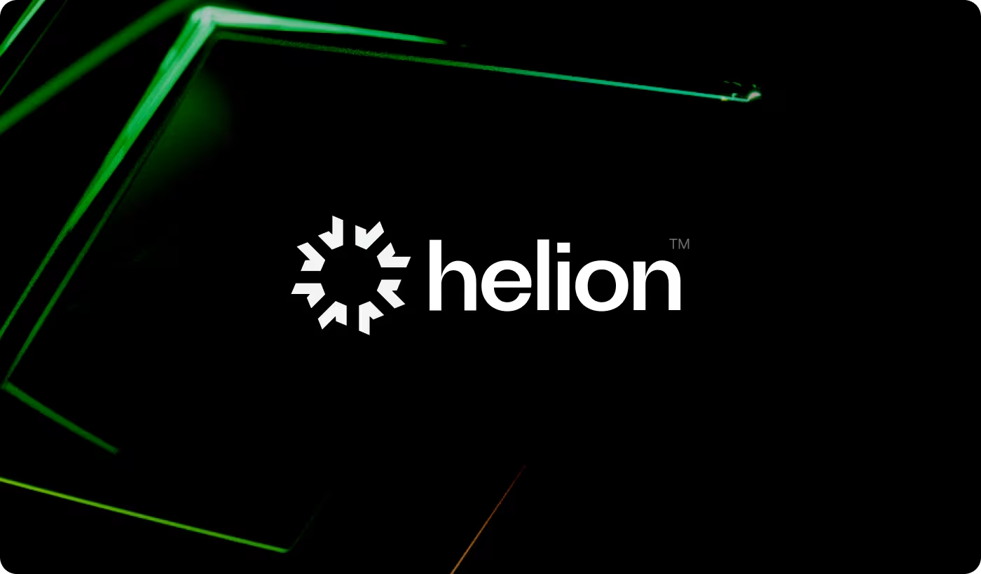
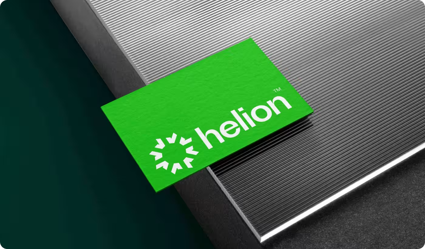
- Built recognition through simple visual cues: The identity used a distinct wordmark, bright green, and bold graphic shapes to make Helion easier to remember.
- Made trust feel more immediate: The system was designed to feel clean, confident, and clear from the first glance.
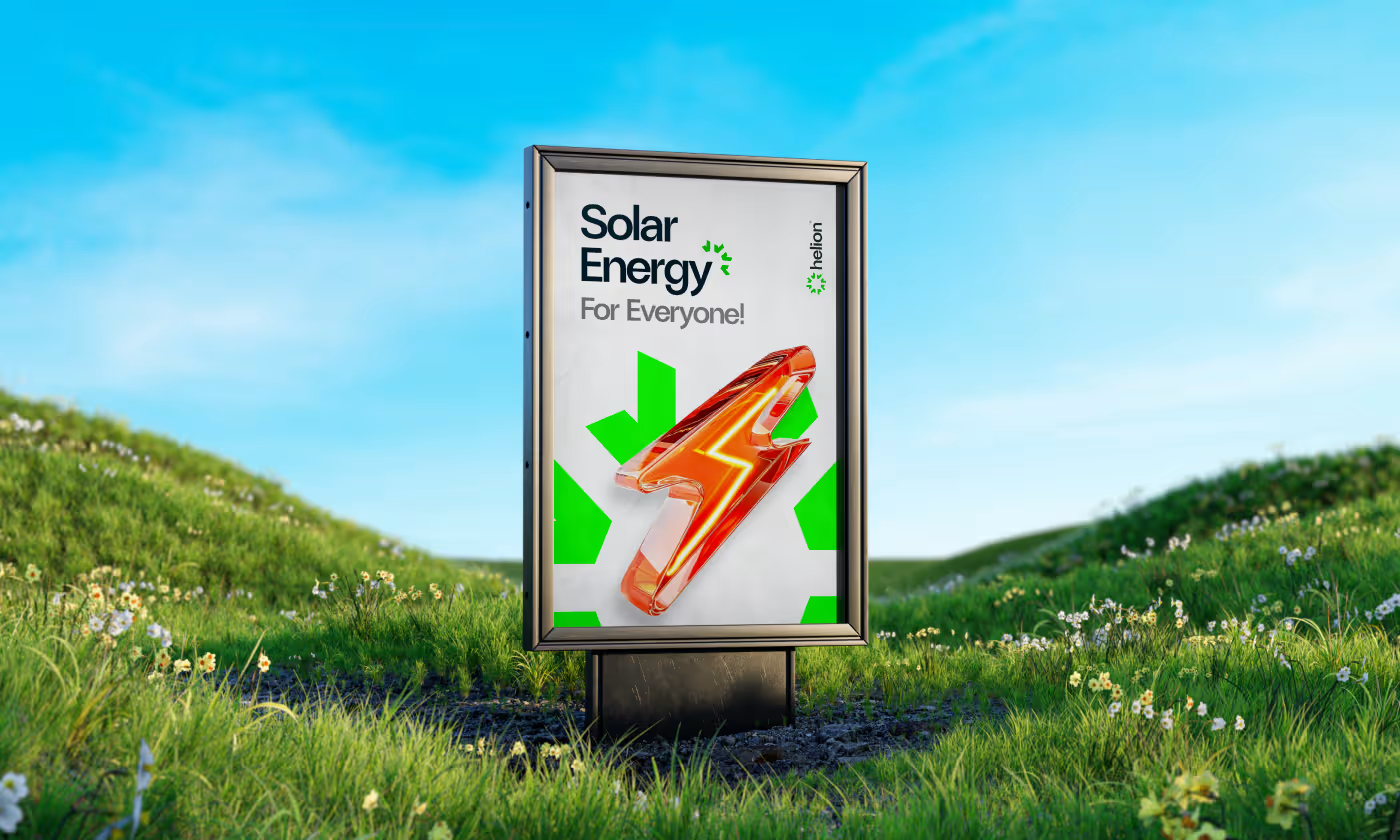
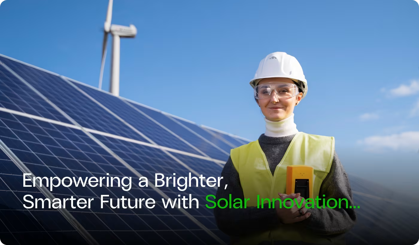
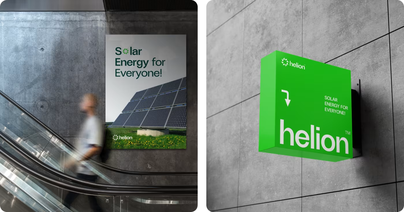
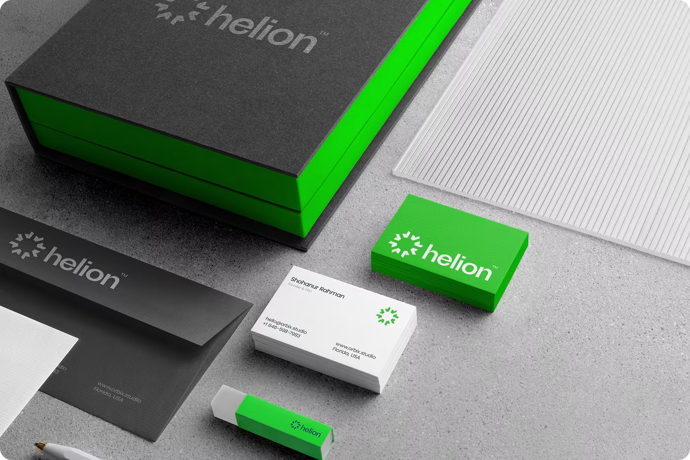
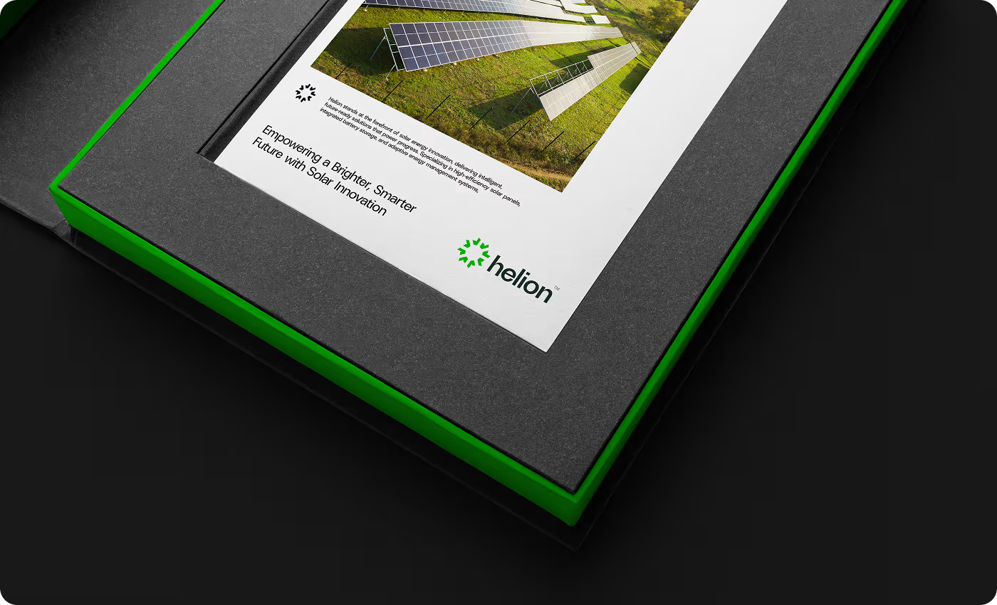
- Carried the identity into real use: We applied the system across signage, print, and field materials so the brand could hold together beyond the logo.

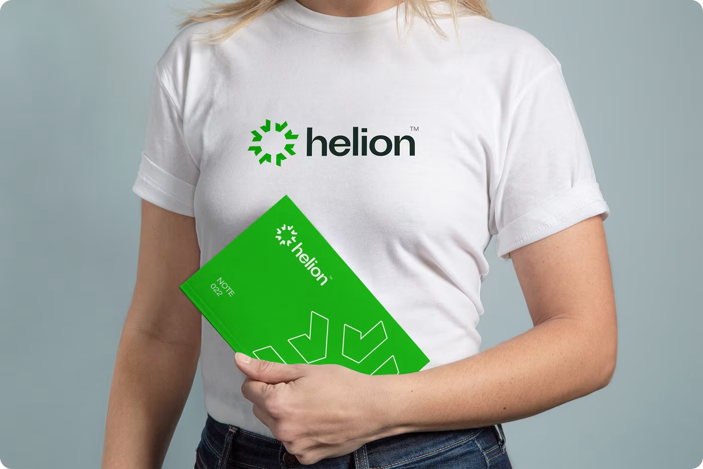
Shaping a solar brand people could connect with
- Clarified the brand’s core values
- Identified what felt too cold or generic in the category
- Framed the brand around trust, clarity, and accessibility
- Explored logo directions
- Developed the color palette
- Tested graphic forms and layout language
- Refined typography choices
- Balanced clarity with personality
- Built supporting visual elements
- Applied the system to signage
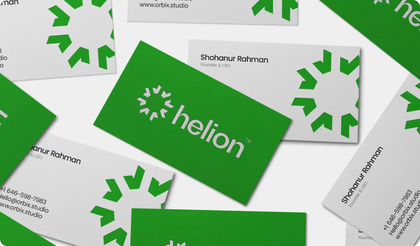
- Extended it into print and promo pieces
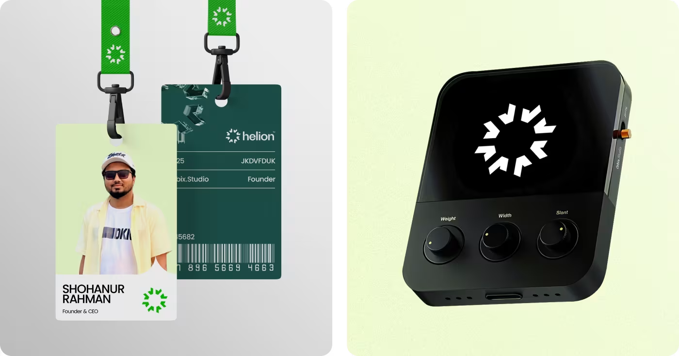
- Carried the identity into field-facing materials
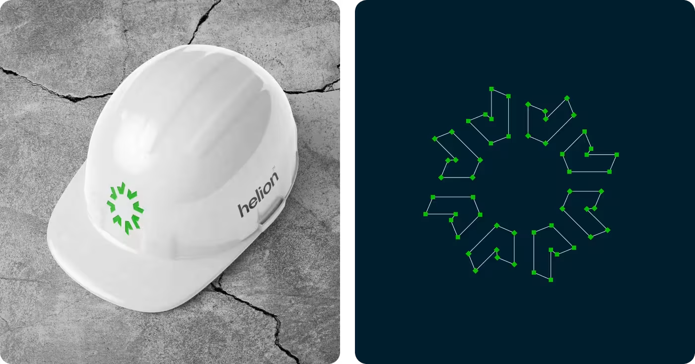

Finding the gap between clean energy and brand perception
Our research focused on the gap between what solar represents and how solar brands often come across. That gave us a clearer view of how Helion could feel more relevant, more trustworthy, and easier to recognize.
- The category often felt more corporate than human: Many brands created distance instead of connection.
- Innovation was not always easy to read: Advanced energy ideas were often presented in ways that felt abstract or hard to grasp.
- Trust needed to happen faster: Because solar involves commitment, the brand had to feel credible at first glance.
- The strongest opportunity was in clarity: A simpler, more cohesive identity could help the brand feel more immediate and more memorable.
Defining how Helion should feel
We started by shaping the brand direction before moving into visuals. The focus was to make Helion feel less technical and more clear, trustworthy, and approachable.
This helped us define the tone, the message, and the overall brand shift. It gave the project a clearer foundation and made the design decisions feel more aligned.
Turning that direction into a visual system
Once the strategy was clear, we translated it into a visual identity for Helion. The goal was to create something modern and recognizable without feeling cold or overly corporate.
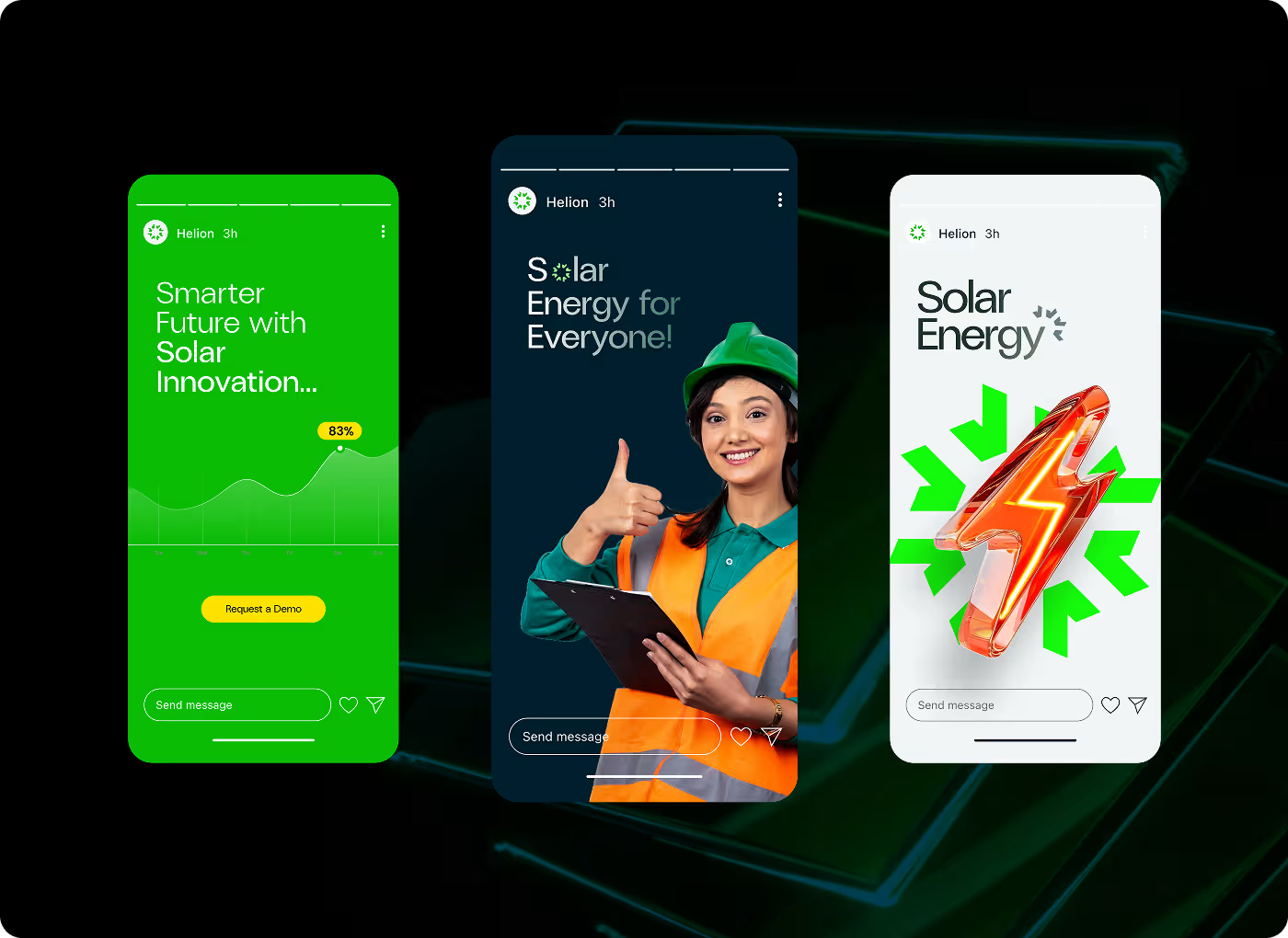
We built the core system through the logo, color palette, typography, and supporting graphics. From there, the brand identity was applied across touchpoints so the brand could feel consistent in real use.
A clearer brand presence with stronger day-to-day usability
The biggest shift was that Helion no longer felt like just another technical solar company. The new identity gave the brand a clearer voice, a more recognizable visual presence, and a system that could work more consistently across real touchpoint
- Brand clarity improved: Core ideas like trust, sustainability, and innovation became easier to read through the identity.
- More consistent brand system: The visual language was built to carry across signage, print, digital assets, and field materials with more consistency.
- First impressions felt more approachable: A colder, more technical tone was replaced with something clearer and easier to connect with.
- Launch-ready brand assets: We delivered a usable identity system across multiple touchpoints, including branded collateral, environmental applications, and team-facing materials.
Ready To Build
Your Next Project?
.avif)


%201%201.svg)
.svg)

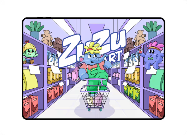
ZuZu Mart
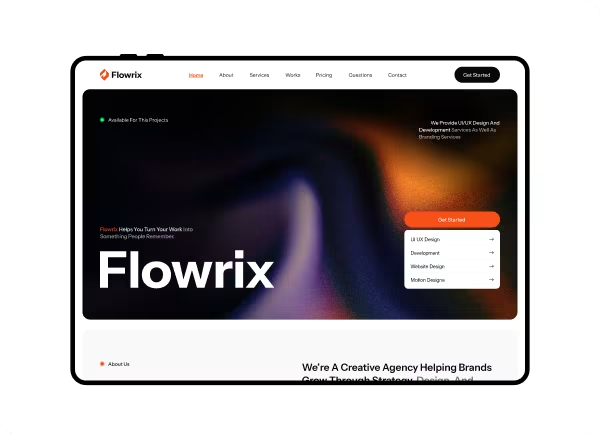
Flowrix website

.svg)


.svg)

.svg)

.svg)
.svg)


.svg)







.avif)



.svg)

