- What Is Progressive Disclosure in UX?
- How Does Progressive Disclosure Work?
- Progressive Disclosure vs Staged Disclosure vs Progressive Enabling
- Progressive Disclosure Examples
- When Progressive Disclosure Helps
- When You Should Not Hide Things
- The Disclosure Decision Record
- Worked Example: Advanced Permissions in a SaaS Admin Panel
- Finding, Checking and Discovering: Three Different Problems
- How to Test Progressive Disclosure
- Accessibility Basics for Show/Hide Controls
- Does Progressive Disclosure Reduce Cognitive Load?
- Progressive Disclosure Checklist
- Frequently Asked Questions
- Final Takeaway


Progressive Disclosure in UX: Patterns, Examples & Testing
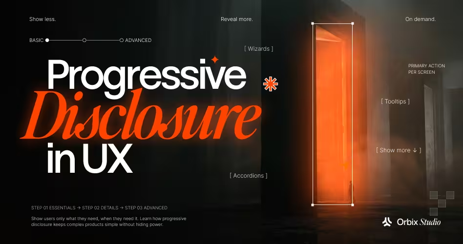
- Progressive disclosure balances simplicity and depth by displaying essential information upfront while keeping advanced options accessible on a secondary layer.
- Two critical success factors (from Jakob Nielsen): a correct split keeping high-frequency items visible, and clear information scent guiding users to secondary details.
- Progressive disclosure vs. staged disclosure vs. progressive enabling: Progressive disclosure hides non-essential options; staged disclosure sequences linear steps (e.g., wizards); progressive enabling toggles controls interactively based on prerequisites.
- Never hide consequences or high-stakes data: Critical details (such as data export permissions, security roles, and order summaries) must remain visible even if editing controls are tucked away.
- Reviewability and discoverability are distinct UX challenges: Folding away completed steps without a visible summary damages checkout reviewability and user confidence.
Progressive disclosure means showing people the few things they need right now and keeping the rest one easy step away. That’s really all it is. The tricky part is deciding what “need right now” means. Hide the wrong thing and you’ve made the product harder to use, not easier.
So this guide is about that decision. We’ll cover what progressive disclosure is, and how it’s different from the patterns people often confuse it with. Then we’ll walk through a simple worksheet we call the Disclosure Decision Record.
What Is Progressive Disclosure in UX?
Progressive disclosure is a design approach where you show the most important options first and put the less common ones on a second layer that people open only when they need it. Jakob Nielsen wrote about it in his 2006 Nielsen Norman Group article, describing it as a way to give users power and simplicity at the same time.
Think of a print window. You see the basics first: which printer, how many copies, which pages. Things like scaling or printing pages in reverse order sit behind a “More settings” button. Most people never click it. The few who need it know exactly where to look.
According to NN/G, two things have to go right:
- The split: Anything people use often has to stay on the first layer. If people keep opening the second layer, you split things the wrong way.
- The path: It has to be obvious how to reach the second layer, and the label should tell people what they’ll find there. Designers call this “information scent.”
The idea is older than the web, too. The team behind the Xerox Star interface wrote about it back in 1982, and IBM’s training wheels research in 1984 tested a similar idea: limit what beginners can do at first. No one person really invented it. Nielsen’s article is best seen as the guide that made it a standard practice.
How Does Progressive Disclosure Work?
It comes down to one question for every piece of information on the screen: does the person need this to finish what they’re doing right now?
If yes, keep it visible. If not, but they might need it later, put it behind a clear button or link. If almost nobody needs it, it might not belong on this screen at all.
Sounds easy, but you can’t answer it by gut feeling. NN/G suggests watching how people work, looking at usage data, and running usability tests. That way you know a busy page is busy because people actually use everything on it, not because they ended up there by accident.
A few things shape the decision:
- The task: What is the person trying to get done on this screen?
- What matters most: Which details are key to that task, and which ones just support it?
- The trigger: Is the button or link easy to spot, and does its label set the right expectation?
- Context: Does the right answer change based on what the user already picked, or who they are?
NN/G also warns about going too deep. In real products, more than two layers usually hurts, because people get lost moving between them.
If you find yourself needing three layers, the screen probably needs a rethink, not more hiding. Often the better fix is to improve your information architecture in UX so things are grouped the way people expect.
Progressive Disclosure vs Staged Disclosure vs Progressive Enabling
People use these terms as if they mean the same thing. They don’t. Each one changes something different: what you can see, the order you do things in, or what you’re allowed to click.
NN/G draws a clear line between progressive and staged disclosure. With progressive disclosure, most people never need the second layer. With staged disclosure, everyone goes through every step. The later steps aren’t less important, they’re just needed later.
Look at the last row as well. A disabled button isn’t a hidden button.
You can see it, it just isn’t ready yet. Mixing these up leads to confusing design reviews, so it helps to use the right names. Different sources like IxDF, UXPin, and LogRocket group these a bit differently, so treat this table as a handy shared vocabulary, not an official list.
Progressive Disclosure Examples
Here are three examples, and each one teaches something different. For each, we’ll look at the task, what shows first, what’s tucked away, and what the source actually proves.
GOV.UK Details: Help Only Some People Need
The GOV.UK Design System Details component is a small link, like “Help with nationality,” that opens a few extra lines of help.
- Task: fill in a government form.
- Shown first: the question.
- Tucked away: an explanation only some people need.
- Trigger: a short, plain link.
The guidance is very direct. Use it for information only some users need, and don’t use it to hide what most users need. That second rule is the one team breaks most often.
GOV.UK’s research also points out two weak spots. Some people don’t click the link because they think it will take them to another page, and some voice control users may have trouble opening it. So even a well-tested component has a cost. If people skip the link, they skip the help.
GOV.UK Conditional Questions: Ask Only When It Matters
On the GOV.UK radios page, picking an answer can open a follow-up question. Choose “Phone” as your contact method and a phone number field appears.
- Task: tell the service how to contact you.
- Shown first: the contact options.
- Revealed: only the field that matches your choice.
- Trigger: the radio button itself.
This is conditional disclosure at its best. No one has to scroll past an email field they don’t need.
The guidance is also upfront about the limits. It lists a known issue: users aren’t always told when a revealed question appears or disappears, which fails WCAG 2.2 success criterion 4.1.2.
In their testing, screen reader users handled simple revealed questions fine but got confused by long, multi-part ones. Their advice: keep it to one simple question and move anything bigger to the next page.
Accordion Checkouts That Hide Too Much
Baymard Institute’s research on accordion checkouts (Edward Scott, 2023) shows what happens when you fold things away a little too hard.
- Task: check out and make sure the order is right.
- Shown first: the current step.
- Collapsed: finished steps like shipping and payment.
- The problem: some sites folded finished steps down to just the heading.
In Baymard’s testing, people wanted to double-check what they’d typed. When a finished step showed only “Shipping Address,” they had to open it, look, and close it again. Sites that kept a short summary of each finished step let people check as they went, and eye tracking showed shoppers glancing at those summaries all through checkout.
The lesson goes beyond checkout. Hiding a finished step is fine. Hiding what’s inside it can stop people from checking their own work. Note that Baymard’s article doesn’t promise a jump in sales, and its screenshots show those sites at the time of testing, not necessarily how they look today.
When Progressive Disclosure Helps
Progressive disclosure usually works well when:
- The extra options really are secondary, and most people finish the task without them.
- A follow-up only matters for certain answers, like a phone field after “Contact by phone.”
- The task can focus on one part at a time without people needing to compare parts.
- The way into the hidden layer is easy to spot and clearly labeled.
- The hidden information is there at the exact moment someone needs it.
None of these guarantee a better experience. They just make it likely that the trade-off is worth testing.
When You Should Not Hide Things
A lot of guides skip this part, but it’s arguably the most important one. Avoid progressive disclosure, or at least question it hard, when:
- Most users need the information. GOV.UK says this plainly for its Details component.
- People need to compare things side by side. NN/G’s hotel booking example showed room types, prices, and dates working better on one screen, because people kept going back and forth between them.
- Users jump between steps a lot. Step-by-step flows struggle when the steps depend on each other.
- The stakes are high. Permissions, payments, deletions, and legal terms are bad places to tuck away a detail someone might miss.
- People need to review what they already entered. Baymard’s checkout research is the clearest example.
- The real problem is a messy layout. An accordion can hide a confusing screen without fixing it.
- People need to find features later. If they never see a feature, they may never learn it exists.
- The control isn’t accessible. A show/hide that doesn’t work with a keyboard, or doesn’t say whether it’s open or closed, shuts some people out.
It’s worth saying the obvious alternative out loud: often the fix isn’t hiding anything. Clearer labels, tighter grouping, and a better order can make a busy screen easy to read with everything still on it. Strong SaaS UX writing principles do a lot of the work teams try to do with accordions.
The Disclosure Decision Record
The Disclosure Decision Record is a simple worksheet that helps you make this choice on purpose instead of out of habit. We put it together from the research above. It’s an editorial tool for running a design review, not a scientifically tested method, and it doesn’t give you a score.
For each piece of information or control you’re thinking of hiding, answer these eight questions:
Then pick one outcome:
- Keep it visible.
- Reveal on request (a button, link, or expandable section).
- Reveal based on a choice (conditional).
- Split it into steps.
- Reorganize the screen instead of hiding anything.
- Remove it if nobody needs it here.
- Find out more first if you don’t have enough evidence to decide.
Don’t skip that last one. “We don’t know yet” is a fair answer, and it beats a confident guess every time.
Worked Example: Advanced Permissions in a SaaS Admin Panel
This is a made-up example we built to show the worksheet in action. It isn’t from a real Orbix client project, and neither design has been usability tested.
The Task
An admin at a mid-size company is adding a new team member to a SaaS reporting tool. They need to give this person the “Analyst” role, which lets them view reports and export data. Exporting is a big deal, because it means company data can leave the product.
The admin wants to get this done fast, but they also need to be sure they’re not giving more access than they meant to.
Option A: Access Details Behind “Advanced”
The role dropdown sits on the main screen. Pick “Analyst” and you’re done. The list of what that role can actually do, including export, sits behind an “Advanced permissions” link.
The upside: the screen is clean and quick for admins who already know what “Analyst” means.
The risk: the one detail that really matters, export access, is the one that’s hidden. An admin who doesn’t open the link may never realize this person can download data. And later, when someone asks “who can export reports?”, there’s no quick way to see the answer.
Option B: Visible Summary, Editing Tucked Away
The role dropdown stays on the main screen. Right below it, a short summary appears: “Can view all reports. Can export data.” The controls for fine-tuning each permission sit behind an “Edit permissions” link.
The upside: the admin sees exactly what they’re giving before they hit save. The risky part is right there in plain view, while the detailed toggles, which few admins touch, stay out of the way.
The risk: the screen gets a little longer. For roles with lots of permissions, the summary could get crowded and need its own grouping.
The Filled-In Decision Record
Here’s the worksheet applied to one item: the export permission.
Our working recommendation: keep a summary of the granted permissions visible, and put the detailed editing controls behind a clear link. In other words, hide the controls if you like, but never hide the consequences.
What this recommendation is not: proof. It’s a reasoned call based on published guidance, and it needs testing with real admins before anyone ships it.
What We Would Still Need to Test
Before picking one, a team would want to watch real admins:
- give someone the Analyst role, then explain in their own words what that person can now do;
- find and change a single permission;
- answer “who can export data?” a week later, without help.
If admins using Option A describe the access correctly every time, the hidden version might be fine. If they keep missing the export rights, you have your answer.
This kind of trade-off is where a fresh pair of eyes really helps. If your product is full of choices like this, getting UI/UX design support for complex SaaS workflows can save your team a lot of back and forth.
Finding, Checking and Discovering: Three Different Problems
People lump all of these together as “discoverability.” They’re actually three separate questions, and a design can pass one while failing another.
- Can users find a control when they need it? This is about the trigger and its label. NN/G’s point about information scent fits here: the link has to tell people what’s behind it.
- Can users review and fix what they already did? This is reviewability. Baymard’s checkout research shows how folded-up steps with no summary make people reopen sections just to double-check.
- Can users discover features they’ve never used? This is feature awareness, and it’s the easiest one to miss. Leah Findlater and Joanna McGrenere’s 2010 research on personalized interfaces found that trimming what people see can help with the task at hand but lower their awareness of other features.
There’s a real tension here. NN/G’s article says worries about people building a limited picture of the system are unfounded, and points to the training wheels research.
Findlater and McGrenere’s work suggests it’s more mixed when you measure whether people notice features they haven’t used yet. Both can be true in different situations, which is exactly why testing beats guessing.
How to Test Progressive Disclosure
You can’t settle a show/hide decision in a meeting. You settle it by watching people use the thing. Here’s a simple test plan you can adapt. It’s a suggested plan, not a study Orbix has run.
A few things keep the comparison fair:
- Recruit the right people. An occasional admin and a daily power user will behave very differently.
- Use the same tasks for each design. Otherwise you’re comparing tasks, not designs.
- Mix up the order. If everyone sees Option A first, they’ll be faster on Option B just from practice.
- Write down what people say, not just what they click. Pauses and “wait, where’s the…” moments tell you a lot.
- Be careful with numbers. A handful of people can show you problems. They can’t prove one design is better by some percentage.
If the issues you find go beyond one screen, a broader UX audit process can show whether disclosure is the real problem or just a sign of something bigger.
Accessibility Basics for Show/Hide Controls
If you build your own show/hide control, follow the W3C disclosure pattern. The short version:
- Use a real button for the control, not a styled div.
- It should open and close with Enter and Space.
- Set aria-expanded to “true” when the content is showing and “false” when it’s hidden, and keep it in sync.
- aria-controls can point to the content it opens. This one is optional.
- Make sure keyboard users can reach the control, and that focus lands somewhere sensible after it opens.
- Write a label that says what’s inside, like “Edit permissions,” not just “More.”
The built-in HTML details and summary elements handle a lot of this for you, but test them anyway. Even GOV.UK’s version has known issues with voice control software.
For conditional questions, keep GOV.UK’s known issue in mind: screen readers aren’t always told when a new question appears. Keep revealed questions short and simple.
Does Progressive Disclosure Reduce Cognitive Load?
Sometimes. It depends on the task, the people, and what you measure.
- NN/G says progressive disclosure helps people learn faster, work more efficiently, and make fewer mistakes, mostly by keeping their attention on what matters.
- Forsey and colleagues (2024, online first) studied layered interfaces in a specialized mission-planning tool and looked at how layering affected how easily people learned it. That’s a narrow, expert setting, so the results don’t automatically apply to a consumer app.
- Anik and Bunt (2026) studied explanations of AI training datasets and found that progressive disclosure didn’t really reduce mental effort in their setup.
- Newer 2026 studies on AI tools, like work on exploratory search and AI-assisted design exploration, suggest different kinds of mental effort can move in different directions. Some of the effort that goes up is the good kind: the effort of actually learning something.
So the fair answer is that progressive disclosure can cut down on unnecessary complexity, but it isn’t an on/off switch for mental effort. If a tool or a guide promises that, ask what they actually measured.
Progressive Disclosure Checklist
Before you ship a show/hide decision, check that:
- Information most people need is still visible.
- The trigger’s label says what’s behind it.
- People can find hidden controls without guessing.
- Users can review and fix earlier choices without reopening everything.
- Risky details, like who can access data, are never only behind a click.
- The design works for both occasional users and power users.
- The control works with a keyboard and says whether it’s open or closed.
- You tested it with real tasks, not just in a design review.
- You tried a simpler fix first: better labels, grouping, or order.
Frequently Asked Questions
What is progressive disclosure in UX design?
Progressive disclosure is an interaction design pattern that presents essential information upfront while keeping advanced or secondary options accessible on a subsequent layer. This balances initial simplicity with functional depth, reducing screen clutter so beginners complete primary tasks quickly without stripping power users of specialized settings.
What is the difference between progressive disclosure and staged disclosure?
Progressive disclosure hides secondary options on a separate layer that most users never need to open. In contrast, staged disclosure - such as a setup wizard - organizes a linear sequence of steps where every user progresses through each stage sequentially, because all steps are required rather than optional or secondary.
When should you avoid using progressive disclosure?
Avoid progressive disclosure when most users require the information frequently, or when tasks require side-by-side comparison of items like pricing tiers or room options. Additionally, avoid hiding high-stakes details such as security permissions, irreversible deletion warnings, legal disclaimers, or data export rights where missed details create serious operational risks.
How do you maintain a strong information scent in progressive disclosure?
Maintain strong information scent by writing explicit, descriptive trigger labels that tell users exactly what lies behind the hidden layer. Vague labels like "More" or "Advanced" force guessing; specific triggers like "Edit export permissions" or "Help with nationality" provide clear context, ensuring users know precisely where to look when needed.
Why does folding away completed steps harm checkout reviewability?
Collapsing completed checkout steps into plain headings forces shoppers to reopen accordion panels repeatedly just to verify shipping addresses or billing details. Maintaining a visible summary of entered data preserves reviewability, reassures users before payment submission, and prevents the friction of constantly expanding and collapsing sections during final verification.
Why should you keep summaries visible while hiding editing controls?
Keeping a summary visible while tucking editing controls away ensures users understand the consequences of their actions without cluttering the screen with granular toggles. In SaaS permissions or checkout reviews, visible summaries communicate high-stakes outcomes like data export rights immediately, while editing links remain available for the few requiring fine adjustments.
What are the key accessibility requirements for progressive disclosure controls?
Accessible progressive disclosure requires semantic HTML buttons operable via Enter and Space keys, accompanied by dynamic aria-expanded attributes communicating open or closed states to assistive tech. Furthermore, focus must transition predictably upon activation, and conditional fields should alert screen reader users when new form inputs dynamically appear or disappear.
Does progressive disclosure always reduce cognitive load?
Not universally. While progressive disclosure reduces visual clutter and prevents extraneous overload during straightforward flows, it can increase interaction cost through extra clicks and hunting. Recent research shows mental effort depends heavily on domain complexity, user expertise, and whether hidden options obstruct holistic comprehension or side-by-side comparison.
Final Takeaway
Progressive disclosure isn’t about hiding as much as you can. It’s about showing the right thing at the right moment, while keeping people in control, able to find what they need, and able to check their own choices.
Sometimes that means tucking options away. Sometimes it means leaving everything in view and just organizing it better. The Disclosure Decision Record won’t make the call for you, but it will make sure you make it on purpose.