Avara Fashion Branding
.svg)
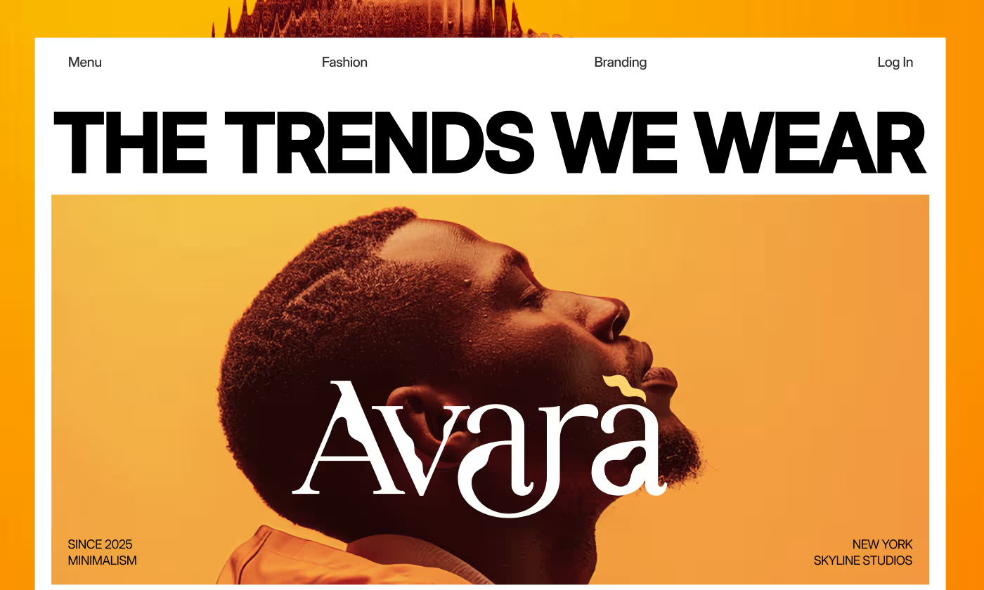
Avara entered the market as a modern women’s clothing brand focused on blending classic elegance with contemporary trends.
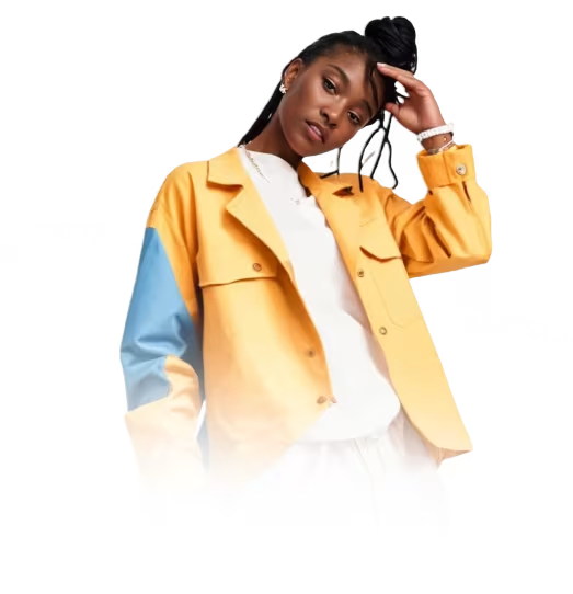
Our task was to build a scalable visual identity for Avara. The brand needed to look just as premium on a tiny physical clothing tag as it did on a large exhibition billboard. We were tasked with making Avara feel established and memorable from day one.
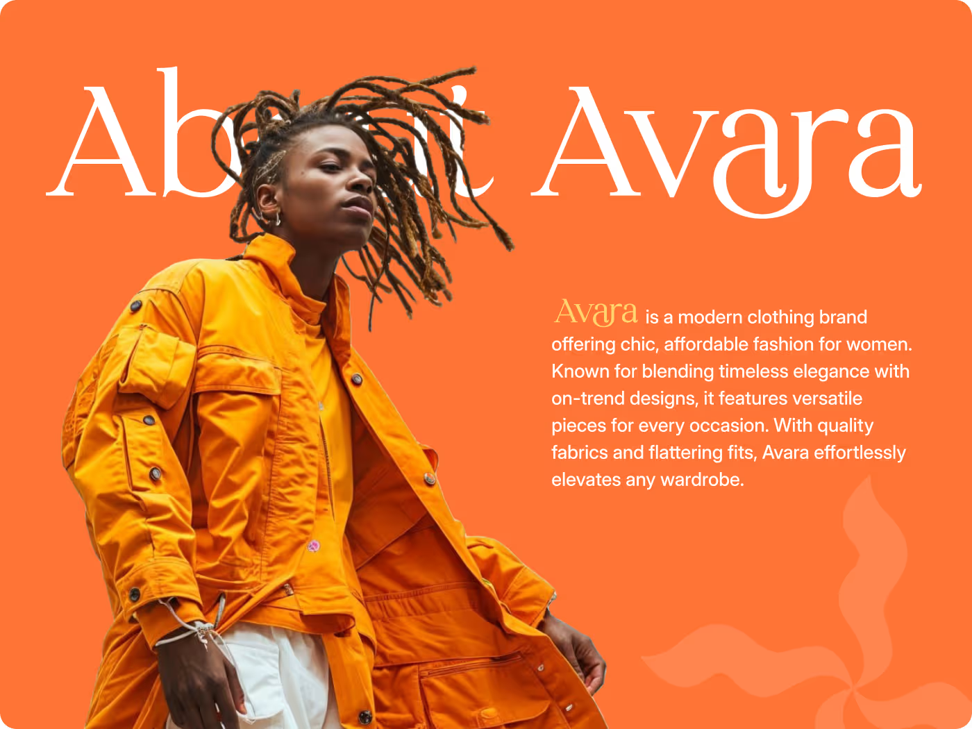
Standing out in a crowded market
Fashion is incredibly saturated, and most minimalist brands end up looking identical. Avara needed to break through the noise without losing its high-end feel.
- The Copycat Trap: Hard to show classic elegance and modern energy without looking generic.
- No Content Blueprint: The internal team lacked a solid system to design future collection rollouts smoothly.
- Weak Scaling: They needed an identity that felt just as powerful on a tiny clothing tag as it did on a massive street billboard.
High-contrast minimalism
We dropped the visual clutter and let bold color blocks and heavy typography do the talking so the clothes stay front and center.
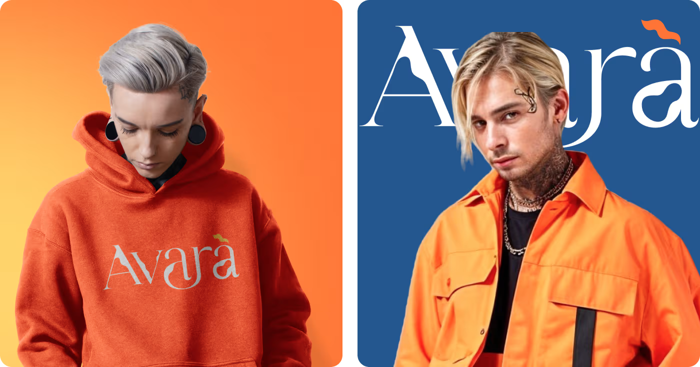
- The Color Hook: Pairing vibrant orange, yellow, and deep blues for instant recognition.
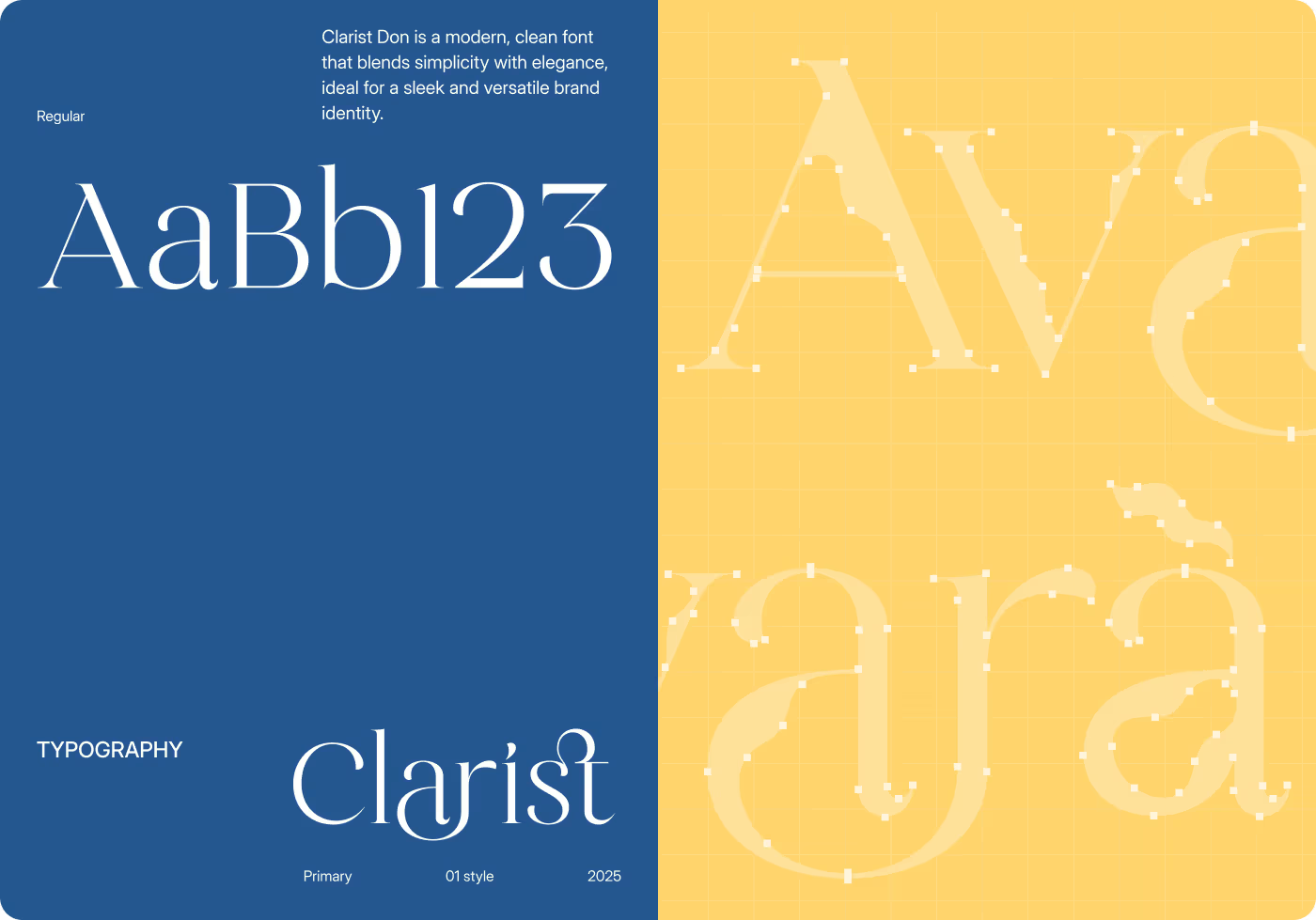
- Sleek Type: Anchoring the layouts with a distinct, razor-sharp primary font.
- Clean Backdrops: Stripping out complex backgrounds to keep all eyes on the product.
Turning a vibe into a scalable system
- User research
- Behavior analysis
- Brand positioning
- Market gaps
- Information architecture
- User flows
- Wireframes
- Navigation logic
- UI design
- Visual hierarchy
- Design tokens
- Component library
- Usability testing
- Feedback loops
- Asset validation
- UI iteration
Type and color that demand attention
Instead of safe neutrals, we went loud and structured.
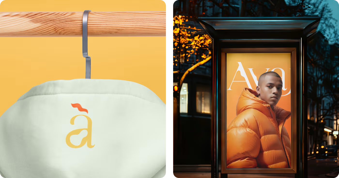
- The Typography: We chose Clarist Don as the main typeface. It’s clean, fluid, and gives the wordmark an undeniable luxury edge.
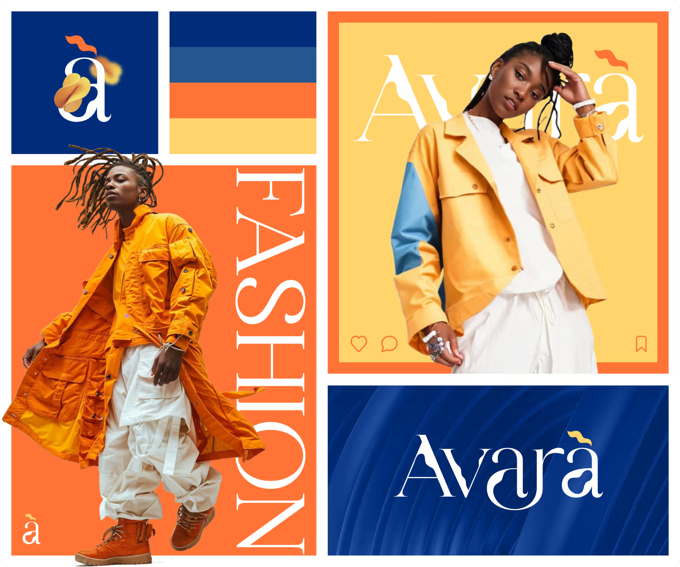
- The Palette: We mixed Orange (#FF7436) and Yellow (#FFD56D) with Catalina Blue (#002C7A) for a high-contrast look that pops instantly.
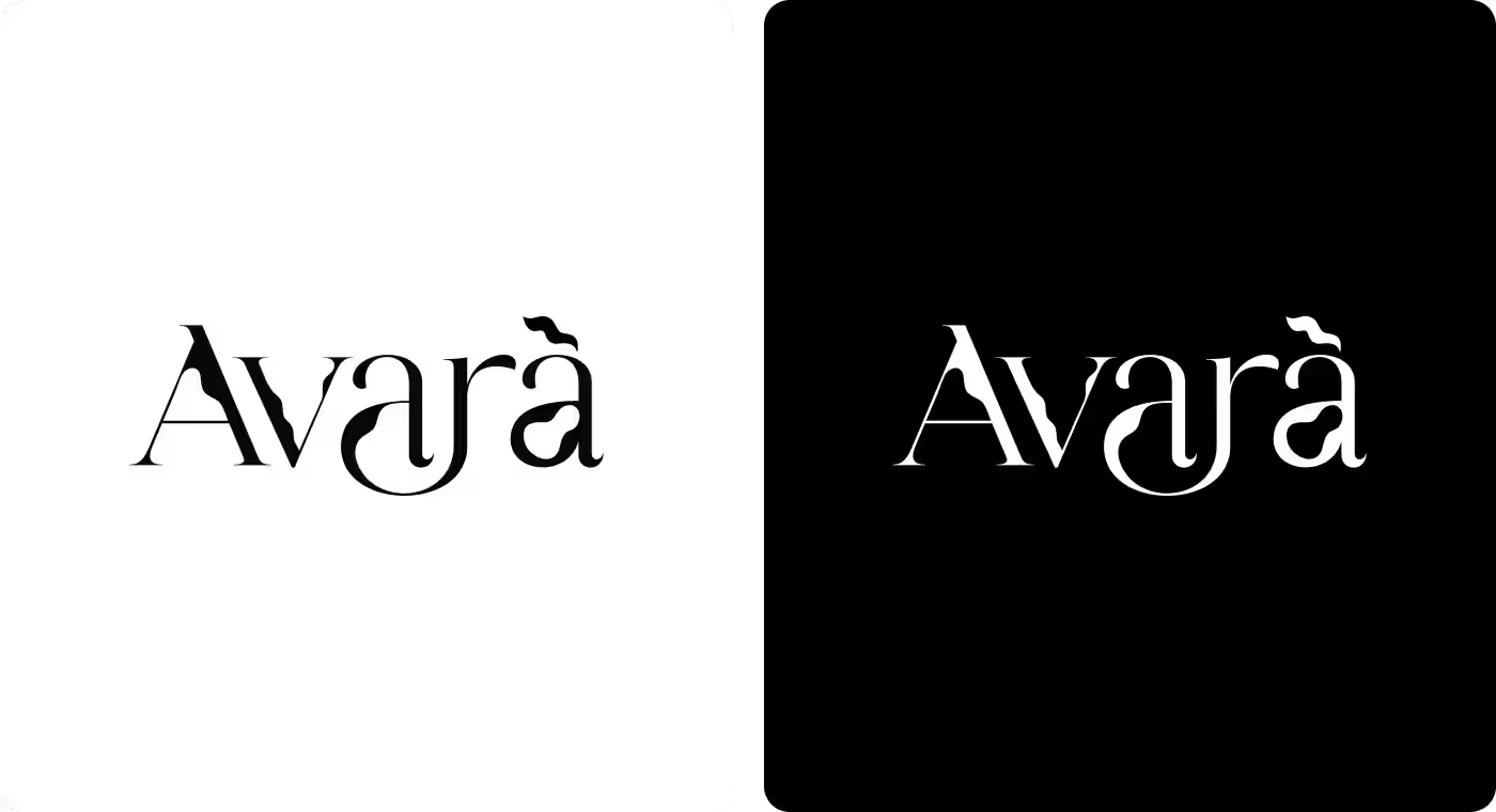
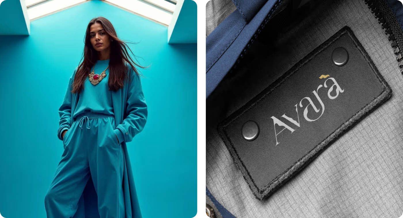
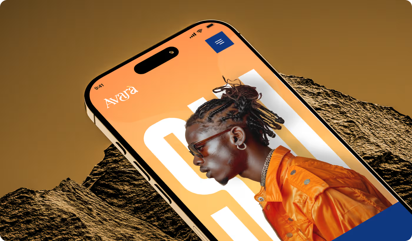
- The Logo: The custom logo mark builds a distinct fluid wave into the lettering, giving it a memorable visual signature.
Editorial e-commerce layouts
We built digital spaces that feel less like a boring storefront and more like a high-end digital lookbook.
- Desktop Layout: the desktop layout shows how we split layouts with oversized headlines and massive imagery.
- E-com Banners: Promotional layouts utilize clean grid borders and bold text boxes to drive easy clicks.
- Social Identity: The design highlights how the contrast templates scale seamlessly into square formats for marketing channels.
Scaling for the real world
The identity carries the exact same weight when it transitions offline.
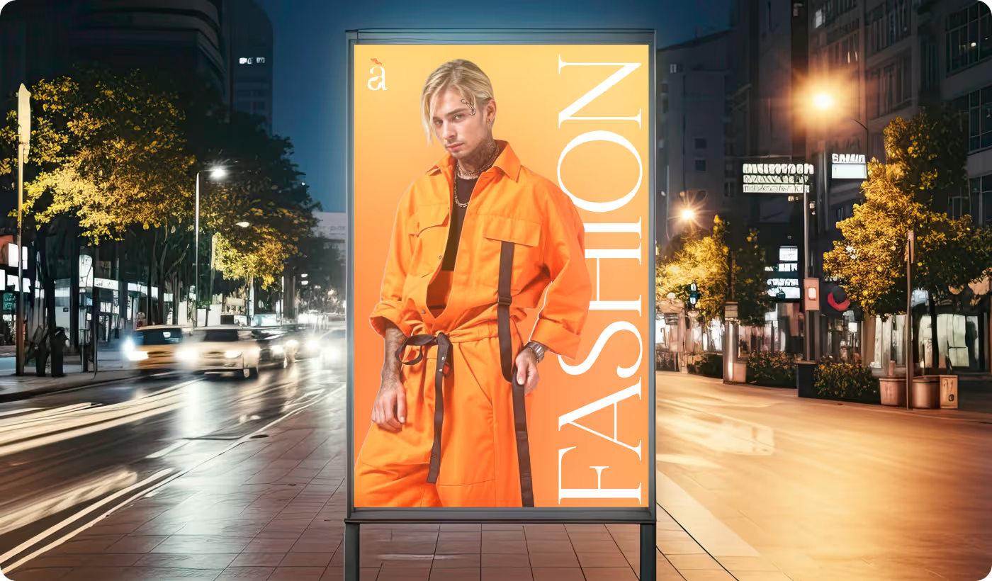
- Street Billboards: The bold typography scale fits perfectly on vertical outdoor displays.
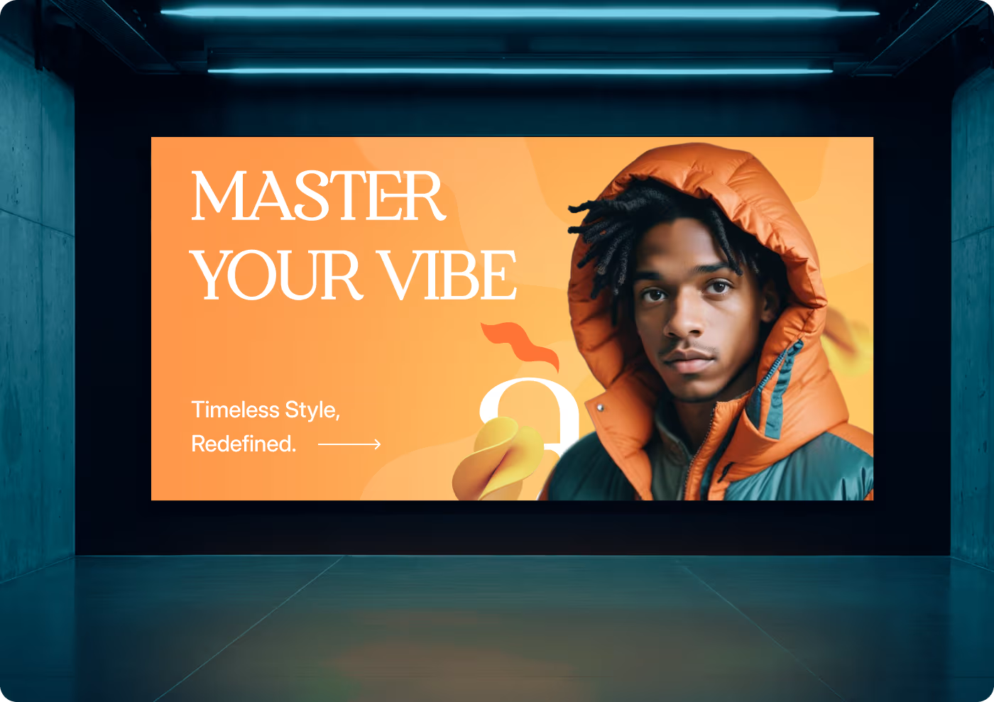
- Showroom Assets: Solid, bright color backdrops keep the attention fixed on the clothing models during exhibitions.
Launching with authority
The brand system gave Avara everything they needed to go to market fast.
- +2,500 Pre-launch waitlist signups driven by the high-contrast campaign.
- 40% Reduction in asset creation time for their internal design team.
- +65% Boost in social media engagement within the very first month.
- 120 Direct retail leads captured during their first physical exhibition.
Ready To Build
Your Next Project?
.avif)


%201%201.svg)



.svg)


.svg)

.svg)

.svg)
.svg)


.svg)







.avif)



.svg)

