


Dhaka Regency
.svg)
Dhaka Regency Hotel & Resort offers premium dining and spa experiences near the city's airport and business hubs.
Our main goal was to design a brand identity system that bridges the gap between the hotel’s established physical presence and its market perception. The new visual language needed to communicate authority, refined luxury, and meticulous attention to detail to both international corporate travelers and local clientele.

The hotel was beautiful inside, but the old look felt cheap
Dhaka Regency is a big, beautiful luxury hotel near the airport with great food and a relaxing spa. But its old logos and signs did not look rich or important enough. It looked like a basic, boring hotel, so it was losing customers to newer luxury places nearby.
- Weak Signs: The old drawings looked weak and could not compete with other premium hotels.
- Nothing Matched: When guests arrived, the different cards, papers, and signs did not match each other.
- Hidden Luxury: The old look did not show off the amazing premium services waiting inside the hotel.
- Confusing Style: It lacked a single, solid brand mark that people could remember easily.
Designed rich black and gold look that instantly looks expensive
We remade the entire visual identity using only two main colors: deep black and shiny metallic gold. This classic mix tells the human brain that a place is high-class and exclusive without using messy or crowded drawings.
- The Star Logo: We made a clean, new round symbol with stars on top that stands for excellent service.
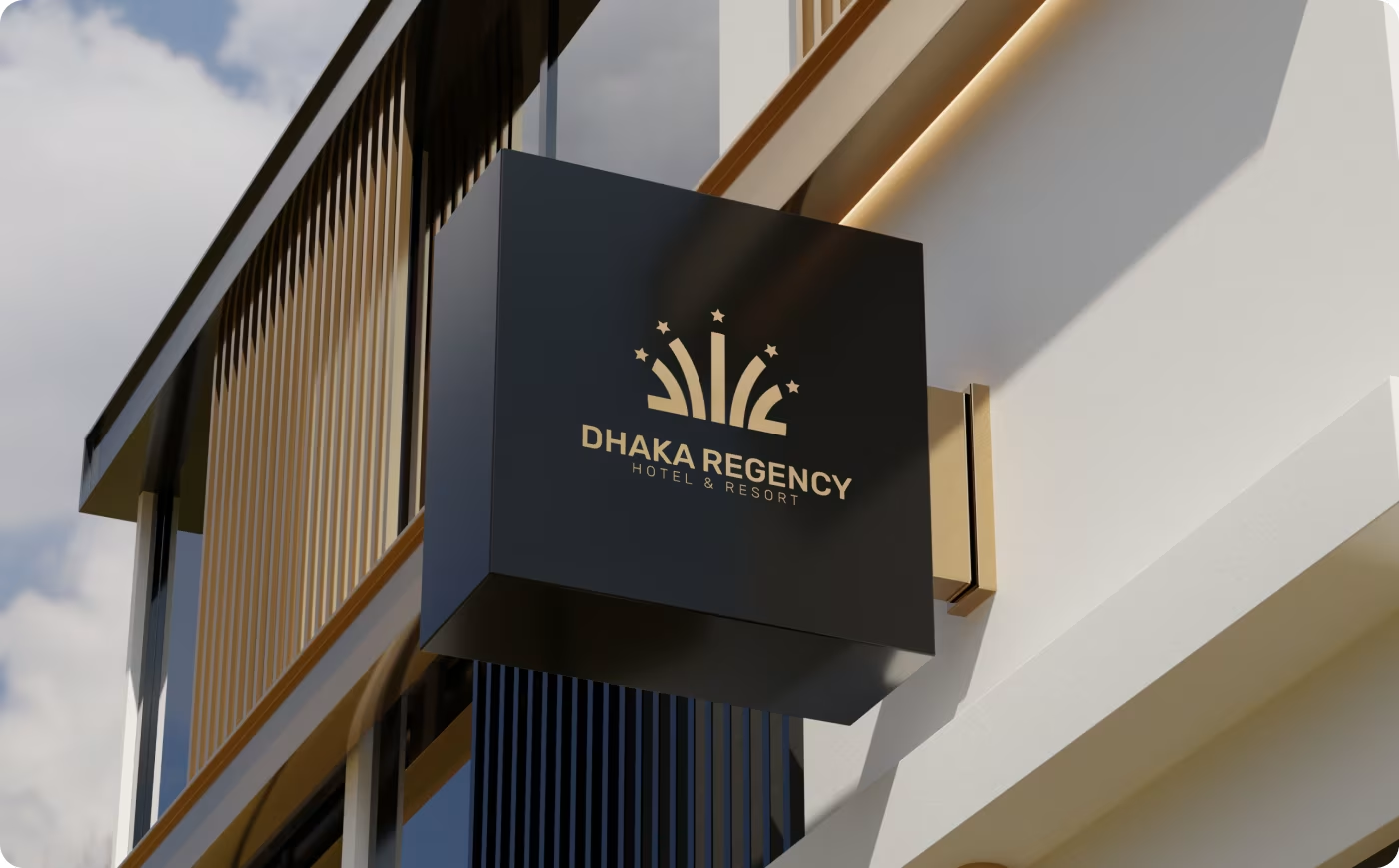
- Perfect Matching: We put this exact gold look on every single item, from room keycards to big glowing outside walls.
- Easy to Read: We chose a clear, proud lettering style so the hotel name looks powerful from far away.
- Rich Building Style: We blended the logo directly into the wood, marble, and lights of the physical building.
A user-centered design process
- Planning for international business guests
- Making the hotel feel important
- Dropping standard corporate styles
- Focusing on high-end lifestyle themes
- Drawing the clean curved shapes
- Adding the crown of stars on top
- Mixing the shiny metallic gold color
- Setting the solid black background
- Testing letters on small phone screens
- Balancing classic and modern text styles
- Designing layouts for giant road billboards
- Keeping spacing perfectly neat and clean
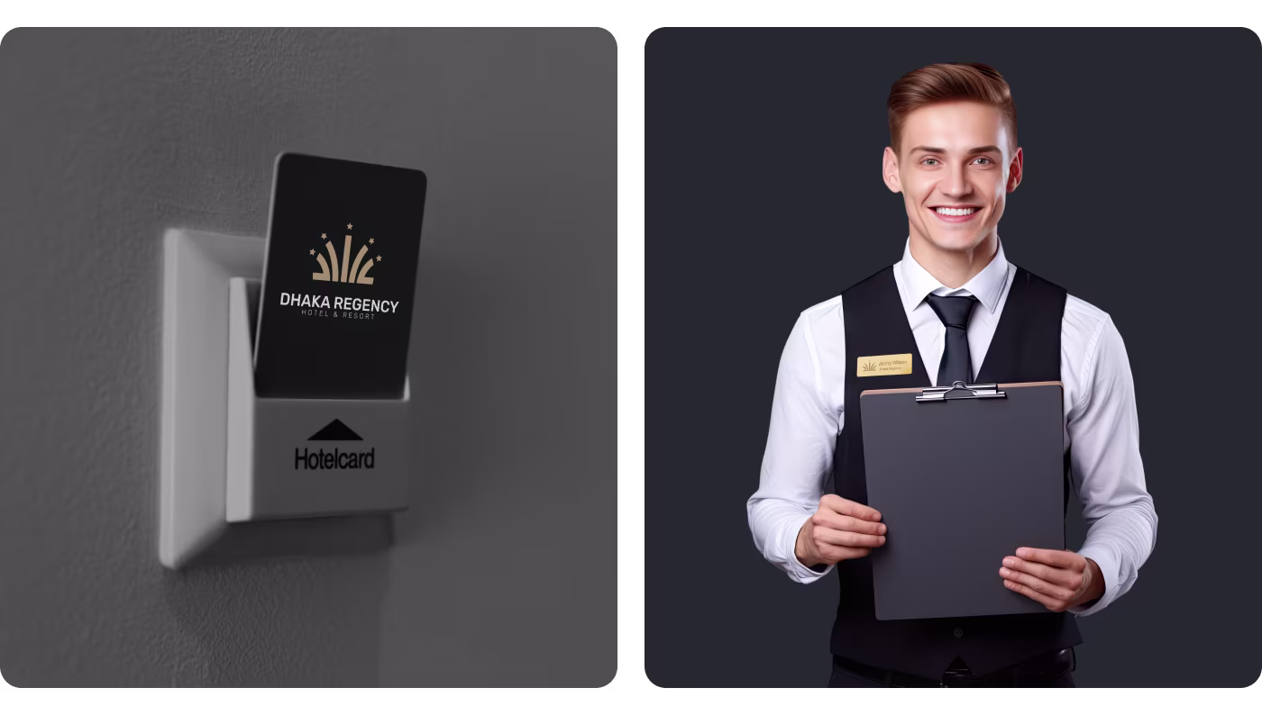
- Printing premium gold guest keycards
- Putting logos on worker uniforms and hats
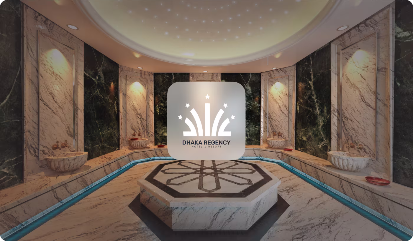
- Mixing the logo into the bathroom marble
- Building illuminated exterior wall signs
Using secret math circles to make lines look perfect
We studied how the human eye reacts to lines and shapes. When drawings are uneven or asymmetrical, the brain feels uneasy and thinks the business is disorganized.
To prevent this, we used perfectly balanced geometric circles and dotted grid lines to map out the logo. This background math ensures that every curve is perfectly smooth and completely even, which makes people trust the brand instantly.
Logo Design: Making a premium royal symbol
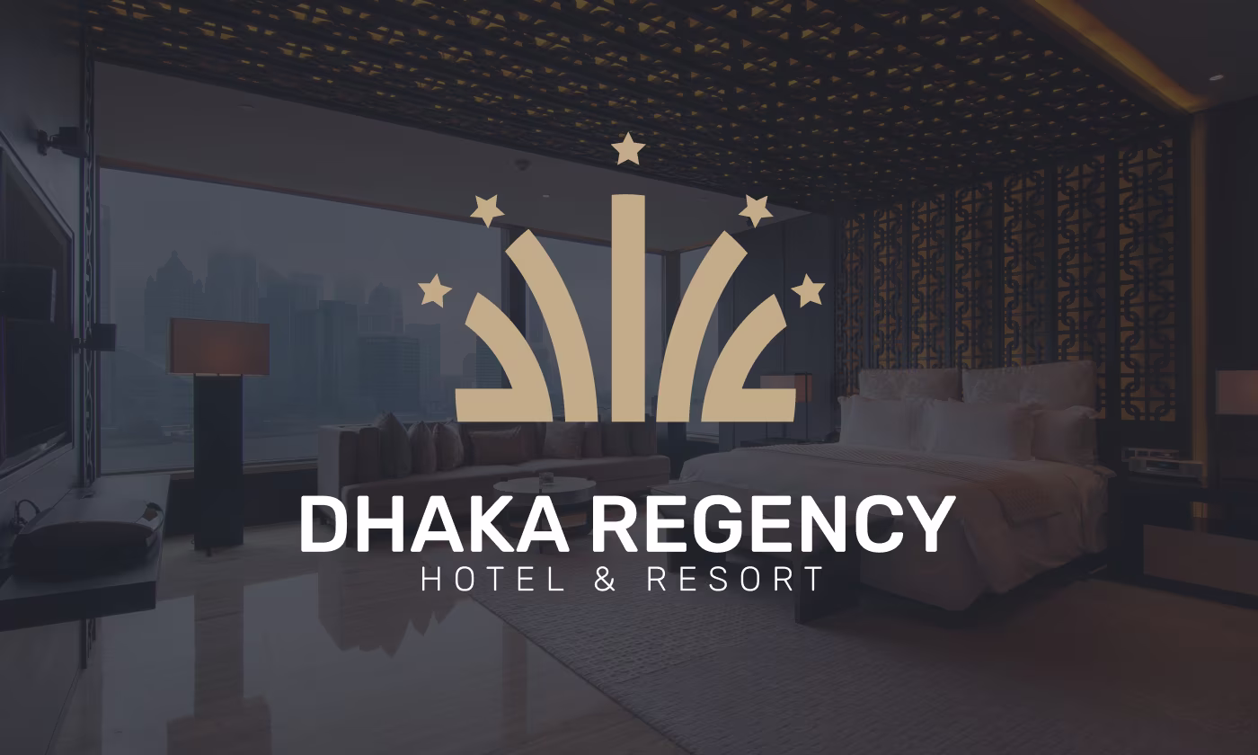
We created a brand-new high-class mark that immediately tells guests they are entering a five-star luxury space.
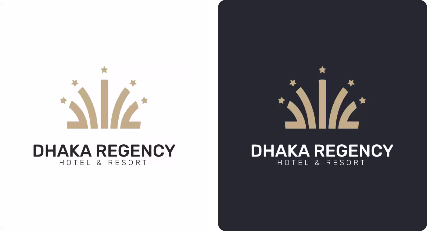
- The Logo Options: The logo works perfectly as a solid black symbol on a white background, or as a shining gold symbol on a premium dark gray background.
- Real-World Preview: You can see how beautiful and rich the new gold star logo looks when placed over a picture of a luxury bedroom suite.

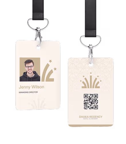
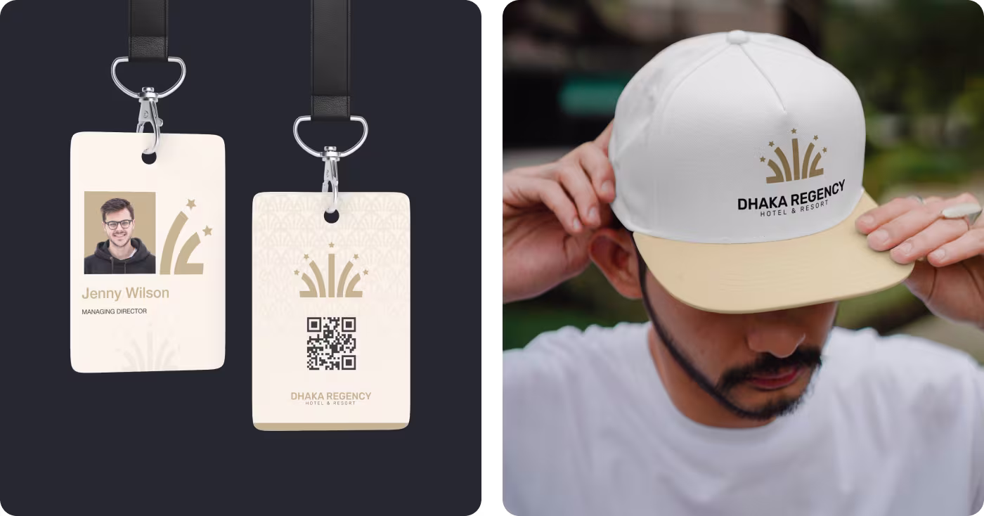
Spatial Integration: Putting the brand onto walls and clothing
We didn't just design a logo for a computer screen; we brought it into the physical world so guests feel surrounded by luxury.
- Building Materials: We integrated the lines into the wooden lattice interiors and outside walls of the resort.
- Guest Accessories: The design system was applied cleanly to staff ID badges, custom stitched hats, and luxury guest keycards.
A 100% matching look that makes the hotel look richer
Our design changes completely refreshed the hotel's public image and gave it a commanding position in the market.
- Looks Much More Expensive: The shiny gold accents on black materials instantly raised how premium the hotel looks to people.
- 100% Perfect Match: Every single item inside the hotel and outside on the streets now matches perfectly with the same look.
- Unmissable from the Road: The high-contrast black-and-gold glowing signs make the building stand out beautifully at night.
- Instant Corporate Trust: International business travelers can recognize the clean style and know it is a top-tier place to stay.
Got a project in mind? Let's build it
.avif)


.svg)


.svg)

.svg)


