Buildea Branding
.svg)
Buildea is a real estate and architectural solutions company focused on acquiring, selling, leasing, renting, and evaluating properties
Our task was to design a brand identity for Buildea that works across both digital and physical spaces. The visual system needed to look professional on corporate stationery, stand out on large-scale physical signage, and clearly communicate their focus on creative, sustainable building solutions.
Looking trustworthy while staying eco-friendly
Many real estate companies look exactly the same and feel a bit boring. Buildea wanted a fresh, modern look that tells people their buildings are safe and strong, while also showing that they care about protecting the planet.
- Too Much Copying: It is hard to stand out when every building company uses the same old, generic design.
- Two Different Goals: Trying to show that you build tough structures but also love green, eco-friendly living.
- Giant Physical Items: Making the brand look good on huge, rugged things like shipping containers and construction signs.
- Small to Large: Creating a look that works perfectly on a tiny employee name badge and a massive building site.
A smart design system that works anywhere
Buildea did not have a clear visual style, so we built a strong design system for them. We chose solid corporate colors to show safety, mixed with bright greens for nature, making the brand look great online and on real-world job sites.
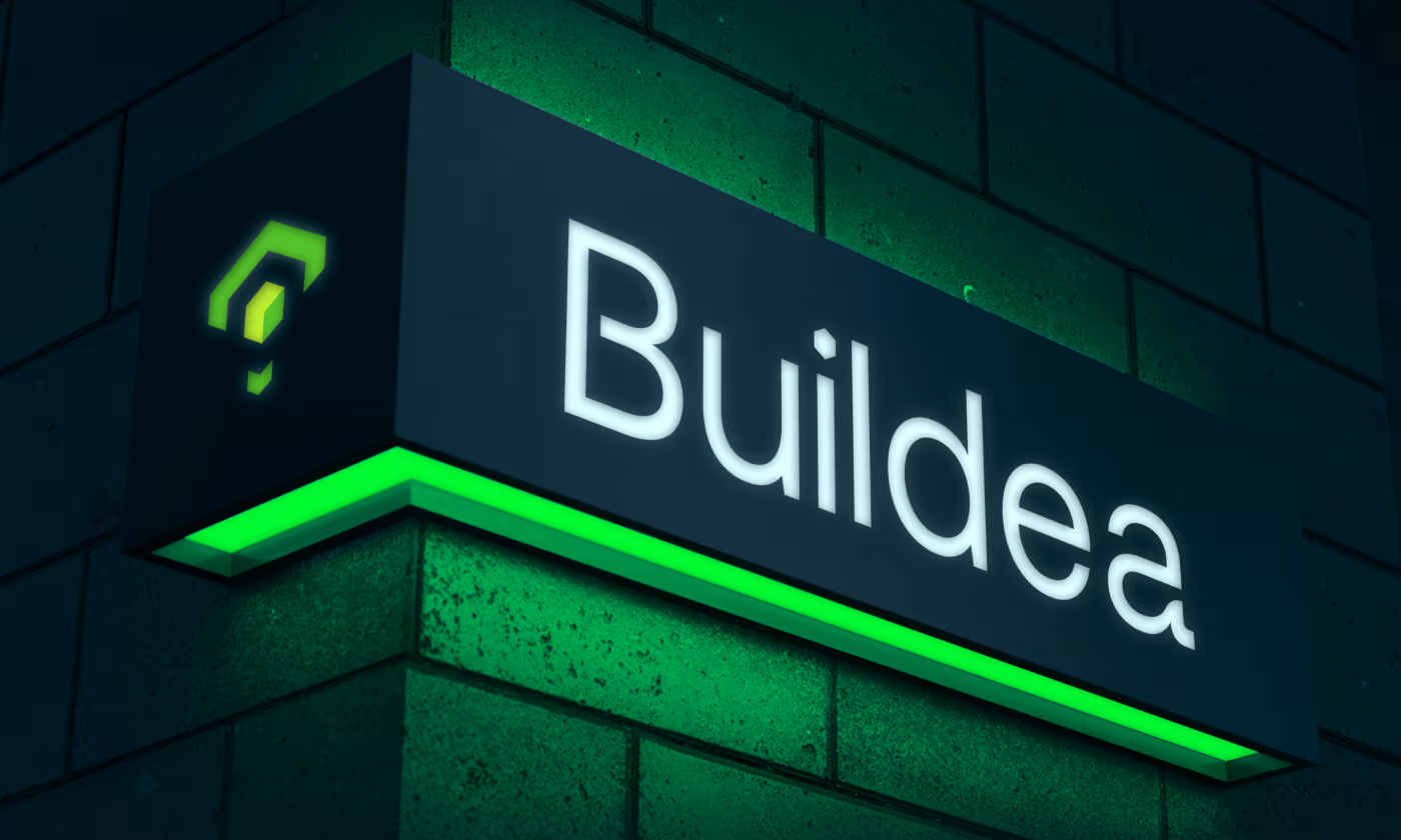
- Clean Building Logo: Designing a simple logo shape that looks great on business cards or glowing on a brick wall at night.
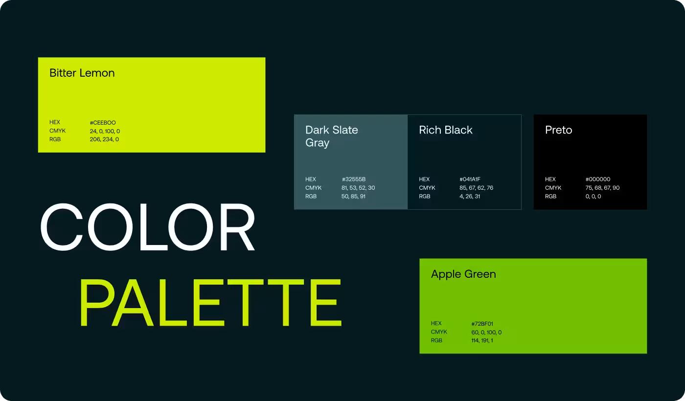
- Smart Color Choices: Using deep, dark tones for trust, combined with bright lime colors to show growth and green ideas.
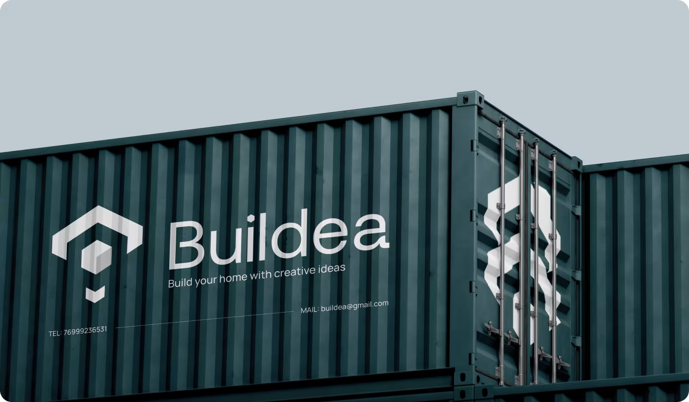
- Cool Construction Sites: Putting the logo on big shipping containers so people see their name while walking past project sites.
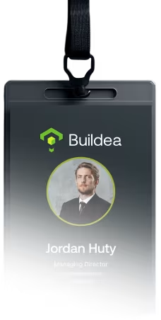
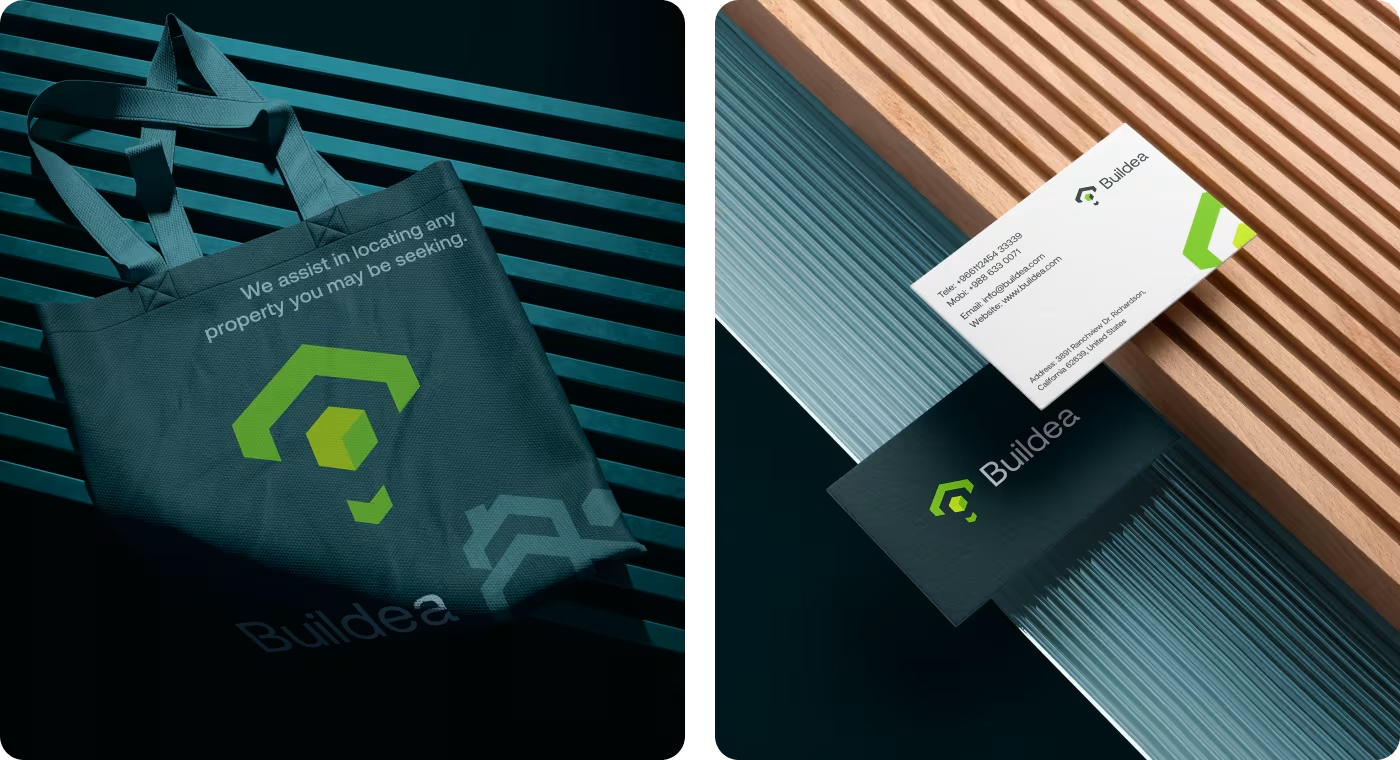
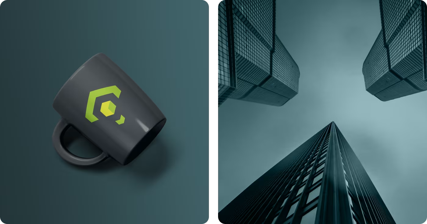
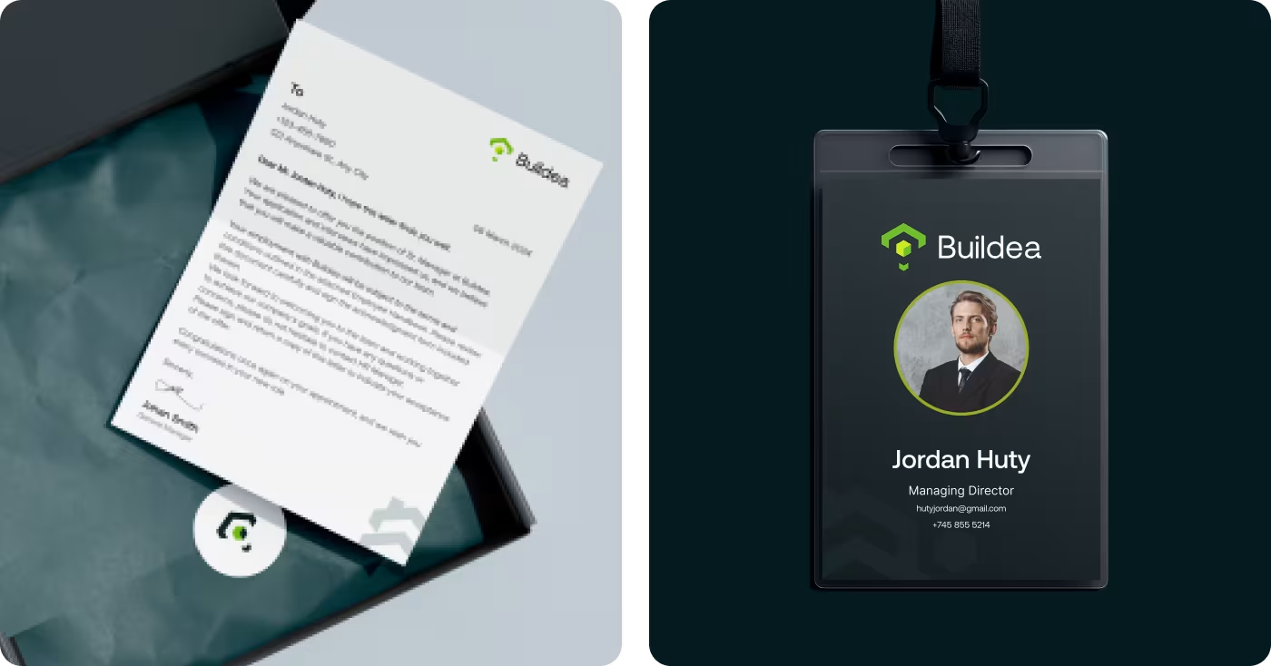
- Matching Office Gear: Making sure employee badges, papers, bags, and cups all look like they belong to the same family.
How we built the new look step by step
- Checking out other brands
- Finding missing styles
- Learning about what clients want
- Choosing our design direction
- Picking the perfect colors
- Choosing easy-to-read fonts
- Drawing the main logo shape
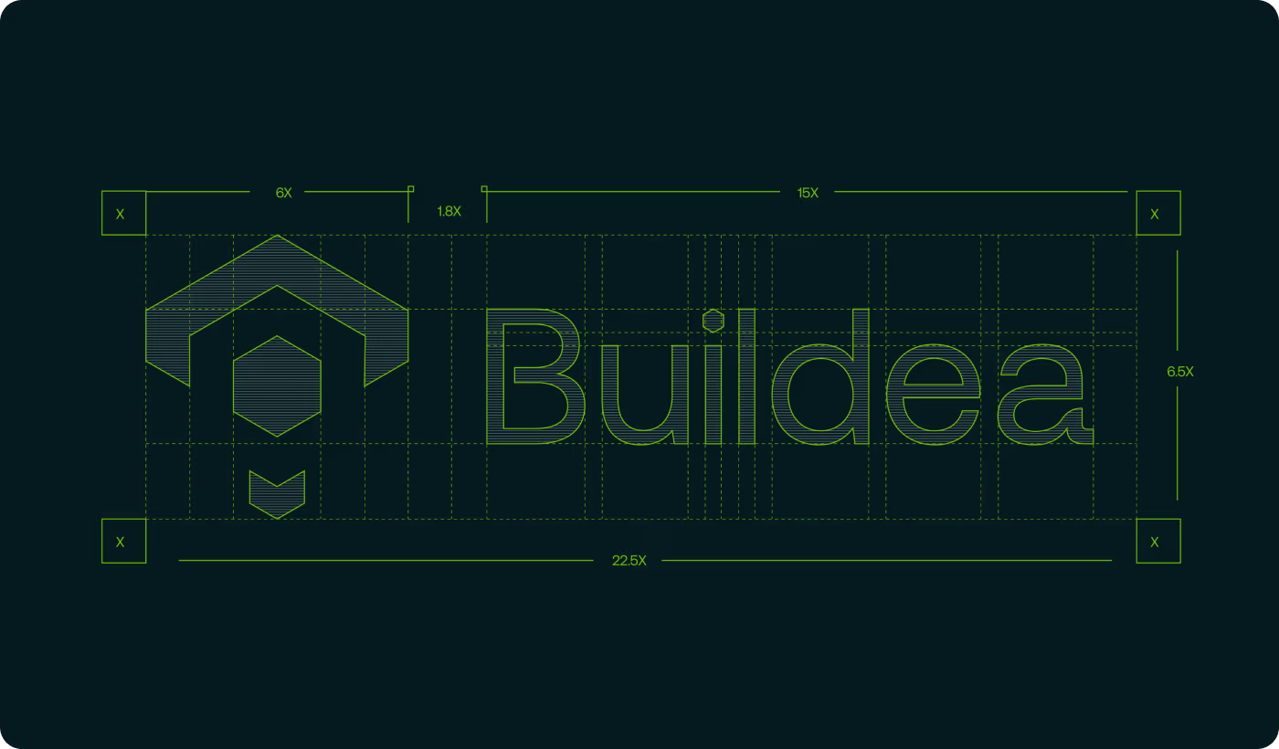
- Testing different layout grids
- Creating professional business cards
- Styling large outdoor signs
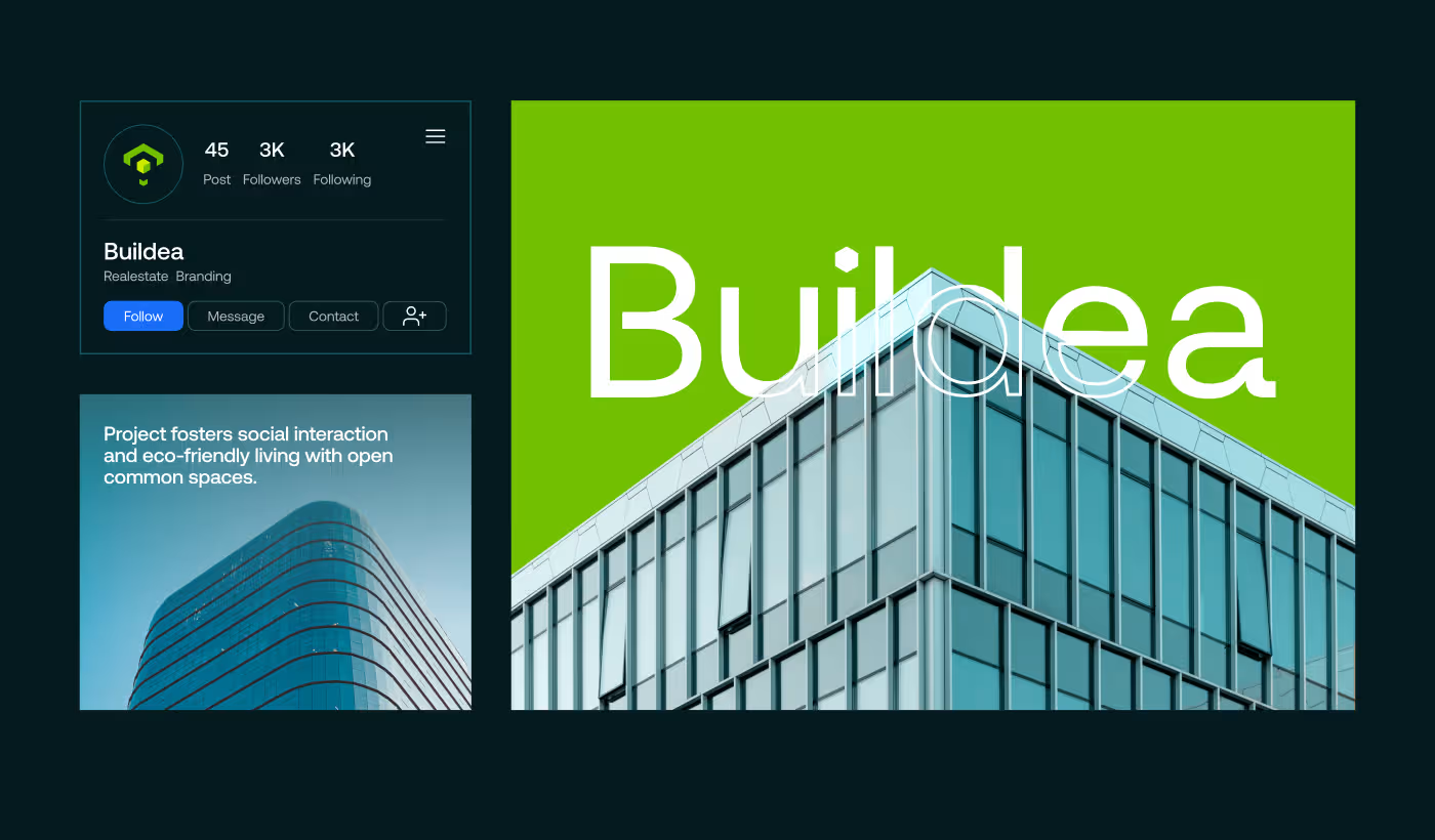
- Setting up internet profile pages
- Designing cool bags and cups
- Checking printed office items
- Testing big signs on job sites
- Auditing layouts on mobile screens
- Sending over the final files

UX Research & Design Artifacts
The things we learned from watching how early users behaved helped us make all our design choices later on. By figuring out exactly where people paused, felt confused, or lost trust while looking at properties, we turned those clues into clear design building blocks that fixed the structure, setups, and looks.
As mapped out in the layout framework, these tools helped match the brand experience with real-world customer habits. This plan made it easy for users to find information quickly, helped them make decisions faster, and showed off Buildea's high-quality identity through the whole process.
UX Research & Design Artifacts
The things we learned from watching how early users behaved helped us make all our design choices later on. By figuring out exactly where people paused, felt confused, or lost trust while looking at properties, we turned those clues into clear design building blocks that fixed the structure, setups, and looks.
As mapped out in the layout framework, these tools helped match the brand experience with real-world customer habits. This plan made it easy for users to find information quickly, helped them make decisions faster, and showed off Buildea's high-quality identity through the whole process.
Simple shapes and smart color choices
We made the logo using clean, straight lines so it looks like a modern architectural blueprint. The design is bold and simple, which helps people recognize the company instantly whether they see it on a small phone screen or out on a real street corner.
The logo works perfectly on dark backgrounds. We mixed heavy tones like Rich Black (#041A1F) and Dark Slate Gray (#32555B) for a safe feeling, then added pops of Bitter Lemon (#CEEB00) and Apple Green (#72BF01) to show they love nature.
Office gear that matches perfectly
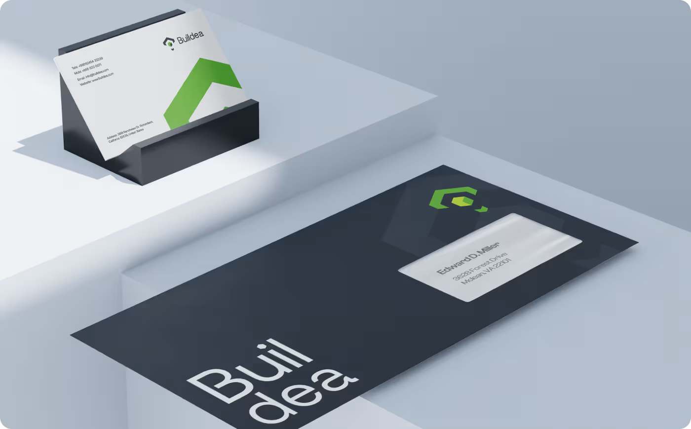
We designed all the basic business tools so the company always looks highly professional when talking to clients.
By making sure the text, lines, and colors are in the exact same spot on every paper, we eliminate messy layouts and help build fast consumer trust.
A complete design system built to last
The new look gave Buildea a great visual style that matches their high building standards and works perfectly anywhere.
- Easy Scaling: The design moves perfectly between small phone screens and giant outdoor construction signs.
- Street Advertising: Branded shipping containers now work as awesome street ads for their active building projects.
- Team Alignment: Matching cards and ID badges help the team feel united and look highly professional.
- Clear Message: The dark and green colors perfectly show that the company is reliable and loves eco-friendly ideas.
Ready To Build
Your Next Project?
.avif)


%201%201.svg)



.svg)


.svg)

.svg)

.svg)
.svg)


.svg)







.avif)



.svg)

