Givehub



.svg)
Investing secures external funds for business, used in innovative ventures. Claiming involves obtaining returns for debt settlement, profit distribution, or business reinvestment.
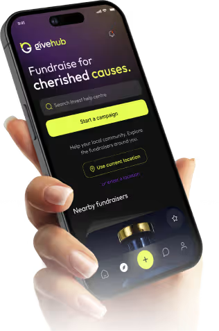
The project required simplifying donation flows without removing critical information users rely on to build trust. At the same time, the experience had to make campaign impact clear while keeping the interaction fast and easy to complete.
.avif)
.avif)
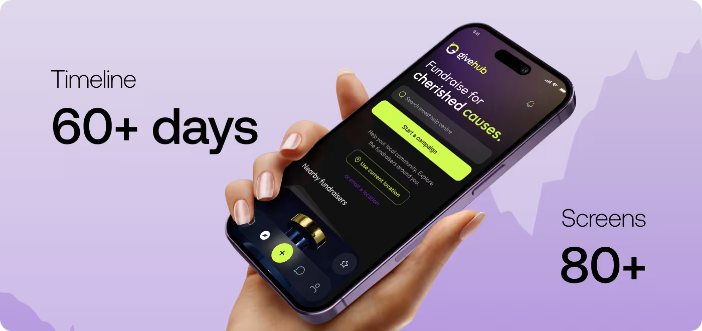
The Donation Experience Felt Confusing During Important Moments
Users wanted to support campaigns, but the app made simple actions feel harder than expected. Too much information, unclear actions, and a heavy flow caused hesitation before completing donations.
- Campaign information felt crowded, so users struggled to quickly understand what mattered most.
- Users were unsure about the next step during the donation process and often paused before continuing.
- Important actions like donating or connecting wallets did not stand out clearly enough on key screens.
- The experience required too much effort between browsing a campaign and completing payment.
.avif)
.avif)
We Simplified the Donation Experience and Made Actions Clearer
The experience was redesigned to help users understand campaigns faster, move through the donation flow more smoothly, and complete actions with less confusion.
- Campaign layouts were reorganized to make important information easier to scan and understand quickly.
- The donation flow was simplified step by step so users always knew what to do next.
- Primary actions like donating, connecting wallets, and joining memberships were made more visible across key screens.
- Spacing, hierarchy, and cleaner layouts were used to reduce distractions and help users stay focused during important moments.
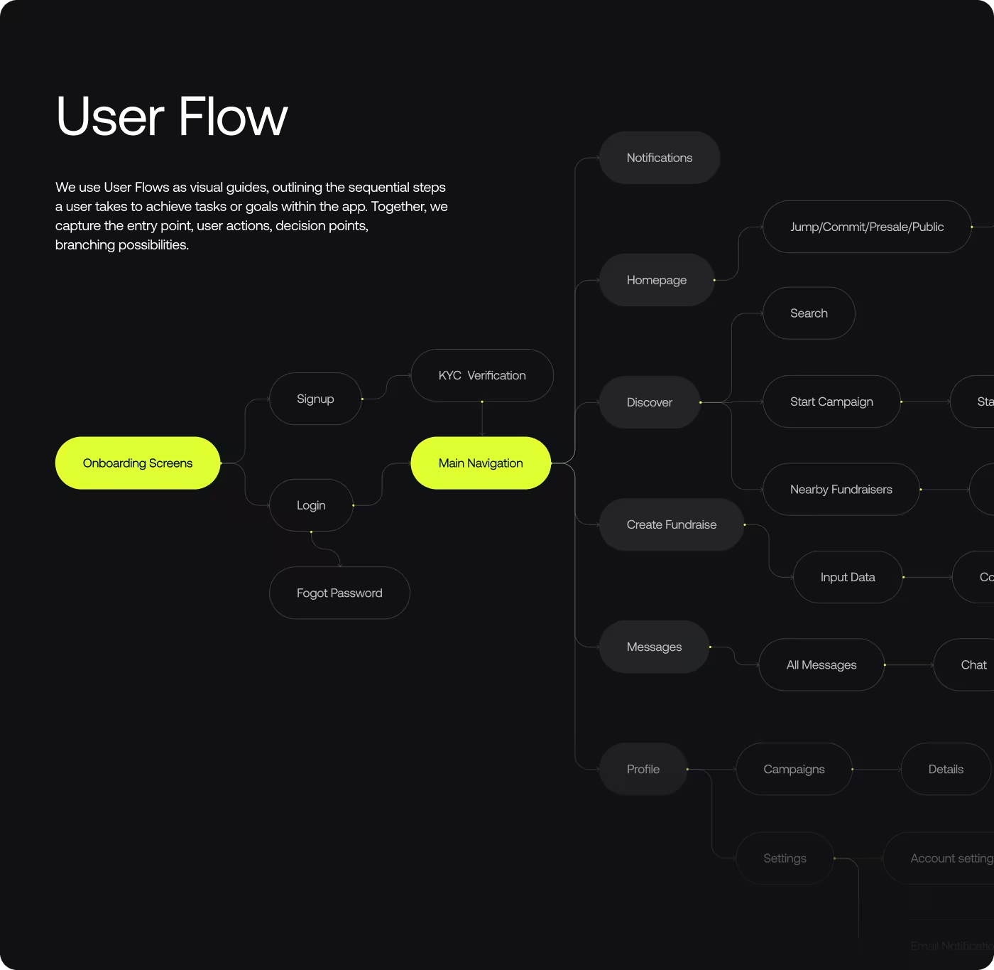
Building a Simpler and More Focused Donation Experience
- Reviewed user journey
- Found crowded screens
- Spotted missed actions
- Identified hesitation points
- Reduced extra steps
- Grouped related content
- Clarified next actions
- Improved screen movement
- Highlighted campaign impact
- Improved visual hierarchy
- Reduced visual clutter
- Simplified campaign scanning
- Unified visual structure
- Standardized interactions
- Created cleaner layouts
- Improved content readability
.avif)
.avif)
.avif)
Understanding Why Users Hesitated Before Donating
The research focused on finding where users felt confused, overloaded, or unsure during the donation experience and understanding what prevented them from completing actions smoothly.
- Users struggled to scan campaign information quickly during important decision-making moments.
- Donation actions were not always clear enough across campaign and payment screens.
- Users slowed down when too much information appeared at once in the flow.
- Campaign trust and donation confidence depended heavily on clearer structure and easier navigation.
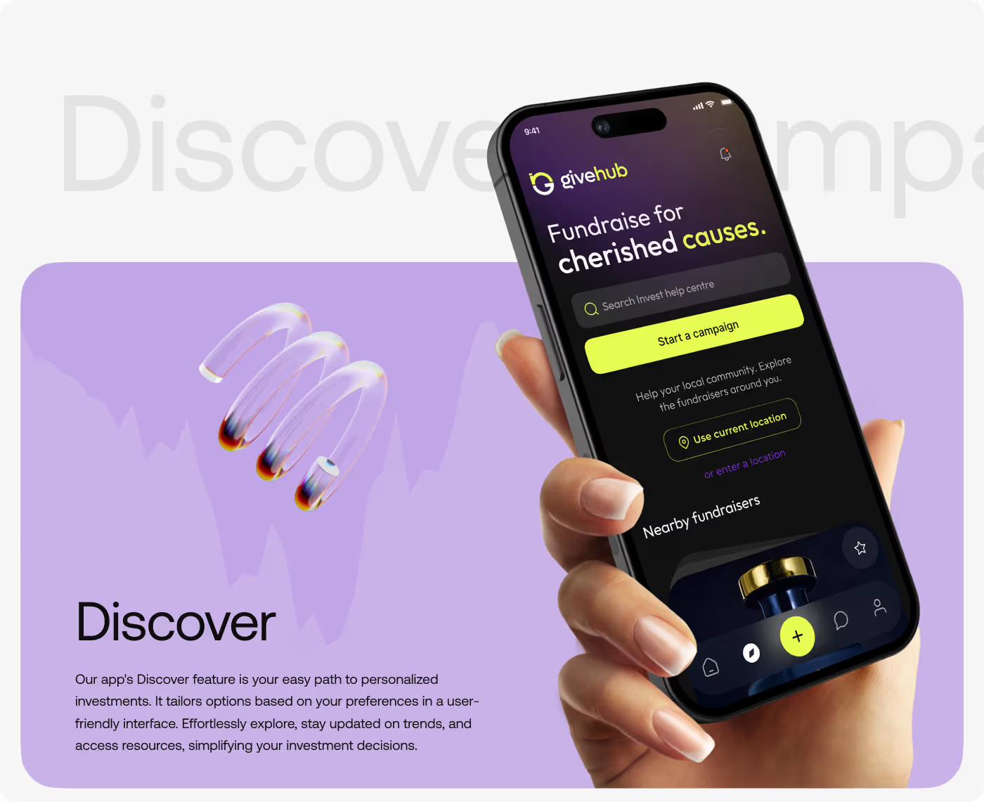
Simplifying the Donation Journey
The UX design work focused on making the donation experience easier to understand from the first interaction to the final payment step. The original flow asked users to process too much information at once, which created hesitation during important moments.
Campaign discovery, payment flow, and interaction patterns were redesigned to reduce unnecessary effort. The goal was to help users stay focused on supporting causes instead of trying to figure out how the app worked.
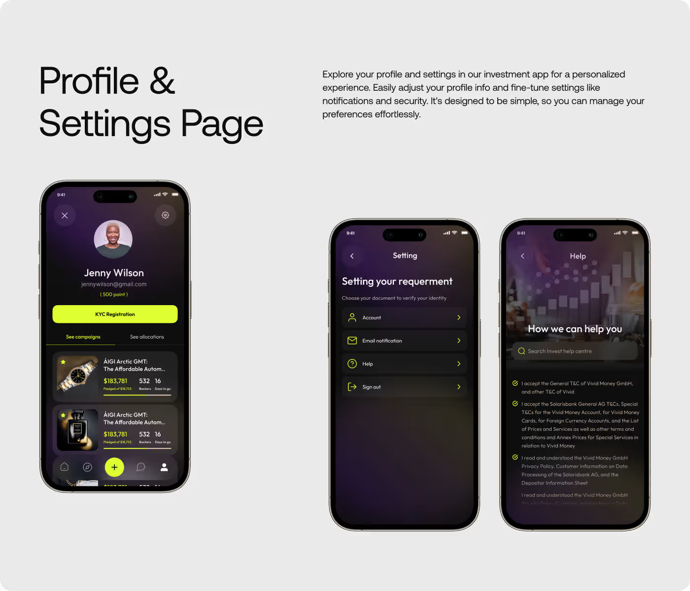
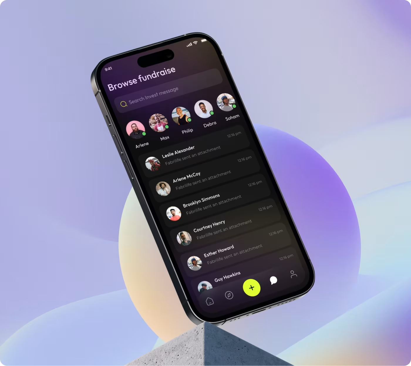
Creating a Clearer and More Focused Interface
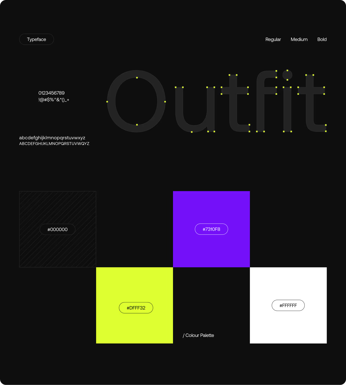
The interface was redesigned to improve readability, spacing, and visual focus across the app. Important campaign details, donation actions, and user interactions needed to stand out more clearly during decision-making moments.
Layouts were cleaned up to reduce distractions and improve scanning behavior. Typography, cards, buttons, and content hierarchy were refined to create a more balanced and consistent experience across screens.
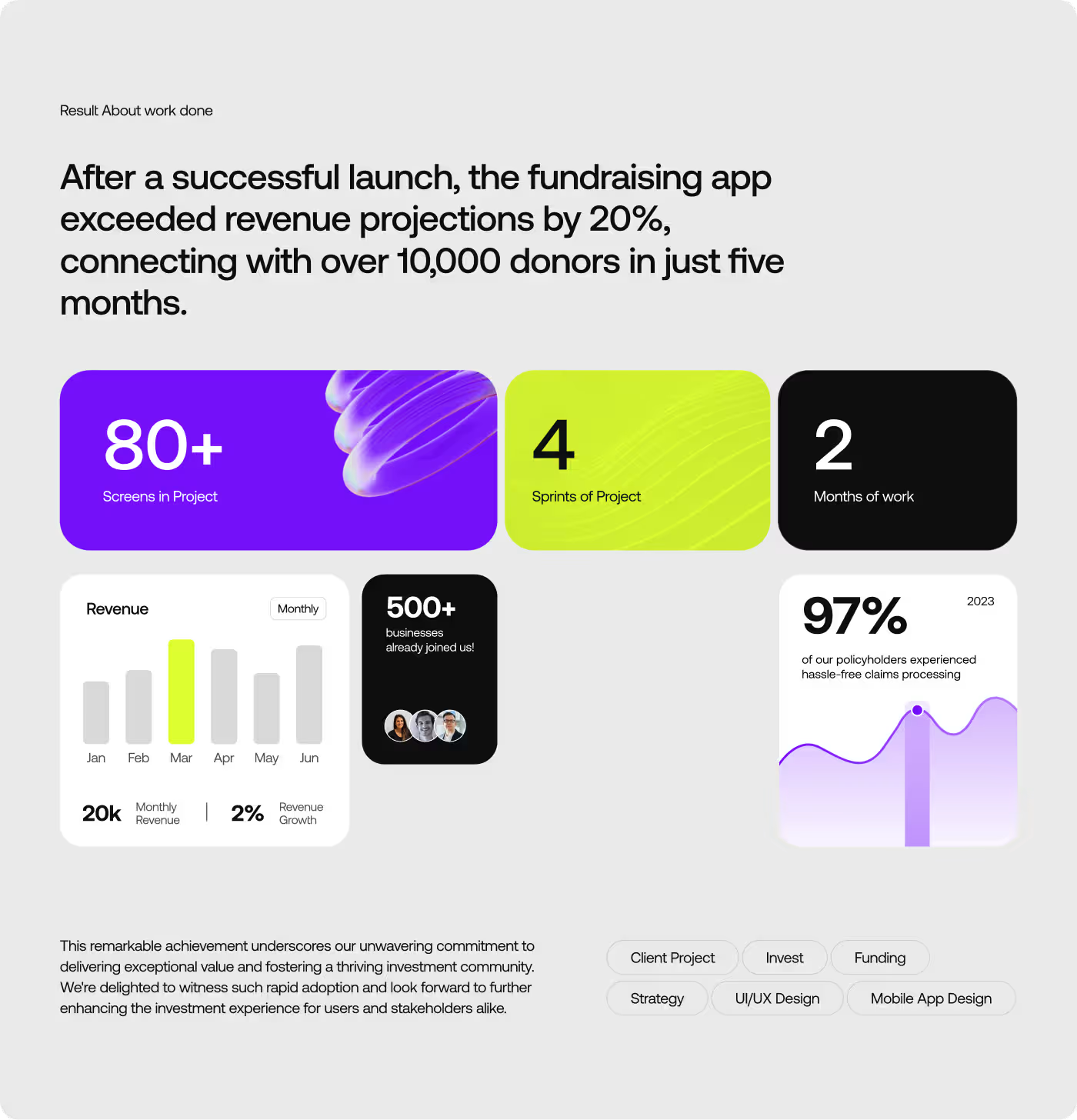
The Donation Experience Became Faster, Clearer, and Easier to Follow
After the redesign, users could understand campaigns more quickly and move through the donation flow with less confusion. The experience felt more focused, which helped people complete actions with more confidence.
- Donation completion increased by 36% after simplifying the payment flow.
- Users spent less time figuring out what to do next during key actions.
- Payment drop-offs decreased by 28% across the donation journey.
- Campaign interaction increased by 31% because information became easier to scan and understand.
Ready To Build
Your Next Project?
.avif)


%201%201.svg)
.svg)
Bluecat modern website
.avif)

Helion

.svg)


.svg)

.svg)

.svg)
.svg)


.svg)







.avif)



.svg)

