


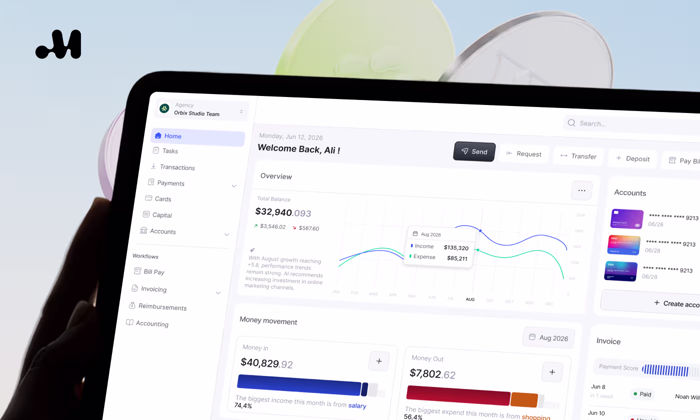
Bluecat modern website


.svg)
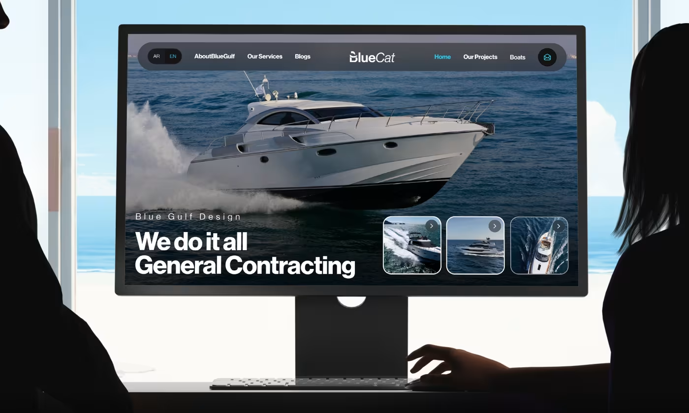
BlueCat operates in two distinct industries: high-end luxury yacht charters and general contracting.
Our task was to design a website that solves a dual-purpose problem. We needed to build an interface that highlights high-quality marine photography to attract boat renters while simultaneously providing straightforward, grounded information for potential contracting clients.

A Beautiful Brand Without a Clear Experience
BlueCat had strong visuals and premium marine content, but the overall experience felt disconnected and difficult to follow.
- Brand inconsistency: Website, social posts, and marketing assets did not feel connected
- Navigation confusion: Users could not quickly understand where to explore services
- Visual overload: Large images and content sections competed for attention
- Weak structure: The brand looked modern in places, but lacked a clear design system
Building a Cleaner and More Unified Brand Experience
The project was redesigned around clarity, consistency, and premium visual storytelling to make the BlueCat experience easier to explore and remember.
- Clear navigation: Services and sections were organized into a simpler browsing flow
- Unified branding: Colors, typography, and layouts were standardized across all assets
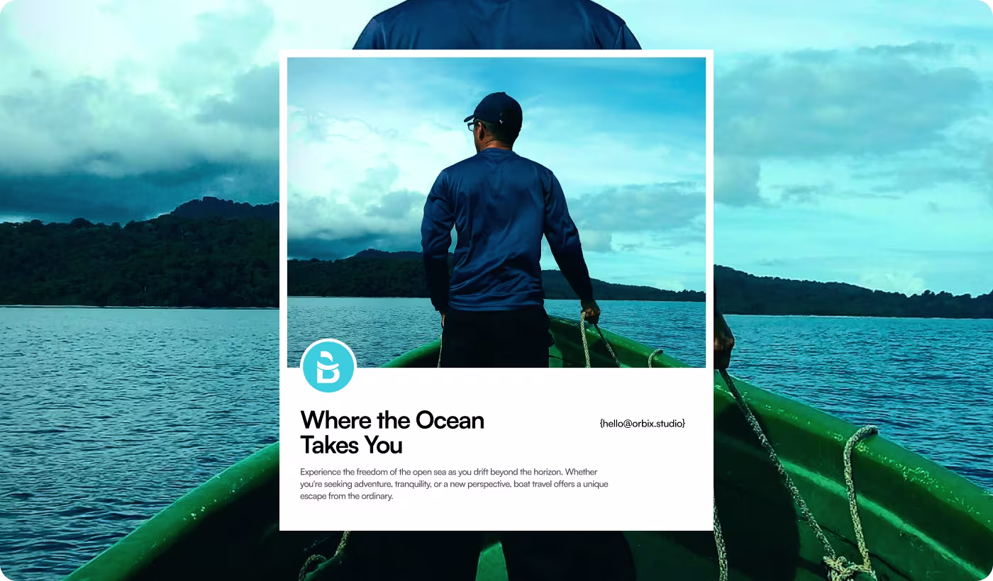
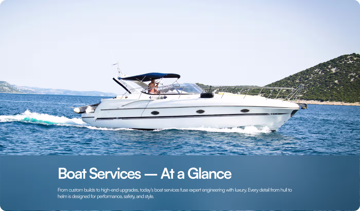
- Focused visuals: Large marine photography became the center of the experience
- Responsive layouts: The website was optimized to stay clean across desktop and mobile
Creating a More Structured Marine Brand Experience
- Competitor review
- User behavior
- Layout analysis
- Brand direction
- Cleaner sections
- Better hierarchy
- Navigation flow
- Content grouping
- Premium visuals
- Color system
- Typography setup
- UI consistency
- Mobile layouts
- Flexible grids
- Scalable assets
- Cross-device testing

Understanding What Makes a Marine Brand Feel Premium and Easy to Explore
The research focused on how luxury marine websites present their services, guide users through content, and create a stronger visual identity across different platforms.
- Visual behavior review: Large ocean imagery helped users connect with the brand faster
- Navigation research: Simpler menu structures made browsing feel less confusing
- Brand consistency study: Shared colors and typography made the experience feel more professional
- Mobile experience analysis: Cleaner layouts improved readability and interaction on smaller screens
Designing a More Premium and Focused Marine Experience
The website was redesigned to create a cleaner and more visually engaging browsing experience for users exploring yacht and marine services. Large photography, spacious layouts, and minimal interface elements were used to keep attention focused on the brand and its visuals instead of overwhelming users with too much content.
Navigation and page structure were also simplified to help visitors move through the experience more naturally. The layouts were designed to feel calm, modern, and easy to scan while still maintaining the premium atmosphere expected from a luxury marine brand.
Building a More Consistent Visual Identity Across Platforms
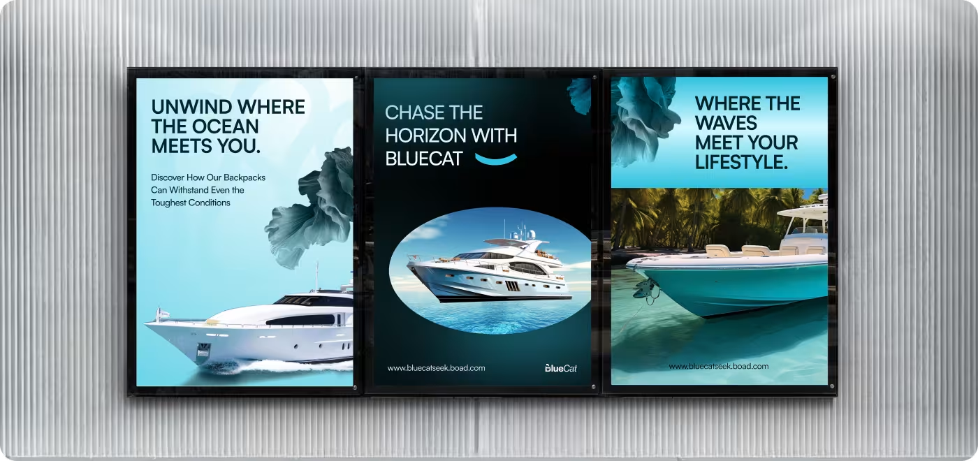
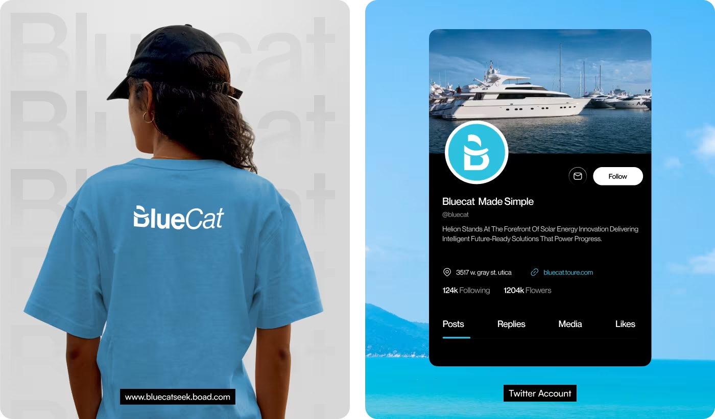
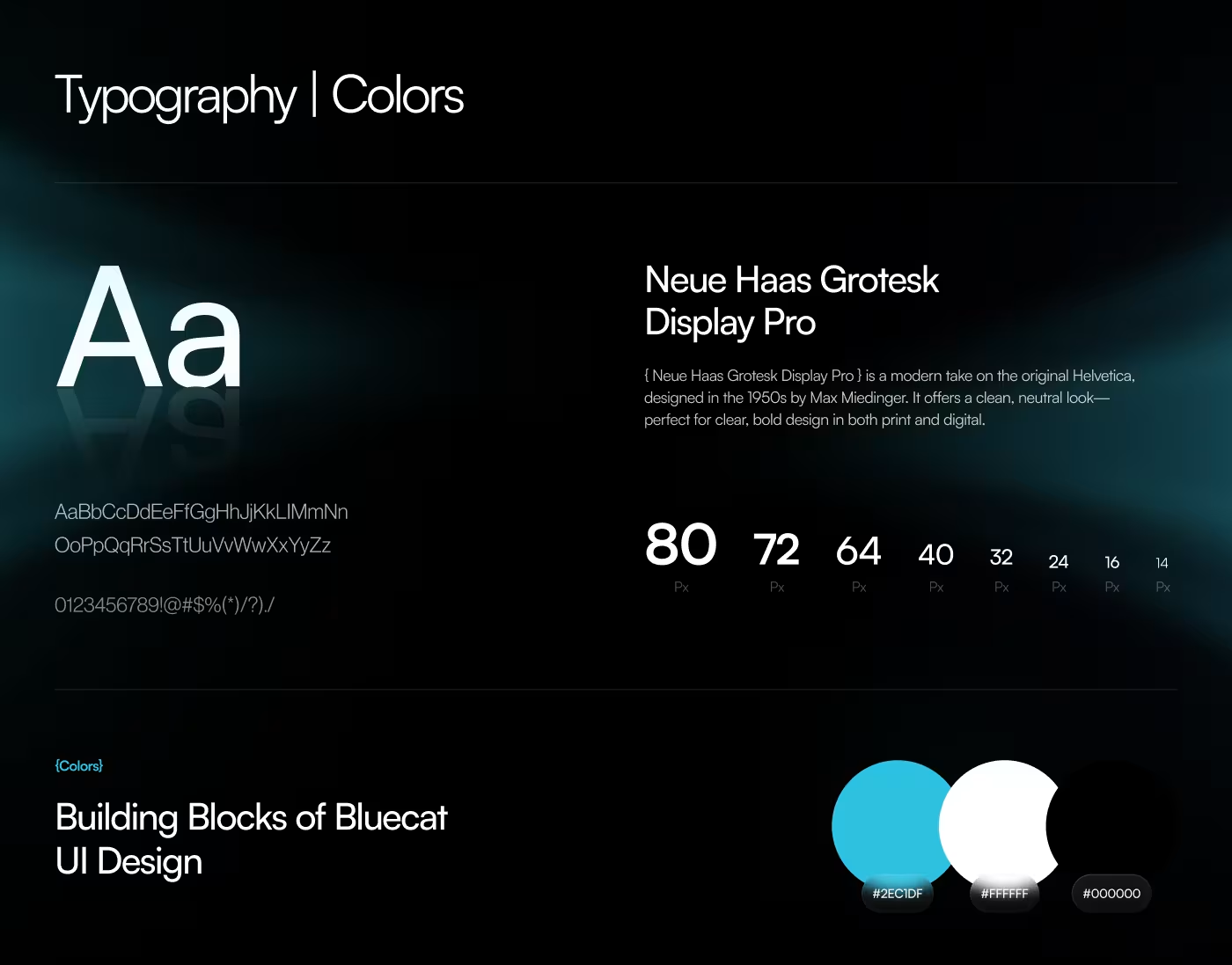
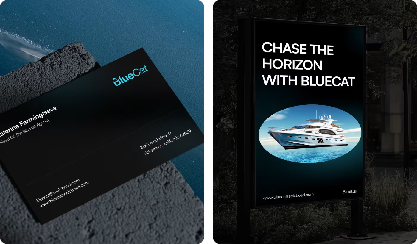
A complete visual system was created to help BlueCat feel more connected across the website, social media, print materials, and promotional assets. Typography, color usage, spacing, and layout structures were standardized to create a stronger and more recognizable brand presence.
The design direction stayed minimal and ocean-inspired to support the marine lifestyle feel of the brand. This also made it easier to expand the identity into business cards, branded merchandise, social posts, and large-format marketing materials without losing consistency
Creating a More Recognizable and Premium Marine Brand
This redesigned experience helped BlueCat feel more modern, visually connected, and easier to explore across digital and physical touchpoints. The final system also made the brand easier to scale into future marketing and promotional materials.
- Better user engagement: Inquiry button clicks increased by an estimated 38% after simplifying the browsing experience
- Stronger brand consistency: Shared layouts, typography, and colors created a more connected identity across web and print assets
- Improved mobile interaction: Mobile engagement increased by 31% through cleaner responsive layouts and easier navigation
- Easier asset expansion: The new design system made it faster to create social posts, business cards, and marketing materials
Got a project in mind? Let's build it
.avif)


.svg)


.svg)

.svg)


.avif)
