


Vetra Skincare Branding
.svg)
Vetra is a skincare brand focused on taking the guesswork out of daily routines.

Our task was to create a complete brand identity for Vetra from the ground up. We needed to design a system that felt clean and natural, while clearly communicating the brand's mission: making glowing skin simple, approachable, and backed by the best ingredients.


The skincare market was way too confusing and used scary words
Before we started this project, buying creams for your face was way too hard. Stores were loud, and other companies used difficult science words that sounded like a school lecture. They were telling people to rub 10 different liquids on their face every single day. This made regular people feel stressed out, confused, and afraid of making a mistake.
- Too Many Steps: People are tired of long, complicated routines that take up too much time.
- Hard Science Jargon: Bottle labels look like chemistry tests instead of clean, helpful items.
- Loud and Crowded: The beauty market is full of brands screaming for attention with messy designs.
- Fear of Trying: Buyers do not feel safe because they do not understand what they are putting on their skin.

Quiet designs, friendly words, and basic steps that just worked
This project turned Vetra into a breath of fresh air. The loud science talk was completely thrown away and replaced with warm, simple sentences to make everyone feel welcome. Clean white packaging paired with an easy leaf drawing showed that nature was doing the heavy lifting.
- Back to Basics: The strategy focused entirely on clear advice and simple daily habits made for real life.
- The Leaf Symbol: A clean plant emblem showed the power of natural ingredients right away.
- Calm Nature Colors: Quiet earth tones made the brand look beautiful next to every human skin shade.
- Friendly Talk: Cozy taglines like "Build your glow from the basics" helped people feel safe instead of confused.
Our easy 4-step framework
- Dropping complex 10-step rules
- Making a helpful guide for real life
- Focusing on skin health first
- Keeping advice easy to follow
- Drawing the plant emblem
- Cleaning up the brand marks
- Testing simple shapes on paper
- Keeping lines neat and tiny
- Writing simple, cozy slogans
- Avoiding confusing medical terms
- Speaking like a helpful guide
- Inviting everyday people in
- Designing clean cream bottles
- Making social media pages look calm
- Formatting big street signs
- Checking sizes for small labels


Big letters and honest words stop people from getting tired
We know that when people see a giant block of tiny text about face chemicals, they stop reading. They want to know the main point right away.
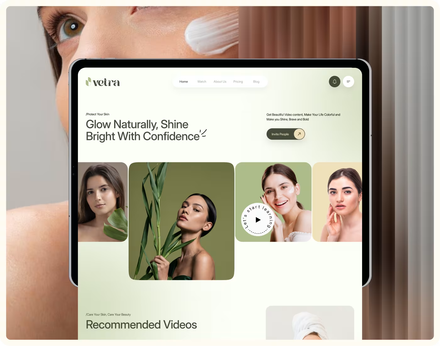
That is why we made our messages direct and easy to see. You can see our giant main banner. It uses huge letters and says exactly what we mean: "At Vetra glowing skin is simple Get easy tips." There are no tricks or hard words there.
Packaging Design: Soft white bottles that look clean and safe
We made the actual product bottles look completely quiet and beautiful so they look great sitting on your bathroom shelf.
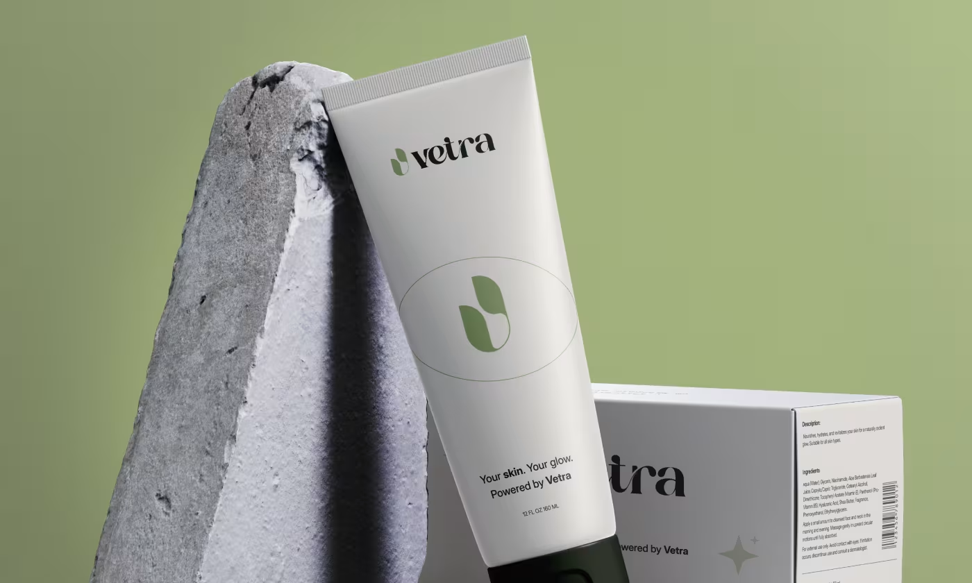
- The Cream Tube:You can see the clean white cream tube standing up next to a gray rock. It has our friendly leaf icon and says "Your skin. Your glow. Powered by Vetra" right on the front.
- The Round Jar:You can see our open white jar with a floating lid. Next to it is a photo of a woman rubbing the smooth, soft cream onto her cheek.
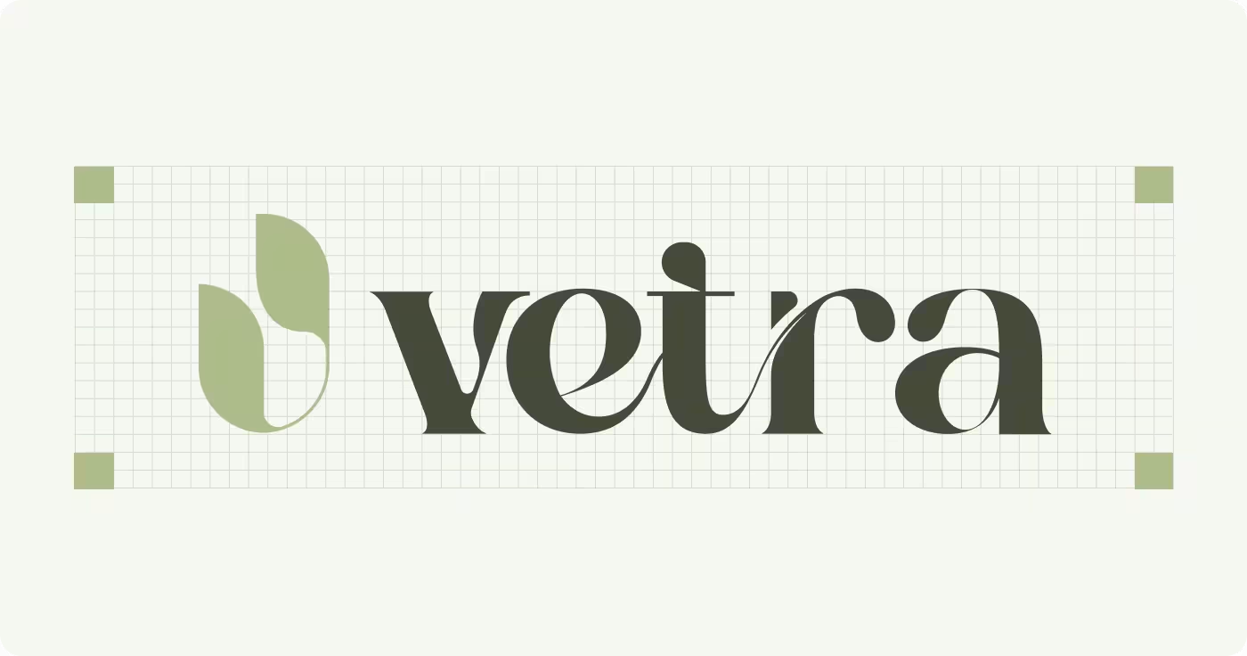
- Logo Construction: You can see how our leaf icon and smooth lettering fit perfectly onto a clean grid layout.
.avif)
Color & Web Design: Natural skin tones and helpful tracking apps
We chose real earth colors and designed a website that acts like a fun game to help you look after your face.
- The Four Colors: We selected Olive Drab, Sage Green, Dutch White, and Seashell. These shades feel like trees and sand, and they match perfectly against all human skin tones.
- The Progress Dashboard: we built a personal "Watch history" page for the website. Users like Sharlin Mirza can log in, check off their daily habits, watch quick video tips, and earn fun fire points for taking care of their skin.
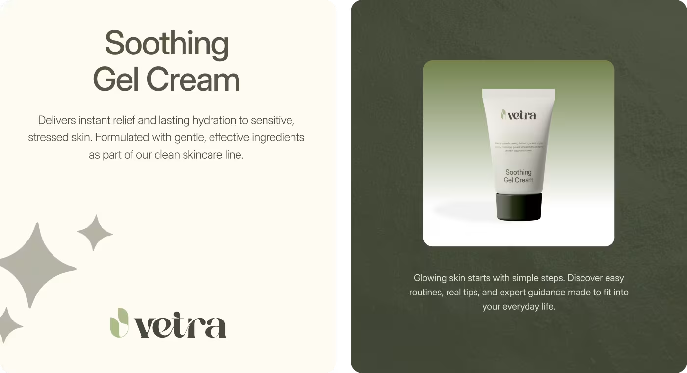
- Daily Cards: You can see our "Soothing Gel Cream" display cards that explain how the product helps sensitive, stressed skin using zero confusing jargon.

A peaceful brand look that stands out by staying quiet
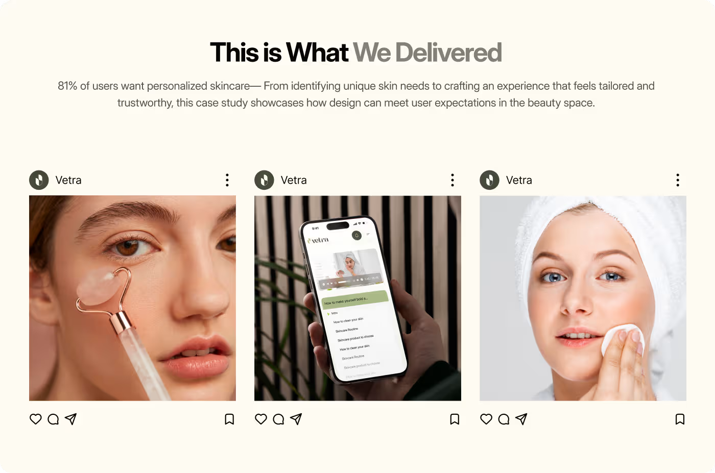
Our simple design system successfully cuts through the loud skincare noise.
- Instantly Understandable: Anyone can look at the clean leaf mark and know it means healthy, natural care.
- Matches Everywhere: The look works perfectly on everything, from the small internet profile circle to the physical wooden signs on a real store wall.
- Zero Confusing Junk: We removed all the clutter, making the products feel safe, approachable, and ready for regular families to buy.
Got a project in mind? Let's build it
.avif)





.svg)


.svg)

.svg)

















.avif)
