Payno


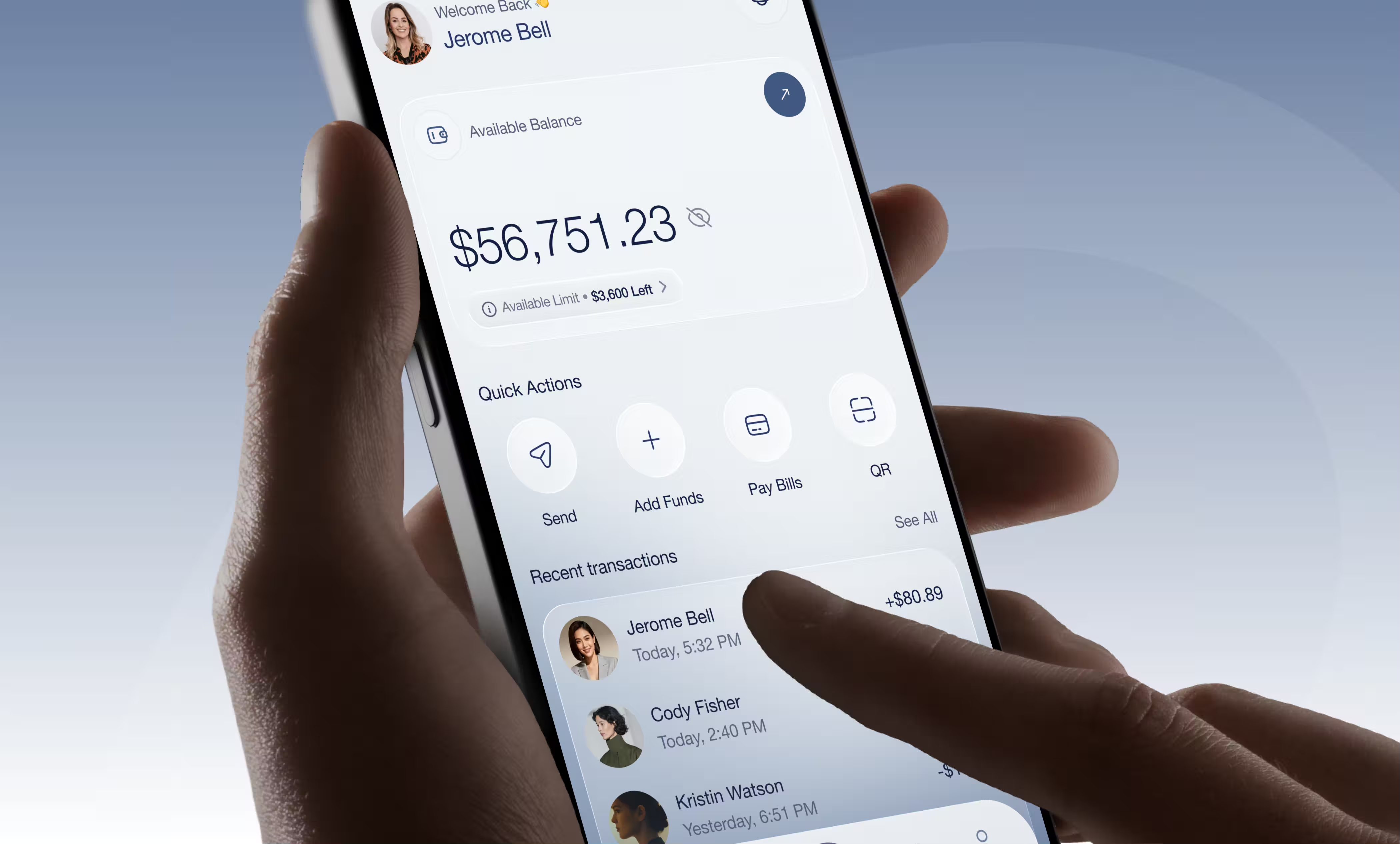

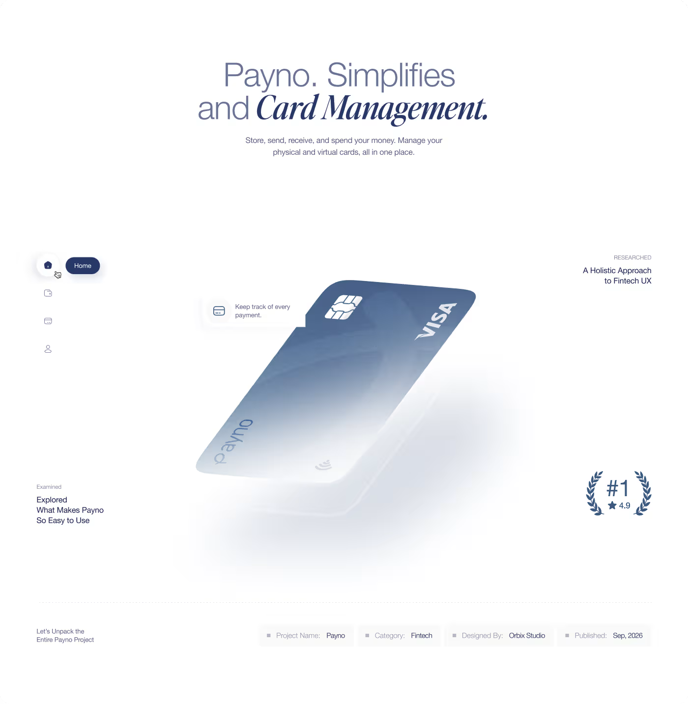
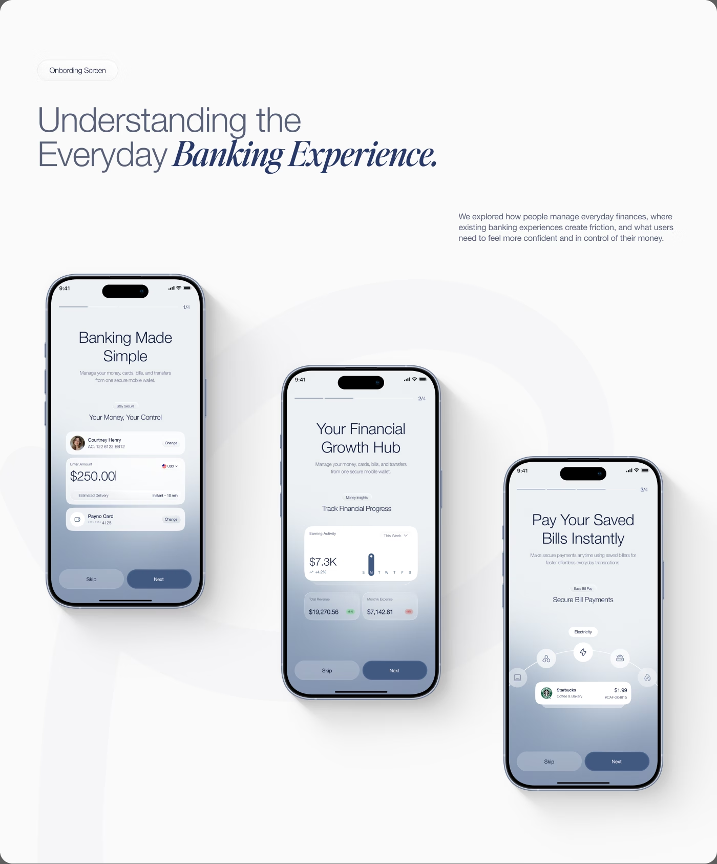
Payno was designed to simplify how users manage everyday money, cards, and payments in one place.
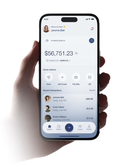
Our task was to design Payno to make daily banking, transfers, and card management seamless. Many existing banking applications overwhelm users with fragmented menus and confusing verification flows. We created Payno to unify digital wallets, instant transfers, utility bill payments, and smart card controls into one intuitive experience.
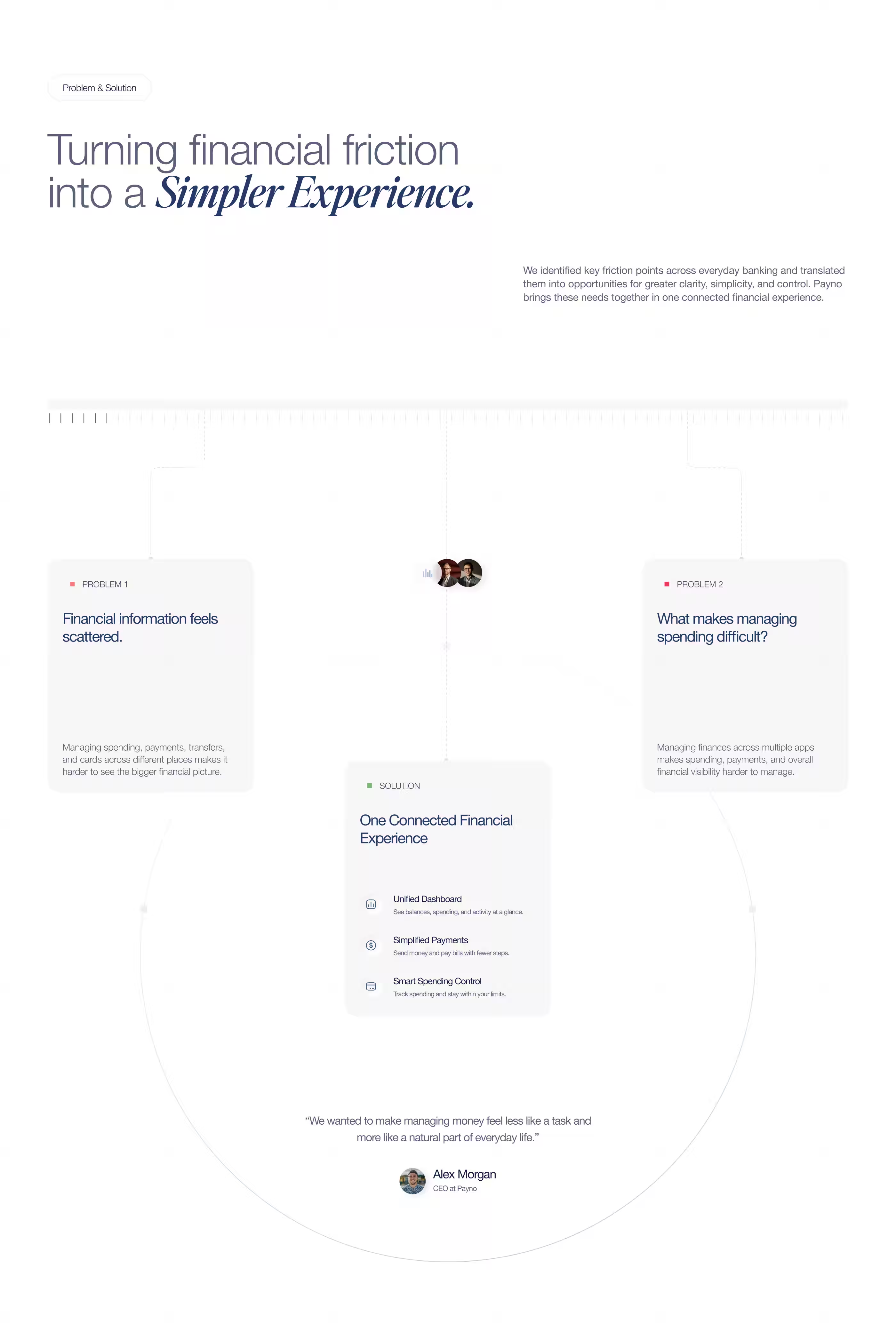
Users Felt Overwhelmed by Fragmented Financial Tools
Managing spending, payments, transfers, and cards across disconnected platforms created friction and made it difficult for users to maintain a clear overview of their financial activity.
- Scattered Account Data: Users struggled to monitor balances, spending limits, and expenses across multiple accounts.
- Complex Transfer Steps: Sending money or paying recurring utility bills involved unnecessary friction and lacked clear confirmation.
- Buried Card Controls: Freezing cards, issuing virtual cards, and managing daily limits were difficult to locate quickly.
- Lack of Real-time Visibility: Unclear transaction history and reporting made it harder for users to track their everyday cash flow.
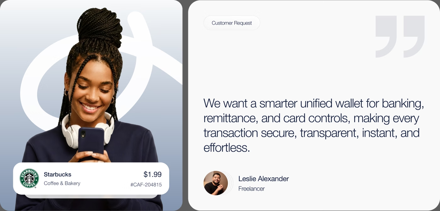

We Unified Daily Banking, Transfers, and Card Management
The experience was redesigned to help users understand their finances faster, send money effortlessly, and manage cards without confusion.
- Unified Financial Dashboard: Designed an intuitive home view showing available balances, spending limits, quick actions, and recent activity at a glance.
- Streamlined Transfers & Bill Pay: Simplified money transfers and bill payments with saved billers, instant confirmations, and scheduled reminders.
- Immediate Card Controls: Enabled one-tap card freezing, limit adjustments, and instant virtual card management directly from the wallet screen.
- Predictable Visual Hierarchy: Reorganized information architecture and interaction patterns to ensure consistent usability across all devices.

4-Step Process: From Financial Friction to Seamless UX
- Audited existing banking flows
- Interviewed target users
- Mapped friction points
- Defined key use cases
- Simplified payment flows
- Optimized onboarding steps
- Streamlined bill pay journey
- Structured card controls
- Built modular card system
- Refined typography hierarchy
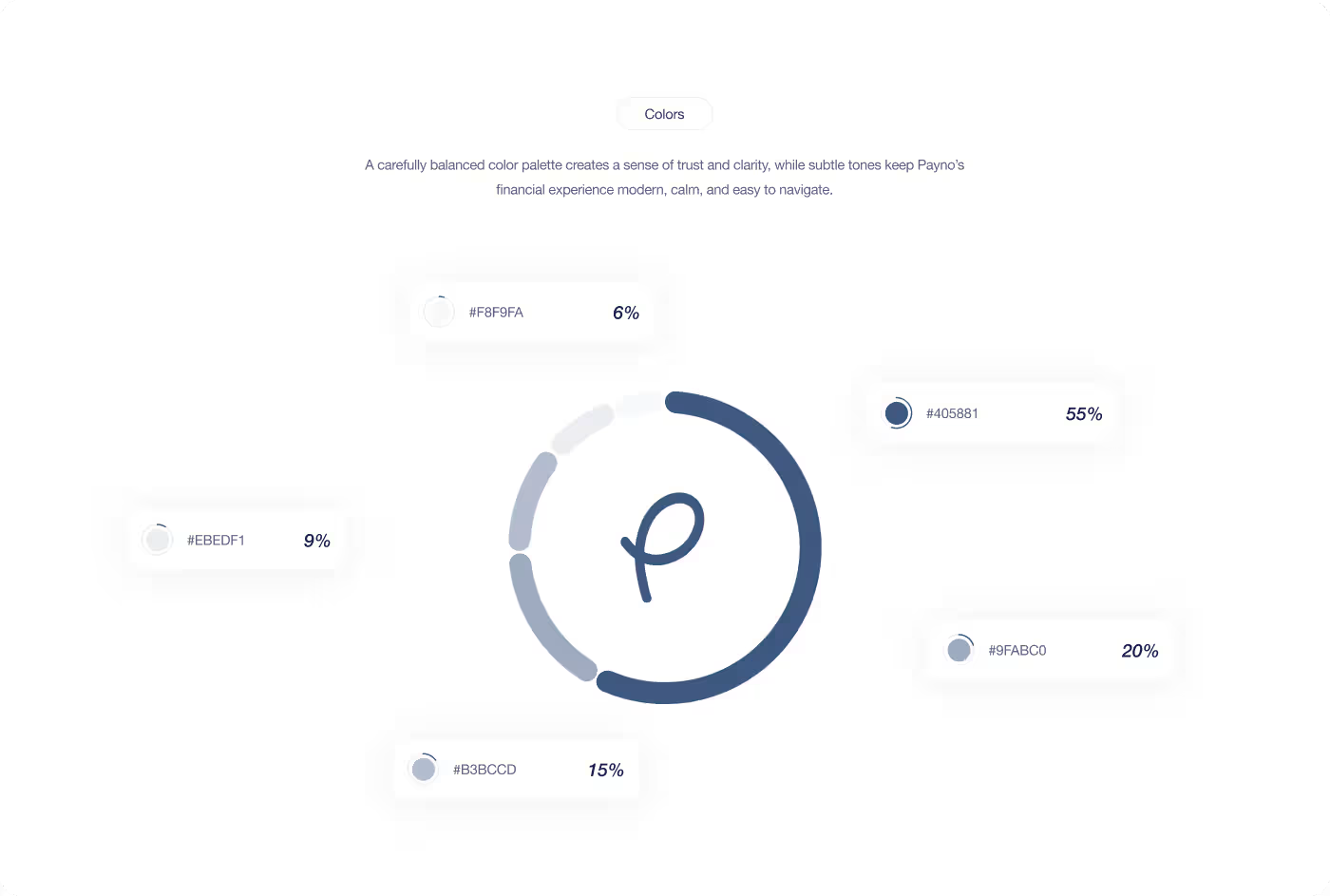
- Selected trust-focused palette
- Designed custom finance icons
- Conducted usability tests
- Measured 92% transfer success
- Iterated based on user feedback
- Finalized design specifications

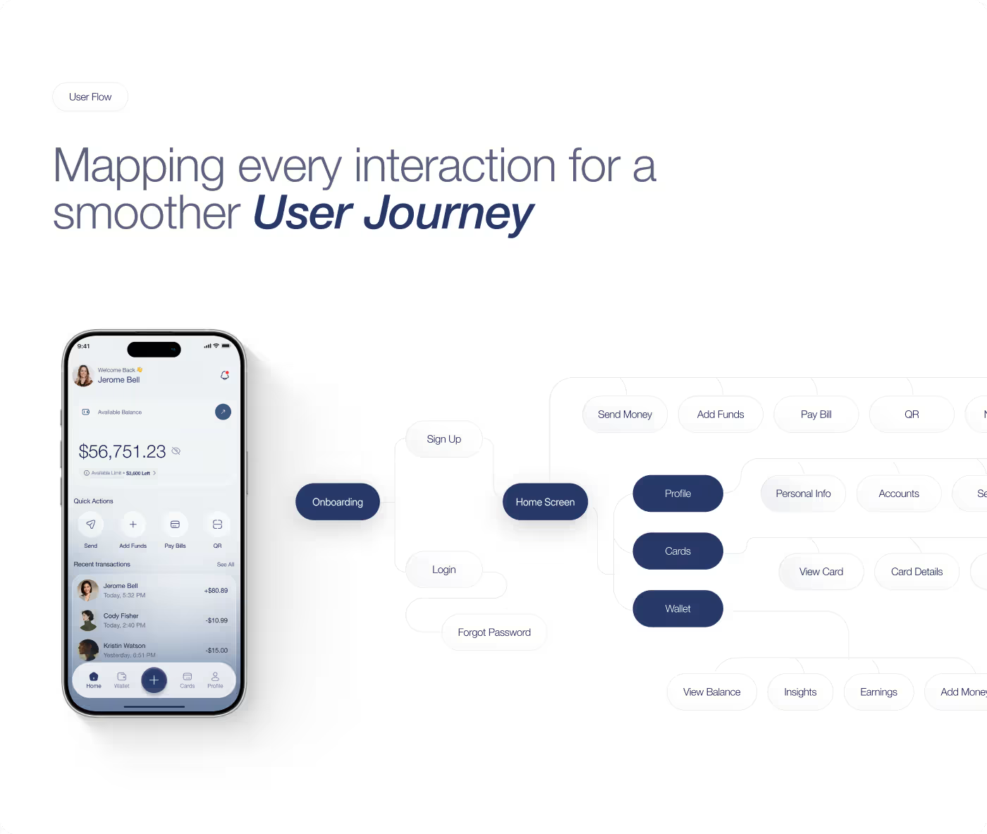
Understanding User Hesitation Across Daily Banking Workflows
Our research examined how people interact with mobile banking, where anxiety arises during payment confirmation, and what causes friction in card management.
- 68% of users felt anxious when completing transactions without clear immediate confirmation.
- Users frequently lost track of upcoming utility bills across separate apps and portals.
- Traditional banking apps buried essential card controls under nested settings menus.
- Clear visual feedback and immediate status badges significantly increased user confidence and trust.

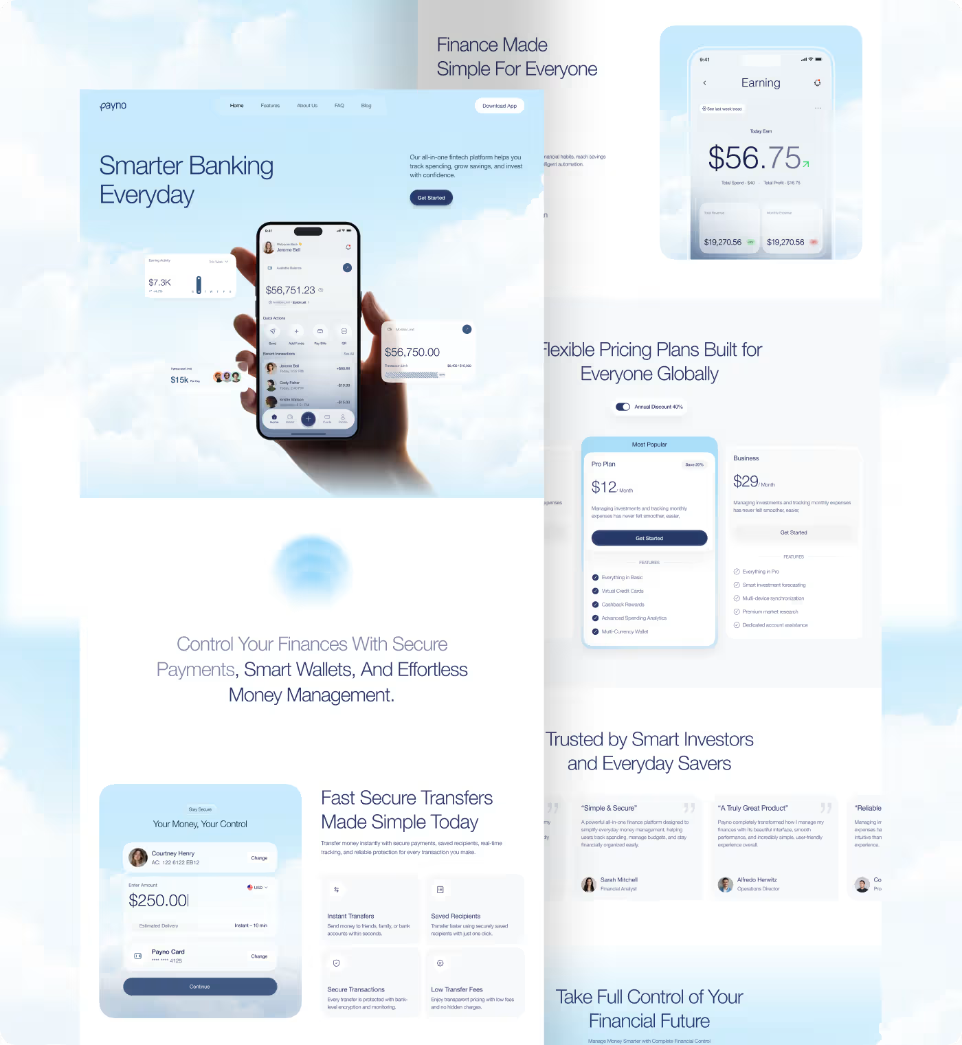
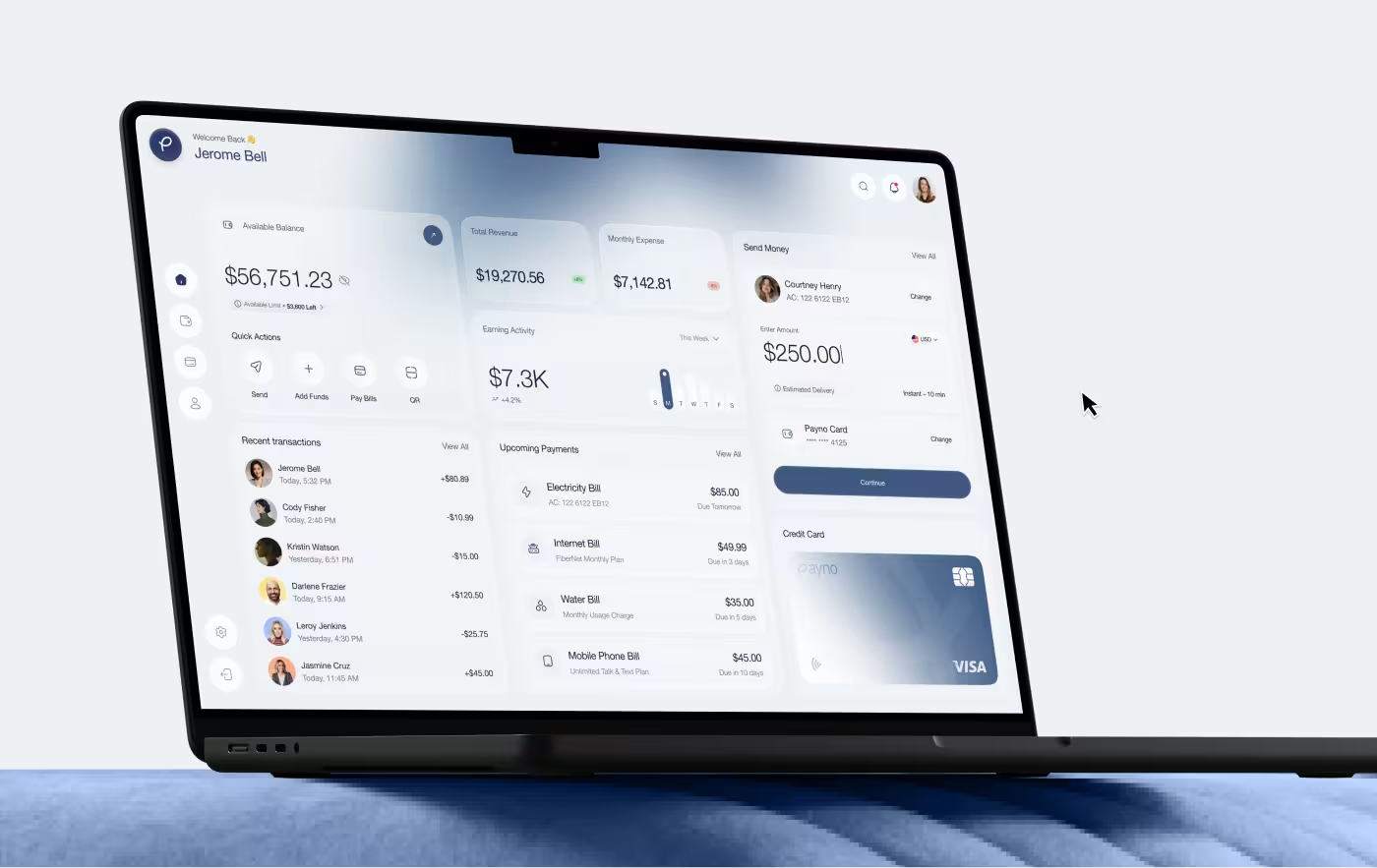
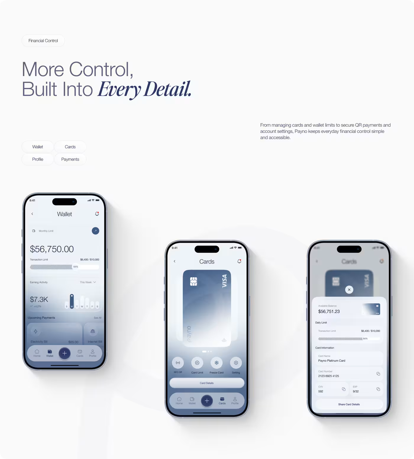
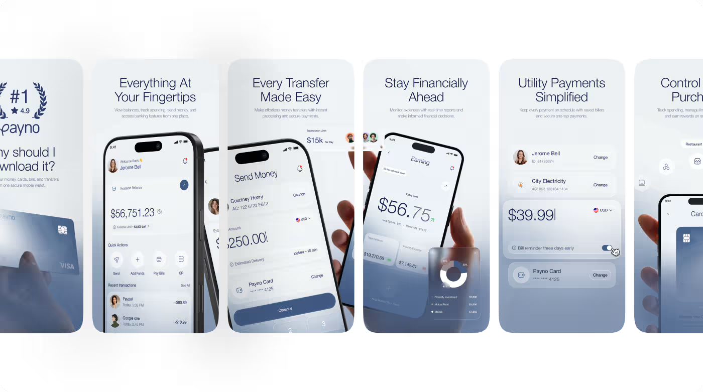
Structuring Frictionless User Journeys for Every Payment
The UX work focused on organizing the app around real financial habits rather than rigid banking structures. Because users need to check balances, send funds, and verify payments quickly on the go, every core flow was streamlined for speed and clarity.
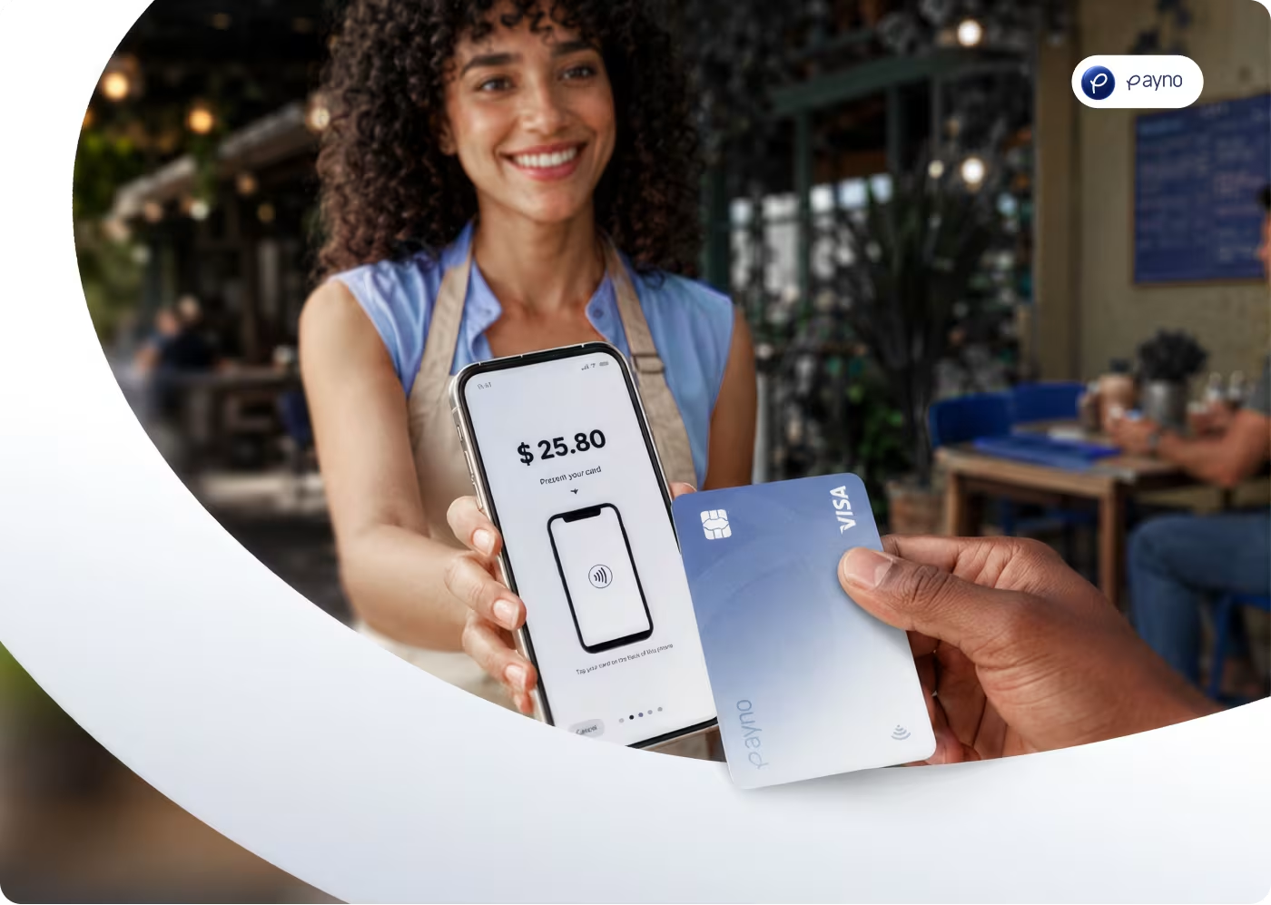
We mapped clear user flows from onboarding to recipient selection, cutting redundant steps and providing real-time feedback. Important actions like instant transfers, NFC payments, and expense filtering were brought forward, making the daily banking experience feel natural from the first interaction.
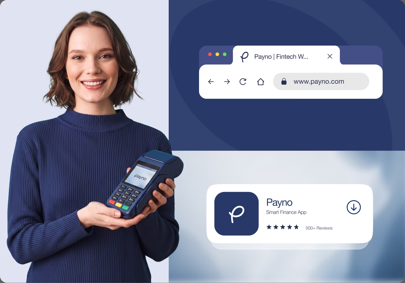
Creating a Clean, Trustworthy, and Modern Interface
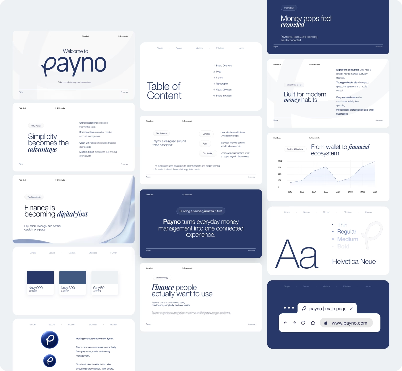
The interface was crafted with a balanced visual language that communicates security, clarity, and precision. Clean layouts and structured card components make complex financial data easy to scan and act upon.
We defined an accessible typography hierarchy, modern soft-elevation cards, and a refined color system that highlights important financial states without visual clutter, showing users clearly how the app works.
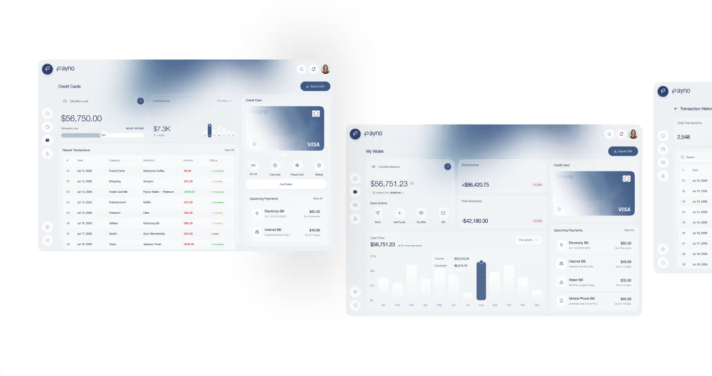
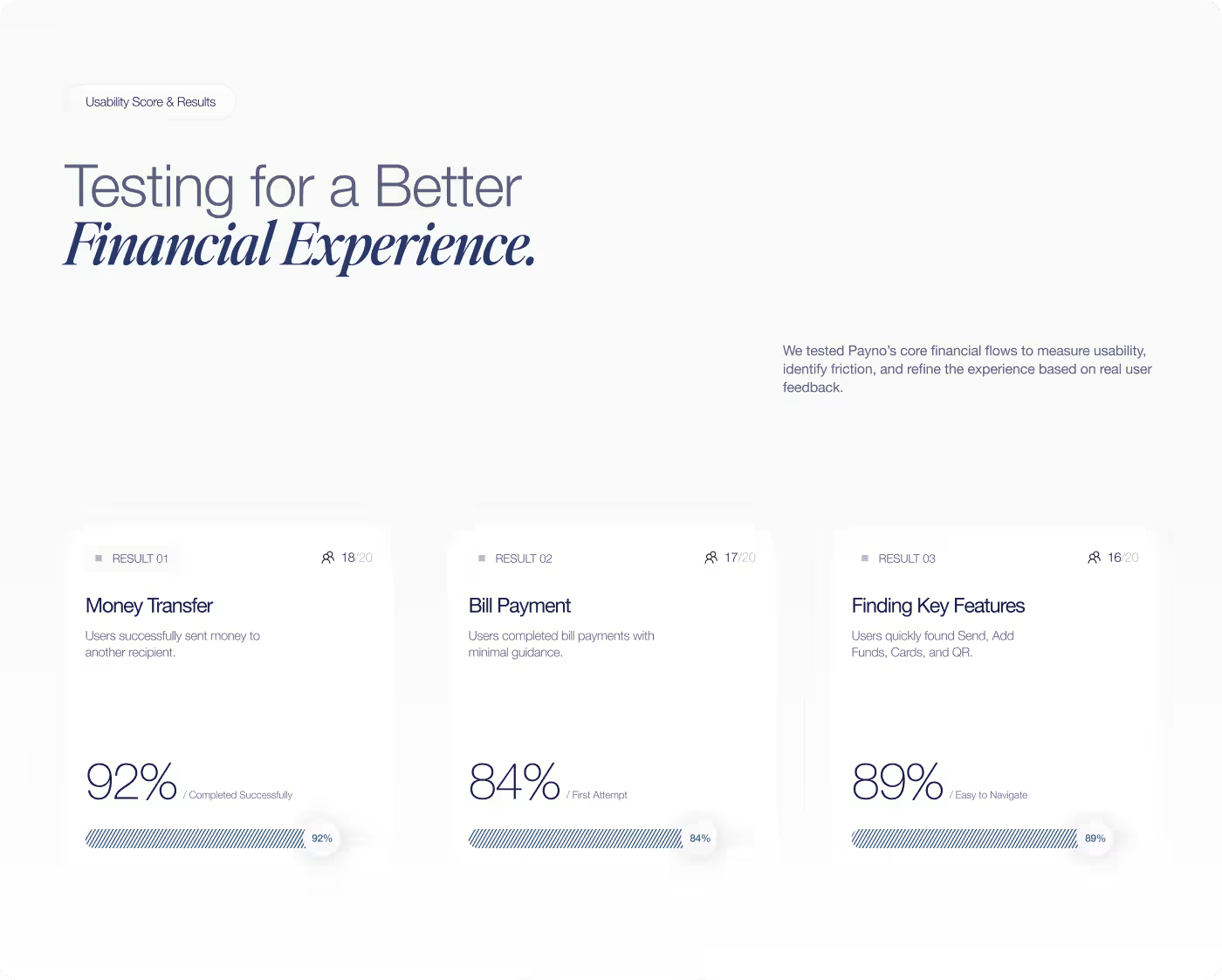
Users Completed Money Transfers and Payments Faster
After the redesign and usability testing, Payno delivered a significantly smoother financial experience with higher user satisfaction across all core workflows.
- 92% of usability test participants completed money transfers successfully on their first attempt.
- Bill payment completion time dropped by 40% with scheduled reminders and simplified biller selection.
- Users praised the clean card controls, highlighting that freezing and adjusting limits felt immediate and reassuring.
- Fewer drop-offs and higher engagement confirmed a reliable, frictionless financial product.
Ready To Build
Your Next Project?




Zone Production
Avara Fashion Branding