


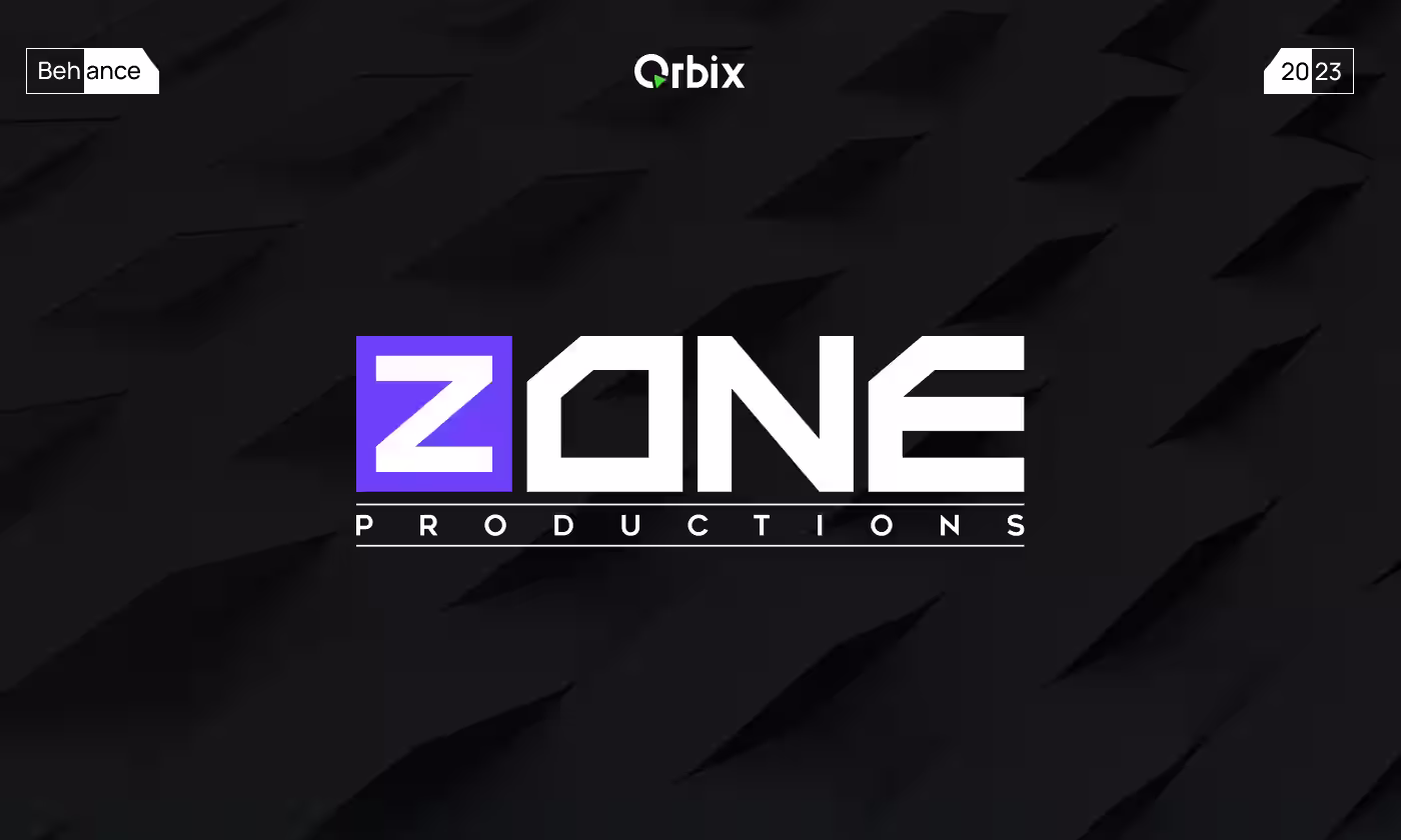
Zone Production
.svg)
Zone Productions is a post-production company focused on creating promotional trailers for film and TV, as well as capturing pivotal moments and events.
Our task was to build a master brand for Zone Productions that translates their high-end cinema capabilities into a clear visual language. The brand needed to work seamlessly across digital interfaces and physical merchandise, while clearly communicating their focus on future tech and premium film production.
Making invisible work look super cool and premium
Movie editors do amazing work, but since it happens behind the scenes, regular clients don't always notice it. Zone Productions makes awesome movie trailers, but their old look didn't show how high-tech and professional they really are.
- No Matching Styles: They didn't have a single, unified look to connect their online pages with their real-world events.
- Hard to Show Quality: It was tough to prove they make premium, high-end cinema just by using their old, basic graphics.
- Bad Scaling: Their old design elements looked messy and blurry when printed on clothes, caps, or packaging boxes.
- Team Disconnect: The old look didn't reflect the fun, creative, and collaborative nature of their actual internal team.
.avif)
.avif)
A bold, futuristic look that stands out anywhere
We built a strong, clean design system to fix their visual problems and elevate their brand. By using sharp geometric shapes and bright, popping colors, we gave them an unforgettable look that works perfectly from a phone screen to cool physical gear.
- Futuristic Brand Plan: Setting a clear style direction that shows they are masters at editing and capturing major movie moments.
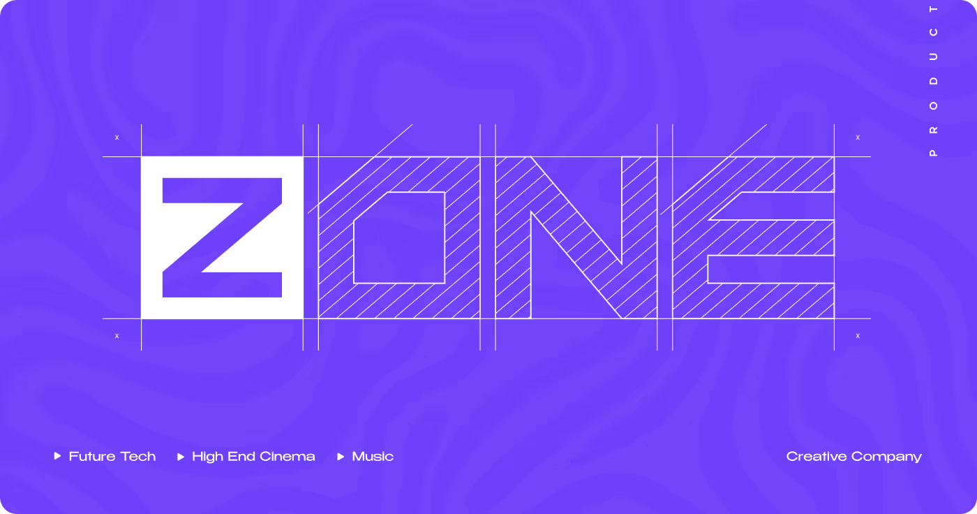
- Eye-Catching Logo: Creating a bright purple square with a sharp white "Z" that people can recognize instantly.
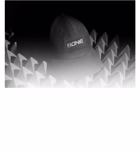
- Awesome Streetwear Gear: Designing hoodies, caps, and bags that look like premium clothing instead of boring corporate merchandise.
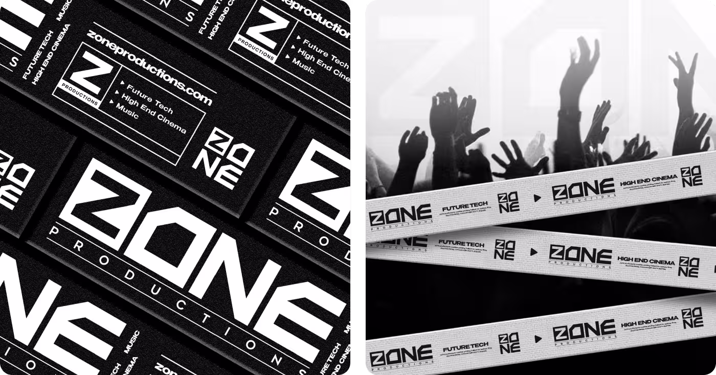
- Matching Event Gear: Making sure their promotional banners and packaging look exactly the same so the brand feels united at live shows.
How we built the cinematic brand step by step
- Looking at competitor logos
- Finding open design styles
- Learning what film clients want
- Choosing the main concept
- Choosing the signature purple tone
- Setting up bold text rules
- Drawing the geometric "Z" logo
- Making layout alignment guides
- Making premium clothing templates
- Creating unique snack packaging
- Setting up outdoor banner layouts
- Designing custom brand stickers
- Checking clothing print quality
- Testing colors on packaging wrappers
- Auditing layouts on mobile viewports
- Delivering all the final assets
UX Research & Design Artifacts
The things we learned from watching how clients and creators interact helped us make all our big design decisions. By finding out where people felt confused or wanted to see more high-tech details, we turned those clues into clean design steps that fixed the layouts.
As mapped out in the layout framework, these tools helped match the brand experience with real-world user habits. This plan made it simple for filmmakers to trust the studio, helped them browse services faster, and showed off the premium cinema vibe.
.avif)
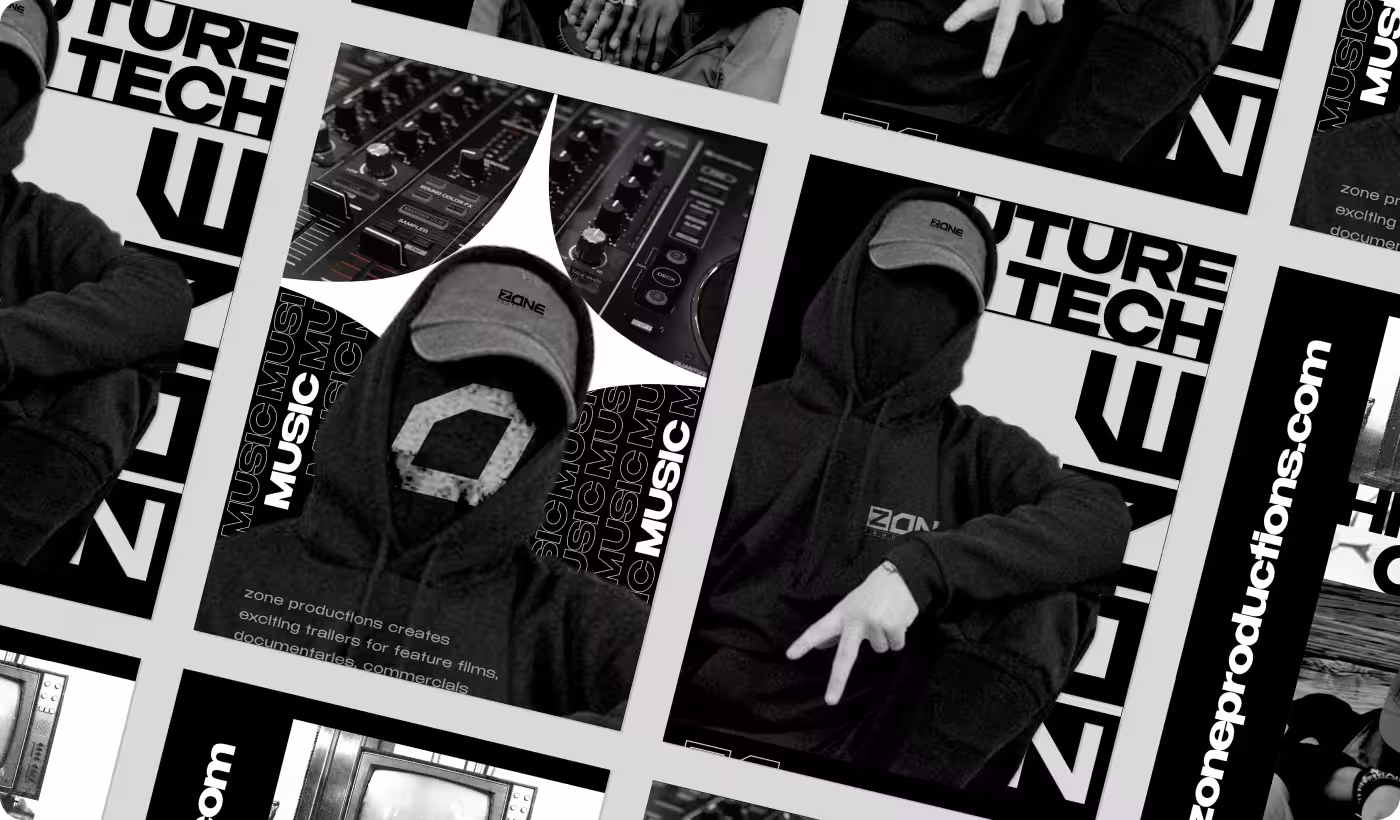
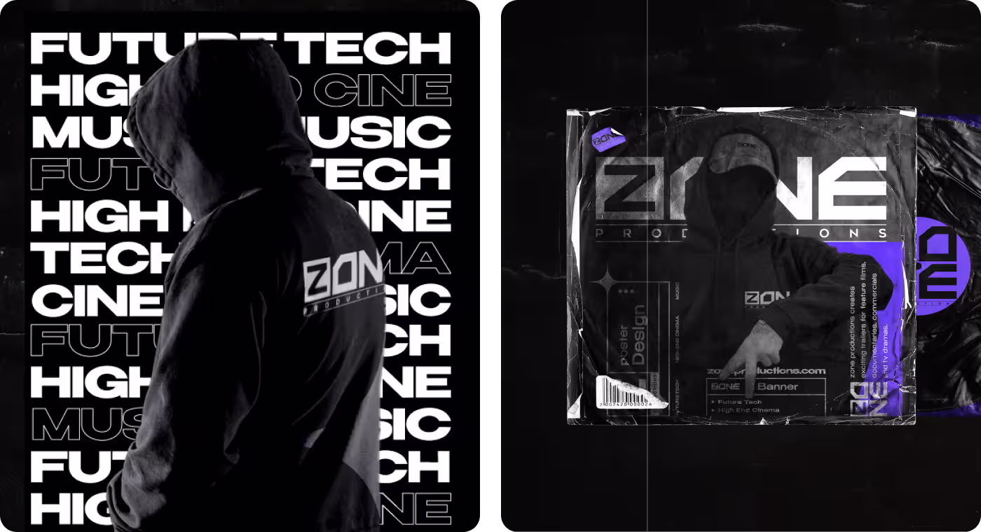
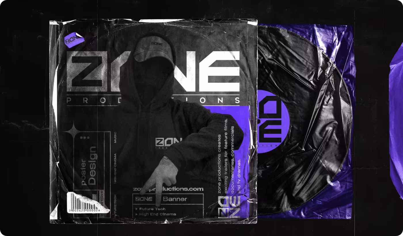
Bold text layers and mysterious dark layouts
We used heavy black backgrounds and stacked bold words like "Future Tech" and "Cine Music" to create a premium movie-theater mood. The text covers the space like a modern movie poster, giving the brand a highly confident and artistic feel that regular corporate logos just can't match.
This dark style makes the clothing and physical cases look incredibly sleek. The textured vinyl record sleeves and hooded sweatshirts show off a mysterious, high-end look that makes the production team look like true creative rockstars.
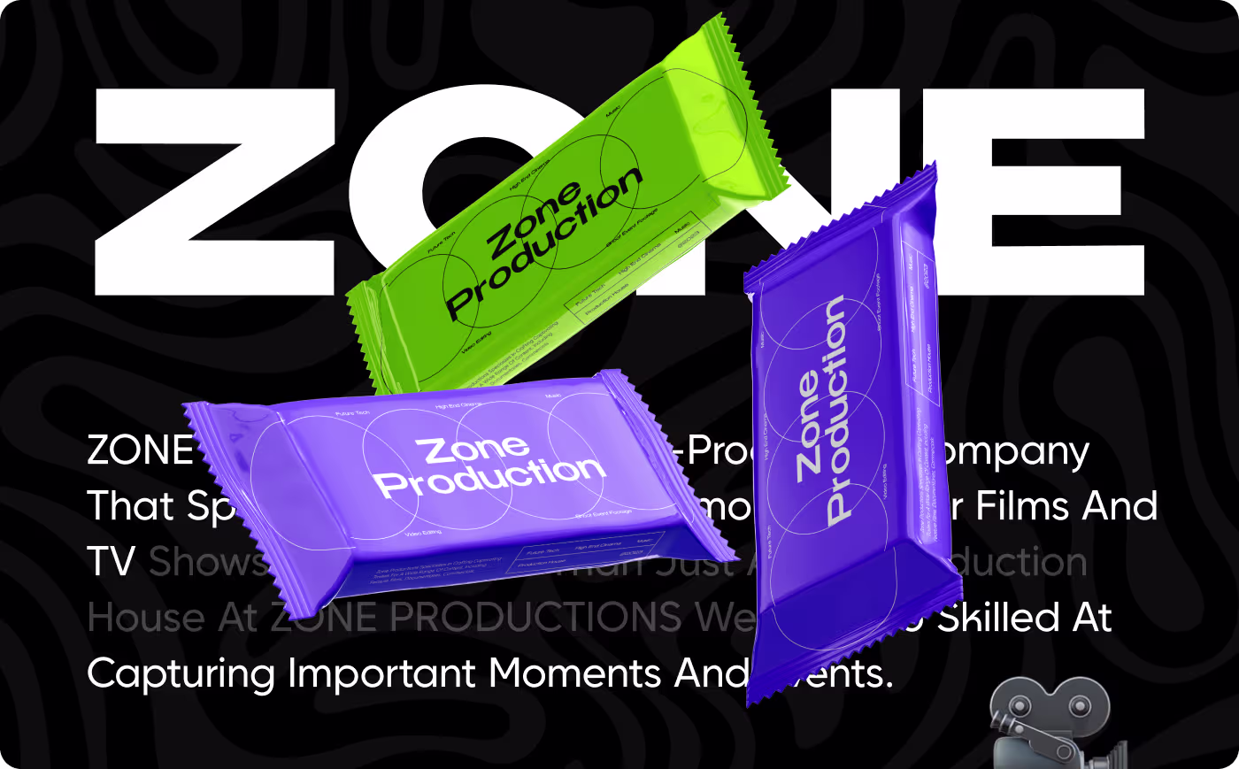
Bright popping colors on everyday items
To break away from completely dark colors, we introduced a fun, high-energy green and purple color block strategy. Applying these bright, clean colors onto unique physical items gives the studio a playful edge while keeping everything looking expensive and well-designed.
Wrapping items in bright lime green and deep purple against a wavy black background ensures the brand grabs attention instantly when handed out to clients or team members.
A premium look built for Hollywood quality
The new look gave Zone Productions a powerful visual style that matches the epic quality of their movie trailers.
- Full Unity: Created a matching design look that works perfectly across all digital phone screens and real-world event tools.
- Cooler Gear: Upgraded basic merch into trendy streetwear, boosting team pride and getting clients excited to wear it.
- Instant Recognition: The geometric "Z" logo and purple boxes make the studio instantly recognizable to top film clients.
- Faster Creation: Cut down the time it takes the team to design new promo banners and marketing posts by 30%.
Got a project in mind? Let's build it
.avif)


.svg)


.svg)

.svg)


