Zevoa


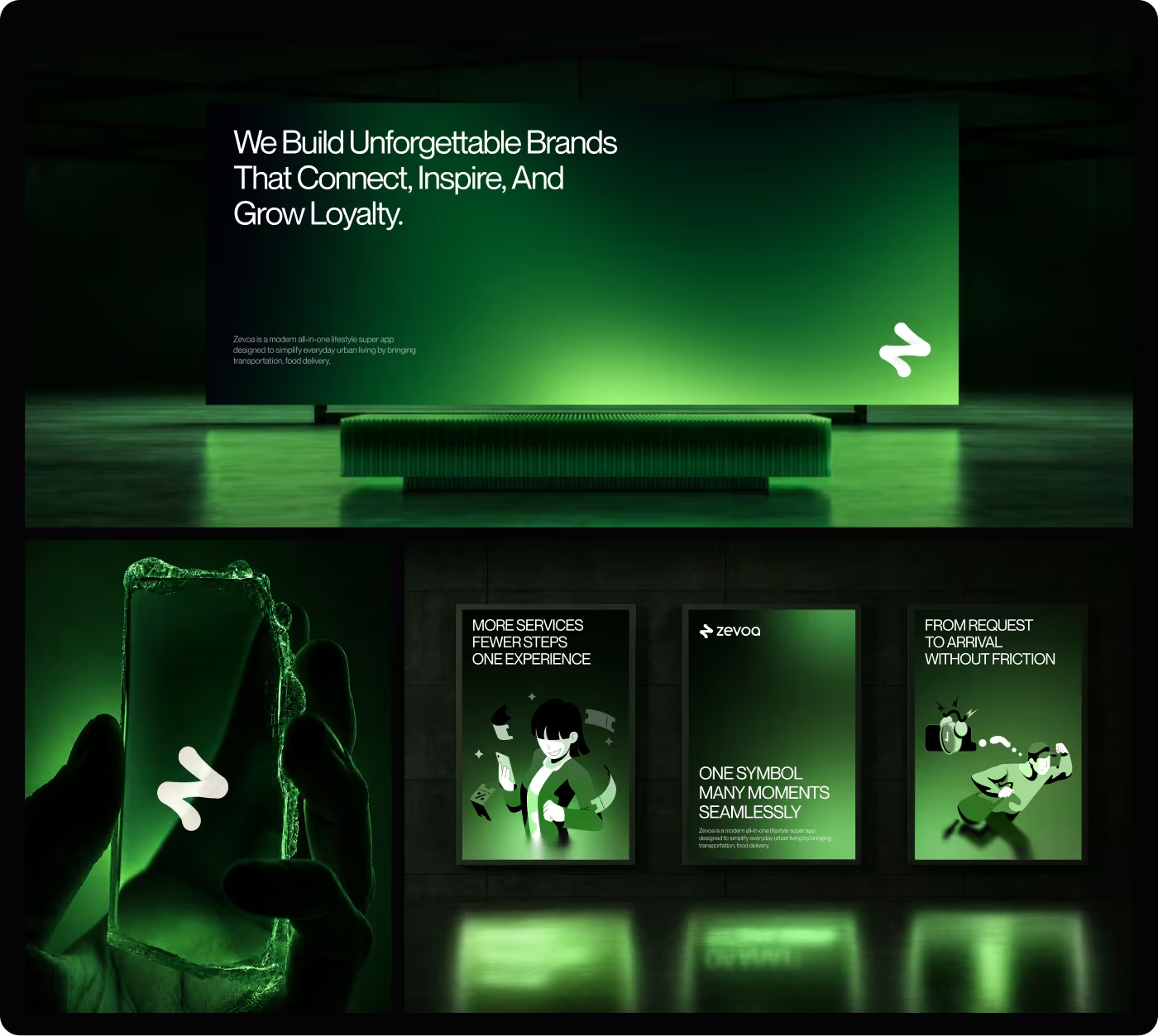
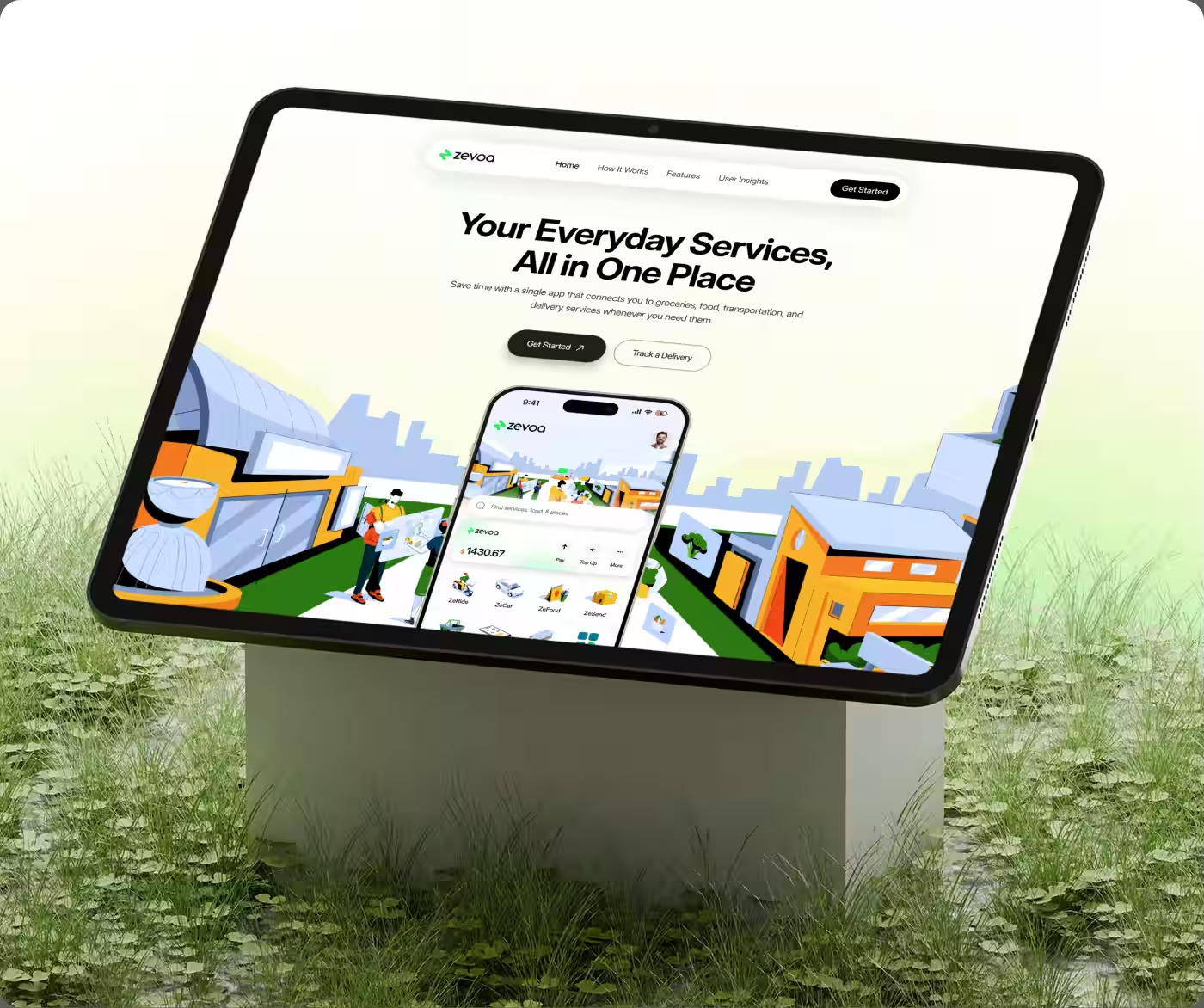
Zevoa was created to simplify everyday urban living by bringing groceries, food delivery, and on-demand services into one connected app.
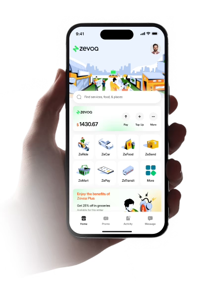
Our mission was to design Zevoa's core delivery ecosystem, centered around ZeMart, to turn everyday grocery shopping into a fast and effortless experience. Traditional grocery and super apps often overwhelm users with cluttered layouts, buried promotions, and fragmented checkout steps. We redesigned the end-to-end journey—from product discovery and smart cart management to live tracking and one-tap reordering—ensuring users can find what they need and check out in minutes.
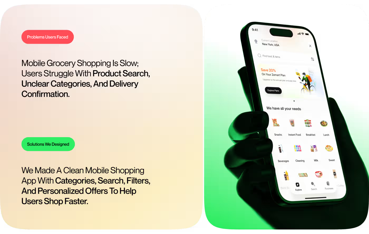
Shoppers Struggled with Slow Discovery and Complicated Checkouts
Ordering groceries through mobile apps often felt sluggish and frustrating due to cluttered product categories, hidden fees, and confusing checkout flows in typical on-demand delivery platforms.
- Fragmented Product Discovery: Unclear catalog categorization made it difficult for users to quickly find everyday staples and fresh essentials.
- Cluttered Cart & Voucher Management: Applying promotional vouchers and understanding minimum spend thresholds caused hesitation and basket abandonment.
- Unclear Price Estimates: Lack of transparency in delivery, packaging, and handling fees reduced shopper trust before order placement.
- Disjointed Delivery Tracking: Users lacked immediate, step-by-step visibility into order preparation, driver dispatch, and estimated arrival times.
We Built a Fast, Frictionless Grocery Shopping & Delivery Experience
We designed Zevoa around clarity, speed, and real-time transparency, helping users complete their grocery orders with fewer taps and zero confusion.
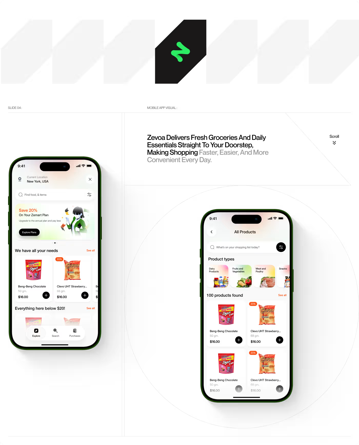
- Intuitive Catalog Architecture: Reorganized categories, visual aisles, and smart search filters to accelerate product discovery and comparison.
- Seamless Voucher & Cart Experience: Built dynamic cart progress bars that show remaining spend needed to unlock discounts and free delivery automatically.
- Transparent Checkout Breakdown: Provided an itemized fee summary before purchase confirmation, building customer trust and preventing drop-offs.
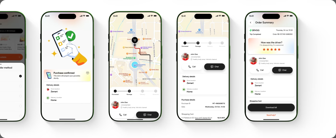
- Live Step-by-Step Order Tracking: Designed interactive delivery status cards displaying store preparation, driver contact, and real-time arrival estimates.

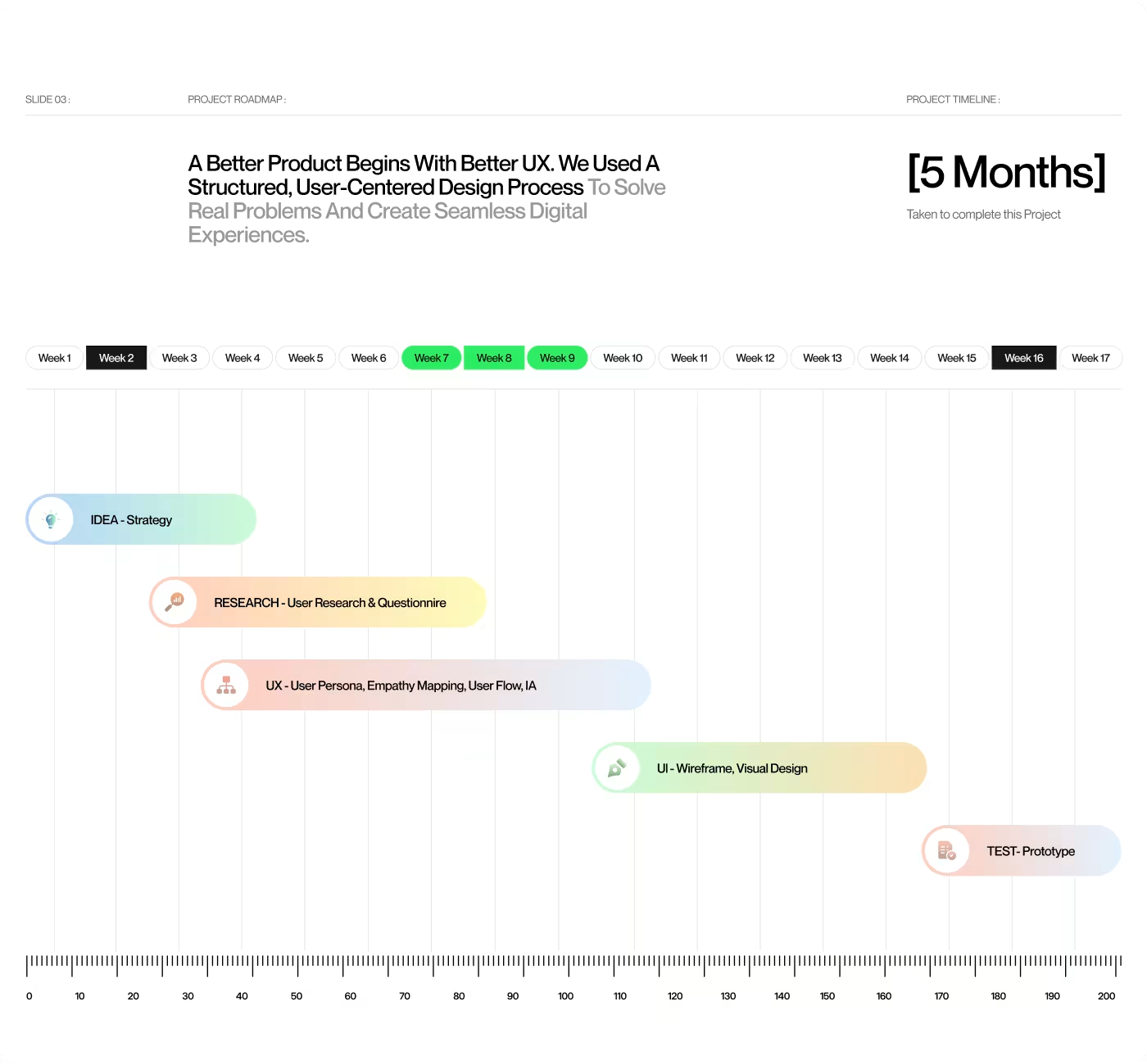
4-Step User-Centered Process: From Cart Friction to Delivery Delight
- Audited existing grocery apps
- Built user personas & journeys
- Identified checkout friction
- Mapped daily shopping habits
- Reorganized grocery aisles
- Simplified checkout funnel
- Streamlined voucher validation
- Structured delivery tracking
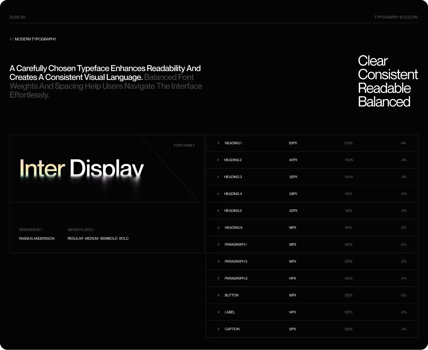
- Defined Inter typography scales
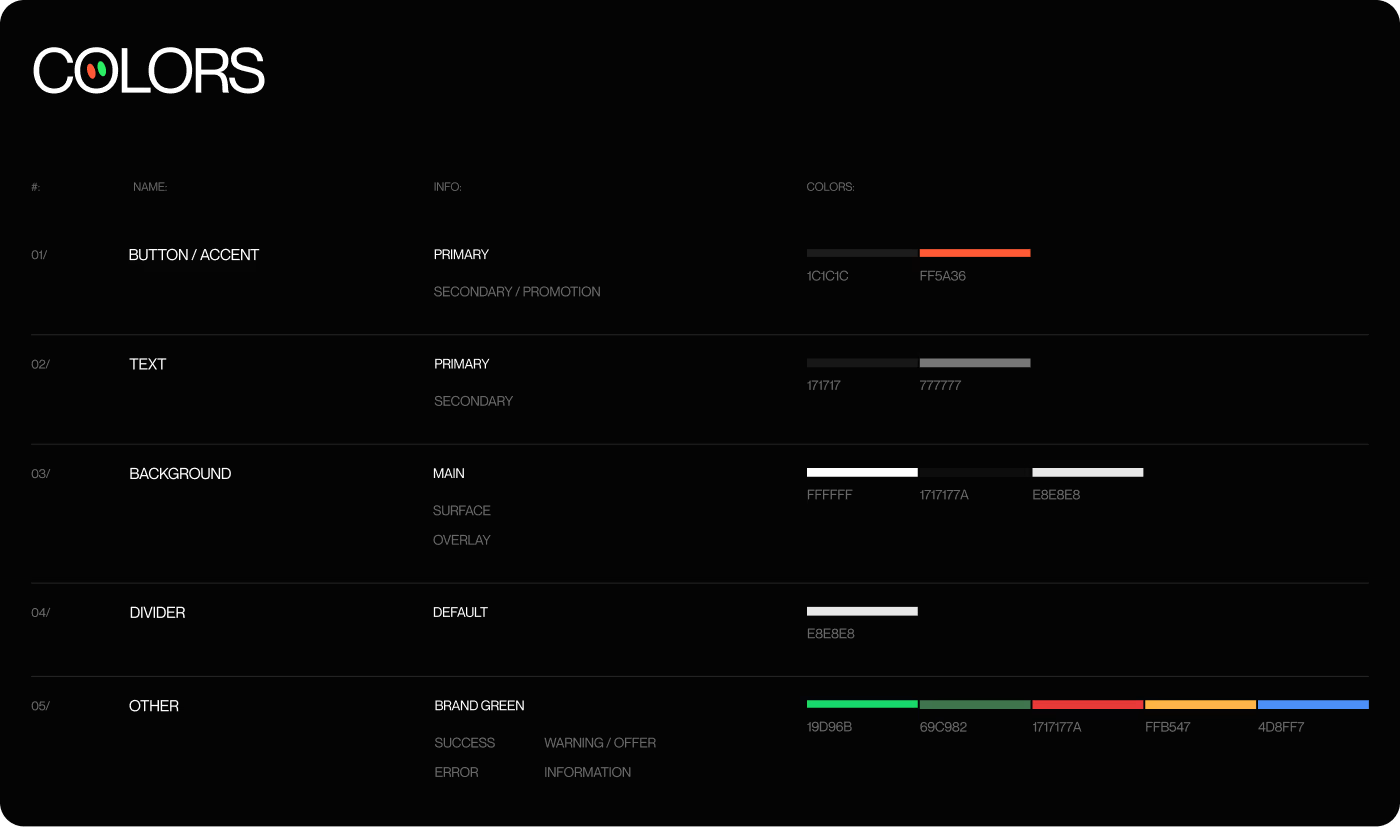
- Established trust-driven colors
- Crafted reusable product cards
- Designed custom delivery icons
- Tested end-to-end user flows
- Measured search & order speed
- Gathered real user feedback
- Prepared dev-ready handoff
Understanding User Friction in On-Demand Grocery Habits
Our research analyzed everyday shopping routines, time constraints, and digital behaviors of busy urban professionals who rely on on-demand delivery.
- 82% of users shop on tight schedules and abandon orders if product discovery requires more than two minutes.
- Shoppers demanded clear distinction between store preparation and in-transit delivery stages.
- Dynamic discount reminders significantly motivated users to complete high-value baskets without friction.
- Clear visual order confirmation and driver health status badges elevated peace of mind during delivery.
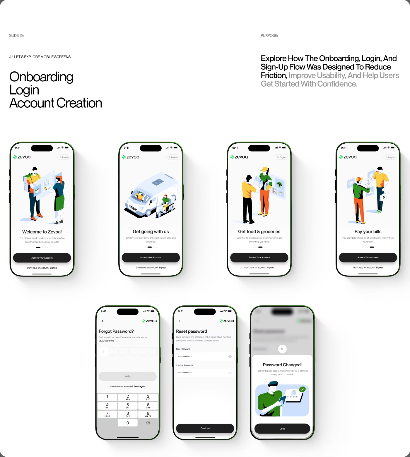
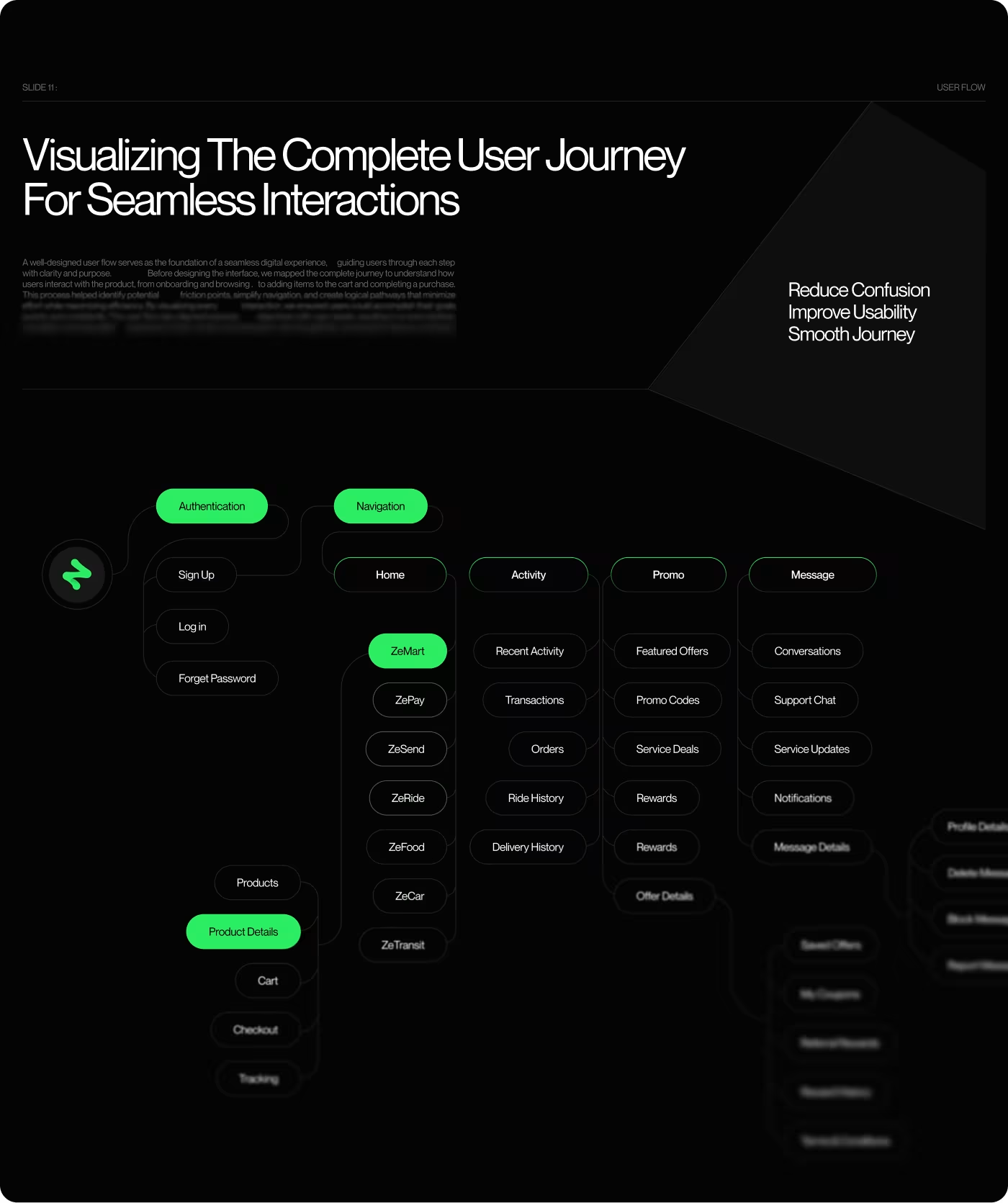
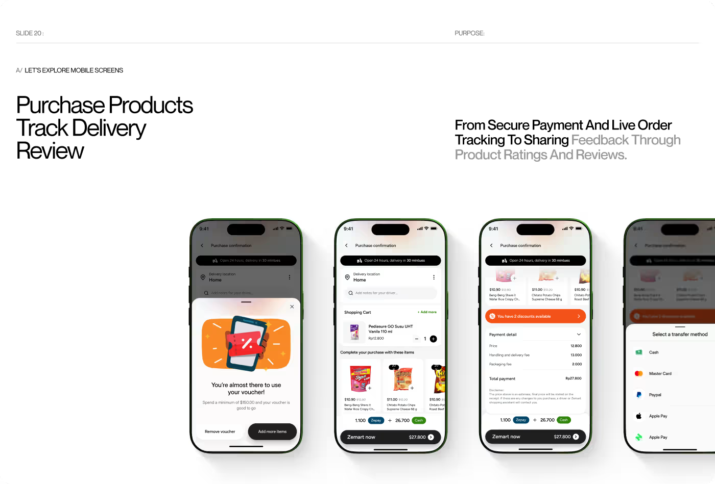
Streamlining the Journey from Product Discovery to Doorstep Delivery
The UX work focused on minimizing cognitive load and friction at every touchpoint. Because grocery shopping involves multiple decisions—quantity, brand preference, substitute items, and delivery timing—we prioritized an intuitive, low-friction information architecture.
We structured frictionless task flows for item browsing, quick cart adjustments, and one-tap checkout. Reordering favorites, selecting delivery addresses, and contacting delivery drivers were placed within immediate thumb reach, making the entire ordering experience feel effortless from the first session.
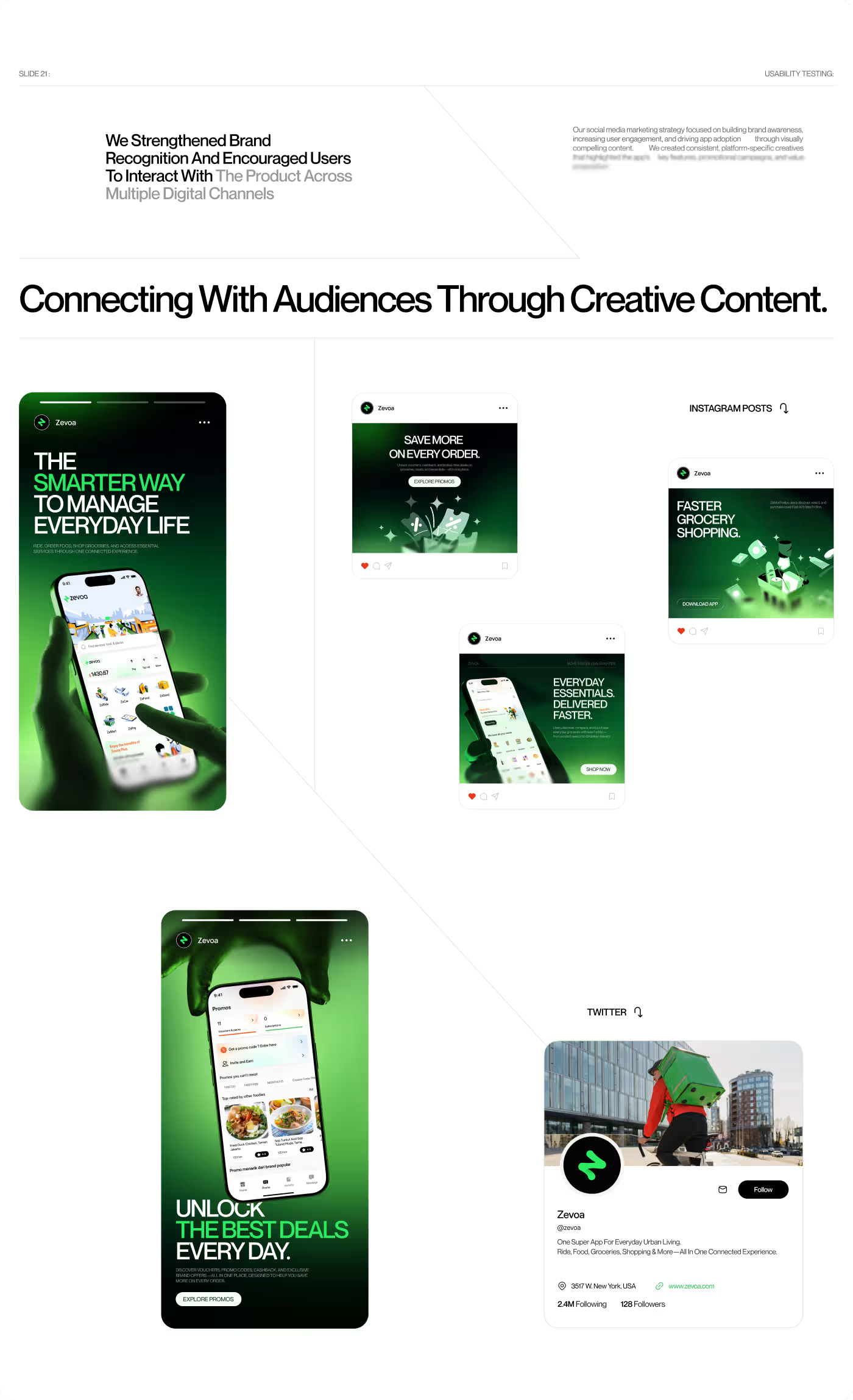
A Modern, Vibrant Interface Built for Speed and Readability
The visual interface combines modern typography with high-contrast color accents to make dense product lists easy to scan. Clean card components, generous white space, and clear action buttons ensure shoppers always understand how the app works.
We established a cohesive design system using Inter Display typography, vibrant brand green accents for success and offers, and clean elevation layers. Every interaction—from tapping quantity steppers to reviewing live dispatch routes—was crafted to provide instant feedback and an enjoyable shopping rhythm.
Faster Orders, Higher Completion, and Delighted Shoppers
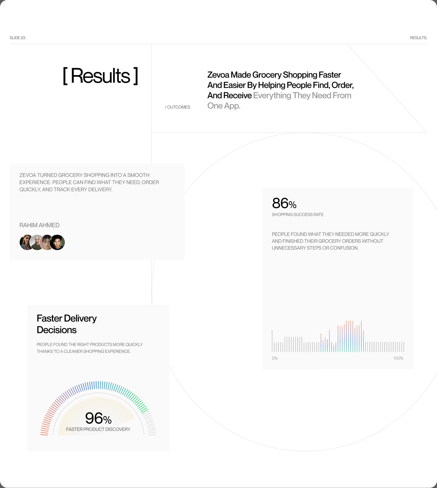
Following the new design and comprehensive usability testing, Zevoa achieved outstanding performance metrics across product discovery and order fulfillment.
- 86% of test participants completed their grocery orders without any hesitation or assistance.
- 96% faster product discovery achieved through optimized search, categorized aisles, and smart filters.
- Drop-offs during cart review and checkout decreased significantly with transparent pricing breakdowns.
- Users praised the live delivery tracking interface for providing complete peace of mind from store to doorstep.
Ready To Build
Your Next Project?




Trendly Fashion


InvestIQ

Bluecat modern website