


Table of Contents

A founder spent eight months building a habit-tracking app. Code was clean. Design looked sharp. On launch day, 600 users installed it. By day seven, 31 were still opening it. That's not an extreme case. Mixpanel's 2024 Product Benchmarks report puts average Day-7 app retention at 29%. Most apps lose most of their users before those users ever encounter the feature that was supposed to make them stay.
Mobile app UX design is what closes that gap. Not visual polish. Not feature quantity. UX design is the discipline of making every path through your app feel obvious, every interaction feel confirmed, and every return visit feel easier than the last.
Before reading this guide, pair it with the mobile app development guide on Orbix so the design decisions here connect directly to how they get built.
By the end of this guide, you'll know exactly how to structure a mobile UX design process from user research to shipped product, how to apply the principles that separate apps users return to from apps users forget, and what five mistakes are silently killing retention in apps that look finished.
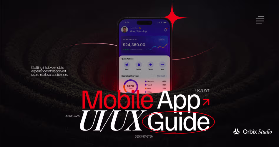
What is Mobile App UX Design?
Mobile app UX design is the practice of structuring every screen, interaction, and feedback state inside a mobile application so users can complete their goals quickly, with minimal effort, and without needing to read instructions. UX stands for user experience, and on mobile it covers everything from the first screen a new user sees to the path a power user takes on their 300th session.
Mobile UX design is not the same as mobile UI design. UI design determines how the app looks: the colors, typography, icon choices, spacing, and visual hierarchy. UX design determines how the app works: which screens exist, in what order, what happens after each tap, what error a user sees when something fails, and how long any step takes.
Bad mobile UX design is immediately felt, even when users can't name it. A button that sits where their thumb can't comfortably reach. A menu that requires three taps to get to the feature they use every day. An error message that says "something went wrong" without telling them what to do next. None of those failures are visual. All of them cause users to leave.
Notion demonstrates the gap between good web UX and weak mobile UX. On desktop, Notion's flexible block editor is fast and discoverable. On early versions of the mobile app, the same interactions required small touch targets and non-obvious gestures that desktop users had never needed to learn. Notion's mobile retention lagged their desktop retention specifically because UX patterns that work on a large screen with a cursor don't transfer directly to a thumb-driven interface. Their subsequent mobile redesigns fixed this by building separate interaction models for each platform, not by porting the desktop experience.
Mobile UX design starts from a different constraint set than web: smaller screens, touch-only input, one hand, divided attention, and variable connection quality. Every principle in this guide stems from those five constraints.
Why Mobile UX Design Is a Business Metric, Not a Design Preference
Design teams often fight for UX investment by arguing for aesthetics. That's the wrong fight. Mobile UX design decisions show up directly in retention rate, trial-to-paid conversion, and support ticket volume. Both are revenue numbers.
According to Google's 2023 Core Web Vitals research, 53% of mobile users abandon any experience that takes longer than three seconds to load. That's not a design preference from UX researchers. It's a business fact from Google's analysis of billions of mobile sessions. Performance is a UX decision, and it has a measurable cost.
Retention numbers show the same pattern at a deeper level. Apps that deliver a clear first-value moment within the first session retain 3x more users at 30 days than apps that require multiple sessions before users understand the product's purpose, according to Mixpanel's Product Benchmarks data. A well-designed onboarding flow is not a nice-to-have. It's a 3x multiplier on the investment already made in acquisition.
So what does bad mobile UX design actually cost?
A SaaS app charging $49 per month with 2,000 trial signups and a 12% trial-to-paid conversion rate earns $11,760 per month. Improving the onboarding UX from 12% to 18% conversion, a change that Intercom documented across several of their product redesigns, means $2,940 more in monthly recurring revenue from the same acquisition spend. No new features. No new ads. Just a better first session.
Good UX patterns for mobile app retention compound over time because every cohort benefits from the improvement. A bad onboarding flow charged every user who ever signed up.
The Mobile App UX Design Process, Step by Step
Most apps skip the process and go straight to Figma. That's the reason so many apps look designed but feel broken. Mobile app UX design done correctly moves through six stages before any high-fidelity visual work begins.
Step 1: User Research and Flow Mapping
Every mobile UX design project starts with one question: what does the user need to accomplish, and what is the fastest path to that accomplishment? Without a clear answer to both parts, the design process has no target.
User research on mobile is different from web research because mobile context is different. Mobile users are frequently in motion, distracted, or under time pressure. A task that a user completes calmly at a desktop takes an entirely different UX design when attempted on a phone in a taxi. Research methods that account for context include contextual inquiry (observing users in their real environments), screen-recorded usability testing with Maze or UXCam, and session replay data from live apps showing where users stop, re-tap, or abandon.
Flow mapping takes the research findings and converts them into a visual sequence: every screen the user encounters from launch to task completion, with decision points, error branches, and exit paths labeled. A flow map is not a wireframe. It's a logic diagram. Building it before opening any design tool reveals dead ends, missing states, and path lengths that no wireframe will catch.
Step 2: Information Architecture for Mobile
Information architecture on mobile means deciding which content lives where and how users navigate between it. Get this wrong and users can't find what they need. Get it right and navigation becomes invisible because users always know where they are.
Flat information architecture outperforms deep hierarchies on mobile every time. A flat structure puts everything important within two taps of the home screen. A deep hierarchy buries features behind menus inside menus inside menus, which means users use only what they can find, which means they underuse the product, which means they churn.
Five or fewer items in any navigation bar, and no menu item that requires more than two taps to reach from the home screen. Linear applies this precisely. Linear's mobile information architecture has Issues, Inbox, and Projects as persistent bottom-bar items. A user can reach any of them in one tap from anywhere in the app. That single architectural decision means users never feel lost and never need to back-navigate to find the thing they actually wanted.
Step 3: Wireframing with Thumb Zone Rules
Wireframing is where interaction logic becomes screen reality. On mobile, every wireframe must respect one constraint above all others: where the user's thumb actually lands.
Thumb zone design divides the screen into three areas based on natural one-hand grip: the easy zone (bottom 40% of the screen, where the thumb rests), the stretch zone (middle 40%, reachable with effort), and the difficult zone (top 20% and corners, requiring a grip shift). Primary actions belong in the easy zone. Secondary actions can live in the stretch zone. Navigation controls that must always be accessible belong in the bottom bar, not the top.
Google's Material Design guidelines specify 48 x 48dp as the minimum touch target for any interactive element. Below that size, users miss taps at a measurably higher rate. Missing taps creates a sensation that the app is unresponsive, even when the only problem is that the target was too small.
Wireframe every state, not just the success state. For each screen, the wireframe should show: the loaded state, the loading state, the error state, and the empty state. Apps that wireframe only the loaded state ship the other three states as afterthoughts, and those afterthoughts are what users experience most during their first session.
Step 4: Interaction Design and Micro-Feedback
Every tap a user makes is a question: did that work? Interaction design answers that question through visual and motion feedback that confirms the action was received and processed.
Micro-interactions are the small feedback signals that answer those questions. A button that visually depresses on press. A form field that shows a green checkmark when the input is valid. A success animation when a task completes. None of these are decorative. Each one tells the user that reality changed, which prevents the double-tap, the anxious wait, and the support email that follows.
Stripe's error design demonstrates the highest standard for interaction feedback. When a payment fails in Stripe's app, the error message tells the user exactly what failed, why it failed, and what to do next. "Card declined. Check the billing address and try again." Not "Something went wrong." Not "Error 403." A specific statement followed by a specific action. That pattern eliminates an entire category of user confusion at the moment users are most likely to abandon.
Keep micro-interaction timing proportional to action weight. Input validation feedback should appear within 300 milliseconds. Screen transitions should complete within 300 to 400 milliseconds. Success states for significant actions like completing a purchase can run up to 600 milliseconds. Beyond that, animations stop feeling like feedback and start feeling like delay.
Step 5: Accessibility and Contrast Audit
Accessibility is not a compliance pass that happens before launch. It's a design standard that applies from the first wireframe. Building accessible mobile UX from the start costs less than retrofitting it, produces better outcomes for every user, and in many markets is a legal requirement under WCAG 2.2 AA.
Color contrast is the accessibility failure most often found in mobile apps. WCAG 2.2 AA requires a minimum contrast ratio of 4.5:1 for body text and 3:1 for large text (18pt or 14pt bold). Apps that use light gray text on white backgrounds, a common aesthetic choice in flat design, frequently fail this threshold on secondary screens like settings, empty states, and error messages. Every one of those screens is what a user lands on when something goes wrong.
Touch target size and screen reader compatibility are the other two most common failures. Every icon-only button needs an accessibility label that describes what the button does. A button with a trash icon needs a label that reads "Delete item," not "Trash." A button with a heart icon needs "Add to favorites," not "Heart."
The accessibility in UI/UX design guide covers how to run a full WCAG audit, which tools catch contrast failures automatically, and how to write accessibility labels that work across both iOS VoiceOver and Android TalkBack.
Step 6: Performance States Design
Performance states are the screens and micro-interactions that bridge the gap between a user action and the app's response. Loading states, skeleton screens, optimistic UI, and offline fallbacks are all performance states. Designing them deliberately changes how fast the app feels, even when the actual speed stays constant.
Skeleton screens reduce perceived wait time by up to 35% compared to spinner-only loading states, according to UX research published by Luke Wroblewski. A user watching a spinner experiences waiting. A user watching a skeleton screen filled with content experiences arriving. Same server response time. Completely different emotional experience.
Airbnb's app shows this at scale. When loading search results, Airbnb displays skeleton cards that match the exact shape and layout of the listing cards about to appear. Users don't see a blank page. Users see a preview of the structure. That framing, content forming rather than content is absent, cuts the perceived wait and keeps users engaged through the load.
When performance decisions are documented in the design spec rather than left to interpretation during build, the mobile app development process translates them exactly. Developers build the skeleton screens, the error states, and the offline fallbacks that were designed, not the ones they assumed were meant.
What Good Mobile UX Design Looks Like in Practice
Principles are abstract until they're in a real product. Three apps demonstrate the principles above at high quality, in different categories, and for different reasons.
Linear: Navigation That Gets Out of the Way
Linear's mobile app handles navigation through a combination of persistent bottom tabs and swipe gestures that power users learn once and never forget. Issues, Inbox, and Projects always sit in the bottom bar. Tapping any of them takes one tap from anywhere in the app. Swiping right on an issue opens the detail view. Swiping left dismisses it. Every gesture follows platform convention, so users don't have to learn a proprietary system.
Linear's empty states are worth studying separately. When a project has no open issues, the empty state shows a short message and a single "Create issue" button, nothing else. No illustration. No tutorial. No multi-step guide. Linear assumes that a user who reached the project view already knows what an issue is. That assumption is correct, and respecting it makes the empty state faster to act on.
Duolingo: Onboarding That Hides the Registration
Duolingo's onboarding flow is one of the most-studied in mobile UX. Open the app for the first time and you choose a language, set a daily goal, and complete your first two-minute lesson before registration is ever mentioned. By the time Duolingo asks for an email address, you've already done something and you want to save it. Registration becomes a consequence of value, not a prerequisite to it.
Duolingo also designs their streak counter as a primary UI element, not a gamification add-on. Duolingo's streak sits in the most visible position on the home screen. Users see exactly what they're protecting before they decide whether to practice today. Loss aversion does what no notification strategy could. That streak placement is a UX decision made at the information architecture stage, not added during polishing.
Slack: Progressive Disclosure Under Real Complexity
Slack's mobile app handles extreme information density through progressive disclosure. Channel lists collapse by default. Direct messages collapse by default. Thread replies collapse. Notification badges surface urgency without expanding the view. A new user sees a manageable interface. A power user who has joined 40 channels can still navigate quickly because the structure scales without surfacing complexity all at once.
Slack's onboarding flow on mobile walks new users through their first workspace setup with inline tooltips that appear in context, not as a separate guided tour. Tooltips appear when a user hovers near the feature being described. Dismiss it once, and it never reappears. That pattern respects users who learn by exploring instead of users who read instructions.
The 5 Mobile UX Mistakes
Mistake 1: Onboarding That Leads With Registration
Any screen that asks for an email and password before showing product value is a conversion bottleneck. Apps that front-load registration before showing any value see 40% to 60% higher early drop-off compared to apps that deliver a first-value moment before asking for account creation, according to Mixpanel's 2024 data. Lead with what the app does. Ask for an account only after the user has a reason to create one.
Mistake 2: Designing for One Platform's Patterns
iOS and Android have different navigation conventions, different gesture models, and different user expectations. Swipe-back is a core iOS navigation pattern. Android uses a system back button and edge swipe from the left. Building iOS gesture patterns into an Android app without accounting for Android's model creates friction for Android users who are following their platform's native conventions.
Cross-platform UX design requires a decision at the architecture stage: follow each platform's native model, or build a consistent cross-platform model that both platforms support without collision. Both are valid. Choosing neither is how confusion gets shipped.
Mistake 3: Missing States for Non-Success Paths
Happy path design means designing only what happens when everything works: the user fills the form, taps submit, sees the confirmation. What appears when the network drops on the third field? What does the user read when the API returns an error code? What shows up on the first screen after sign-up, before the user has any data?
Empty states, error states, and offline states are the most abandoned screens in most app designs. Build them last and users experience them first. Every state that doesn't have a designed response gets an automatic response from the OS: a white screen, a system error, or nothing at all.
Mistake 4: Touch Targets Below the Minimum
Touch targets smaller than 48 x 48dp make users miss taps at a measurably higher rate. Users re-tap, assume the app is unresponsive, and form a negative perception of reliability before they've had time to evaluate the feature. Google's own research shows that reducing tap miss rates by sizing touch targets correctly increases task completion rates by 15% to 20% on mobile. Sizing touch targets correctly isn't an aesthetic question. It's a UX quality floor.
Mistake 5: Inconsistent Feedback States
When some buttons respond with a press state and others don't, users learn that the app is unpredictable. Unpredictable apps generate double-taps, anxious pauses, and eventually distrust. Every interactive element needs a consistent pressed state. Every form submission needs a loading state. Every completed action needs a confirmation. Building the Figma mobile app design guide into your component system solves this at the system level so individual screens inherit consistency automatically.
What Mobile UX Guides Don't Tell You
Almost every mobile UX guide covers the mechanics: thumb zones, touch targets, navigation patterns, onboarding flow. What they skip is the tension between first-session UX and returning-user UX, and why getting both right at the same time is the actual hard problem.
A new user needs guidance. Context about what the app does. Tooltips that explain what an unfamiliar button does. An empty state with a clear "what to do first" message. Without that guidance, new users bounce.
A returning user needs none of that. Every tooltip they've already dismissed, every empty state they've already passed, every guided walkthrough they've already completed becomes noise. If a returning power user sees the same new-user guidance every session, the UX is optimized for the person who no longer exists.
Google Maps solves this with session-count logic. Contextual tips for new gestures appear during the first three sessions. After three dismissals, those tips are gone permanently. New users get orientation. Power users get speed. Same app. Different behavior based on a single session counter.
Apply this to your own product by identifying the top five things a new user needs to understand and the top five actions a returning user performs. If any item appears on both lists, design a single screen that works for both contexts. If items appear only on one list, use session logic to show or hide them based on how many times the user has visited. That distinction is what separates apps with 40% Day-30 retention from apps with 12%.
Most teams don't build this because it requires a design decision and a development hook working together from the start. Plan it at the wireframe stage or it never gets built.
Frequently Asked Questions
What is mobile app UX design?
Mobile app UX design is the process of planning and building every screen, interaction, and feedback state inside a mobile application so users can complete tasks quickly and without confusion. Coverage includes navigation structure, onboarding flow, micro-interactions, accessibility, and performance states. UX design determines how an app works; UI design determines how it looks.
What is the difference between mobile UX design and mobile UI design?
Mobile UX design covers how an app works: the paths users take, what happens after each tap, what error appears when something fails, and how long any step takes. Mobile UI design covers how the app looks: colors, typography, spacing, and visual hierarchy. UX is built first. UI adds the visual layer on top. A beautiful UI on a broken UX flow still fails.
What are the most important principles of mobile app UX design?
Six principles drive mobile UX quality: flat information architecture so users reach any feature in two taps or fewer, thumb zone design so primary actions are always easy to reach, onboarding that delivers value before asking for registration, micro-interactions that confirm every user action, accessibility built to WCAG 2.2 AA, and deliberate loading states that reduce perceived wait time.
How do you run usability testing for a mobile app?
Run task-based usability testing: give five to eight users a specific goal and watch them attempt it without guidance. Record where they hesitate, tap wrong elements, re-tap, or abandon. Use Maze for unmoderated remote testing on prototypes, and UXCam for session replay on live builds. Combine screen recordings with heatmaps to see both behavior and intent.
What is thumb zone design and why does it matter?
Thumb zone design places interactive elements in the screen area a user's thumb reaches naturally when holding a phone with one hand. The bottom third of the screen is the easiest zone. Top corners require a grip shift. Placing primary actions outside the easy zone makes the app physically harder to use, increases tap miss rates, and reduces completion rates for the tasks those buttons trigger.
How long should mobile app onboarding take?
Mobile app onboarding should get a user to their first value moment in under 60 seconds and under three screens. Apps that require email, password, profile setup, and permissions before showing any value lose 40% to 60% of users before those users understand what the product does. Collect only the minimum data required to create the first experience, and defer everything else until after the user has a reason to stay.
How does mobile UX design affect app store ratings?
Poor mobile UX design directly drives 1- and 2-star reviews. Three complaints dominate low-rated app reviews: confusing navigation, slow or unresponsive interactions, and unclear error messages. All three are UX failures, not feature gaps. Fixing navigation clarity, adding consistent interaction feedback, and writing specific error messages address the root causes of negative reviews without adding a single new feature.
Conclusion
Mobile app UX design isn't something you add to a finished product. Every screen structure, every navigation path, every loading state is a decision made or left to chance. Left to chance, it produces apps that lose 77% of users in three days.
Start with this: open your app and count every tap between install and the moment a new user first gets value. If that count is above four, you've found where your retention is leaking. Reduce it to three or fewer before building anything else. That single audit will surface more about your UX problems than a full redesign brief.
Want to go deeper on this? Orbix Studio works with SaaS and mobile founders on UI/UX design from early-stage wireframes to shipped products. Explore our UI/UX design services →
.avif)


.avif)


