


- What are SaaS UI Patterns?
- Why SaaS UI Patterns Directly Affect Trial-to-Paid Conversion
- What Premium SaaS UI Patterns Feel Like - and Why They Convert Better
- 7 SaaS UI Patterns That Destroy Trial-to-Paid Conversion
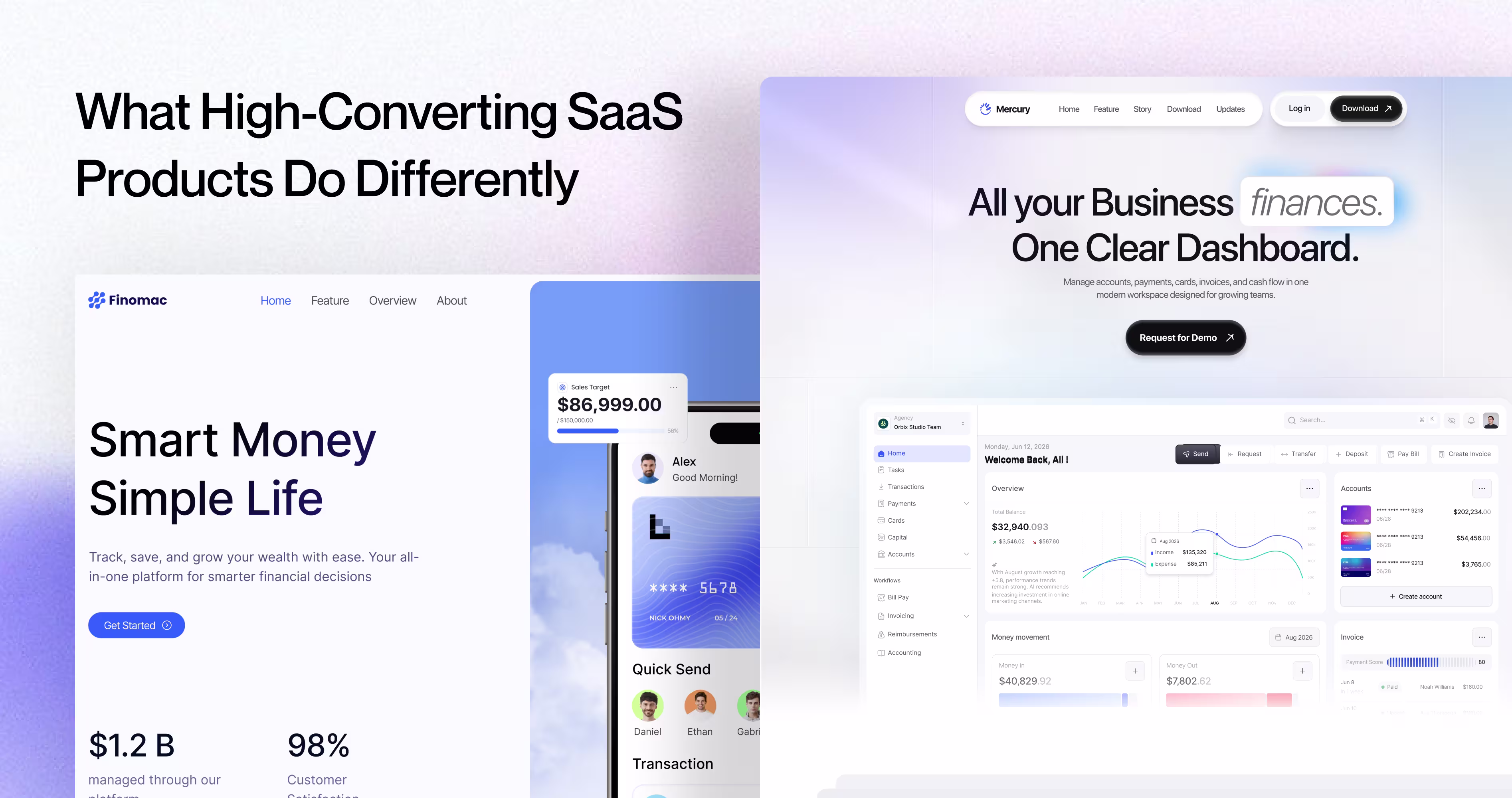
- What High-Converting SaaS Products do Differently
- Frequently Asked Questions
- Final Thoughts


.svg)

7 SaaS UI Patterns That Kill Your Trial-to-Paid Conversion Rate
- 85% of SaaS trial users never convert, and specific UI patterns during onboarding are the primary cause most product teams miss entirely.
- An empty dashboard with no sample data kills conversion in the first 90 seconds, before users ever reach your product's core value.
- SaaS upgrade prompts that interrupt mid-task trigger loss aversion. Slack places them after value delivery, not during work, lifting paid conversions.
Your SaaS product just got a new trial signup. They log in, look around for 90 seconds, and leave. They never come back. The problem isn’t your product. It’s your SaaS UI patterns.
According to Lenny Rachitsky’s 2023 benchmark survey of 600+ SaaS companies, the median trial-to-paid conversion rate sits between 10% and 15%. That means 85% or more of trial users walk away and for products, the UI is doing the pushing.
This article breaks down 7 specific SaaS UI patterns that silently destroy trial-to-paid conversion, why each one fails, and what to replace it with. Every pattern includes a real product example so you can see the fix in action.
What are SaaS UI Patterns?
SaaS UI patterns are the repeating design structures inside software products. Login screens, dashboards, navigation menus, onboarding flows, upgrade prompts, settings pages. Every SaaS product is built from these building blocks.
The problem is teams copy these patterns from other products without testing whether they work for their specific users. A pattern that works for Salesforce (enterprise, trained users, long contracts) will destroy conversion for a self-serve tool targeting freelancers.
SaaS product design patterns only work when they match the user’s context: their skill level, their urgency, and the specific job they hired the product to do.
Why SaaS UI Patterns Directly Affect Trial-to-Paid Conversion
A trial user isn’t a customer. They’re skeptics with a browser tab open.
According to Pendo’s 2023 State of Product report, the average SaaS user spends just 4.4 minutes per session in a new product during trial. That’s the window. If your UI doesn’t deliver a clear win inside those 4.4 minutes, the user closes the tab and opens a competitor.
SaaS conversion rate optimization isn’t about adding more features or writing better marketing copy. It’s about removing friction from the exact moment the user goes from “I’m trying this” to “I need this.” That moment, the aha moment in SaaS, is entirely controlled by your UI.
And when your UI patterns are wrong, users never reach it.

What Premium SaaS UI Patterns Feel Like - and Why They Convert Better
There's a reason certain SaaS products feel expensive the moment you open them. It's not the logo. It's not the brand colors. It's the specific UI patterns running underneath the spacing decisions, the interaction timing, the way each screen communicates rather than abandons the user.
These premium SaaS UI patterns aren't complicated to implement. But they're intentional. And they have a direct line to improving trial-to-paid conversion because they signal one thing to a skeptical trial user: this product was built by people who thought about me.
Here's what each premium pattern looks like in practice and why it works.
Generous white space that commands focus
Open Linear next to any average project management tool. The difference isn't the features. It's the breathing room. Linear uses deliberate negative space to make every element feel considered. Nothing competes for your attention because everything has room to exist.
Premium SaaS UI patterns treat white space as an active decision, not leftover pixels. Space signals confidence — it's one of the first principles covered in any SaaS UX design fundamentals framework. The result is a product that feels calm and intentional exactly what a trial user needs to trust you enough to upgrade.
What this looks like in practice:
- Minimum 24px padding inside cards and containers
- Line heights between 1.6 and 1.8 for all body text
- Clear visual hierarchy where each section has one dominant element, nothing else
Micro-interactions that confirm every action
Cheap-feeling SaaS products respond to user actions silently. You click a button. Something maybe happened. You're not sure.
Premium products respond immediately: a smooth checkmark when a task completes, a subtle color shift when a form saves, a brief loading state that tells you the system heard you. Notion uses these throughout - every checkbox, every drag-and-drop, every save has a tactile response that makes the product feel alive.
According to Nielsen Norman Group, users perceive systems as responsive when feedback appears within 100 milliseconds. These micro-interactions sit at the intersection of SaaS app performance and UX optimization - they don't just look premium. They make the product feel fast. And fast feels trustworthy.
Typography that earns authority before a word is read
A single typeface decision separates a $29/month tool from a $299/month platform in a trial user's mind. Premium SaaS products use clean, readable sans-serif type with consistent sizing scales. Font sizes don't jump randomly. Heading hierarchies make structure scannable at a glance. Body text never drops below 15px.
Stripe's dashboard uses Inter at carefully calibrated sizes across every screen. The consistency alone communicates: the people who built this care about details. A trial user who feels that attention in the typography believes it extends to the product's reliability. For a direct look at how the best-converting products handle type choices, see these SaaS typography examples.
What this looks like in practice:
- One typeface family, maximum two weights regular and medium or semibold
- Consistent type scale: body 15–16px, secondary text 13px, labels 11–12px
- Never mix more than two font sizes inside a single UI component
Color used as information, never decoration
Premium SaaS UI patterns use color to carry meaning. Green signals success. Red signals an error. Orange signals a warning. Every instance of color tells the user something specific instead of existing because it fills space nicely.
Products that use color decoratively — random gradients on navigation, different button colors with no functional difference, accent colors that shift between screens — feel built by people who were guessing. Trial users sense this even when they can't name it. Understanding color palette types in UI design is what separates intentional product decisions from teams picking shades by feel.
Figma uses almost no color in its core UI. The canvas is white. The sidebar is neutral gray. Color only appears when it carries meaning: selected elements, active states, error indicators. That restraint is what makes Figma feel precise and it's one of the most consistent patterns across the SaaS product design trends that define high-converting products in 2026. Precision signals professionalism. Professionalism converts.
7 SaaS UI Patterns That Destroy Trial-to-Paid Conversion
These are the SaaS UI patterns that often break the path from trial to payment. Some create confusion, some add friction, and some interrupt the user at the exact wrong moment. But all of them slow down time to value, which is usually where conversion starts to fall apart.
1. The Empty Dashboard That Says Nothing
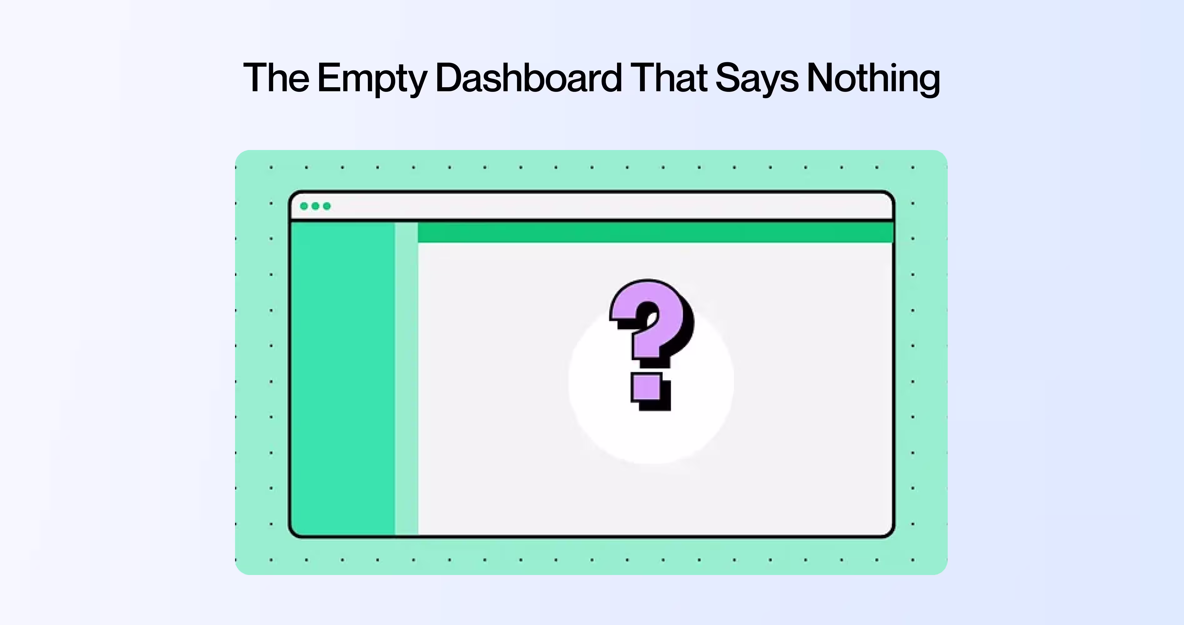
A new user signs up for your analytics tool. They land on a SaaS dashboard with zero data, zero guidance, and a big empty chart area staring back at them.
This is the blank dashboard user experience problem. The user doesn’t know what to do first. They don’t know what this screen will look like once it’s working. They have no mental model of the value waiting for them on the other side of the setup.
Empty state design in SaaS products is one of the most overlooked conversion killers. The fix isn’t complicated, but it requires intention.
Notion handles this well. When you open a new workspace, you don’t see a blank page. You see templates, a getting-started guide, and sample content that shows you what a populated workspace looks like. The empty state becomes the onboarding.
What to do instead:
- Show sample data that mirrors a real use case (like Mixpanel showing a demo analytics dashboard)
- Add one clear first action: “Import your first dataset” or “Create your first project”
- Display a visual preview of what the dashboard looks like with real data
2. Feature Overload on Day One
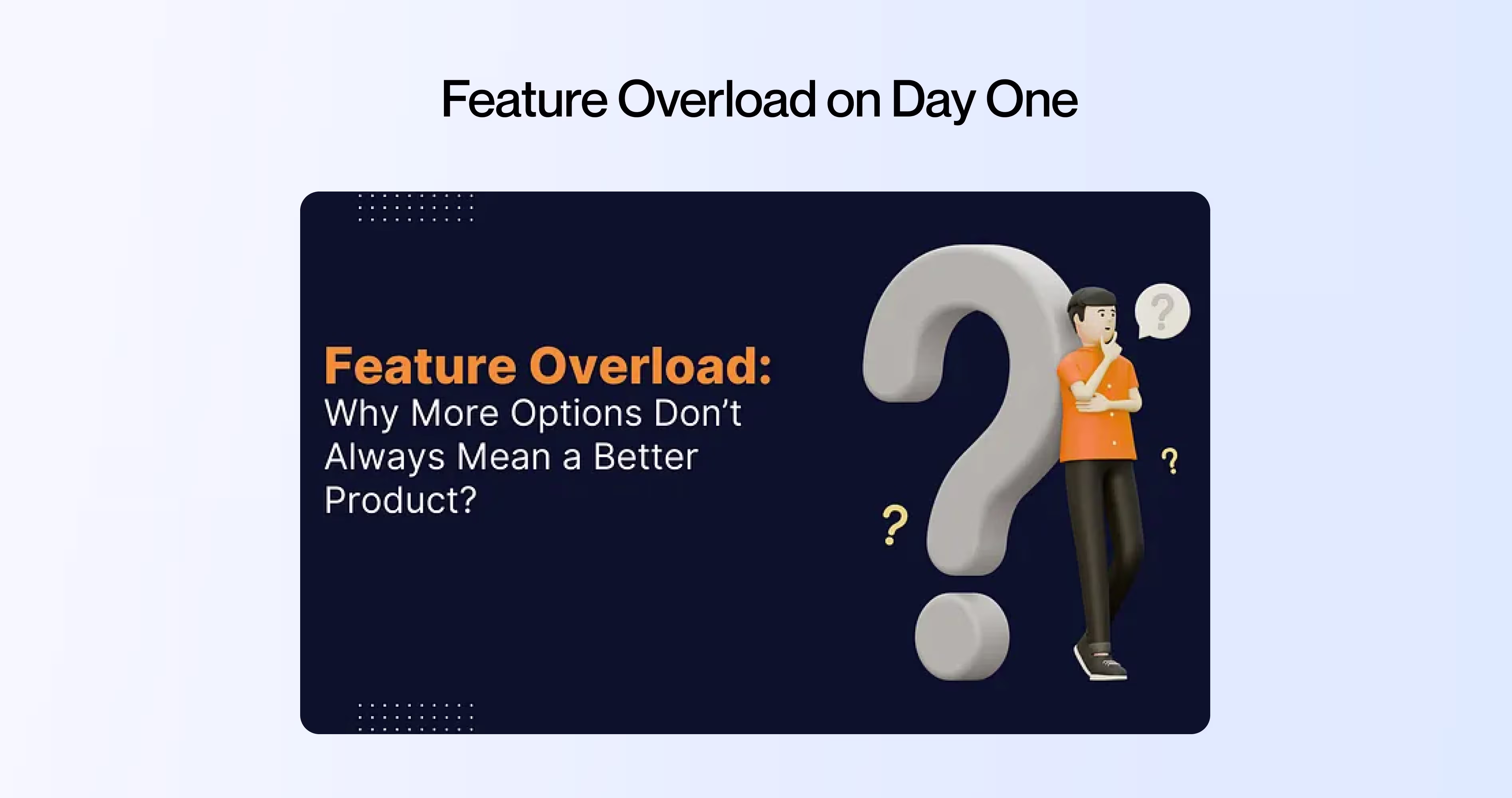
Picture opening a new project management tool for the first time. The sidebar has 22 menu items. The top bar has 8 icons. There’s a settings gear, a notification bell, a help button, and three dropdown menus.
This is feature overload in SaaS navigation, and it triggers what psychologists call Hick’s Law: the time it takes to make a decision increases with every option you present. When a trial user faces 30+ clickable elements on their first screen, they don’t explore. They freeze.
Progressive disclosure UX solves this. Linear, the project management tool, starts new users with just three visible sections: issues, projects, and views. Advanced features like cycles, triage, and automations unlock as users hit milestones. The product feels simple on day one and powerful on day thirty.
What to do instead:
- Audit your first-run screen. Count every clickable element. If it’s over 10, you’re losing trial users
- Hide advanced features behind progressive disclosure. Show them when the user’s behavior signals they’re ready
- Use the “1-3-5 rule”: one primary action, three secondary options, five visible navigation items max
3. Upgrade Prompts That Feel Like Hostage Notes
A user is mid-task. They click a button. A popup appears: “Upgrade to Pro to use this feature. $29/month.”
That user didn’t want an upgrade prompt. They wanted to finish their task. And you just told them they can’t, not unless they pay.
This is the upgrade prompt design failure that kills SaaS free trial UX. When upgrade prompts interrupt the user’s flow, they trigger loss aversion: the user feels like something is being taken away, not offered.
The paywall UX best practice is to place upgrade prompts at moments of value, not moments of work. Slack does this well. Free teams can use Slack fully until they hit the 90-day message history limit. By then, the team already depends on Slack. The upgrade prompt appears after the user has experienced the value, not before.
What to do instead:
- Never interrupt a task with a paywall. Let users finish what they started, then show the prompt
- Frame upgrades as additions (“Unlock unlimited history”) not restrictions (“Your messages will be deleted”)
- Place upgrade prompts contextually, right next to the feature the user just tried to use, not as a random popup
4. Onboarding With No Progress Feedback
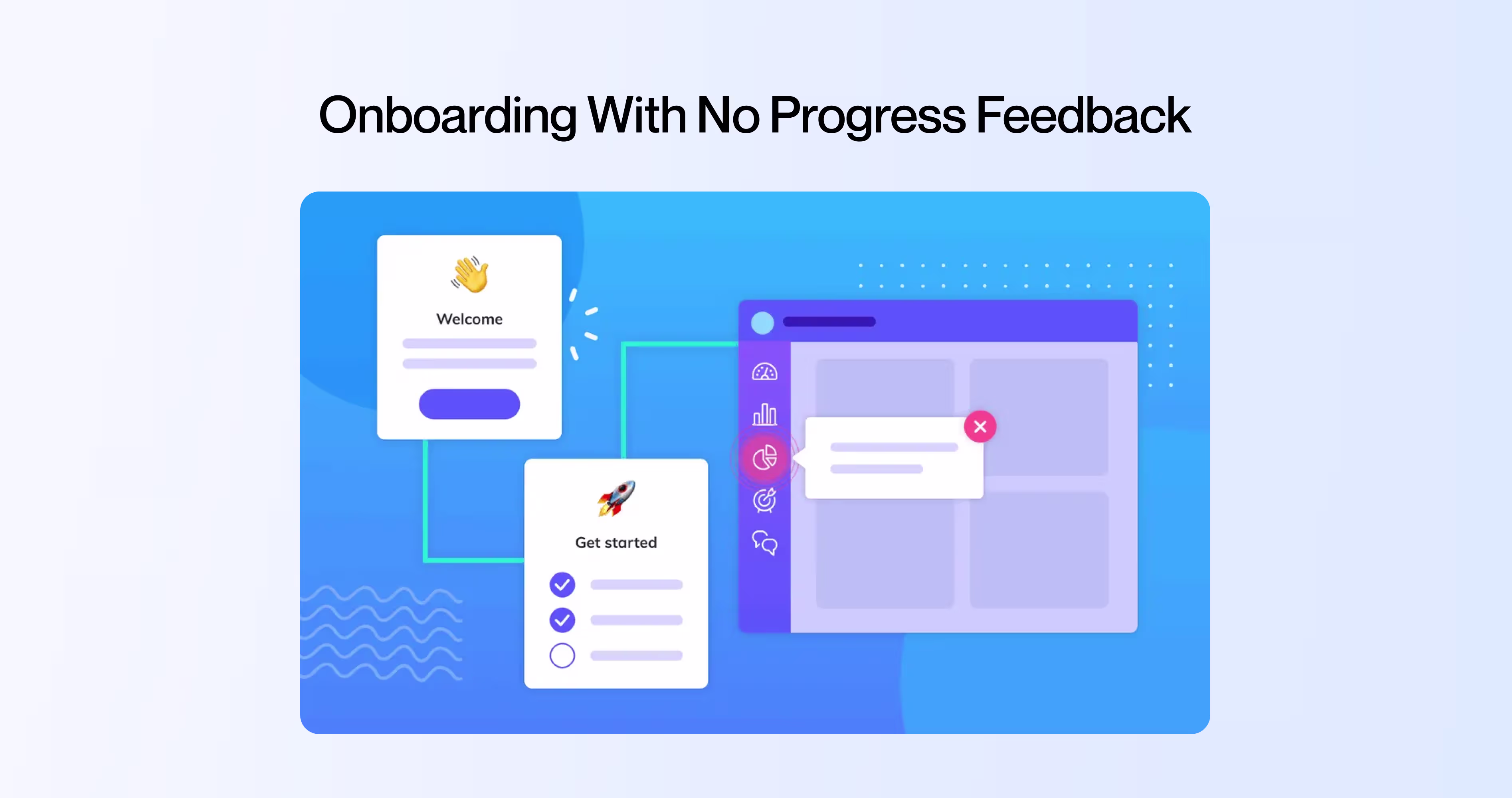
A trial user starts your onboarding flow. They fill in their company name, invite a teammate, connect an integration, upload a file. Five steps done. How many are left? They have no idea.
Missing progress feedback during SaaS onboarding UX causes what’s called the Zeigarnik effect in reverse. The Zeigarnik effect says people remember incomplete tasks more than complete ones, which drives them to finish. But that only works if they can see how much is left. Without an onboarding checklist UI showing progress, the user feels like the setup is endless.
Duolingo shows a progress bar on every screen. You always know how far you’ve come and how far you have to go. That micro-interaction, the visual progress indicator, keeps completion rates above 80% for their onboarding flow.
What to do instead:
- Add a visible progress bar or step counter to every multi-step flow
- Show “3 of 5 complete” instead of just step titles
- Celebrate micro-completions: a checkmark animation, a brief “Nice work” message. These micro-interactions in SaaS keep motivation up
5. Data Overload Before the User Has Context
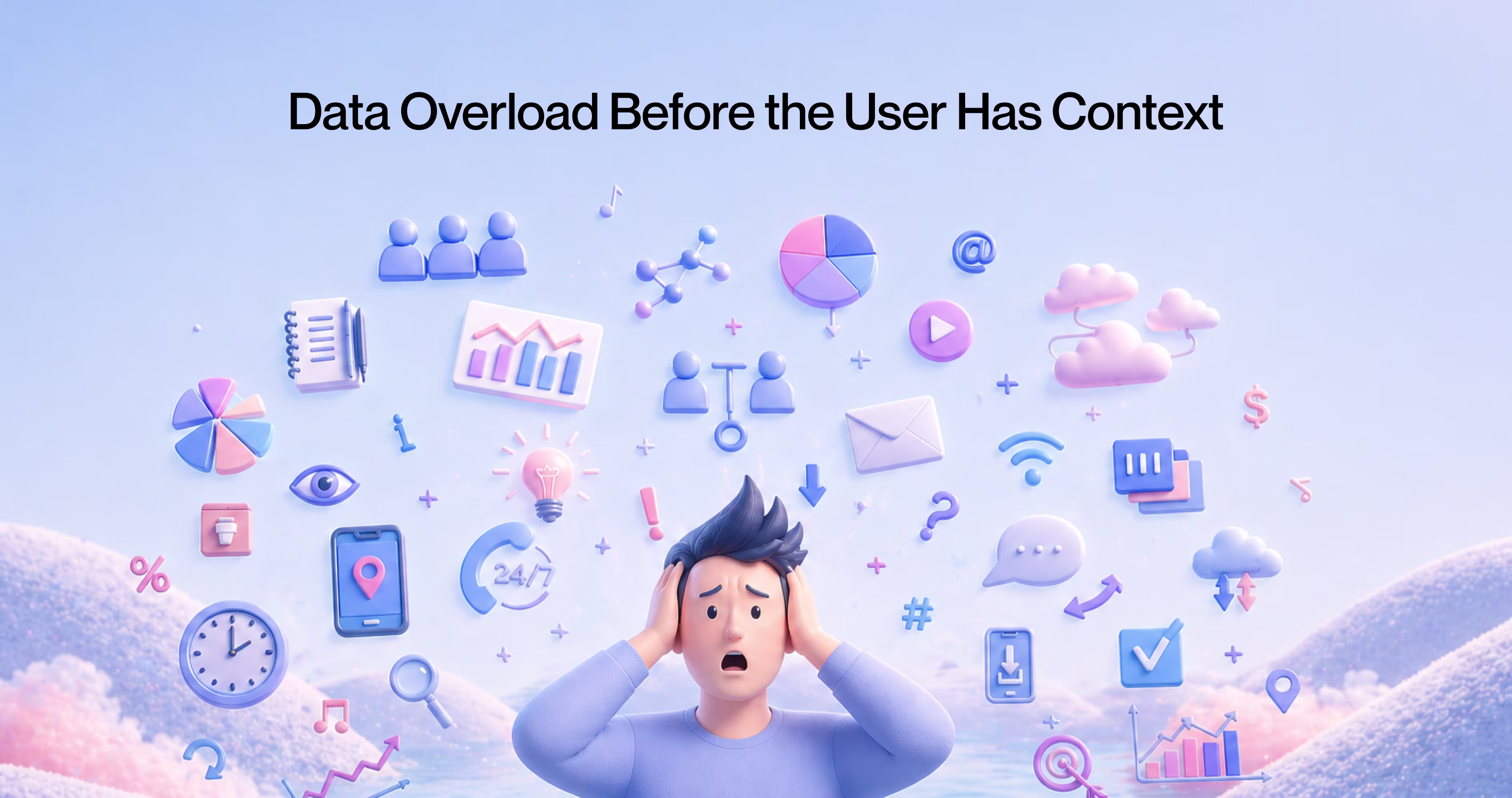
A new user opens your analytics dashboard. They see 14 charts, 6 KPIs, 3 date-range selectors, and a filter panel with 20 options.
This is the information overload SaaS problem applied to data visualization dashboard UX. The user has no context for what these numbers mean, which metrics matter, or what “good” looks like. They’re drowning in data before they’ve learned to swim.
KPI dashboard design for trial users requires a different approach than dashboards for power users. Stripe’s dashboard does this right. New accounts see three things: total revenue, last payment received, and a simple activity feed. As transaction volume grows, more complex charts and filters appear. The data visualization grows with the user.
What to do instead:
- Start trial users with 3 to 5 key metrics. No more
- Add contextual labels: “This is your daily active users count. The average for your plan size is 150.”
- Unlock advanced dashboards after the user has enough data to make them useful
6. Designing for Desktop While Users Are on Mobile
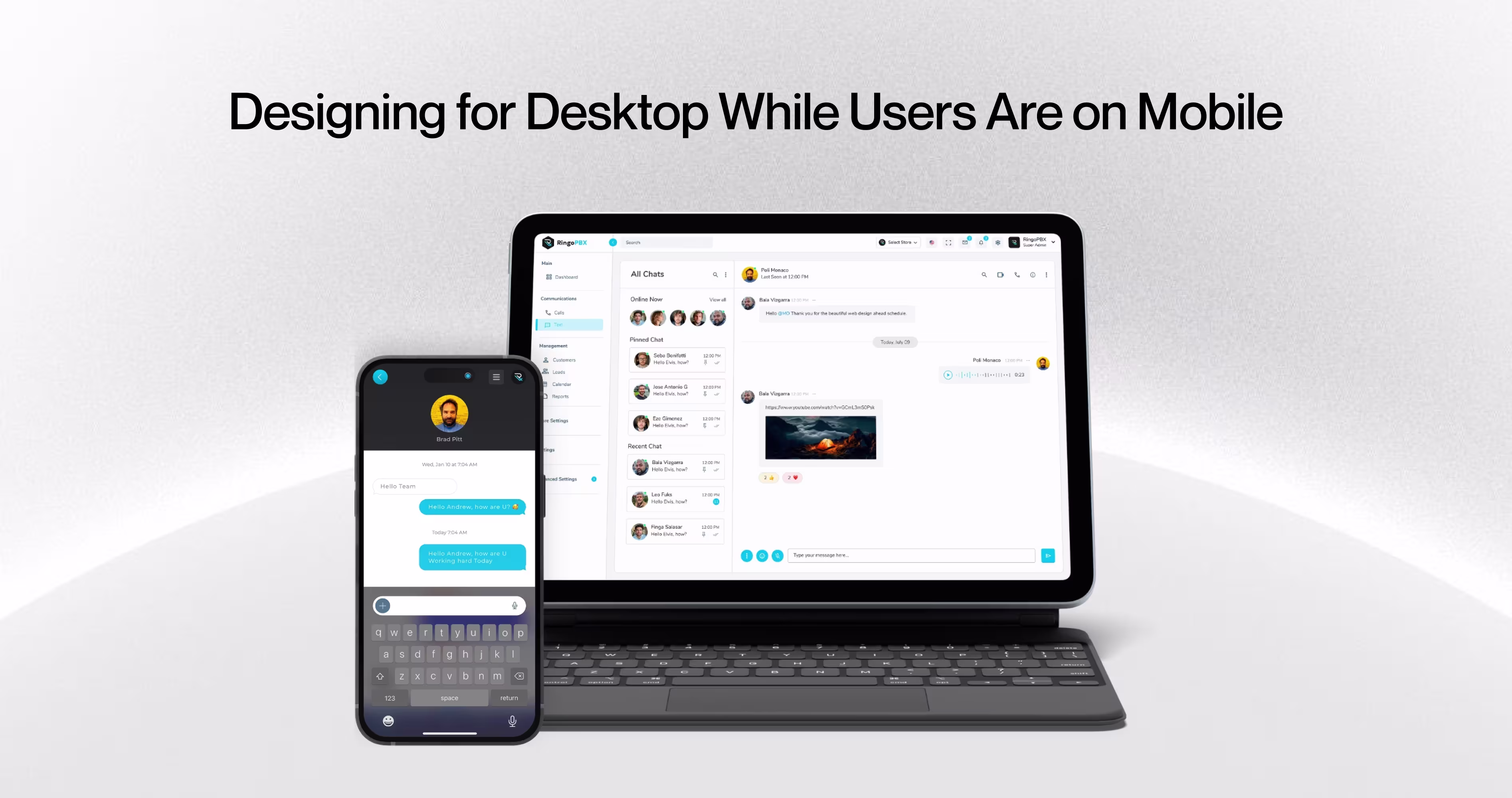
According to Stat counter’s 2025 data, 59.4% of global web traffic comes from mobile devices. But open most B2B SaaS products on a phone and the experience falls apart. Tiny buttons, horizontal scrolling, features hidden behind hover states that don’t exist on touchscreens.
Mobile-first SaaS design isn’t optional anymore, even for B2B products. Your trial user signs up during a commute, checks the app during lunch, shows it to a colleague on their phone. If the responsive SaaS dashboard breaks on mobile, you just lost three touch points.
Thumb zone optimization matters. The primary actions need to live in the bottom half of the screen where thumbs can reach them. Navigation should collapse cleanly. Forms should stack vertically.
What to do instead:
- Test your entire trial flow on a phone. Every screen, every interaction
- Move primary CTAs to thumb-reachable zones (bottom 40% of screen)
- Replace hover-dependent interactions with tap-friendly alternatives
7. Making It Hard to Pay You
This one sounds absurd, but it happens constantly. A trial user hits day 10 of a 14-day trial. They like the product. They want to upgrade. They click around looking for the upgrade button.
It’s buried three levels deep in the settings menu. Or the in-app upgrade CTA only shows on the billing page. Or the trial expiry UX pattern shows a countdown banner but the banner doesn’t link to the upgrade page.
The contextual upgrade prompt should appear where the user’s intent is highest: right after they’ve completed a successful action, exported a report, or shared results with their team. That’s when conversion intent peaks.
What to do instead:
- Place a persistent but non-intrusive upgrade option in the main navigation
- Add contextual upgrade prompts after the user completes high-value actions (“You just built your first report. Upgrade to schedule automatic delivery.”)
- Make the trial expiry banner clickable and link directly to checkout, not to a settings page
What High-Converting SaaS Products do Differently
Product-led growth UX works because the product sells itself through the experience, not through popups and paywalls. Time to value in SaaS is the single metric that separates products with 25%+ conversion rates from those stuck at 8%.
The products with strong trial-to-paid conversion rates share three traits:
- They reduce time to value. Calendly gets users to their first booking link in under 2 minutes. SaaS user activation happens fast because the UI removes every step that isn’t essential.
- They match UI complexity to user maturity. Figma shows a simple canvas on day one. Design system features, team libraries, and branching show up after the user has created several files.
- They make the upgrade feel earned, not forced. Loom lets free users record and share videos without limits. The upgrade prompt appears when storage fills up, after the user already depends on the tool.
Frequently Asked Questions
What are SaaS UI patterns?
SaaS UI patterns are recurring design structures used across software products, like dashboards, onboarding flows, upgrade prompts, and navigation menus. They shape how users interact with a product during trial and directly influence whether someone converts to a paid plan or abandons the product.
Why do SaaS UI patterns affect trial-to-paid conversion?
Trial users decide within the first 3 to 5 sessions whether a product is worth paying for. UI patterns control what users see, how fast they reach value, and whether the upgrade path feels natural. Poor patterns create friction that pushes users away before they experience the product’s core benefit.
What is an empty state in SaaS dashboard design?
An empty state is what users see when they open a SaaS dashboard for the first time, before they’ve added any data. A blank dashboard with no guidance gives users zero reason to continue. The best SaaS products use empty states to show sample data, prompt a first action, or demonstrate what the dashboard will look like once populated.
How does feature overload hurt SaaS onboarding?
Feature overload happens when a product shows every feature at once during onboarding. According to Hick’s Law, decision time increases with each option presented. When trial users face 15+ menu items on day one, they feel confused instead of capable, and confusion kills conversion.
What makes a good upgrade prompt in SaaS products?
A good upgrade prompt appears at the exact moment a user tries to do something the free plan doesn’t support. It shows what they’ll gain, not what they’re missing. The worst upgrade prompts interrupt tasks, pop up randomly, or use fear-based language, which triggers loss aversion and drives users to cancel.
How long should a SaaS free trial be?
Trial length depends on time to value. According to Totango’s SaaS benchmarks, 14-day trials convert at 18.2% while 30-day trials convert at 14.1%. Shorter trials create urgency, but only if users can reach the product’s core value within that window. If your activation takes 10 steps, a 7-day trial will fail.
What UI patterns reduce SaaS conversion rates?
Seven UI patterns consistently reduce SaaS conversion: empty dashboards with no guidance, feature overload during onboarding, aggressive upgrade prompts, missing progress indicators, overwhelming data visualizations, desktop-only designs that ignore mobile users, and hidden upgrade paths that make it hard to buy when users are ready.
Final Thoughts
Each of the 7 patterns above is bad on its own. Together, they’re fatal. A user who hits an empty dashboard, then faces feature overload, then gets interrupted by an upgrade popup, then has no progress feedback? That user is gone in 60 seconds.
The compound effect is what makes SaaS churn UX design so tricky. Fixing one pattern helps. But the real gains come from auditing the full trial journey and fixing the sequence. User retention design patterns work as a system, not as individual fixes.
Run a complete SaaS UX audit of your trial flow. Sign up as a new user. Screen-record the entire experience. Watch where you hesitate, where you feel confused, where you look for something and can’t find it. Those moments are where conversion dies.
.avif)


.avif)
