Table of Contents
- Why Admin Dashboards Get Rebuilt and it's Not Scope Creep
- Layer 1: Information Architecture Map the Structure Before the Screens
- Layer 2: Design for Roles from Day One (RBAC-Aware UI)
- Layer 3: Design Tokens + Component Library Build Once, Scale Forever
- Layer 4: Engineer Handoff The Layer Designers Usually Skip
- The 4 Design Mistakes That Trigger Rebuilds
- Before You Start: The Checklist
- Frequently Asked Questions
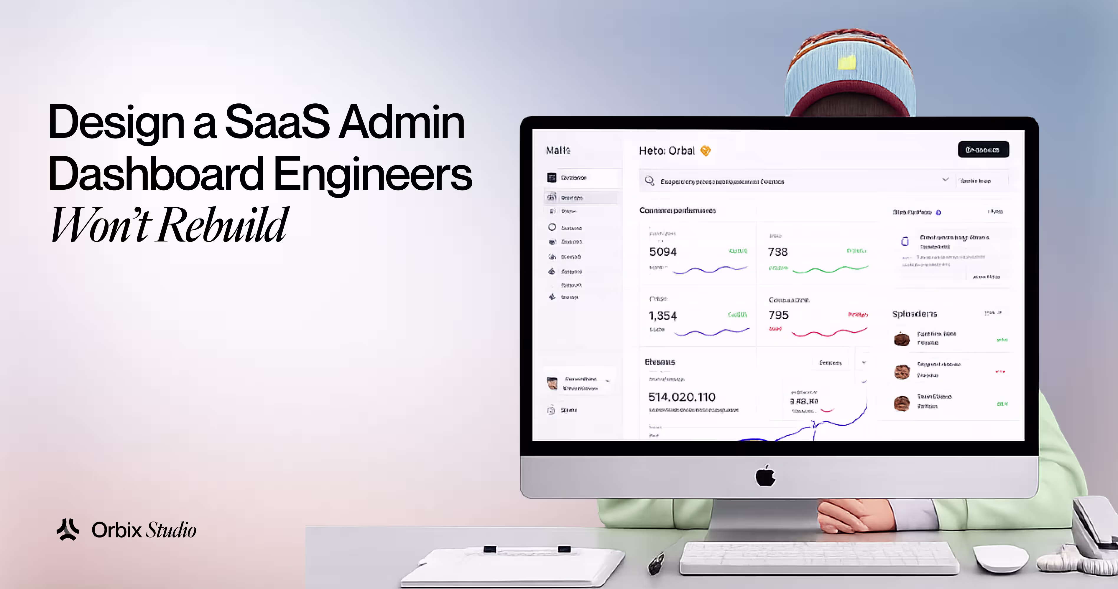

Six months after launch, your engineering lead sends a message in Slack. The admin dashboard needs a rewrite. Not a hotfix. Not a new feature layer. A full rebuild from zero.
And the frustrating part? The original version wasn't poorly built. The engineers were competent. But the design was built for a team of five, and now there are three customer tiers, six user roles, and a data table that breaks if a row has more than twelve columns.
According to McKinsey's 2022 technology debt research, tech debt consumes roughly 20% of IT budgets across companies. For SaaS products, admin dashboards are among the biggest contributors not because they're complex, but because they're designed without the decisions that protect them from complexity later. (Source: McKinsey Digital, 2022)
Here's the short answer: a dashboard that survives growth is designed around four things from day one information architecture, role-based UI logic (RBAC), a component system with design tokens, and an engineer handoff that actually translates. Get all four right and the dashboard scales. Miss one, and the rebuild clock starts ticking.
Why Admin Dashboards Get Rebuilt and it's Not Scope Creep
.avif)
The easy explanation is scope creep. Real answer is more specific.
Admin dashboards get rebuilt because the first version was designed for a user who doesn't exist at scale. The initial design assumes one role (admin), one tenant (your own company), and a fixed data structure. Then the product grows. A "viewer" account is needed for a client's finance team. A third client signs on with a different plan that hides half the features. The data table needs to support 50 columns instead of 8.
None of those changes were outrageous. But the design had no room for them.
Stripe's 2022 State of Developer Experience report found that developers spend roughly 33% of their time on maintenance and rework, not new features. For SaaS teams, an unstructured admin panel is one of the fastest ways to eat into that time. (Source: Stripe, Developer Experience Report 2022)
The design decisions that cause this aren't obvious at the moment. A flat navigation that works for 10 pages breaks at 40. Hard-coded role checks in components create nightmares when a third role appears. Colors defined as hex values in every component become a rebranding crisis when the first enterprise client signs up. That's where the four layers come in.
Layer 1: Information Architecture Map the Structure Before the Screens
Most design processes start with wireframes. The right process starts with a map.
Before designing a single screen, draw the full navigation structure of the admin dashboard. List every entity type users, billing, settings, reports, permissions every action a role can take, and how frequently each happens. This is information architecture. For admin dashboards, it's the difference between a sidebar that works forever and one that collapses under its own weight by page 30.
Nielsen Norman Group's research on progressive disclosure shows that users presented with too many options at once make slower decisions and more errors. For admin users — usually internal teams or power users a sidebar showing everything is actually harder to use than one showing the right things for the right role. (Source: Nielsen Norman Group, Progressive Disclosure, 2020)
The practical rule: group navigation by user goal, not by data type.
Bad: Settings → General, Settings → Billing, Settings → Team, Settings → API, Settings → Security five flat items.
Better: Settings → Account (merges General + Billing), Settings → Access (merges Team + Security + API).
The second version has fewer cognitive jumps. An admin looking to control who has access doesn't need three separate pages it's one logical group.
Before building any screen, answer these three questions:
- What are the top 3 tasks each role performs daily?
- Which sections are role-specific and which are shared?
- What happens to the navigation when a new role is added in 12 months?
Layer 2: Design for Roles from Day One (RBAC-Aware UI)
Here's a situation that plays out in nearly every growing SaaS product. The first admin dashboard has one user type: the admin. Then a customer asks for a read-only account for their finance team. Engineering adds a check: if user.role 'admin' show this button. Six months later, there are four roles and forty of those checks scattered across components. Adding a fifth role means auditing the entire codebase.
That's RBAC treated as an engineering problem after the fact. Designing for it from day one means it never becomes one.
A RBAC-aware UI design approach means three things:
1. Every component knows its permission context
A button, a table action, a sidebar link each should receive a permission flag, not a role name. Instead of checking if role === 'admin', the logic is if can('edit_users'). When roles change, you update the permission map, not every component.
2. The design specifies which elements hide vs. disable
Hiding removes options entirely right for features the user should never know exist. Disabling shows the element but makes it inactive right for features the user should know about but can't yet access (often used to prompt upgrades). This is a design decision, not a dev decision. If the spec doesn't define it, engineers will guess and they'll guess differently on every screen.
3. Role-switching previews are part of the spec
During handoff, include a spec showing how each screen renders for each role. Not just the admin view. Three roles and twelve screens means thirty-six states to document. It sounds like a lot. It saves weeks of back-and-forth during QA.
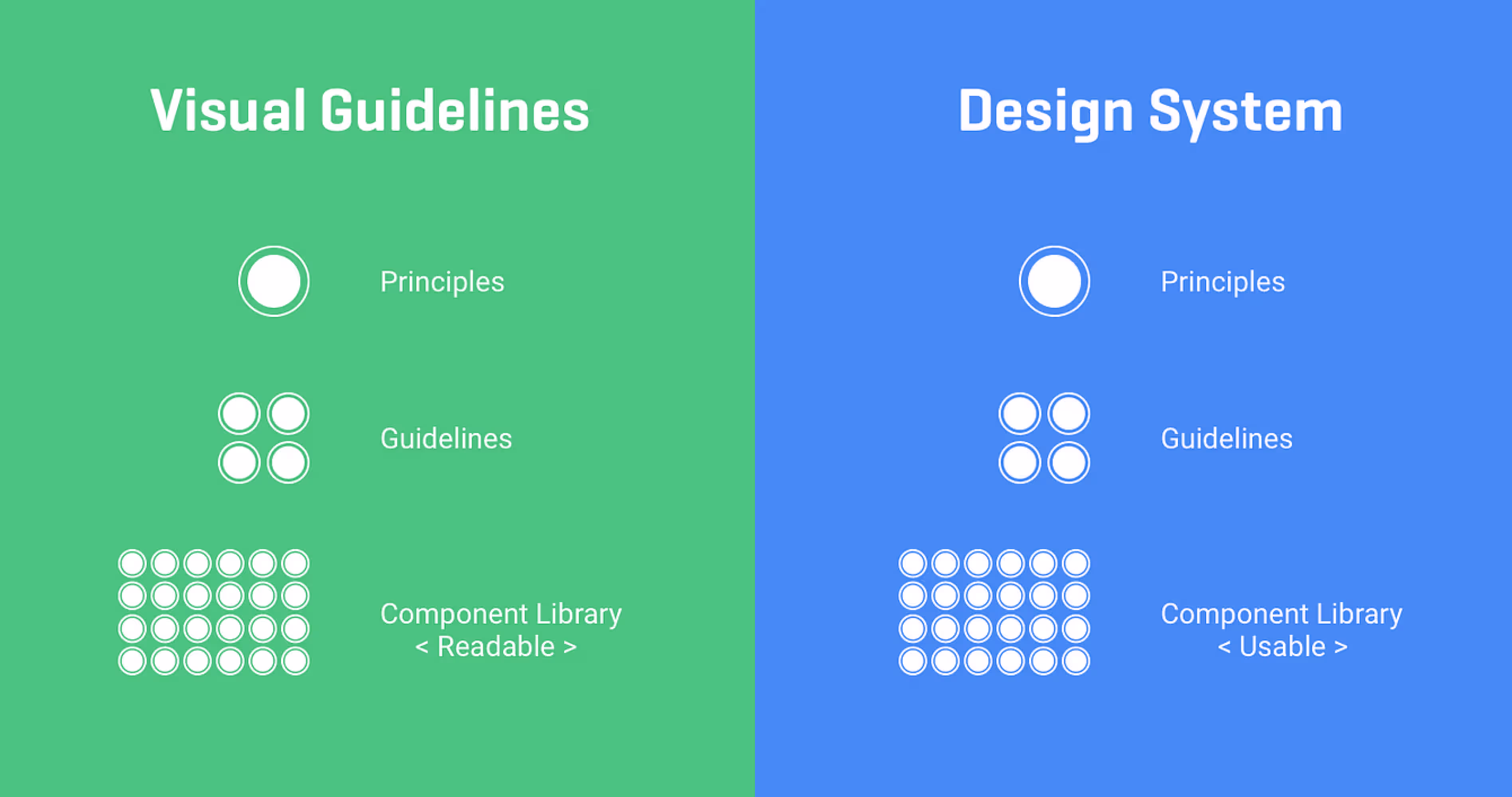
Layer 3: Design Tokens + Component Library Build Once, Scale Forever
Every admin dashboard rebuilt after twelve months has one thing in common: colors defined as #1A73E8 in a hundred places, font sizes set as 14px directly in components, and spacing handled by eyeballing it.
When the first enterprise client asks for a white-labeled version with their brand colors, the answer becomes: that'll take three months.
Design tokens fix this. A design token is a named variable for a visual decision color-primary, spacing-md, font-size-body. Instead of hardcoding #1A73E8, every component references --color-primary. Changing that one token updates the entire dashboard.
For Figma users working with engineers on React and Tailwind, this maps directly to CSS variables or Tailwind config values. When the token system is set up in Figma Variables and exported to the codebase, a full theme change is a config file edit not a search-and-replace marathon.
The atomic design methodology components built from atoms (buttons, inputs) to molecules (form fields) to organisms (data tables, sidebars) — gives admin dashboards a structure that grows cleanly. A data table built as an organism that accepts column definitions, row data, and action configs as props can serve every table in the dashboard without being rewritten each time. (Source: Brad Frost, Atomic Design, 2016)
The component libraries that work best for SaaS admin dashboards:
- ShadCN UI - highly composable, unstyled base, maximum control.
- Tremor - built specifically for dashboards and data visualization, fastest path to charts and metrics.
- Ant Design - enterprise-grade, comprehensive, ideal for data-heavy interfaces.
Layer 4: Engineer Handoff The Layer Designers Usually Skip
A design that lives only in Figma is not a design. It's a reference that engineers interpret differently on every screen.
For admin dashboards specifically, the handoff needs to cover three things that standard handoffs miss:
Component states
Every interactive element a data table row, a form field, a status badge has at minimum five states: default, hover, active, disabled, and empty. For data tables specifically, add loading, error, zero results, and overflow (what happens at 10,000 rows). If the spec doesn't show these, engineers invent them. And they invent them differently on every screen.
Responsive behavior at breakpoints
Admin dashboards are primarily used on desktop, but internal ops teams use tablets. Define what happens to the sidebar navigation at 768px does it collapse to icons, or go to a hamburger menu? This isn't optional. It takes 30 minutes to document and saves three days of back-and-forth during QA.
Storybook documentation
Storybook is a tool that lets engineers view UI components in isolation, with all states documented. When the design system is built and documented in Storybook, a new engineer can onboard the component library in hours instead of days. It also acts as a living spec if a component looks wrong in Storybook, something broke.
The 4 Design Mistakes That Trigger Rebuilds
- Static data table mockups. A table with 6 rows and 5 columns looks clean in Figma. The real product has 200 rows, 12 columns, resizable headers, inline editing, and bulk actions. Design data tables with variable content from day one long strings, empty cells, overflow states included.
- Ignoring the sidebar at scale. A sidebar with 8 items is a navigation. A sidebar with 35 items which happens by month 18 in most SaaS products is a maze. Design the sidebar with a scalability plan: grouping, collapsible sections, and a search fallback when items exceed 20.
- Adding multi-tenancy after launch. If the product will ever serve multiple clients (it will), the dashboard needs multi-tenant logic from day one: client-specific branding slots, data isolation at the UI level, and role definitions scoped per tenant. Adding this later means rebuilding authentication, navigation, and data fetching.
- Skipping the empty state. A new account, a cleared table, a report with no results each needs a designed empty state. Without it, engineers render a blank page. Blank pages look broken. Users file support tickets. The fix is a 2-hour design task that gets skipped every time.
How Orbix Approaches Admin Dashboard Design
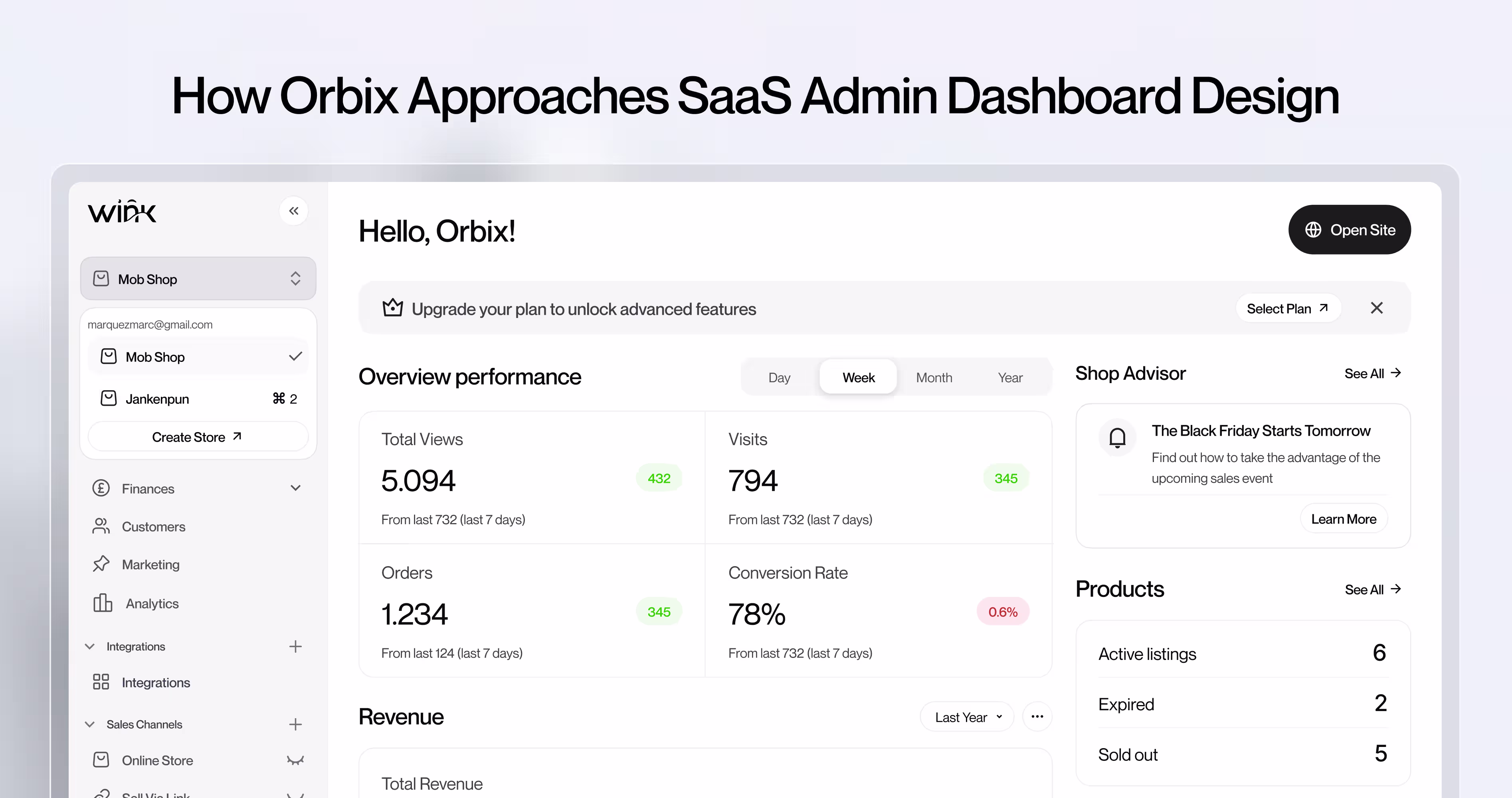
When SaaS founders bring admin dashboard design problems to Orbix Studio, the work starts in the same place every time: the role model.
Before any screen gets designed, we map every user role that needs to access the dashboard, their primary task, and the data they need to complete that task. That mapping becomes the information hierarchy. The hierarchy becomes the layout. The layout becomes the component specification. This order matters. Teams that start with components and work backwards to a hierarchy always end up with a flat, one-size-fits-all layout that can't serve multiple roles cleanly.
From there, the work moves to navigation architecture. Most admin dashboards that come to Orbix Studio for a redesign have flat navigation that nobody structured for growth. We rebuild the nav hierarchy around functional areas first and module detail second, so every new feature the product ships lands inside an existing functional area without forcing a navigation restructure.
The component and design token layer comes last. By the time components get designed, the role model and navigation structure have already determined the surface area each component needs to serve. Components built to spec, with tokens for spacing, color, and typography, stay consistent regardless of how many contributors touch the codebase.
The outcome founders care about: an admin dashboard that doesn't require a rebuild when the second enterprise customer asks for multi-tenancy support, when the third user role gets added, or when the data volume doubles.
Want to see how Orbix Studio approaches admin dashboard design? See our process ->
Before You Start: The Checklist
Before writing a single spec or designing a single frame, go through these five steps:
- Map the full navigation structure and every role's access level before opening Figma.
- Define design tokens in Figma Variables before any component is designed.
- Choose a component library (ShadCN, Tremor, or Ant Design) and commit to it.
- Write a permission matrix: every role, every action, every UI response (hide or disable).
- Design at least one data table with overflow, loading, error, and empty states in the spec.
Frequently Asked Questions
What makes a SaaS admin dashboard scalable?
A scalable admin dashboard uses design tokens for visual decisions, RBAC-aware components for permission logic, and an information architecture that can add new sections without breaking navigation. Scalability is a design decision made at the start, not an engineering fix added later.
Why do admin dashboards get rebuilt so often?
Because they're designed for the current state of the product, not the next 18 months. Hard-coded role checks, flat navigation, and no component system mean every significant product change requires touching the original structure.
What design decisions prevent admin dashboard rebuilds?
Four decisions: (1) information architecture mapped before screens, (2) RBAC built into component logic from day one, (3) design tokens and a component library set up before the first screen, and (4) a handoff that includes component states, responsive behavior, and Storybook docs.
How should a dashboard handle multiple user roles?
Each component should reference a permission flag can('view_reports') not a role name. Design specs should define what each role sees on every screen. Role changes then update a permission map, not individual components across the codebase.
Admin dashboard vs. user dashboard what's the difference?
A user dashboard shows an individual's activity, data, and personal settings. An admin dashboard manages entities, users, and system-level configuration usually for a team or client. Admin dashboards have significantly more data density and require strict access control.
How do design tokens help scalability?
Design tokens are named variables for visual decisions colors, spacing, typography. When every component references a token instead of a hardcoded value, changing the visual system (new client brand, dark mode, design refresh) is a config file edit, not a codebase-wide change.
How do you design a multi-tenant admin panel?
Build branding slots, data isolation at UI level, and tenant-scoped role definitions from the first version. Multi-tenancy added after launch means rebuilding authentication, navigation, and data logic essentially the whole dashboard.
How should data tables be designed in SaaS admin dashboards?
Design data tables as organisms with variable content: long strings, empty cells, 200+ rows, overflow states. Define loading, error, zero-results, and bulk-action states in the spec. Never design a data table with clean demo data only.
.avif)


.avif)