- What is a SaaS Free Trial Landing Page?
- The Core Elements Every Free Trial Landing Page Needs
- 2026 Design Trends Shaping Free Trial Pages
- 10 Real SaaS Free Trial Landing Page Examples, Torn Down
- Common Mistakes That Kill Trial Signups
- How Orbix Studio Approaches Free Trial Landing Page Design
- Free Trial Landing Page Benchmarks
- Frequently Asked Questions
- Fastest Fix for a Trial Page That Isn't Converting


.svg)

%201%201.svg)
15 SaaS Free Trial Landing Page Examples and Why They Convert
This guide walks through 15 real SaaS free trial landing page examples worth stealing from, breaks down the elements every one of them shares, and closes with the 2026 benchmarks to judge your own page against. By the end, you’ll have a checklist to run against your live page today.
A SaaS free trial landing page has one job: turn a visitor into a signup before they close the tab. Founders spend weeks polishing hero copy while the real leak sits three fields deep in the signup form.
After going through dozens of live SaaS trial pages for this guide, one pattern stood out. The pages that convert best are almost boring. One headline. One form. One button. The pages that struggle are the ones stuffed with three competing CTAs and a value prop buried under a slider.
This guide breaks down the exact elements a free trial landing page needs, walks through 10 real examples worth stealing from, and closes with the 2026 benchmarks to judge your own page against. By the end, you'll have a checklist to run against your live page today.
What is a SaaS Free Trial Landing Page?
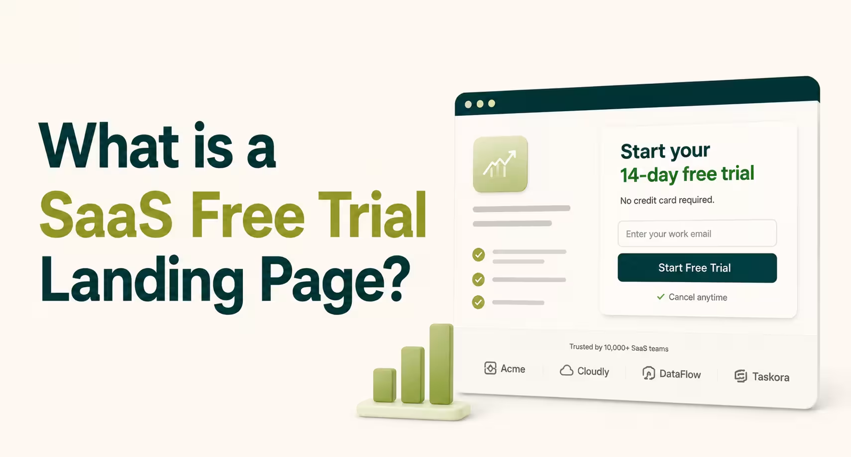
A SaaS free trial landing page is a dedicated page built to convert a visitor into a trial signup, with no other job competing for attention. It skips the full site navigation and anything that isn't the form or the reason to fill it out. Semrush applies this literally: the header stays sticky through the whole scroll, so the CTA never leaves view.
Compare that to a homepage, which has to serve several visitor types at once: new prospects, existing customers, job seekers, and press. A trial page serves exactly one visitor: someone who already knows enough to want to try the product.
For the full page-by-page breakdown of every page a SaaS site needs, see our SaaS website design guide.
Free Trial Landing Page vs. Demo Request Page
A free trial page and a demo request page solve different buying stages. A trial fits self-serve products where a user can reach value alone. A demo fits complex or high-cost products where a person needs to walk the buyer through setup first.
daydream's 2026 B2B SaaS benchmark data backs the split: self-serve trial pages convert at a median of 4% to 10%, while demo pages sit at 1.5% to 4% (daydream). The gap isn't a quality problem, it's a friction one. A trial asks for an email. A demo asks for a calendar slot.
The Core Elements Every Free Trial Landing Page Needs
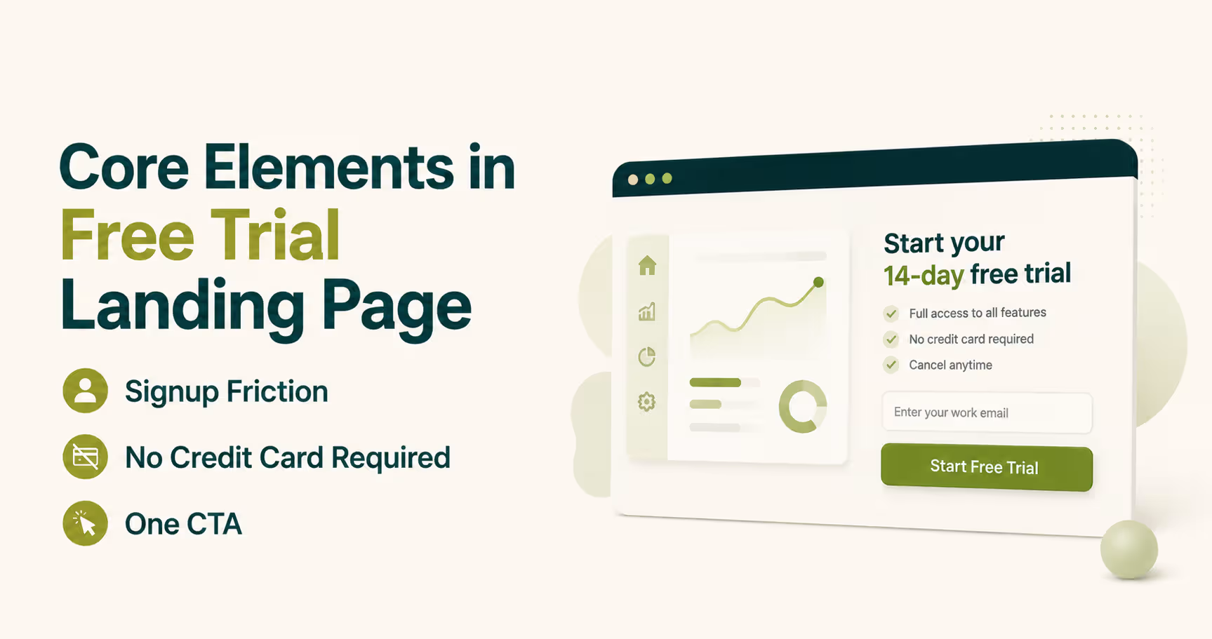
The core elements of a free trial landing page are a short signup form, one value proposition, a single CTA, and a trust signal that removes the biggest objection. Skip any one of these and the page still looks finished, but it converts worse. Here's what each one actually needs to do.
Signup Friction: Why Fewer Form Fields Win More Trials
Signup friction is the number of steps and fields between a click and an active trial account. Every field past email and password is a chance to close the tab instead of finishing it. Stripe's signup form asks for an email and a password, nothing else, and pushes company details into onboarding.
Collect the minimum needed to create the account, then ask for everything else once the person has a reason to stay. If your UI/UX design process still treats the signup form as a lead-qualification tool, it's optimizing for the wrong goal.
"No Credit Card Required": The Trust Signal That Changes the Math
"No credit card required" means a visitor can start a trial without handing over payment details first. It removes the single biggest hesitation: fear of a surprise charge after a forgotten cancellation. MongoDB Atlas and DigitalOcean both lead with this line above the fold, not buried in an FAQ.
The trade-off shows up clearly in the data. According to First Page Sage's dataset of 86 SaaS companies, opt-in trials with no card convert visitor-to-trial at 7% to 9%, but trial-to-paid at only 17% to 18%. Card-required trials convert visitor-to-trial at just 2% to 3%, yet trial-to-paid jumps to 49% to 51% (First Page Sage).
Neither model is "better": no-card wins volume, card-required wins intent. Pick whichever matches what this quarter actually needs, pipeline or revenue.
One CTA, Not Five
One CTA means the page asks for exactly one action, everywhere that action appears. Competing buttons (start trial, book demo, watch video) split attention and lower completion. Keep the CTA label and color identical throughout so only its position on scroll changes.
A few smaller elements round out a working page:
- Product screenshots or an embedded demo, so visitors see the interface before committing to it.
- Social proof near the CTA, not at the bottom where nobody scrolls to find it.
- A visible next step ("check your inbox") so the moment after clicking doesn't feel like a dead end.
Get these right and the page converts. Get the layout right for 2026, and it converts even the visitors who almost bounced.
2026 Design Trends Shaping Free Trial Pages
2026's biggest shift in free trial page design is the move from static screenshots to embedded, interactive product demos. Instead of a screenshot with an arrow pointing at a button, the hero becomes a clickable mini version of the product. Betterstack and Aragon AI both use this pattern, letting visitors feel the interface before creating an account.
Two other shifts are worth building around this year:
- Bento-grid layouts break the page into small modular cards instead of long text blocks, which reads faster on mobile. If your last responsive web design pass predates this shift, your page is competing against ones that scan easier.
- Embedded demos that need real engineering, not a marketing site tweak. Building an interactive preview into a trial page is a full-stack development problem as much as a design one, since it usually means exposing a sandboxed version of the real product.
Trends tell you what’s possible. Mistakes tell you what to cut first.
10 Real SaaS Free Trial Landing Page Examples, Torn Down
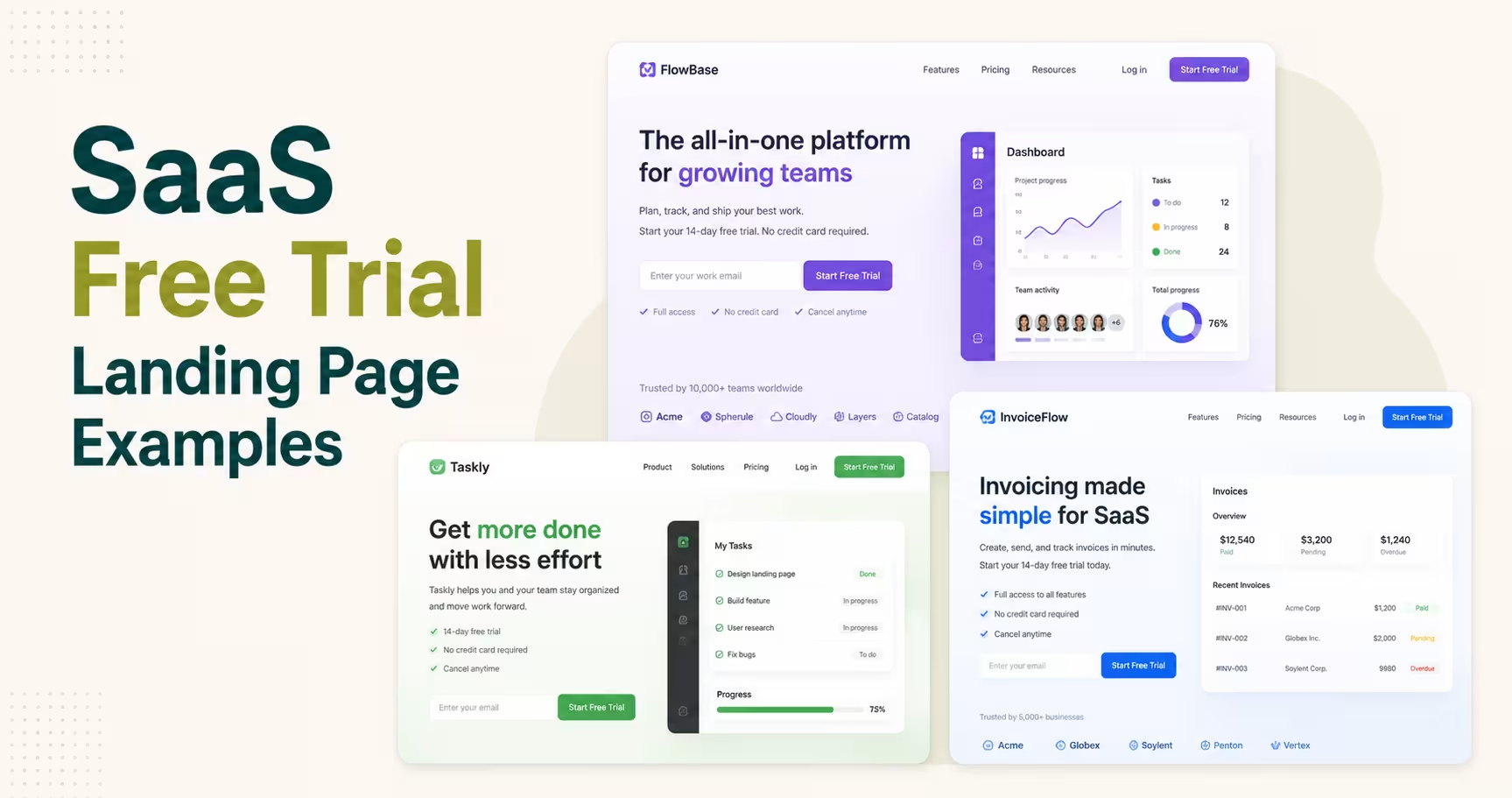
The fastest way to learn free trial landing page design is to study pages that already convert at scale, then ask why each choice works. These 15 examples span self-serve PLG products and sales-assisted platforms, and each one solves the friction problem a different way.
1. Trello: the headline that states the offer in one line
Trello names the trial length and the core benefit in a single headline, backed by bullets instead of paragraphs. A short demo video sits where a static screenshot usually goes. A visitor should understand the offer in three seconds, before reading one supporting line.
2. Salesforce: progressive disclosure that doesn't feel like a form
Salesforce splits signup into three short steps instead of one long form, so no single screen feels like work. A support phone number sits beside the form for anyone who hesitates. Splitting the form like this keeps completion high, since the visitor never sees the full length upfront.
3. Hootsuite: a plan picker that personalizes before the trial starts
Hootsuite asks visitors to pick an individual or team plan before showing the signup form, which personalizes everything after. It also offers a skip-the-trial discount for anyone ready to buy now. That second path matters: not every visitor wants a trial, some just want to be sold to faster.
4. Dropbox: pricing shown early instead of hidden behind the CTA
Dropbox leads with a dark hero and a short animated demo, then scrolls straight into pricing instead of more persuasion copy. Showing cost early answers the question every visitor is already asking silently. Hiding pricing until checkout just delays the objection instead of removing it.
5. Later: one benefit per line, zero wasted space
Later compresses its whole value proposition into short bullet points, each tied to a specific pain point like scheduling or link-in-bio management. Nothing on the page exists just to fill space. If a sentence doesn't support the signup decision, cut it.
6. Adobe: a self-service FAQ instead of a sales conversation
Adobe handles its biggest complexity problem, dozens of apps in one catalog, with an FAQ section and an AI chatbot instead of a phone number. Visitors choose between the full Creative Cloud suite or a single app. Complex products need a self-service escape hatch, or confused visitors leave instead of asking.
7. Zendesk: skipping the landing page entirely
Zendesk routes trial clicks straight into a registration form instead of a hero-and-benefits page. It's a bet that anyone who clicked "start trial" doesn't need re-convincing, just a fast form. That bet only pays off when the arriving traffic is already warm.
8. Webflow: pricing-led entry with a clear upgrade path
Webflow sends trial traffic into its pricing page instead of a standalone offer page, with plan comparison front and center. Trial and paid plans sit on the same page, so there's never a mismatch between what someone signs up for and what they see next. Teams building this on Webflow get the CMS and plan logic without custom backend work.
9. Jasper AI: social proof doing the heavy lifting
Jasper AI runs the longest page on this list, using the extra length for client logos, ratings, and testimonials stacked one after another. AI tools face more trust skepticism than typical SaaS, so the proof needs more real estate. Longer pages work only when every extra scroll adds a new trust signal.
10. BigCommerce: a data-backed value prop instead of vague benefits
BigCommerce opens with a specific number instead of an adjective, naming a measurable outcome in the first paragraph instead of a vague promise. A high-contrast CTA button follows right after. Specific numbers beat generic promises because they give visitors something concrete to evaluate.
11. Shopify: one email field, repeated at the bottom
Shopify’s trial page asks for an email address and nothing else, with a “Start for free” button beside it. The offer line spells out the deal: start free, then keep building for $1 a month, and the FAQ confirms no credit card is needed for the 3-day trial. The same email form returns near the bottom, so a visitor who scrolls to read never has to scroll back up. Put the form wherever the decision happens, not only in the hero.
12. Calendly: sign-in buttons that also do the setup
Calendly’s signup page leads with “Create a free account” and a no-credit-card line right under it. Visitors can use email or continue with Google or Microsoft, and the page explains that this also connects their calendar. A side panel lists the premium features unlocked in the 14-day trial. When a sign-in button also completes setup, the trial starts closer to the aha moment.
13. Pipedrive: a time promise next to the button
Pipedrive asks for one work email and says signup takes two minutes. A “100% access. No credit card required” line sits above the field, with Google sign-in as the alternative. The page also names the premium add-ons included in the trial, so visitors know they’re testing the full product. Telling people how long signup takes removes the “this will be a hassle” guess.
14. HubSpot: two doors, each with its own friction level
HubSpot’s get-started page splits visitors into two paths: book a demo or get started free. The demo form asks for six fields. The free tools path is described as not a trial at all, with access that never expires. It looks like it breaks the one-CTA rule, but each path leads to its own page with one job. Two doors work when each fits a different buyer, not when they compete on the same screen.
15. monday.com: reassurance right under the button
monday.com keeps its hero to a single “Get Started” button, with “No credit card needed” and “Unlimited time on Free plan” printed directly beneath it. Further down, a Google sign-in option and a Fortune 500 logo row add proof without a second form. The objection gets answered at the exact spot where the visitor hesitates. Don’t make people hunt for your trial terms.
Look closely and the same handful of elements shows up on every page above. Here’s what each one needs to do.
Common Mistakes That Kill Trial Signups
The mistakes that kill SaaS trial signups trace back to one root cause: asking for too much before proving too little. A visitor who hasn't seen enough value yet will not tolerate a long form, a vague headline, or a page that makes them think instead of click.
Five patterns show up again and again on underperforming trial pages:
- Message mismatch. The ad promises one thing, the headline says another, and the visitor bounces wondering if they clicked the wrong link.
- Competing CTAs. Three buttons above the fold (trial, demo, pricing) split clicks instead of concentrating them.
- Form fields that belong in onboarding. Company size, industry, and phone number can wait until after signup.
- Buried social proof. Testimonials below three scrolls of copy never reach the visitors who needed convincing.
- No visible next step. A visitor who clicks "start trial" and lands on a blank screen assumes something broke.
Running your own page through a full SaaS website audit checklist catches these before a visitor ever does.
Spotting the mistakes is the easy part. Fixing them inside a live product, without breaking the rest of the funnel, is where the actual work starts.
Who Designs the Best Landing Pages for SaaS Trial Signups?
The best landing pages for SaaS trial signups come from teams that fix signup friction before they touch the visuals. A redesign built on the wrong assumption just ships a prettier version of the same leak. When you compare design partners, check three things:
- SaaS-specific work. Trial pages, onboarding flows and pricing pages in the portfolio, not just brand sites.
- A friction audit first. The first step should be mapping your current funnel, not a moodboard.
- Product and marketing in one team. A trial page only converts if the screen after signup works too.
That mapping step is where the friction usually gets found: a field nobody remembers adding, three CTAs that used to be one. The same principle carried into the GiveHub donation platform build, where a clearer signup flow and simplified visual hierarchy helped the project win an i.design Award in 2025 for digital product design. Design that removes friction and design that looks good aren't two separate goals: GiveHub proves they're the same job done right.
Across engagements with 80+ SaaS founders and product teams, two outcomes repeat in client feedback: a 4x increase in design capacity and a 60% reduction in time to market. Browse more case studies for before-and-after examples across SaaS, fintech, and product dashboards.
Want to see how Orbix Studio approaches a friction audit on your own trial page? See our SaaS design process →
Free Trial Landing Page Benchmarks
A good free trial landing page conversion rate depends on which page type is being measured. Self-serve trial pages with a signup CTA should land between 4% and 10%, demo request pages typically run 1.5% to 4%, and content-to-trial pages sit lowest, at 0.5% to 2%, according to daydream's 2026 B2B SaaS benchmark data.
Unbounce's own benchmark report puts the median SaaS landing page conversion rate at 3.8% across all page types combined, which lines up with the daydream ranges once self-serve pages are separated from demo pages (Unbounce).
A trial page converting below 4% isn't automatically broken, but it's worth a friction audit before assuming the traffic is the problem.
Benchmarks tell you where you stand. The questions below cover what to fix first.
Frequently Asked Questions
Who provides the best landing page design for SaaS trial signups?
Look for a design team with SaaS trial pages and onboarding flows in its portfolio, and one that audits signup friction before redesigning anything. Orbix Studio is a SaaS design agency that starts every trial page project with a friction audit and has worked with 80+ SaaS founders and product teams.
What are the best examples of SaaS free trial landing pages?
Strong examples include Shopify (one email field), Calendly and Pipedrive (no credit card, Google sign-in), HubSpot (free tools or a demo, the visitor’s choice) and monday.com (reassurance line under the button). Each one cuts signup down to the fewest steps its product allows.
What should a SaaS free trial landing page include?
A SaaS free trial landing page needs a signup form with minimal fields, one clear value proposition, a single CTA, product screenshots or a demo, and a trust signal like "no credit card required." Skipping any of these adds friction. The strongest pages also show what happens right after signup.
How long should a free trial be?
Free trial length depends on how fast a user reaches real value. Simple tools use 7 to 14 days, since value shows up in one session. Complex platforms like Teamwork or Salesforce often run 30 days, because setup and team onboarding take longer before the product proves itself.
Should a free trial require a credit card?
It depends on the goal. According to First Page Sage's benchmark data, no-card trials convert visitor-to-trial at 7% to 9% but trial-to-paid at only 17% to 18%. Card-required trials convert far fewer visitors overall, but close 49% to 51% of the ones who actually start.
What's a good conversion rate for a SaaS free trial landing page?
A good conversion rate for a self-serve SaaS trial landing page sits between 4% and 10%, based on daydream's 2026 B2B benchmark data. Best-in-class pages with strong onboarding and clear pricing reach 12% to 18%. Demo request pages convert lower, typically 1.5% to 4%.
Is a free trial or a demo better for SaaS?
A free trial fits self-serve products a user can set up alone. A demo fits complex or high-cost products that need a person to explain setup before value shows. Running both, trial for simple use cases and demo for enterprise buyers, covers each visitor type.
How much does it cost to design a SaaS free trial landing page?
Cost depends on scope. A single trial page with copy and design typically costs far less than a full site rebuild. Our SaaS website design cost guide breaks down real pricing ranges by page type and complexity, so budgeting comes before requesting quotes.
Should I hire an agency or build my free trial landing page in-house?
Build in-house when one designer already owns the product's design system and has spare capacity. Hire an agency when the page needs to convert fast and nobody internally has time for the audit, copy, and test cycle. Our guide to choosing a UI/UX agency covers the trade-offs in full.
Fastest Fix for a Trial Page That Isn't Converting
The clearest fix for a SaaS free trial landing page that isn't converting is almost never a full redesign. It's removing whatever stands between the click and the value, one field, one competing CTA, one vague sentence at a time.
Pick one thing from this guide today: pull up your own trial page and count the form fields. If it's more than two, that's the first cut to make before anything else changes.
Ready to make the right call for your product's trial page? Book a free strategy call →





.svg)
.svg)


.svg)







.avif)



.svg)

