Table of Contents
- What Makes Great SaaS Typography?
- Top 15 SaaS Typography Styles for Modern Websites
- 1. Inter
- 2. Geist
- 3. Satoshi
- 4. General Sans
- 5. Neue Montreal
- 6. Manrope
- 7. IBM Plex Sans
- 8. Plus Jakarta Sans
- 9. DM Sans
- 10. Graphik
- 11. Circular
- 12. Avenir Next
- 13. Work Sans
- 14. TT Hoves
- 15. Söhne
- How to Choose Typography for Your SaaS Website
- Frequently Asked Questions
- Final Thoughts

Every SaaS website tells a story, and typography plays a major role in how that story is experienced. From oversized hero headlines to carefully balanced body text, type helps shape the way users engage with content.
The strongest SaaS brands don't rely on typography as decoration. Instead, they use it as a design tool to improve readability, create visual hierarchy, and communicate their brand's unique voice. The result is an experience that feels effortless and intentional.
Whether you're designing a landing page, refining a product website, or building a complete design system, these 15 SaaS typography examples offer inspiration and practical takeaways for creating more effective digital experiences.
What Makes Great SaaS Typography?
Great SaaS typography isn't just about choosing a beautiful font. It's about creating a system that helps users consume information, navigate interfaces, and interact with products more effectively.
While every brand has its own visual style, the strongest typography systems tend to share a few common characteristics.
- Readability comes first: SaaS websites often need to communicate complex ideas, product features, and technical information. Clear, legible typography helps users absorb that information quickly without creating unnecessary friction.
- A strong visual hierarchy guides attention: Through size, weight, spacing, and contrast, typography helps users understand what matters most. The best SaaS websites make it easy to distinguish between headlines, supporting content, and calls to action.
- Consistency creates a better experience: Typography should feel connected across marketing pages, product interfaces, documentation, and support resources. Consistent type styles make products feel more polished and easier to navigate.
- Typography reinforces brand identity: Whether a company wants to appear innovative, trustworthy, technical, or approachable, typography plays a major role in shaping that perception. The right type choices help communicate a brand's personality before users read a single sentence.
- Flexibility matters: Great typography systems work across a variety of screen sizes, layouts, and content types. They remain effective whether users are reading a landing page, exploring a dashboard, or browsing a knowledge base.
- Accessibility should never be overlooked: Factors such as contrast, spacing, and font sizing help ensure content remains readable for a wider range of users. Good typography isn't just about aesthetics - it's about usability.
Top 15 SaaS Typography Styles for Modern Websites
Typography plays a key role in how users experience a website. The right style can improve readability, strengthen branding, and make content easier to navigate.
Here, we've rounded up 15 SaaS typography styles that stand out for their clarity, versatility, and modern appeal.
1. Inter
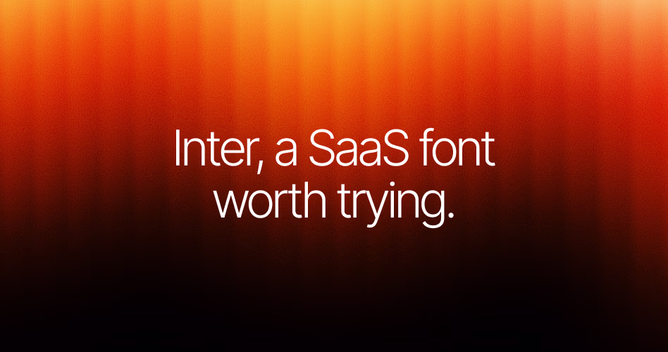
Pricing: Free
Inter, a SaaS font worth trying.
Inter has become one of the most popular typefaces in SaaS design - and for good reason. Designed specifically for digital interfaces, it delivers excellent readability across everything from landing pages to complex dashboards.
What makes Inter stand out is its versatility. The font feels clean and modern without being overly distinctive, making it easy to pair with different brand styles. Whether you're building a startup website, a productivity tool, or a documentation hub, Inter rarely feels out of place.
2. Geist
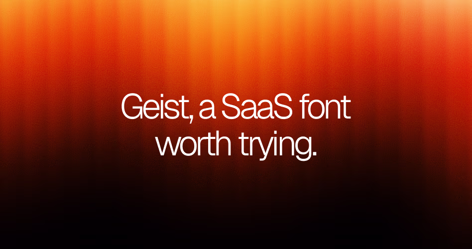
Pricing: Free
Geist, a SaaS font worth trying.
Geist has quickly become a favorite among AI startups, developer tools, and modern SaaS brands. Over the past few years, its presence has expanded beyond the Vercel ecosystem, appearing across websites that want to feel contemporary, technical, and forward-thinking.
Part of its appeal comes from balance. Geist feels cleaner and more refined than many geometric sans-serifs, yet it avoids the neutrality that can make some SaaS typography feel interchangeable.
The result is a typeface that feels modern without trying too hard, making it a strong choice for product websites, AI platforms, and developer-focused experiences.
3. Satoshi
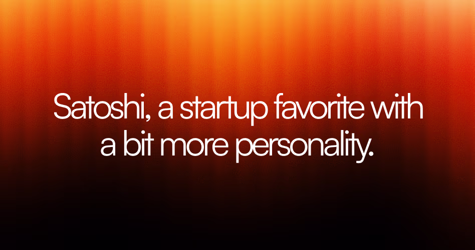
Pricing: Free
Satoshi, a startup favorite with a bit more personality.
Satoshi is a geometric sans serif typeface designed by Indian Type Foundry and released through Fontshare. Available for free, it has become a popular choice among startups and SaaS companies looking for a modern alternative to more established fonts like Inter and Helvetica.
Its clean structure, balanced proportions, and wide range of weights make it suitable for everything from bold hero sections to body text and user interfaces.
Because of its versatility, Satoshi works well across landing pages, product websites, dashboards, and design systems.
The typeface feels contemporary without being overly technical, making it a strong option for brands that want a professional look with a bit more personality.
4. General Sans
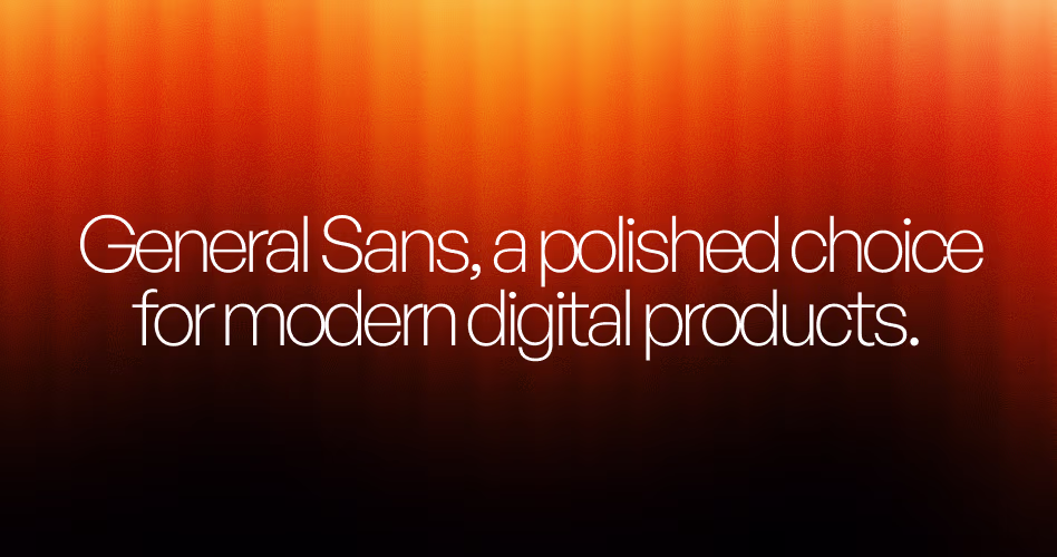
Pricing: Free
General Sans, a polished choice for modern digital products.
View General Sans on Fontshare
General Sans is a modern sans serif typeface created by the Indian Type Foundry and available through Fontshare. Designed with simplicity and versatility in mind, it combines clean geometric forms with subtle humanist influences.
This gives a polished appearance that's well suited for digital products and contemporary brands. Its balanced letterforms and broad weight range make it easy to use across both large headlines and smaller interface elements.
As SaaS websites continue to embrace cleaner and more minimal design systems, General Sans has become a popular choice for startups and product-focused companies.
It works particularly well for landing pages, dashboards, marketing websites, and design-heavy brands that want a professional look without feeling overly corporate.
Used by: Supabase, Lemonsqueezy, LogSnag
5. Neue Montreal
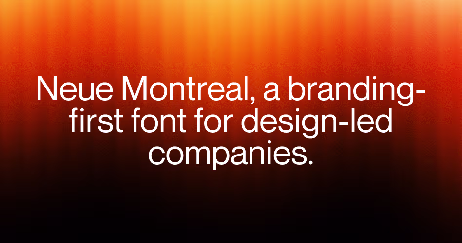
Pricing: Premium
Neue Montreal, a branding-first font for design-led companies.
View Neue Montreal on Pangram Pangram Foundry
Neue Montreal is a contemporary sans serif typeface from Pangram Pangram that has become a favorite among startups, creative agencies, and design-focused SaaS brands. Inspired by classic Swiss typography, it combines clean geometric shapes with distinctive details that help websites feel more refined and memorable.
Unlike many UI-first typefaces, Neue Montreal is often chosen for its strong visual presence. It performs especially well in large headlines, hero sections, and brand-driven marketing pages where typography plays a central role in the design.
For SaaS companies looking to move beyond purely functional typography, Neue Montreal offers a more editorial and expressive approach while remaining highly readable.
6. Manrope
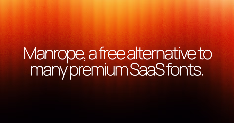
Pricing: Free
Manrope, a free alternative to many premium SaaS fonts.
Manrope is a modern sans serif typeface created by Mikhail Sharanda and released as an open-source font. Originally designed as a single-weight font, it has since evolved into a complete type family with multiple weights.
That made this font a practical choice for websites, user interfaces, and design systems. Its clean letterforms and generous spacing help maintain readability across a wide range of screen sizes.
One reason Manrope has gained popularity among startups and SaaS companies is its ability to deliver a premium look without the cost of a commercial license. The typeface works equally well in headlines and body text.
This makes it easy to build a consistent visual system throughout a website. For teams looking for a free alternative to many popular premium fonts, Manrope is often one of the first options worth considering.
7. IBM Plex Sans
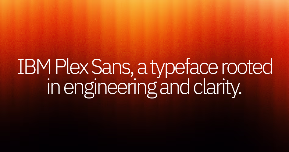
Pricing: Free
IBM Plex Sans, a typeface rooted in engineering and clarity.
View IBM Plex Sans on Google Fonts
Few typefaces on this list come with a design philosophy as clearly defined as IBM Plex Sans. Introduced by IBM in 2017, the font was created to replace Helvetica and serve as the company's new global typeface system.
The goal wasn't simply to modernize IBM's branding, but to create a font that reflected the relationship between machines and people - a concept that influenced everything from its proportions to its character shapes.
That heritage gives IBM Plex Sans a unique personality. It feels technical and structured without appearing cold, which is one reason it's frequently used in enterprise software, developer platforms, and documentation-heavy products.
Combined with its extensive language support and open-source license, IBM Plex Sans has become a practical choice for SaaS companies that want their typography to communicate expertise and credibility.
8. Plus Jakarta Sans
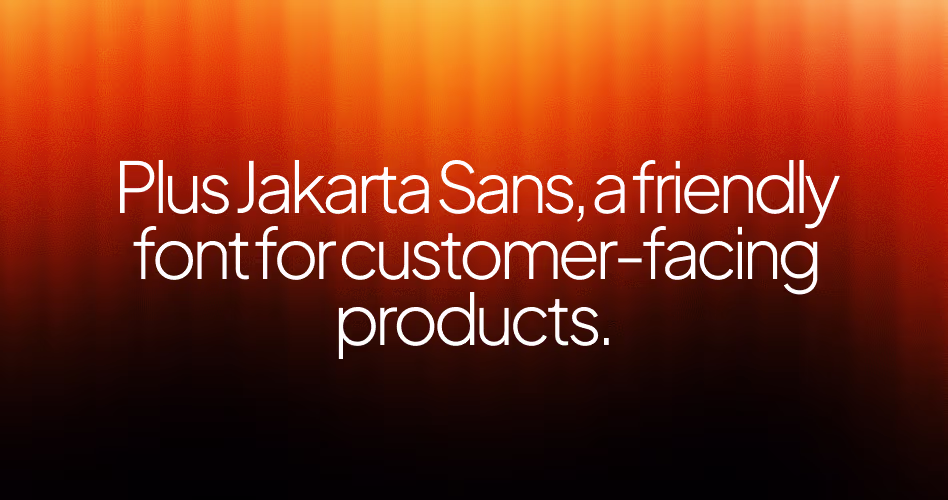
Pricing: Free
Plus Jakarta Sans, a friendly font for customer-facing products.
View Plus Jakarta Sans on Google Fonts
Some fonts are designed to disappear into the interface. Plus Jakarta Sans does that well, but it also manages to feel welcoming. Its rounded shapes and open letterforms give it a softer appearance than many popular SaaS typefaces, making websites feel more approachable without sacrificing professionalism.
That balance has helped the font gain traction among fintech companies, productivity tools, and customer-focused SaaS brands.
Whether used in headlines, UI components, or long-form content, Plus Jakarta Sans maintains a clean and modern appearance while adding a subtle sense of warmth that many purely functional fonts lack.
Used by: Midday, Payload CMS, Better Stack
9. DM Sans
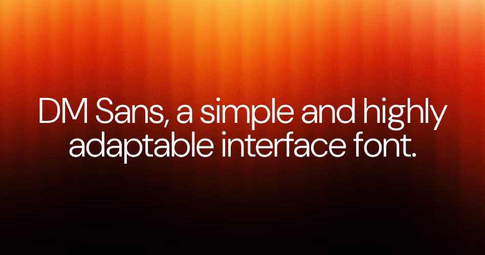
Pricing: Free
DM Sans, a simple and highly adaptable interface font.
DM Sans is a low-contrast geometric sans serif designed by Colophon Foundry as part of the open-source DM Fonts project.
Based on the classic Latin portion of Poppins, it was optimized for smaller text sizes, making it particularly effective for digital products, websites, and user interfaces where readability is a priority.
One of DM Sans's biggest strengths is its simplicity. It doesn't feel overly technical, heavily branded, or visually demanding. Instead, it provides a clean foundation that allows content to take center stage.
This versatility has made it a popular choice for SaaS websites, startup landing pages, mobile apps, and design systems that need a modern typeface without unnecessary complexity.
10. Graphik
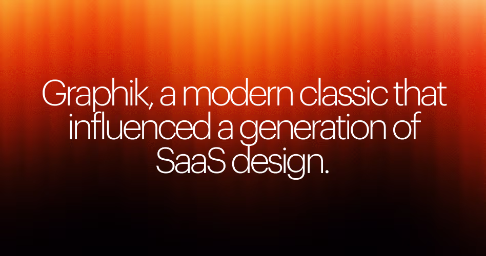
Pricing: Premium
Graphik, a modern classic that influenced a generation of SaaS design.
Before fonts like Inter and Manrope became staples of modern SaaS design, many brands turned to Graphik. Designed by Christian Schwartz, Graphik has earned a reputation as one of the most influential sans serif typefaces.
This font appears in digital design, appearing across websites, apps, branding systems, and marketing campaigns for some of the world's biggest companies.
Part of Graphik's appeal comes from its ability to feel contemporary without chasing trends. Its geometric structure gives it a clean and professional appearance, while subtle design details prevent it from feeling overly mechanical.
The result is a typeface that works equally well in bold headlines, user interfaces, and long-form content. For SaaS companies looking for a premium typeface with a proven track record, Graphik remains one of the most respected choices available.
11. Circular
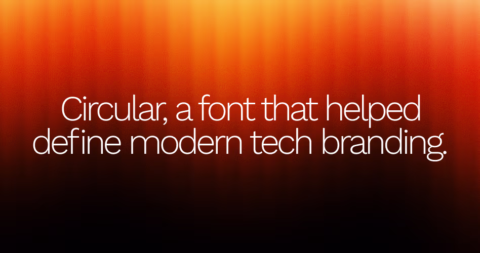
Pricing: Premium
Circular, a font that helped define modern tech branding.
Circular is a geometric sans serif typeface designed by Swiss type designer Laurenz Brunner for Lineto. Since its release, it has become one of the most recognizable fonts in modern branding, appearing across technology companies, startups, and consumer-facing products.
Major brands such as Spotify, Airbnb, and Uniqlo have used Circular as part of their visual identity, helping establish it as a staple of contemporary design.
One reason for its popularity is its ability to make brands feel modern without appearing overly corporate. While many geometric typefaces can feel rigid or mechanical, Circular's proportions create a more natural and approachable reading experience.
This versatility allows it to work across everything from marketing websites and mobile apps to large-scale brand systems, making it a popular choice for companies that want a polished yet approachable visual presence.
12. Avenir Next
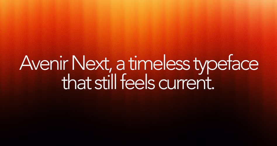
Pricing: Premium
Avenir Next, a timeless typeface that still feels current.
Avenir Next is a modern sans serif typeface designed by Adrian Frutiger as an expanded version of his original Avenir family. First released in 2004, it builds on the geometric foundation of Avenir while introducing additional weights, improved screen readability, and a more refined typographic system.
Over the years, it has become a popular choice for brands, educational institutions, software companies, and corporate websites seeking a clean and professional appearance.
Unlike many newer SaaS fonts, Avenir Next wasn't created specifically for digital products. Its lasting appeal comes from its balance of geometric precision and humanist design, allowing it to feel both structured and approachable.
This versatility makes it effective across marketing websites, product interfaces, mobile applications, and brand identity systems, particularly for companies that want a timeless design rather than a trend-driven aesthetic.
13. Work Sans
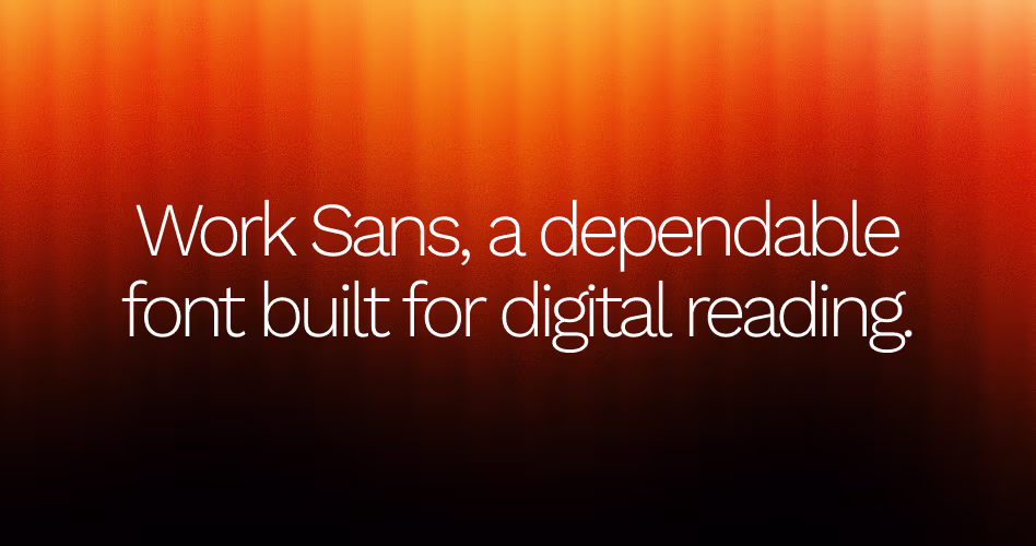
Pricing: Free
Work Sans, a dependable font built for digital reading.
View Work Sans on Google Fonts
Work Sans was designed by type designer Wei Huang with a focus on improving readability on screens. Drawing inspiration from early grotesque typefaces, it combines traditional typography influences with modern digital optimization.
This makes it a practical choice for websites, apps, and user interfaces. The font family includes a wide range of weights, allowing designers to create clear visual hierarchy without introducing additional typefaces.
One of Work Sans's defining characteristics is its flexibility. While some fonts are primarily used for branding or display purposes, Work Sans performs equally well in headlines, body text, navigation menus, and interface components. This versatility has made it a popular choice among SaaS companies, startups, and content-heavy websites that need a reliable typography system capable of handling a variety of design scenarios.
Used by: Buffer, Ghost, ConvertKit
14. TT Hoves
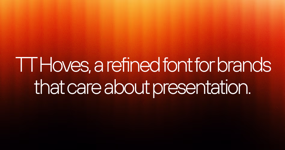
Pricing: Premium
TT Hoves, a refined font for brands that care about presentation.
TT Hoves is a geometric sans serif from TypeType that has quietly become a favorite among modern startups and SaaS brands.
While fonts like Inter and Helvetica tend to dominate digital products, TT Hoves offers something a little different. It feels clean and contemporary, but with a stronger visual presence that helps websites look more intentional and design-driven.
A lot of its appeal comes from how it handles larger typography. Headlines feel sharp and confident, which is why the font is often used on marketing pages where typography carries much of the design.
At the same time, it remains comfortable to read in navigation menus, product pages, and supporting content, making it a flexible choice for brands that want a polished look from top to bottom.
Used by: Spline, Relume, Arc Browser
15. Söhne
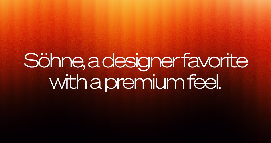
Pricing: Premium
Söhne, a designer favorite with a premium feel.
View Söhne on Kim Type Foundry
Söhne is a contemporary sans serif typeface created by Klim Type Foundry. Inspired by the classic grotesque fonts that shaped much of 20th-century typography. It reinterprets those influences for modern digital products and brands.
Since its release, Söhne has become a favorite among designers looking for a typeface that feels both timeless and current. There's a certain confidence to Söhne that makes it stand out. It doesn't rely on unusual details or trendy styling to get attention.
Instead, its strength comes from its balance, giving websites and interfaces a clean, sophisticated appearance that feels considered and well-crafted. Whether used in bold headlines or smaller interface elements, Söhne brings a level of refinement that has made it increasingly popular among design-led SaaS companies.
How to Choose Typography for Your SaaS Website
Choosing a font isn't just about aesthetics. The right typography helps users navigate your website, understand information faster, and build trust in your product. While there's no perfect typeface for every SaaS company, a few principles can help narrow your options.
- Define your brand personality: Typography should support how you want your brand to be perceived. A developer-focused platform may benefit from a more technical typeface, while a creative product might need something with more personality and visual character.
- Prioritize readability: Users spend more time reading than admiring typography. Look for fonts that remain clear across different screen sizes, especially in body text, navigation, and product interfaces.
- Limit font combinations: Most SaaS websites only need one or two typefaces. Too many fonts can make a design feel inconsistent and distract from the content itself.
- Build a scalable type system: Your typography should work across headlines, body text, buttons, forms, and product screens. A strong type system creates consistency throughout the user experience.
- Test across devices: A font that looks great on a desktop monitor may not perform as well on smaller screens. Always review typography across multiple devices before making a final decision.
Frequently Asked Questions
What font do most SaaS companies use?
Inter is currently the most widely used font among SaaS companies. Its readability, flexibility, and open-source license have made it a popular choice for everything from startup landing pages to enterprise software platforms.
What is the best typography for SaaS websites?
There isn't a single best font for every SaaS website. Popular choices include Inter, Geist, Satoshi, Graphik, and IBM Plex Sans. The right option depends on your brand personality, audience, and product experience.
Should SaaS websites use serif fonts?
Yes, but selectively. While most SaaS brands prefer sans serif fonts for readability and user interfaces, serif fonts can work well in headlines, branding, and marketing pages where a more distinctive visual identity is needed.
How many fonts should a SaaS website use?
Most SaaS websites use one primary typeface and occasionally a second font for accents or headings. Limiting font choices helps create a cleaner, more consistent user experience.
What font size works best for SaaS landing pages?
Body text is typically set between 16px and 18px for comfortable reading. Headlines vary depending on the design, but many SaaS websites use sizes between 40px and 72px to create a strong visual hierarchy.
How can typography improve conversions?
Good typography makes content easier to read, helps users find important information faster, and creates a more professional first impression. Together, these improvements can increase engagement, trust, and conversion rates.
Final Thoughts
Typography plays a larger role in SaaS design than many teams realize. Beyond readability, it helps shape brand perception, create visual hierarchy, and influence how users experience a product.
Whether you choose a widely adopted font like Inter, a premium option like Graphik, or a modern favorite like Geist, the goal remains the same: create a consistent reading experience that supports your product and audience. Use these typography styles as inspiration, but focus on finding the one that best fits your brand, content, and long-term design goals.
.avif)