


- What is a color wheel?
- How colors are organized on the color wheel
- The 6 color harmony types every designer should know
- Warm vs cool colors: what’s the difference?
- How to apply the color wheel in web and ui design
- How the color wheel shapes brand identity
- Common color wheel mistakes designers should avoid
- Frequently asked questions
- Final Thoughts


.svg)

- The color wheel is a simple tool that shows how colors relate to each other.
- Designers use it to create balanced, attractive, and effective color combinations.
- It helps explain primary, secondary, and complementary colors in an easy way.
- Learning the color wheel makes it easier to choose colors with purpose and confidence.
Have you ever looked at a design and thought, “Why do these colors just work so well together?” The answer is often the color wheel. It’s one of the simplest tools in design, but it can make a big difference.
Instead of guessing which colors match, designers use the color wheel to make smarter choices. It helps them see which colors connect, which ones contrast, and which combinations feel balanced and professional.
In this article, we’ll explain the basics of the color wheel in a simple way. You’ll learn what it is, how designers use it, and how it can help you choose better color combinations with more confidence.
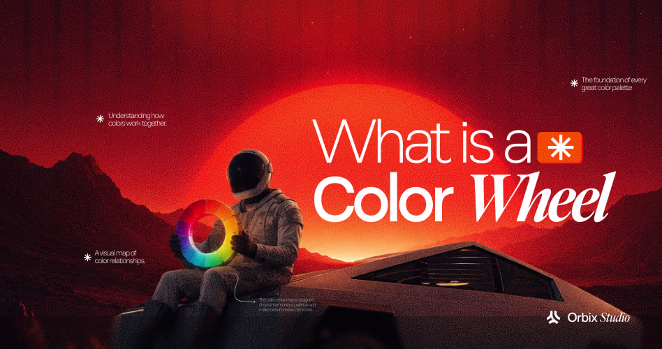
What is a color wheel?
A color wheel is a circular chart that shows colors in a way that makes their relationships easier to understand. Designers use it to see which colors look good together, which colors create strong contrast, and how color choices affect the feel of a design.
The wheel usually starts with the main hues and arranges them in a smooth order, like red, orange, yellow, green, blue, and violet. This simple layout helps people quickly spot color patterns instead of guessing.
The idea behind the color wheel goes back to Isaac Newton, who arranged colors in a circle in the 1600s while studying light. Later, color theorists such as Johannes Itten made it more useful for design by showing how colors can work together in harmony.
That is why the color wheel still matters today. It gives designers a practical way to build color palettes that feel balanced, intentional, and easy to use.
How colors are organized on the color wheel
Every color on the wheel belongs to one of three groups: primary, secondary, or tertiary. Once you understand these groups, it becomes much easier to mix colors, build palettes, and choose combinations that work well together.
This is one of the most important basics in color theory. If you skip it, color choices can start to feel random instead of intentional.
The primary colors
Primary colors are the starting point of the color wheel. In the traditional RYB model, they are red, yellow, and blue, and they cannot be created by mixing other colors together.
Designers think of them as the base colors that everything else grows from. When you combine primary colors in different ways, you get secondary and tertiary colors, which is why they are so important to understand first.
In digital design, the primary colors shift to red, green, and blue in the RGB model. That’s the system used for screens, so it matters a lot when you’re working on websites, apps, or other digital visuals.
The secondary colors
Secondary colors are made by mixing two primary colors together. In the traditional color wheel, red and yellow make orange, yellow and blue make green, and blue and red make purple.
These colors sit between the primary colors on the wheel. They make the secondary color wheel an important part of how the whole system works.
These wheels often help designers create harmony, contrast, and more interesting color combinations. The secondary colors are useful because they give you a wider palette without losing the simple structure of the wheel.
Once you understand them, it becomes much easier to build color schemes that feel balanced and intentional.
The Tertiary Colors
Tertiary colors are made by mixing a primary color with a neighboring secondary color. That gives you colors like red-orange, yellow-orange, yellow-green, blue-green, blue-purple, and red-purple.
These colors sit between the primary and secondary colors on the wheel. This makes tertiary colors especially useful for creating more subtle and refined palettes.
Designers often use them when they want color choices that feel less bold than primary colors but more interesting than simple basic mixes.
Tertiary colors add depth and variety to a design. Once you understand them, it becomes much easier to build palettes that feel more polished, balanced, and professional.

The 6 color harmony types every designer should know
Color harmony is about choosing colors that work well together in a design. Different harmony types help you create contrast, balance, or a softer overall look depending on what you want the design to feel like.
Understanding these color combinations makes it much easier to build palettes with purpose instead of guessing. Let’s look at the six most useful types every designer should know.
Complementary colors
Complementary colors are colors that sit opposite each other on the color wheel. Because they are so different, they create strong contrast and can make important design elements stand out quickly.
Designers often use them for call-to-action buttons, highlighted text, brand accents, or any part of a layout that needs attention. They work best when one color leads and the other supports, so the design stays bold without feeling too intense.
Analogous colors
Analogous colors sit next to each other on the color wheel. This is why they usually feel smooth, natural, and easy on the eyes. Designers often use analogous color schemes when they want a palette that feels calm, connected, and visually cohesive.
This type of color harmony works especially well when you want a design to feel unified without being boring. A palette built from neighboring colors can add variety while still keeping everything in the same visual family.
Triadic color scheme
A triadic color scheme uses three colors that are evenly spaced around the color wheel. This creates a palette with strong visual design while still keeping a sense of balance.
What makes it useful is the mix of contrast and structure. The colors feel lively together, but they don’t clash as easily as some other bold combinations. This makes a triadic color scheme a smart choice when you want color meanings with control.
Split-Complementary colors
A split-complementary color scheme starts with one base color, then uses the two colors next to its opposite on the color wheel. This gives you strong contrast, but with a softer and easier-to-manage feel than a direct complementary pair.
It’s a smart choice when you want a design to feel lively without becoming too harsh. The extra flexibility also makes it easier to build palettes that feel colorful, balanced, and more polished.
Tetradic color scheme
A tetradic color scheme uses four colors that are evenly spaced around the color wheel. It gives you a rich color palette, but it also takes more care to use well because there are more colors competing for attention.
The easiest way to handle it is to let one color lead, use one as support, and keep the other two as accents. That balance helps the design feel active without turning messy, especially when you leave enough white space and test the palette in a real layout.
Monochromatic color scheme
A monochromatic color scheme uses one main color and builds the palette by changing its lightness or darkness. Instead of adding lots of different hues, it creates variation through tints, shades, and tones.
This approach often feels clean, elegant, and very cohesive. It’s especially useful when you want the design to look simple, unified, and calm without losing depth.
Warm vs cool colors: what’s the difference?
Warm and cool colors affect how a design feels almost instantly. Warm colors like red, orange, and yellow usually bring energy and attention. While cool colors like blue, green, and purple tend to feel calmer and more controlled.
That difference matters because designers use color not just to decorate, but to guide the viewer’s mood and focus. A warm accent can pull the eye toward a button or key message, while cool tones can help the rest of the layout feel balanced and easy to read.
If you want to go deeper into how people respond to different hues, our article on the most popular colors in the world is a useful next read. It connects color choice with real-world preference, which can help when you’re building palettes that need to feel both intentional and familiar.
How to apply the color wheel in web and ui design
Knowing color harmony is useful, but using it in a real design is where it becomes valuable. In web and UI work, the goal is not just to choose colors that look good together, but to place them in a way that supports readability, hierarchy, and the overall experience.
That means thinking about where each color should appear, how much of it to use, and whether the palette still works in a real interface.
Match the harmony type to the product’s goal
Different products need different color moods. A finance app or healthcare product usually benefits from a calmer palette, often built with analogous or cool colors. This is because the combinations tend to feel stable, steady, and trustworthy.
By contrast, consumer apps, gaming products, and entertainment brands often use complementary or triadic color schemes because they feel more active, energetic, and attention-grabbing. When the color harmony fits the product’s purpose, the design feels natural. When it doesn’t, the interface can feel off even if the colors look good on their own.
That is why the color wheel should not be used in isolation. It helps to start with the product’s goal, then choose a palette structure that supports that goal. If you want to go deeper, color palette types for UI design is a useful next read.
Apply the 60-30-10 distribution rule
The 60-30-10 rule is a simple way to keep a design palette balanced. It means using one color as the main color for about 60% of the interface, a second color for about 30%, and a third accent color for the last 10%.
This works because every color gets a role instead of fighting for attention. The main color usually handles the background or large areas, the second color supports sections and structure, and the accent color is saved for the most important detail, like a button or call to action.
Check color contrast before finalizing
A palette can look beautiful on screen and still fail in real use if the color contrast is too low. For standard body text, the contrast should meet at least 4.5:1, and for large text it can go as low as 3:1.
That matters because contrast affects more than appearance. It changes whether text is easy to read, whether the interface feels comfortable to use, and whether important information stays visible for everyone. Before final handoff, it’s a good idea to test the palette with a contrast checker and review a color contrast guide and use of color guide to make sure the design still works in practice.
Handle dark mode as a separate palette decision
Dark mode is not just a light palette turned upside down. Colors behave differently on dark backgrounds, and highly saturated brand colors can look harsher, brighter, or harder to read when they sit on dark surfaces.
That’s why dark mode needs its own color choices. In many cases, designers reduce saturation a little and retest the palette so text, buttons, and accents still feel clear and comfortable across both light and dark themes.
How the color wheel shapes brand identity
Brand color is not just decoration. It sends a message before anyone reads a headline, clicks a button, or even understands what the product does. The color wheel helps make that message deliberate, so the color choice supports the brand instead of happening by accident.
That is why many brands choose colors based on the feeling they want to create. Blue often suggests trust and precision, which is why it works well for products that handle money or information.
Purple can feel creative but controlled, and near-black can make a brand feel serious, focused, and modern. These choices are rarely random - they usually come from a thoughtful harmony decision.
Once a brand color is chosen, it usually becomes the base for the whole system. From there, teams build out brand identity for startups, create a wider palette, and turn that color into tints, shades, and supporting UI colors. That is why getting the harmony right early matters: it gives the brand a clear identity and saves a lot of rework later.
Common color wheel mistakes designers should avoid
Knowing the color wheel is helpful, but using it well is what really matters. A palette can still fail if the colors are chosen or balanced in the wrong way, even when the theory looks correct on paper.
- Choosing too many colors with equal importance: when every color tries to stand out, the design loses focus and feels noisy. A better choice is to let one color lead and use the others to support it.
- Using warm colors on a warm background: this can make buttons and text blend into the layout. A better choice is to test contrast against the real background, not just in the picker.
- Using only pure hues: this often makes a design feel flat and overly bright. A better choice is to build tints, shades, and neutrals around the main colors.
- Ignoring accessibility contrast: many designers focus on how colors look together and forget how easy they are to read. This creates text that feels weak or unreadable. A better choice is to check contrast early and make sure the palette stays usable.
- Using a color wheel without the product goal in mind: some palettes look good on paper but don’t match what the product is supposed to feel like. This creates a design that feels off even if the colors are technically correct. A better choice is to start with the product’s mood and choose colors that support it.
Frequently asked questions
What is a color wheel in simple terms?
A color wheel is a circular chart that shows how colors relate to each other. Designers use it to choose color combinations that look balanced and work well together.
What are the 3 primary colors on the color wheel?
In the traditional model, the primary colors are red, yellow, and blue. In digital design, the main primaries are red, green, and blue.
What is color harmony and why does it matter?
Color harmony is the way colors are combined so they feel balanced and pleasing. It matters because it helps a palette look intentional instead of random or clashing.
What is the difference between complementary and analogous colors?
Complementary colors sit opposite each other and create strong contrast. Analogous colors sit next to each other and create a smoother, more unified look.
How do designers use the color wheel to pick a palette?
Designers choose a harmony type, assign each color a role, and test contrast. A good palette should feel balanced, support the product, and stay readable.
What is the difference between a tint, shade, and tone?
A tint is a color made lighter with white. A shade is made darker with black. The tone is softened with gray.
How does the color wheel apply to web design specifically?
In web design, the color wheel helps shape mood, hierarchy, and usability. It guides color choices for trust, energy, contrast, and readability across the interface.
Final Thoughts
Color theory is not just about picking colors that look nice together. It is a practical system that helps designers make smarter decisions about harmony, contrast, balance, and mood. Once you understand the color wheel, it becomes much easier to build palettes that feel intentional instead of random.
The best results usually come from a simple process: choose a harmony type that fits the product’s goal, distribute the colors with balance, and test contrast before finalizing anything. When those steps come together, the palette is more likely to work in real design, not just in theory.
.avif)


.avif)
