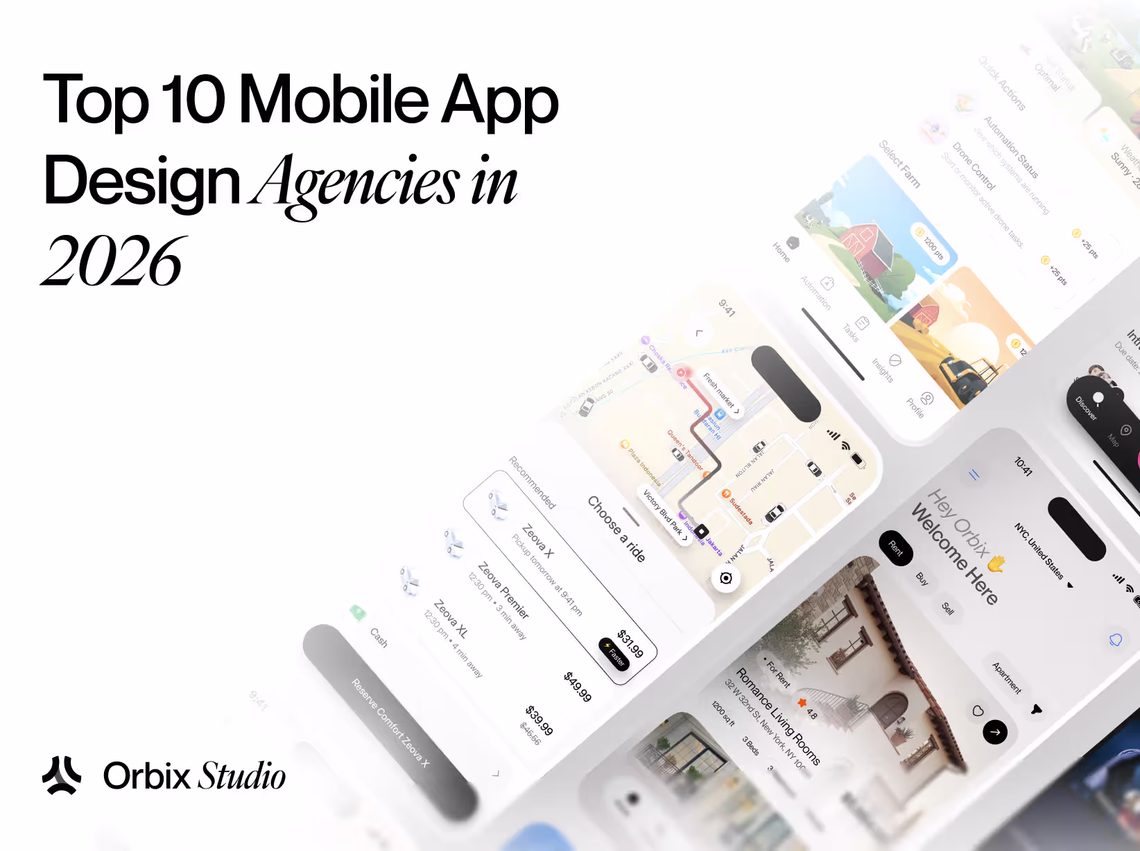
Table of Contents

A great SaaS website does more than look good. It helps people understand your product, trust your company, and take the next step. The challenge is that most SaaS products are complex. You have limited time to explain what you do, who it's for, and why it's better than the alternatives.
The best SaaS websites solve this problem with clear messaging, thoughtful design, strong product visuals, and a user experience that makes information easy to understand.
In this guide, we'll explore 21 SaaS website design examples that stand out for their design, UX, messaging, and product storytelling. For each example, we'll look at what works and what lessons you can apply to your own website.
What Makes a Great SaaS Website?
The best SaaS websites do more than look good. They help visitors understand the product, trust the company, and take action.
That sounds simple, but many SaaS websites struggle with it. They focus too much on features, use confusing language, or make visitors work too hard to understand why the product matters.
While every SaaS website is different, the strongest ones tend to get a few important things right.
- Clear positioning and messaging: Visitors should be able to understand what your product does within a few seconds. A great SaaS website clearly explains who the product is for, what problem it solves, and why it's different from other options. If someone has to scroll through half the homepage to figure out what you're selling, your messaging probably needs work.
- Product-led design: The best SaaS websites don't just talk about the product. They show it. Product screenshots, videos, interactive demos, and real interface previews help visitors understand the software much faster than paragraphs of copy. People trust what they can see, which is why many successful SaaS companies put their product front and center.
- Trust and credibility signals: Before signing up, visitors want proof that your product actually works. Customer testimonials, client logos, case studies, reviews, security badges, and usage statistics all help build confidence. These elements reduce uncertainty and make people feel more comfortable moving forward.
- Strong conversion paths: Every SaaS website should make the next step obvious. Whether the goal is starting a free trial, booking a demo, or creating an account, visitors should always know what to do next. Great websites remove friction and guide users naturally from learning about the product to taking action.
- Great user experience: A website can have excellent design and still be frustrating to use. The best SaaS websites make information easy to find, keep navigation simple, load quickly, and work well across devices. Everything feels intuitive. Visitors spend less time figuring out the website and more time understanding the product.
SaaS Websites That Win With Product-Led Design
The websites in this category let the product do most of the talking. Through screenshots, demos, and real interface previews, they help visitors understand the software before reading much copy.
1. Linear
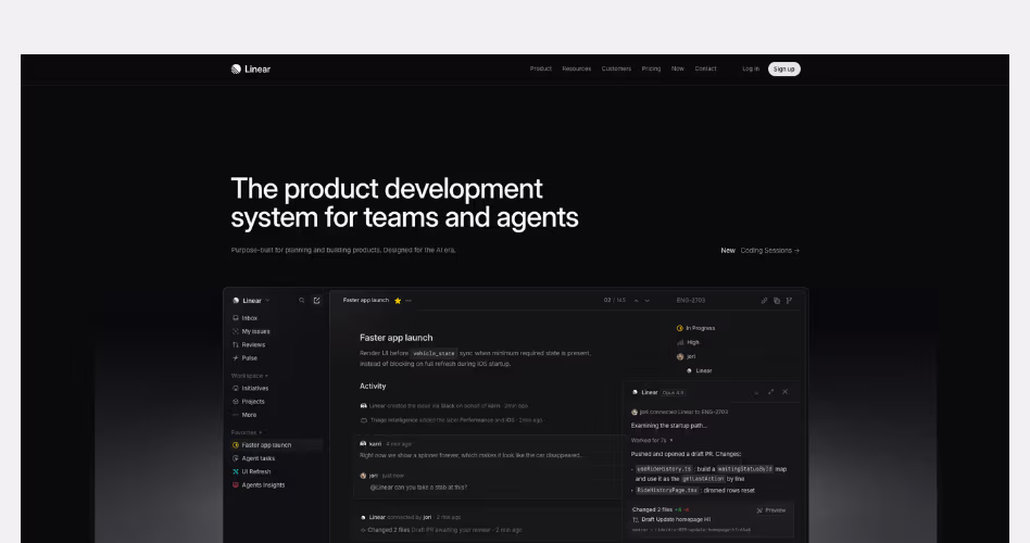
Linear is a project management platform built for modern software teams. Its website is one of the strongest examples of product-led design because nearly every section uses the product itself to explain features, workflows, and outcomes.
Design Highlights
- Product-first hero section: The homepage immediately showcases the Linear interface instead of relying on illustrations or marketing visuals. Visitors can see the product before they start scrolling.
- Every feature is demonstrated visually: Rather than describing features through long paragraphs, Linear uses interface screenshots to show how planning, collaboration, roadmaps, reviews, and reporting work in practice.
- Consistent visual system: The dark theme, spacing, typography, and product visuals remain consistent throughout the page, creating a focused and premium experience.
- Progressive product storytelling: Each section introduces a different capability of the platform. As visitors scroll, they gradually build a better understanding of how the product fits into a team's workflow.
- Minimal distractions: Navigation, copy, and supporting elements stay lightweight, keeping attention on the product experience.
Why It Works
Many SaaS websites spend too much time talking about their product. Linear spends most of its time showing it.
The homepage reduces the amount of explanation needed by placing real product screens throughout the experience. Visitors don't have to imagine how the software works because they can see it for themselves. This makes the product easier to understand and creates confidence early in the journey.
2. Vercel
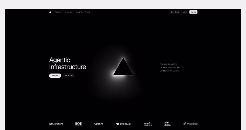
Vercel is a cloud platform that helps developers build, deploy, and scale modern web applications and AI-powered products. Its website is a strong example of outcome-driven SaaS design. It focuses on infrastructure details and more on the products, companies, and experiences made possible by the platform.
Design Highlights
- Outcome-first homepage: Instead of leading with technical specifications, the homepage highlights real-world use cases and customer success stories. Visitors quickly understand what can be built with Vercel before learning how the platform works.
- Strong customer validation: Well-known brands such as OpenAI, Zapier, and DoorDash appear throughout the page. These logos act as immediate trust signals and help establish credibility within seconds.
- Case-study-driven product presentation: Sections featuring companies like Notion, Zapier, and Mintlify show how different types of businesses use Vercel. This helps visitors see how the platform could fit their own needs.
- Minimal visual complexity: Despite selling a highly technical product, the design remains simple. Large typography, generous spacing, and clean layouts make the page easy to scan and understand.
- Clear content hierarchy: The homepage introduces broad categories such as Agents, Apps, and Platforms before diving deeper into examples. This creates a logical flow and prevents information overload.
Why It Works
Vercel understands that infrastructure is difficult to sell directly. Most visitors don't care about servers, deployments, or cloud architecture. They care about what those technologies help them build. Instead of focusing on technical complexity, the website focuses on outcomes, customer stories, and real-world applications.
3. Supabase
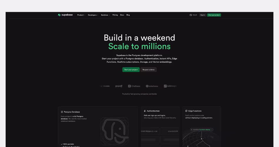
Supabase is an open-source backend platform that provides databases, authentication, storage, edge functions, and other developer tools in a single platform. Its website is a strong example of ecosystem-focused SaaS design. It helps visitors quickly understand the breadth of the platform without making the experience feel overwhelming.
Design Highlights
- The platform is explained at a glance: The hero section introduces Supabase's core value immediately. Instead of focusing on a single feature, it presents the platform as a collection of integrated products working together. Visitors can quickly understand what Supabase offers and why developers use it.
- Product architecture becomes part of the design: One of the strongest sections on the homepage visually maps out the platform's different products, including Database, Authentication, Storage, Edge Functions, Realtime, and Vector. This helps communicate the ecosystem without requiring lengthy explanations.
- Strong developer credibility: Throughout the page, Supabase reinforces trust through customer logos, community adoption, GitHub activity, and open-source positioning. These elements help establish credibility with a technical audience.
- Use-case driven content: Instead of focusing only on features, Supabase showcases starter projects, frameworks, integrations, and real-world implementation examples. This helps visitors understand how the platform fits into their workflow.
- A balance between simplicity and depth: Despite offering many products, the page remains approachable. Visitors can get a high-level understanding of the platform while still having opportunities to explore technical details if they want to learn more.
Why It Works
Many developer platforms struggle to explain everything they offer without overwhelming visitors. Supabase solves this by focusing on the relationship between its products rather than explaining every feature individually.
4. Perplexity
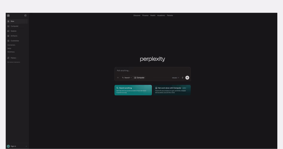
Perplexity is an AI-powered answer engine that helps users find information through natural language conversations. Unlike traditional search engines, it focuses on providing direct answers with supporting sources and citations.
Design Highlights
- The interface is the homepage: Most SaaS websites use their homepage to explain the product. Perplexity skips that step and places the core product experience at the center of the page. Visitors can start using the product immediately.
- Extreme visual simplicity: The design removes almost every unnecessary element. Large areas of white space, limited navigation, and minimal visual distractions keep attention focused on a single action: asking a question.
- Search-first experience: The search box is the most prominent element on the page. This mirrors the product's primary use case and makes the next step obvious for users.
- Product before marketing: Rather than filling the page with feature sections, testimonials, and sales copy, Perplexity encourages visitors to experience the product directly. The software becomes its own demonstration.
- Clear interaction hierarchy: Every design decision points toward the input field. There is no confusion about where to look or what to do next.
Why It Works
Usually, SaaS websites spend a lot of effort convincing visitors to try the product. Perplexity takes a different approach by removing as much friction as possible between curiosity and action.
5. PostHog
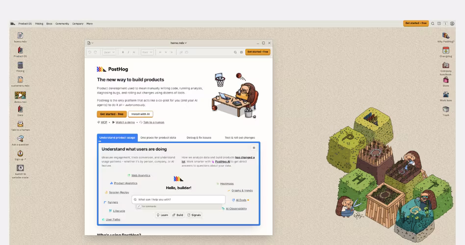
PostHog is an open-source product analytics platform that helps companies understand how users interact with their products. Its website stands out because it deliberately rejects many modern SaaS design trends in favor of a more transparent, product-focused, and community-driven experience.
Design Highlights
- An intentionally unconventional design: While many SaaS websites prioritize visual polish, PostHog embraces a more functional and documentation-inspired aesthetic. This immediately gives the brand a distinct personality and helps it stand out from competitors.
- Transparency built into the homepage: Pricing information, customer logos, product details, documentation links, and company resources are all visible throughout the page. Visitors don't have to hunt for important information.
- Heavy emphasis on the product itself: Product screenshots, dashboards, and feature previews appear throughout the experience. The website focuses more on showing what the platform does than creating a highly polished marketing narrative.
- Community and open-source positioning: Customer stories, open-source messaging, and educational resources help reinforce trust with technical audiences. The website feels more like a product ecosystem than a sales page.
- Documentation-style information architecture: The page is structured around helping users explore and learn rather than pushing them through a traditional marketing funnel.
Why It Works
PostHog understands its audience. Developers and product teams are often skeptical of overly polished marketing websites. Instead of trying to look perfect, PostHog focuses on being useful, transparent, and informative. The homepage feels less like a sales pitch and more like a place where visitors can explore the product and make their own decisions.
6. Retool
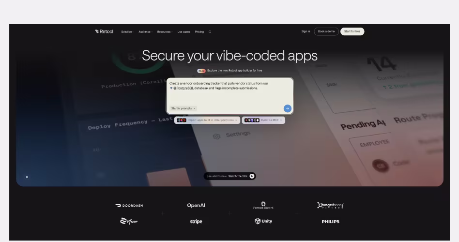
Retool is a platform for building internal tools, workflows, and AI-powered applications. Its website stands out by combining product-led design with high-quality visual storytelling, making a highly technical product feel more approachable and engaging.
Design Highlights
- Strong visual storytelling: Instead of relying solely on screenshots, Retool uses custom 3D visuals, illustrations, and motion throughout the page. These elements help simplify complex concepts and make the platform feel more approachable.
- A balance between visuals and product proof: While the website includes rich visual assets, it still showcases real product interfaces where they matter most. This helps visitors understand both the product experience and the outcomes it enables.
- Enterprise-focused design: Customer logos, case studies, and enterprise messaging are woven throughout the page. These elements help establish trust and reinforce Retool's positioning as a platform built for serious business use.
- Clear product segmentation: Different sections focus on specific use cases, workflows, and team needs. This makes it easier for visitors to connect the platform to their own problems and goals.
- Premium visual execution: The dark theme, lighting effects, gradients, and custom graphics create a polished experience that feels modern without distracting from the product itself.
Why It Works
The technical SaaS products usually struggle because the product is difficult to explain. Retool solves this by combining product education with visual storytelling.
Their website doesn't force visitors to understand databases, workflows, and internal tooling from the start. Instead, it uses visuals to create interest, then gradually introduces product capabilities through screenshots, use cases, and customer examples.
7. OpenAI
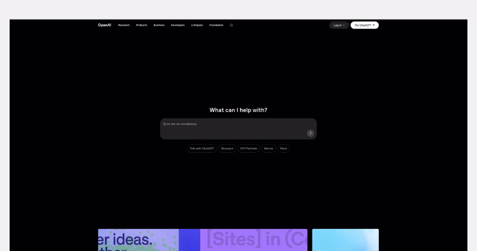
OpenAI is the company behind ChatGPT, GPT models, APIs, and a growing ecosystem of AI products. Unlike most SaaS companies, its homepage is designed less like a product landing page and more like a destination where users can discover products, research, stories, updates, and business applications.
Design Highlights
- The product experience starts immediately: Instead of leading with a traditional marketing hero, the homepage places a ChatGPT-style prompt box at the center of the experience. This reinforces the product's core behavior and invites interaction from the first screen.
- Content becomes the product story: Research papers, product launches, customer stories, and company updates are featured throughout the homepage. Rather than explaining OpenAI through marketing copy, the website uses content to demonstrate progress and innovation.
- A modular card-based layout: The homepage is built from cards, previews, and content blocks. This allows OpenAI to showcase many different products and initiatives without overwhelming visitors.
- Clear separation of audiences: Researchers, developers, businesses, and everyday ChatGPT users all have different needs. The website organizes content into distinct sections, helping each audience quickly find relevant information.
- Minimal visual distractions: Despite containing a large amount of content, the design remains clean and spacious. Large margins, simple typography, and consistent layouts make the experience easy to scan.
Why It Works
Most of the SaaS companies only need to sell a single product. OpenAI has a much bigger challenge. It needs to communicate research breakthroughs, product launches, developer tools, business solutions, and consumer products at the same time.
Instead of forcing everything into a traditional marketing funnel, the homepage acts as a gateway into the entire OpenAI ecosystem. Visitors can discover products, explore research, read stories, or learn about business use cases depending on their interests.
SaaS Websites That Sell Through Storytelling
Features explain what a product does. Stories help people understand why it matters. The websites in this category go beyond product descriptions and feature lists. They use visuals, customer examples, content, and carefully structured page flows to guide visitors from problem to solution.
This approach is especially effective for complex products, new technologies, and platforms that need more context than a simple headline can provide.
1. Stripe
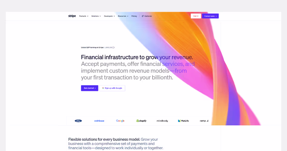
Stripe is a financial infrastructure platform that helps businesses accept payments, manage revenue, and build financial services into their products. Its website is one of the strongest examples of storytelling-driven SaaS design, using narrative, customer stories, and visual storytelling to transform a complex technical platform into a compelling business story.
Design Highlights
- A bold vision leads the story: Instead of focusing on payment processing, the homepage opens with a much bigger idea: helping businesses grow revenue through financial infrastructure. This immediately elevates the conversation beyond product features.
- Storytelling through visual sections: As visitors scroll, Stripe introduces different products, industries, and business models through highly visual content blocks. Each section feels like a chapter in a larger story rather than a standalone feature explanation.
- Customer stories integrated throughout the page: Instead of placing testimonials in a single section, Stripe weaves customer examples directly into the experience. This helps visitors connect product capabilities with real business outcomes.
- Complex ideas made approachable: Payments, billing, financial services, and global commerce can be difficult topics to explain. Stripe uses illustrations, animations, dashboards, and product previews to make these concepts easier to understand.
- A sense of scale everywhere: Metrics, enterprise customers, global reach, and large-scale use cases appear throughout the homepage. These elements reinforce Stripe's position as infrastructure powering businesses around the world.
Why It Works
Stripe does not just sell a product like other SaaS companies, they sell a vision. Their website highlights the role stripe plays in helping business start, grow and scale - instead of showing individual features. Every section expands the story, moving from payments to platforms, global commerce, startups, enterprise businesses, and emerging technologies.
2. Webflow
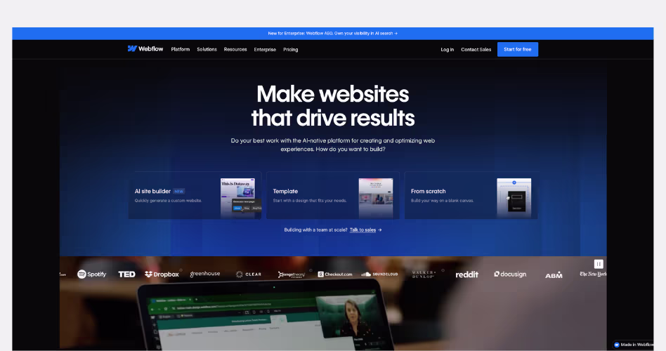
Webflow is a visual website experience platform that helps teams design, build, and manage websites without relying heavily on developers. Its website is a strong example of storytelling-driven SaaS design, using customer success stories, business outcomes, and product demonstrations to show how modern teams can move faster and achieve better results.
Design Highlights
- A transformation-focused narrative: Rather than starting with features, Webflow immediately focuses on outcomes. The homepage positions websites as growth engines and frames Webflow as the platform that helps businesses create better digital experiences.
- Customer stories as proof: Real customer examples appear throughout the page, showing how different companies improved performance, generated revenue, or accelerated workflows. These stories make the value proposition feel more tangible and believable.
- A strong connection between product and outcome: Product screenshots and platform features are consistently tied back to business benefits. Instead of showing what the platform does, Webflow focuses on what users can achieve with it.
- Designed for multiple stakeholders: The homepage speaks to marketers, designers, content teams, and business leaders. Different sections help each audience understand how the platform fits into their workflow.
- Modern editorial-style layouts: Large imagery, customer case studies, product showcases, and spacious layouts create a premium experience that feels closer to a modern digital publication than a traditional software website.
Why It Works
The website builders usually focus on features such as page creation, CMS tools, or design controls. Webflow takes a different approach by focusing on the results those features create. Their homepage shifts the conversation from software capabilities to business impact. As a result, the visitors aren't just learning about a website platform, they're seeing how websites can grow, and improve marketing performance.
3. Runway
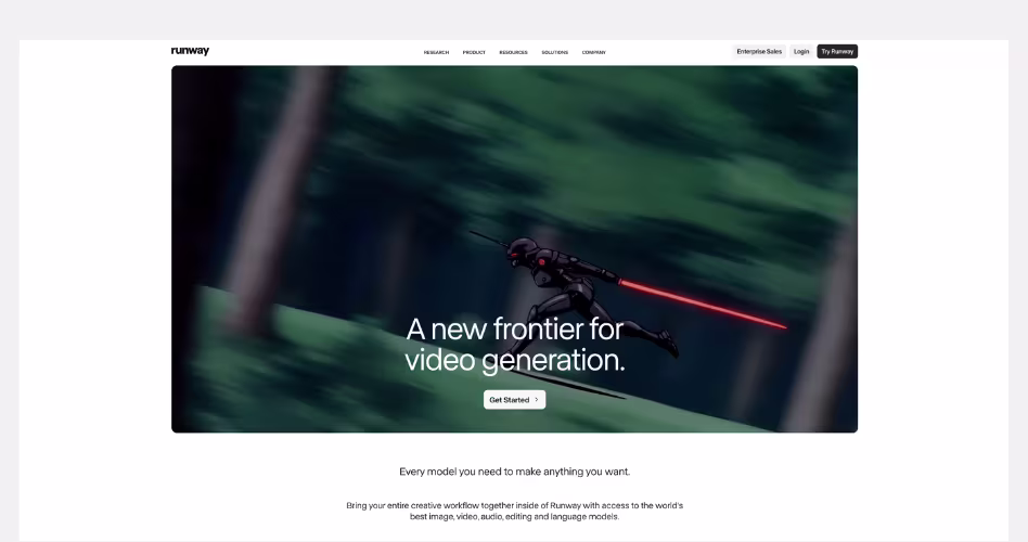
Runway is an AI research and media company known for its video generation models and creative AI tools. Its website is a standout example of storytelling-driven design, using a bold vision, cinematic visuals, and research narratives to make the company feel larger than a collection of AI products.
Design Highlights
- A vision-led homepage: Instead of opening with product features, Runway leads with a mission: "Building AI to Simulate the World." This immediately creates curiosity and frames the company as a research-driven innovator rather than just another AI software provider.
- Cinematic visual storytelling: Large imagery, videos, and immersive visual sections create an experience that feels closer to a digital magazine than a SaaS website. The visuals help communicate creativity, imagination, and possibility.
- Research and products are presented together: The homepage blends product launches, research breakthroughs, and company initiatives into a single narrative. This helps visitors understand not only what Runway offers today but also where the company is heading.
- Real-world applications bring ideas to life: Case studies, partnerships, and customer stories show how organizations are using Runway's technology in filmmaking, media, research, and creative production. These examples make abstract AI concepts feel more tangible.
- Consistent narrative throughout the page: Every section supports the same story. Whether visitors are exploring products, research, or customer examples, the message remains focused on advancing creativity and building new ways to interact with AI.
Why It Works
The AI companies struggle to explain complex technology in a way that feels meaningful to everyday users. Runway solves this by focusing on a larger story instead of individual features.
Their website constantly connects products, research, creativity, and future possibilities into a single narrative. Visitors aren't simply learning about AI models - they're being introduced to a vision of how AI could change filmmaking, media, entertainment, and scientific discovery. .
4. Airtable
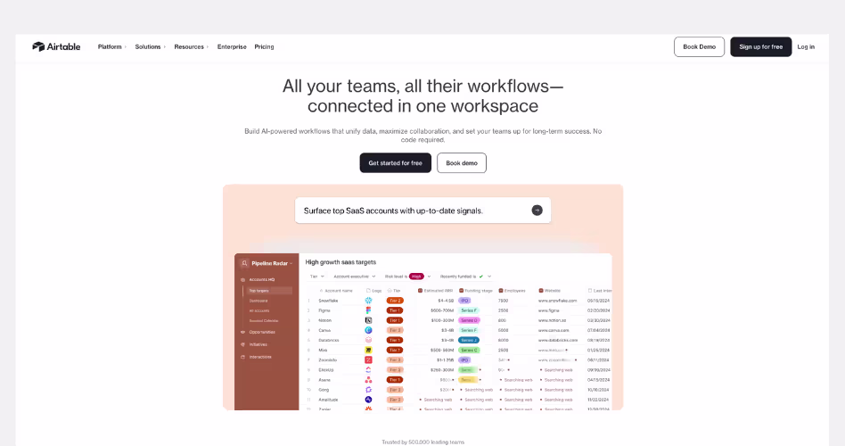
Airtable is a no-code platform that helps teams build workflows, manage data, and create custom applications. Its website is a strong example of possibility-driven SaaS design, showing visitors how a single platform can support many different teams, workflows, and business needs.
Design Highlights
- The platform's flexibility is the main story: Rather than focusing on a single feature or use case, Airtable positions itself as a workspace that can adapt to different teams and workflows. The homepage repeatedly shows how the platform can support marketing, operations, product, and business teams.
- Use cases take center stage: Throughout the page, Airtable demonstrates how businesses can use AI, automations, and custom workflows in real-world scenarios. This helps visitors connect the platform to their own challenges instead of learning features in isolation.
- Product screenshots support every section: Nearly every major message is paired with an interface preview. These screenshots help visitors understand how the platform works while reinforcing Airtable's flexibility.
- Trust is built through recognizable brands: Customer logos and success stories appear throughout the homepage, helping establish credibility and showing that large organizations rely on the platform.
- A balance between simplicity and depth: The page introduces complex topics such as AI agents, workflow automation, and enterprise-scale operations without overwhelming visitors. Content is organized into clear sections that gradually expand the platform's capabilities.
Why It Works
Airtable focuses on what people can build with it, instead of focusing on what their product does. Their homepage constantly shifts the conversation away from features and toward possibilities. Instead of asking visitors to learn a new tool, it encourages them to imagine new workflows, processes, and applications that could improve how their teams work.
5. Notion
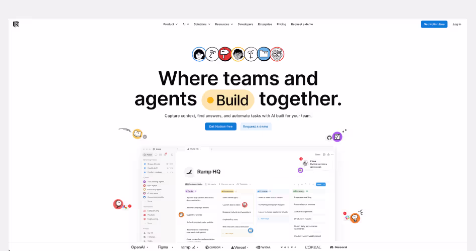
Notion is an all-in-one workspace that combines documents, projects, knowledge management, AI tools, and team collaboration into a single platform. Its website is a strong example of unification-driven SaaS design. It shows how multiple products can be brought together under one clear and compelling story.
Design Highlights
- A clear central narrative: The homepage revolves around a simple idea: bringing teams, knowledge, and AI agents into one workspace. Every section reinforces this message, helping visitors understand the platform's value without needing to learn each product separately.
- The platform is presented as a connected system: Instead of treating Docs, Projects, Knowledge Bases, Search, and AI as separate products, Notion shows how they work together. This creates a stronger understanding of the ecosystem and reduces perceived complexity.
- Real workflows over feature lists: The website focuses heavily on practical examples such as answering questions, automating repetitive work, managing projects, and organizing company knowledge. Visitors see how work happens inside the platform rather than simply reading feature descriptions.
- Strong visual organization: Large product previews, colorful interface cards, and clearly separated sections make it easy to navigate a platform that offers many capabilities. Each section introduces a different workflow without making the page feel overwhelming.
- Customer proof built into the story: Logos, customer stories, testimonials, and usage statistics appear throughout the page. These trust signals support Notion's positioning as a platform used by teams ranging from startups to large enterprises.
Why It Works
SaaS companies face difficult challenges as they grow. But every new feature, product or capability can make the platform harder to explain. Notion solves this problem by focusing on a single idea rather than a collection of tools.
The homepage doesn't try to sell documents, projects, AI search, meeting notes, or agents individually. Instead, it presents them as pieces of one connected workspace where teams can create, organize, search, automate, and collaborate.
6. Ramp
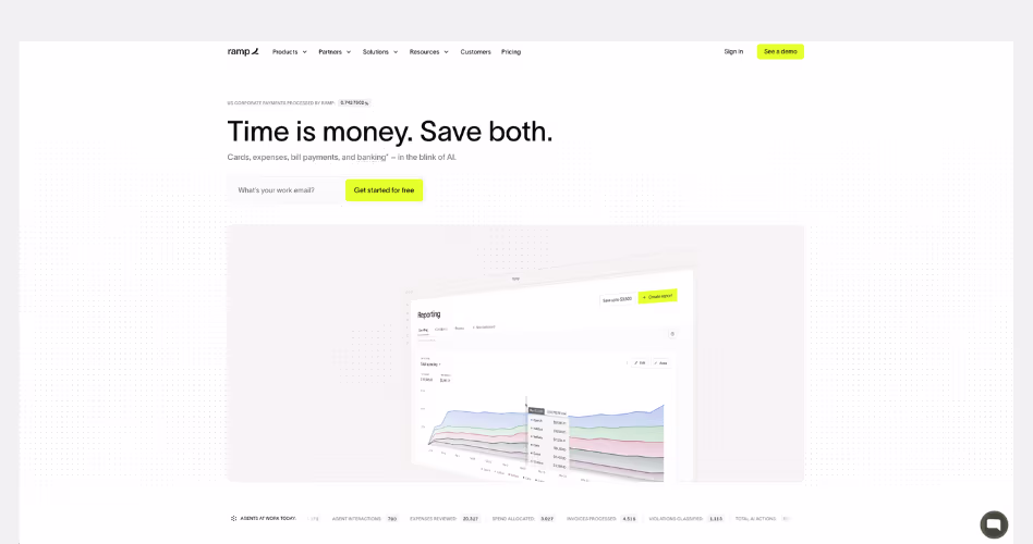
Ramp is a financial operations platform that helps businesses manage spending, expenses, procurement, accounting, and corporate cards in one place. Its website is a strong example of outcome-driven SaaS design. It focuses less on software features and more on the time and money businesses can save by automating financial operations.
Design Highlights
- A simple value proposition from the start: The homepage opens with a direct message: "Time is money. Save both." Instead of explaining finance workflows immediately, Ramp leads with a benefit that every business understands.
- Results before features: Customer savings, efficiency gains, and operational improvements appear throughout the page. The website consistently focuses on outcomes before diving into product capabilities.
- Automation is visualized clearly: Product screenshots demonstrate how approvals, expense management, accounting workflows, and procurement processes work together. Rather than presenting disconnected tools, Ramp shows a connected operational system.
- Strong use of proof and credibility: Customer stories, business results, testimonials, and recognizable companies appear throughout the experience. These elements help support Ramp's claims and make the benefits feel more tangible.
- Complex finance workflows feel approachable: Financial operations can be intimidating, but the page uses simple language, clean layouts, and visual examples to make complicated processes easier to understand.
Why It Works
Finance platforms usually highlight what their software does. Ramp focuses on what businesses gain from using it.
The homepage continually connects product features to measurable outcomes such as reducing manual work, improving efficiency, and helping teams operate faster. Instead of asking visitors to learn a new finance system, the website shows how automation can remove repetitive tasks and free teams to focus on higher-value work.
7. Intercom
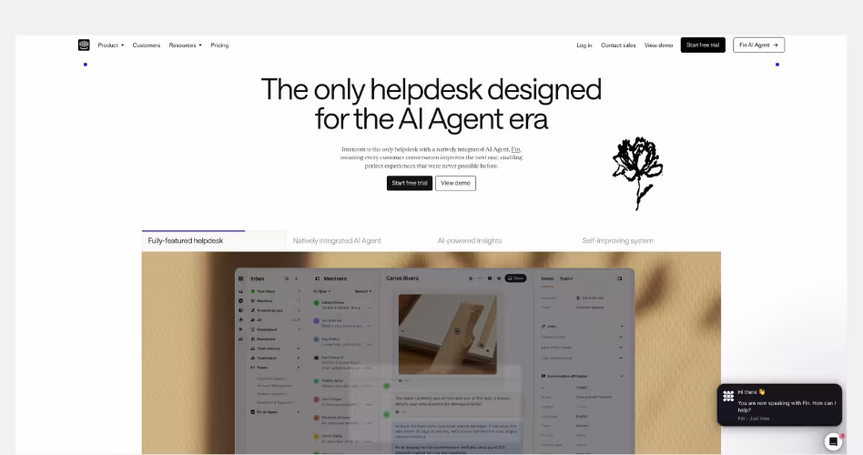
Intercom is a customer service platform that combines AI agents, helpdesk tools, automation, and customer support workflows into a single system. Its website is a strong example of narrative-driven SaaS design, using the idea of an AI-first future to reframe how businesses think about customer support.
Design Highlights
- A clear industry narrative: The homepage doesn't start by listing features. Instead, it introduces a bigger idea: customer service is entering the AI Agent era. This immediately gives visitors a reason to rethink how support teams operate.
- Every section reinforces the same message: From AI agents and automated workflows to human support tools and customer experience management, every section supports the idea that AI and humans should work together inside a single support platform.
- The future is shown, not explained: Rather than making predictions about AI, Intercom demonstrates how AI-powered support works through product interfaces, workflows, and real examples. This makes a major industry shift feel practical and believable.
- Strong balance between innovation and trust: AI is a central part of the story, but the website consistently shows real customer experiences, recognizable brands, and product capabilities. This prevents the message from feeling overly futuristic or speculative.
- A connected product experience: Product screenshots are organized around customer support workflows rather than individual features. Visitors see how agents, automation, knowledge, reporting, and AI work together as part of one system.
Why It Works
Intercom focuses on what customer support will look like because of their technology. The website is built around a clear transformation story. Visitors aren't simply evaluating a helpdesk platform. They're being introduced to a new model of customer service where AI agents handle repetitive work, support teams move faster, and customers get answers instantly.
SaaS Websites That Build Trust Fast
People rarely buy software the first time they see it. Before making a decision, they want proof that the product works, the company is credible, and other businesses already trust it.
The examples below use customer stories, trust signals, product transparency, and clear messaging to reduce uncertainty and help visitors feel confident about taking the next step.
1. Claude
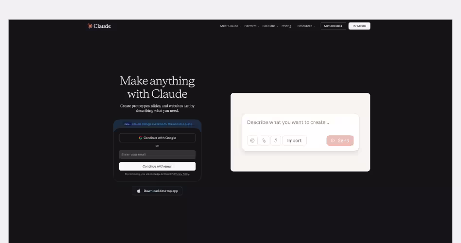
Claude is an AI assistant developed by Anthropic for writing, research, analysis, coding, and everyday work. Unlike many AI websites that focus on flashy demonstrations and feature-heavy messaging. Claude takes a more restrained approach. Its homepage uses simplicity, clear communication, and a calm visual design to build trust from the first interaction.
Design Highlights
- A minimalist first impression: The homepage contains very little visual noise. Large amounts of whitespace, simple typography, and a clean layout help visitors focus on the product instead of distractions. This creates a sense of confidence and professionalism.
- The product is immediately accessible: Rather than forcing visitors through multiple marketing sections, Claude makes it easy to start using the product right away. The sign-up form is visible from the first screen, reducing friction between interest and action.
- Simple messaging that feels believable: The website avoids exaggerated promises and complex AI jargon. Headlines and supporting text focus on practical use cases, helping visitors quickly understand what Claude can help them do.
- Transparent pricing and plans: Pricing is presented clearly with a straightforward comparison between plans. Visitors can easily understand what each tier includes without digging through multiple pages.
- Trust through consistency: Every part of the experience feels aligned. The visual design, messaging, layout, and product positioning all communicate the same idea: Claude is designed to be a reliable assistant for serious work.
Why It Works
Trust is often built by what a website chooses not to do. Claude doesn't rely on flashy animations, aggressive sales tactics, or endless feature lists. Instead, it creates confidence through clarity and simplicity. Visitors can quickly understand the product, explore pricing, and start using it without feeling overwhelmed.
2. Rippling
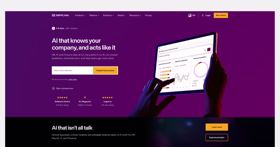
Rippling is a workforce management platform that brings HR, Payroll, IT, Finance, and business operations into a single system. Its website is a great example of trust-driven SaaS design. It shows visitors how multiple business functions can work together through one connected platform rather than a collection of separate tools.
Design Highlights
- A powerful promise backed by clear explanations: Many SaaS companies make ambitious claims, but Rippling spends the entire homepage explaining how its platform works. Instead of simply saying everything is connected, it shows how employee data, permissions, workflows, reporting, and automation operate from one system.
- Trust through operational depth: Product screenshots, workflows, reporting tools, permissions, and automation examples appear throughout the page. These sections help visitors understand that Rippling isn't just offering features—it has built a complete operational platform.
- AI positioned as part of the platform: Unlike many AI websites that place AI at the center of the story, Rippling presents AI as a natural extension of its platform. The website explains that AI works because it has access to unified business data across HR, IT, Payroll, and Finance.
- Enterprise credibility throughout the experience: Customer stories, product updates, awards, and business results are integrated across the homepage. These elements reinforce the idea that large organizations already trust the platform to run critical operations.
- A connected visual system: Every section supports the same message. Whether visitors are looking at HR, Finance, IT, Payroll, or AI, the design continually reinforces that everything runs on one platform rather than separate products.
Why It Works
Trust becomes more important as a product becomes more complex. Rippling is asking businesses to centralize some of their most important operations. That includes employee data, payroll, devices, access controls, expenses, and financial workflows. The website understands that visitors need more than marketing claims to feel comfortable making that decision.
3. Figma
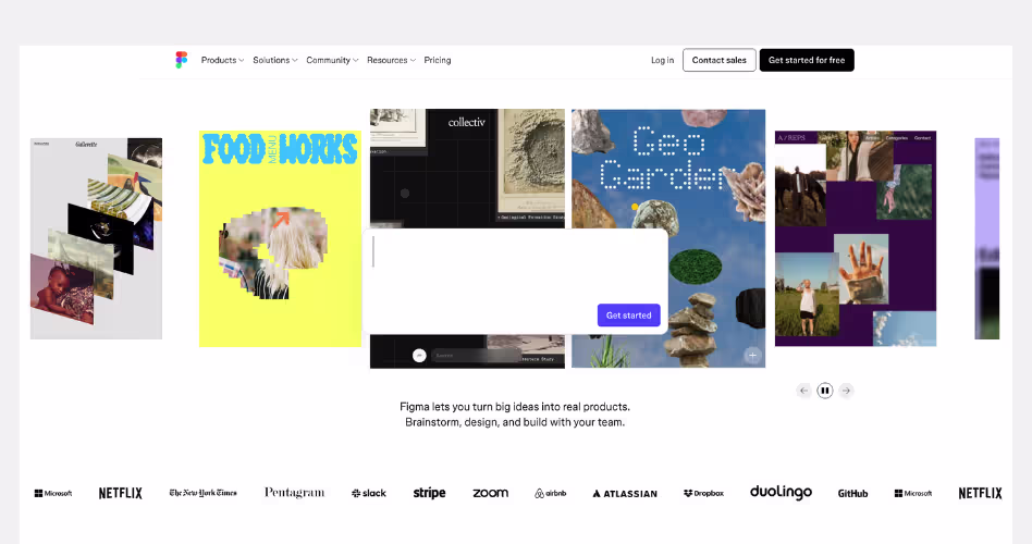
Figma is a collaborative product design platform used for design, prototyping, development handoff, websites, and team collaboration. Its website is a strong example of outcome-driven SaaS design. It shows how ideas move from concept to launch inside a single connected workflow.
Design Highlights
- A product journey instead of a feature list: The homepage doesn't focus on individual tools. Instead, it presents a complete workflow that takes users from brainstorming and design to prototyping, development, and publishing. This helps visitors understand the bigger value of the platform.
- The ecosystem feels connected: Products such as Figma Design, FigJam, Slides, Sites, Make, and Dev Mode are presented as parts of a larger system rather than separate tools. This makes the platform easier to understand despite its growing feature set.
- Real work takes center stage: Throughout the homepage, visitors see actual projects, templates, prototypes, websites, and community creations. The focus stays on what people can build rather than what the software can do.
- Creativity and productivity are balanced: The design feels playful and creative, but it is also highly structured. Large visual examples inspire visitors while clear navigation and product sections help them quickly find relevant information.
- Community becomes part of the experience: User creations, templates, and shared projects appear throughout the page. This helps demonstrate the platform's capabilities while also creating social proof.
Why It Works
Many software companies focus on helping users complete a single task. Figma focuses on helping teams build entire products.
The homepage continually connects different stages of product creation into one story. Visitors can see how ideas become designs, how designs become prototypes, and how prototypes become real products. Instead of selling a design tool, Figma sells a faster and more connected way to build digital products.
4. HubSpot
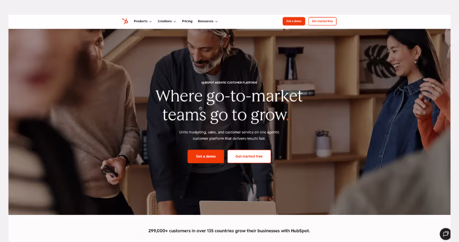
HubSpot is one of the most recognized CRM platforms in the world, combining marketing, sales, customer service, content management, and customer data into a single system. The current website reflects HubSpot's evolution from a traditional CRM into what it calls an AI-powered customer platform, where teams and AI agents work together to drive growth.
Design Highlights
- The homepage is organized around business growth: Instead of leading with software features, HubSpot starts with a bigger promise: helping businesses grow. Every section connects back to that idea, making the platform feel like a business solution rather than a collection of tools.
- Complex products are simplified through modular design: HubSpot offers a large ecosystem of products, including Marketing Hub, Sales Hub, Service Hub, Content Hub, Operations Hub, and more. The website breaks these into simple cards and sections, helping visitors understand the platform without feeling overwhelmed.
- AI is presented as a practical business tool: Rather than talking about AI in abstract terms, HubSpot shows specific AI agents for prospecting, customer support, and data management. The focus stays on saving time, improving customer experiences, and helping teams work more efficiently.
- Customer success is woven throughout the page: The homepage regularly shifts from product explanations to customer stories, case studies, and performance results. This creates a stronger connection between the software and the business outcomes it can produce.
Why It Works
HubSpot succeeds because it sells a complete growth system rather than individual features. The website makes a large and complex platform feel approachable by focusing on outcomes, simplifying navigation, and connecting every product back to a single goal: helping businesses attract customers, close deals, and grow faster.
5. Asana
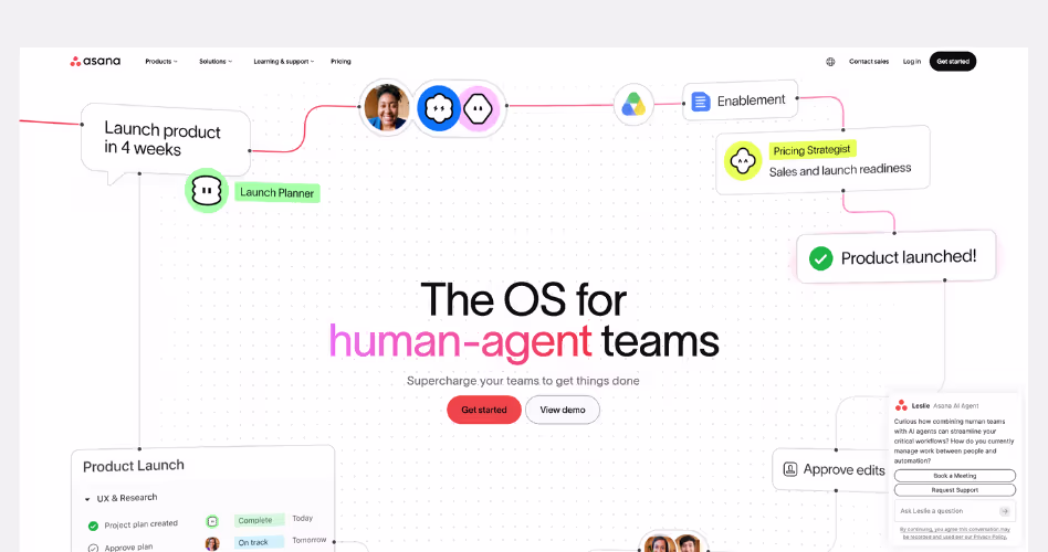
Asana is a work management platform that helps teams plan, organize, and execute projects. Its website stands out because it no longer focuses primarily on project management. Instead, it positions Asana as a system where humans and AI agents can work together to manage complex workflows and business operations.
Design Highlights
- A clear future-focused message: The homepage immediately introduces a new idea: human-agent teams. Rather than talking about tasks and projects, Asana focuses on how people and AI can collaborate inside the same system. This creates a more compelling story than a traditional productivity tool.
- The platform is explained through workflows: Instead of listing features, Asana shows how work moves across teams, projects, and AI agents. Visitors see real examples of planning, execution, coordination, and reporting, making the platform easier to understand.
- AI feels integrated, not bolted on: Many SaaS companies treat AI as a separate product. Asana presents AI teammates as part of the workflow itself. Throughout the page, AI is shown helping teams coordinate work, automate tasks, and move projects forward rather than acting as a standalone assistant.
- Strong emphasis on structure and coordination: Product screenshots, workflow diagrams, and examples consistently reinforce the idea that all work happens within one connected system. This helps visitors understand why Asana can support both human and AI collaboration.
- Trust built through enterprise proof: Customer logos, analyst recognition, case studies, and customer stories appear throughout the homepage. These elements help support Asana's positioning as a platform trusted by large organizations running complex operations.
Why It Works
Usually the project management websites focus on helping teams stay organized. Asana focused on helping organizations coordinate work at scale.
Their website constantly reinforces the idea that productivity is no longer just about managing tasks. It's about connecting people, workflows, systems, and AI agents inside a shared environment. By framing the platform this way, Asana feels much larger than a traditional project management tool.
6. Zendesk
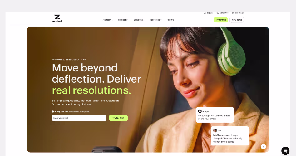
Zendesk is a customer service platform built to help businesses manage support across chat, email, voice, help centers, and AI agents. What makes the current website interesting is how clearly it reflects the company's shift toward AI-powered customer service. Instead of selling tickets and help desks, Zendesk now sells a bigger promise: faster resolutions for customers.
Design Highlights
- The website is built around outcomes, not features: Most customer support platforms spend their homepage explaining ticketing systems, live chat, and inboxes. Zendesk takes a different approach. The homepage repeatedly focuses on one idea: helping businesses resolve customer issues faster. Even the product sections are framed around resolutions rather than tools, making the value proposition much easier to understand.
- AI is woven into the entire story: Many SaaS companies add AI as a separate feature page. Zendesk makes AI part of almost every section of the website. From self-improving AI agents and knowledge systems to automation and analytics, visitors quickly understand that AI is not an add-on. It is positioned as the foundation of the platform.
- The design visualizes customer service workflows: Instead of showing generic dashboards, Zendesk uses interface mockups that demonstrate conversations, resolutions, knowledge management, and automation in action. This helps visitors see how the platform fits into real customer support operations rather than viewing it as another software dashboard.
- Strong use of proof throughout the page: Customer logos, usage statistics, case studies, and performance metrics appear across the homepage. These elements build credibility without interrupting the flow of the story. For a product responsible for customer communication, trust is one of the most important conversion factors.
Why It Works
Zendesk succeeds because it focuses on the result customers want, not the software itself. The website rarely gets lost in technical details. Instead, it continuously brings visitors back to a simple message: help customers faster, improve service quality, and scale support with AI. That makes a complex platform feel surprisingly easy to understand.
7. Dropbox
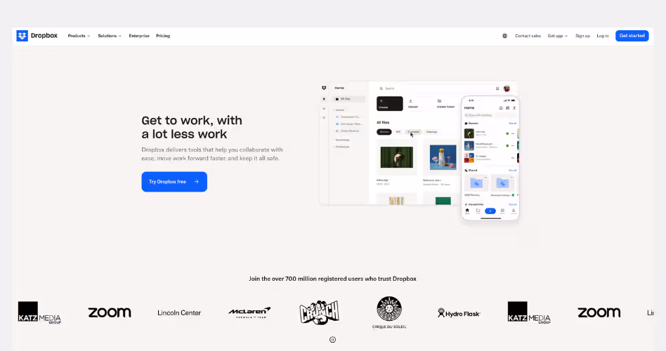
Dropbox has evolved far beyond cloud storage. What started as a simple file-sharing platform is now positioned as a complete workspace for finding, organizing, sharing, and securing work across teams. The homepage reflects this shift clearly. Instead of selling storage space, Dropbox sells productivity. This helps teams spend less time searching for information and more time getting work done.
Design Highlights
- Workflow-focused messaging: Instead of talking about storage space, Dropbox focuses on everyday tasks like finding files, organizing projects, and sharing content. This makes the platform feel more useful and relevant.
- Simple product demonstrations: Each section shows the product solving a specific problem. The screenshots are easy to understand and help visitors quickly connect features to real workflows.
- Strong balance between productivity and security: The homepage combines collaboration features with security messaging, helping businesses feel confident that their content is both accessible and protected.
Why It Works
Dropbox understands that most people don't care about file storage - they care about getting work done. By focusing on workflows rather than features, the website makes the product feel practical, approachable, and easy to understand.
Common Patterns Used by the Best SaaS Websites
After studying these SaaS website examples, a few patterns appear again and again. Different products use different styles, but many of the most successful websites follow similar principles.
- Product screenshots above the fold: Many SaaS websites show the product before visitors start scrolling. This makes it easier to understand what the software looks like and how it works. Instead of asking people to imagine the product, they show it immediately.
- Clear and benefit-focused headlines: The best headlines explain the value of the product, not just its features. Visitors should quickly understand what the product does and why it matters. Clear messaging almost always outperforms clever messaging.
- Strong social proof: Customer logos, testimonials, reviews, and case studies appear on many successful SaaS websites. These elements build trust and reassure visitors that real people and companies already use the product.
- Interactive product demonstrations: Many modern SaaS websites include product walkthroughs, videos, animations, or interactive demos. This helps visitors experience the product before signing up and makes complex features easier to understand.
- Consistent calls-to-action: High-performing SaaS websites make the next step obvious. Whether it's starting a free trial or booking a demo, visitors regularly see clear calls-to-action throughout the page.
- Simple navigation systems: Even when products are complex, the best websites keep navigation simple. Clear menus and well-organized content help visitors find information quickly without feeling overwhelmed.
- Visual storytelling: Great SaaS websites don't just list features. They use screenshots, layouts, illustrations, and product visuals to show how the product solves problems and helps users achieve their goals.
SaaS Website Design Checklist
After reviewing the examples in this guide, you may be wondering how these ideas apply to your own website.
While every SaaS company has different goals, most successful websites include a similar set of pages and elements. Use the checklists below as a starting point when designing or improving your website.
Homepage Checklist
Your homepage is usually the first impression visitors have of your product. Its main job is to help people understand what you do, why it matters, and what they should do next.
A strong SaaS homepage should include:
- A clear headline that explains the product
- A short supporting description
- Product screenshots or videos above the fold
- A primary call-to-action
- Customer logos or trust signals
- Key benefits and features
- Testimonials or case studies
- Frequently asked questions
- A final call-to-action near the bottom of the page
If someone visits your homepage for the first time, they should be able to understand the product within a few seconds.
Feature Page Checklist
Feature pages give visitors a deeper look at what the product can do. Instead of listing technical capabilities, focus on explaining how each feature helps users solve a problem or achieve a goal.
A good feature page should include:
- A clear feature overview
- The problem the feature solves
- Product screenshots or demonstrations
- Key benefits for users
- Real examples or use cases
- Customer proof where relevant
- A call-to-action that encourages the next step
The goal is to help visitors understand both the feature and the value behind it.
Pricing Page Checklist
Pricing pages are often one of the most visited pages on a SaaS website. Visitors come here when they're seriously considering the product, so clarity is critical.
A strong pricing page should include:
- Clearly labeled plans
- Transparent pricing information
- Included features for each plan
- Feature comparisons
- Billing options
- Free trial or demo information
- Answers to common pricing questions
- Trust-building elements such as guarantees or security information
The easier it is to compare plans and understand costs, the more confident visitors will feel about making a decision.
Landing Page Checklist
Landing pages are designed around a single goal, such as generating demo requests, free trial signups, or webinar registrations. Unlike a homepage, a landing page removes distractions and focuses attention on one specific action.
A high-converting landing page should include:
- A clear value proposition
- A focused headline
- Relevant product visuals
- Key benefits
- Social proof
- Objection-handling content
- A simple form or call-to-action
- Minimal navigation
Every section should support the same goal. If a piece of content doesn't help visitors take action, it probably doesn't belong on the page.
Frequently Asked Questions
What makes a good SaaS website?
A good SaaS website explains the product clearly, shows the value fast, builds trust with proof, and makes it easy for visitors to sign up, book a demo, or learn more.
Why should I study SaaS website examples before designing my own?
Studying SaaS website examples helps you understand what works. You can learn from strong layouts, clear messaging, product visuals, CTAs, and trust-building sections before creating your own site.
What are the most important sections of a SaaS website?
The most important sections are the hero, product overview, features, benefits, use cases, social proof, pricing, FAQs, and clear calls-to-action throughout the page.
What should be included on a SaaS homepage?
You should include a clear headline, short product explanation, product visuals, main benefits, customer logos, feature highlights, testimonials, pricing path, and a strong call-to-action.
What is the best layout for a SaaS landing page?
The best layout starts with a clear hero section, then explains the problem, shows the product, highlights benefits, adds social proof, answers questions, and ends with a strong CTA.
How do SaaS websites build trust with visitors?
SaaS websites build trust with customer logos, testimonials, case studies, reviews, security badges, clear pricing, real product images, strong copy, and proof that other people use the product.
How often should a SaaS website be updated or redesigned?
A SaaS website should be updated whenever the product, audience, pricing, or messaging changes. Where, a full redesign may be needed every few years or when performance drops.
Key Takeaways
It's easy to get distracted by animations, trends, and visual styles when looking at SaaS website examples. But those aren't usually the reason a website performs well.
The strongest websites focus on the fundamentals. They explain the product clearly, show how it works, build trust, and guide visitors toward action. That's what makes them effective.
If there's one lesson to take away from these examples, it's that clarity almost always wins. When people understand your product, they're far more likely to trust it, remember it, and eventually become customers.
.avif)


.avif)