- Why 2026 Is a Turning Point for Web Design
- Top 8 Web Design Trends 2026
- Web Design Trends to Avoid in 2026
- Real Examples of Web Design Trends That Actually Work
- Common Mistakes When Chasing Web Design Trends
- How to Apply Web Design Trends 2026 Without a Full Redesign
- Frequently Asked Questions
- Final Thoughts


The biggest web design trends for 2026 are AI-personalized experiences, immersive 3D and WebGL visuals, kinetic typography, glassmorphism, dopamine-driven UI, and a deep focus on Core Web Vitals and WCAG accessibility.
These aren't decorative choices; they directly affect conversions, SEO rankings, and user trust.
You hired a web designer two years ago. The site looked great. Your team was proud of it. Then a prospect visited, clicked around for 20 seconds, and left.
Nobody told you the site felt outdated. Nobody said the navigation was confusing or the fonts felt stiff. They just left. And that's the real cost of ignoring how design is changing.
Web design trends in 2026 aren't about chasing aesthetics. They're about understanding what users now expect, and building sites that meet that bar. Because the bar has moved fast.
This article breaks down exactly which web design trends matter right now, why they're happening, and what you need to do about them.
Why 2026 Is a Turning Point for Web Design
Three things happened at once, and the combination changed everything.
First, AI became a design tool not just for developers, but for every team. Tools like Figma AI and Adobe Firefly let designers prototype interactions in minutes that used to take weeks.
Which means user expectations jumped. People now encounter more sophisticated interfaces every day, and their tolerance for dull, static pages dropped.
Second, Google updated how it measures good design. Core Web Vitals the metrics that measure how fast, stable, and responsive your site feels became a real ranking factor. That means a beautiful site that loads slowly or jumps around when you click it can now cost you search visibility.
Third, users got smarter about fake personalization. A homepage that says "Welcome back!" with your name doesn't impress anyone anymore. Real personalization means showing different content based on behavior, industry, or intent. And visitors can feel the difference.
That's why 2026 isn't just another design refresh cycle. It's a convergence point and companies that treat it that way will gain ground while competitors argue about button colors.
Which Web Design Trends Fit Your Business Type?
Not every web design trend belongs on every website. The right choice depends on what your business needs the site to do.
For SaaS companies, the most effective trends are AI-driven personalization, strong typography, dark mode, and product-led interactive demos. These help explain value faster and improve conversion on high-intent pages.
For eCommerce brands, dopamine-driven design, subtle micro-interactions, and functional 3D usually have the biggest payoff. They make products feel more tangible and keep attention where purchase decisions happen.
For agencies and service businesses, kinetic typography, refined glassmorphism, and sharper visual hierarchy tend to work better than heavy visual effects. They create a modern brand impression without getting in the way of the message.
For local businesses, accessibility, mobile usability, and fast performance matter more than trend-heavy visuals. A site that feels fast, clear, and trustworthy will outperform a stylish site that feels confusing.
Top 8 Web Design Trends 2026
The key is choosing trends that fit your audience, your goals, and the way people actually use your site.
1. AI-Driven Web Design: Not What You Think
When people hear "AI web design trends 2026," they picture auto-generated layouts or chatbots. That's not where the real shift is happening.
The actual change is in dynamic content personalization at the component level. Imagine a SaaS company's homepage. A first-time visitor from a startup sees case studies about scrappy growth. A returning enterprise buyer sees ROI calculators and security compliance badges. Same URL. Different experiences. All driven by behavior signals.
This isn't magic, it's conditional rendering logic connected to a CRM or analytics layer. But the UX impact is real. Sites using this approach are seeing 30–45% improvements in time-on-page and meaningful drops in bounce rate.
If you want to implement this without a full rebuild:
- Start with your hero section. Test two variants one for new visitors, one for returning. Tools like Webflow Optimize or Mutiny make this accessible without engineering.
- Use behavior triggers. If someone reads three blog posts about UX design, show them your UX audit service next visit. This is basic but almost no one does it.
- Don't fake it. Shallow personalization ("Based on your location...") feels worse than no personalization. Go specific or go home.
2. Immersive 3D and WebGL: Now Accessible, Not Just Experimental
In 2022, 3D web design was a toy for well-funded agencies. In 2026, it's a competitive tool if you use it right.
WebGL has matured enough that a mid-sized company can now add interactive 3D product viewers, ambient background animations, or scroll-triggered 3D transforms without needing a team of engineers. Libraries like Three.js, Spline, and Rive have made the implementation gap much smaller.
Here's where it breaks though: 3D for the sake of 3D still fails. A real estate site that uses a 3D globe as a background looks clever for two seconds and then annoys every visitor who just wants to see listings.
The 3D web design trend works when the interactivity is functional, not decorative. A furniture brand letting users rotate a chair in 3D before buying? That reduces returns and increases confidence. A fintech platform using subtle 3D charts to make data feel more spatial? That improves comprehension.
How to implement 3D web design without breaking performance
- Use Spline for no-code 3D scene embedding; it outputs a lightweight script that loads after page content.
- Compress all GLTF/GLB files before deploying. A 3D model above 2MB will hurt your Core Web Vitals score.
- Always add a 2D fallback for mobile users. Rendering 3D on low-end phones kills experience.
- Test on real devices, not just your design machine. A scene that runs smoothly on a MacBook Pro might stutter on a mid-range Android.
3. Kinetic Typography: When Text Becomes the Experience
Kinetic typography web design is one of those trends that sounds niche until you see it done well and then you can't unsee it everywhere.
The idea: text that moves, scales, responds, or reveals as you scroll. Not as decoration, but as storytelling. A word that grows as you scroll past it. A headline that breaks apart when you hover. Type that reacts to cursor speed.
The reason this is exploding in 2026 is variable fonts. Variable fonts are single font files that can shift weight, width, and slant dynamically without loading multiple font files. That means kinetic effects that used to require heavy JavaScript animations can now be done in CSS, with far less performance cost.
For brands who rely on content to convert agencies, SaaS companies, publishers this is a high-ROI trend. It makes pages feel alive without adding complexity or slowing load time.
One practical approach: use scroll-linked font weight changes on your hero headline. As the user scrolls down, the font transitions from thin to bold. It takes about 20 lines of CSS and creates an immediate sense of motion and depth.
4. Glassmorphism in 2026: Refined, Not Retired
Glassmorphism, frosted glass effects, translucent panels, layered depth peaked as a trend around 2021. Most articles written since then have declared it dead.
It's not dead. It's evolved.
The version that died was excessive: every card, every modal, every sidebar with a blur effect and a 70% opacity white layer. It looked good in Dribbble mockups and terrible in production because it destroyed text legibility and confused spatial hierarchy.
The glassmorphism web design approach that's thriving in 2026 uses the effect with surgical restraint. One frosted panel against a vivid gradient background. A tooltip with a soft blur. A navigation bar that picks up the color of the page content behind it.
Why is it still relevant? Because depth cues matter to the brain. The human eye is wired to understand layering. We instinctively know a frosted glass panel is "above" the background. When that maps to the actual UI hierarchy (this panel is more important, this action is primary), it guides users without a single word of instruction.
The rule: glassmorphism should explain the interface, not decorate it.
5. Dopamine Design: Why Ugly Websites Convert Better
This one will annoy every designer who trained on Bauhaus minimalism.
Dopamine design is the intentional use of bold color, exaggerated shapes, playful motion, and visual surprise to trigger an emotional response. It's the reason sites using bright greens, hot pinks, chunky shadows, and misaligned grids are outperforming "tasteful" design on conversion metrics.
The neuroscience behind it is simple: novelty triggers dopamine release. When the brain encounters something unexpected: a button that jiggles, a gradient that shifts as you scroll, a card layout that breaks the grid deliberately it pays more attention. And attention is the bottleneck of every conversion funnel.
This trend overlaps with what used to be called brutalist web design. But the 2026 version isn't ugly for the sake of ugly. It's strategically unconventional.
Think of a DTC brand selling supplements with a site built entirely in high-contrast yellow and black, with rounded blobs and a mascot character. It shouldn't work by any classical design principle. But the visual energy signals confidence, distinctiveness, and fun and that's exactly what their buyer wants to feel before purchasing.
This doesn't mean every site should go maximalist. But if your design brief still says "clean, minimal, professional" without further definition, you're probably leaving an emotional impact on the table.
6. Sustainable Web Design: The Trend With a Business Case
Sustainable web design gets grouped with feel-good initiatives. That's a mistake, because the business case is concrete.
The average web page now transfers about 2.4MB of data per load. For a site with 50,000 monthly visitors, that's approximately 120GB of data transferred monthly, most of it video autoplay, uncompressed images, and JavaScript libraries loaded "just in case."
Google's Core Web Vitals penalize this. Page Experience signals directly affect rankings, and a bloated page that takes 4 seconds to become interactive loses both search position and visitor patience.
Sustainable web design isn't about making your site look eco-friendly. It's about:
- Removing JavaScript that doesn't serve a function the user actually uses
- Using next-gen image formats (AVIF and WebP) instead of PNG and JPEG
- Implementing lazy loading so images below the fold don't load until needed
- Auditing third-party scripts a single analytics pixel from a forgotten campaign can add 400ms to your load time
The result is a site that loads faster, ranks better, costs less to serve, and converts more. That's not a trend. That's just good engineering that the industry is finally prioritizing.
7. Neumorphism and Micro-Interactions: The Quiet Revolution
Neumorphism is soft UI elements that appear to be extruded from the background rather than sitting on top of it. Light shadows on one side, dark shadows on the other. The result is a tactile, almost physical-feeling interface.
It had a rough debut. Early neumorphic designs looked beautiful in isolation and were nearly unusable in practice because the contrast between active and inactive states was too subtle a huge problem for accessibility.
The 2026 approach fixes this by combining neumorphic depth with WCAG-compliant contrast ratios. The visual softness is preserved. The usability issue is resolved.
What makes this trend worth watching is how it pairs with micro-interactions UX design. A neumorphic button that presses in when clicked, then releases with a slight spring that tiny feedback loop creates a sense of physical response. Users feel the interface working, not just see it.
These micro-interactions aren't about polish for its own sake. They answer the user's subconscious question: "Did that click register?" When the answer is visually and physically clear, users move faster and feel more confident.
8. Accessibility and WCAG: The Trend You Can't Opt Out Of
WCAG accessibility web design stopped being optional in 2024 when the DOJ finalized ADA web accessibility guidelines for the US, and similar legislation tightened across the EU.
But compliance aside, the business case is straightforward: roughly 1 in 4 adults in the US lives with some form of disability. Color contrast issues, missing alt text, non-keyboard-navigable menus these don't just fail compliance audits. They cost you customers.
The good news: WCAG 2.2 accessibility improvements and conversion-friendly design overlap significantly. High-contrast text is easier to read for everyone. Keyboard navigation makes sites faster for power users. Clear error messages reduce form abandonment for all users.
If your site hasn't had an accessibility audit in the last 18 months, run one now. Tools like Axe, Wave, and Lighthouse Surface issues in minutes. The fixes are rarely expensive but the cost of ignoring them is.

Web Design Trends to Avoid in 2026
Some design trends still get attention, but they fail in production when they are used without restraint.
Avoid heavy 3D effects that slow down the page or distract from the content. If visitors feel the effect before they understand the offer, it is hurting more than helping.
Avoid glassmorphism that weakens readability. Frosted layers only work when text contrast stays strong and the hierarchy stays obvious.
Avoid motion used only for decoration. Kinetic type and animated UI should guide attention, not compete with it.
Avoid fake personalization. Generic location swaps or shallow “custom” messaging feel artificial fast. If the personalization is not genuinely useful, a clear static experience is better.
Real Examples of Web Design Trends That Actually Work
The best web design trends in 2026 are the ones that solve a real user problem.
AI personalization works best on homepages, landing pages, and pricing pages where different visitors need different messages, proof points, or calls to action.
3D and WebGL work best when they improve understanding. Product viewers, interactive walkthroughs, and visual data experiences are where this trend earns its place.
Kinetic typography works best for brands that rely on messaging to differentiate themselves. Agencies, publishers, SaaS brands, and campaign pages often benefit the most.
Accessibility and sustainable performance improvements work on every website. Unlike style-based trends, these improve usability, trust, rankings, and conversion at the same time.
Common Mistakes When Chasing Web Design Trends
Mistake 1: Implementing trends before auditing current performance
A glassmorphism redesign won't save a site that converts at 0.3% because of a broken checkout flow. Before touching aesthetics, look at your Core Web Vitals, your heatmaps, and your drop-off points. Fix the foundation first.
Mistake 2: Using trends as decoration instead of communication
3D for 3D's sake. Kinetic type that moves because it looks cool but makes the headline harder to read. Every trend in this article has a functional rationale. If you can't explain why the effect helps the user, remove it.
Mistake 3: Ignoring Webflow and Figma design system compatibility
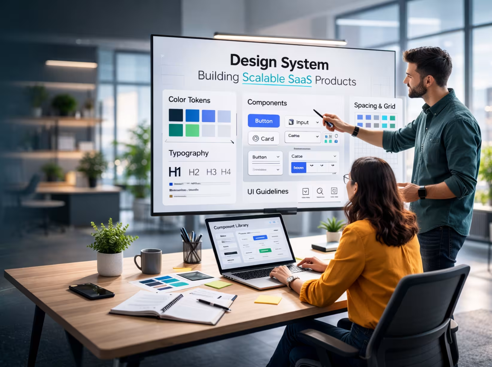
Design teams build beautiful concepts in Figma, then hand them off to developers who either can't build what was designed or build it in a way that breaks on mobile. Build within the constraints of your production tools from day one. Webflow design trends in 2026 show teams moving toward design systems built directly in the deployment environment, not prototyped in a vacuum and then rebuilt.
Mistake 4: Treating dark mode as an afterthought
The dark mode web design trend is now a baseline expectation, especially in developer tools, SaaS products, and consumer apps. But most teams still design in light mode and add a dark version at the end of the project. The result is a dark mode that looks like a photo negative inverted without thought. Design both modes in parallel from the start.
How to Apply Web Design Trends 2026 Without a Full Redesign
You don't need to start from scratch. Here's a prioritized order of changes that will have the most impact for the least disruption:
- Week 1: Run a Core Web Vitals and accessibility audit. Fix the critical issues. This is the highest ROI action you can take right now.
- Week 2–3: Update your typography. Swap to variable fonts and add one kinetic text effect to your hero section. Minimal code, immediate visual improvement.
- Week 4: Review your color system through a dopamine design lens. Not to go wild but to add one strategic moment of visual energy that breaks pattern and draws attention to your primary CTA.
- Month 2: Test one AI personalization variant on your homepage using a tool like Webflow Optimize. One version for new visitors, one for returning. Measure for 30 days.
- Month 3: Add micro-interactions to your primary form and CTA buttons. Spring physics on clicks, color transitions on hover. Small effort, noticeable retention impact.
This isn't a roadmap for everyone. But it's a framework for teams who need to move on modern web design without a six-month redesign project.
Which Web Design Trends Should You Prioritize First?
If you are not doing a full redesign, the smartest move is to prioritize by impact.
Start with Core Web Vitals, accessibility, and mobile usability. These affect every visitor and create the foundation for everything else.
Next, improve typography, visual hierarchy, and micro-interactions. These changes are usually easier to implement and can make the site feel noticeably more modern.
After that, test AI personalization and stronger visual differentiation. This is where you can create a more tailored and memorable experience.
Use 3D, WebGL, and advanced visual effects selectively. They work best when they support the product or message, not when they exist just to look impressive.
Frequently Asked Questions
What are the biggest web design trends in 2026?
The biggest web design trends in 2026 are AI personalization, immersive 3D and WebGL, kinetic typography, refined glassmorphism, dopamine-driven UI, sustainable performance-focused design, and accessibility-first UX.
Which web design trends actually improve conversions?
The trends that improve conversions most are AI personalization, strong typography, micro-interactions, faster page performance, and accessible design. These help users understand the offer faster and act with less friction.
Is 3D web design good for SEO?
3D web design can support SEO if it does not slow the site down. If 3D hurts Core Web Vitals, it will damage performance and search visibility instead of helping it.
Is glassmorphism still a trend in 2026?
Yes, but in a more refined way. In 2026, glassmorphism works best when it adds depth and hierarchy without reducing readability.
How do I use AI in web design in 2026?
The most practical use of AI in web design is personalization. That means showing different content, CTAs, or proof points based on visitor behavior or audience type.
What web design trends should businesses avoid in 2026?
Businesses should avoid heavy effects that hurt performance, fake personalization, unreadable glassmorphism, and motion that distracts from the message.
How can I update my website for 2026 without a full redesign?
Start with performance, accessibility, mobile usability, and typography. Then test one high-impact design change, such as personalization or micro-interactions, before changing everything else.
Final Thoughts
The web design trends for 2026 aren't a list to implement blindly. They're a set of signals about what users now expect from a digital experience and what they'll leave immediately if they don't get it.
The sites that will rank, convert, and retain visitors in 2026 are built on a foundation of fast performance and accessible UX, layered with intentional design decisions that create genuine emotional responses. Not just aesthetic ones.
Start with your audit. Then pick one trend from this list that fits your audience and your brand voice. Build it well. Measure it properly. And move to the next one.
The teams winning in 2026 aren't chasing all of this at once. They're executing one thing at a time better than everyone else.
Ready to future-proof your SaaS design?
.avif)