




.svg)


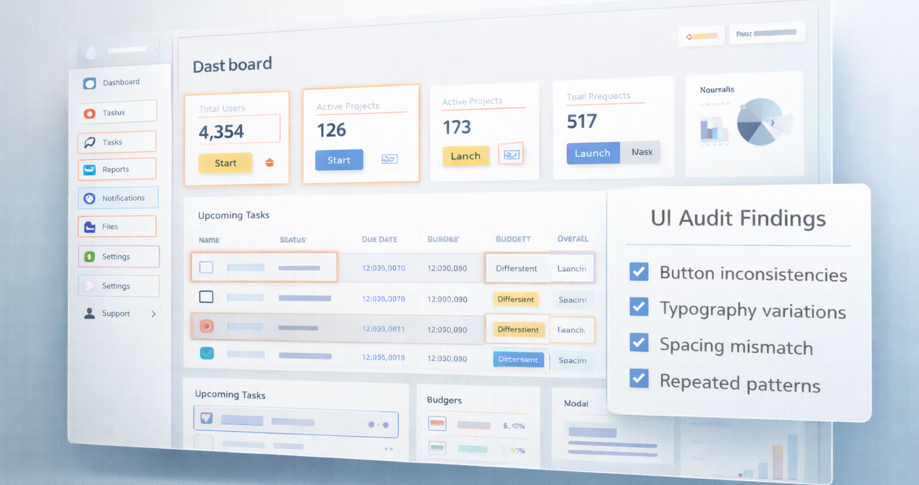
SaaS products grow fast, and new features like dashboards, modules, and workflows are added continuously. Over time, these new features add small design inconsistencies like different spacing, typography, component styles across screens. As the product scales, these inconsistencies make the product interface harder to manage.
A design system solves this by providing a set of reusable components and clear design rules. Instead of redesigning elements for every feature, teams use the same predefined patterns. This keeps the product consistent and removes confusion as it scales.
In this guide, we’ll share how you can build a design system for scalable SaaS products. You’ll also learn how to scale it across teams as the product grows.
What is a Design System?
A design system is a single source of reusable components, visuals and product guidelines used to build interfaces consistently at scale. It brings together all UI elements in one cohesive framework that teams can reference as the product grows.
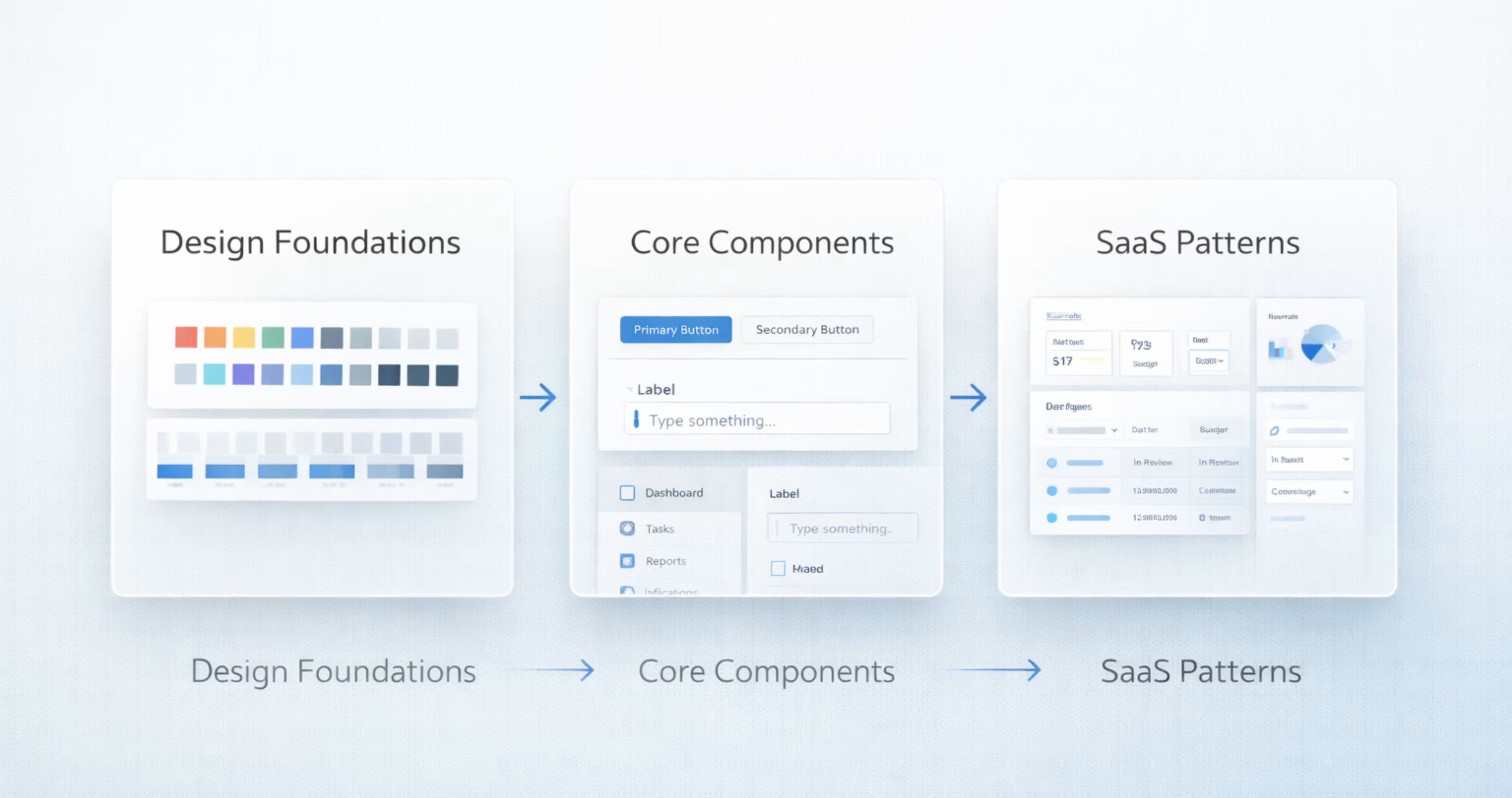
The design system works as a single shared foundation of how the product will look and behave, as it scales. Instead of creating new designs every time, a design system provides a set of design components that you can use across the product. Here are the components you'll usually find in design systems:
- Design foundations: colors, typography, spacing, grid
- Reusable UI components: buttons, inputs, navigation, tables and modals
- Layout structures and UI patterns
- Interaction states and behaviors
- Documentation and usage references
So, instead of using scattered design files, a design system works as a unified collection of product visual language and interface building blocks in one place.
Why Do SaaS Products Need Design Systems?
SaaS products are not the same as the typical marketing websites. They are built with complex interfaces that contain dashboards, tools, settings, and workflows that continue to expand over time. With complexities like that, it can be easy to get confused about adding a new feature or module to the application.
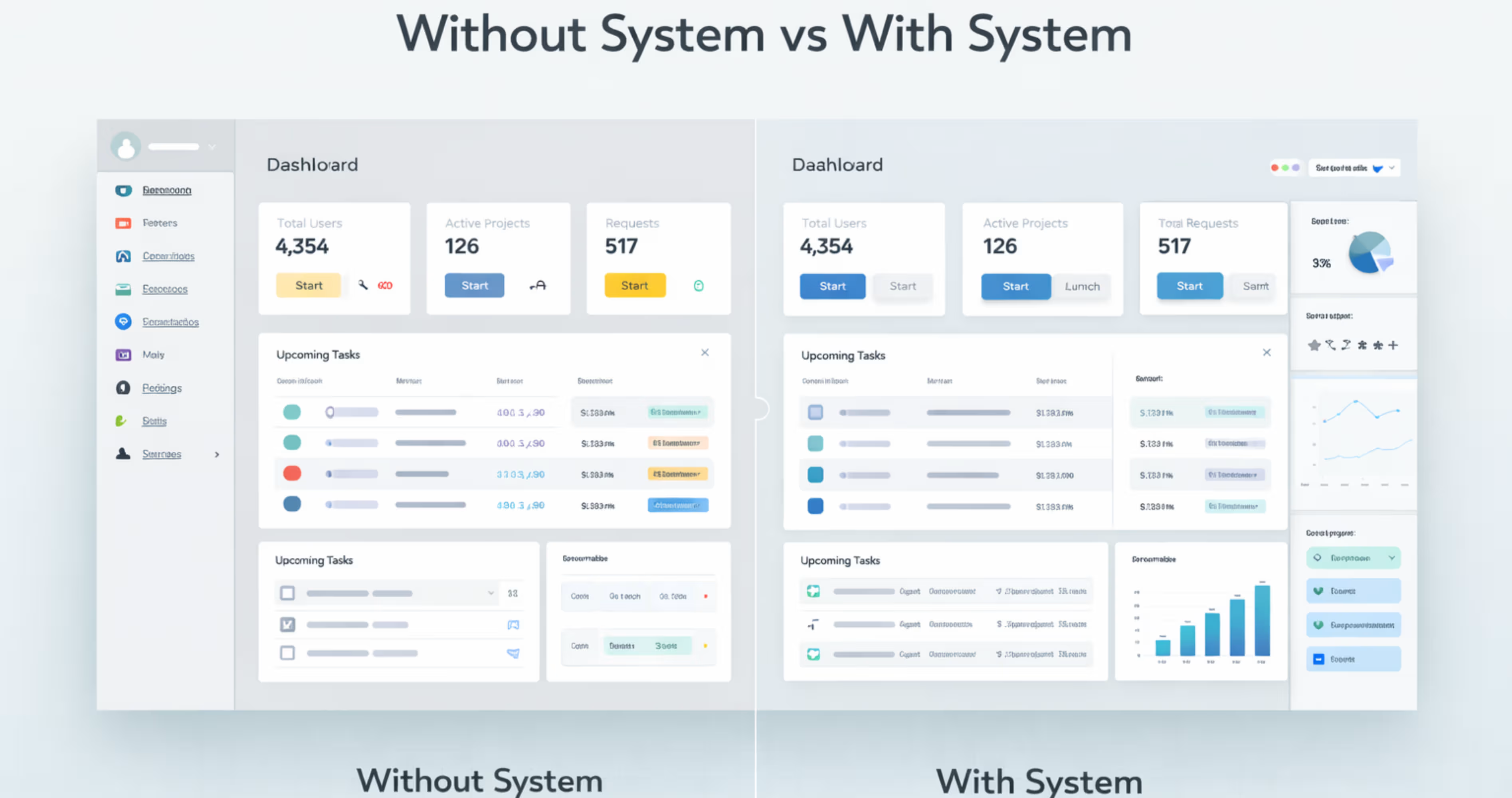
That’s where the SaaS design system helps. It provides a shared set of reusable components that helps design new features while keeping consistent with the whole product.
Here are the top reasons why you should include a design system for your SaaS product:
Increases Brand trust: Most of the leading SaaS platforms use design systems to provide a smooth brand experience to the users. Using the design system produces a consistent interface design through the entire product, so it’s easier to understand and use the software.
Makes operation more efficient: with reusable design components, the team doesn't need to redesign common UI elements every time a new feature arrives. This helps reduce the time for continuously recreating components, and speeds up the overall process.
Easy to scale product: a design system helps teams to add new modules, screens, or workflows without starting from scratch. When new design modules arrive, they don’t have to design from scratch, but implement the already used patterns. So it makes scaling products consistent and easy over time.
Improves User Experience: following a standardized user experience makes the navigation predictable and easier to understand. This helps users to easily understand how the product works, and improves the user retention.
Want to see how design clarity improves real products? Check out our case study on InvestIQ to see how we transformed a complex investment dashboard into a scalable interface built on clear design patterns.

The Components of a SaaS Design System
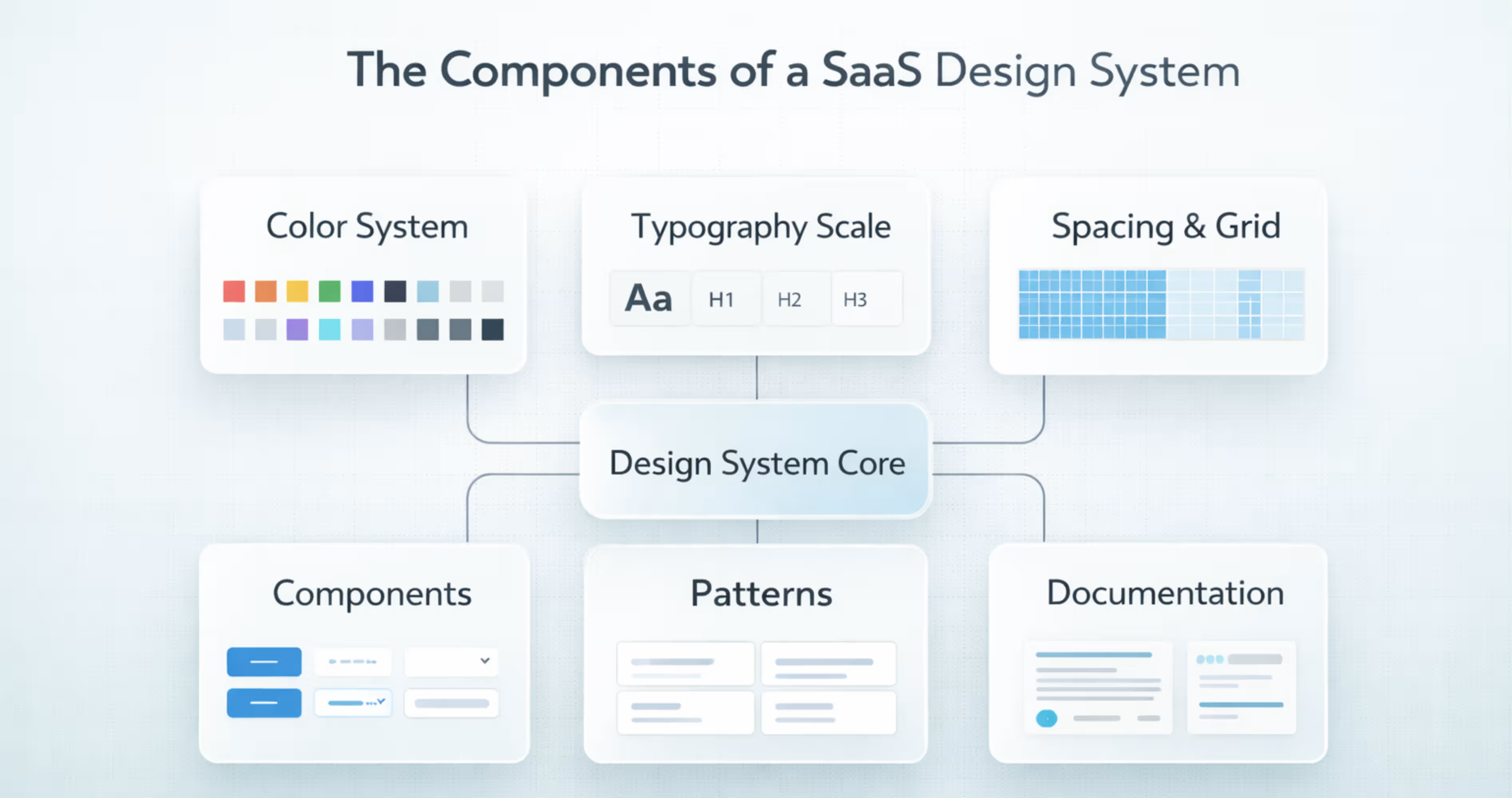
A SaaS design system is more than just a set of UI components. It’s a shared system that includes visual foundations, reusable components, and interface patterns that teams use to design and build the product consistently.
It gives designers and developers a single reference for how the product should look and behave across all features and screens. Here are the core elements that most SaaS design systems include:
Color System
A color system is a defined set of colors used consistently across the product. It usually includes brand colors, neutral colors, background colors, and status colors like success, warning, or error.
Without a design system color palette, the teams may use slightly different shades in different designs. Over time, it makes the product look inconsistent and harder to recognize. A color system keeps the interface visually consistent over different screens.
Typography Scale
A typography scale defines different text sizes, spacing and font styles across the product. It sets clear standards for headings, body text, labels and captions.
SaaS users read a lot of information in tables, forms and dashboards while using a product. If the text style varies across screens, it would make the UI inconsistent for users and harder to scan. That’s why using a typography scale is important for keeping the text readable and consistent through the product .
Spacing & Layout Grid
Spacing and layout grid help keep screens aligned and organized. The grid gives structure to the layout, and spacing keeps equal gaps between elements. Together, they make the interface look clean and balanced.
SaaS screens often contain tables, filters, sidebars, cards, and forms. A defined spacing and grid system makes sure these elements line up properly and keep consistent spacing across all screens.
Buttons
Buttons trigger actions in the product, such as submitting forms, confirming choices, or moving to another screen.
In SaaS interfaces, buttons appear everywhere from tables, modals, to dialogs. If button styles change across screens, it makes the product feel inconsistent and harder to use. While, following a standard button design system keeps the actions clear and consistent throughout the product.
Form Inputs
Form inputs are input components that provide a structured set of rules, components and best practices that help create intuitive, efficient and accessible forms for products.
SaaS products have different forms using accounts, filtering data, configuration settings etc. Form inputs in a design system define how each input looks and how large it is.
Navigation
Navigation helps users move around the product using elements like sidebars, menus, tabs, and search.
SaaS products usually have many features, sections, and tools. Without clear navigation, it becomes hard for users to find what they need. A defined navigation system in the design system keeps the layout consistent across screens and makes the product easier to use.
Tables and Data Display
Tables and data components are the core parts of some SaaS products. They organize, display, and interact with large datasets. Usually the table and data display include components like data tables, rows, columns, sorting controls, filters, paginations, and dense layouts.
Many SaaS products users use them to scan, compare, filter, sort and manage complex information like lists, reports and dashboards. A proper data table component keeps the data easy to read while interacting across the product.
Cards and Containers
Cards and containers are the fundamental layout elements for design systems. They are used to organize, structure and display data in a clean, digestible and visually distinct way. Cards use borders and spacing to visually separate and represent a distinct topic or content group. While, the containers provide structure to the topic.
In the SaaS design system, they are used in dashboards, product listings, and complex interfaces reduce the cognitive load, and improve scalability.
Modals and Dialogs
Modals and dialogs are interruptive UI components that cover the content and make the users focus on a specific task. This task can be anything from confirming, deletion, editing details, creating new items and showing forms.
They let users complete tasks without leaving the current page. It helps make the workflow faster and more focused. A design system defines how modals should look, its size, spacing, headers, and buttons. So, the modals are consistent across all the SaaS products.
Alerts and Notifications
Alerts and notifications are messages that inform the users about the current system status or result of actions. The notification suggests any information about the stem, or result of an action, while alert highlights something important that may require user attention.
Alerts and notifications are used in SaaS design systems for showing success messages after saving, warning before risky actions, error messages in forms , or info banners about updates. Without a consistent style, this feedback can be missed or confusing. That’s where including them in a design system helps. A design system defines ideal colors, placement and behavior. So, the message looks clear and consistent across all the screens.
Icons
It’s impossible to open an app without interacting with icons. Icons are clear, understandable visual metaphors that you can understand without knowing any language. It helps users understand the specific action, without reading it, so reduces cognitive load to the user.
The SaaS products use icons in toolbars, buttons, menus , tables and navigation bars. You might see one in the edit, delete settings, search, filter or down icons used throughout the product. They make every page feel consistent and easy to understand.
Design systems define the ideal icon style, like line, filled, size and stroke across the product. So, everything feels unified and on-brand .
Empty States
Empty states appear when there is no data to show on a screen. This can happen when a new user has arrived on a data screen, or when a list has no results. Without guidance, users may feel confused about what to do next.
The empty states are short messages that clearly guide actions like creating a project, adding data or more. Examples of using empty states in SaaS design can include ‘no projects yet’, or ‘no results found’.
The design system includes empty states to set a standard of icons, illustrations, or short messages that are used in the content. It helps understand and navigate users without creating any confusion.
Loading and Skeleton States
Loading and skeleton states appear when a page or content is still loading. During this time, users may think the page has stopped or an error has occurred. Loading indicators help reassure users that the system is working.
The design systems define when to use spinners or skeletons, how they look, and how they behave. This keeps loading feedback consistent across the product and improves the overall user experience.
How to Build a Design System for Scalable SaaS Products (Step-by-Step)
Building a SaaS design system is not about just creating UI components. It’s about creating a proper system for design that understands your current product and helps build a system that teams can understand and maintain over time.
Here is a step by step process for creating design system for SaaS products:
Step 1: Audit the Current Product UI
Before creating a design system, you have to audit the current design and find out what’s inconsistent in the design. For that, you can go to the product screens to list every UI element used.
Then look for common inconsistencies, and repetitive designs through the design, like different buttons, radios, different fonts in tables etc. For this, you can use collaboration brands like Miro or FigJam to help teams map inconsistencies and user flows visually.
This will help show what needs to be fixed and what can be reused over the design system.
Step 2: Define Design Foundations
After auditing the current product UI, it’s time to define design foundations that everything will be built on. The design foundations includes common things like spacing, sizing scales, evolution rules etc
Define these elements as design tokens like color-primary-5000 or spacing-md. It helps create a clear, semantic narrative and decide how different themes like black or white will work with it. These foundations ensure consistency before components are created.
Step 3: Build Core Component Library
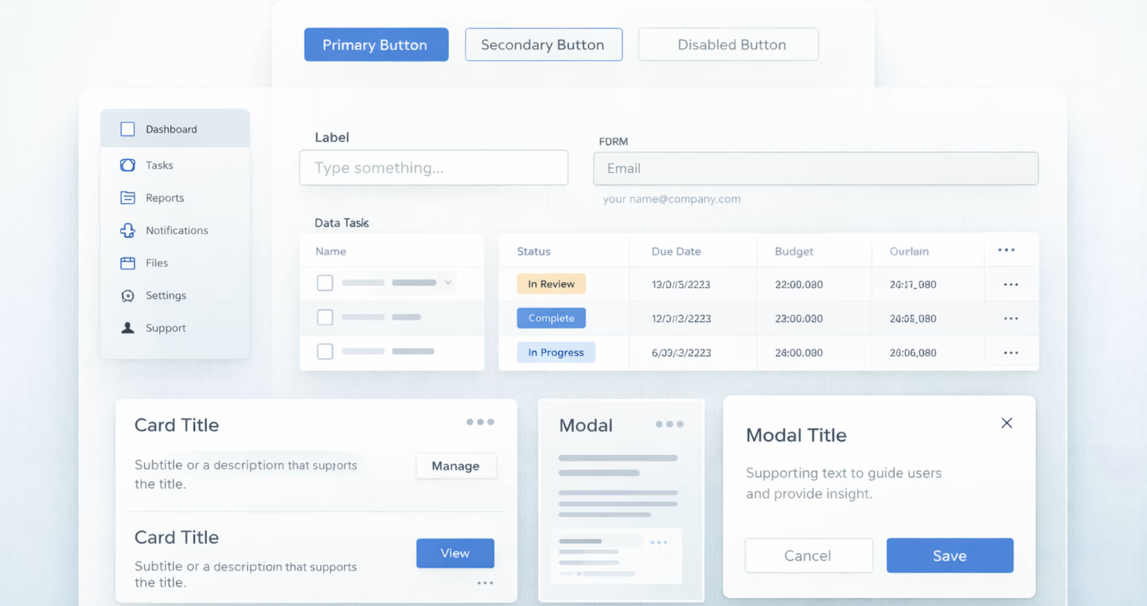
When you have defined the core design foundations, it’s time to create the reusable components library that will be used across the products.
These reusable components include buttons, inputs, dropdown modals, navigation and layout elements. Using tools like Figma’s shared libraries, or Sketch symbols, you can create and manage these centralized UI components.
Start with simple components and gradually move from basic elements to more complex ones. For each component, define all the states and variations ( hover, active, disabled, loading, size variations) and how it behaves in different screen sizes.
This component library becomes the main building block that SaaS interfaces use to create consistent and scalable user experiences.
Step 4: Add Saas-Specific Patterns
SaaS products often use the same screen structures across different features and modules. After defining core UI components, the next step is to create SaaS-specific patterns that combine those components into real product layouts.
These patterns represent common structures used throughout the application. For example, a data table pattern may combine rows, columns, sorting, filters, pagination, and row actions into one standard layout. Instead of designing these structures from scratch each time, teams can reuse the same pattern across modules.
Step 5: Align With Engineering
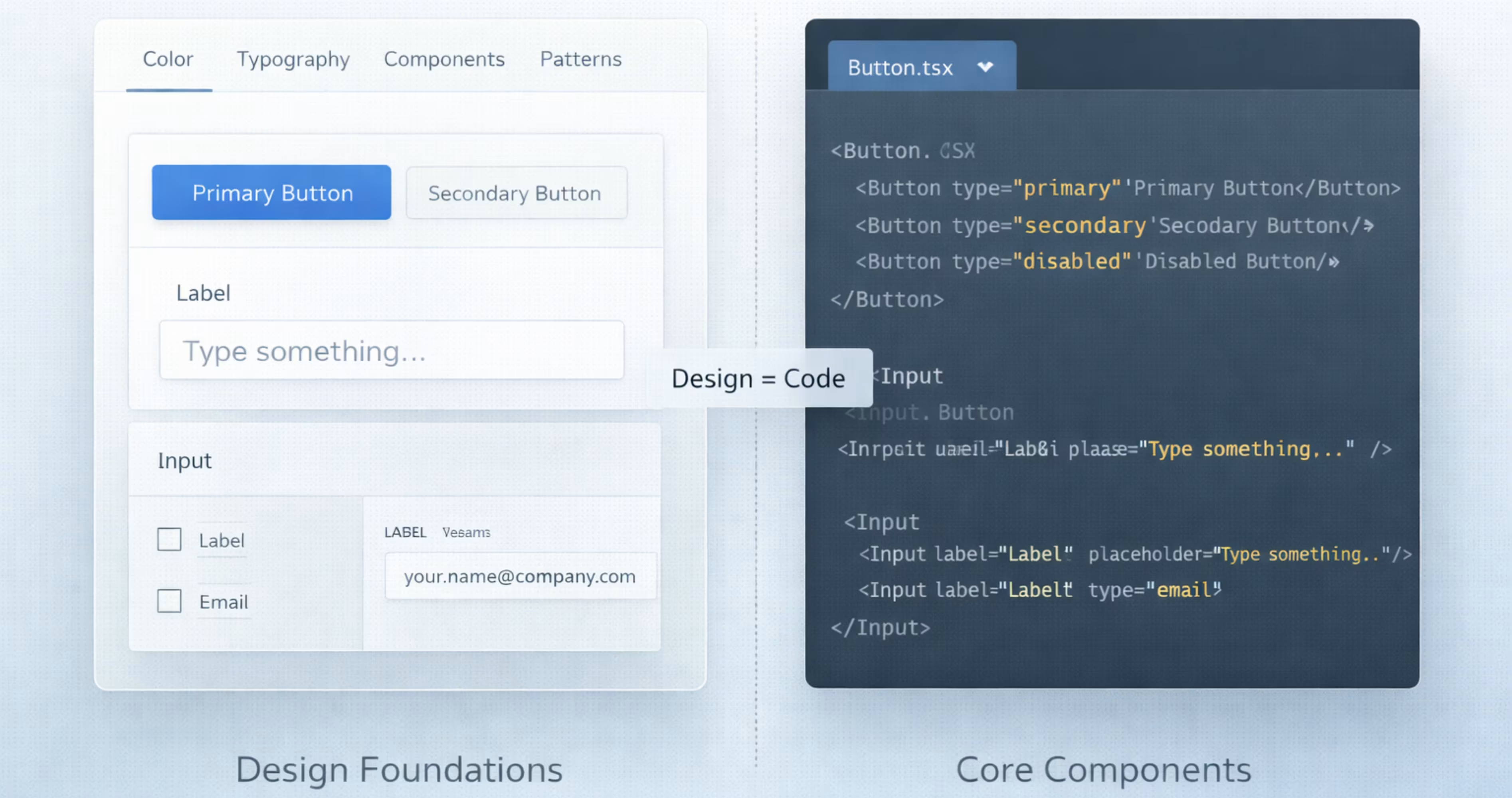
A design system only works when the design matches the actual product UI. And to make that happen, every component designed should also exist in the code with the same structure, styles and behavior. And for that, you’ll need a close alignment between design and engineering.
Start by mapping out each design component with a coded component. For example, you can attach the button designed for designer usage to be reusable in the code base. Both of the sides should support the same sized states and variant that what designer issues is exactly what developers build.
Step 6: Document Usage Rules
Each component should have clear guidance on how it is used, how it behaves, and how it should appear in different situations.
For every component or pattern, document its ideal structure, correct usage examples, and clear do-and-don’t guidelines. It will help designers and developers apply components consistently without making assumptions.
Step 7: Adoption Across Teams
After creating the design system, the next step is adoption across design and engineering teams. A design system is valuable only when it’s actively used in real product work.
Start by introducing the systems gradually by providing onboarding sessions and walkthroughs. So, they understand how to use it in daily work. For implementations, teams should begin using design systems in the new features first. Then, slowly upgrade the existing screens over time as they are redesigned.
Testing and Validation of Design Systems
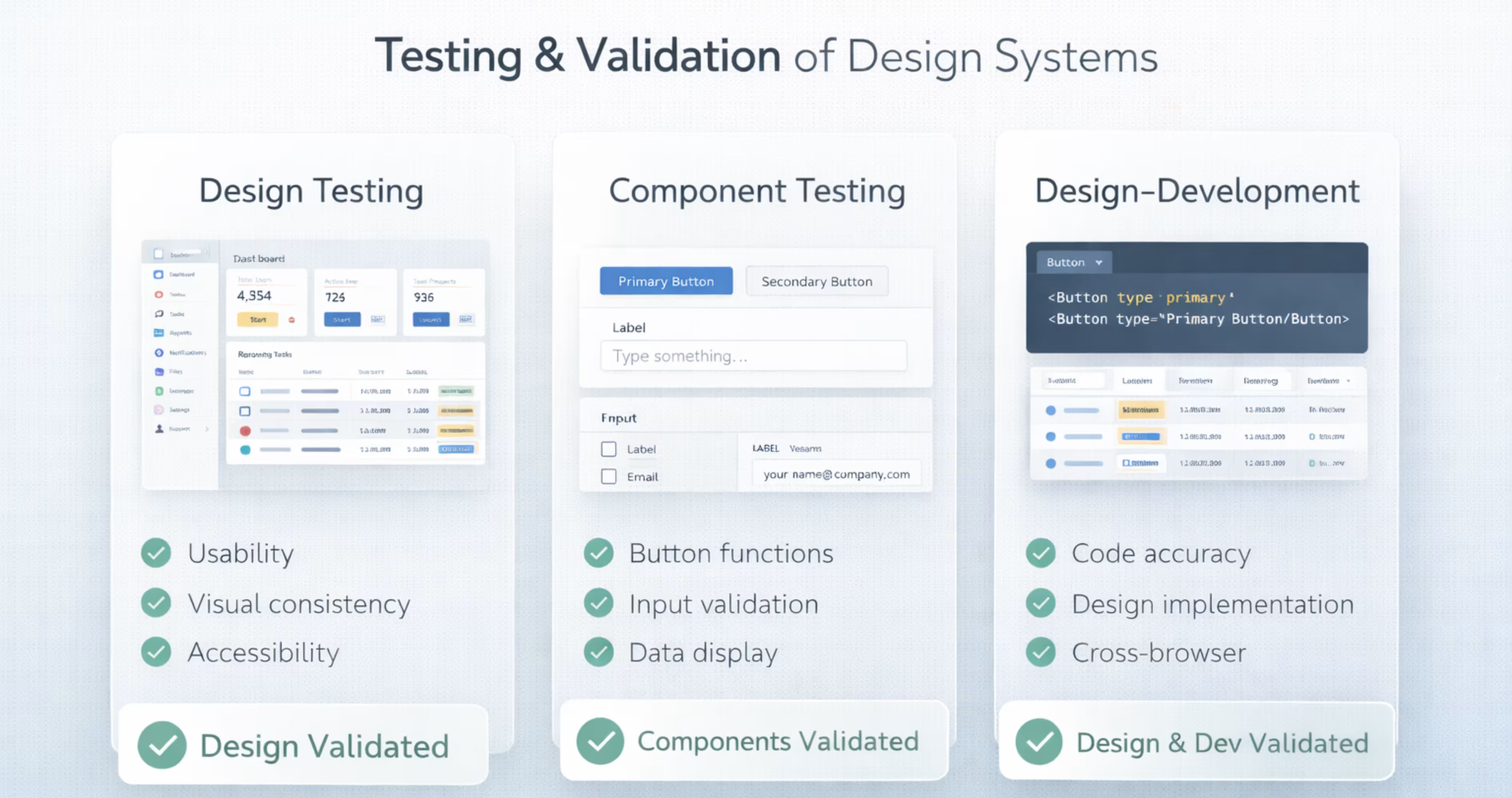
Testing and validating design systems make sure the design system is accessible and functional across platforms. It confirms that components are usable, accessible, and consistent across different platforms or screen sizes.
Here are three main areas to test and validate a SaaS design system:
Design Testing
The design testing checks whether the layouts work with real user workflows. SaaS products often contain complex data such as tables, dashboards and forms, so interfaces must stay clear, and easy to scan.
This testing involves reviewing screens in realistic scenarios to see if users can understand and navigate the design easily. It will make sure that the design system works for real usage, not just ideal layouts.
Component Testing
Component testing makes sure that each component works correctly in all its states and variations. This includes working in hover, active, disabled, loading, and different sizes.
As the components appear in many contexts across SaaS products, they must adapt consistently to different layouts and use cases. This component testing makes sure they remain usable and visually consistent wherever they are used.
Design-Development Testing
The design-development testing makes sure that the design matches the development implementation. This means matching the spacing, layout, colors, and typography that the product design has assigned.
It also needs to be checked whether the implemented design follows these rules correctly to produce a UI that properly reflects system states and expected outputs.
Another part of checking consistency is confirming that responsive behaviors, icons, and patterns in the product follow the same design rules assigned to them in the design system.
Common Design Mistakes to Avoid in SaaS Design Systems
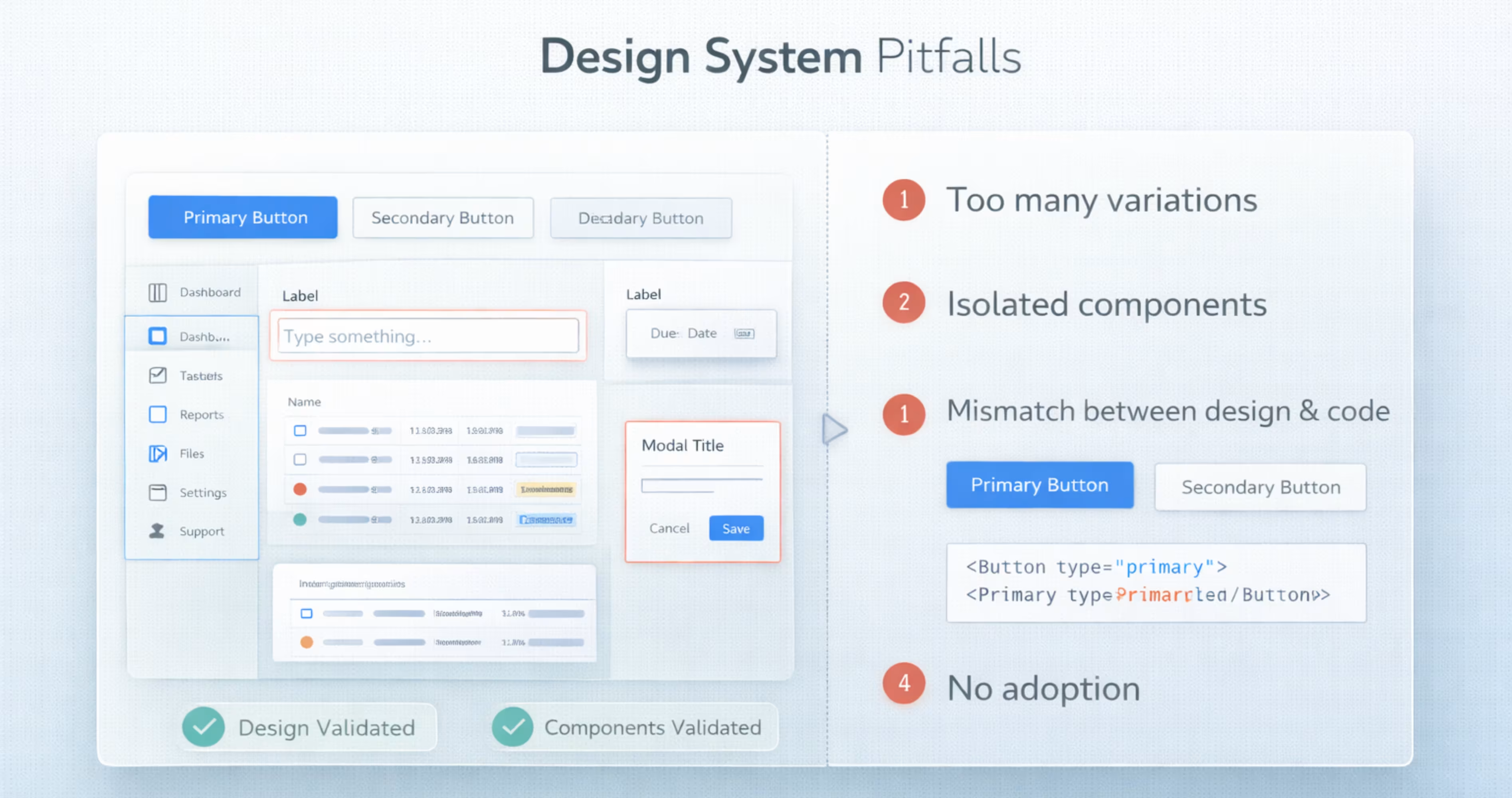
SaaS design systems can greatly improve product consistency and team efficiency. However, if they are created or used incorrectly, they can cause confusion instead of clarity. Here are common mistakes to watch for when building and maintaining a SaaS design system:
- Treating the design systems as just a UI kit instead of following the patterns and usage rules.
- Designing components in isolation without reviewing the product or user workflows.
- Adding too many size, color, style variations and exceptions in the design system.
- Design components not matching with coded components. This is where teams end up using UI inconsistently.
- Not adopting the design system across both design and development teams.
- No governance or maintenance after creating the design system. This causes teams to add new components outside the best practices.
Final Thoughts
Creating a design system can be highly effective for SaaS products, when used correctly. It can help SaaS teams produce consistent, scalable interfaces that improve the overall product quality.
By maintaining a well-structured design system, teams can scale product features more easily. It also keeps design and development teams collaborate across the product.
Frequently Asked Questions
How long does it take to build a SaaS design system?
A basic SaaS design system can take around 4-8 weeks to define foundations and core components. A more complete structure with patterns, documentation and engineering alignment may take 3-6 months.
What happens if a SaaS product has no design system?
Without a design system, the interface becomes inconsistent as the product grows. As a result, different screens start to use different buttons, spacing and typography without following any standard product alignment.
Where can I create a SaaS design system?
You can create expert SaaS design systems with expert support from design agencies like Orbix Studio. They use scalable design practices customized to the product for creating specific SaaS patterns and documentation that goes with development.
What makes a SaaS design system scalable?
A SaaS design system becomes scalable by building on reusable foundations and patterns that can support new features without redesigning UI each time.
Do developers need to follow the design system exactly?
Developers should follow the design system as a default approach, as it makes sure consistency across the product. However, if the design structure blocks real product needs, then teams can extend the system with a new component or variant.
Ready to simplify authentication in your app?
.avif)



















.avif)
