

- Best Figma UI kits are pre-built component libraries that give designers reusable, production-ready elements across every project.
- Choose by project type first: SaaS dashboard, mobile app, or design system then verify token architecture and dev stack compatibility.
- Designers who use UI kits without pairing them with the right plugins still spend 30–40% of their time on tasks that plugins automate in seconds.
A designer spending six hours building a button component from scratch is not being thorough. That is a workflow gap.
Figma UI kits exist to close it. But with over 4,770 kits listed in the Figma Community and hundreds of plugins in the marketplace, picking the wrong one costs more time than starting from nothing. A kit chosen for aesthetics instead of architecture gets abandoned in week two, once customization reveals the component structure was never built to scale.
In 2026, the gap between designers who work with structured kits and those who don't shows up directly in output speed and design consistency. Volume of options is not the problem. Direction is.
This guide covers the best Figma UI kits and plugins by category, with specific picks for SaaS dashboards, mobile apps, design systems, and free downloads. By the end, you'll know exactly which kit matches your project type and which plugins remove the busywork around it.
What is a figma ui kit?
A Figma UI kit is a pre-built component library inside Figma that gives designers production-ready elements: buttons, forms, cards, navigation bars, modals, icons, and full screen templates. Instead of building every component from scratch on each project, you pull from a library that is already structured, already styled, and already consistent.
A UI kit is not a static template. Figma UI kits are built on components and variants, so you can swap states, resize elements, and update your entire design by changing one master component. Changing a primary button color in the kit updates every button instance across every file linked to that library. That single behavior is what makes a good kit worth using across ten projects.
One concrete example: a SaaS team using Untitled UI can move from a blank canvas to a 12-screen dashboard prototype in under three hours. Without a kit, that same prototype takes two full workdays.
A kit's value lives in its architecture, not its aesthetics. A visually polished kit with weak component structure slows you down the moment you need to deviate from its defaults. A neutral kit with clean auto layout, token-connected styles, and properly named variants ships fast and adapts to any brand. Choose structure first, style second.
Why figma plugins and ui kits work better together
Using only a UI kit is like hiring a skilled architect and refusing to use power tools. Kits provide structure. Plugins remove every task that does not need a human decision.
Without plugins, designers using UI kits still manually rename layers, populate placeholder text with dummy content, check accessibility contrast by hand, and leave Figma to search for icons in separate tabs. Each of those steps interrupts flow. Across a full design sprint, those interruptions add up to hours.
Plugins solve each problem at the exact moment it appears. Design Lint catches inconsistencies the second you finish a screen. Content Reel fills every text and image placeholder with realistic names, emails, avatars, and cities in one click. Iconify delivers 150,000+ icons across 100+ icon libraries directly inside Figma without leaving the file.
Understanding the full UI/UX design process makes the role of each tool clearer. Kits handle structure and speed at the component layer. Plugins handle accuracy and automation around every design action. Combining both is where the real productivity gap opens between teams that ship weekly and teams that ship monthly.

Best Figma UI kits by category
Not every UI kit works for every project. A mobile app kit does not translate to a SaaS dashboard. A design system kit built for enterprise teams is overkill for a two-week landing page sprint. Here is where each category fits.
SaaS dashboard ui kits
SaaS dashboards need components built for data density: sortable tables, chart containers, stat cards, sidebar navigation, empty states, filter panels, and notification drawers. Generic UI kits do not include these. Dashboard-specific kits do.
Untitled UI ranks as the best option for SaaS products in 2026. Untitled UI includes 30+ component categories, auto layout built into every element, and a design token structure that lets you swap brand colors across the entire kit in under two minutes. A designer opening it for the first time can build a working dashboard layout in a single session.
Tailwind UI's Figma kit works directly with Tailwind CSS, making developer handoff cleaner. Developers recognize the components because they match the CSS utility classes the team already writes. Handoff friction drops when design mirrors the development stack exactly.
For a detailed breakdown of how to structure a SaaS dashboard from the ground up, covering hierarchy, empty states, and data-first layout decisions, the SaaS dashboard design complete guide covers every decision from nav structure to data visualization placement.
Mobile app ui kits
Mobile UI kits need to account for platform conventions, safe areas, gesture navigation, and smaller tap targets. A kit that ignores any of these forces you to rebuild every component before production.
iOS-style kits following Apple Human Interface Guidelines give you pre-built native components: bottom sheets, tab bars, action sheets, swipe gestures, and scroll views with correct inset handling. Android kits following Material Design 3 include M3 design tokens, dynamic color support, and component-level theming that maps directly to Android's theming API.
Choosing between iOS and Android conventions early changes which kit you need. For mobile-specific layout decisions beyond component choice, the Figma mobile app design guide covers how to structure frames, handle device previews, and prepare assets for both iOS and Android developer handoff.
Design system kits
Design system kits go beyond individual components. Full token architecture is what separates a design system kit from a regular UI kit: color tokens, spacing tokens, typography tokens, and shadow tokens that propagate changes across every component automatically. Changing one token updates every element that references it across every linked file.
Shadcn's Figma kit has gained traction with engineering-led teams because its component structure mirrors the actual Shadcn UI library in React. Designers and developers work from the same component model. That alignment removes an entire category of handoff confusion, specifically the gap between what a component looks like in Figma and how it behaves in code.
If you are building a design system from scratch for a SaaS product, the Design Systems 101: SaaS guide explains token architecture, component hierarchy, and how to scale a design system as the product team and codebase both grow.
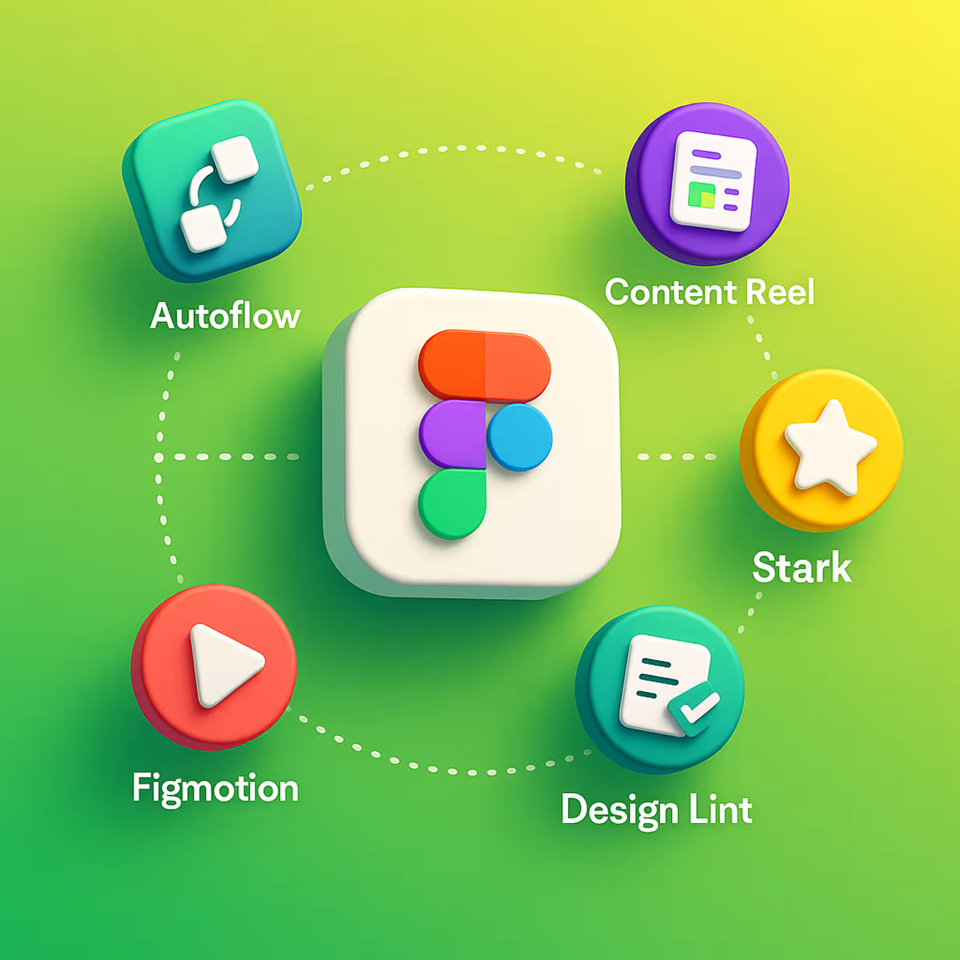
Top Figma plugins that belong in every design workflow
Plugins are not extras. Removing them from a professional workflow means doing manually what Figma is built to automate. Here are the six that belong in every designer's permanent toolkit.
Autoflow - map user journeys without leaving figma
Autoflow draws connection arrows between frames with a single keyboard shortcut. Point from one screen to another, and Autoflow renders a clean directional arrow with configurable labels and step numbers.
Before presenting a flow to stakeholders, converting Figma frames into a readable journey map takes 30 seconds with Autoflow. Without it, the same task involves manual line drawing, three rounds of alignment corrections, and a file that looks nothing like a clean flow diagram.
Knowing when a flow diagram is the right deliverable versus a wireframe or a prototype shapes which tool to use. For a clear breakdown of where each belongs, the prototype vs wireframe vs mockup guide explains how each fits into the design process and when stakeholders need which format.
Content Reel - fill designs with real-looking data
Content Reel populates every text placeholder and image frame with realistic content: full names, email addresses, profile photos, cities, and job titles. One click replaces "Lorem ipsum" across an entire screen.
Designs with realistic data get more actionable feedback in client reviews. Stakeholders engage with what looks real. A screen showing "Jane Morris, Product Lead, jane@company.io" gets real feedback about information hierarchy. A screen showing "User Name, Role, email@placeholder.com" gets feedback about fonts.
Design Lint - catch inconsistencies before they reach developers
Design Lint scans every frame in your file and flags elements that do not match your design system: missing text styles, undefined color variables, unlinked components, and misaligned spacing.
Running Design Lint before a handoff session catches the category of errors developers raise repeatedly in inspect mode. Fixing them inside the design file takes seconds. Fixing them post-handoff means a back-and-forth loop that breaks sprint momentum.
Iconify - 150,000+ icons, zero tab switching
Iconify brings icon sets from Material Design, Feather, Phosphor, Radix, Heroicons, and over 100 other libraries directly into Figma. Search by name, filter by visual style, and drop a clean SVG icon into your design without leaving the file.
Switching between Figma and an external icon site costs more than the seconds spent. Every context switch interrupts flow. Iconify keeps the entire icon search inside the tool where the design lives.
Figmotion - add motion without exporting to after effects
Figmotion lets you define micro-interactions, easing curves, transitions, and animation timings directly on Figma frames. No export to After Effects. No round-trip between tools.
Animations communicate interaction intent in ways static screens cannot. A button press state, a loading skeleton sequence, or a slide-in modal tells developers exactly how a component should behave during user interaction, not just how it should look at rest.
Stark - wcag accessibility checks built into your file
Stark checks color contrast ratios, simulates eight types of color blindness, and flags text that fails WCAG 2.2 AA standards before the design leaves Figma. Accessibility failures caught in the design file cost seconds to fix. Accessibility failures discovered in production QA cost days and sometimes delay a launch entirely.
For teams building products at WCAG 2.2 AA compliance level, Stark turns an audit that previously required a separate tool into a real-time check inside the design workflow.
Free Figma UI kits worth downloading in 2026
Paid UI kits offer broader component coverage and active maintenance cycles. But three free kits justify a download before committing to a paid option, each for a specific reason.
Figma's Community Starter Kit ships directly from Figma and covers foundational components: buttons, inputs, checkboxes, toggles, modals, and basic navigation patterns. Downloading it first helps you understand how a well-structured kit organizes its component page before evaluating premium alternatives.
Open Design System by Adobe includes 200+ components built on accessible defaults. Color contrast ratios meet WCAG 2.1 AA out of the box across every component. For teams shipping accessible products from day one, this is the free starting point that removes the most rebuild work.
Material Design 3 Figma Kit comes from Google and reflects the current M3 specification. Every component includes state layers, dynamic color support, and Android-specific layout guidance built in. For Android-first mobile apps, this kit removes weeks of component-building work before a single design screen is created.
How to choose the right Ffigma ui kit for your project
Choosing a Figma UI kit based on visual style first is the single fastest way to pick a kit you'll abandon in week two.
Start with project type: SaaS dashboard, mobile app, marketing site, or design system. Each type has a different component density requirement. A marketing site kit has no data tables. A dashboard kit has no hero section. A mobile kit has no desktop-scale navigation patterns. Mismatched project types create gaps that no amount of custom component building recovers cleanly.
Second, check component architecture before downloading. Open the component page and look for three specific things: Are components built with auto layout? Are text and color styles connected to a global library? Are variants labeled clearly with state names like Default, Hover, Active, and Disabled? A kit that passes all three works at scale. A kit that fails any one creates structural debt the moment you need to customize beyond its defaults.
Third, confirm handoff compatibility with your development team. If your developers build with Tailwind CSS, a kit using Tailwind tokens cuts handoff clarification time. If they build with Shadcn UI, a kit matching that component structure removes the translation layer between design and code entirely.
Fourth, check the maintenance date. A kit last updated in 2022 does not account for Figma's variables system, which launched in 2023, or the dev mode handoff improvements that followed in 2024. Variable support is non-optional for any kit used across multiple projects. Kits built before the variables update require manual workarounds for every token-level change.
At Orbix Studio, the pattern we see with design teams that keep rebuilding the same components across projects is a consistent one: they chose a kit for its visual style and discovered the architecture was incompatible with their development stack two weeks in, after the rebuild cost had already been paid.
Frequently asked questions
What is a Figma UI kit and how does it work?
A Figma UI kit is a pre-built component library inside Figma containing reusable design elements: buttons, inputs, cards, navigation patterns, and full screen templates. Components use auto layout and variables, so updating one master element updates every instance across your entire design file automatically.
What is the difference between a Figma plugin and a UI kit?
A Figma UI kit provides design structure: pre-built components, layouts, and connected style libraries. A Figma plugin automates design tasks: filling placeholder content, checking accessibility contrast, drawing flow arrows, or importing icons. Kits give you the building blocks. Plugins remove the manual work around using them.
Are there free Figma UI kits worth using professionally?
Yes. Figma's own Community Starter Kit, Google's Material Design 3 kit, and Adobe's Open Design System are free and actively maintained by their original teams. Each targets a specific use case: Material 3 for Android apps, Open Design System for accessible products, and the Community Starter Kit for foundational component exploration.
Which Figma UI kit is best for SaaS dashboards?
Untitled UI ranks as the strongest option for SaaS dashboards in 2026. Untitled UI covers 30+ component categories, includes full auto layout, supports design tokens, and organizes its component page by pattern type. Tailwind UI's Figma kit works best for engineering-led teams already building with Tailwind CSS.
How do Figma plugins improve accessibility in UI design?
Stark checks color contrast ratios against WCAG 2.2 AA standards, simulates eight visual impairment types, and flags failing text elements directly in Figma. Catching and fixing contrast failures inside the design file costs seconds. Catching them in production QA costs days and can delay a product launch.
Can I use multiple Figma UI kits on the same project?
Mixing two full component kits creates token conflicts and visual inconsistency within a few sprints. One primary kit plus one icon-focused kit, such as Iconify, is the practical limit. Using two full component kits means two different spacing systems, two type scales, and two color token sets competing across every file.
How often should a Figma UI kit be updated?
A production Figma UI kit needs a review whenever the product adds a new component type or when Figma releases a major feature update. Figma's variables system (2023) required kit-wide updates across all token-dependent components. Kits untouched for 18+ months typically lack variable support and compliant auto layout in newer components.
Conclusion
Picking the right Figma UI kit is not about finding the best-looking one. Architecture, token structure, and dev stack compatibility determine whether the kit saves time across ten projects or gets abandoned midway through the first one.
Start with project type, verify component architecture before downloading, confirm stack compatibility with your developers, and pair the kit with the plugins that automate every task around it. Get those four decisions right, and the kit pays for itself inside the first sprint.
Want to go deeper on UI/UX design for your product? Orbix Studio works with SaaS founders and product teams on full-stack UI/UX design, from design systems to shipped interfaces.
Schedule Your Free Consultation
.avif)


%20(1).avif)