Wink Shopping Website


.svg)
Wink is a high-end fashion e-commerce platform designed to merge premium retail aesthetics with smart technology.
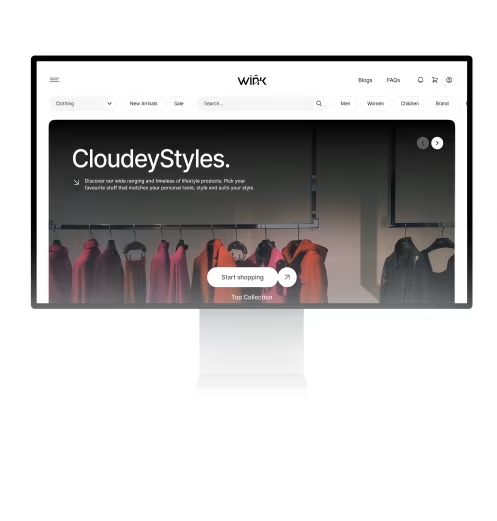
We were tasked with translating a premium physical retail experience into a frictionless digital environment. Users needed an intuitive way to browse collections and complete purchases with confidence, while the Wink operations team required a centralized dashboard to track orders and oversee customer data without complexity.
Creating a Premium Fashion Experience Without Making Shopping Feel ComplicatedThe main challenge was building a fashion shopping experience that felt premium and visually polished while still keeping browsing, shopping, and management simple for users and the internal team.
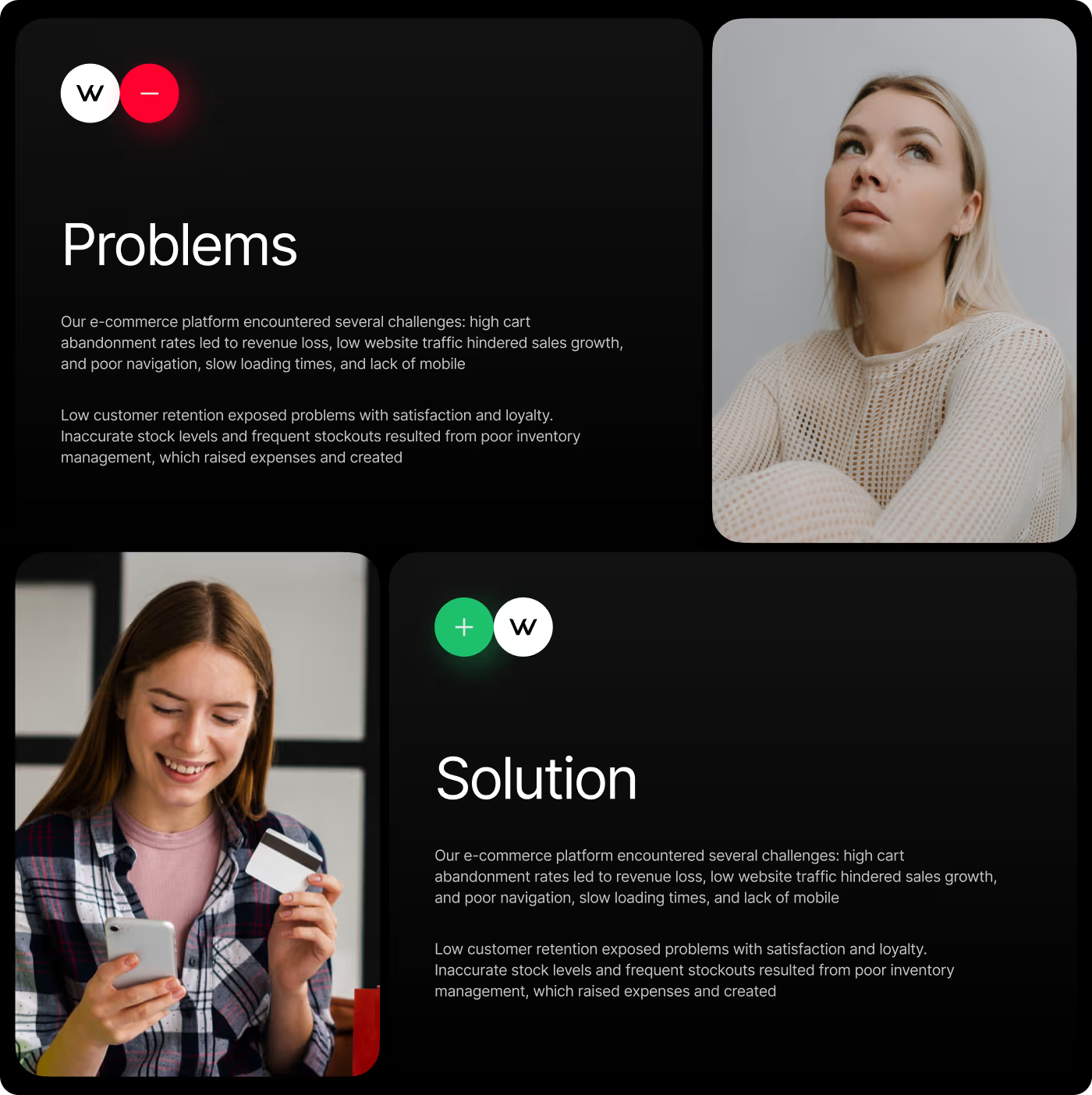
- Generic Shopping Experience: The platform did not feel unique or visually connected to a premium fashion brand.
- Product Discovery: Users needed a clearer and easier way to browse collections, pricing, and product details.
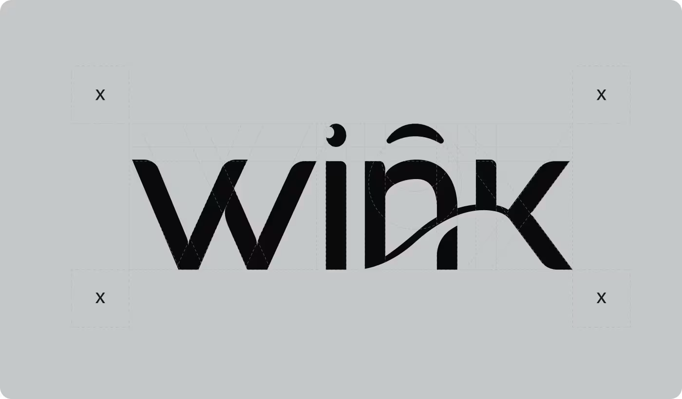
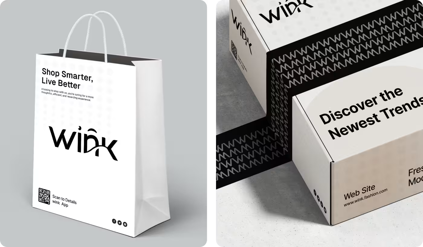
- Brand Consistency: The website, mobile experience, and physical brand materials lacked a unified visual direction.
- Backend Management: Managing products, customer activity, and orders needed a more organized and centralized workflow.
Building a Cleaner and More Connected Fashion Shopping Experience
We redesigned the shopping experience to feel more premium, visually organized, and easier to navigate while also creating a unified system for both customers and the internal management team.
- Simplified Shopping Flow: We created a clearer browsing and checkout experience to help users move through the platform more naturally.
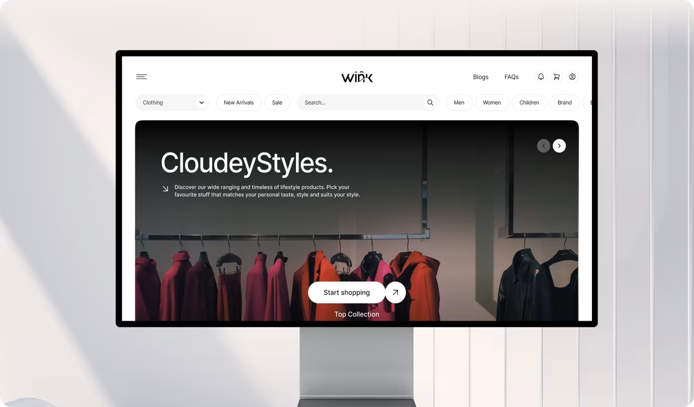
- Premium Visual Direction: We designed a clean and minimal interface that kept the focus on the fashion products and brand identity.
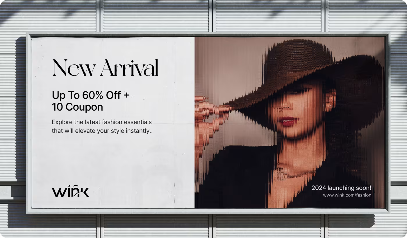
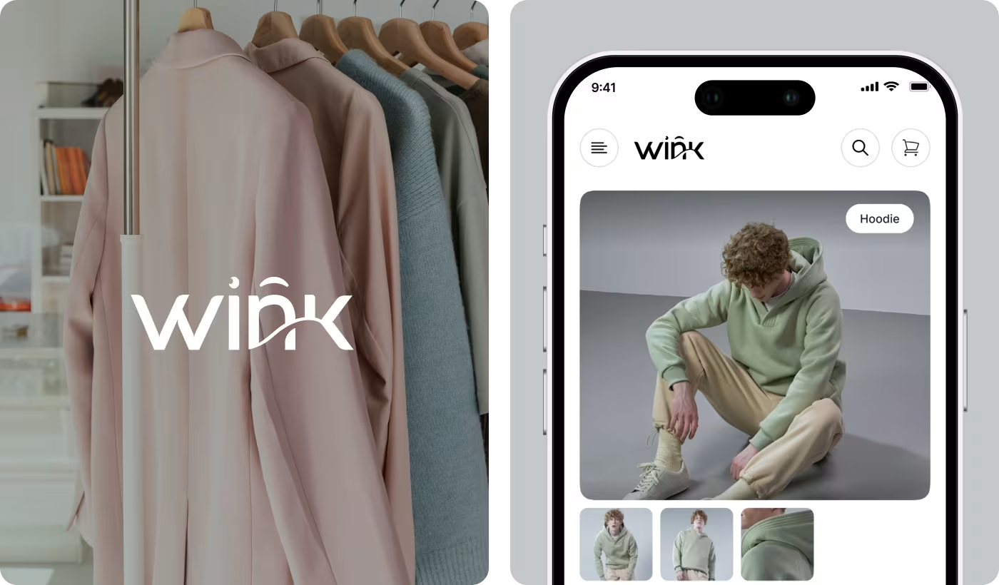
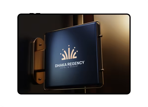
- Unified Brand Experience: We built a consistent visual system across the website, mobile screens, packaging, and promotional materials.
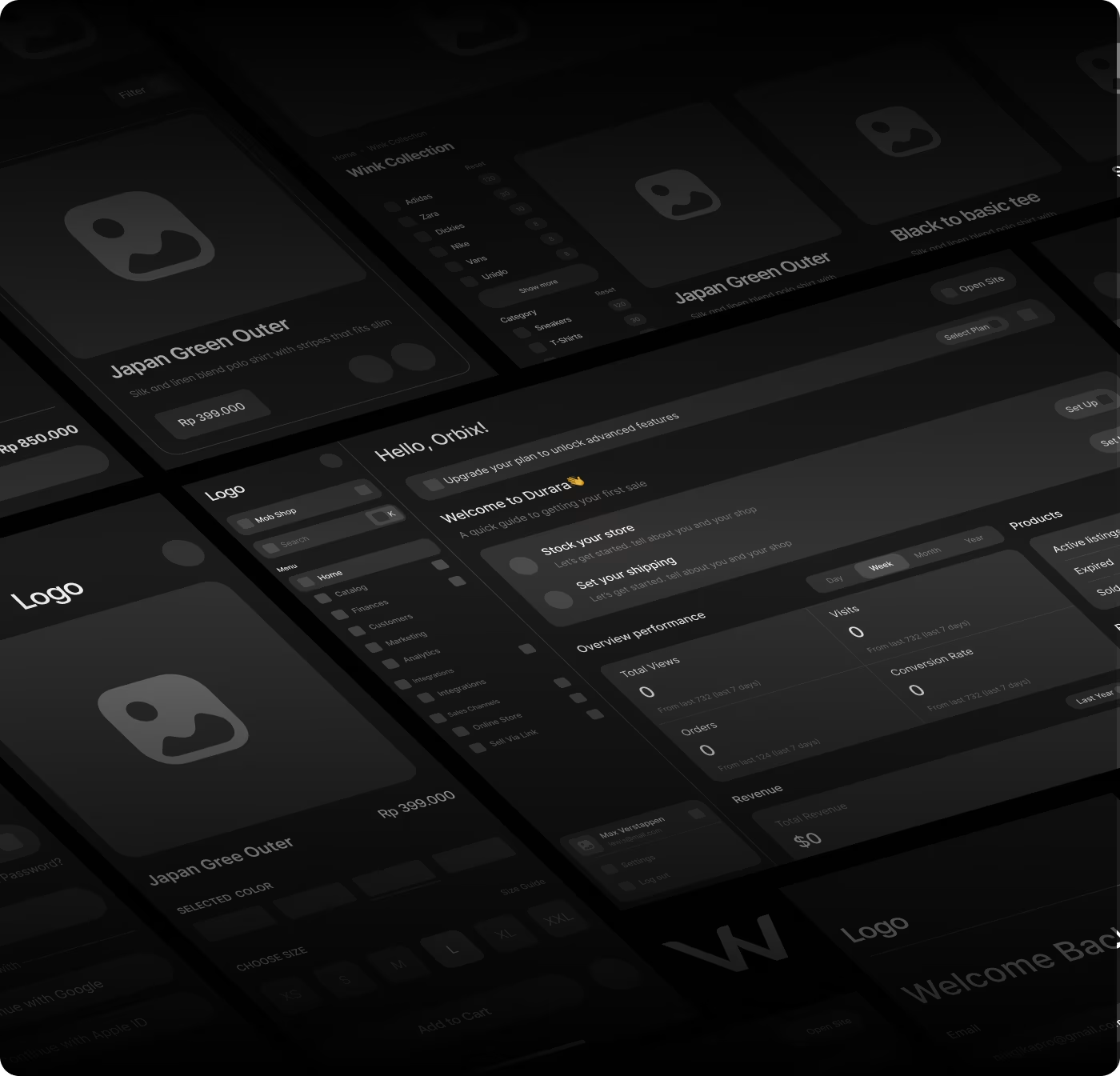
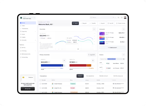
- Organized Backend System: We designed a structured admin dashboard to make product, order, and customer management easier for the internal team.
Designing a More Connected Fashion Shopping Experience
- User flow review
- Product discovery
- Navigation clarity
- Experience mapping
- Minimal layouts
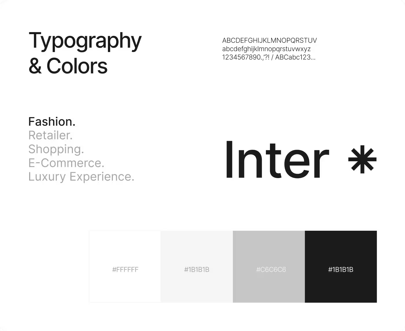
- Typography system
- Brand consistency
- Product-first visuals
- Dashboard structure
- Order tracking
- Product management
- Workflow clarity
- Checkout flow
- Interaction polish
- Cross-platform consistency
- UI refinement
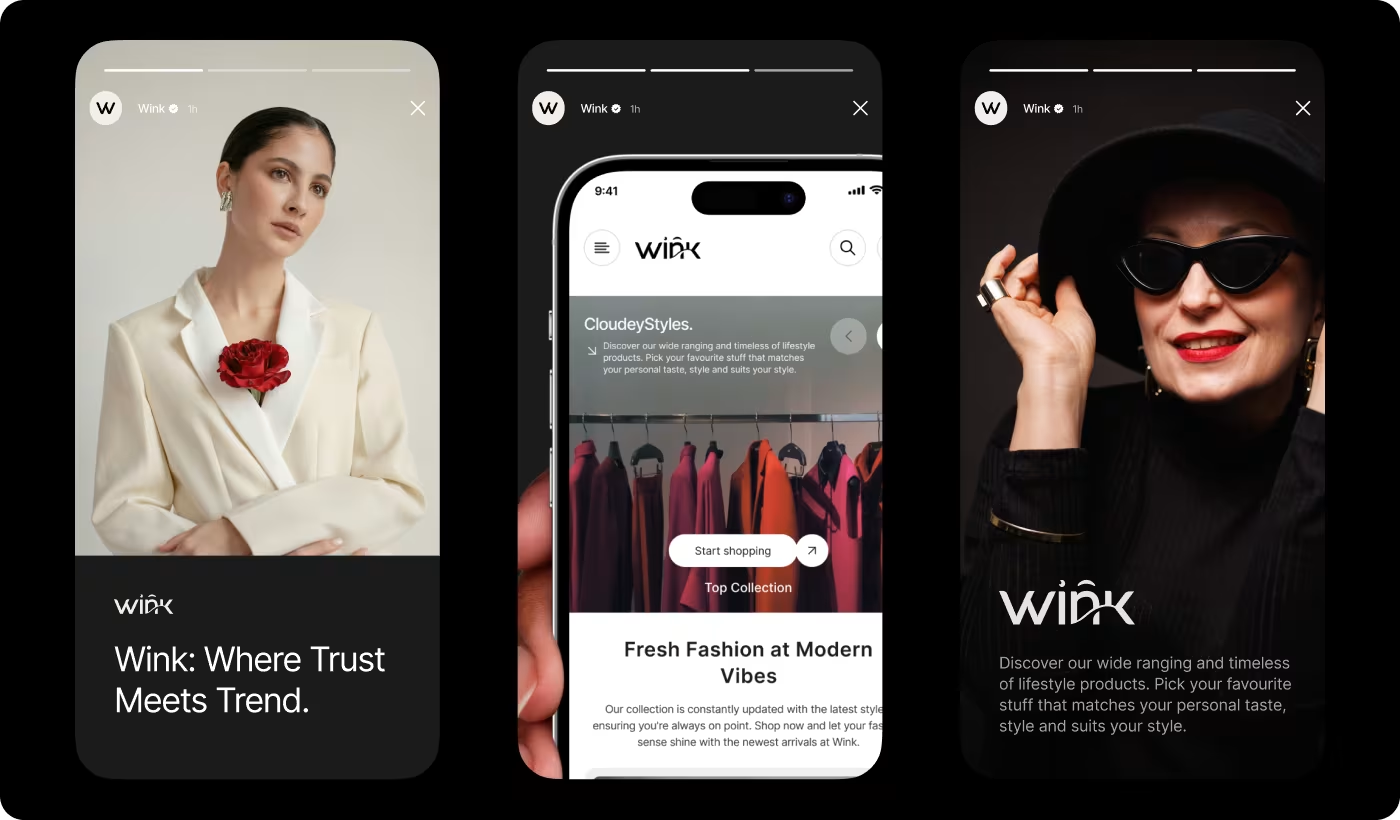

Understanding How Users Explore Premium Fashion Online
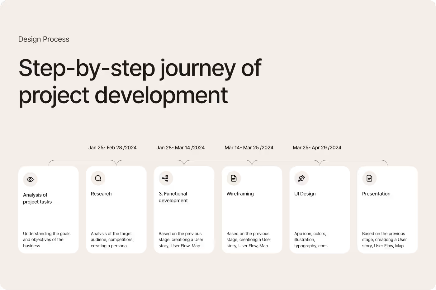
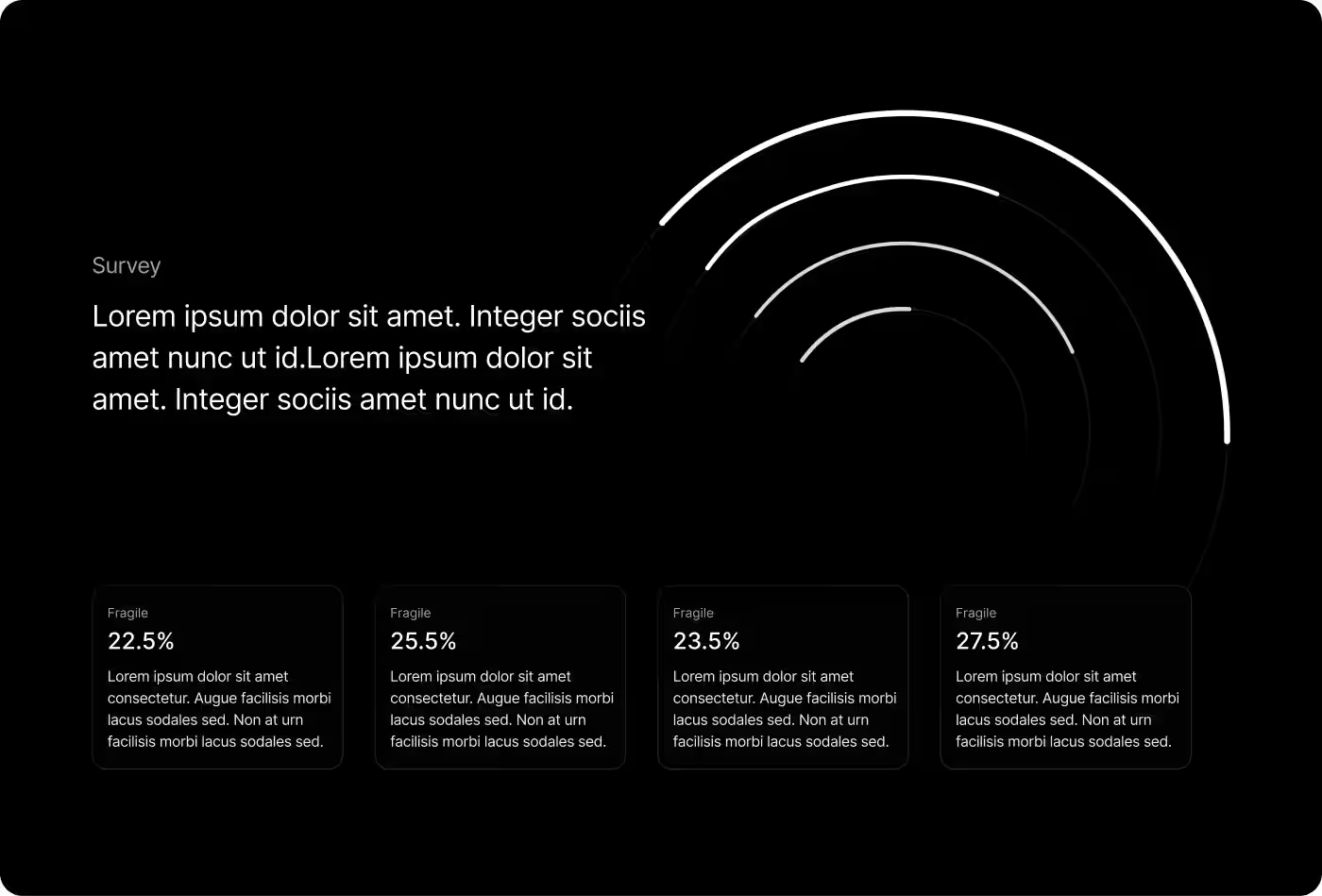
The research focused on how users browse fashion products, what builds trust during shopping, and how the overall experience could feel more premium without becoming complicated.
- Shopping behavior review: Users preferred cleaner browsing experiences with less visual clutter.
- Product presentation study: Large imagery and clearer layouts helped products feel more premium and easier to explore.
- Navigation research: Simple category structures made product discovery faster and less confusing.
- Backend workflow analysis: Managing products and orders needed a more organized and centralized system.

.avif)
Creating a Simpler and More Premium Shopping Journey
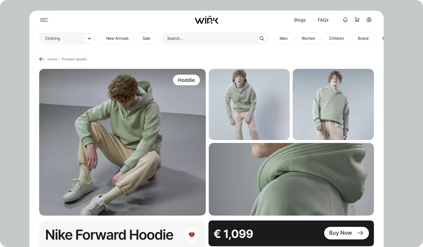
The shopping experience was redesigned to make browsing feel cleaner, calmer, and easier to follow. Product discovery, navigation, and checkout flows were structured in a way that reduced visual noise while keeping important information easy to access.
A more product-focused layout helped the clothing and imagery stand out naturally without overwhelming the interface. Spacing, hierarchy, and content organization were refined to guide users through the experience more smoothly from homepage to purchase.
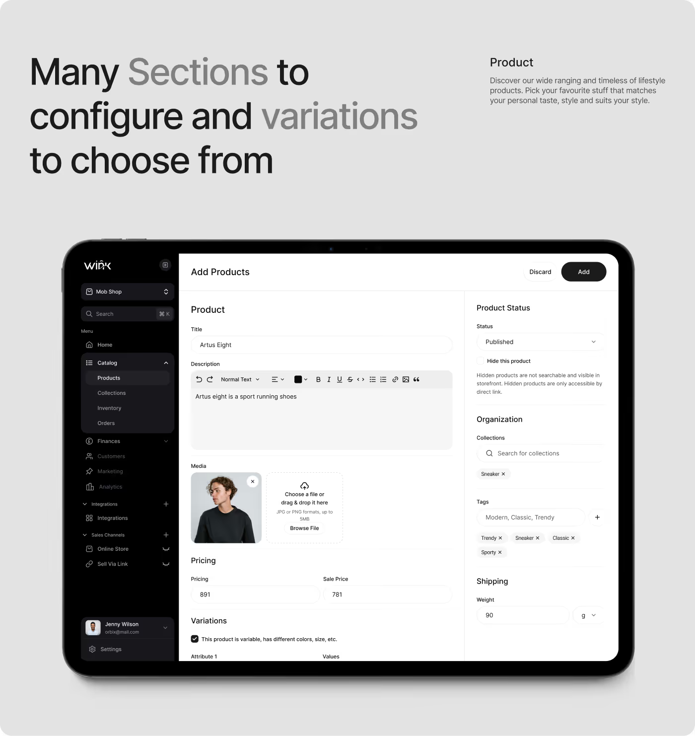
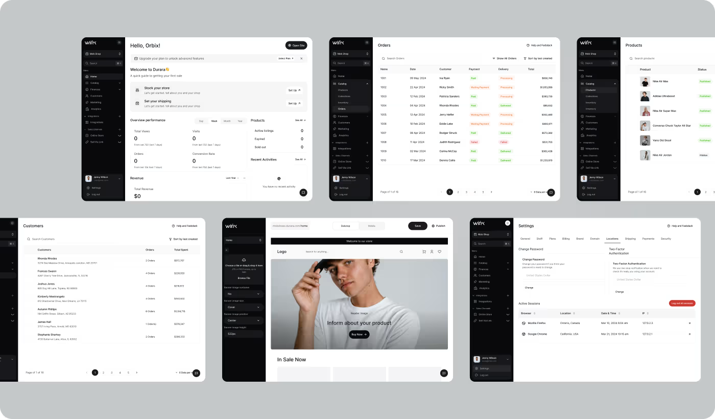
Building a More Organized System for Daily Operations
Alongside the customer-facing experience, the project also included designing a structured backend system for managing products, orders, and customer activity. The goal was to make internal workflows easier to navigate and less time-consuming for the team.
The dashboard experience was designed with clearer layouts, organized data sections, and simplified navigation patterns. Information was grouped more thoughtfully so daily tasks could be handled without unnecessary complexity.
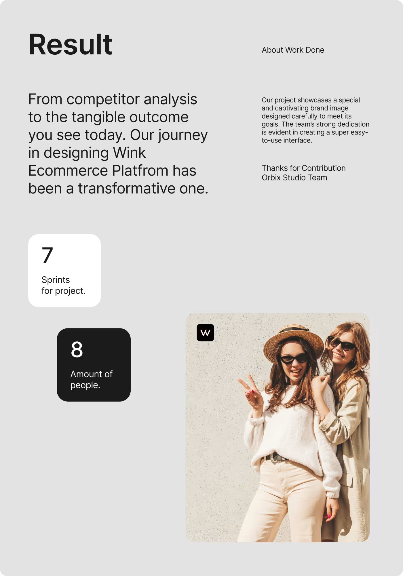
Creating a More Premium and Connected Shopping Experience
The final experience helped the brand feel more consistent across digital and physical touchpoints while making shopping, browsing, and backend management simpler and more organized for both users and the internal team.
- Improved product visibility: Cleaner layouts and larger imagery made products easier to explore and compare.
- Stronger brand consistency: The same visual direction was carried across the website, mobile experience, packaging, and promotional materials.
- Smoother shopping flow: Simplified navigation and checkout interactions helped reduce unnecessary friction during browsing and purchasing.
- Faster backend management: A more structured dashboard system helped organize products, orders, and customer activity in one place.
Ready To Build
Your Next Project?
.avif)


%201%201.svg)


.svg)


.svg)

.svg)

.svg)
.svg)


.svg)







.avif)



.svg)

