


Zypo Electric Bike Branding

.svg)
Zypo Electric is an emerging brand in the urban e-mobility space, dedicated to creating electric bikes and scooters that make city commuting effortless and enjoyable.
Our task was to build a complete visual identity for Cardboard Stage. The brand needed to clearly state its purpose as an "Agency of Human Movement." We had to design a system that felt active and alive, while remaining structured enough to be applied consistently across different materials by the Orbix Studio team.

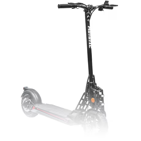
Weak brand presence
The main issue was simple: Zypo looked functional, but the brand identity did not feel memorable, clear, or strong enough to stand out.
- Low brand recognition: Zypo did not have a distinct enough identity to stand out in a crowded electric mobility market.
- Weak product-brand match: Product looked modern, but branding did not reflect the same energy, style, or quality.
- Inconsistent visual system: Brand lacked a clear visual language that could work across product, marketing, and digital touchpoints.
Unclear audience impression: Overall identity did not clearly communicate what kind of experience it meant to represent.
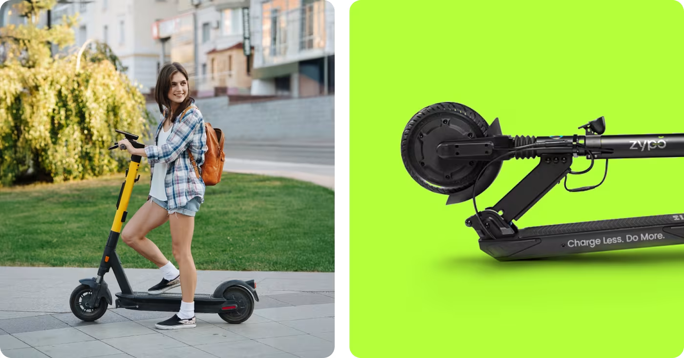
Shaped a clearer brand direction
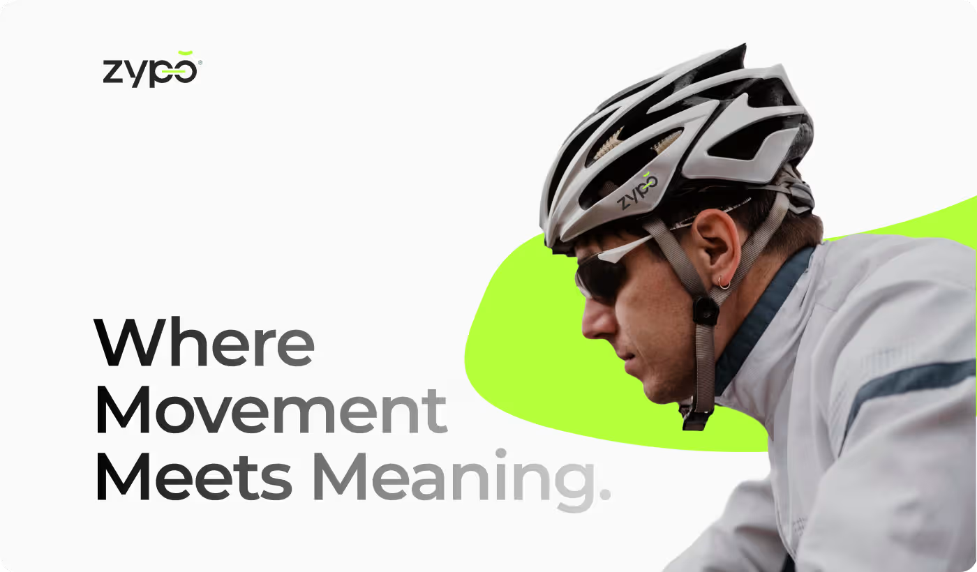
We built a cleaner, stronger brand identity that made Zypo feel more modern, consistent, and easier to recognize.
- Refined visual identity: Created a look that felt sharper, cleaner, and more distinct.
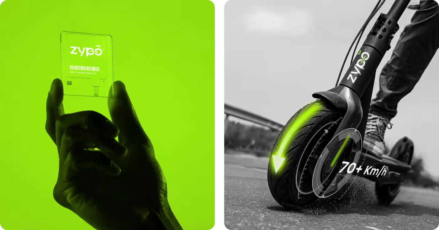
- Aligned brand with product: Made branding feel closer to the product’s modern and active character.
- Built a consistent system: Defined colors, type, and layouts that worked together clearly.
Added stronger personality: Gave the brand a more confident and memorable presence.
Branding process behind Zypo
- Brand review
- Product positioning
- Visual gap analysis
- Market references
- Mood exploration
- Tone setting
- Color direction
- Early concept routes
- Logo refinement
- Typography system
- Color palette
- Visual language
- Product branding
- Campaign layouts
- Marketing visuals
- Consistent rollout

Research behind the brand direction
We looked at the market, the product, and the visual space around urban mobility to understand what kind of brand would make Zypo feel more clear and more distinct.
- Category review: Looked at how other electric mobility brands present themselves and where they start to feel repetitive.
- Product reading: Studied the form, feel, and character of the product to shape a brand that fit it better.
- Visual pattern check: Noticed that many brands leaned too technical or too generic, which made them harder to remember.
- Brand opportunity: Found room for a cleaner, more energetic identity that could feel modern without losing clarity.
.avif)
Clearer brand direction
Zypo needed more than a good-looking identity. It needed a clearer brand idea behind it. This service helped define how the brand should come across, what kind of space it should own, and why it should feel different from other mobility brands.
From there, the project got a stronger base. Instead of making design decisions just for style, every choice could support a more focused and believable brand direction.

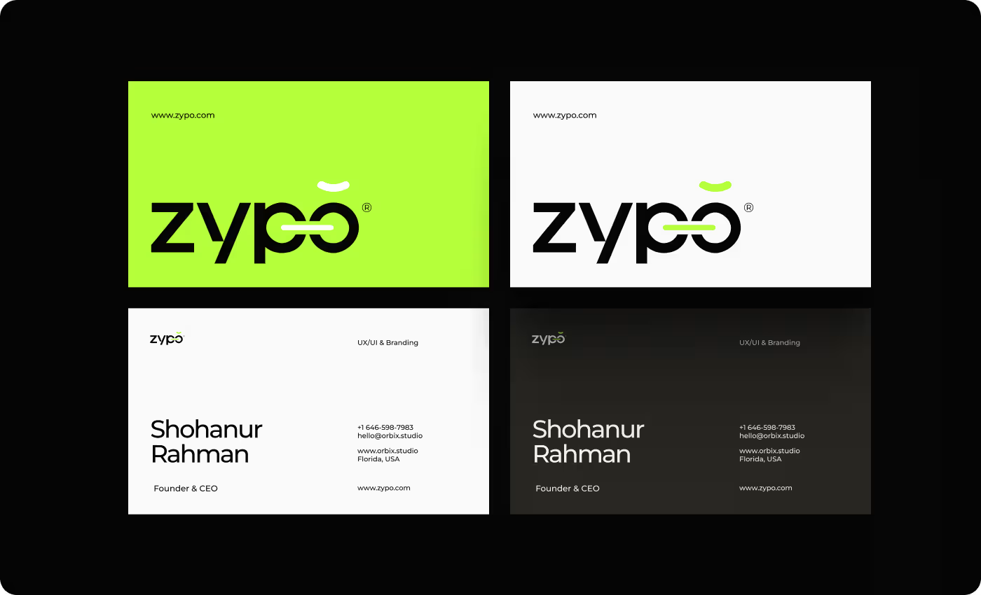
A sharper visual system
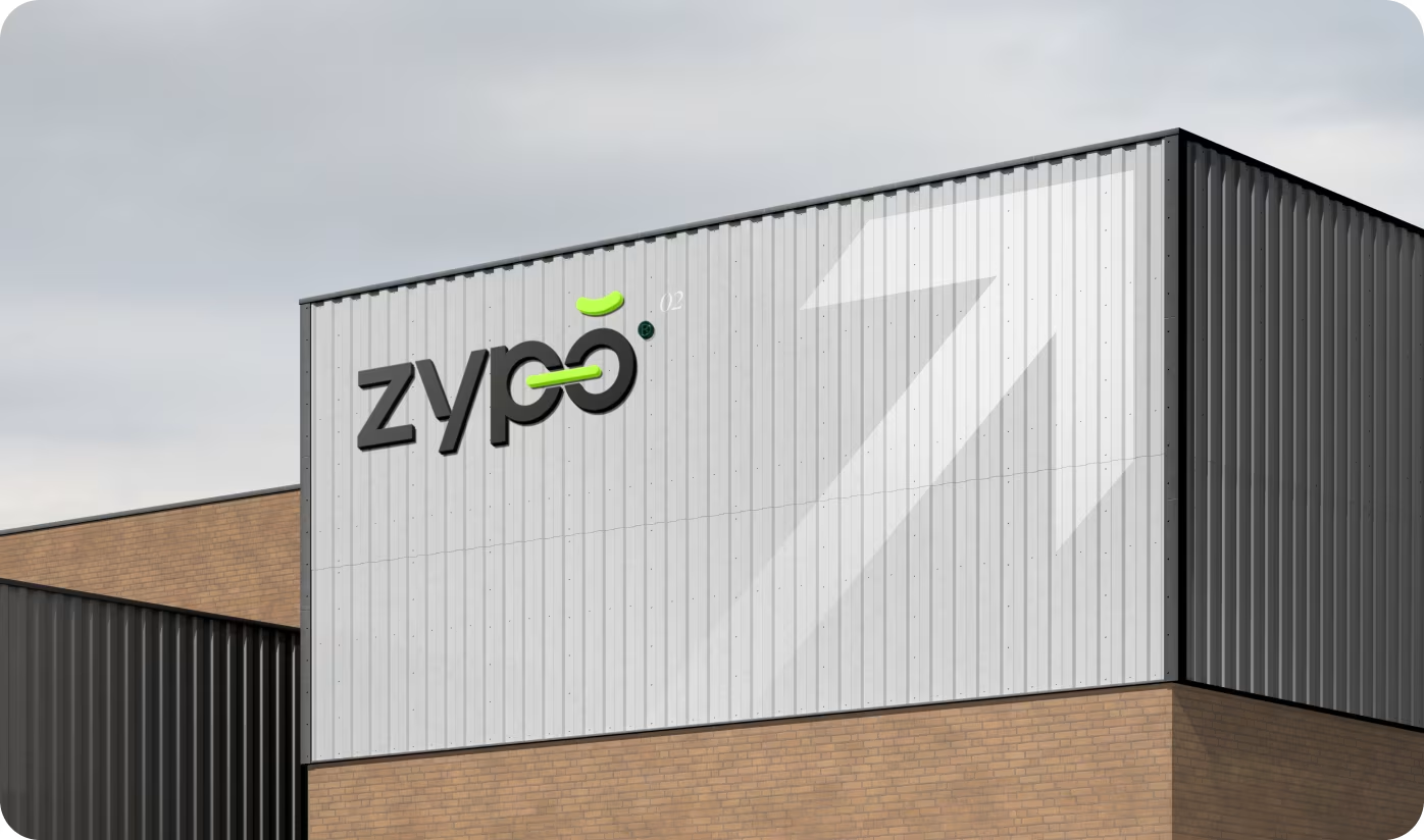
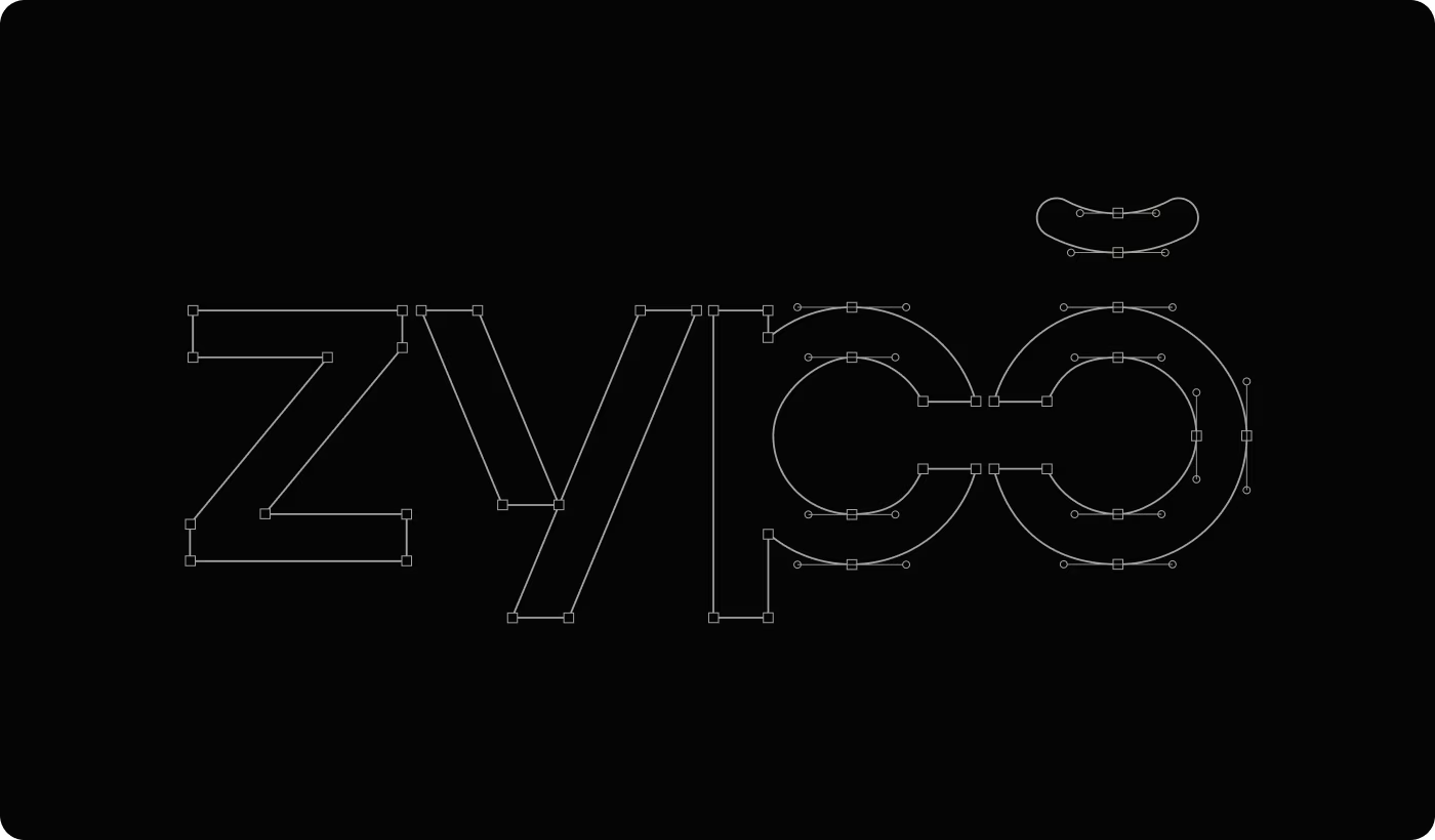
Once direction was clear, identity work turned that into something visible. This included the logo, color palette, typography, and the overall look across brand touchpoints.
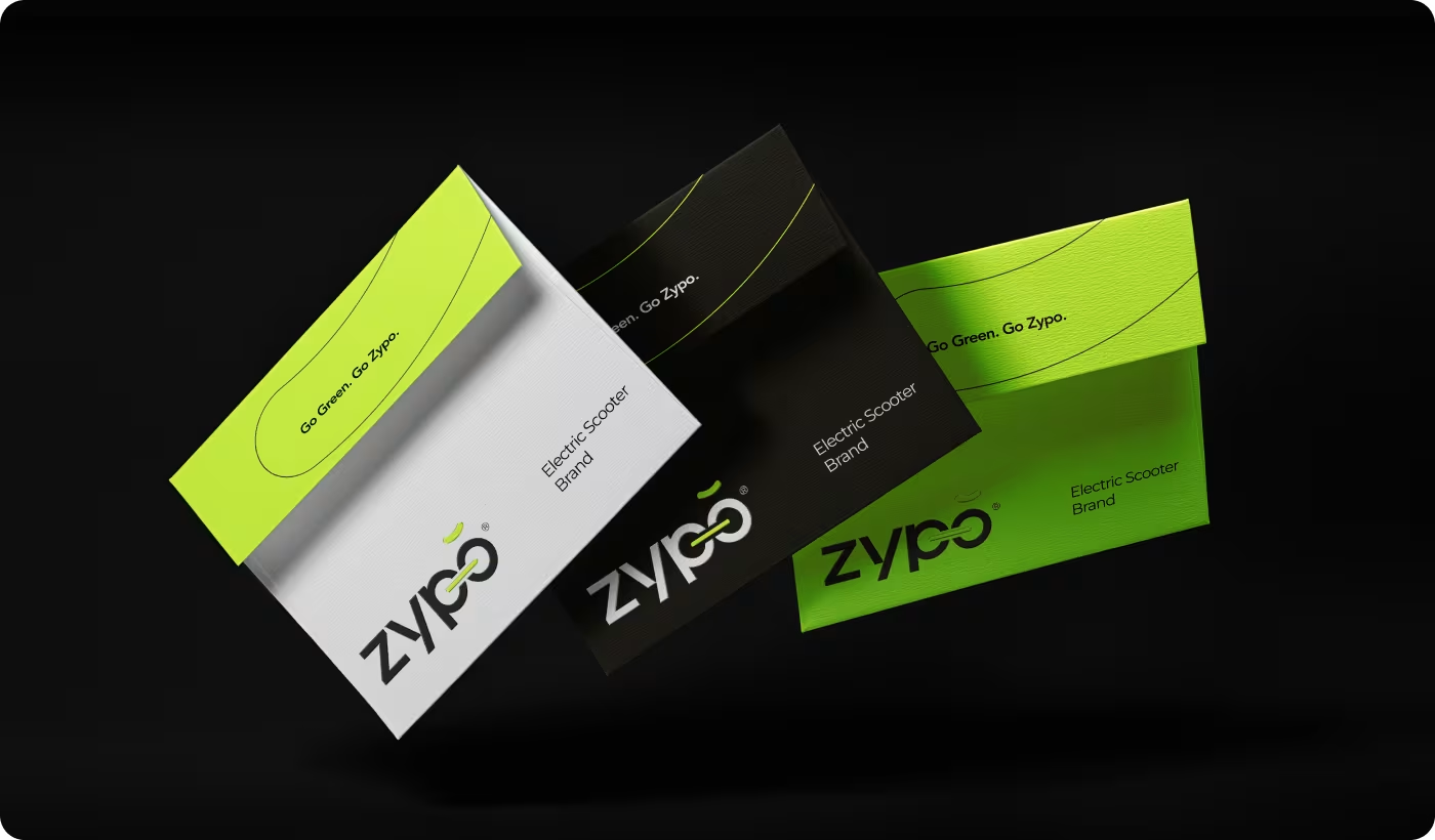
Our goal was to make Zypo feel sharp, current, and easy to recognize. The final system brought more consistency to the brand and gave the product a look that felt much more connected to its character
.avif)
A brand that felt clearer and more complete
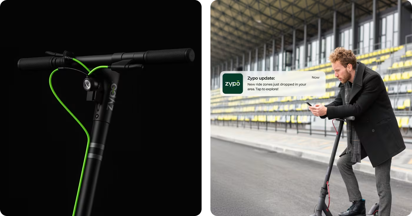
The project helped move Zypo from looking like just a product to feeling more like a real brand with a clear visual presence and a stronger point of view.
- More defined brand presence: Identity felt more intentional and easier to understand at a glance.
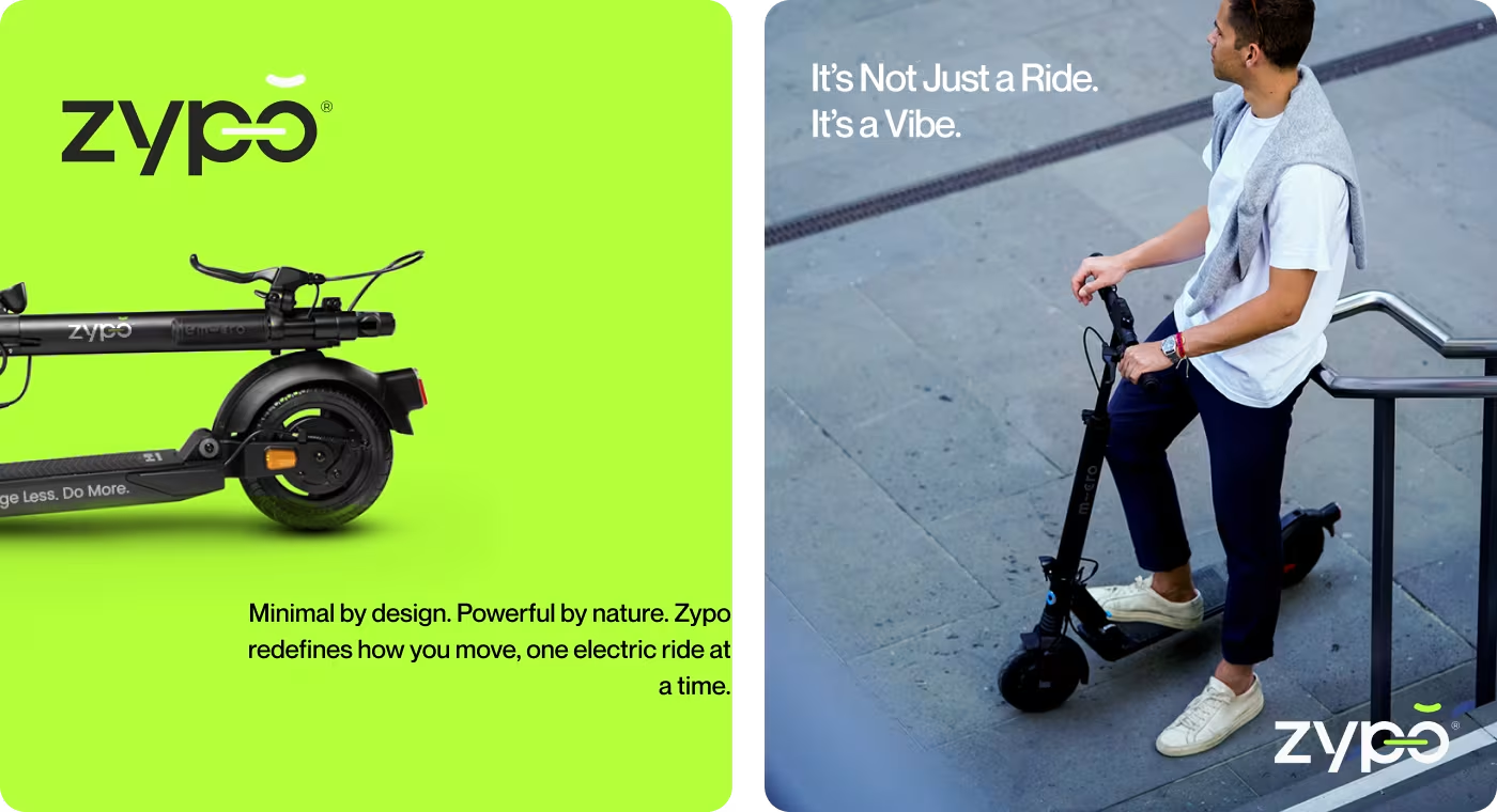
- Improved visual consistency: Logo, color, and layout style created a more connected brand experience.
- Stronger market distinction: Brighter color contrast and cleaner direction helped separate Zypo from more generic-looking mobility brands.
- Wider brand flexibility: System was strong enough to work across multiple formats and future brand use.
Got a project in mind? Let's build it
.avif)


.svg)


.svg)

.svg)

















.avif)
