Table of Contents
- What Makes a Good Dental Website?
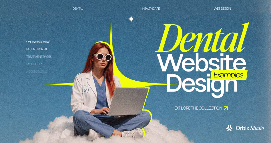
- Best Dental Website Design Examples by Practice Type
- 1. Premier Arts Dental: Bold, Personality-Driven Dental Branding
- 2. Prism Oral Surgery & Implants: Specialist Dental Clinic Website Design
- 3. Dental Boutique: Calming Design for Anxious Patients
- 4. Airily Orthodontics: Minimal Dental Web Design That Guides the User
- 5. Brooks Pediatric Dentistry: Family-Friendly Design for Parents and Kids
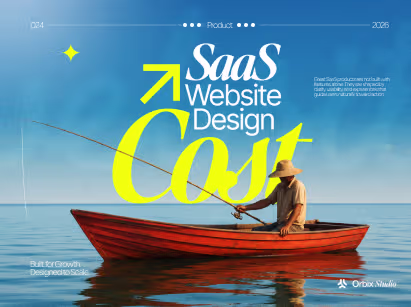
- Dental Website Design Cost
- Frequently Asked Questions
- Final Thoughts


- A good dental website should build trust before a patient calls.
- Clear CTAs help turn visitors into booked appointments.
- Each practice type needs a different design approach.
- Mobile speed and easy booking matter for new patient growth.

A patient with tooth pain, dental anxiety, or questions about implants will not wait long for a slow or confusing website. If your site does not feel clear and trustworthy, they may simply choose the next practice.
Strong dental website design helps your practice make a confident first impression before the consultation begins. It shows who you are, what you treat, and why patients should trust you with their care.
Here, we’ll review real dental website examples and the lessons behind them. You’ll see what works for different practice types, how to structure treatment pages, and which design choices help improve booking, trust, and new patient acquisition.
What Makes a Good Dental Website?
The best dental websites do more than look polished. They help patients understand their options, feel more confident, and know exactly how to book.
In plain language, dental website design is how your practice presents services, trust, patient education, and appointment access online. It includes layout, mobile usability, treatment pages, page speed, branding, SEO, and conversion paths.
The strongest sites usually combine five things:
- Trust signals: Helps patients feel safe choosing your practice
- Clear usability: Makes it easy to find services, hours, location, and booking
- Dental branding: Shows the personality and quality of your practice
- SEO structure: Helps patients find treatment pages in local search
- Conversion design: Moves visitors toward calling or booking
For dentists, trust signals can include provider bios, real office photos, credentials, patient testimonials, reviews, and clear contact details. These details matter because patients are often comparing multiple clinics before they ever speak to your team.
This is backed by broader credibility research. Stanford’s web credibility guidelines point to professional design, clear contact information, real people, and ease of use as important trust factors.
For a broader healthcare perspective, our healthcare website design guide explains how trust, usability, and patient access work across medical websites.
Best Dental Website Design Examples by Practice Type
The best dental website design examples are useful because they show how different practices build trust in different ways. A cosmetic patient wants to see outcomes, an implant patient wants confidence in your expertise, and a parent wants to know their child will feel safe.
That is why these examples are not just about good-looking dental web design. Each one shows how dental branding, patient emotion, clear treatment paths, and conversion-focused design work together to help the right patient take the next step.
1. Premier Arts Dental: Bold, Personality-Driven Dental Branding
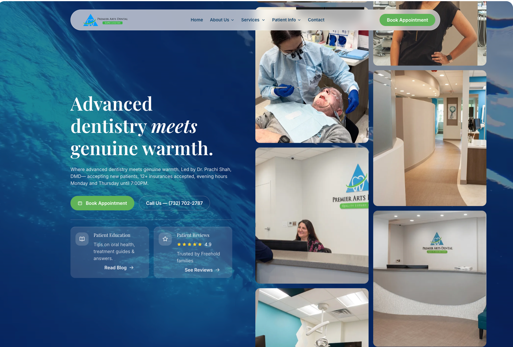
Premier Arts Dental is a strong example of how a dental website can position a practice as premium without feeling cold.
The site leads with a “Quality Luxury Care” message, then supports that promise with doctor visibility, office photography, service pathways, reviews, and clear appointment actions.
For a dentist, the lesson is simple: strong dental branding should make the patient feel what kind of care they are about to receive.
In this case, the visuals and messaging suggest comfort, polish, and a higher-end experience, which fits well for patients considering cosmetic work, smile makeovers, Invisalign, whitening, or restorative care.
What works especially well:
- Bold positioning: The practice does not present itself as a generic family dental office. It clearly leans into luxury, comfort, and personalized care.
- Doctor-led trust: Dr. Prachi Shah is introduced early, with a video prompt and a dedicated doctor page. That helps humanize the practice before the patient calls.
- Custom office visuals: The office tour and real practice photography make the experience feel tangible. Patients can picture the environment before scheduling.
- Clear service paths: Smile Makeover, Invisalign, General Dentistry, Zoom Whitening, Bridges, and Dental Crowns are surfaced directly on the homepage.
- Conversion support: Phone, email, directions, reviews, and “Request An Appointment” are easy to find, which reduces friction for new patients.
2. Prism Oral Surgery & Implants: Specialist Dental Clinic Website Design
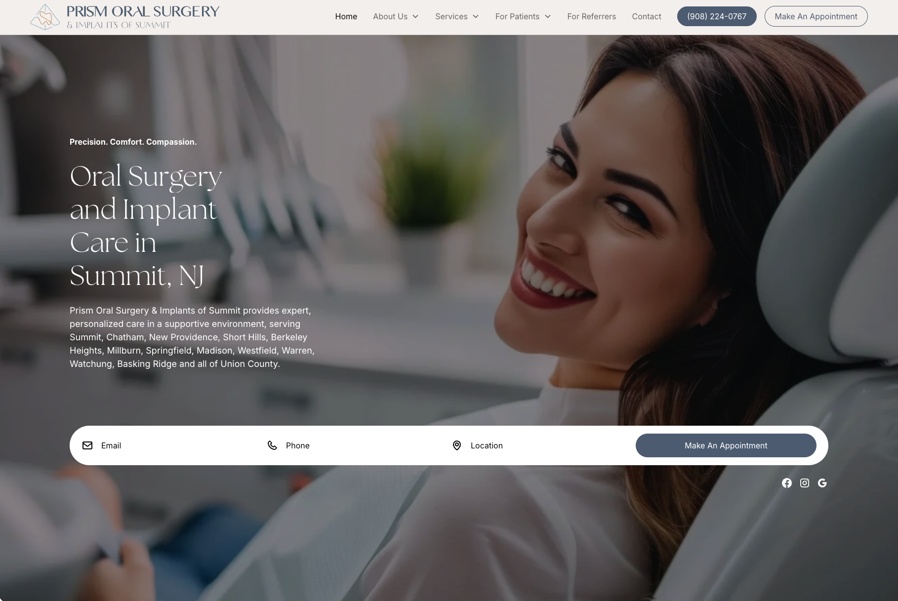
Prism Oral Surgery & Implants is a strong example of specialist dental clinic website design because it understands the patient’s mindset.
Oral surgery patients are often not browsing casually; they may be worried about pain, sedation, recovery, cost, or whether the surgeon is qualified.
The site answers that anxiety with a clear specialist message: “Precision. Comfort. Compassion.” That works because it balances clinical confidence with emotional reassurance.
This is exactly what patients need before procedures like extractions, dental implants, All-on-X, bone grafting, or general anesthesia.
What works especially well:
- Specialist authority: Dr. Jean Kim is introduced as a board-certified oral and maxillofacial surgeon. For surgical cases, this credential is one of the strongest trust signals on the page.
- Clear service structure: The site separates oral surgery, wisdom teeth removal, dental implants, All-on-X, bone grafting, sedation, and anesthesia into clear pathways. That helps patients find the exact procedure they were referred for.
- Comfort-forward messaging: The site does not only talk about surgery. It repeatedly connects care to comfort, safety, clarity, and long-term health.
- Technology as reassurance: 3D imaging, laser systems, digital impressions, real-time monitoring, and guided implant placement are framed as ways to improve outcomes and reduce risk.
- Referral confidence: The site speaks to both patients and referring providers, which is important for an oral surgery practice that depends on general dentist and physician referrals.
- Practical conversion paths: Phone, location, patient forms, insurance, pre/post-op instructions, online booking, and referral access are all easy to find.
3. Dental Boutique: Calming Design for Anxious Patients
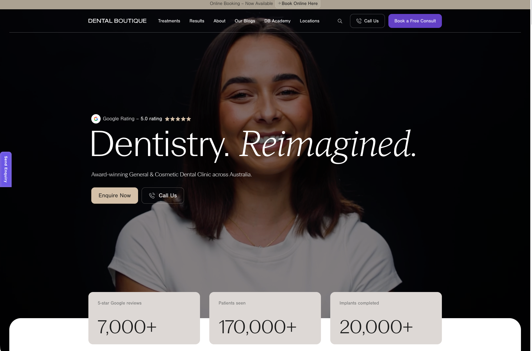
Dental Boutique is a good example of how calming dental website design can make complex care feel less intimidating. The site uses soft visuals, patient-first messaging, and a polished clinic experience to make dentistry feel more supportive than clinical.
For doctors, the important lesson is how the site handles emotion. Instead of leading only with procedures, it talks about the patient’s story, no-pressure conversations, comfort, and careful explanation of treatment options.
What works especially well:
- Spa-like presentation: The site describes its clinics as calm, modern, welcoming, and spa-like. That helps patients imagine a less stressful visit.
- Soft conversion language: CTAs like “Book a Free Consult,” “Enquire Now,” and “Get In Touch” feel lower pressure than a hard sales-style appointment prompt.
- Patient-first positioning: The site explains that patients receive personalised support, treatment education, and help through the decision process.
- Comfort and accessibility: Dental Boutique highlights comfort, payment options, urgent care access, and a smooth patient journey.
- Outcome confidence: Before-and-after results, awards, reviews, and clinician experience help patients feel safer moving forward.
4. Airily Orthodontics: Minimal Dental Web Design That Guides the User
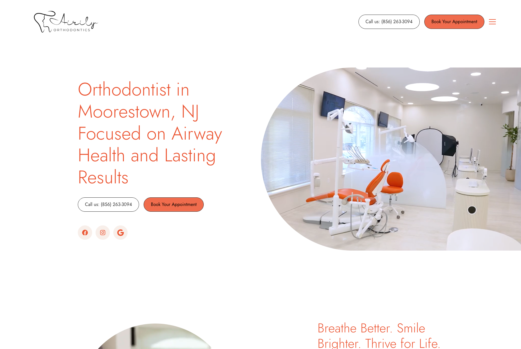
Airily Orthodontics is a strong example of minimal dental web design because the page feels open, calm, and easy to move through.
The design uses a lot of white space, thin typography, rounded image shapes, and a focused orange accent color to guide attention without making the site feel busy.
For doctors, the smart part is that the site does not treat orthodontics as only a cosmetic service.
It frames the practice around airway health, jaw development, breathing, sleep, and long-term function, which gives patients a clearer reason to choose this orthodontist beyond “straight teeth.”
What works especially well:
- Clean visual hierarchy: The hero section has one clear message, one strong office image, and two simple CTAs: call or book.
- Focused service organization: Airway dentistry, orthodontics, and orthodontic technology are separated clearly, so patients can understand the practice’s clinical focus.
- Minimal but memorable branding: The orange accent color gives the site personality without overpowering the calm, white layout.
- Treatment education: The site explains options like Invisalign, braces, expanders, TMJ/TMD treatment, CBCT imaging, and intraoral scanning in patient-friendly language.
- Whole-health positioning: The copy connects orthodontic care to breathing, sleeping, facial growth, and long-term wellness.
- Trust through testimonials: Patient reviews reinforce the exact brand promise: clean office, modern design, careful explanations, airway expertise, and feeling understood.
5. Brooks Pediatric Dentistry: Family-Friendly Design for Parents and Kids
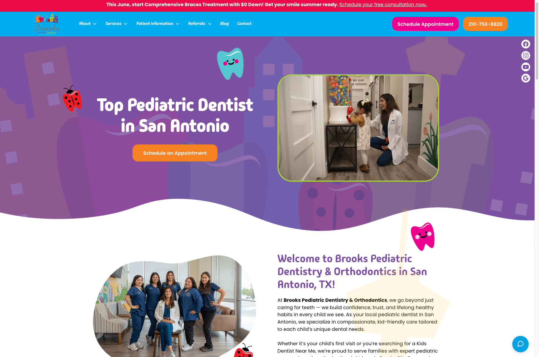
Brooks Pediatric Dentistry & Orthodontics is a useful example because pediatric websites have two audiences at once. The design needs to feel playful and safe for children, but it also has to answer practical parent questions quickly.
The site does this by combining kid-friendly visuals with parent-focused pathways. Parents can quickly find services, insurance information, emergency care, patient forms, directions, and appointment scheduling without digging through the site.
What works especially well:
- Kid-first positioning: The site uses warm language around confidence, trust, healthy habits, and gentle care. That matters because parents want to know the visit will not create dental fear.
- Playful visual direction: Bright colors, friendly imagery, and child-focused design cues make the practice feel less clinical.
- Clear service grouping: Preventive care, restorative dentistry, orthodontics, sedation, emergency services, and special needs dentistry are easy to separate.
- Parent practicals: Insurance, Medicaid, HSA/FSA options, financing, patient information, and forms are visible. That reduces front desk friction before the first visit.
- Emergency readiness: The site calls out emergency pediatric dental care clearly, which is important for parents searching under stress.
- Simple booking flow: Schedule, call, directions, and patient forms are all placed where parents can act quickly.
Make the Next Step Obvious on Every Page
A dental website should never make patients wonder what to do next. Every important page should have one clear call to action.
The best CTAs are simple and matched to the page intent:
- Homepage: Book an Appointment or Call the Office.
- Treatment pages: Request a Consultation or Schedule Online.
- Emergency page: Call Now.
- Cosmetic page: Book a Smile Consultation.
- Pediatric page: Schedule Your Child’s Visit.
- Insurance page: Check Coverage or Call With Questions.
Mobile matters here. Many patients are searching from their phone, so click-to-call, sticky CTAs, short forms, and online appointment booking can directly affect new patient flow.
The missing point is that CTAs should not only sit in the header. They should appear after trust-building moments, such as testimonials, treatment explanations, before-and-after galleries, insurance details, or doctor credentials.
Use Proof Close to the Decision Point
Patients rarely book because a website says “we are the best.” They book when proof appears near the moment they are deciding.
That proof can take different forms:
- Patient testimonials near appointment CTAs.
- Before and after gallery near cosmetic or restorative treatment pages.
- Doctor credentials near implant, surgery, orthodontic, or sedation pages.
- Technology explanations near complex treatments.
- Insurance and financing details near cost-sensitive services.
- Reviews near homepage, contact, and booking sections.
For doctors, think of this like a case presentation. You would not explain a treatment plan without showing why it is appropriate, what the patient can expect, and why they can trust the recommendation.
Dental Website Design Cost
Dental website design cost usually ranges from $2,000 to $25,000+, depending on scope.
The final price depends on what your website needs to include. Extra treatment pages add copy, design, and SEO work, while custom brand design increases cost because the site has to feel unique to your practice.
Photography and video also raise the budget, but they help patients see the real office, doctor, and care environment. Online booking, HIPAA-aware forms, and SEO setup can add more planning because they affect patient flow, data handling, and local search visibility.
If you are deciding who to hire, this list of healthcare website design agencies can help you compare experienced partners. Or just create a fully customized website matching your needs with our web design services.
Frequently Asked Questions
How much does a dental website cost?
A dental website usually costs between $2,000 and $25,000+. The price depends on whether you need a template site, custom design, treatment pages, SEO, photography, online booking, or secure forms.
Does a dental website need to be HIPAA compliant?
Yes, if the website collects or handles patient health information. Contact forms, appointment forms, chat tools, and patient portals should be set up carefully with privacy and security in mind.
What pages should a dental website have?
Most dental websites should include a homepage, about page, doctor bio, treatment pages, patient reviews, insurance or payment page, new patient forms, contact page, and location page. Specialty practices may also need before-and-after galleries, referral pages, or emergency care pages.
What is the best website builder for dentists?
It depends on the practice. Webflow is strong for custom design and performance, WordPress is flexible for content and SEO, Squarespace and Wix can work for simple sites, and custom builds are best for larger or more complex practices.
How often should you redesign a dental website?
Most dental websites should be reviewed every 2 to 3 years. Redesign sooner if the site feels outdated, loads slowly, performs poorly on mobile, has weak booking rates, or no longer reflects your services.
Should a dental website include online appointment booking?
Yes, if your practice can support it operationally. Online appointment booking reduces friction, especially for patients searching after hours or from mobile.
Are before and after galleries good for dental websites?
Yes, especially for cosmetic, orthodontic, implant, and restorative dentistry. They help patients understand outcomes, but you should only use photos with proper patient permission.
How important is color psychology in dental website design?
Color psychology matters because patients read visual tones quickly. Soft colors can feel calm and reassuring, while bold colors can make a practice feel modern, premium, or energetic.
Final Thoughts
Effective dental website design is more than a polished layout. It brings together trust, usability, branding, treatment education, and clear booking paths so patients can move from interest to action.
The examples above matter because they show how different practices use design for different patient needs. If your current site feels outdated, unclear, or disconnected from your care experience, a redesign can help more patients understand your value and feel ready to book.
.avif)