- What Good Drag and Drop UI Design Actually Requires
- Four Ways to Implement Drag and Drop UI
- Matching the Pattern to Your Use Case
- Accessibility and Compliance Checklist SaaS Teams Skip
- Mobile and Touch Behavior
- What to Do When a Drag Fails (And Why Undo Isn't Optional)
- Six Mistakes That Quietly Break Drag and Drop UX
- How Orbix Studio Approaches Drag and Drop UI Design
- Frequently Asked Questions
- Conclusion


.svg)

%201%201.svg)
Drag and Drop UI Design: Choosing the Right Approach for SaaS

- Drag and drop UI design works when you match the implementation method to your team's skill and the use case, not the trend.
- Four paths exist: native browser API, an open-source library, a no-code builder, or a custom build.
- The mistake teams repeat: shipping drag and drop with no keyboard support, then finding out during a compliance review.
A SaaS product manager spends two sprints wiring up a drag-and-drop dashboard builder. It looks great in the demo. Three weeks later, an enterprise prospect's accessibility review flags it: no keyboard support, no screen reader labels, no way to reorder without a mouse. The deal stalls.
This is the drag and drop user interface problem every SaaS team eventually runs into: it's easy to build, hard to build well.
That's the real decision buried inside drag and drop UI design. It's not just a visual pattern. That's a set of choices about implementation, accessibility, and use case. Teams routinely make these choices in the wrong order.
Get the order right and you ship once. Get it wrong and you rebuild it during a deal review, the costliest time to rebuild anything.
This guide covers four things: how to implement drag and drop, and which pattern fits your use case. It also covers the accessibility checklist that keeps this decision out of your next procurement conversation, plus one filter you can apply today.
Founders rarely budget time for this decision up front. They pick whatever tutorial ranks first, ship it, and move to the next feature. That works until a buyer's IT team runs an audit, or a support ticket reveals the pattern nobody tested on mobile.
What Good Drag and Drop UI Design Actually Requires
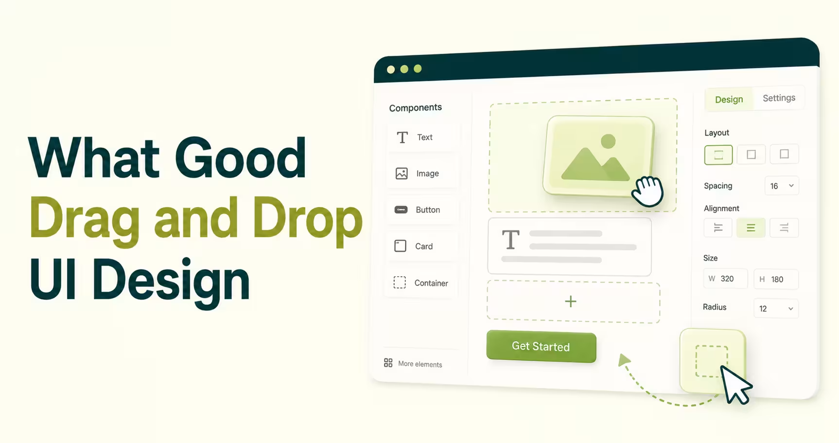
Good drag and drop UI design means the interface clearly signals what's draggable. It gives constant feedback during the interaction, and it works for people who can't use a mouse. Meaning it's not one state, it's five: resting, grabbed, in-transit, dropped, and error. Miss any one of those five and the interaction feels broken even when the code works.
This is exactly the kind of detail generic template libraries skip and dedicated ui design services build in from the first prototype.
The Five States Every Drag Interaction Needs
- Resting: the item looks draggable before anyone touches it, usually through a handle icon or a subtle shadow.
- Grabbed: the item lifts, tilts slightly, or gains elevation the moment a user picks it up.
- In-transit: the cursor or finger carries the item, and valid drop zones light up as it passes over them.
- Dropped: the item settles into place with a short animation, confirming the action landed.
- Error: an invalid drop bounces back to its origin with a visible signal, not a silent failure.
Each of those five states needs its own visual treatment, not a shared default. A component that only styles the resting and dropped states leaves grabbed, in-transit, and error looking identical. That's exactly where users lose track of what's happening.
Trello nails the grabbed state. Lift a card and it tilts slightly, gains a shadow, and the column underneath highlights. That's three signals confirming one action. Gmail does the same thing when you drag an email into a folder: the folder brightens the second your cursor crosses into it.
A drag and drop interaction is only as good as its weakest state, and error is the state teams design last.
So what happens when a user drops a card in the wrong place? If your interface has no error state, the answer is: nothing visible, and the user assumes the app is broken. Build the undo path before you ship the happy path.
Once you know what good looks like, the real question becomes how to build it. That's where teams pick the wrong tool for their team's size and timeline.
Drag Handle UI: When You Need One
A drag handle is the small, dedicated grip icon usually six dots or three lines that tells a user exactly where to click and drag, instead of leaving them to guess whether the whole row, just the icon, or nothing at all is draggable.
Not every draggable element needs one. If a card or row has no other clickable content, the whole surface can be the handle. But the moment a row also has a link, a checkbox, or an edit button, a dedicated handle stops accidental drags and stops accidental clicks.
Meaning the handle isn't a style choice, it's a collision-prevention tool: without one, users hit the wrong target, drag when they meant to click, or click when they meant to drag. Skip the handle on simple, single-purpose rows. Add one everywhere else.
Where Drag and Drop Fits Into Your Design System
A drag and drop design system is the shared set of components, states, and rules handles, drop zones, elevation, animation timing that every draggable element in your product reuses, instead of each team reinventing the interaction from scratch.
Without one, this is Mistake #5 in practice: your kanban board lifts cards with a shadow, your dashboard builder doesn't, and users relearn the pattern every screen. With one, the five states above (resting, grabbed, in-transit, dropped, error) get built once as tokens and components, then applied everywhere dragging happens.
That single decision is usually the difference between a drag interaction that feels native to your product and one that feels bolted on.
Four Ways to Implement Drag and Drop UI
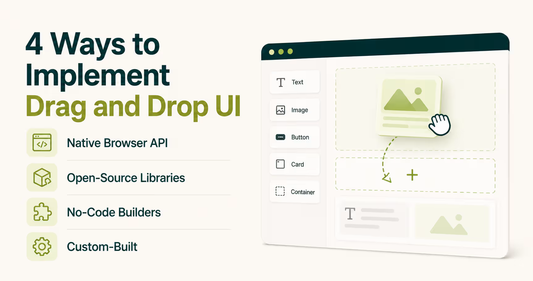
Four real paths exist to ship drag and drop. They are the native browser API, an open-source library, a no-code builder, or a custom build from a UI/UX design agency. If you're weighing those options, a user interface design services partner can usually tell you within an hour which path fits your timeline, before you commit engineering time to any of them.
The decision isn't whether to build drag and drop yourself, it's which of these four fits your team's size, timeline, and accessibility requirements.
The table above compares effort against long-term flexibility. Use it as a first filter, then read the fit for your specific use case below.
None of these four options is universally right. A five-person startup building an internal tool needs speed, while a fintech product preparing for a compliance audit needs the custom route from day one.
Native Browser API
The native HTML5 drag-and-drop API ships with every browser and needs no dependencies. It's the right call for a simple internal reorder list where nobody outside your company will ever touch it. Chrome, Firefox, and Safari all implement the same core events, so cross-browser bugs are rare.
But it comes with almost no accessibility built in. You write every ARIA attribute and every keyboard handler by hand. For anything customer-facing, that gap turns into weeks of work you didn't budget.
Open-Source Libraries
React DnD Kit and react-beautiful-dnd cover the bulk of the interaction logic a product team needs. React DnD Kit ships hooks like useDraggable and useDroppable, so you're not rebuilding drag physics from scratch. Puck takes a different angle: it's a full layout-builder component, useful when the deliverable itself is a page builder rather than a single reorder list.
Here's the part teams miss: a library handles the mechanics, not the accessibility decisions. You still choose how errors look, how focus moves, and how a screen reader announces a drop.
No-Code Builders
UI Bakery and Anvil Works let you drag components onto a canvas and ship an internal tool in days, not sprints. That speed is real, and it's the right trade for an MVP or an internal dashboard nobody outside the company sees.
The ceiling shows up the moment your brand or your compliance team needs something the platform doesn't expose. Speed and customization trade off directly: the faster the builder, the sooner you hit its ceiling.
In practice, this covers a specific set of tools, each suited to a different job. Webflow and Framer handle drag-and-drop page and layout building for marketing sites and prototypes.
Figma's drag-based auto layout works inside the design file itself, before any code exists. Builder.io and similar visual CMS tools let non-technical teams drag components into live, production pages.
None of these replace custom-built drag and drop inside your actual product they solve the page-building problem, not the in-app-feature problem covered in the rest of this article.
Custom-Built
Enterprise SaaS, fintech, and healthtech products usually end up here, because procurement teams ask accessibility questions with no template answers by default. This is also where an agency partner earns its cost. Building the interaction states, the keyboard model, and the ARIA labeling into one connected system takes a specialized team. That's different from patching in three separate fixes after launch.
Orbix Studio's recent work for BlueGulf followed this exact path. The team rebuilt a data-heavy interface in Webflow and Framer using the same interaction-state discipline drag and drop needs. Resting, active, and error states were designed before a single screen shipped. You can see the full BlueGulf UI/UX case study for how that process plays out end to end.
Want to see how Orbix approaches this decision for SaaS teams specifically? See our SaaS design process ->
Matching the Pattern to Your Use Case
The right drag and drop pattern depends on what the user is actually rearranging, not on which library is trending. A kanban board, a dashboard builder, and a file upload zone all need different interaction logic, even though each one uses the word drag. Treat the use case as the starting point, not the tool you already know how to use.
Reordering Lists and Kanban Boards
List reordering is the simplest case and the one react-beautiful-dnd was built for. Notion uses this pattern for its block editor: grab a block's handle, and a thin blue line shows exactly where it will land. That thin line is the entire feedback system: no shadow, no tilt, just precise placement.
Dashboard and Report Builders
Dashboard builders need drag and drop plus resize handles plus a grid snap. This is the SaaS dashboard design problem specifically. A dashboard's whole value is letting a user control what they see, without filing a support ticket.
File Upload Zones
A file drop zone is drag and drop's simplest cousin: one drag target, one drop action, no reordering logic at all. Airtable's attachment fields use exactly this pattern: drag a file anywhere onto the row and it uploads without a separate button. The design work here is almost entirely about the hover and error states, not the drag mechanics.
No-Code App and Page Builders
Webflow and GenCodex both build entire products around drag and drop as the core interaction, not a feature bolted onto one screen. If you're evaluating whether no-code tooling fits your team's workflow builder, our guide on AI workflow automation covers where that approach earns its keep.
Picking the right pattern solves half the problem. The other half is making sure that pattern doesn't quietly fail an accessibility review six weeks after launch.
Accessibility and Compliance Checklist SaaS Teams Skip
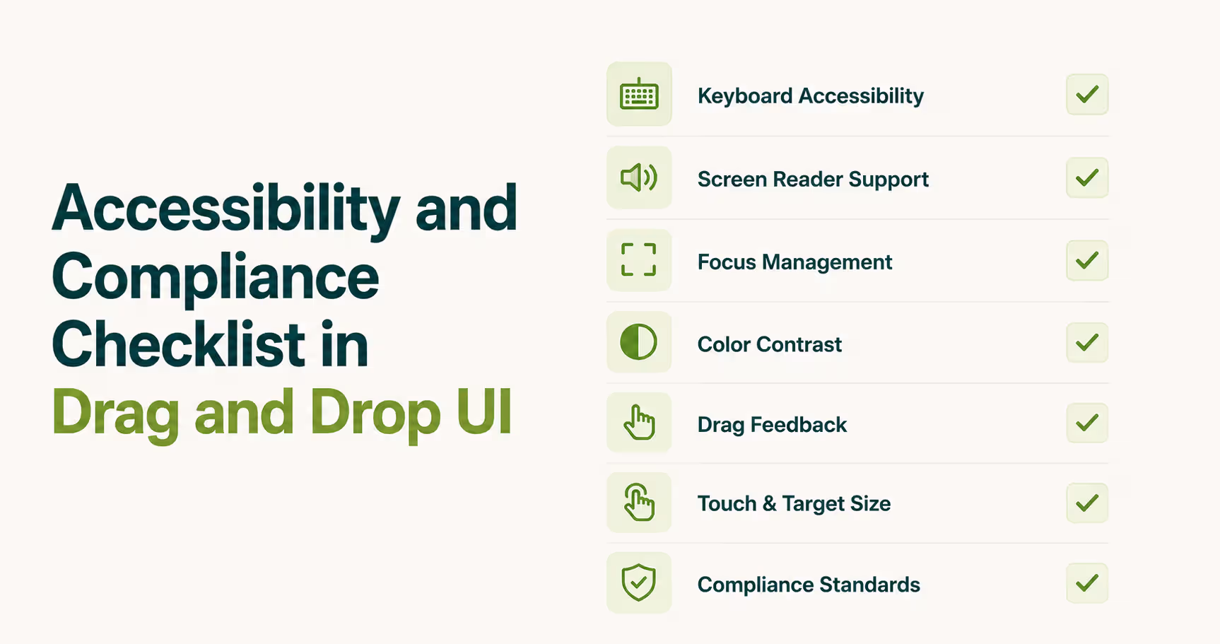
Drag and drop accessibility means a user can complete the same action with a keyboard or screen reader that a mouse user completes by dragging. Meaning accessible isn't a visual polish item. It's a functional requirement procurement checklists now test directly.
Why does this matter for a MOFU decision and not just a design nitpick? Because enterprise SaaS deals increasingly include an accessibility audit before signature, and drag and drop is one of the first patterns testers check.
Keyboard Support Users Expect
The standard pattern starts with Tab, which focuses on a draggable item. Space or Enter picks it up, arrow keys move it, and Enter again drops it. Escape cancels the action at any point. Adobe's React Spectrum accessibility documentation walks through this exact model in production code.
Screen Reader Announcements
A screen reader needs a live region that announces state changes out loud. Phrases like item picked up or moved to position three tell a non-sighted user exactly what happened. Without that announcement, the interaction is invisible to anyone not looking at the screen.
Designing for Motor Impairment
Touch targets need real size, not visual size. Nielsen Norman Group's research on drag-and-drop usability backs up what practitioner teams find on their own. Precision-heavy interactions punish users with motor impairments hardest. Always ship a non-drag alternative alongside the drag path.
Why This Matters for Enterprise SaaS Deals
WCAG 2.5.1 specifically requires a single-pointer alternative for any drag-based interaction. Teams evaluating a UI/UX agency for a SaaS startup should ask one direct question. Is accessibility designed in from step one, or patched in after a failed audit?
Tip: Test your drag and drop flow with only a keyboard before you ship it. If you can't complete the full task without touching a mouse, neither can a portion of your users, or your next enterprise buyer's compliance reviewer.
Accessibility covers desktop and screen readers. Mobile brings its own set of constraints, and drag and drop behaves differently the moment a finger replaces a cursor.
Mobile and Touch Behavior
Drag and drop on mobile needs a bigger touch target and a real fallback, because a thumb is far less precise than a mouse cursor. The 1cm by 1cm minimum touch target that desktop accessibility guidelines suggest becomes non-negotiable the moment your primary device shifts from desktop to phone.
Long-press-to-drag is now the expected mobile pattern, since a plain drag conflicts with scrolling the page. Whatever you choose, always give mobile users a tap-based alternative, like a move-to menu, next to the drag gesture. If your roadmap includes mobile-first delivery, our progressive web app guide for SaaS covers the performance and offline patterns that pair with mobile drag interactions.
Testing on an actual phone catches problems a simulator misses. A drag gesture that feels smooth with a mouse pointer often feels sluggish on a real touchscreen. Older Android devices with slower repaint cycles make that gap worse, not better.
Even with the right pattern, the right library, and solid accessibility, drag and drop still breaks in a handful of predictable ways. Here's what to check before launch.
As a baseline: keep touch targets and drag handles at least 44×44 pixels, the minimum Apple and Google both use for tappable elements. Animate state transitions (grabbed, dropped) within roughly 100ms fast enough to read as instant, slow enough to still feel intentional.
Below that threshold, most users perceive drag feedback as immediate; above it, the interaction starts to feel laggy even on fast connections.
What to Do When a Drag Fails (And Why Undo Isn't Optional)
A failed drag should never look like a broken app. When a drop is invalid, or a save request fails after the item has already moved, the interface needs a clear, honest response, not a silent freeze.
The pattern that works: update the UI immediately when the user drops the item, before the server confirms anything. This is called an optimistic update, and it's why modern drag interactions feel instant instead of laggy. If the save then fails, animate the item back to where it started and show a short message explaining why, instead of leaving it in a state that quietly reverts on refresh.
Undo works the same way. A five-second toast that lets a user reverse the last move costs one component to build and removes the single biggest reason people stop trusting a drag interaction: the fear that one wrong drop can't be taken back. Once users trust that a mistake is reversible, they use the feature more, not less.
None of this is a nice-to-have. A drag interaction with no recovery path and no undo trains users to avoid it after the first failure, and by the second failure, they've stopped trying entirely.
Six Mistakes That Quietly Break Drag and Drop UX
Six repeatable mistakes cause the majority of drag and drop failures, not a broken library. Catching these before launch costs an afternoon of QA. Catching them after launch costs a support queue.
None of these six require new tooling to fix. Each one just needs someone on the team to run through the full interaction once, deliberately, before the sprint closes.
- Invisible drop zones. A drop target needs a visible border change the moment a drag starts, not just on hover. Waiting for hover to reveal the zone means touch users, who have no hover state, never see it at all.
- Missing drag handles. If every part of a card looks clickable, users won't know which part is draggable. A separate handle icon fixes this in one line of CSS.
- No undo action. One misplaced drop with no way back trains users to avoid the feature entirely. Adding a five-second undo toast costs one component and saves a support ticket every week.
- No error state. Silent failure reads as a broken app, not a rejected drop. Users who hit this twice stop trying the feature a third time.
- Inconsistent feedback across components. If your kanban board lifts cards with a shadow but your dashboard builder doesn't, users relearn the pattern every screen. Consistency is a design system problem, not a component problem.
- Ignoring touch targets. A drag handle sized for a mouse cursor is often too small for a thumb, and that gap shows up in mobile support tickets within the first week.
How Orbix Studio Approaches Drag and Drop UI Design
Orbix Studio treats drag and drop as an interaction-state problem before it's a component problem. Every engagement starts by mapping the five states, resting, grabbed, in-transit, dropped, and error, before a single line of code ships.
When we audit SaaS products, the pattern we see again and again is a beautiful drag interaction with zero keyboard support. A team that assumed accessibility could be added later built it. That assumption doesn't hold, not without a rebuild. That's why the BlueGulf project scoped accessibility requirements in the same discovery call as the visual system, not as a separate phase afterward.
That discovery call maps every screen where drag and drop appears, not just the obvious ones. A settings page with reorderable notification rules needs the same discipline as a kanban board. Nobody thinks of it as a drag and drop feature until launch day forces the question.
Ready to make the right implementation decision for your product? Book a free strategy call ->
Frequently Asked Questions
What's the difference between drag and drop UI and click-to-add UI?
Drag and drop UI lets a user physically move an element to reorder or place it. Click-to-add UI uses a button or menu to perform the same action instead. Drag and drop feels faster for spatial tasks like reordering, but click-to-add is often more accessible for single, precise actions.
Is drag and drop accessible with a keyboard by default?
No native drag and drop implementation is keyboard accessible by default. Every keyboard interaction, focusing an item, picking it up, moving it, and dropping it, needs to be built by hand. That means ARIA live regions and custom key handlers, regardless of which library or framework you use.
What's the minimum touch target size for a drag handle?
The accepted minimum touch target for a drag handle is about 1cm by 1cm. That's roughly 44 by 44 pixels on typical mobile screens. Smaller targets increase mis-taps and frustrate users with limited fine motor control, especially on touchscreens.
What keyboard controls should a drag and drop interface support?
A keyboard-accessible drag and drop interface follows one clear pattern. Tab focuses an item, and Space or Enter picks it up. Arrow keys move it between valid drop targets, Enter confirms the drop, and Escape cancels at any point.
Do screen readers announce drag and drop interactions?
Screen readers only announce drag and drop interactions when the interface includes ARIA live regions. Those regions describe each state change out loud, using phrases like item picked up or moved to position three. Without them, screen reader users have no way to know a drag started.
Should I hire a design agency or build a drag and drop UI in-house?
Build in-house when the interaction is simple, like one reorderable list, and your team already has frontend capacity. Hire an agency when the pattern touches multiple screens or needs enterprise-grade accessibility. Choose an agency too when it must match a brand system your in-house team can't maintain long-term.
What's the best drag and drop approach for real-time dashboards, like iGaming or trading platforms?
High-stakes, real-time dashboards need drag and drop that updates instantly without waiting on the server, paired with strict keyboard accessibility, since these platforms are often subject to the same compliance reviews as enterprise SaaS. A custom-built implementation is usually worth the extra dev time here: off-the-shelf libraries rarely handle the update frequency and state complexity these dashboards need without noticeable lag.
How much does it cost to add drag and drop UI to a SaaS product?
Cost depends entirely on the approach you choose. A native or library-based implementation might take one to two sprints for a small team. A fully accessible, brand-matched custom build across multiple screens typically runs into a multi-week engagement with a specialized design and development partner.
Conclusion
The decision that actually matters isn't which library to pick. It's whether you design the five interaction states, including error and accessibility, before you write a single line of drag logic. Teams that skip that order rebuild the same feature during a compliance review, which costs more than building it right the first time.
Pick one screen in your product this week and map its five drag states on paper before touching code. That exercise alone surfaces nearly every gap this guide covers.
Ready to make the right decision for your product? Book a free strategy call ->






.svg)
.svg)


.svg)







.avif)



.svg)

