Table of Contents
- Before We Start: Why Homepage Sections Exist in the First Place
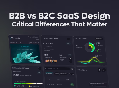
- 10 SaaS Homepage Design Elements Your Product Should Have
- 1. Hero Section
- 2. Social Proof
- 3. The Problem
- 4. Product Overview
- 5. Key Features
- 6. Benefits
- 7. Screenshots or Demo
- 8. Customer Stories
- 9. Pricing or Sign-Up Section
- 10. Final CTA
- Who Should Use This Framework?
- Common SaaS Homepage Mistakes
- Frequently Asked Questions
- Final Thoughts
- A homepage should guide decisions, not just display information.
- People trust your product before they compare its features.
- Clear outcomes matter more than long feature lists.
- Every section should reduce doubt and increase confidence.

A lot of SaaS homepages look great. They have modern layouts, polished visuals, and impressive animations. Yet many of them struggle to turn visitors into customers.
The problem is that most teams focus on design while visitors focus on finding answers. They want to know what the product does, whether they can trust it, and if it's the right solution for their problem. When those answers are missing or hard to find, people leave.
That's why the best SaaS homepages aren't just well-designed. They're structured to answer questions in the right order. In this guide, we'll break down the 10 essential sections every SaaS homepage needs and explain how each one helps move visitors closer to conversion.
Before We Start: Why Homepage Sections Exist in the First Place
When someone lands on your SaaS homepage, they're usually trying to figure out one thing: "Is this worth my time?"
To answer that question, they need a few smaller questions answered first.
- What does this product actually do?
- Who is it built for?
- Can it solve my problem?
- Why should I trust this company?
- How does it work?
- What results can I expect?
- Has it worked for businesses like mine?
- What should I do next if I'm interested?
Most visitors won't consciously think through this list. But as they scroll, they're looking for information that helps them reach a decision.
This is one reason many of the best-performing SaaS websites follow similar patterns. If you're looking for real examples, see our guide to SaaS Website Examples.
A hero section helps people understand what the product does. Social proof builds trust. Screenshots help them visualize the product. Customer stories show real-world results. Each section plays a different role in helping visitors feel confident enough to take the next step.
Once you start looking at homepage design this way, things become much simpler. The 10 sections below are important not because every SaaS company uses them, but because they help answer the questions buyers already have.
10 SaaS Homepage Design Elements Your Product Should Have
Most high-converting SaaS homepages share a similar structure. They provide the information visitors need to understand the product, build trust, evaluate their options, and take the next step.
The 10 sections below aren't rules you must follow. Think of them as building blocks. Each one serves a specific purpose and helps answer a question your visitors are already asking.
1. Hero Section
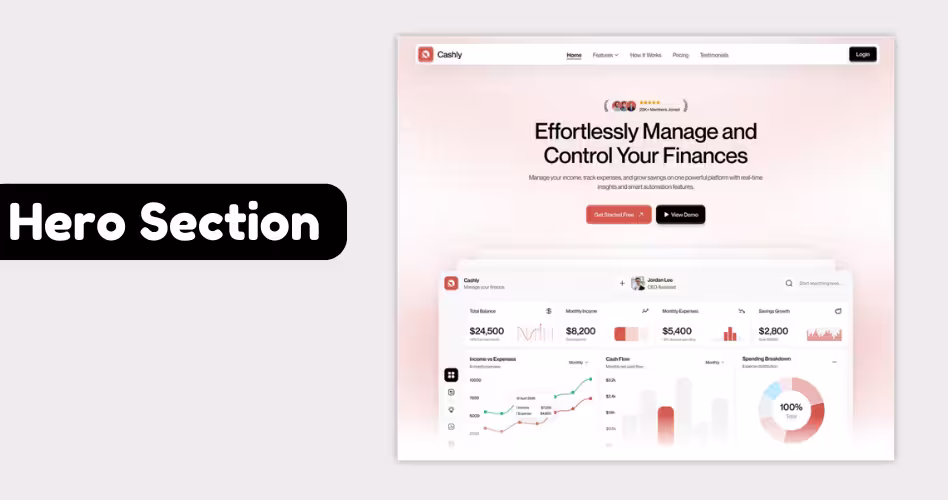
The hero section is often the first thing visitors see when they land on your homepage. It sets the tone for everything that follows.
At this point, people aren't comparing features or looking for pricing. They're simply trying to understand what your product does and whether it's relevant to them.
A strong hero section should answer three questions within a few seconds: What is this product?, who is it for? And why should I care?
For example, if someone lands on a project management software website, they should immediately understand that the product helps teams organize work and collaborate more effectively. They shouldn't have to scroll or read multiple paragraphs to figure that out.
A typical SaaS hero section includes:
→ Clear headline that explaining the product's value
→ Short supporting description
→ Primary call-to-action, such as "Start Free Trial" or "Book a Demo"
→ Product screenshot, demo video, or visual that reinforces the message
The biggest mistake companies make is trying to be clever instead of clear. Creative headlines might look impressive, but they often leave visitors confused about what the product actually does.
A good test is simple: if someone can understand your product in less than five seconds, your hero section is probably doing its job.
Example: Slack's homepage immediately explains that it's a platform for communication and collaboration, making it easy for visitors to know they're in the right place. You'll find similar examples in our SaaS Website Inspiration guide.
2. Social Proof
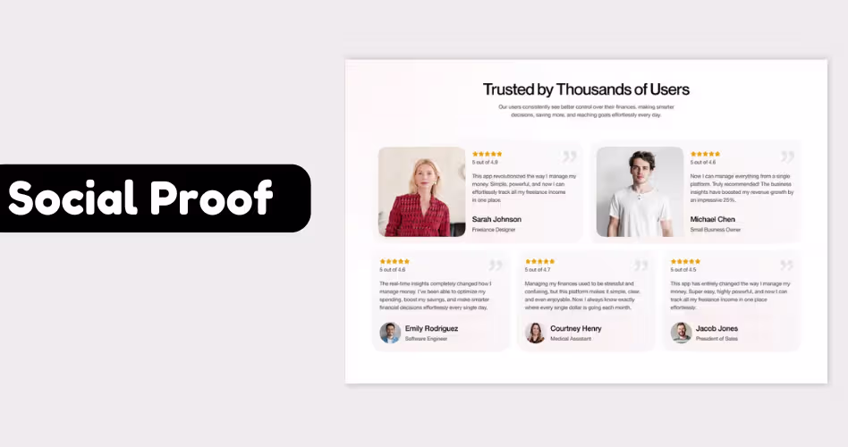
Imagine you're looking for a new software tool for your business. You land on a website you've never heard of before. The product looks interesting, but before you spend time learning more, you'll probably want some proof that it's legitimate.
That's where social proof comes in. Social proof is anything that shows other people or companies already use and trust your product. It helps visitors feel more comfortable moving forward.
Common examples include:
- Customer logos
- Testimonials
- Reviews and ratings
- Case studies
- Number of customers served
- Awards or industry recognition
For example, if your homepage says, "Trusted by 5,000+ businesses worldwide," that immediately tells visitors they're not the first person to try your product.
Without social proof, visitors have to rely only on your claims. With social proof, they can see evidence that other people have already had a good experience.
A common mistake is placing social proof too far down the page. And this is also the reason why trust-building elements are prominently featured in successful B2B SaaS website designs.
Example: HubSpot places customer logos near the top of its homepage, including well-known brands such as Reddit, DoorDash, and Eventbrite. For a first-time visitor, those logos act as instant proof that established companies trust the platform, making it easier to keep exploring the product.
3. The Problem
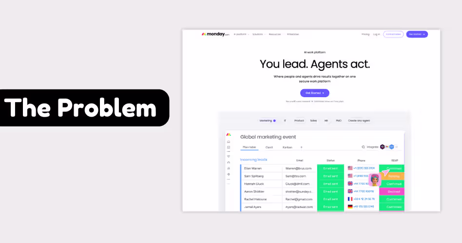
By the time visitors reach this section, they already know what your product does and have some reason to trust your company. Now they're trying to figure out whether your product is relevant to them.
This is where many SaaS homepages lose people. They start talking about features, dashboards, integrations, and capabilities before explaining why any of those things matter.
A problem section helps bridge that gap. Focus on the customer's problem before the product features. It’s one of the most fundamental saas website best practices that helps you improve the clarity and conversations.
When visitors recognize their own situation on the page, they're more likely to continue reading and explore the solution. For example, a project management tool might highlight common challenges such as:
- Missed deadlines
- Scattered communication
- Lack of visibility across projects
- Time wasted switching between tools
A visitor dealing with those issues can quickly connect the dots and understand why the product exists.
Example: On its homepage, monday.com often focuses on workplace chaos and disconnected workflows before diving into product features. This helps visitors understand the problem first, making the solution feel more relevant when it's introduced later.
4. Product Overview
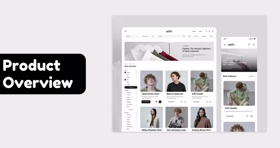
At this point, visitors understand the problem and are interested in finding a solution. Now they want to know how your product actually helps. This is the job of the product overview section.
Think of it as the "big picture" explanation of your product. Instead of listing every feature, this section gives visitors a simple understanding of how the product works and how it helps solve their problem.
For example, a project management tool doesn't need to explain every dashboard, report, and automation right away.
A simple overview might be: "Plan projects, assign tasks, track progress, and keep your team aligned in one place."
In a single sentence, visitors can understand what the product does and how it helps. A strong product overview section usually includes:
- Short explanation of how the product works
- Simple breakdown of the main workflow
- Visual or screenshot of the product
- Clear connection between the problem and the solution
The biggest mistake is overwhelming visitors with too much detail too soon. Remember, people aren't ready to explore every feature yet. They're still trying to understand the product at a high level.
Example: When you visit Notion's homepage, the company doesn't immediately dive into every feature. Instead, it introduces the product as a connected workspace for notes, documents, projects, and collaboration. This gives visitors a clear understanding of what the product does before they explore the details.
5. Key Features
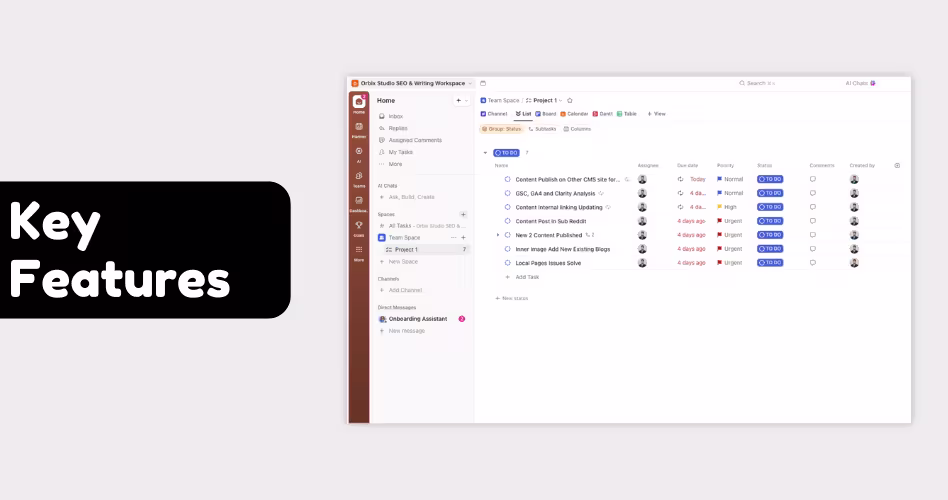
Once visitors understand your product, they naturally start evaluating it. That's where key features come in.
Features give buyers a clearer picture of what they'll be able to accomplish with your product. They help visitors compare solutions and decide whether your product has the capabilities they're looking for.
For example, someone looking for project management software may care about:
- Task assignment
- Workflow automation
- Team collaboration
- Progress tracking
- Reporting
These aren't just features. They're requirements. The feature section helps visitors quickly check whether your product meets their needs without digging through documentation or booking a demo.
A common mistake is trying to showcase everything. Most SaaS products have dozens or even hundreds of features. Putting all of them on the homepage usually creates more confusion than clarity. Instead, focus on the handful of capabilities that matter most to your target audience.
Example: When you visit ClickUp's homepage, you won't see every feature the platform offers. Instead, ClickUp highlights a few important capabilities, such as task management, docs, goals, and dashboards. This gives visitors enough information to evaluate the product without overwhelming them.
6. Benefits
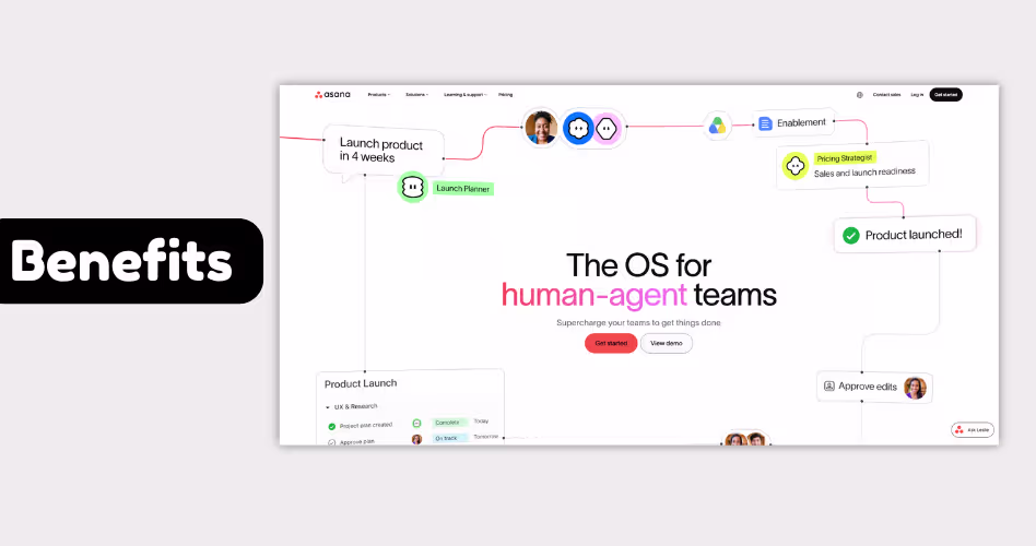
A visitor might understand your product and even like its features. That doesn't automatically mean they'll want it.
People don't buy software because it has dashboards, automation, or integrations. They buy software because they believe it will help them achieve something valuable.
That's the role of the benefits section. Instead of focusing on what the product does, this section focuses on what users gain from using it.
Here’s the difference:
Notice how the benefits focus on outcomes rather than functionality. This shift from features to outcomes is one of the most effective principles in B2B website design.
A strong benefits section helps visitors picture what success looks like after adopting your product.
Example: Rather than promoting individual features, Asana often focuses on outcomes such as helping teams stay aligned, move work forward faster, and spend less time coordinating projects. The message isn't just about what the platform does - it's about what teams can accomplish because of it.
7. Screenshots or Demo
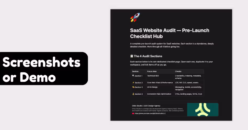
You can explain your product with headlines, features, and benefits, but eventually visitors will want to see what they're actually getting.
That's why screenshots and demos are an important part of SaaS homepage design.
They turn an idea into something tangible. Instead of imagining how the product works, visitors can see the interface, explore key workflows, and get a feel for the overall experience before signing up
For example, a project management platform can say it helps teams organize work. But a screenshot showing tasks, deadlines, team members, and project status makes that idea much easier to understand.
This is especially important for products that have complex workflows or unique interfaces. A visual can communicate in seconds what might take several paragraphs to explain.
When adding screenshots to a homepage, focus on showing:
- The product interface
- Important workflows
- Key actions users can take
- The outcome of using the product
Avoid using screenshots simply as decoration. Every image should help visitors understand the product better.
If you're looking for ideas, our collection of SaaS website inspiration examples shows how leading products use screenshots, demos, and visuals throughout their websites.
Example: Notion uses screenshots throughout its homepage to show real documents, project boards, and collaborative workspaces. Instead of describing every use case, visitors can quickly see how the product works and where it fits into their workflow.
8. Customer Stories
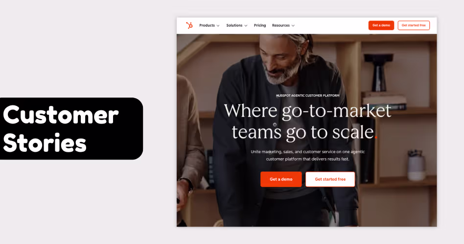
Every SaaS company claims its product saves time, improves productivity, or helps teams work better. The problem is that anyone can make those claims. Customer stories help prove them.
Instead of talking about what the product can do, they show what happened when a real customer used it. This makes the benefits feel more believable and easier to relate to.
For example, a project management platform might promise better collaboration. That's a nice claim, but it's much more convincing to see how a company reduced project delays, improved communication, or saved hours every week after adopting the tool.
This is why customer stories are often one of the most persuasive sections on a homepage. People naturally look for evidence before making a decision, especially when evaluating software they may use every day.
A strong customer story usually includes three things:
- The challenge the customer faced
- How they used the product
- The results they achieved
The best customer onboarding stories are specific. Numbers, measurable improvements, and real outcomes are often more convincing than generic praise.
Example: HubSpot regularly features customer success stories that explain how businesses generated more leads, improved their sales process, or increased revenue using the platform. Rather than asking visitors to trust a marketing claim, the company shows what customers were able to achieve in the real world.
9. Pricing or Sign-Up Section
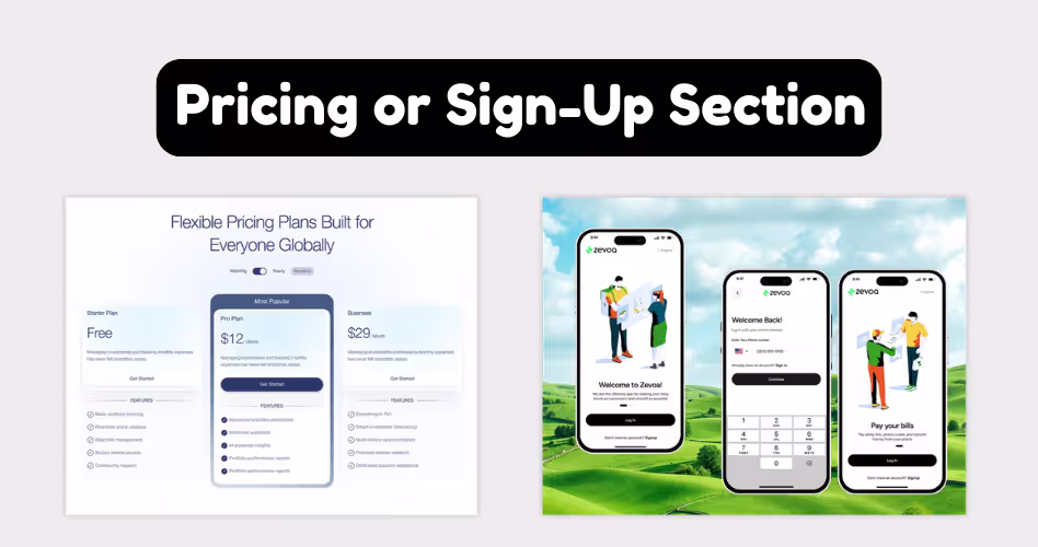
After learning about a product, most visitors eventually want to know what it takes to get started.
For some SaaS products, that means viewing a pricing plan. For others, it means booking a demo, requesting a quote, or starting a free trial. Either way, people are looking for clarity before taking the next step.
This is why pricing and sign-up sections are so important. They help remove uncertainty and make it easier for visitors to decide whether the product fits their needs and budget.
The same principle applies when evaluating website projects. This is why many founders research SaaS website design costs before starting a redesign.
Depending on the product, a sign-up section might include:
- Pricing plans
- Feature comparisons
- Free trial information
- Demo booking options
- Contact sales forms
The goal isn't necessarily to show a price. The goal is to clearly explain what happens next.
An enterprise software company may take a different approach. Instead of listing prices, it may encourage visitors to book a demo or speak with a sales representative before receiving a custom quote.
Example: Notion includes a pricing section that compares its different plans and highlights what each tier includes. This allows visitors to quickly understand their options without needing to leave the homepage.
10. Final CTA
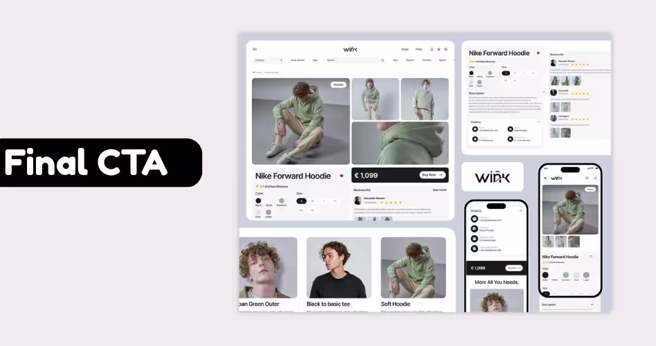
A visitor can read your homepage, understand the product, like the features, and even trust your company. But none of that matters if they don't know what to do next.
That's why most SaaS homepages end with a clear call-to-action (CTA). Think of it as a signpost. Its job is to point visitors toward the next step, whether that's starting a free trial, booking a demo, creating an account, or contacting sales.
Without a clear CTA, people are left to figure things out on their own. Some will leave the page, get distracted, or decide to come back later. A strong CTA makes the decision easy.
Common examples include:
- Start Free Trial
- Book a Demo
- Get Started
- Contact Sales
- Create an Account
The best CTAs are simple and specific. Visitors should immediately understand what will happen after they click.
The same principle applies to service websites. If you're evaluating agencies, here’s a guide on choosing SaaS website design agencies based on the products, buyers and CRO-focused design.
Example: Slack ends its homepage with clear actions such as "Try for Free" and "Talk to Sales." Instead of making visitors search for the next step, the company puts the most important actions directly in front of them.
Who Should Use This Framework?
Not every website has the same goals, audience, or buying process. The framework in this guide is designed specifically for SaaS companies that need to explain their product, build trust, and turn visitors into users or customers.
If You're Building or Improving a SaaS Homepage
- SaaS Founders: If you're launching a new product or redesigning an existing homepage, this framework can help you communicate your value more clearly and guide visitors toward signups, demos, or free trials.
- Product Marketers: Product marketers can use these sections to improve messaging, highlight key differentiators, and create a homepage that supports the buyer journey from awareness to conversion.
- UX Designers: UX designers can use this framework as a starting point for structuring content and creating a homepage that feels intuitive and easy to navigate.
If You're Working With a Small or Growing Team
- SaaS Startups: Startups often have limited time and resources. Following a proven homepage structure can help you avoid guesswork and focus on the information visitors care about most.
- Growing SaaS Companies: As products become more complex, homepage messaging can become cluttered. This framework helps organize information in a way that's easier for potential customers to understand.
When This Framework Might Not Be the Best Fit
- Ecommerce Stores: Online stores have a different goal. Instead of explaining a software product, they focus on showcasing products, categories, pricing, and the checkout experience.
- Portfolio Websites: Portfolio sites are designed to showcase work, skills, and personal achievements. They usually don't need the same level of product education and buyer guidance that SaaS websites require.
Common SaaS Homepage Mistakes
Even if you include all the right sections, small mistakes can make your homepage harder to understand and less effective at converting visitors. Here are some of the most common issues to watch for.
- Listing Features Too Early: Many SaaS companies start talking about features before explaining the problem they solve. As a result, visitors see a list of capabilities without understanding why they matter. Build context first, then introduce features.
- Hiding Social Proof: Trust is one of the biggest factors in buying decisions. When customer logos, testimonials, or reviews are buried near the bottom of the page, visitors may leave before they see them. Social proof works best when it's easy to find.
- Copying Competitors: Looking at successful SaaS websites can be helpful, but copying them rarely works. Your product, audience, and customer journey are different. Focus on answering your visitors' questions instead of recreating someone else's homepage.
- Explaining Too Much: A homepage isn't meant to answer every possible question. Trying to explain every feature, workflow, and use case often creates confusion instead of clarity. Give visitors enough information to understand the product and encourage them to learn more.
- Using Too Many Sections: More sections don't automatically create a better homepage. In many cases, they make important information harder to find. Every section should have a clear purpose and earn its place on the page.
- Weak or Confusing Headlines: Visitors often decide whether to continue reading based on the headline alone. If your headline is vague, clever, or difficult to understand, people may leave before learning what your product actually does.
- No Clear Next Step: Some homepages do a great job explaining the product but never tell visitors what to do next. Whether it's starting a free trial, booking a demo, or contacting sales, the next step should always be obvious.
Frequently Asked Questions
Do all SaaS homepages need these 10 sections?
Not necessarily. The exact structure can vary depending on your product, audience, and sales process. However, most successful SaaS homepages include some version of these sections because they help answer important buyer questions.
What is the most important section on a SaaS homepage?
The hero section is often the most important because it's the first thing visitors see. If people don't quickly understand what your product does, they may leave before exploring the rest of the page.
Should pricing be displayed on the homepage?
It depends on your business model. Self-service SaaS products often show pricing directly on the homepage, while enterprise products may guide visitors toward a demo or sales conversation instead.
How long should a SaaS homepage be?
There is no perfect length. A homepage should be long enough to answer key questions but short enough to stay focused. The goal is clarity, not word count.
Can I combine some of these sections?
Yes. Many SaaS companies combine sections such as benefits and features, or social proof and customer stories. What matters is that the information is still easy to understand.
Should I copy the homepage structure of successful SaaS companies?
You can learn from successful examples, but avoid copying them directly. Your homepage should be built around your audience, product, and customer needs.
How often should I update my SaaS homepage?
Review your homepage whenever your product, positioning, audience, or messaging changes. Even small updates can improve clarity and conversions over time.
Final Thoughts
The best SaaS homepages don't try to say everything at once. They answer the right questions in the right order. From the hero section to the final CTA, each part of the page should help visitors understand the product, build confidence, and decide what to do next.
As you evaluate your homepage, don't focus on adding more sections or copying competitors. Instead, focus on the questions your visitors are asking. If your homepage answers those questions clearly and guides people toward action, you're already ahead of most SaaS companies.
.avif)