- What Is Heuristic Evaluation?
- When Should You Use a Heuristic Evaluation?
- Nielsen’s 10 Usability Heuristics Explained
- How to Conduct a Heuristic Evaluation (Step by Step)
- How to Rate Severity in a Heuristic Evaluation
- Heuristic Evaluation Template and Example
- Benefits and Limitations of Heuristic Evaluation
- Heuristic Evaluation vs. Other UX Research Methods
- Frequently Asked Questions
- Final Thoughts


Heuristic Evaluation: 10 Usability Heuristics, Steps and Template


- Heuristic evaluation is a usability inspection method that helps identify interface problems using established usability principles.
- Nielsen’s 10 usability heuristics provide a framework for assessing how easily users can navigate, understand, and interact with a digital product.
- A heuristic evaluation involves defining the scope, selecting 3 to 5 evaluators, inspecting the interface, identifying usability issues, and documenting findings.
- Each usability issue should be assessed based on its frequency, impact, and persistence to determine its severity and priority.
- Effective evaluation reports connect usability problems to specific heuristics, explain their impact on users, and recommend actionable design improvements.
- Heuristic evaluation can uncover usability problems early, but it does not replace usability testing with real users.
- Using practical examples, evaluation checklists, and a simple template makes it easier to conduct and communicate heuristic evaluations.
When reviewing a website or app, it’s easy to focus on what you can see: spacing, typography, colors, and layout. But some of the most important usability problems have little to do with appearance.
They show up when users try to complete a task, recover from an error, understand a system response, or move between different parts of a product.
Heuristic evaluation gives UX designers a method for examining these interactions. It involves reviewing an interface against established usability principles to identify problems that could make the product harder to use.
We’ll explore Nielsen’s 10 usability heuristics, what each principle means, and show you how to conduct a heuristic evaluation step by step. You’ll also learn how to assess issue severity, use a simple template, and turn your findings into actionable recommendations.
What Is Heuristic Evaluation?
Heuristic evaluation is a usability inspection method used to identify problems in a website, app, or digital product. It involves reviewing an interface against a set of established usability principles, known as heuristics. These principles help evaluators assess whether an interface is easy to understand, navigate, and use.
The method was introduced by Jakob Nielsen and Rolf Molich in their 1990 paper, Heuristic Evaluation of User Interfaces. It’s often called a “discount usability” method because it’s fast and low-cost compared to many other UX research methods. It’s also a type of expert review, since UX specialists do the evaluation, not real users.
During a UX heuristic evaluation, designers examine different parts of a product and look for interactions that might confuse users or make tasks harder to complete.
They pay attention to details such as navigation, button labels, error messages, system feedback, and consistency across screens. When they find a usability problem, they document it, identify the relevant heuristic, and suggest ways to improve the experience.
For example, imagine a user completing a checkout process on an e-commerce website. After clicking the payment button, the page takes several seconds to respond without showing a loading indicator or confirmation.
The user might assume the payment failed and click the button again. An evaluator would identify this as a usability issue because the interface doesn’t communicate what’s happening.
When Should You Use a Heuristic Evaluation?
Heuristic evaluation works at almost any stage of a project, but it’s most useful when you need quick answers without recruiting users. Common moments include:
- Early design stage: Review wireframes and prototypes before development starts, when fixes are cheapest.
- Before usability testing: Catch the obvious problems first, so real-user sessions can focus on deeper issues.
- Before a redesign: Find out what’s broken in the current website or app before deciding what to change.
- After a launch or big update: Check new features against the same standards as the rest of the product.
- Competitor reviews: Run a heuristic evaluation of a competitor’s website or app to spot gaps you can improve on.
Nielsen’s 10 Usability Heuristics Explained
Jakob Nielsen’s 10 usability heuristics provide a framework for evaluating how well an interface supports its users. Nielsen refined the list in 1994, and the Nielsen Norman Group still publishes it as the “10 usability heuristics for user interface design.” Each principle focuses on a different aspect of usability, from keeping users informed about system activity to preventing errors and maintaining consistency.
Together, they help designers identify common interface problems and understand where a product’s user experience needs improvement. They also work well alongside other UX laws every designer should know. Let’s look at each principle, how it works, and what it means for everyday interface design.
1. Visibility of System Status
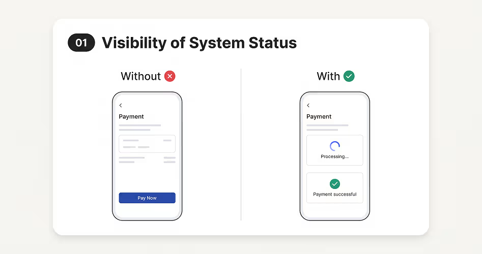
Visibility of System Status means keeping users informed about what’s happening when they interact with a website or application. The interface should provide feedback when users perform an action, whether they’re submitting a form, uploading a file, or making a payment. Users should know whether their action was received, is still processing, or has been completed.
For example, when someone submits an online payment, the website should display a loading indicator while processing the transaction. Once the payment is successful, it should show a confirmation message. If something goes wrong, the interface should explain the problem instead of leaving users uncertain.
Designers can communicate system status through different interface elements:
During a heuristic evaluation, check whether users receive timely feedback, understand the results of their actions, and can recognize the current state of the application.
2. Match Between the System and the Real World
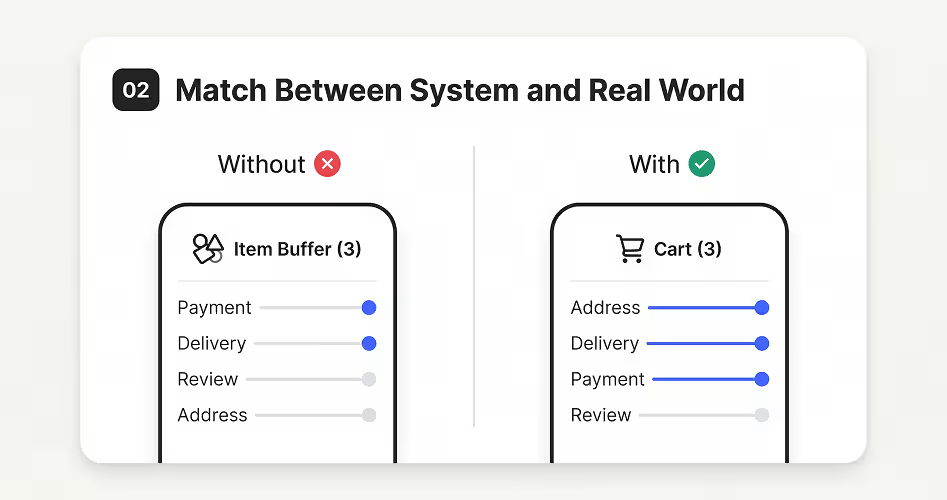
Think about the last time you used an application and came across a term you didn’t understand. You probably had to stop and figure out what it meant before moving forward. That’s exactly the kind of problem this heuristic aims to prevent.
A good interface speaks the user’s language, not the developer’s. It uses familiar words, clear UX writing, recognizable icons, and workflows that match people’s expectations.
For example, an online shopping website uses a shopping cart icon to represent selected products. Users already understand what a shopping cart does, so they don’t need an explanation.
The same idea applies to how information is organized. A checkout process should follow a logical order: add an address, choose a delivery method, enter payment details, and review the order. Making users jump between unrelated steps only adds confusion.
When evaluating this principle, ask yourself: Would someone unfamiliar with the product understand its labels, icons, and actions? Does the interface follow a logical order? Or does it expect users to learn how the system works before they can use it?
3. User Control and Freedom
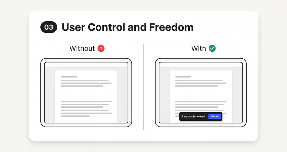
Users don’t always make the right choice when interacting with a website or application. They might click the wrong button, delete something accidentally, or open a page they didn’t intend to visit. User Control and Freedom means giving them a way to reverse these actions or leave unwanted situations without starting over.
For example, imagine writing a document and accidentally deleting an entire paragraph. An Undo button lets you restore the deleted text without rewriting it. Similarly, a Cancel button can stop an unwanted process, while a Back button helps users return to a previous screen.
Common features that support this principle include:
- Undo and Redo: Reverse or repeat previous actions.
- Cancel: Stop an ongoing process.
- Back and Close: Leave unwanted screens or dialogs.
- Undo Delete: Recover accidentally deleted content.
When designing an interface, consider whether users can easily correct mistakes, cancel actions, and exit unwanted processes. For actions that cannot be reversed, such as permanently deleting an account, provide a clear warning and an opportunity to reconsider.
The goal is to give users control over their interactions rather than making them feel trapped by the system.
4. Consistency and Standards
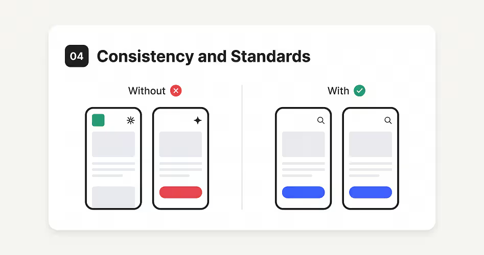
Consistency and Standards means keeping design elements and interactions predictable throughout a website or application. When users learn how something works on one page, they should be able to use that same knowledge on other pages.
Buttons, navigation menus, icons, and similar elements should follow familiar patterns rather than behaving differently without a clear reason. Many teams keep this under control with a shared design system.
This principle also applies to conventions people already recognize from other websites and applications. For example, users expect a shopping cart icon to show selected products and a magnifying glass to represent search. Changing these familiar meanings can make an interface harder to understand.
There are two important aspects of this principle:
- Internal consistency: Maintain similar design patterns and interactions throughout the same product.
- External consistency: Follow familiar conventions that users recognize from other products.
During a heuristic evaluation, look for inconsistent button styles, confusing icon meanings, changing navigation patterns, and interactions that behave differently across similar screens. The goal is to help users recognize familiar patterns instead of learning how every part of the interface works again.
5. Error Prevention
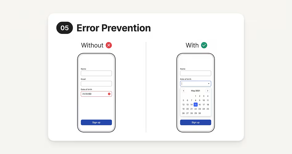
A well-designed interface shouldn’t wait for users to make mistakes before helping them. It should anticipate where things could go wrong and make those mistakes less likely. This is the idea behind Error Prevention.
Consider an online registration form. If a user needs to enter their date of birth, providing a date picker is often easier than asking them to type it manually.
Similarly, a form can highlight missing information before submission, while an online store can let customers review their order before making payment. These design decisions reduce the chances of incorrect entries and unintended actions.
Not every mistake can be prevented, but designers can remove many common causes. This might involve providing sensible default options, restricting invalid inputs, showing clear instructions, or warning users before they perform actions that cannot easily be reversed.
When evaluating this principle, look beyond the error messages. Ask whether the interface could have prevented the mistake in the first place. That’s the real focus of Error Prevention.
6. Recognition Rather Than Recall
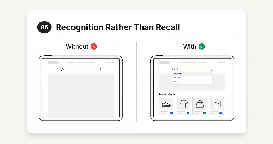
People can recognize information more easily than they can remember it from memory. This heuristic encourages designers to keep important information, options, and actions visible instead of expecting users to remember them from previous interactions.
For example, an e-commerce website that displays recently viewed products makes it easier for customers to return to something they were interested in. They don’t need to remember the product name or search for it again.
Similarly, search suggestions, saved addresses, visible navigation menus, and autofill options help users find what they need without relying on memory.
This becomes particularly important when users move between different pages or complete multi-step tasks. If they have to remember details from one screen to use on another, the interface creates unnecessary mental effort.
During a heuristic evaluation, look for places where users must remember information, instructions, or actions that could be displayed directly in the interface. A good design makes relevant information easy to find when users need it.
7. Flexibility and Efficiency of Use
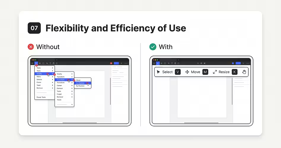
Not everyone uses a website or application in the same way. Beginners may need clear instructions and visible controls, while experienced users often prefer shortcuts that help them complete tasks faster. Flexibility and Efficiency of Use means designing interfaces that support both without making either group struggle.
For example, in a design application like Figma, beginners can use the toolbar to select, move, and resize objects. Experienced designers can use keyboard shortcuts to perform the same actions more quickly. Both can achieve the same result, but they can choose the method that suits their experience.
Other features that improve efficiency include keyboard shortcuts, autofill, saved preferences, customizable toolbars, and bulk actions. These options reduce repetitive work and make frequently performed tasks easier.
When evaluating this heuristic, consider whether users have faster ways to complete common tasks, whether the interface supports different experience levels, and whether repetitive actions can be simplified. The goal is to make everyday tasks easier without making the interface difficult for beginners to learn.
8. Aesthetic and Minimalist Design
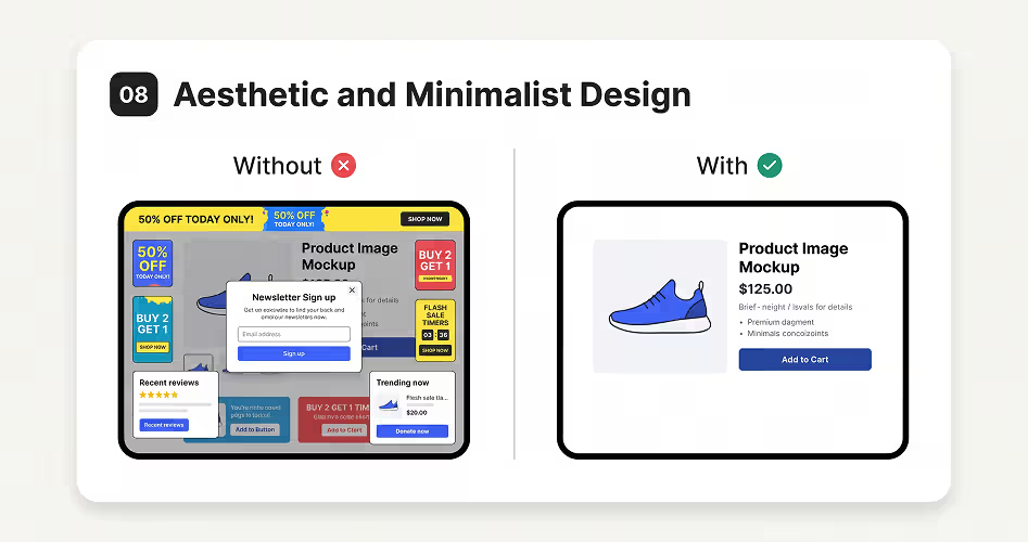
A good interface doesn’t need to show everything at once. It needs to make the right information easy to find. Aesthetic and Minimalist Design focuses on removing unnecessary content and giving priority to elements that support the user’s current task.
Think about an e-commerce product page. Customers mainly want to see the product, its price, important details, and how to purchase it. If the page is crowded with promotional banners, pop-ups, unrelated recommendations, and too many competing buttons, finding that information becomes harder. The problem isn’t necessarily the number of elements, but whether they add value to the experience.
This principle also involves creating a clear visual hierarchy. Important information should stand out, while secondary details should remain accessible without competing for attention. Designers can achieve this through appropriate spacing, typography, layout, and visual emphasis.
Remember: Minimalist design doesn’t mean removing everything. An interface can look simple but still be difficult to use if it hides important information or removes useful guidance. Every element should have a clear purpose and help users complete their tasks.
9. Help Users Recognize, Diagnose, and Recover from Errors
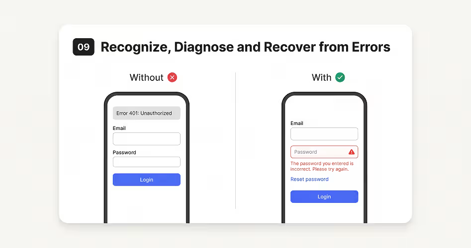
Errors are sometimes unavoidable, but users shouldn’t have to figure out what went wrong on their own. This heuristic focuses on making error messages clear, explaining the problem, and helping users find a way to fix it.
For example, when someone enters an incorrect password, displaying “Error 401: Unauthorized” doesn’t tell them much. A better message would say, “The password you entered is incorrect. Please check it and try again.” Adding a password reset link gives users another way to resolve the issue.
A useful error message should do three things:
- Recognize: Make it clear that something went wrong.
- Diagnose: Explain the problem in simple, understandable language.
- Recover: Suggest what users can do to fix it.
This principle applies to more than login forms. It also covers payment failures, missing fields in contact forms, failed uploads, and network errors. During a heuristic evaluation, check whether error messages explain the problem, identify where it occurred, and provide clear next steps.
10. Help and Documentation
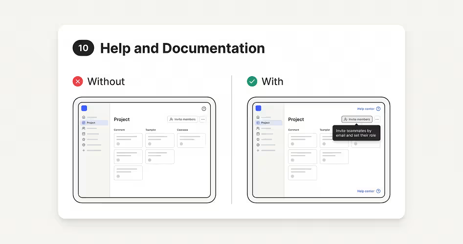
Even a well-designed interface may not answer every question users have. They might need help understanding an unfamiliar feature, completing a task, or fixing a problem. Help and Documentation focuses on making useful guidance available whenever users need it.
Someone using a project management application for the first time might not know how to invite team members or manage their permissions. Short tooltips, step-by-step instructions, or a searchable help center can guide them through the process without requiring assistance from someone else. This is why a good customer onboarding flow matters so much in SaaS products.
Common ways to provide help include:
- Tooltips: Explain unfamiliar buttons and features.
- FAQs: Answer frequently asked questions.
- Help centers: Provide detailed guides and instructions.
- Tutorials: Walk users through specific tasks.
- Contextual help: Show relevant guidance within the interface.
However, documentation shouldn’t replace good interface design. If users constantly need instructions to perform basic actions, the interface itself may be too complicated. During a heuristic evaluation, check whether help is easy to find, relevant to the task, and written in language users can understand.
How to Conduct a Heuristic Evaluation (Step by Step)
Knowing the 10 usability heuristics is only half the job. Here’s how to run a heuristic evaluation from start to finish, based on the process recommended by Nielsen Norman Group.
Step 1: Define the Scope and Key Tasks
Decide what you’re evaluating. It could be a full website, a single app flow like sign-up or checkout, or a new feature. Then list the main tasks users need to complete, such as “create an account” or “buy a product.” A clear scope keeps the review focused and stops it from turning into a general opinion session.
Step 2: Pick 3 to 5 Evaluators
One person will miss a lot. Nielsen’s research found that a single evaluator finds only about 35% of usability problems, while five evaluators find around 75%.
That’s why 3 to 5 evaluators is the usual recommendation. If your team doesn’t have UX specialists, working with an experienced UI/UX design agency gives you trained evaluators who haven’t been too close to the product.
Step 3: Brief Evaluators and Share the Heuristics
Give every evaluator the same information: the scope, the user tasks, who the target users are, and the list of heuristics. You can also share a simple heuristic evaluation questionnaire or checklist (see the one below) so everyone reviews the product in the same way.
Step 4: Evaluate the Interface Independently
Each evaluator should review the interface alone, so their findings aren’t influenced by others. Most evaluators go through the product twice: the first pass to understand the overall flow, and the second pass to look closely at each screen. For every problem, they note where it happens, which heuristic it breaks, and why it matters.
Step 5: Combine Findings and Rate Severity
Once everyone is done, bring all findings into one list. Remove duplicates, group similar issues, and give each problem a severity rating (explained in the next section). This turns a long list of notes into a clear order of what to fix first.
Step 6: Write the Report and Recommend Fixes
Finally, document each issue with a short description, the heuristic it breaks, its severity, a screenshot, and a suggested fix. A good report makes it easy for designers and developers to act without needing a long meeting to explain it.
How to Rate Severity in a Heuristic Evaluation
Not every usability problem is equally serious. A heuristic evaluation severity rating helps your team decide what to fix first. Nielsen suggests looking at three factors:
- Frequency: How often does the problem happen? Is it common or rare?
- Impact: When it happens, how hard is it for users to get past it?
- Persistence: Is it a one-time problem users learn to avoid, or will it keep bothering them?
These three factors are combined into a simple 0 to 4 scale, as described by Nielsen Norman Group:
Ask each evaluator to rate severity on their own, then average the scores. This gives you a fairer result than one person’s opinion.
Heuristic Evaluation Template and Example
You don’t need special heuristic evaluation tools to get started. A spreadsheet, a shared doc, or a FigJam or Miro board is enough. What matters is that every evaluator records findings in the same format.
Heuristic Evaluation Template
Use these columns to log each issue:
You can also add a screenshot column and an “Evaluator” column if more than one person is filling it in.
Heuristic Evaluation Example
Here’s a heuristic evaluation example for the checkout flow of an online store:
Writing the Heuristic Evaluation Report
A heuristic evaluation report turns your findings into a plan. Keep it short and easy to scan:
- Summary: What you evaluated, who evaluated it, and the top 3 to 5 problems.
- Method: The heuristics used, number of evaluators, and the user tasks covered.
- Findings: The full issue list, sorted by severity, with screenshots.
- Recommendations: Clear, practical fixes for each issue.
- Next steps: What to fix first and which issues need usability testing to confirm.
If you want to see how real reports are structured, these UX audit report examples follow a very similar format.
Quick Heuristic Evaluation Checklist
Use these questions as a fast checklist while reviewing each screen:
Benefits and Limitations of Heuristic Evaluation
Heuristic evaluation is popular for good reasons, but it isn’t perfect. Knowing both sides helps you use it in the right way.
Benefits
- Fast and low-cost: No need to recruit users, book sessions, or pay incentives.
- Works early: You can evaluate sketches, wireframes, and prototypes, not just live products.
- Finds many issues at once: A few evaluators can uncover a large number of problems in a short time.
- Easy to repeat: The same heuristics can be used every time the product changes.
Limitations
- No real users: Results are based on expert opinion, not actual user behavior.
- Depends on evaluator skill: Less experienced evaluators may miss problems or flag things that aren’t real issues.
- Can produce false alarms: Some problems found may not bother real users at all.
- Misses context: Evaluators may not fully understand users’ goals, industry, or daily workflow.
Heuristic Evaluation vs. Other UX Research Methods
Heuristic evaluation is one of several methods used to identify usability problems. However, each method examines a product differently. Some rely on expert reviews, while others involve real users or compare design performance.
Frequently Asked Questions
What is a heuristic evaluation in UX?
A heuristic evaluation in UX is an expert review where UX specialists check a website or app against a set of usability principles, usually Nielsen’s 10 usability heuristics. The goal is to find usability problems, such as confusing labels or unclear error messages, before they frustrate real users.
What are Nielsen’s 10 usability heuristics?
Nielsen’s 10 usability heuristics are: visibility of system status, match between the system and the real world, user control and freedom, consistency and standards, error prevention, recognition rather than recall, flexibility and efficiency of use, aesthetic and minimalist design, helping users recognize, diagnose, and recover from errors, and help and documentation.
What is the difference between a UX audit and a heuristic evaluation?
A heuristic evaluation checks an interface against usability principles only. A UX audit is wider and can include accessibility, content, analytics, user journeys, and business goals. In most projects, a heuristic evaluation is one step inside a full UX audit.
What is the difference between a cognitive walkthrough and a heuristic evaluation?
A cognitive walkthrough follows one specific task step by step from a new user’s point of view. A heuristic evaluation reviews the whole interface against a list of principles. Walkthroughs test how easy a task is to learn, while heuristic evaluations find a broader mix of usability problems.
How many evaluators do you need for a heuristic evaluation?
Most experts recommend 3 to 5 evaluators. One evaluator usually finds only about a third of the problems, while five evaluators find around 75%. Adding more than five gives smaller returns for the extra time and cost.
How long does a heuristic evaluation take?
It depends on the size of the product. Each evaluator’s review session usually takes 1 to 2 hours for a focused flow. A full evaluation of a website or app, including combining results and writing the report, often takes a few days to about two weeks.
Is heuristic evaluation qualitative or quantitative?
Heuristic evaluation is mainly qualitative, because it’s based on expert judgment about what could confuse users. Severity ratings and issue counts add a small quantitative layer, which helps teams compare and prioritize problems.
Can AI do a heuristic evaluation?
AI tools can help by scanning screens and flagging common issues, like missing feedback or inconsistent buttons. However, they often miss context, such as who the users are and what they’re trying to do. AI works best as a helper for human evaluators, not a replacement.
Final Thoughts
Heuristic evaluation gives UX designers a practical way to identify usability problems before they affect more users. By reviewing an interface against Nielsen’s 10 usability heuristics, teams can find confusing interactions, improve navigation, prevent common mistakes, and make digital products easier to use.
However, identifying problems is only the first step. The real value comes from turning those findings into meaningful design improvements. Combine heuristic evaluation with usability testing and feedback from real users to build products that work well for the people using them.