Table of Contents
- What people get wrong about wireframes, mockups, and prototypes
- Wireframes: what they are and when to stop using them
- Mockups: what they do that wireframes cannot
- Prototypes: when static designs stop being enough
- Wireframe vs Mockup vs Prototype: the decision filter
- Low-Fidelity vs High-Fidelity: where the real trade-off lives
- Best tools for each stage in 2026
- Three mistakes that ruin the transition between stages
- Frequently asked questions
- Conclusion


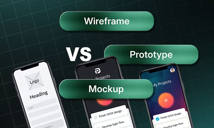
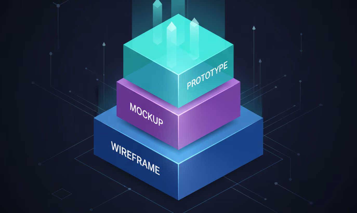
- A wireframe defines layout and structure, a mockup shows visual style, and a prototype demonstrates interaction.
- Each stage answers a different question: where does content go, how does it look, and how does it work.
- Skipping straight from idea to high-fidelity mockup burns weeks of design work before a single layout question is answered.

Design projects break down at predictable moments. A developer asks if the design is final when it's still a rough sketch. A client complains that "nothing works yet" while looking at a static screen. A PM wonders why feedback took three weeks when the team was building a prototype nobody had approved.
Every one of those situations points to the same problem: the team didn't agree on which stage the design was in.
Wireframes, mockups, and prototypes serve three different purposes. Each one answers a different question, requires a different amount of time to build, and unlocks a different type of feedback. Using them in the wrong order, or skipping one entirely, creates exactly the confusion described above.
Understanding wireframe vs mockup vs prototype is not abstract theory. It's a practical decision every designer, PM, and founder makes at the start of every project. Get it right and feedback loops tighten. Get it wrong and you'll rebuild the same screens three times.
What people get wrong about wireframes, mockups, and prototypes

Wireframes, mockups, and prototypes answer three separate design questions. Treating them as interchangeable forces teams to collect the wrong feedback at the wrong time. A client who gives color feedback during a wireframe review is solving the wrong problem at the wrong stage.
Here's the core misconception: that fidelity and interactivity are the same thing. Fidelity refers to how visually detailed a design is. Interactivity refers to whether a design responds to clicks and navigation. A high-fidelity mockup can be completely static. A low-fidelity prototype can be fully clickable. Confusing the two leads teams to skip the mockup stage entirely and prototype far too early.
A second misconception is that wireframes are only for junior designers or early-stage projects. Figma's own design team wireframes before building every major feature. Sketch publishes process documentation showing that wireframing shortens client revision cycles by removing visual distraction from structural decisions.
Understanding the full UI/UX design process helps here. Each stage produces a specific output for a specific audience. Wireframes are for structure decisions. Mockups are for visual decisions. Prototypes are for behavior decisions. Get that framing right and review meetings stop being about the wrong things.
Wireframes: what they are and when to stop using them
A wireframe is a low-detail structural blueprint of a digital screen. It uses boxes, lines, and placeholder text to show where content lives, without committing to any color, typography, or branding. No aesthetic decisions live in a wireframe: only structure and layout.
Wireframes answer one question: where does everything go?
Low-fidelity wireframes are hand-drawn or built in tools like Balsamiq. A single screen can be sketched in under five minutes. Use them when exploring multiple layout options and needing to test structure ideas without investing time in polish.
High-fidelity wireframes use tools like Figma or Adobe XD and produce cleaner, more precise layouts. Use them when structure is approved and the team needs a handoff-ready blueprint before the visual design phase begins.
Stop wireframing when layout and content hierarchy are locked. Not when the design looks good. Stop when the structure works. Once every element has the right place on every screen, move to mockups. Refining wireframes after structure is approved wastes time that visual design will solve in a fraction of the sessions.
Here's where teams stall: they over-refine wireframes because structural feedback feels safer than visual feedback. But a perfect wireframe still produces the same surprises a 20-minute mockup review would catch faster.
Balsamiq built its product around this insight. Its tool forces low fidelity by design, making wireframes look deliberately rough so no one confuses them for finished work. According to Balsamiq's own documentation, the hand-drawn aesthetic exists to signal "this is still a conversation, not a decision."
Wireframes sit at the skeleton plane of design. If you're working through Jesse James Garrett's 5 planes of UX, that skeleton plane defines page layout and interface design before any visual presentation decisions enter the room. Resolving skeleton-plane questions during the surface phase, when colors and typography are already in play, costs weeks.
Mockups: what they do that wireframes cannot
A mockup is a static, high-fidelity visual representation of a screen. It includes real colors, actual typography, brand imagery, and finalized iconography. Mockups show exactly what the finished product will look like, without any interactivity.
Mockups answer one question: how does this actually look?
Where wireframes keep visual decisions out of the conversation, mockups invite them in. A mockup is the first time a stakeholder can say "that blue doesn't match our brand" or "the call to action isn't prominent enough." Getting those comments during mockup review costs a fraction of what the same feedback costs during prototyping or development.
UI mockup tools have shifted significantly over the past five years. Figma's component system lets design teams build reusable UI elements once and apply them across every screen in the mockup. A button style change in one component updates across 40 screens simultaneously. Before Figma, that same change required manual updates across every file and caused visual inconsistencies in large projects.
Sketch pioneered the component-first approach. Adobe XD combined vector design and annotation in one workflow. Figma now leads for team-based mockup work because of real-time collaboration and browser-based access that requires no installs.
For product teams building on a shared design language, mockups are where the system gets applied to real screens. A design system for SaaS ensures every mockup screen uses the same tokens, spacing rules, and component variants. That consistency makes the mockup closer to production-ready code than it appears on the surface.
Stop using mockups when visual decisions are locked and approved. When a stakeholder says "this looks right, now show me how it flows," that's the cue to move to prototyping. Staying in mockups after that point is answering a structural question with a static image.
Prototypes: when static designs stop being enough
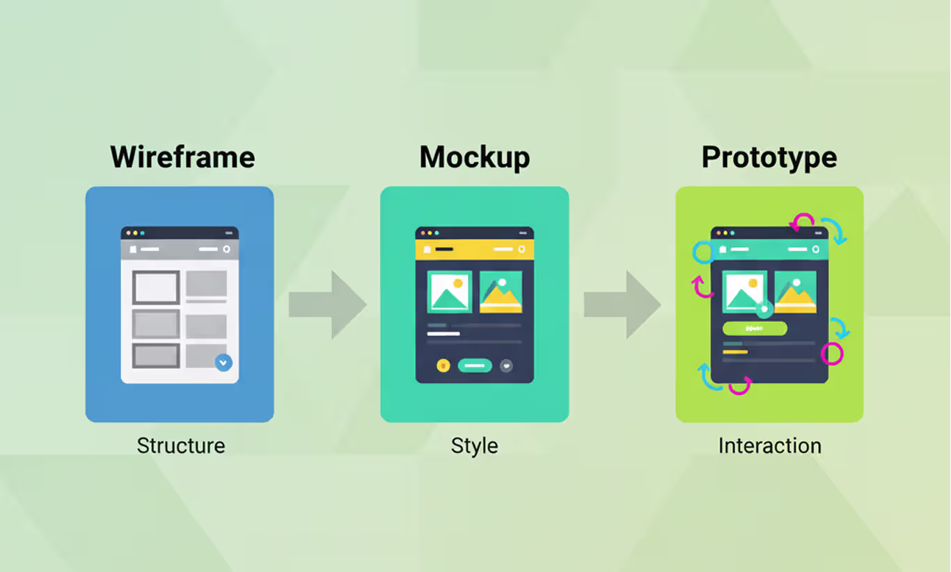
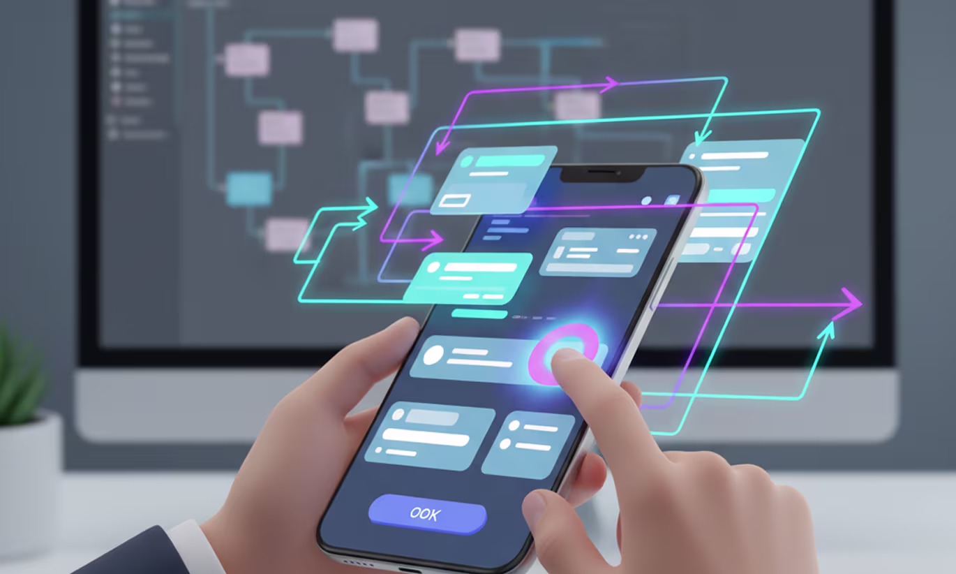
A prototype is an interactive version of a design that simulates real user flows and behaviors. Users can click buttons, navigate between screens, and complete tasks without any functional code running behind it.
Prototypes answer one question: how does this actually work?
Low-fidelity prototypes use rough visuals with basic click paths. Use them to test whether a navigation flow makes sense before investing time in visual design. High-fidelity prototypes mirror the finished product in both design quality and interaction depth. Use them for stakeholder presentations, usability testing, and developer handoff.
Mockup vs prototype becomes a critical distinction during usability testing. A mockup can't reveal whether a user understands how to complete a task, because the user can't try to complete it. A prototype can. On the Gourmeat food delivery app, our prototype testing identified critical checkout friction points that the static mockups never revealed fixes that directly contributed to a 32% increase in checkout completion and a 21% drop in abandonment. Prototypes make those discoveries possible before a single line of code is written.
Figma handles both mockups and interactive prototypes in the same file, which is a large part of why it became the standard for product design teams. ProtoPie extends prototype capability with conditional interactions, variables, and sensor-based gestures for mobile. InVision built its product around prototype-based client collaboration before Figma absorbed that use case.
When designing a mobile product, prototyping is where interaction patterns get validated. Whether a swipe gesture reads naturally, whether a bottom sheet navigation feels intuitive, whether the tab bar placement is correct. None of that shows up in a static screen. The Figma mobile app design guide covers how to set up prototype flows that replicate real device behavior, including transition types and scroll interactions.
Stop prototyping when usability testing stops producing new findings and stakeholders have approved all major flows. Everything built after that point belongs to the development team.
Wireframe vs Mockup vs Prototype: the decision filter
Choosing which stage to use on a given project depends on one question: what decision are you trying to make right now?
Here's the comparison across six criteria that actually drive project decisions:
Apply this filter at the start of every review meeting. Identify what question needs answering next and choose the stage that answers it. Skip structure decisions and jump straight to mockups: every visual choice gets contested because nobody agreed on layout first. Skip mockups and move straight to prototyping: half the prototype feedback will be about colors that were never approved.
Here's the exception worth knowing: early-stage startup teams sometimes combine low-fidelity wireframes and low-fidelity prototypes into a single clickable wireframe. Figma makes this fast enough that the boundary between stages blurs. That approach works when speed is the priority and the team is small enough to hold visual decisions in a shared context. With external clients or larger teams, separating the stages prevents feedback confusion.
Wireframe vs prototype is also a separate decision from wireframe vs mockup. A team can move from wireframe directly to a high-fidelity prototype when the visual language is already locked in a design system. If components, tokens, and styles already exist, building a high-fidelity prototype from the wireframe skips the static mockup stage entirely. Nothing is lost.
Low-Fidelity vs High-Fidelity: where the real trade-off lives
Fidelity is how detailed and realistic a design artifact is. Low-fidelity means rough and fast. High-fidelity means polished and precise. Every wireframe, mockup, and prototype sits somewhere on that scale, and choosing the right level changes how useful the feedback you collect will be.
Low-fidelity designs have one clear advantage: speed. A lo-fi wireframe takes 20 minutes to produce. A high-fidelity prototype can take 20 hours. When you're still testing whether an idea works at all, low fidelity lets you fail fast and change direction without sunk cost.
High-fidelity designs have one clear advantage: precision. A hi-fi prototype produces feedback that maps directly to the final product experience. Usability test results from a lo-fi prototype sometimes miss issues that only appear when real visual weight, contrast ratios, and spacing are in place.
Here's the practical rule: use the lowest fidelity that still answers the question being asked. Running a stakeholder alignment meeting on information architecture? A lo-fi wireframe is enough. Validating a checkout flow before launch? Use a hi-fi prototype that matches the production visual design.
Mixing fidelity levels across the same project is valid and common. A landing page might be in high-fidelity mockup while the settings flow is still being wireframed. Progress doesn't have to move at the same pace across every screen in the product.
Best tools for each stage in 2026
Choosing the right tool depends on where you are in the design process and what output the team needs at that moment.
For wireframing: Balsamiq remains the fastest choice for lo-fi wireframes. Its deliberately rough visual style signals to everyone in the room that structure, not aesthetics, is the topic. Figma handles high-fidelity wireframing natively, with grids, auto-layout constraints, and component libraries that make precise layout work faster than any competing tool.
For mockups: Figma leads for team collaboration. Real-time co-editing, shared component libraries, and browser access mean a designer in New York and a client in Dhaka can review the same file in the same moment. Sketch holds a loyal base among Mac-focused teams with established plugin workflows. Adobe XD suits teams already embedded in the Creative Cloud ecosystem.
Extending Figma's mockup capability is straightforward with the right plugins. The best Figma plugins and UI kits cover everything from auto-layout components to accessibility checkers to realistic content generation, reducing the manual work of populating mockups with real data.
For prototyping: Figma's built-in prototyping handles the vast majority of product design use cases. ProtoPie handles complex conditional logic, variable states, and device-specific gesture interactions that Figma doesn't support natively. InVision still works for teams with existing workflows built around it.
Prototype quality directly affects handoff speed. Clean Figma files with named components, organized layers, and annotated interactions reduce developer questions and prevent post-launch design rework. For teams moving from validated prototype to built product, the MVP development process depends heavily on how clearly the prototype communicates intent: not just how it looks, but how every state and interaction is documented.
Three mistakes that ruin the transition between stages
Changing from one design stage to the next is where errors get introduced. Designs themselves are rarely the problem. How teams communicate across stage boundaries is.
Mistake 1: Seeking visual feedback on wireframes
Starting visual conversations during wireframe review derails structure decisions. A stakeholder asking "why is the button gray?" during a wireframe session is reviewing the wrong artifact. Set stage expectations in the first 30 seconds of every design review. Name the stage, name what feedback is useful, and name what feedback belongs to the next stage.
Mistake 2: Prototyping before visual decisions are locked
Building a prototype before the mockup is approved guarantees revision cycles. Every stakeholder who sees a clickable screen will give visual feedback regardless of the intended review scope. Approve the visual direction first. Prototype after.
Mistake 3: Skipping usability testing before handoff
Prototypes exist to be tested. A prototype that moves from design approval directly to development, with no usability test in between, bypasses the entire purpose of building it. Even a five-participant unmoderated test run through a Figma share link catches critical navigation errors before a developer writes a single function.
When we redesigned the ADPList mentorship platform, prototype testing before handoff caught critical onboarding gaps that would have required expensive rework in production. Addressing them at the prototype stage reduced early drop-offs by 22% in the final product. For SaaS and mobile products, one focused prototype test targeting your highest-risk flows is enough to validate core paths before development. Running a prototype test takes hours. Reworking the same logic in production takes weeks.
Frequently asked questions
What is the difference between a wireframe and a mockup?
A wireframe defines the structure and layout of a screen using simple shapes and placeholder text, with no color or branding. A mockup adds color, typography, imagery, and visual style to show what the finished screen will look like. Wireframes answer "where does content go," mockups answer "how does it look."
What is the difference between a mockup and a prototype?
A mockup is a static, high-fidelity visual of a screen that cannot be clicked or navigated. A prototype is an interactive version of a design that simulates real user flows and lets users click through screens and complete tasks. Mockups answer visual questions; prototypes answer usability questions.
What comes first in the design process: wireframe, mockup, or prototype?
Wireframes come first, followed by mockups, then prototypes. Wireframes establish structure and layout. Mockups lock in visual design. Prototypes add interaction for usability testing. Skipping wireframes and starting with high-fidelity mockups creates layout problems that require expensive redesign later in the process.
When should you use wireframe vs prototype directly?
Move directly from wireframe to prototype when a shared design system already provides approved visual components, tokens, and styles. If components and visual rules exist, a high-fidelity prototype can be built from the wireframe without producing a separate static mockup. Without an existing design system, skip the mockup at your own risk.
Is a prototype higher fidelity than a mockup?
Not necessarily. Fidelity and interactivity are separate dimensions. A low-fidelity prototype can be rough and clickable. A high-fidelity mockup can be polished and completely static. High-fidelity prototypes combine visual polish with full interactivity, but the prototype itself can be built at any fidelity level depending on what the test needs to reveal.
What tools do designers use for wireframing, mockups, and prototypes?
Balsamiq and pen-and-paper are standard for lo-fi wireframing. Figma, Sketch, and Adobe XD handle high-fidelity wireframes and mockups. Figma and ProtoPie are the leading prototype tools. Figma is the only tool that handles all three stages in a single file, which is why it became the industry standard for product design teams.
How many usability test participants do you need for prototype testing?
Across Orbix Studio's mobile app projects including ADPList, Gourmeat, and SwiftWash prototype testing consistently surfaces the most critical flow issues before development begins. For most SaaS and mobile products, one focused test round on your highest-risk flows is enough to validate core user paths before handoff. The goal is not a large sample. It's testing the right flows at the right stage.
Conclusion
Knowing which stage to work in is more valuable than knowing how to design in any single stage. Wireframes lock the structure. Mockups lock the look. Prototypes validate the behavior. Each stage earns the right to the next one.
Pick one project you're on right now. Before the next design review, decide which stage the work is actually in. State it clearly at the start of the meeting. Watch how much faster the useful feedback comes.
Want to go deeper on your UI/UX process? Orbix Studio works with founders and product teams on everything from first wireframe through development handoff. Explore UI/UX Design →
Schedule Your Free Consultation
.avif)


%20(1).avif)