- Step 1: Define What Your Contact Form Design Needs to Solve
- Step 2: Evaluate Contact Form Options Against the Right Criteria
- Step 3: Validate the Design Before You Publish It
- What Orbix Studio Does Differently on Contact Forms
- Signs You Chose the Right Contact Form Design
- Frequently Asked Questions
- Conclusion


.svg)

%201%201.svg)
Contact Form Design: How to Choose the Right Approach for Your Site


- Contact form design fails on the decision, not the paint job: template versus custom, one step versus many, embedded versus a standalone page.
- Pick your approach by lead volume and stakes, not by what looks nice in a gallery.
- Readers often skip validation and publish a form nobody ever tested on a phone.
A founder picks a contact form template in ten minutes and moves on. Three months later, the form is still live, still simple, and still losing leads nobody ever traces back to it. The problem was never the fields. It was the decision made before the fields: which approach fits this business, this traffic, and this stage.
That decision is what a lot of contact form design guides skip. They show galleries of pretty forms and call it finished. This guide skips the gallery. It gives you a framework instead.
You'll learn how to define what your form needs to do. You'll learn how to evaluate the real options against that job. Then you'll learn how to validate the result before it ever goes live.
Step 1: Define What Your Contact Form Design Needs to Solve
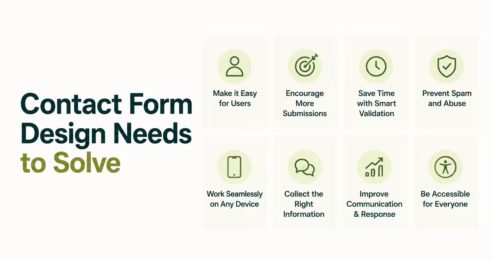
Contact form design is the process of deciding what a visitor sees, fills in, and clicks before a message reaches your team. It is not one thing. A one-field newsletter box and a ten-field project intake form both sit under "contact form design." They still solve completely different problems.
The wrong starting point is picking a template before naming the job. Start with the job, not the field list. A support form needs speed: two fields, one message box, one send button. A sales or project-intake form needs qualification instead: budget range, timeline, project type.
Confusing the two costs real leads. So many B2B sites lose serious buyers to a form built for casual visitors instead.
Here's where it gets interesting. "Contact form" and "contact us page design" get treated as the same search. They are not quite the same thing.
A contact form is the input widget. A contact page is the full experience around it: the map, the hours, the trust signals. If your page ranks well for "contact us page design" but still converts poorly, the form inside it is usually the reason why.
Contact form design succeeds when the fields match the stakes of the inquiry, not when the layout wins an award.
So the first move is naming your job in one sentence. "This form needs to filter serious project inquiries from casual questions" is a real answer. "This form should look modern" is not.
The job also depends on where the visitor stands before they reach the form. Someone who found you through a "contact form design ideas" search is still browsing. Someone typing "best contact form design" or landing straight on your contact page has already decided to reach out. Design for the second group first, since they carry the higher stakes.
Once the job is named, the next step is evaluating your actual options against it. That evaluation is where the template, format, and placement decisions actually get made.
Step 2: Evaluate Contact Form Options Against the Right Criteria
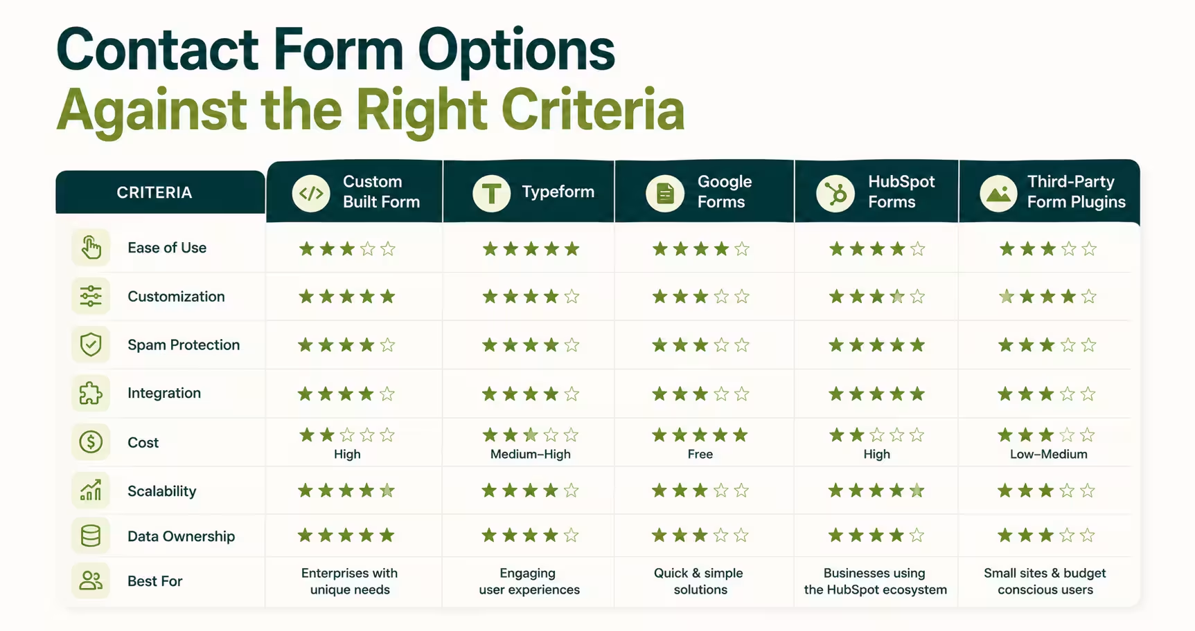
Choosing a contact form design approach means picking between real trade-offs. It is never a choice between "pretty" and "ugly."
Three decisions matter more than any visual choice: template versus custom, single-step versus multi-step, and where the form actually lives on your site. Get these three right, and the visual layer gets easy fast.
Template Builders vs. Custom-Designed Forms
A builder tool like JotForm, Typeform, or a Webflow-native form solves a simple job fast. Name, email, message, done in an afternoon. That's the right call when the form is low-stakes and the brand cost of looking generic stays low too.
A custom-designed form earns its cost once the form becomes a real conversion event. Think an agency intake, an enterprise sales inquiry, or a qualified demo request. At that stage, a generic template sitting next to a well-built site reads as a mismatch.
Visitors notice that mismatch right before they decide whether to trust you. That's usually the point where interface design services get involved, since the form has to match the rest of the product, not just collect an email.
If you're weighing this trade-off at the team level too, Orbix Studio's breakdown of a UI/UX agency versus a freelancer covers the same build-versus-buy logic.
Tip: Test this in ten seconds. Open your homepage, then your contact form, back to back. If the form feels like it belongs to a cheaper, different website, that gap is costing you trust before a single field gets filled in.
Single-Step vs. Multi-Step Forms
A single-step form wins for anything under five fields. Think a support question, a quick quote request, or a newsletter signup. Multi-step design earns its added complexity once a form needs six or more fields.
Breaking "budget, timeline, project type, team size" into two or three short screens feels lighter than one long wall of inputs. The field count never changes between the two formats. Only the perceived effort changes.
HubSpot's own form research pattern backs this up directly. A form that feels like three quick questions completes at a different rate than the same fields shown all at once.
Where the Form Lives on Your Site
Placement decides how many people ever see the form at all. A standalone contact page works well when visitors arrive specifically to reach out. A footer form or an end-of-page embed catches visitors mid-decision instead.
That's exactly when a service page just answered their question and a next step feels natural. This same logic drives SaaS landing page design: the form or CTA sits right where the pitch just finished landing.
A single site rarely has to pick just one placement. A SaaS homepage can run a short embed at the footer while a full, standalone contact page handles serious sales inquiries. The trick is keeping both forms consistent, so a visitor never wonders which one is the real one.
Placement and format solve the structural half of contact form design. The other half is whether the form actually works once someone starts typing into it. That's a validation problem, not a design problem.
Step 3: Validate the Design Before You Publish It
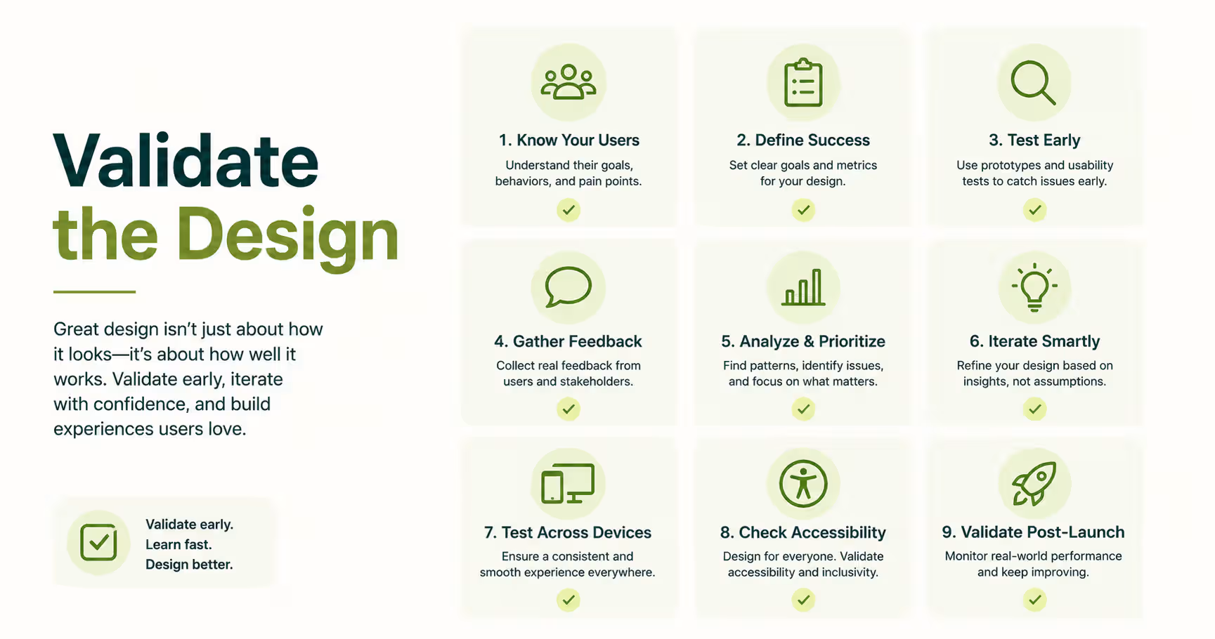
Validating a contact form means testing it the way a real visitor experiences it. Not the way it looks in a design file. Test it on a phone, on a slow connection, and with a screen reader running. Test it through the eyes of a first-time visitor who has never seen your brand before.
Skipping this step is a common failure in contact form design. It is also an entirely avoidable one.
Nielsen Norman Group's research on form fields found a specific, avoidable mistake: placeholder text used as the only label. The hint disappears the instant someone starts typing. A user who gets interrupted mid-form loses the context for what that field was even asking.
Labels above or beside each field fix this in one line of CSS. That one change alone removes a common source of form errors.
A form validated on desktop and never tested on mobile is a form you have not actually tested.
Accessibility is part of validation, not an extra step tacked on afterward. The W3C's Web Accessibility Initiative publishes a form tutorial covering exactly this. It walks through labeled inputs, keyboard-only navigation, and error messages a screen reader can announce clearly.
Google's own web.dev forms guide adds a practical layer on top of that. Correct input types like type="email" and type="tel" make mobile keyboards adjust on their own. Nobody should have to hunt for the @ symbol on a numeric keypad.
The same clarity principle runs through Orbix Studio's 7 pillars of UX design. Usability and accessibility sit right next to each other there, for a reason.
So what does a validated form actually check before it ships?
- Every field carries a visible label, never a placeholder standing in for one.
- The form completes cleanly on a phone, thumb-sized tap targets included.
- Error messages appear in real time, next to the field, in plain language.
- A screen reader can read every label, error, and button without guessing.
- The confirmation state is unmistakable, so the visitor knows the message sent.
Validation catches the failures a design file never shows you. Once that framework is set, the next question is what a team's actual process looks like in practice.
What Orbix Studio Does Differently on Contact Forms
Orbix Studio treats contact form design as a conversion problem before a visual one. A project involving a contact or intake flow never opens with a look-and-feel question. Instead, it opens with a sharper one: what does this form need to filter, qualify, or capture, and for whom.
That thinking showed up directly on NexCard, a digital contact-sharing app. First-time users had never used a product like it before. Profile setup and sharing felt unclear during that first session.
Orbix Studio redesigned the setup flow into clear, sequential steps. Sharing actions got reorganized so they were easier to notice on screen.
The result showed up fast in the numbers. Profile verification became 41% faster. Support queries tied to setup and sharing confusion dropped 32%. Adoption of the profile-tracking feature rose 28%.
The same principle applied to Upmatch, a recruiting platform. Crowded dashboards and unclear flows were slowing down recruiters and job seekers alike. Orbix Studio rebuilt the layout with clearer spacing and turned hiring dashboards into structured cards and charts.
Recruiters could scan candidate information faster after that. The redesigned dashboard flow made day-to-day hiring data easier to manage too.
Flowrix, a fintech website, tells the same story from a different angle. Visitors once drowned in financial information the moment they landed. The homepage and feature sections got restructured to guide visitors step by step instead.
Primary CTA clicks increased 46% after that simplification. Scroll depth rose 52%, meaning visitors kept exploring instead of leaving after the first screen.
None of these were pure contact-form projects. But each one solved the exact problem a bad contact form creates. Too much gets asked of the visitor, too soon, with no clear next step in sight.
Orbix Studio's UI/UX design process starts every engagement, forms included, with that same question before a single field gets drawn. For B2B SaaS teams specifically, that same audit runs as a standard part of every SaaS design engagement.
Want to see how Orbix Studio approaches a project like this?
Teams building on Webflow get an added advantage here. Native form handling and animation come without extra backend work. That's exactly why Orbix Studio's Webflow development projects treat custom form design as a standard deliverable, never as an afterthought.
Signs You Chose the Right Contact Form Design
A correctly designed contact form shows its results within thirty to ninety days. Not immediately, and not never either. Watch submission-to-lead quality first: if sales or support starts getting fewer vague, one-line messages, the form is filtering correctly.
Watch mobile completion rate next. Well over half of contact-page traffic now arrives on a phone.
A few signs say the design is working. Support tickets asking "how do I even use this" start to disappear from the queue entirely. The form's bounce rate drops relative to the page it sits on, a pattern tracked closely in B2B website design benchmarks for comparable sites. Submissions start arriving with the context your team actually needs, not just a name and one line.
A few signs say it's not working yet either. Spam submissions flood in with no CAPTCHA or filter in place to catch them. Completion rate drops sharply on mobile specifically, while desktop numbers stay fine. The support inbox stays full of basic questions the form should have already answered on its own.
Any one of these is a signal to revisit Step 2. It is not a reason to reach for a new color palette instead.
That distinction, results over aesthetics, is the real difference between a form that was designed and one that was only decorated. If your current form fails on more than one of these signs, the fix usually starts with a wireframe pass before a single pixel changes.
Orbix Studio's guide on wireframes versus mockups versus prototypes walks through exactly where that step fits into the process.
Frequently Asked Questions
How do I make a simple contact form?
Use name, email, and a message box as the floor. Add one clear call-to-action button with specific copy. Label every field visibly instead of relying on placeholder text alone. Test the finished form on a real phone before you ever publish it live.
Do people still use contact forms on websites?
Yes. Forms centralize inquiries in one place and keep an email address private from spam bots. A business collects exactly the context it needs upfront, instead of chasing missing details through several rounds of email once the first message finally arrives.
What is the difference between a contact form and a contact page?
A contact form is the input widget itself: the fields, labels, and submit button. A contact page is the full experience built around it, including the map, business hours, and trust signals. A page can rank well in search while its form still converts poorly.
Should I use a contact form builder or a custom-designed form?
Use a builder like JotForm or Typeform for low-stakes forms, where speed matters more than exact brand fit. Choose custom contact form design once the form becomes a real conversion event, like an enterprise sales inquiry. A generic template at that stage undercuts the trust your site just built.
What are the essential fields for a contact form?
Name, email, and a message field cover the majority of use cases on their own. Add a dropdown for project type or budget only when that extra qualification genuinely helps your team respond faster. Every additional required field reduces how many visitors finish the form.
How much does custom contact form design cost?
Custom contact form design is usually scoped inside a broader page or website project, rather than priced as its own line item. Layout, branding, and backend handling all affect the total cost. Orbix Studio's website design cost guide breaks down real pricing ranges by scope.
What makes a contact form convert better?
Fewer required fields, visible labels instead of placeholder-only text, and real-time validation with plain-language error messages all measurably improve completion. Nielsen Norman Group's form research ties abandonment directly to friction from exactly these issues. A mobile-first layout closes the remaining gap.
Conclusion
Contact form design is a decision you make before you design anything at all. It comes down to the job the form does and the format that fits that job. It also comes down to whether the form holds up once a real visitor starts typing on a real phone. Skip that order, and no amount of styling ever fixes a form solving the wrong problem.
Start this week with one audit. Open your current contact form on your own phone and time how long it takes you to complete it. If it takes longer than you expected, you already found your first fix to make.
Ready to make the right call for your product? Book a free strategy call with Orbix Studio ->






.svg)
.svg)


.svg)







.avif)



.svg)

