Table of Contents
- What is mobile app retention?
- Why app retention rate is the business metric that compounds
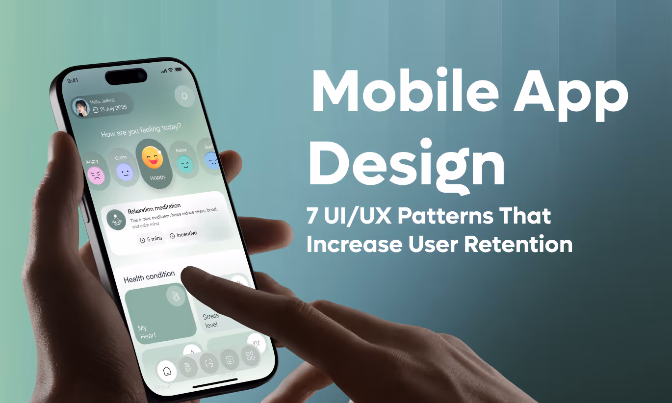
- 7 UX design patterns that directly improve mobile app retention
- How to measure your mobile app retention strategy
- Three retention mistakes that undo every pattern you implement
- Mobile app retention benchmarks by industry
- Frequently asked questions
- Build the habit before you scale the acquisition


- Mobile app retention is the percentage of users who return after their first visit, measured at Day 1, Day 7, and Day 30.
- Design the experience around habit formation before spending on marketing.
- The fastest way to kill retention: teach features before the user feels the app's value.

77% of mobile apps lose their daily active users within the first three days after install, according to AppsFlyer's State of App Marketing report.
That number isn't a UX statistic. It's a revenue statistic.
Every user who installs and abandons represents wasted acquisition spend, a lost lifetime value opportunity, and a competitor waiting to fill the gap. Apps with strong mobile app retention don't get lucky. They follow a specific set of UX design patterns rooted in behavioral psychology, not gut feel.
Seven patterns separate the apps users open every morning from the ones sitting in a forgotten folder. Each one targets a precise moment in the user lifecycle where apps typically lose people.
Here's what they are, why they work, and exactly how to apply each one.
What is mobile app retention?
Mobile app retention is the percentage of users who return to an app after their first visit, measured at Day 1 (return within 24 hours), Day 7 (return within a week), and Day 30 (return within a month). It answers one direct question: after someone downloads your app, do they keep using it?
Retention differs from installs. An app can reach 100,000 installs with a Day 30 retention rate below 5%, meaning 95 out of 100 users have already left. That's not growth. That's a leaky bucket.
Adjust's 2024 Mobile App Trends report sets average Day 1 retention at 25–30%, Day 7 at 10–15%, and Day 30 at 5–8%. Apps that beat these benchmarks consistently share one pattern: deliberate UX designed around user behavior, not feature volume.
Churn sits at the center of any mobile app retention strategy. Churn is the inverse of retention. A 30% Day 30 retention rate means 70% of users churned. Every percentage point of churn recovered compounds directly into revenue. According to Harvard Business Review, a 5% improvement in customer retention can increase profits by 25–95%.
That ratio makes retention the highest-ROI activity in mobile product development.
For a solid foundation on the UX decisions that shape every user's first impression, see this mobile app UX best practices guide. Now let's look at why retention is the one metric that compounds all the others.
Why app retention rate is the business metric that compounds
A high app retention rate generates revenue in three directions at once: direct repeat usage, word-of-mouth referrals, and premium feature adoption. Cut the retention rate and all three shrink together.
Here's the real cost. Acquiring a new mobile user costs 5–7x more than keeping an existing one, according to Statista's App Economy data. Low retention means constantly paying acquisition costs to replace users who already came, already onboarded, and already left.
Retained users also generate disproportionate revenue. A user who stays 90 days has passed the point of habit formation. That user refers to friends, upgrades to premium tiers, and ignores competitor ads. A user who churned on Day 3 does none of those things.
Poor mobile app user retention almost always points back to UX, not marketing. When users leave in the first 72 hours, the root causes are: a confusing first session, no clear value within the first two minutes, or a workflow that demands too many steps before delivering anything useful.
For a deeper look at the UX decisions that drive churn, see this guide on reducing customer churn with UX design strategies.
Seven UX patterns fix these failure points directly. Here's exactly how each one works.
7 UX design patterns that directly improve mobile app retention
Each pattern below targets a specific drop-off point in the user lifecycle. Skip one and you leave a gap where users fall through.
Pattern 1: Progressive onboarding with contextual education
Progressive onboarding teaches app features during actual use, not before it. Instead of walking a new user through a 10-screen tutorial before they do anything real, the app opens directly into core functionality and introduces each feature at the exact moment it becomes relevant.
Here's the problem with front-loaded onboarding: delivering information before a user has experienced value creates cognitive overload. Cognitive overload leads to one outcome: the user closes the app.
Nielsen Norman Group defines progressive disclosure as "deferring advanced or rarely used features to a secondary screen, making applications easier to learn and less error-prone." Applied to mobile onboarding, this means the app reveals complexity gradually, matching what users need to know with where they are in their journey.
Duolingo applies this pattern better than any other language app. A new user starts a lesson immediately. No tutorial screens. No feature demos before value. Contextual tooltips appear only when the user first encounters a new interface element. Duolingo's Day 1 retention sits above 50%, double the industry average, and this onboarding approach is a primary driver.
Slack takes the same approach for teams. Basic messaging works from the first session. Advanced features, including workflows, integrations, and search operators, reveal themselves only when user behavior signals readiness.
To implement this pattern, confirm:
- Users complete a core task within 60 seconds of opening the app for the first time
- All tutorial screens are skippable with an easy path to revisit them later
- Tooltips appear in context, not all at once in an intro sequence
- Advanced features stay hidden until usage patterns indicate the user is ready
Apps that shift from front-loaded tutorials to progressive onboarding see 40–60% improvement in Day 1 retention and 35–50% better feature adoption rates. Now let's look at the pattern that turns a first-time user into a daily habit.
Pattern 2: Habit-forming daily engagement loops
Habit-forming apps don't wait for users to remember to come back. They build a structure where returning feels natural and even necessary.
B.J. Fogg's Behavior Model, from Stanford's Persuasive Technology Lab, explains how habits form: Motivation × Ability × Prompt all need to converge at the same moment. The design challenge is engineering that converges reliably, every day.
Daily streak tracking is one of the clearest implementations. "Don't break your 14-day streak" activates loss aversion, the cognitive bias documented by Daniel Kahneman where people feel losses more strongly than equivalent gains. Headspace uses streak tracking with personalized reminder timing and session lengths as short as three minutes for busy days.
Headspace's 65% weekly active user rate is exceptional for wellness apps. The three-minute session option is critical: it removes the "I don't have time" objection, making daily engagement possible regardless of schedule.
Variable reward schedules reinforce this pattern further. Unpredictable positive reinforcement, such as new content appearing each morning or a surprise badge after a milestone, keeps engagement fresh because the brain responds to novelty. Strava uses segment leaderboards, kudos, and challenge competitions to create variable rewards around exercise habits.
Apps implementing daily engagement loops see 50–70% improvement in Day 7 retention as habits solidify. Make the daily habit achievable in under five minutes. No day should feel too busy to maintain the streak.
Pattern 3: Personalized dynamic content feeds
Generic content feels irrelevant. Irrelevant content gets ignored. An app showing the same experience to every user regardless of their behavior or history is one delete away from being forgotten.
Personalized content feeds adapt what each user sees based on their interaction patterns. Every engagement makes the feed a little better. That improvement creates a switching cost: the longer someone uses the app, the more the algorithm knows them, and the harder it becomes to leave without losing that accumulated preference data.
Spotify's 92% monthly active user retention ties directly to its personalization engine. Discover Weekly, Daily Mix, and Release Radar don't just play music. They demonstrate that Spotify knows the user better each week. Leaving Spotify means starting a recommendation engine from scratch somewhere else. That's a real cost, and users feel it.
TikTok learns preferences within a single session. Watch time, scroll patterns, and interaction signals feed into a recommendation engine that delivers relevant content faster than any manually curated feed. Average session duration on TikTok reached 34 minutes per day in 2023, according to DataAI (formerly App Annie).
Personalized experiences generate 30–45% higher mobile app retention through increased relevance. Add diversity mechanisms to prevent filter bubbles. A user who sees only the same type of content will eventually exhaust it. Spotify handles this by mixing highly familiar artists with algorithmically similar but new ones. Balance personalization with discovery.
Pattern 4: Frictionless core workflows with smart defaults
Every unnecessary tap between a user and their goal is a dropout risk. Each extra step in a workflow reduces completion rates by 5–10%. Add five unnecessary steps to a checkout flow and you've lost half your users before they reach the value moment.
Frictionless core workflows remove every step that doesn't directly serve the user's goal. Smart defaults go further: they pre-fill fields, remember past choices, and make the obvious option the easiest option.
Amazon's one-tap purchasing is the definitive example. Saved payment methods, saved addresses, and purchase history reduce a six-step checkout to two taps. Amazon's mobile conversion rate increased 40% after launching this feature. The pattern: save everything the user enters once, use it automatically forever after.
Uber applies the same logic to ride requests. Saved home and work locations, stored payment, and GPS-based pickup detection mean booking a ride takes literally two taps. That two-tap experience is why ride-hailing became habitual instead of occasional.
For apps with complex workflows, the answer isn't to hide complexity. Audit each interaction point against your core user flow. This mobile app development guide covers the architecture decisions that affect workflow speed from the build stage forward.
Apps with frictionless core workflows see 35–50% higher task completion rates and 2–3x increases in repeat action frequency. A practical audit question: how many taps does your most frequent user need to complete your most frequent action? If the answer is more than three, start cutting.
Pattern 5: Strategic gamification with meaningful progress
Gamification done wrong feels manipulative. Points for opening the app, badges for logging in three days in a row, levels that reward time spent rather than value created: these patterns generate short spikes in engagement, then accelerate churn when users realize nothing real is happening.
Gamification done right ties every reward to progress the user already cares about.
LinkedIn's profile completion bar is the clearest example. The "Strengthen your profile" progress indicator drives 20x higher profile completion rates than profiles started without it. Completing the profile isn't a game mechanic. It's a genuine improvement to how the user presents themselves professionally. The progress bar makes the path to that improvement visible.
Fitbit uses achievement badges tied to actual fitness milestones: first 10,000-step day, first 5-day activity streak, first 50,000 steps in a week. Each badge represents real behavior change, not app usage metrics. That's the distinction between gamification that retains users and gamification that eventually annoys them.
Progress also activates the Endowment Effect. Once a user accumulates meaningful progress inside an app, they feel ownership over it. Losing a 60-day streak feels like losing something real. This psychological shift typically happens around Day 7–14 and is the point where churn risk drops sharply.
Strategic gamification drives 40–55% higher feature engagement and 30–45% better long-term mobile app retention through invested progress. A useful test: can a user explain why they earned a badge in terms of real value? If not, redesign the reward.
Pattern 6: Social integration that creates switching costs
An app used alone is replaceable. An app used with friends, colleagues, or a community becomes part of a network the user is unwilling to leave.
Social features create switching costs because leaving the app means leaving the connections built inside it. Strava makes this pattern concrete. Activity feeds showing friend workouts, segment leaderboards, kudos, and challenge competitions create a social identity inside the app. Strava's socially connected users show 60% higher retention compared to users who never connect with anyone on the platform.
Pinterest's collaborative boards and following features build a discovery network that grows richer over time. A user who follows 50 curators has built a personalized discovery engine that doesn't exist anywhere else. Leaving Pinterest means rebuilding that entire network from zero on another platform.
Effective social integration doesn't mean forcing users to connect before they find value. Requiring social features for basic functionality kills early retention. Social features should be available and compelling, not gated.
Social integration delivers 50–70% higher retention for connected users versus solo users. Design the social entry point to be frictionless: one-tap friend finding via contacts, easy invitation flows, and clear privacy controls so users feel safe engaging rather than exposed.
Pattern 7: Smart notifications that re-engage without annoying
Notification strategy sits at one of the sharpest trade-offs in mobile app retention. Well-timed, genuinely useful notifications increase retention by 25–40%. Excessive or irrelevant notifications increase churn by 30–50%, according to Braze's 2024 Global Customer Engagement Report.
The gap between a notification that brings a user back and one that earns an uninstall is personalization and genuine value, not frequency.
Behavioral triggers outperform scheduled blasts every time. A notification that fires because a user hasn't logged a meal by 7 PM, based on their typical logging time, is relevant. A notification at 10 AM because it's been 24 hours since their last session is generic. Calm meditation app achieves 45% notification open rates, versus an 8% industry average, by sending reminders only at the time each individual user typically meditates.
Value-first content separates useful notifications from noise. "Your package shipped, arriving Thursday" is useful. "Open the app" is noise. Every notification should answer one question: what does the user gain by opening this right now?
Actionable notifications, where users complete a task directly from the notification without opening the full app, reduce friction one level further. Asana lets users mark tasks complete without entering the app at all. That frictionless loop trains users to trust that the app respects their time.
Smart notifications drive 30–45% improvement in re-engagement and 50–70% reduction in notification-related uninstalls. Set daily frequency caps before building any notification automation.
How to measure your mobile app retention strategy
Retention measurement starts with three primary numbers. Day 1, Day 7, and Day 30 retention rates are the anchor metrics. Every other number connects back to one of them.
Beyond those anchors, DAU/MAU ratio (Daily Active Users divided by Monthly Active Users) measures stickiness. A DAU/MAU ratio of 20% means roughly one in five monthly users opens the app daily. Slack averages 50%+ DAU/MAU, meaning daily habits are fully formed for its user base. A ratio below 10% signals that monthly users aren't building any routine around the app.
Session frequency, session duration, and feature adoption depth reveal where users find value and where they drop off. High session duration combined with low feature adoption means users are engaged but haven't found new reasons to stay. That combination usually signals the personalization or gamification patterns that need attention.
Cohort retention curves show whether your improvements are working over time. Plot retention rates by install cohort: all users who installed in January, all who installed in February, and so on. If newer cohorts show higher retention than older ones, your product changes are having a measurable effect. If the curves are flat or declining, the core experience isn't improving fast enough.
For a complete view of how app performance at the technical level connects to retention metrics, see this app performance UI/UX optimization guide.
Three retention mistakes that undo every pattern you implement
Knowing what breaks retention is as important as knowing what builds it. Three mistakes appear repeatedly in app audits. Each one quietly cancels the investment made in the patterns above.
Mistake 1: Over-gamifying without tying rewards to real value. Points, badges, and streaks that aren't connected to meaningful outcomes feel hollow within days. Users recognize manufactured rewards fast. Headspace earns streak loyalty because users are genuinely building a meditation habit. An app that badges users for opening it five days in a row, with no other value attached, creates an engagement spike followed by faster churn when novelty wears off.
Mistake 2: Sending every possible notification because "it might work." High notification volume trains users to ignore the app's alerts entirely. Once a user mutes notifications, re-engagement through that channel is effectively gone. Set strict daily frequency caps before building any notification automation. Test with a smaller user segment and measure uninstall rate alongside open rate.
Mistake 3: Treating onboarding as a one-time event. New features, new user segments, and seasonal contexts all create onboarding moments throughout the app lifecycle. An app that nails first-session onboarding but never introduces advanced features contextually leaves long-term retention untapped. Duolingo and Spotify continuously introduce features to existing users based on behavior patterns, not just to new installs.
None of these three mistakes require a product rebuild to fix. Each one is a policy decision, not a technical one. Define a notification frequency cap, tie gamification to real behavior change, and build re-onboarding moments for existing users. Those three decisions alone can recover 15–25% of lost Day 30 retention.
Mobile app retention benchmarks by industry
Retention rates vary by app category. Comparing Day 30 numbers to the 5–8% industry average without category context leads to wrong conclusions. Social apps perform differently from fintech apps. Food delivery performs differently from productivity tools.
Source: Benchmarks compiled from Adjust Mobile App Trends 2024 and UXCam industry retention data.
Your category benchmark is the real target. Beating your category average by 20–30% signals that retention-focused design is working as a competitive advantage.
If you're planning a new build and want to understand what drives cost across retention-impacting features, this mobile app development cost guide breaks down where budget decisions directly affect long-term user experience.
Frequently asked questions
What is mobile app retention?
Mobile app retention is the percentage of users who return to an app after their first visit. Product teams measure it at Day 1, Day 7, and Day 30 intervals. Day 1 retention above 25–30%, Day 7 above 10–15%, and Day 30 above 5–8% represent healthy baselines, though benchmarks vary by app category and industry.
What is a good mobile app retention rate?
A good Day 30 mobile app retention rate sits between 5–8% for average apps and 12–18% for top-quartile performers, depending on category. Social apps retain at 12–18% at Day 30, while health and fitness apps average 5–9%. Beating your category benchmark by 20% means your retention-focused UX design is working.
Why is my app's retention rate low?
Low mobile app retention traces back to three UX failures: the first session delivers no clear value within two minutes, the core workflow has too many steps before doing anything useful, or no re-engagement mechanism exists to bring users back after Day 1. Fix the first-session experience before running any re-engagement campaign.
How does UX design affect mobile app retention?
UX design controls how quickly users reach their first value moment, how easy it is to complete core tasks, and whether daily habits form around the app. Apps with progressive onboarding, frictionless workflows, and habit-forming loops consistently outperform apps built around feature count alone. UX quality is the number one predictor of 30-day retention, according to Adjust.
What is the average Day 1 app retention rate?
Average Day 1 mobile app retention sits between 25–30% across categories. Social and communication apps reach 35–45%, while health and fitness apps typically land at 22–30%. Apps using progressive onboarding and delivering a clear value moment in the first 60 seconds consistently reach the upper end of their category range.
How can I increase mobile app retention?
Increase mobile app retention by addressing five areas in order: deliver clear value in the first session, remove friction from the core workflow, build a daily engagement trigger into the experience, personalize content based on user behavior, and send notifications with genuine value at individually optimized times. Each fix compounds the one before it.
What is the difference between app retention and DAU/MAU ratio?
App retention measures whether new users return over a fixed window (Day 1, Day 7, Day 30). DAU/MAU ratio measures the percentage of monthly active users who open the app on any given day, showing how habitual the app has become. High retention brings users back. High DAU/MAU means they came back and kept coming back every single day.
Build the habit before you scale the acquisition
Retention isn't a marketing metric. Retention is what happens when UX design aligns with how people actually form habits.
Start with the first session. If a new user can't complete a meaningful action within 60 seconds, every pattern in this list becomes harder to deliver. Fix the first session, add a daily engagement trigger, then build personalization over time. That sequence does more for Day 30 numbers than any ad spend increase.
Check your current app against the seven patterns above. Which one is missing? That gap is where your Day 30 numbers are leaking.
Want help applying these patterns to your specific app? Orbix Studio designs retention-focused mobile app experiences for founders who want fewer uninstalls and more daily habits.
Ready to increase your mobile app retention
.avif)


.avif)