


- What makes a color popular?
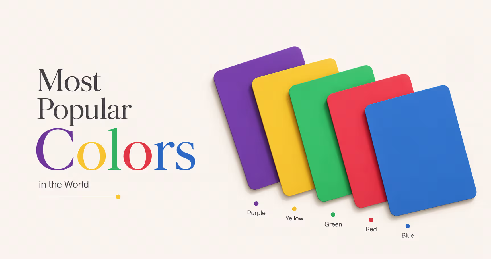
- The most popular colors in the world
- Why blue is the world’s favorite color
- Red, green, and purple mean different things around the world
- Your brain really does react to favorite colors
- Millions of people do not see your colors the same way
- What color blindness really looks like
- How color blindness changes what people see
- Social media algorithms are creating color trends
- The red button myth: what actually drives conversions
- Frequently asked questions
- Conclusion


- Blue: 37-45% of people like it. The most popular color in the world.
- Red: 15-22% of people like it. One of the boldest colors.
- Green: 14-22% of people like it. Often linked to nature, health, and growth.
- Purple: 14-20% of people like it. Feels creative, special, and a little different.
- Yellow: 8-13% of people like it. It’s bright, warm, and cheerful
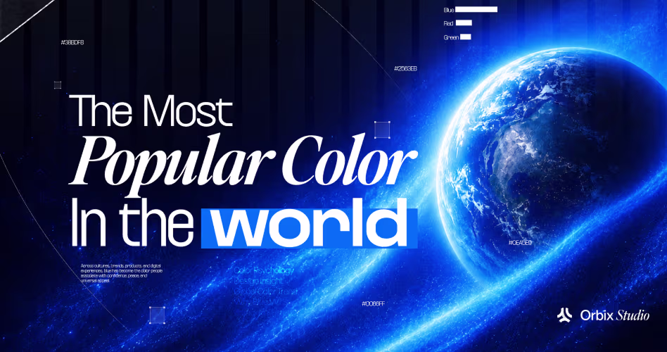
The most popular colors in the world are blue, red, green, purple, and yellow. Blue is usually the top favorite. Red comes next for energy and attention. Green is loved for its link to nature. Purple stands out for creativity and style. Yellow is more divisive, but many people still connect it with warmth and happiness.
These colors are popular in different ways. Blue is a favorite in surveys and is widely used by tech, finance, and healthcare brands. Red is strong in food, retail, and sales. And green appears often in wellness and eco-friendly branding.
In this article, you’ll learn which colors people love most, why they feel powerful, and how culture, trends, and even brain science shape color choices around the world.
What makes a color popular?
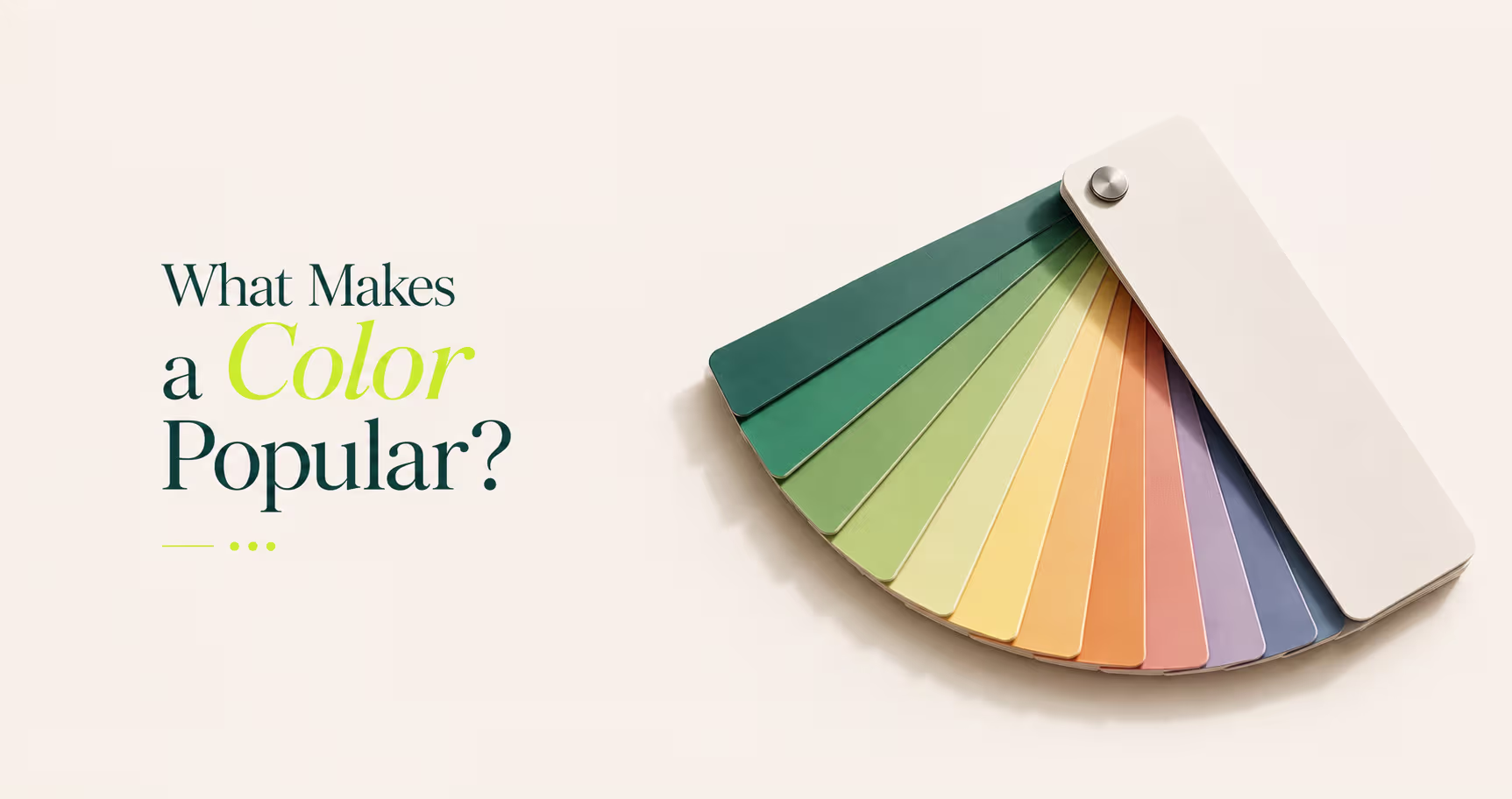
Before looking at the ranking, it helps to understand what popular really means. A popular color is not always just a color that many people love.
Sometimes it is popular because people pick it as a favorite. Sometimes it is popular because brands use it again and again. In other cases, a color becomes popular because it carries a strong meaning in a certain culture, or because it matches a trend at a certain moment.
That means a color can be popular in one way, but not in another. For example, blue may be the world’s favorite overall. But red can be more powerful in food ads because it feels bold and urgent.
Green may be more trusted in health, wellness, or eco-friendly branding because people connect it with nature and growth. And in some parts of the world, the meaning of a color can change a lot depending on culture and tradition as shown in research on color associations across cultures.
So in this article, we are not just looking at favorite colors. We are also looking at where colors are used, what they mean, and why they matter. That gives a fuller picture of what makes a color truly popular.
The most popular colors in the world
So which colors lead the world? The answer is not based on one thing alone. Some colors are popular because they look really good in UI UX design. Others stand out because they are widely used in brands, products, and culture.
Still, a few shades keep showing up at the top across countries, age groups, and daily life.
1. Blue: the undisputed global champion (37-45%)
Blue is the most popular color in the world by a clear margin. In a 2024 Ipsos survey of 18,000 people, 37% chose blue as their favorite color.
A 2024 Harris Poll found that 45% of U.S. men picked blue as their top choice. In a 2023 global survey by Color Marketing Group, 38% of people preferred it. Blue also ranks highly in countries like the USA, the UK, Germany, Australia, and China.
So why does blue win so often? One reason is trust. Blue feels steady and dependable, which is why so many banks, tech brands, and healthcare companies use it. Another reason is calm.
People often connect blue with peace, balance, and clear thinking. It also has a strong link to nature. Blue brings to mind the sky and water, two things people often see as safe, open, and comforting.
Blue is especially popular with men, with 57% choosing it compared to 35% of women. It is also a top brand color, with around 40% of Fortune 500 tech companies using it. In finance and healthcare, blue is often the default choice because it helps create a feeling of trust right away.
2. Red: the passionate runner-up (15-22%)
If blue feels calm, red does the opposite. Red feels loud. Fast. Hard to ignore.
That helps explain why it ranks near the top around the world. In a 2023 Color Marketing Group survey, 16% of people chose red as their favorite color.
It also shows up heavily in branding, with about 30% of Fortune 500 companies using it in some form. In the right setting, red can boost impulse buying by 29% and increase conversions by as much as 34%.
Why does red work so well? Because it pushes people to react. It can make something feel exciting, urgent, bold, or important. That is why red is so common in sales signs, food branding, and action-focused ads. It does not usually sit quietly in the background. It pulls attention toward itself.
Red also changes meaning depending on where you are:
- In many Western cultures, red is linked to passion, danger, and strong emotion
- In China, red is tied to luck, celebration, and prosperity
- In retail and food, red is used to create speed, hunger, and action
That last point matters a lot. Around 70% of fast-food brands use red because it helps them stand out and feel energetic.
So while blue wins on trust, red wins on movement. It makes people stop, look, and do something.
3. Green: the rising eco-warrior (14-22%)
Green has become one of the world’s most popular colors, and its rise is not hard to understand. In a 2023 Color Marketing Group survey, 22% of people said green was their favorite.
That is a strong result. It also fits a bigger trend, since earth tones and natural shades have been growing through 2025 and into 2026. Green feels close to life.
It reminds people of trees, plants, fresh air, and healthy spaces. Because of that, green is often linked with growth, balance, and wellness. It also has a calming effect, which helps explain why people trust it in health and lifestyle spaces.
Green is especially strong in these areas:
- Sustainability brands, where it signals care for nature and the planet
- Younger groups like Gen Z and Millennials, who often respond well to eco-friendly values
- The wellness industry, including health apps, fitness brands, and natural products
There is also a clear branding pattern here. Around 78% of eco-brands use green in some way. Brands like Whole Foods, Starbucks, and Spotify all lean on green to create a feeling of freshness, energy, or connection.
In short, green works because it feels natural. And in a time when more people care about health, calm, and the environment, that gives it real power.
4. Purple: the creative dark horse (14-20%)
Purple is not usually the first color people guess. But it keeps showing up. And that makes it interesting.
In a 2024 Ipsos survey, 20% of people chose purple. A 2022 Statista report found that 16% of young adults in the U.S. preferred it, and that number has been growing. Even more surprising, a 2021 Pew Research finding showed that 36% of American women preferred purple, compared with 32% who chose blue.
That tells us something important: purple is not just a niche color anymore.
So why do people like it? Because purple feels different. It is less common in nature than blue or green, so it can feel rare. It also carries a creative, stylish, and sometimes premium look.
When people see purple, they often read it as bold without being loud. Special without trying too hard. Purple tends to do especially well with:
- women
- younger audiences
- creative industries like design and tech startups
- luxury and innovation-focused brands
Blue may be the safe choice. Red may be the loud choice. Purple is the choice for standing out. It tells people that a brand, product, or idea is a little more original than the rest.
5. Yellow: the divisive optimist (8-13%)
Yellow does not rank as high as blue, red, green, or purple. Usually, about 8-13% of people choose it. That makes it less universally loved than the other top colors.
Still, yellow has something the others do not. It is one of the easiest colors to notice.
That is why yellow is often used in warning signs, caution systems, and anything that needs to stand out fast. It grabs the eye almost immediately. In the right setting, that can be a huge strength.
Yellow also carries a very different feeling from most colors on this list. It often feels warm, hopeful, and full of energy. For people who want positivity, yellow can feel bright and uplifting. It brings a sense of lightness.
But yellow is also more polarizing. Some people love it. Others find it too sharp or too intense, especially when it is overused.
That is why yellow works best when it is used carefully. It tends to work well for:
- people drawn to warmth and positivity
- warning and visibility systems, where being noticed matters most
- Gen Z audiences, who sometimes use it as a bold accent color
In 2025, shades like Awakening Yellow have also been growing in trend reports. So while yellow may not be the world’s favorite, it still plays a strong role when the goal is energy, visibility, and optimism.

Why blue is the world’s favorite color
Blue is the most popular color in the world. And it is not only because people think it looks nice. It wins for a few simple reasons:
- blue is linked to water, sky, and safety
- it often feels calm to the brain
- brands have used it for years to build trust
For early humans, water meant survival. Blue skies also suggested calm weather and open space. Over time, that helped blue feel safe, peaceful, and steady.
Blue also feels different from colors like red. It is often seen as cooler and calmer, while red feels stronger and more urgent. Some studies have even found that blue can lower heart rate, while red can raise it. So the body may respond to blue in a calmer way.
Then brands repeated that message again and again. Tech companies like IBM, Facebook, and Intel used blue to look reliable. Banks like JPMorgan, Chase, and Bank of America used it to feel safe. Healthcare brands use it because it feels clean and steady.
Red, green, and purple mean different things around the world

Color can get tricky fast. A color that works well in one country may send a very different message in another. That is why a one-size-fits-all color strategy often fails.
Here is the key idea:
- the same color can mean different things in different places
- culture can change how a color is understood
- a popular color is not always a universal color
Take red, for example. In many Western countries, red is linked to passion, danger, urgency, and action. That is why it appears so often in warning signs, sale banners, and bold ads.
In China, red usually means something much more positive: luck, celebration, prosperity, and good fortune. So the same color can feel intense in one place and joyful in another.
Green also changes by culture. In many Western markets, green feels natural, healthy, and eco-friendly. That is why it is common in wellness, food, and sustainability branding.
But in China, a green hat has a negative meaning. It can suggest a man’s wife has been unfaithful. That shows how culture can completely change the message of a color.
Then there is purple. Purple has been growing in popularity with women and younger audiences. It often signals: creativity, rarity, and a premium feel.
In one case, purple packaging even helped raise beauty brand sales by 18%. The lesson is simple. Blue may be the safest global color. But red, green, and purple often work better when they match local culture.
Your brain really does react to favorite colors
Color preference is not just a random opinion. Your brain actually reacts to color, and scientists have measured that. It is not only about taste. It is also about brain activity.
Researchers at the Max Planck Institute used fMRI brain scans and found that different colors create different patterns in the visual part of the brain.
Other studies found that the more a person liked a color, the stronger the brain response became in areas linked to value and attention. That means your brain is not just seeing color. It is reacting to it too.
A simple way to think about it is this: blue and red do not hit the brain in the same way. Blue often feels calmer. Red and orange often feel more active and intense. Studies suggest that cooler colors like blue can be linked to lower heart rate, while warmer colors like red can create a more energized response.
So yes, your favorite color is personal. But it is also shaped by your brain, your body, and the world around you.
Millions of people do not see your colors the same way
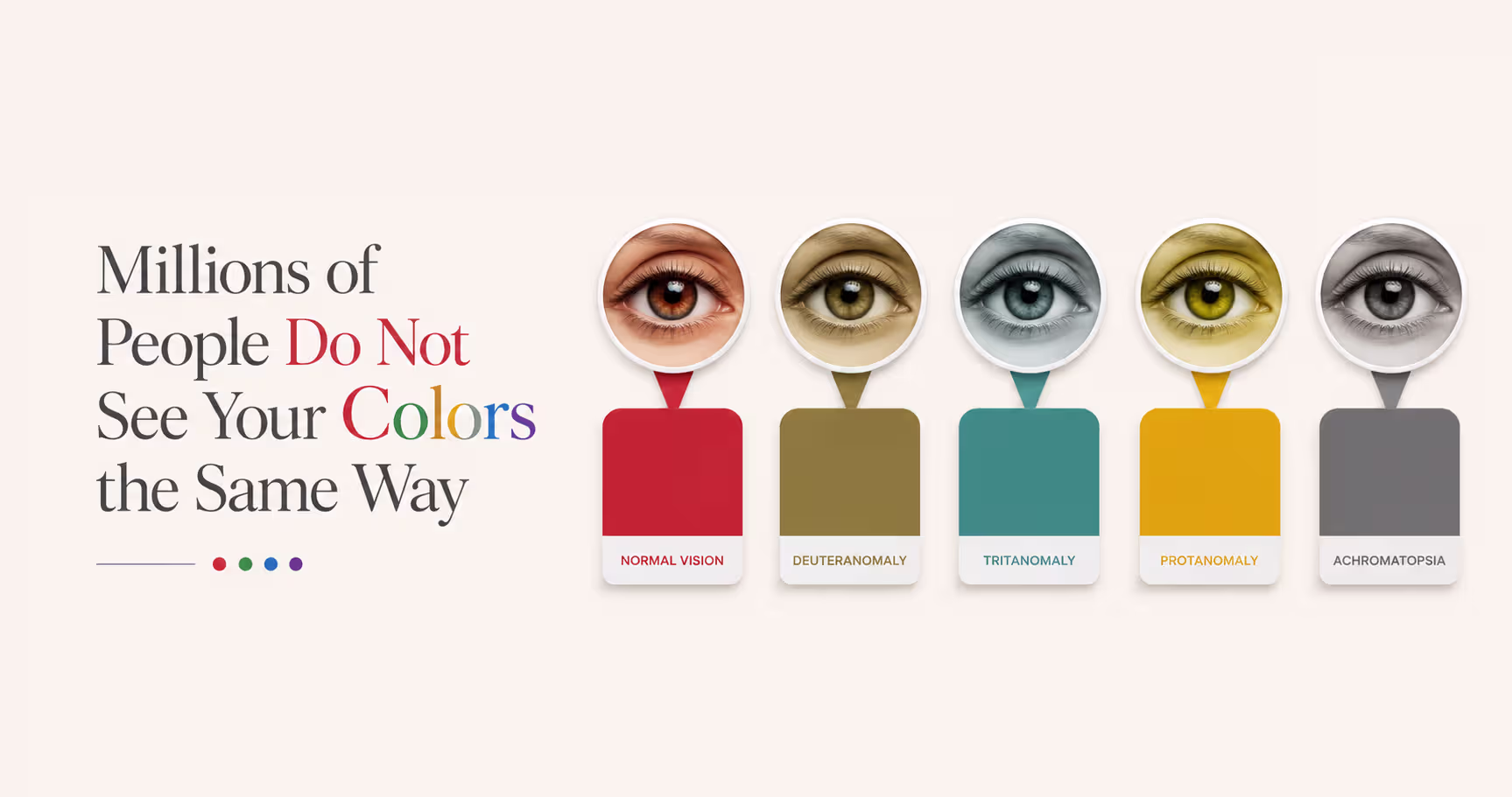
Most people assume everyone sees color in the same way. That is not true.
Around 300 million people worldwide have some form of color vision deficiency. That is about 4.5% of the global population. In simple terms, it affects about 1 in 12 men and about 0.5% of women. In the United States alone, around 13 million people are affected according to a report.
The numbers also change by region. A study shows that in Northern Europe, about 8% of men and 0.5% of women have it. In East Asia, the rate for men is often between 4% and 6.5%. In some African populations, the numbers vary by ethnic background.
So this is not rare. And it is not limited to one place.
What color blindness really looks like
Color blindness does not usually mean seeing the world in black and white.
That is the first thing to understand. In fact, about 99% of colorblind people can still see color. The difference is that they may see a smaller range of colors, or they may have trouble telling certain colors apart.
The most common type is red-green color blindness, where red and green can look too similar. Blue-yellow color blindness is much less common, and complete color blindness is very rare.
So the problem is not seeing anything. It is seeing less clearly. Think of it like this: if a game uses red and green buttons, and both look almost the same to you, the game becomes harder to play. The same thing can happen with websites, charts, apps, maps, signs, and packaging.
How color blindness changes what people see
This matters because color is often used to send messages quickly.
Green might mean “go.”
Red might mean “stop.”
A bright button might mean “click here.”
But if those colors blur together, the message gets weaker. That means a design can look clear to one person and confusing to another. And since vision can also change with age, bright sunlight, or screen settings, this issue reaches even more people than the basic numbers suggest.
The main point is simple: if millions of people do not see your colors the same way, color alone is never enough.
Social media algorithms are creating color trends

Color trends do not spread the way they used to. Before, a color might grow slowly through fashion, design, or advertising. Now it can blow up in a week because an app keeps pushing it in front of millions of people.
TikTok and instagram push different kinds of color
TikTok rewards colors that stop the scroll. That is why bold, high-energy shades do well there. Even TikTok’s own look leans into bright contrast, with vivid pink and bright blue built into its brand style. Loud colors feel fast on TikTok. They grab attention in a split second.
Instagram feels different.
It tends to reward cleaner, more polished visuals. Soft pastels, neutrals, beige tones, and curated palettes often do better there because they fit the platform’s more “put together” look. So even when both apps show photos and videos, they can push very different color moods.
How a Color Becomes “Trendy” So Fast. The pattern is simple:
- a bright post gets attention
- the platform shows it to more people
- more people copy the look
- the color starts showing up everywhere
- brands notice and join in
That is how a color can go from one post to a full trend.
A good example is Brat Green in 2024. Charli XCX used a sharp yellow-green shade for her album Brat. Social media picked it up fast, especially on TikTok. Soon it was not just an album color. It became part of a whole online mood.
Dark mode changes colors too
This gets even more important when you remember how many people use dark mode. Some industry reports say that around 82% of users enable dark mode when it is available, and more design teams now plan for dark mode much earlier than they used to.
That matters because colors do not look the same on dark and light backgrounds.
A bright color can glow on a dark screen. The same color can look flat on a white one. So color preference is not only personal anymore. In many ways, the platforms people use every day help shape it.
The red button myth: what actually drives conversions
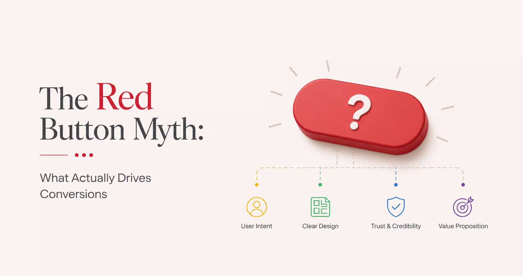
A lot of people online repeat the same idea: red buttons convert better. It sounds simple. It sounds smart. But it is not a rule you can trust. This myth grew from a well-known HubSpot test. In that test, a red button beat a green one by 21%. Then the internet did what it often does. It took one result and turned it into a rule for everyone.
But that is not what the test proved. It only showed that, in that case, red worked better than green.
The bigger reason may have been contrast. Green was already close to the brand’s existing look, so people may have started to ignore it. Red stood out more. That made it easier to notice. So the real winner may not have been the color red itself. It may have been simple visibility.
That idea matches broader data. High-contrast elements can get 23% more clicks than low-contrast ones. Real conversion data also tells a more careful story. Color psychology can help, but usually only a little.
Reports put the average lift at around 2.4%, once stronger factors like copy, layout, and trust signals are already doing their job. In one set of 89 store tests, red performed better only 38% of the time.
That means it did not win most of the time. Even more important, color consistency can beat a so-called “optimal” color by 18%. So what actually works?
- contrast beats color
- consistency beats guessing
- testing beats rules
That is the real lesson. Stop chasing the “perfect” button color. Ask a better question instead: can people see it clearly, and does it fit the page around it?
2026 color trends: earth tones still lead
The mood in 2026 feels softer, warmer, and more grounded. Pantone’s Color of the Year is Cloud Dancer, a soft off-white. But the bigger story is not just one shade. It is the rise of colors that feel natural, calm, and real.
Here are some of the top color trends showing up in 2026:
- Cloud Dancer: a soft off-white that feels light, calm, and clean.
- Chocolate Brown: rich, earthy, and warm without feeling loud.
- Sage Green: gentle, natural, and strongly linked to wellness.
- Burgundy: deeper and more mature than bright red, with a grounded feel.
- Natural Earth Tones: colors inspired by soil, stone, wood, and leaves.
This shift is happening for a reason. People want colors that feel steady. They want warmth, balance, and something that feels more real than flashy neon shades.
Growing interest in sustainability also plays a part, because natural-looking colors often feel more honest and more connected to the world around us.
That is what these trends signal. In 2026, color is not just about standing out. It is also about feeling believable, calm, and close to real life.
Frequently asked questions
What is the most popular color in the world?
Blue is the most popular color in the world. In many surveys, it ranks first and is often chosen by around 37-45% of people.
What are the top 5 most popular colors in the world?
The top five are usually blue, red, green, purple, and yellow. Their order can change a little depending on the survey, country, or age group.
Do color meanings change in different countries?
Yes. A color can mean one thing in one place and something very different somewhere else. For example, red can mean danger in some places, but luck and celebration in China.
Is a popular color always the best color for branding?
No. A color may be popular overall, but that does not mean it is the right fit for every brand, audience, or industry.
How does color blindness affect design?
Color blindness can make some colors harder to tell apart, especially red and green. That is why good design should not rely on color alone to send a message.
How many people are colorblind worldwide?
Around 360 million people worldwide have some form of color vision deficiency. That makes color accessibility a very important part of design.
Do social media platforms shape color trends?
Yes. Apps like TikTok and Instagram can push certain colors again and again, which helps those shades become trendy very quickly.
Conclusion
Blue may be the world’s favorite color, but the best color always depends on the situation. Red, green, and purple can work better in the right place, with the right people, and for the right message. Color is not just about taste either. Your brain really reacts to it, which is why colors can feel calm, bold, safe, or exciting.
The main thing to remember is simple. Do not pick a color just because it is popular. Think about context, culture, and clarity. And make sure people can actually read and understand what they see. The best color is not just the nicest one. It is the one that works.
.avif)


.png)
