- What is a color palette in ui design?
- The 6 types of color palettes used in ui design
- How each palette type affects accessibility
- The 60-30-10 rule: how to proportion any palette
- How to choose the right color palette for your ui project
- Dark mode and what actually changes in your palette
- Color palette mistakes that damage ui credibility
- Tools to build and test your ui color palette
- Frequently asked questions
- Conclusion


.svg)

%201%201.svg)
6 Color Palette Types in UI Design: Examples, Rules & How to Choose

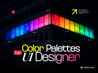
- Six color palette types exist in UI design, each built on a specific color wheel relationship.
- Choose your palette type based on emotional tone, contrast needs, and dark mode compatibility before picking individual colors.
- Grabbing a brand palette and dropping it into product UI without adapting it for interactive states is the error that breaks color systems early.
Open your Spotify app. Notice how album artwork pops against that near-black background. Stripe's dashboard uses white surfaces with a deep purple accent. Linear runs entirely in shades of gray with one sharp blue call-to-action.
Each of those products made a deliberate choice about palette type before they chose a single hex code.
Color palette type is not just a visual preference. For UI design, it's a structural decision. Get the type wrong and your interface feels off, even when users can't explain why. Get it right and your product communicates trust, energy, or calm before a single word is read.
Six palette types drive every UI color decision: monochromatic, analogous, complementary, split-complementary, triadic, and tetradic. Each comes from a specific geometric relationship on the color wheel. Each creates a different emotional signal and a different level of built-in contrast.
By the end of this guide, you'll know which palette type fits your product, how to apply it using the 60-30-10 proportion rule, and which mistakes to skip entirely.
What is a color palette in ui design?
A UI color palette is the full set of colors a product uses across every screen, state, and component. Four structural parts make up this system: primary colors (your brand hues), secondary colors (supporting tones), neutral colors (backgrounds, text, and borders), and semantic colors (success, warning, error, info).
A color palette is not the same as a color scheme. The scheme is the relationship type. The palette is the specific hues you choose within that relationship.
Palette type comes before palette colors. Choosing a complementary relationship first, then selecting specific hues within it, produces far more consistent results than choosing colors first and hoping they work together.
Choosing palette type sets the contrast range, the emotional register, and how many interactive states you can express without visual confusion.
The 6 types of color palettes used in ui design
Color palette types come from color theory. Each type describes a specific geometric relationship between hues on the color wheel. UI designers use six of these relationships as the structural basis for product color systems.
Each type creates a different emotional register and a different level of built-in contrast. Knowing when to use each one is what separates a palette that holds up from one that breaks as the product scales.
Choosing a palette type is not about picking a favorite color. It's about matching your palette's contrast capability to your product's visual complexity and emotional goal.
Getting that match right on the first try is usually what separates a template theme from work built by custom UI design services.
1. Monochromatic color palette
A monochromatic palette uses one hue in multiple shades, tints, and tones. Notion and Linear both run near-monochromatic systems in their core interfaces. Calm, minimal, and easy to make accessible. Contrast comes from lightness variation, not competing hues. Works best for SaaS dashboard design with dense, information-heavy screens.
2. Analogous color palette
An analogous palette draws from three adjacent hues on the color wheel, like blue, blue-green, and green. Slack uses a purple-adjacent analogous palette in its branding. Analogous palettes feel harmonious and natural but carry low built-in contrast. A separate neutral or accent color is required to carry visual hierarchy.
3. Complementary color palette
A complementary palette pairs two hues directly opposite on the color wheel, like blue and orange. Stripe uses complementary contrast to pull attention toward primary actions. Strong focal points come built-in. But placing too many complementary elements side by side creates visual noise fast. Reserve this type when one action needs to dominate the screen.
4. Split-complementary color palette
A split-complementary palette uses one base hue plus the two colors flanking its complement. Instead of blue and orange, you get blue, yellow-orange, and red-orange. Strong contrast arrives with less visual tension than a pure complementary scheme. A reliable choice for creative tools and consumer apps targeting younger audiences.
5. Triadic color palette
A triadic palette uses three hues evenly spaced on the color wheel, like red, blue, and yellow. Google's product suite uses a triadic base across Gmail, Maps, and Drive branding. Triadic palettes are vibrant and energetic. Pick one dominant hue and treat the other two as accents only - otherwise the palette becomes impossible to control.
6. Tetradic (Square) color palette
A tetradic palette uses four hues evenly spaced on the wheel: two sets of complementary pairs. Both Google and Microsoft use tetradic systems in their logo color sets. In UI, tetradic palettes offer maximum color range. Without strong neutral grounding, four active hues compete for attention and produce a chaotic interface fast.
Now that you know the six types, here's how each one affects the accessibility decisions you'll need to make.
How each palette type affects accessibility
Color accessibility is not optional. According to the Web Content Accessibility Guidelines (WCAG) 2.2, text on a background needs at least a 4.5:1 contrast ratio for normal text and 3:1 for large text and UI components.
Your palette type directly controls how easy or hard it is to hit those ratios without custom workarounds.
Monochromatic and analogous palettes have low built-in contrast between adjacent hues. Complementary and split-complementary palettes have high built-in contrast from the start. Knowing this before you choose a palette type prevents accessibility failures that would otherwise require a full redesign. For a deeper framework, read the guide to accessibility in UI design.
Monochromatic and analogous: watch the contrast gap
Single-hue and adjacent-hue palettes rely on lightness differences for visual hierarchy. Dark text on a light background passes WCAG. But using two similar tones say, light blue text on a medium blue background fails. Always run a contrast check before treating similar hues as any text-background combination.
Complementary palettes: vibration risk
Placing two fully saturated complementary hues directly next to each other causes visual vibration. Red text on a green background is technically high contrast but nearly unreadable. Desaturate one hue by 20-30%, or use the complementary color strictly as a small accent rather than a background or body text color.
Semantic colors and every palette type
Semantic colors - red for error, green for success, yellow for warning must stay consistent regardless of palette type. If your brand palette uses red as a primary hue and your error state also uses red, users cannot distinguish brand from warning. Keep semantic colors neutral and fully separate from brand hues.
Once your accessibility profile is set, proportion is the next decision that makes or breaks how the palette looks in a real interface.
The 60-30-10 rule: how to proportion any palette
Color proportion is as important as color selection. A palette that uses all its colors equally creates visual chaos. The 60-30-10 rule is the proportion framework that keeps any UI palette from feeling out of control.
Apply it regardless of palette type. A monochromatic palette still needs proportion: 60% lightest shade, 30% mid-tone, 10% darkest accent. A complementary palette uses the same logic: 60% dominant brand hue (usually a neutral or near-neutral), 30% secondary, 10% complementary accent.
Color systems that skip this step produce interfaces where nothing feels urgent and nothing feels calm. For a full breakdown of how color proportion lives inside a component-level system, read SaaS design systems 101.
60%: The dominant color
Dominant backgrounds and large surfaces get the 60% share. In light mode, this is off-white or very light gray. In dark mode, it's a dark gray in the #121212 to #1E1E1E range, not pure black. Pure black backgrounds create harsh contrast against every hue and cause eye strain over long sessions.
30%: The secondary color
Secondary containers - cards, sidebars, panels, and secondary navigation take the 30% share. A 10-15% lightness difference in HSL between your dominant and secondary color creates clean visual separation without introducing unwanted tension. Going too close makes the surfaces look identical. Going too far makes the layout feel fragmented.
10%: The accent color
Reserve accent colors for calls-to-action, active states, and links only. When an accent appears everywhere, it loses its signal value. When it appears only on actionable elements, users learn instantly that this color means "something I can do." Stripe's primary button color works precisely because it appears nowhere else on the interface.
With proportion locked, the question becomes: which palette type belongs on your specific project?
How to choose the right color palette for your ui project
Choosing a palette type is a four-factor decision: emotional tone, contrast requirement, number of interactive states, and dark mode compatibility. Answer all four before opening a color picker.
Shortcuts on this decision produce palettes that launch fine and break as the product grows. A SaaS product starting with a triadic palette and no neutral scale will run into color collisions by the time the third feature ships.
For brand design decisions, align your palette type with your visual identity before applying it to product UI. Brand and product palettes often need separate but related structures.
Match palette type to your product's emotional register
Calm products - healthcare, finance, productivity tools - work best with monochromatic or analogous palettes. High-energy products - gaming, social apps, creative tools - use complementary or triadic palettes. Choose the emotional register first, then select hues within that type. A wrong palette type sends the wrong emotional signal before a single button is clicked.
Count your interactive states before committing
A product with five interactive states (default, hover, active, disabled, error) needs palette flexibility. Monochromatic palettes handle states through lightness steps. Complementary palettes use hue contrast. A triadic palette creates confusion when three active hues appear in the same interactive component. Map all your states before locking in a palette type.
Check your existing brand color first
If a brand color already exists, it anchors your palette type. A brand color of deep orange pushes toward complementary (blue-orange) or split-complementary. A forest green suggests analogous or complementary. Building against an existing brand color prevents palette conflicts between your marketing assets and your product UI.
Test in dark mode before you commit
Dark mode reverses surface and text relationships. A saturated dark blue as your dominant background creates accessibility failures fast. Test your palette in both light and dark modes during selection, not after design is complete. Current web design trends treat dark mode support as a baseline requirement, not an optional extra.
Testing in dark mode often reveals a specific set of adjustments that every palette needs regardless of type.
Dark mode and what actually changes in your palette
Dark mode is not inverted light mode. A color that reads as calm blue on white looks electric and aggressive on near-black. Hues saturated for light surfaces become overpowering when the background flips.
Every palette type needs specific dark mode adjustments. Building these into your color system from the start, rather than patching them under deadline pressure, prevents a full redesign cycle.
For SaaS dashboard design, dark mode support is standard power users run long sessions and expect both modes to feel intentional.
Reduce saturation by 15-20% for dark surfaces
Hues designed for light backgrounds carry too much saturation on dark surfaces. Drop saturation by 15-20% in HSL for every color used on dark backgrounds. That single adjustment is what makes brand colors feel consistent rather than neon when the surface flips from off-white to dark gray.
Never use pure black as the dark background
A surface of pure black (#000000) creates harsh contrast against every hue in your palette. Use dark gray in the #121212 to #1E1E1E range instead. Google Material Design uses #121212 as its canonical dark mode base surface. That number exists for a reason - pure black fails readability in real indoor and dim-light conditions.
Give semantic colors their own dark-mode versions
A saturated success green (#22C55E) on a white surface reads cleanly. On a dark background, it may need to lighten to #86EFAC to maintain a 4.5:1 contrast ratio. Create dark-mode semantic color tokens from the start. Retrofitting them on release day creates accessibility debt that compounds across every new component.
Dark mode reveals exactly where a palette is fragile. So do the four most common palette mistakes in product UI.
Color palette mistakes that damage ui credibility
Color mistakes in the UI don't just look bad. Low contrast creates usability complaints, color-only signals fail users with color vision differences, and brand palettes applied directly to product UI make every screen feel like a marketing page rather than a working tool.
Four patterns appear consistently in product audits. Catching them early prevents a rebuild later.
At Orbix Studio, the pattern we see in early-stage products is a marketing brand palette applied directly to product UI with no adaptation for interactive states or WCAG contrast requirements.
Using color as the only signal
Red text alone cannot communicate an error state. Green alone cannot confirm success. Approximately 8% of men and 0.5% of women experience some form of color vision deficiency. Pair every color signal with an icon, a label, or a border pattern. Color reinforces meaning it does not replace it.
Skipping the neutral scale
A neutral scale - white, near-white, light gray, mid gray, dark gray, near-black is what makes any color palette functional in practice. Without one, every surface gets a tinted version of a brand color. Figma's own UI uses a 10-step neutral scale to handle all background, text, and border combinations without running into contrast conflicts.
Applying a brand palette directly to product ui
Brand palettes are designed for marketing: bold, saturated, high-impact. Product UI needs a functional adaptation: lighter tints, darker shades, and semantic variations. Copying a Figma brand library directly into product components produces high-contrast buttons, low-contrast body text, and states that visually collide with each other on the same screen.
Ignoring color blindness scenarios
Approximately 8% of men experience some form of color vision deficiency. Red-green combinations fail for users with deuteranopia. Test every palette in a color blindness simulator before development handoff. Figma's accessibility plugins and Chrome DevTools both include vision deficiency emulation at no additional cost.
The right tools make all four of these checks routine rather than afterthoughts.
Tools to build and test your ui color palette
Good color tools close the gap between "this looks right on my screen" and "this holds up across every device, mode, and accessibility profile." Three categories matter: palette generation, contrast checking, and color blindness simulation.
Colors generate harmony-based palette options when you lock a base hue. Adobe Color provides direct color wheel manipulation with harmony type selectors built in. Atmos.style combines palette generation, contrast checking, and dark mode preview in one tool.
For workflow-integrated options, the guide to Figma plugins and UI kits covers the tools that run contrast checks inside your active design file. When you're ready to convert your palette into a scalable system with named tokens, building a design system from scratch walks through the full architecture.
Frequently asked questions
What are the 6 types of color palettes in UI design?
Monochromatic, analogous, complementary, split-complementary, triadic, and tetradic. Each type is defined by a geometric relationship between hues on the color wheel. Monochromatic uses one hue in varying shades. Analogous draws from adjacent hues. Complementary, split-complementary, triadic, and tetradic use two, three, or four hues at specific rotational intervals.
How many colors should a UI color palette have?
A functional UI palette has 1-2 primary brand colors, 1 accent color, a neutral scale of 6-10 steps, and 4 semantic colors for error, success, warning, and info. Active color use in an interface is typically limited to 2-3 hues at a time. More than that creates visual competition between components.
Which color palette type is easiest for beginners?
Monochromatic palettes give new designers the clearest starting point. One hue varied in lightness and saturation eliminates color clashing and simplifies accessibility checking. Contrast comes from lightness differences, not competing hues. Linear and Notion both run near-monochromatic systems and maintain clean, readable interfaces as a direct result.
What is the 60-30-10 rule in UI design?
The 60-30-10 rule divides color use into three tiers: 60% dominant color for backgrounds and large surfaces, 30% secondary color for cards and sidebars, and 10% accent for CTAs and active states. Keeping accent colors at 10% preserves their signal value. Accent colors that appear everywhere stop communicating priority.
What is the difference between a color palette and a color scheme?
A color scheme is the relationship type: complementary, triadic, analogous, and so on. A color palette is the specific set of colors chosen within that relationship. Choose the scheme type first, then select your hues. Choosing individual colors first and hoping they work together produces inconsistent results in any complex interface.
How do I make a UI color palette accessible?
Check every text-background pair against WCAG 2.2 Level AA standards: 4.5:1 for normal text, 3:1 for large text and UI components. Never rely on color alone as the only signal always pair color with an icon or label. Test the full palette in a color blindness simulator before development handoff.
What color palette type works best for a SaaS dashboard?
Monochromatic or analogous palettes work well for data-heavy SaaS dashboards. Low hue variation reduces visual noise and lets data visualizations charts, progress bars, status indicators use color without competing with the interface shell. Save complementary or split-complementary accents for primary CTAs and critical alert states only.
Conclusion
Palette type is the decision that comes before palette colors. Get the type right matched to your product's emotional register, contrast profile, and dark mode requirements and every color decision that follows becomes faster and more consistent.
Start with your product's emotional goal and your existing brand color. Pick a palette type that fits both. Apply the 60-30-10 proportion rule, run your contrast checks against WCAG 2.2, test in dark mode, and build semantic color tokens before development starts.
A palette chosen this way holds up across every feature you ship, not just the ones you built it for.
Want to build a color system that scales with your product? Orbix Studio works with SaaS founders and product teams on UI/UX design from palette architecture to full component systems.





.svg)
.svg)


.svg)







.avif)



.svg)

