Table of Contents
- What Makes Multi-Tenant Dashboard Design Different from Standard SaaS UX
- The 4 Core Design Principles for Multi-Tenant Dashboards
- UI Patterns That Scale for Enterprise Clients
- The 3 Mistakes That Break Multi-Tenant Dashboards
- How Orbix Studio Approaches Multi-Tenant Dashboard Design
- Frequently Asked Questions
- The Design Problem Arrives at Client 50


- Multi-tenant dashboard design is building one shared UI that gives every tenant a fully isolated, role-aware experience without a separate codebase per client.
- Design for your worst-case tenant first: the enterprise client with six roles, three departments, and data that cannot cross boundaries.
- The mistake that forces a rebuild: designing for one user persona and bolting permissions on after the UI is built.

Multi-tenant dashboard design is the discipline of building one interface that serves hundreds of tenants at the same time, each seeing only their data, their roles, and their context, without a separate codebase per client. You build the product once. Every client lives inside that same product, but their experience should feel personal to them. Delivering that promise in the UI is harder than in the database.
Founders who have read the complete SaaS dashboard design guide understand tenant isolation at the backend level. This article covers the design layer: which UI patterns hold at enterprise scale, which principles prevent the rebuild at client 200, and which three design decisions break the dashboard before the sales team closes a single enterprise deal.
What Makes Multi-Tenant Dashboard Design Different from Standard SaaS UX
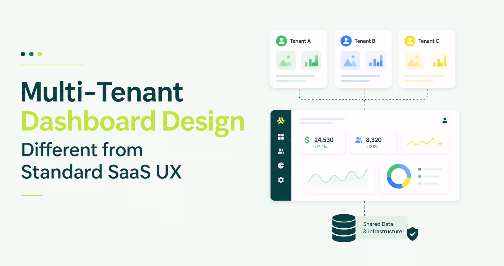
Multi-tenant dashboard design differs from standard SaaS UX design because the same interface must serve fundamentally different user contexts at the same time. A single-product dashboard solves for one user model. A multi-tenant dashboard must solve for every client's user model without rebuilding the UI for each one. That gap is where standard design patterns fail.
A standard B2B SaaS dashboard assumes all users share a context: same company, same data scope, same permissions. That assumption collapses the moment you add a second tenant.
HubSpot illustrates the design target. Switch between HubSpot accounts and the navigation context shifts entirely, but the interface pattern stays identical. Personal to each tenant, built once.
The architecture can be multi-tenant from day one. The design almost never is.
The gap shows up at client 50. A new enterprise account asks for six user roles, department-level data restriction, and white-labeled terminology. A dashboard built for one persona cannot hold that structure, and the rebuild arrives at exactly the wrong moment.
The 4 Core Design Principles for Multi-Tenant Dashboards
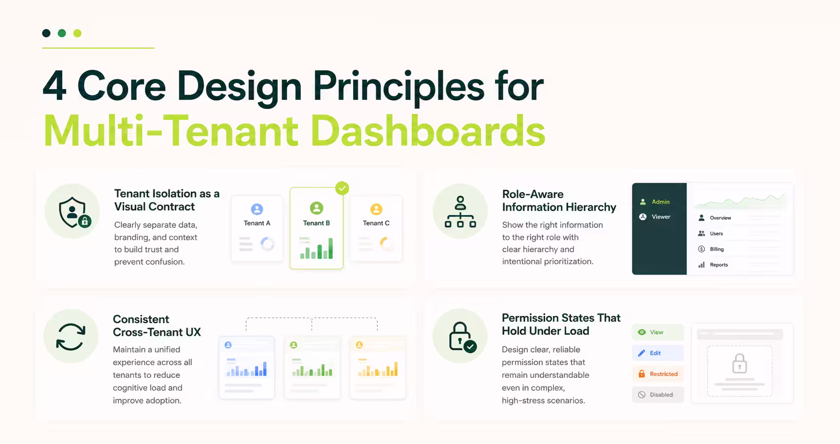
Four principles govern every multi-tenant dashboard that survives enterprise scale: tenant isolation as a visual contract, role-aware information hierarchy, permission states that hold under load, and consistent cross-tenant UX. Miss one and the dashboard leaks context or forces a redesign at the worst possible moment. A design system built for SaaS underpins all four, because without a shared system, tenant customization quietly fragments the codebase over time.
Tenant Isolation as a Visual Contract
The UI must communicate to each user that they are inside their own environment without any text saying so explicitly. This means branding per tenant, visible workspace indicators, and data scope signals in the navigation. Notion's workspace switcher handles this exactly: switching workspaces changes the logo, clears the sidebar, and repopulates it with only that workspace's pages. The user never questions whether they are looking at the right data.
Role-Aware Information Hierarchy
Role-based access control in multi-tenant dashboard design means different roles see different dashboards, not the same dashboard with some buttons hidden. Linear does this at the navigation level: a team member sees their issue queue, a project lead sees cross-team progress, an admin sees workspace-wide settings. The information hierarchy changes per role, not just the visibility rules. Users blocked mid-flow by unexpected permission errors abandon the task entirely, making role-appropriate structure a retention concern, not just a design preference.
Permission States That Hold Under Load
Design your permission model for three roles at launch, but build UI components to handle ten. A read-only user hitting a page they cannot edit should see a scoped view matching their access level, not a broken layout. Figma viewer mode demonstrates this well: viewers see a clean read-only canvas that communicates their role without a permissions wall blocking them.
Consistent Cross-Tenant UX
White-labeling and UX consistency are not opposites. Tenants can have their logo, color palette, and terminology inside your product, but the interaction model cannot change per tenant. Navigation behaves the same across all tenants. Customization lives inside the design system, and that boundary is what separates white-labeling that holds from white-labeling that breaks with every new client.
UI Patterns That Scale for Enterprise Clients
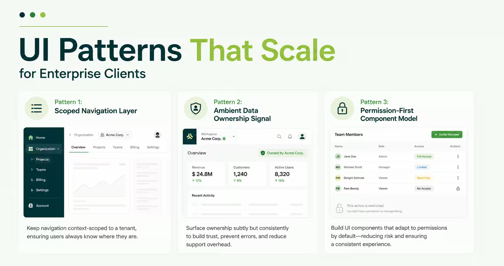
Three UI patterns appear in every multi-tenant SaaS dashboard that enterprise clients adopt without requesting custom UI work. Teams that implement all three avoid the custom-build negotiation. Teams that skip two get that request within 90 days of onboarding their first mid-market account. These patterns connect directly to the SaaS UI patterns that drive conversion, applied at the structural level for multi-tenant contexts.
Pattern 1: Scoped Navigation Layer
The tenant context should wrap the navigation structure, not the content. If tenant context lives only in a header bar, users lose orientation the moment they click into a nested view. Slack solves this by keeping the workspace selector at the top of the left rail, outside the channel structure entirely, so the workspace stays visible at any view depth.
Pattern 2: Ambient Data Ownership Signal
Every data point should carry its tenant origin passively, without the user needing to check. Stripe does this at the account level: the dashboard header shows which account you are in and updates before the data loads on a switch. That ambient signal eliminates the wrong-tenant reporting error. For applied examples, B2B SaaS dashboard design walkthroughs show this pattern across product categories.
Pattern 3: Permission-First Component Model
Components should render based on role state before data state. A component that checks permissions after rendering data will flash unauthorized content to the wrong user. A permission-first component knows what to show before the data request completes, and it simplifies frontend architecture: permissions become part of the component contract, not a post-render filter.
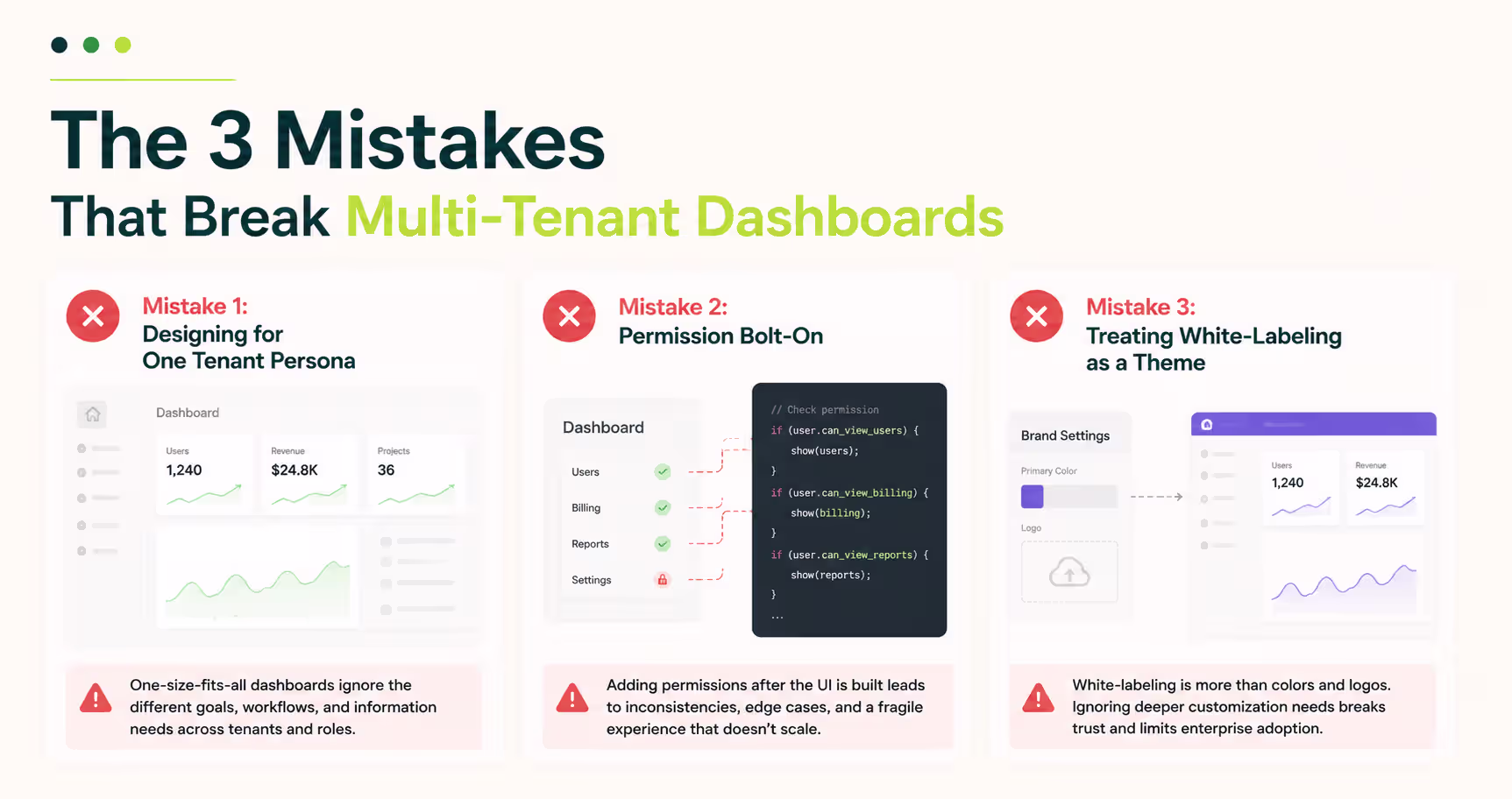
The 3 Mistakes That Break Multi-Tenant Dashboards
Three design decisions force a multi-tenant dashboard rebuild: single-persona design, permission bolt-on, and CSS-only white-labeling. Each hides during early development and surfaces at the same moment: the first enterprise client with real organizational complexity. They drive the admin dashboard redesign projects that arrive mid-growth, and they are the pattern in every SaaS UX post-mortem about decisions no one flagged early enough.
Mistake 1: Designing for One Tenant Persona
Early-stage SaaS products are built for the founder's first ten customers, all sharing a similar profile. When the product moves upmarket, a 500-seat enterprise account arrives with a procurement lead, a department admin, a team lead, and an end user, none sharing the same workflow or data needs. A single-persona dashboard cannot hold four distinct information hierarchies. Map your highest-complexity tenant before wireframing.
Mistake 2: Permission Bolt-On
Building the full UI and adding permissions on top is the highest-cost design mistake in multi-tenant SaaS. The result: a navigation structure built for full-access admins, with read-only users forced through the same tree and blocked at every turn. Users blocked mid-flow abandon at higher rates than users gated at entry. Build the permission model into the information architecture before wireframing.
Mistake 3: Treating White-Labeling as a Theme
A logo swap and a color palette is not white-labeling. Enterprise clients expect their terminology, their data labels, and their navigation language to reflect their own business. A dashboard that labels pipeline stages "Opportunities" when the client's sales team uses "Deals" creates daily friction for every user on the account. White-labeling at enterprise scale needs a configurable content model, not a theme file.
White-labeling is not a theme. It is a tenant-specific information architecture.
Tip: Before designing your permission model, list every user role your highest-complexity enterprise client could need. Build the navigation hierarchy for that list, not for your current customer base.
How Orbix Studio Approaches Multi-Tenant Dashboard Design
Multi-tenant dashboard design follows a specific sequence: permission matrix before information architecture, information architecture before component design. Reversing that order is the fastest route to an expensive rebuild.
At Orbix Studio, SaaS dashboard design engagements start with a tenant mapping session: who are the tenants, what roles exist inside each one, what data can cross role boundaries, and what cannot. That session produces the permission matrix. The permission matrix drives the navigation architecture. The navigation architecture determines the component states.
The Investiq mobile app project followed this sequence: surfacing the right financial data to different user types inside a shared product, with the information hierarchy changing per role without breaking the interaction model. If your sales team is fielding permission questions the UI cannot answer, address the design architecture before the next contract closes.
To see how tenant isolation and role-aware hierarchy translate into actual interface design, our dashboard work on Dribbble shows the visual patterns applied across products.
Want to map your tenant model before the first wireframe?See how we approach SaaS dashboard design →
Frequently Asked Questions
What is multi-tenant dashboard design?
Multi-tenant dashboard design is the practice of building a single UI that serves multiple clients, each with isolated data, independent role structures, and their own access model. Every tenant sees only their context, while the product runs on one shared codebase and one design system beneath the interface.
How does tenant isolation affect dashboard UX?
Tenant isolation in dashboard UX means every user sees only the data and roles assigned to their tenant. It shapes navigation structure, data scope signals, empty state design, and component visibility. When designed correctly, users never need to verify whether they are looking at the right account.
What is the difference between single-tenant and multi-tenant dashboard design?
A single-tenant dashboard is built for one company's user model. A multi-tenant dashboard serves any company's user model inside one shared product. The design complexity comes from building role structures, data scopes, and white-label customization that work across every client without custom code per tenant.
How do you design RBAC into a SaaS dashboard?
RBAC in dashboard design starts at the information architecture level, not the component level. Map every role's data access and task flow before wireframing. Build navigation trees that change per role, not just components that hide buttons. Permission state should drive layout decisions, not override them after the fact.
What UI patterns work best for enterprise multi-tenant dashboards?
Three patterns hold at enterprise scale: a scoped navigation layer that communicates tenant context at every view depth, ambient data ownership signals that confirm the active tenant without user action, and permission-first components that render based on role state before data state. All three need to be present.
How do you handle white-labeling in a multi-tenant SaaS product?
White-labeling in multi-tenant SaaS goes beyond logo and color. Enterprise clients expect configurable terminology, data labels, and navigation language. Build a content model that allows tenant-level configuration of labels and copy, separate from the design system. Style tokens handle visual white-labeling. A content configuration layer handles language and structure.
When should a SaaS team invest in multi-tenant dashboard design?
Invest before your first enterprise client, not after. Redesigning a permission model and navigation hierarchy after an enterprise account reveals the gaps costs three to five times what designing it correctly at the architecture stage would have cost. The earliest signal: a permission question your current UI cannot answer.
The Design Problem Arrives at Client 50
The architecture problem in multi-tenant SaaS gets solved early. The design problem arrives at client 50, when a real enterprise account brings organizational complexity the dashboard was never built to handle.
The correct sequence: persona mapping, then permission matrix, then information architecture, then components. Build for your highest-complexity potential tenant. That choice determines whether enterprise onboarding is clean or a rebuild negotiation every time.
Your next step is concrete. Open your current dashboard and count how many distinct user roles an enterprise client could reasonably need. If the navigation does not have a clear answer for each role, that is where the work starts.
Ready to design a multi-tenant dashboard your enterprise clients can use from day one? Book a strategy call with Orbix Studio →
.avif)


.avif)