- Why Most Dark Modes Fail Contrast Checks
- Build a Color System Before You Design Dark Mode
- Make Sure Your Dark Mode Is Easy to Read
- Build a Shared Color System in Figma First
- Create Depth Without Relying on Heavy Shadows
- How to Design a SaaS Dashboard in Dark Mode
- 6 SaaS Dark Mode Examples Worth Studying
- Common Mistakes That Can Ruin Your Dark Mode
- Frequently Asked Questions
- Final Thoughts


.svg)

%201%201.svg)
SaaS Dark Mode UI Design: Best Practices and 6 Real Examples
- 79.1% of the top one million homepages have low-contrast text (WebAIM, 2025).
- Great dark mode focuses on usability before aesthetics.
- Design systems keep dark mode consistent across every screen.
- Accessibility testing helps create a better experience for every user.
Users don't choose dark mode because it looks cool. They choose it because it's more comfortable, reduces distractions, and fits the way they work. That's why many of today's best SaaS products include dark mode as a core part of the user experience.
However, building an effective dark mode isn't as simple as inverting colors. You need the right color palette, enough contrast, clear visual hierarchy, and consistent UI components. Otherwise, your interface may become harder to read and navigate instead of easier.
This guide explains how to create a SaaS dark mode UI design following proven UI and UX principles. You'll learn how to build a scalable color system, improve accessibility, create better visual hierarchy, and apply practical best practices to deliver a dark mode your users will enjoy.
Why Most Dark Modes Fail Contrast Checks

Many teams think dark mode is simply changing a white interface to black. It isn't. A good dark mode should improve readability, accessibility, and usability - not just change the appearance. That's why we treat it as a user interface design problem first and a color problem second.
The problem is more common than many realize. According to the WebAIM Million 2025 report, 79.1% of the world's top one million homepages have low-contrast text. This makes it the most common accessibility issue on the web. While the study isn't limited to SaaS products, it highlights how easily poor contrast can make an interface difficult to use.
Dark mode makes this challenge even bigger. A color combination that passes in light mode may fail in dark mode, which is why every theme should be tested separately. As GitHub rebuilt its dark mode, the team spent months auditing hard-coded colors before they could create a scalable system.
For SaaS products, the impact goes beyond appearance. Poor contrast can make dashboards, tables, forms, and navigation harder to use, especially for people with low vision. It can also increase accessibility risks as regulations and accessibility standards continue to evolve.
If you're investing in dark mode, don't think of it as a visual upgrade. Think of it as an opportunity to build a more usable, accessible, and consistent product.
Build a Color System Before You Design Dark Mode
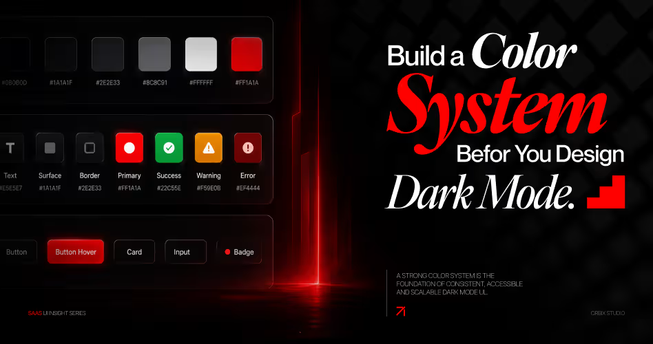
The foundation of every great dark mode is a well-organized color system. Without one, keeping colors consistent across pages, components, and future updates quickly becomes difficult.
A color system gives every color a clear role. Instead of managing hundreds of individual color values, you manage a structured set of reusable tokens that work across your entire product.
This approach offers three key benefits:
- One source of truth for every color.
- Better collaboration between designers and developers.
- An easier way to support both light and dark themes.
Learn how to build a scalable color palette in our Color Palette Types for UI Design guide before creating your dark mode.
Start With Your Core Colors
The first layer of any color system is your core colors, also called primitive tokens. These are the raw colors that make up your palette. At this stage, they have no meaning - they're simply named by their position in the color scale.
Notice that these names don't describe where the colors are used. Instead of names like Primary Button Blue or Success Green, they simply identify the color itself. That makes them reusable throughout your product.
This approach also reduces unnecessary duplication. In one enterprise redesign, EDL Design Studio audited more than 200 color references but found only 40 unique colors. The problem wasn't too many colors - it was the same colors being repeated under different names.
Give Every Color a Clear Purpose
Once you have your core colors, the next step is assigning each one a job. These are called semantic tokens because they describe what a color does, not what it looks like.
For example:
The important part isn't the color - it's the name. Your designers and developers work with text-primary, not a hex code. Whether the interface is light or dark, the semantic token stays the same while the underlying color changes.
This makes collaboration much easier and keeps your design system flexible as your product grows.
It's also how large SaaS teams scale their products. In Figma's article on semantic design systems, Dropbox explains how semantic variables allow different teams to experiment with new designs without breaking the entire system.
Our SaaS Design Services help teams build scalable design systems that stay consistent as products grow.
Create Consistent Colors for Every UI Component
The final layer applies your color system to real interface elements. These are often called component tokens because they define how individual UI components should look.
Instead of assigning colors directly to a button or input field, you create reusable tokens like:
- Button Primary Background
- Button Primary Hover
- Input Border
- Card Background
- Navigation Surface
- Table Header Background
This approach keeps every component consistent while allowing each one to have its own behavior. For example, a button can use different colors for its default, hover, and active states without affecting the rest of the design system.
A great example is GitHub's Primer Design System. It organizes colors at the component level, making the interface easier to maintain as new features and pages are added.
By organizing your colors into core colors, semantic tokens, and component tokens, dark mode becomes much easier to build.
Make Sure Your Dark Mode Is Easy to Read
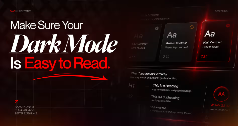
A good dark mode should feel comfortable to use from the first click. If text, buttons, or navigation are difficult to see, users will struggle to complete even simple tasks.
That's why readability should be part of every design decision - not something you test at the end.
Follow WCAG Contrast Guidelines
The WCAG 2.2 accessibility guidelines recommend a minimum contrast ratio of 4.5:1 for normal text and 3:1 for large text. These standards help ensure your interface remains readable across different screens, lighting conditions, and accessibility needs.
Test Both Light and Dark Themes
Never assume a color that works in light mode will also work in dark mode. The same text and background combination can produce very different results once the interface changes.
A gray border that looks clear on white can almost disappear on a dark card, and a link color that passes on white can fail on near-black. Testing both themes separately helps you identify these issues before they reach your users.
Check Every Important Color Pair
Before launching your dark mode, review every key interface element, including:
- Body text and headings
- Buttons and links
- Forms and input fields
- Cards, tables, and navigation
- Alerts, badges, and status indicators
Use the WebAIM Contrast Checker to verify each color pair against the official WCAG 2.2 requirements. A complete review typically takes only a couple of hours, but it can prevent readability issues across your entire product.
You can also download our SaaS Website Audit Checklist to review accessibility issues before launch.
Build a Shared Color System in Figma First
Before writing a single line of code, organize your colors in Figma Variables. Create one collection for your color system, then define separate Light and Dark modes.
Instead of assigning colors manually to every button, card, or form, apply variables to your UI components. This way, switching between light and dark mode updates the entire interface automatically while keeping every screen consistent.
A simple setup usually looks like this:
- Create a Variables collection.
- Define Light and Dark modes.
- Assign variables to every UI component.
- Switch themes to verify everything updates correctly.
Starting with a shared color system saves time later and prevents inconsistencies as your product grows.
Use Shared Color Names Instead of Individual Hex Codes
One of the biggest causes of inconsistent interfaces is relying on individual hex codes. A designer might say, "Use the primary blue," while a developer isn't sure which shade they mean.
Instead, give every color a shared name based on its purpose rather than its value.
Now everyone speaks the same language. Designers use Text Primary, developers use text-primary, and both reference the same color token. If that color changes later, only the token needs updating - not every individual component.
This is one of the biggest advantages of semantic design systems and one of the reasons companies like Dropbox use shared variables to keep large product teams aligned.
Update One Color Instead of Hundreds of Components
As your SaaS product evolves, your color palette will change. You may need to improve contrast, refresh your brand colors, or fine-tune your dark mode based on user feedback.
Without a shared system, every change means updating dozens- or even hundreds - of buttons, forms, cards, and navigation elements manually.
With variables, the process is much simpler.
- Update the color token once.
- Every connected component updates automatically.
- Light and dark themes stay in sync.
- Designers and developers always work from the same source of truth.
Instead of maintaining two separate interfaces, you're maintaining one design system that supports both themes. That makes your dark mode easier to scale, easier to maintain, and far less likely to become inconsistent over time.
Create Depth Without Relying on Heavy Shadows
If your dark mode feels flat or cluttered, shadows may be the reason. In light mode, shadows stand out because they're darker than the background. In dark mode, however, shadows blend into already dark surfaces, making it difficult to distinguish between cards, modals, and other interface elements.
Instead of relying on heavier shadows, modern SaaS products create depth by using slightly lighter surface colors. This subtle change makes elevated elements easier to recognize while keeping the interface clean and comfortable to use.
Example Surface Hierarchy:
Notice how each layer becomes slightly lighter than the one below it. Your eyes naturally interpret lighter surfaces as being closer, creating a clear visual hierarchy without relying on strong shadows.
Instead of adding larger shadows, try:
- Using lighter surface colors to separate interface layers.
- Keeping elevation levels consistent across every page.
- Using shadows sparingly to complement the design rather than define it.
This approach is used throughout Material Design's dark theme guidelines and can also be seen in modern SaaS products like Linear, where subtle surface changes create a clean, layered interface without unnecessary visual noise.
Design Tip: If a card doesn't stand out in dark mode, increase its surface brightness slightly before increasing the shadow. In most cases, a lighter surface creates better depth than a heavier shadow.
How to Design a SaaS Dashboard in Dark Mode
Dashboards are where dark mode usually breaks first. They pack charts, tables, filters, and status colors into one screen, so every weak color choice shows up at once. If you are starting from scratch, our SaaS dashboard design guide covers layout first. Then apply these dark mode rules.
Keep Charts Readable on Dark Backgrounds
Bright chart colors that look fine on white can glow on dark surfaces. Use lighter, less saturated versions of your data colors and keep gridlines and axis lines subtle. WCAG asks for at least a 3:1 contrast ratio for graphics users need to understand the content, so chart lines and data points should meet that against the card behind them. See the WCAG non-text contrast guideline for details.
Use Surface Steps to Separate Tables and Cards
Dense tables get hard to scan in dark mode when every row sits on the same color. Put the table on a card surface, use a slightly lighter header row, and separate rows with a thin border token instead of heavy lines. Use the same surface scale from the section above so cards, tables, and filters stay consistent.
Give Status Colors Their Own Dark Versions
Success, warning, and error colors need dark mode variants. A green that works on white often needs a lighter shade on a dark card to stay readable. Pair every status color with a label or icon too, so users who cannot tell colors apart still understand the status.
Limit Accent Colors to What Needs Attention
In a dark dashboard, one bright color pulls the eye fast. Save your accent color for the primary action, active filters, and alerts. Everything else should rely on gray surfaces and text hierarchy. For real layouts that use this approach, see these B2B SaaS dashboard design examples.
6 SaaS Dark Mode Examples Worth Studying
The best way to learn dark mode is to study products people use for hours every day. Here is what each one does well and what you can copy.
1. Linear: Themes Built From Three Colors
Linear rebuilt its theme system in the LCH color space instead of HSL. Each theme now comes from just three inputs: a base color, an accent color, and a contrast level. The contrast input also lets Linear generate high-contrast themes for users who need them, as explained in Linear's UI redesign write-up.
What to copy: generate your dark theme from a few core inputs instead of picking every shade by hand.
2. GitHub: Multiple Dark Themes for Different Needs
GitHub offers more than one dark option, including a dark high contrast theme and colorblind-friendly themes. Its team built an internal tool to adjust lightness and check color pairings against WCAG contrast while designing each palette, which it describes in this GitHub blog post.
What to copy: test contrast while you build the palette, not after the screens are done.
3. Slack: Dark Mode That Follows the System
Slack lets users choose light or dark mode, or simply match their operating system setting. For a chat tool that stays open all day, that small choice makes long sessions far more comfortable.
What to copy: add a "sync with system" option and keep the message area neutral so conversations stay easy to read.
4. Notion: Soft Grays for Long Writing Sessions
Notion's dark mode uses soft dark grays rather than pure black, with slightly muted text for secondary content. Pages full of text stay comfortable to read for long periods.
What to copy: use off-black surfaces and a softer white for body text on content-heavy screens.
5. Figma: A Dark Interface That Keeps the Canvas in Focus
Figma lets users pick a light, dark, or system theme for the editor. In dark mode, the panels and toolbars fade into the background so the design on the canvas stands out.
What to copy: in creative and editing tools, keep the interface quiet so the user's work is the brightest thing on screen.
6. VS Code: Dark by Default With Built-In High Contrast
VS Code uses Dark Modern as its default theme and ships built-in high contrast themes. Its theme system is token based, which is why community themes can restyle the whole editor without breaking it.
What to copy: build on color tokens so your theme can be changed or extended without touching components.
Common Mistakes That Can Ruin Your Dark Mode
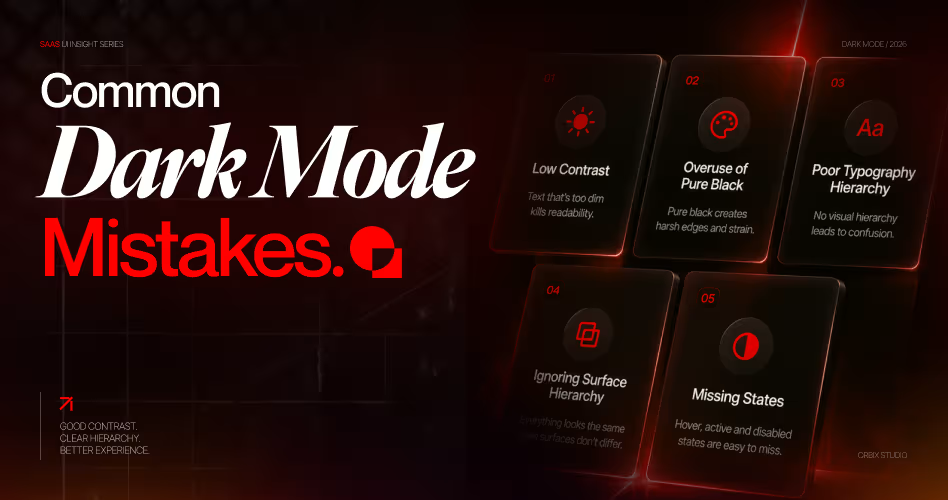
Even with the right design principles, a few small mistakes can make your dark mode harder to use. Here are the most common issues to watch for before you launch.
- Using Pure Black Backgrounds: It may seem like #000000 is the best choice for dark mode, but it often creates harsh contrast and causes eye strain during long sessions. Instead, use a dark gray like #121212 or similar shades to create a more comfortable reading experience.
- Hard-Coding Colors Throughout Your Product: Assigning colors directly to individual components might seem faster, but it becomes difficult to maintain as your product grows. A shared color system makes updates easier and keeps both light and dark themes consistent.
- Skipping Accessibility Testing: A dark mode that looks good on your monitor may not work well for every user. Test your interface on different devices, screen brightness levels, and lighting conditions. If possible, gather feedback from real users to identify issues you might otherwise miss.
- Relying Too Much on Shadows: Heavy shadows often disappear against dark backgrounds, making the interface feel flat. Instead, use slightly lighter surface colors to create depth and separate UI elements.
- Using Too Many Bright Accent Colors: Bright colors can quickly become overwhelming in dark mode. Reserve accent colors for important actions, notifications, and status indicators to maintain a clean and balanced interface.
Frequently Asked Questions
What makes a good SaaS dark mode UI design?
A good SaaS dark mode UI design uses a consistent color system, meets WCAG contrast requirements, creates clear visual hierarchy, and keeps dashboards, forms, and navigation easy to read in any environment.
What's the difference between dark mode design and dark UI design?
Dark mode design adds a dark theme to an existing interface, while dark UI design starts with a dark-first approach. Both should prioritize readability, accessibility, and consistent component behavior.
How do I design a better SaaS dashboard dark mode?
Use subtle surface layers, readable typography, limited accent colors, and strong contrast. Tables, charts, filters, and navigation should remain easy to scan without relying on heavy shadows.
Why should I use a dark mode design system?
A dark mode design system keeps colors, components, and themes consistent. Updating one color token automatically updates every connected button, card, and form across your product.
What contrast ratio should a dark theme UI design follow?
Follow WCAG 2.2 guidelines by using a minimum 4.5:1 contrast ratio for normal text and 3:1 for large text to improve readability and accessibility.
Is pure black a good choice for dark mode?
No. Pure black (#000000) often creates harsh contrast and increases eye strain. Most modern products use dark gray surfaces, such as #121212, for a more comfortable experience.
Should users be able to switch between light mode and dark mode?
Yes. A light mode toggle gives users control over their preferred viewing experience while keeping the same layout, navigation, and functionality across both themes.
Which SaaS products have the best dark mode UI design?
Linear, GitHub, Slack, Notion, Figma, and VS Code all offer strong dark modes. They rely on token-based color systems, lighter surfaces for elevation, accessible contrast, and limited accent colors. GitHub and VS Code also include high contrast dark themes for users who need extra legibility.
How do I test a dark mode UI design?
Check every text and background pair with a contrast checker, review the interface on different screens and brightness levels, and switch between light and dark themes to catch colors that did not update. Test charts, badges, and focus states too, not just body text.
How should I name colors in a dark mode design system?
Name colors by their job, not their value. Use semantic names like text-primary, surface-raised, and border-default so the same name can point to a different value in light and dark mode.
Final Thoughts
A great SaaS dark mode isn't about making your interface darker - it's about making it easier to use. By building a structured color system, following accessibility guidelines, creating clear visual hierarchy, and testing your design with real users, you can deliver a dark mode that feels consistent, comfortable, and ready to scale alongside your product.
Whether you're designing your first dark theme or improving an existing one, start with the fundamentals. Explore our SaaS Design Services if you'd like expert help designing, testing, and maintaining a scalable dark mode for your product.







.svg)
.svg)


.svg)







.avif)



.svg)

