


.svg)

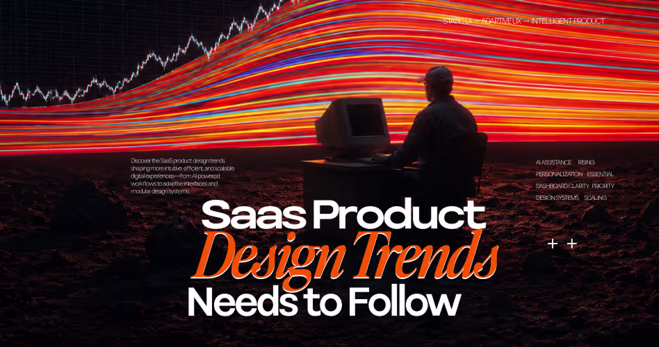
9 SaaS Product Design Trends in 2026 That Cut Churn & Improve Retention
For a long time, SaaS products competed by adding more features, and benefits than competitors. But, the focus of SaaS products has shifted in 2026.
Today, the global SaaS market is projected to hit $375.57 billion in 2026 - (Fortune Business Insights) and with that growth comes a major shift. Users no longer care how many features a product has. They care about how fast they can get things done.
Now, the users care less about how many features a product has, and care more about how easily they can complete their task. And with the changing demand, the SaaS product design is also shifting in that direction.
Today, we’ve listed the top 9 SaaS product design trends that are continuously emerging, and dominating the industry. You’ll also get an idea on which features you can include in your SaaS product.
How SaaS Design Trends is Evolving in 2026
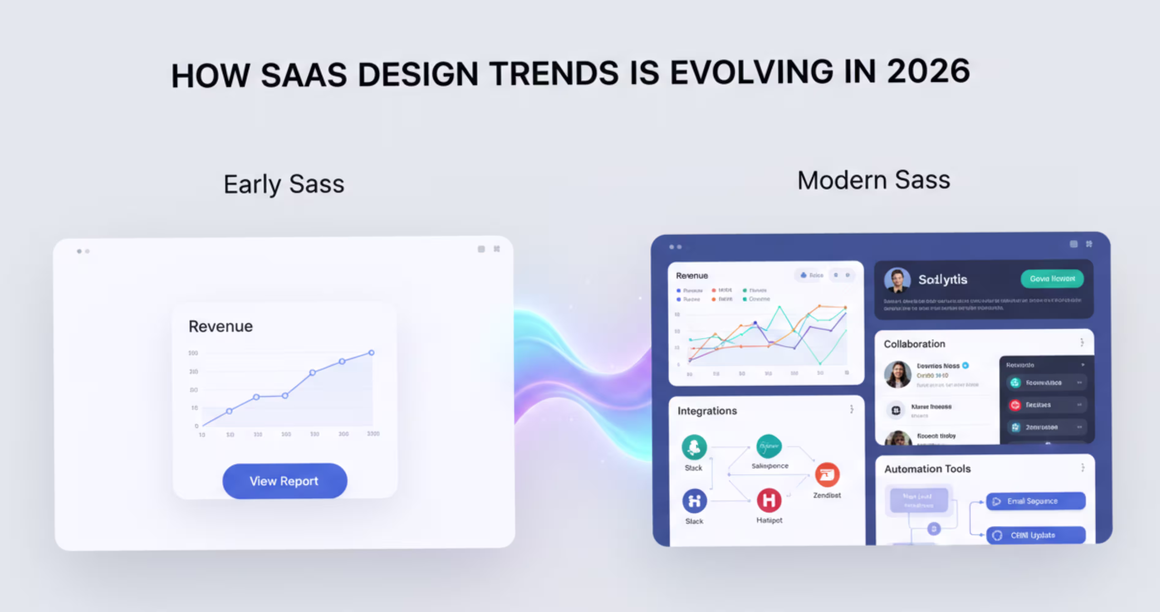
In the early days, the SaaS industry had a trend of simple, aesthetic interfaces. They usually had one core service, and the interface was designed around that single functionality.
But the SaaS industry has now moved from one service to combining multiple services in a single product. This brings analytics, integrations, collaboration tools in a single product. As the products kept increasing the features, their interfaces also started to become more complex.
These added complexities made it confusing for users to navigate and complete their tasks. And that’s why SaaS product designers took a different approach, and started designing product interfaces with a user-centric approach - rather than based on aesthetics.
The goal of the user-centric design is to make SaaS products easier to navigate, customize, and use effectively. That's why modern SaaS platforms are adopting new design approaches like AI-driven interfaces, workflow-based experiences, and modular design systems.
What to Consider Before Designing a SaaS Product
Before jumping into UI screens, you need to understand - how the product will actually be used by its users?
SaaS products are tools that people use on a day to day basis. That means the design must support real workflows, reduce the friction users are facing, and scale as the product grows.
Understand Your Users’ Workflow
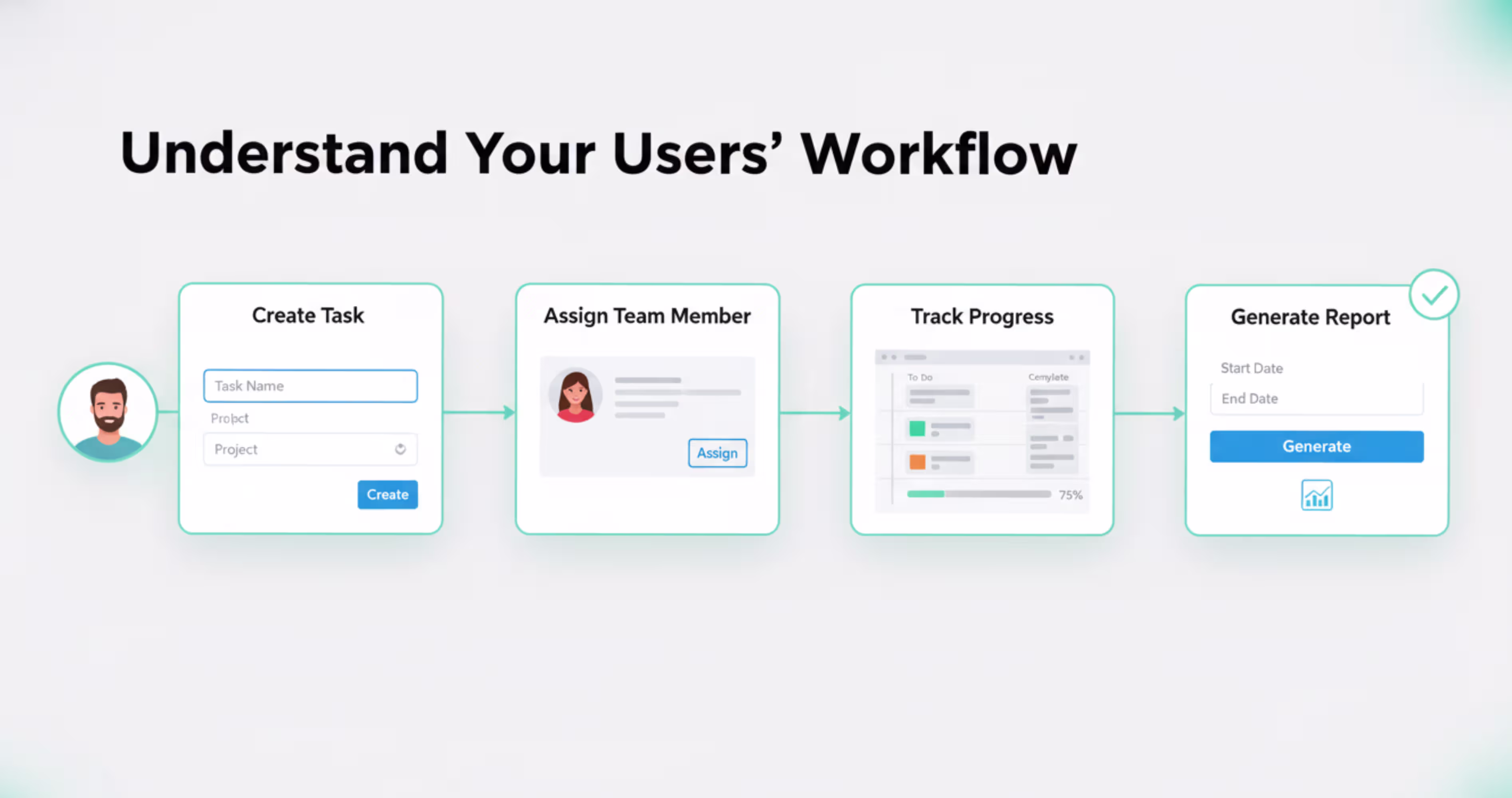
Ask yourself: what are my users trying to accomplish through the product? For example, if you're having a project management tool, it might have features like creating a task, assigning team members or generating reports. But your users don’t think in terms of features.
They think in terms of the task. For example a users would think like:
“I need to create a task, assign it someone, and then track their progress”
A good SaaS design should follow that workflow, not follow the feature list. So, before designing anything, ask yourself:
- What do the users want to achieve from my product?
- What steps do they need to take to complete that?
- What do users get stuck on?
Once you understand the flow users go through your products, it becomes much easier to design an interface that supports them.
Reduce Friction on Your Product Interface
Friction is anything that slows down your users from completing the task they are here for. In SaaS products, the friction usually comes from:
- Too many steps to complete a task
- Confusing navigation
- Unclear actions
- Cluttered interface
For example, imagine a user wants to create a report on your SaaS product. To do that, users might need to:
Open analytics → select a dataset → configure filters → generate the report → export the data
When a product forces users to go through five different screens just to complete a task, it creates unnecessary friction. Over time, users may start feeling that the product is confusing or difficult to use.
Build a Scalable Design System
Saas products rarely stay small, they expand over time, and add new modules, dashboards and workflows that make the product more usable for the users.
However, if scaling the product means designing new screens and UI elements every time, it quickly becomes difficult to manage. Instead, SaaS teams can build a design system that supports the product as it grows. If you want to understand how to structure one properly, read our guide on Design Systems 101.
A design system is basically a design library that contains reusable UI components like buttons, forms, cards, and navigation elements that can be reused over time. So, your team doesn't need to redesign everything from scratch every time.

Top 9 SaaS Product Design Trends in 2026
As products are getting more feature-heavy, new design approaches are being introduced to reduce user friction, improve retention, and keep interfaces organized for users. Here are the top 9 design trends that we have listed.
1. AI-Native Interfaces
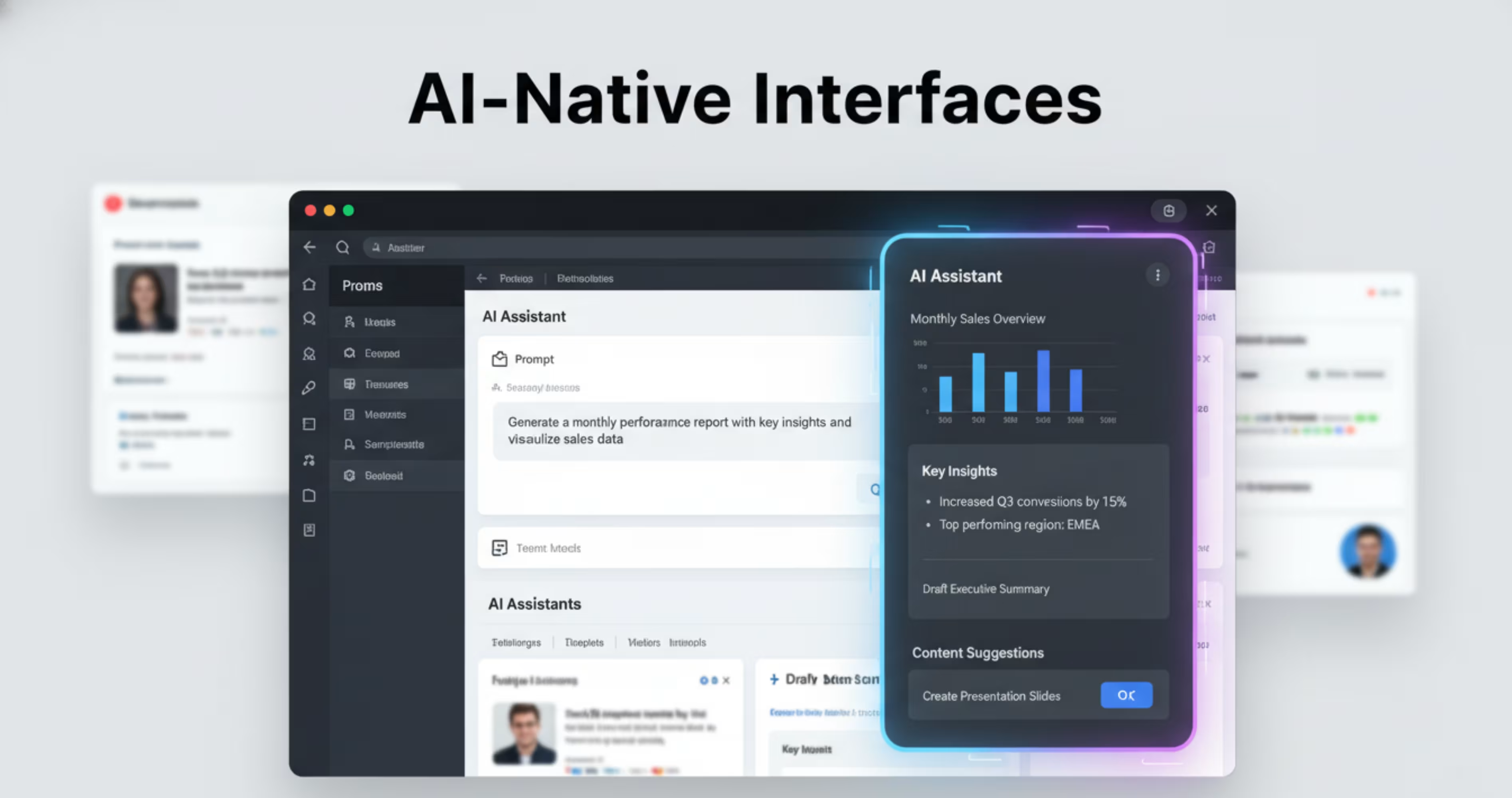
One of the biggest shifts happening in SaaS products right now is that they are moving toward AI native interfaces and the numbers back this up 68% of CEOs plan to increase AI spending in 2026 , while Gartner predicts more than 80% of companies will have deployed AI-enabled apps by 2026. This isn't a future trend it's already happening.
Ai native interfaces does not mean adding separate AI features inside a product, just like a product assistant. Ai native means is becoming a part of the core product experience.
An example of AI native interface is the app Notion. In Notion, users can generate content, summarize notes, analyze information, and organize their workspace directly inside the editor. Here’s a snapshot of their interface:
This approach makes the complex SaaS tools easier to use. Because, the users don’t have to always understand the product features. Instead, they just need to simply describe what they want to do, and the system will generate the result for them. T
Another common use of AI-native interfaces is in the SaaS dashboards, as AI assistants. These assistants act as copilots that help them interact with the product. A similar approach can be seen in the Pxgen AI Generator case study, where an AI-powered creative tool uses intelligent interfaces to simplify complex tasks for users.
Ai-native interfaces can also automate repetitive tasks for the users. Many SaaS product users use the same repetitive tasks every day. With the help of ai-assistant, they can automate these repetitive tasks and focus on the things that need their manual attention.
2. Hyper Personalized UX
Hyper-personalization means personalizing one's specification. Hyper personalized user experience, means providing different user experience to different users based on their roles, goals and how they use the product.
In early days, SaaS products followed the one-size-fit-all interface methods. This means they created one interface that would be followed by every user, regardless of their roles, and the tasks they want to do.
But, with a hyper personalized user interface, the interface changes based on your preference, role and the task you want to complete. For example:
- If you're a marketing manager, you might see more campaign performance and ROI metrics.
- If you're a content strategist, you might want to see the content calendar, and engagement data.
- If you're a data analyst, you might need to see more analytics and reports.
So, instead of forcing all users to use one single interface, the users see the information that matters most to them.
A good example of hyper-personalized UX is the Spotify apps interface. In the Spotify apps interface, you might see different song suggestions, but your suggestions will be totally different from other users' suggestions.
The hyper personalized user experience also works as a behavior based personalizer. The results speak for themselves personalization drives 90% higher user loyalty and personalized CTAs alone lead to a 42% increase in conversions.
For SaaS companies specifically, AI-driven personalization can grow revenue by 25–35% according to industry analysts.
This means that the SaaS product will observe how you use the application, and gradually adapt the interface to match your user patterns.
This way, the product can:
- Highlight common features that you use the most
- Suggest shortcuts from frequently used tasks
- Recommend actions relevant to your work.
This is the kind of personalization that reduces the time users spent on completing a repetitive task over time. Instead of going to a generic interface every day, the system slowly bends to their efficiency, which improves the user engagement over time.
3. Conversational UI
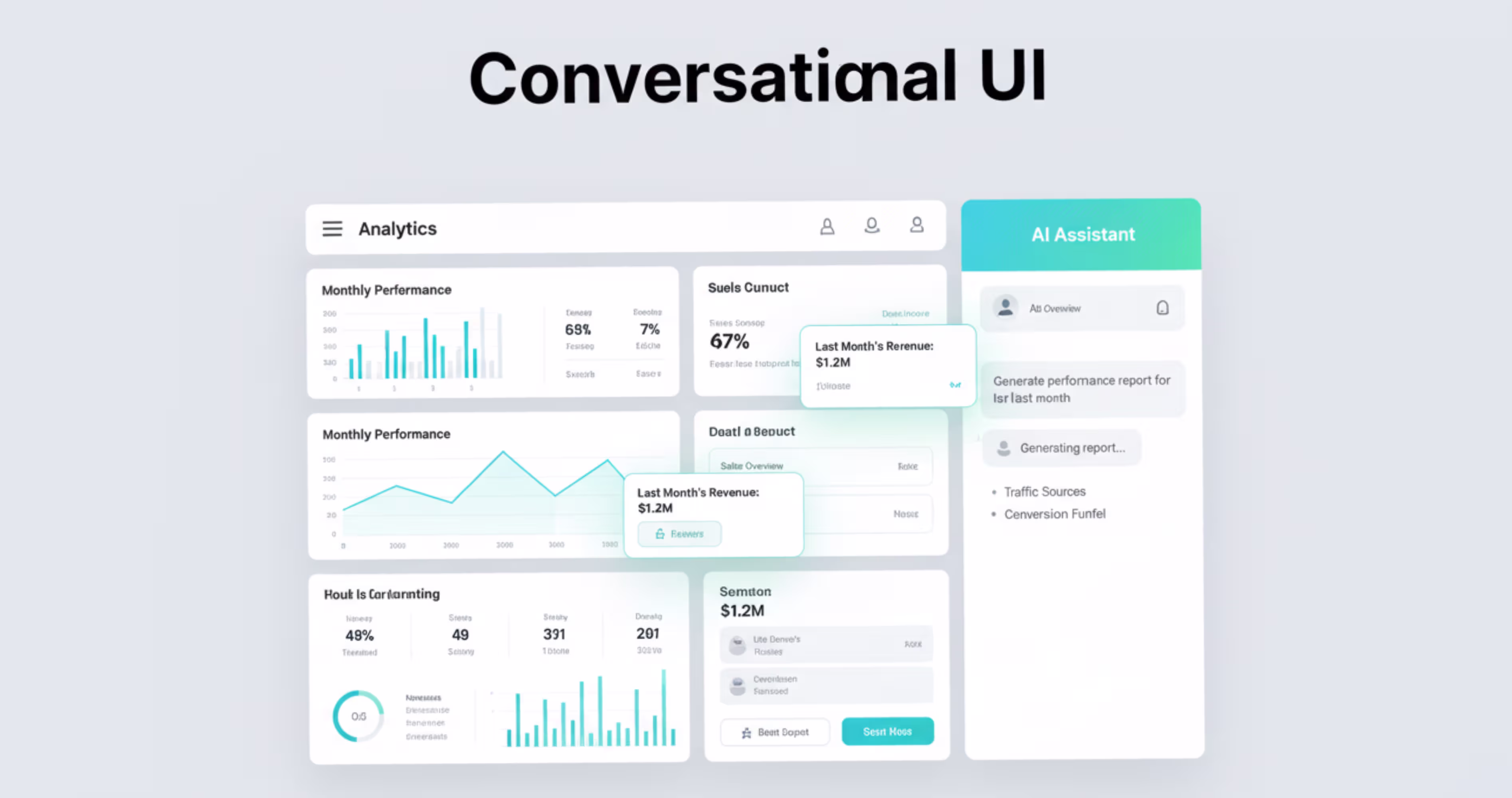
Conversational UI means communicating with the system UI through texts. So instead of going through complex menus, filters, and settings, users can interact with the system by typing, and asking what they want to do.
Traditionally, SaaS products required their users to learn how the interface works. Like which button to click, what to find features, or how to configure tools for their work.
But, with conversational interfaces, you don’t need to learn the product's structure. Instead, you can just simply communicate with the interface, and the system will perform the actions for you. Conversational UI is often used in AI assistance, or chat-based interfaces in the dashboards. Here’s an example of using conversational UI in the dashboard.
As in the interface you can see, you just need to select the agent you want to work with, and the interface will simply give you an output that you are looking to know. UI just works like that.
Another benefit of conversational UI is that it reduces the learning curve of complex Software as a service dashboards. SaaS dashboards can contain different features, tools and configuration options that can overwhelm users. With the conversational UI, they can complete a task by talking with the UI and understand what they want to talk about.
This way, the conversational UI is gradually turning SaaS products from tools based systems into assistant based systems that don’t force the users to adapt, instead the interface adapts to how people naturally communicate.
4. Micro-Interactions & Motion design
Micro interactions are small visual responses that happen when the users interact with the product. They are tiny animations that signal what just happened in the interface.
In SaaS products, the users perform different types of actions at different times. This can be clicking buttons, saving data, dragging items, switching tabs or completing tasks. And without feedback from the interface, the users can feel confused on whether the action actually worked or not.
That’s where micro-interactions help. For example, here’s an example of micro interactions. When the user drags the cursor to the button, a visual makes it understand, that something is happening, and that’s how micro-interactions work.
These small, subtle movements make the interface feel alive.
Motion design takes this liveness to the next level with movement that guides the user's attention, and improves navigation. Instead of elements in the SaaS product appearing abruptly, they transition between stages smoothly with motion.
Motions can be used in SaaS products a lot. Common example of usage of motions are:
- Task completion confirmations
- Drag and drop interactions
- Loading indicators
- Button hover effects
- Notifications and alerts.
When the motion, and micro interactions are designed properly, these interactions feel faster, cleaner and more intuitive to use.
When micro-interactions are designed properly, the business impact is real. A well-designed UI can increase conversion rates by up to 200%, and companies that prioritize UX experience 1.5x faster revenue growth than those that don't These small, subtle movements make the interface feel alive.. Small details create big results.
5. Data First Design
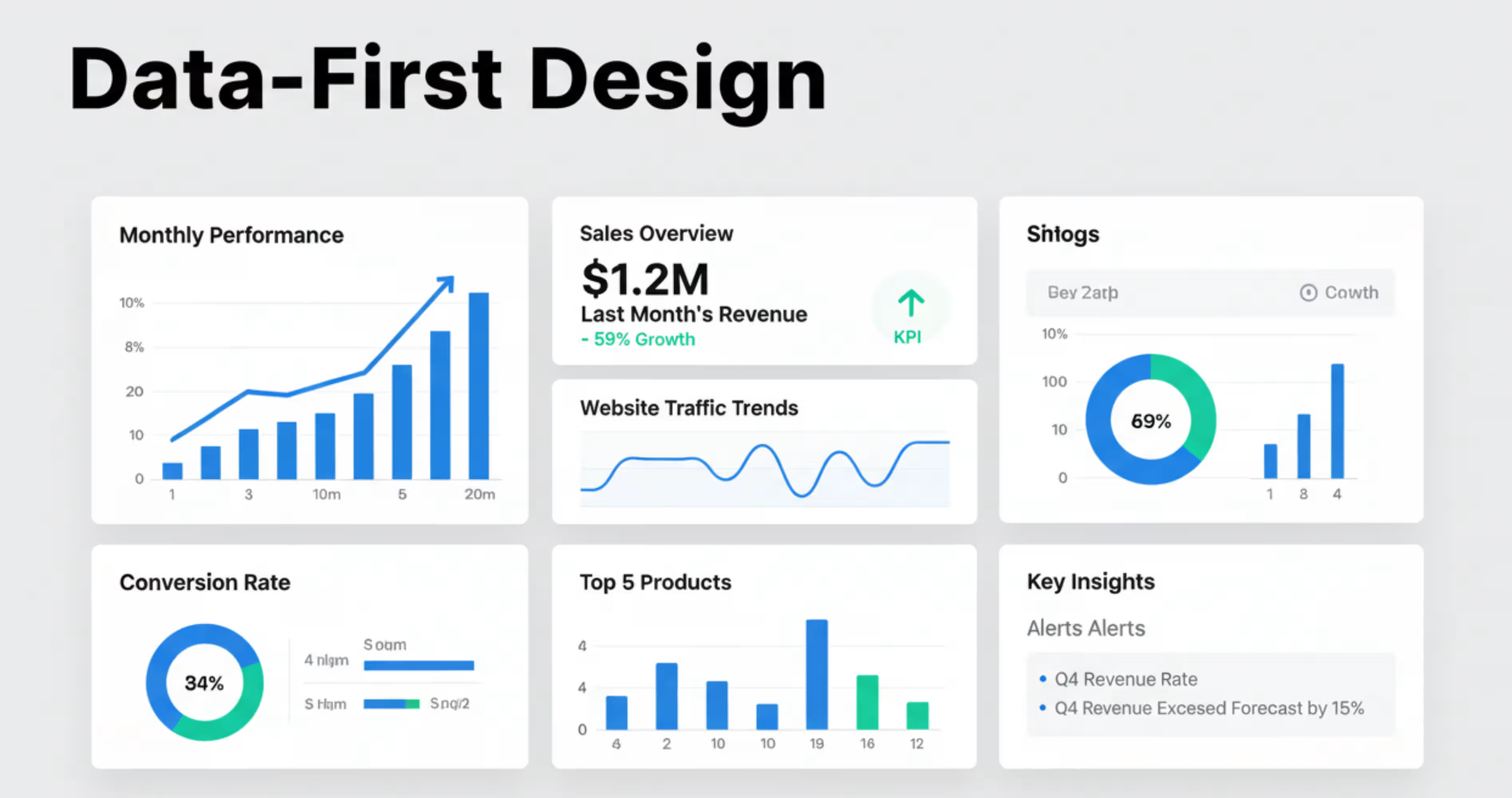
Data first design is a design approach where the product interface is built around data and insights, rather than just features or menus. Most SaaS products help users with analyzing information, making decisions, or tracking any performance. And whatever they are going to do, they need data to decide upon it. Whether it’s marketing analytics, financial data, sales metrics or just project progress.
Because of that, the SaaS products are focusing on designing the interface, where the important data are the first thing they see. So, instead of going through multiple sections to find insights, they can land directly on dashboards that show the metrics, trends, and actionable information. For deeper strategies on designing SaaS dashboards, you can explore SaaS dashboard design guide.
For example, when a users logs into an data-first design dashboards, the dashboard can contain thing like:
- Current performance metrics
- Growth trends
- Alerts for unusual activity
- Recommended actions based on the data
This helps users to get a quick idea about the situation, by giving a glimpse of the key metrics ahead. But, the datasets can also become overwhelming, what is presented in raw numbers or tables. That’s why modern dashboards rely on visual elements to help users quickly identify patterns, and make decisions faster.
Here’s an example of a data first design dashboard. As you can see, the complex data are shown in different bars, and charts for that, they are easy to understand for the users, and make decisions.
6. Modular Design System
As the SaaS products grow, new features, dashboards and workflows are constantly added in the product. But ,if you try to do that manually everytime, it’s gonna be really inconsistent and difficult to maintain.
That’s where a modular design system comes in. Modular design system is an approach when the product interface is built using reusable UI components. Thesis is just like a set of LEGO blocks.
Each of these blocks represents a small reusable UI element, for example:
- A button
- A card
- A chart
- A form field
- A navigation bar
So, instead of redesigning the elements every time, the designers and developers can create these elements once, and use that across the entire product.
Here’s an example a how a modular design components looks together with typography, colors, buttons and badges in the image:
Modular design blocks also makes the whole design system consistent for the product. As the full products are using reusable components, they are simple and seen through the entire product. That’s how it helps the users not get confused and builds trust over time.
7. Multimodal UX (Voice + Text + Visual)
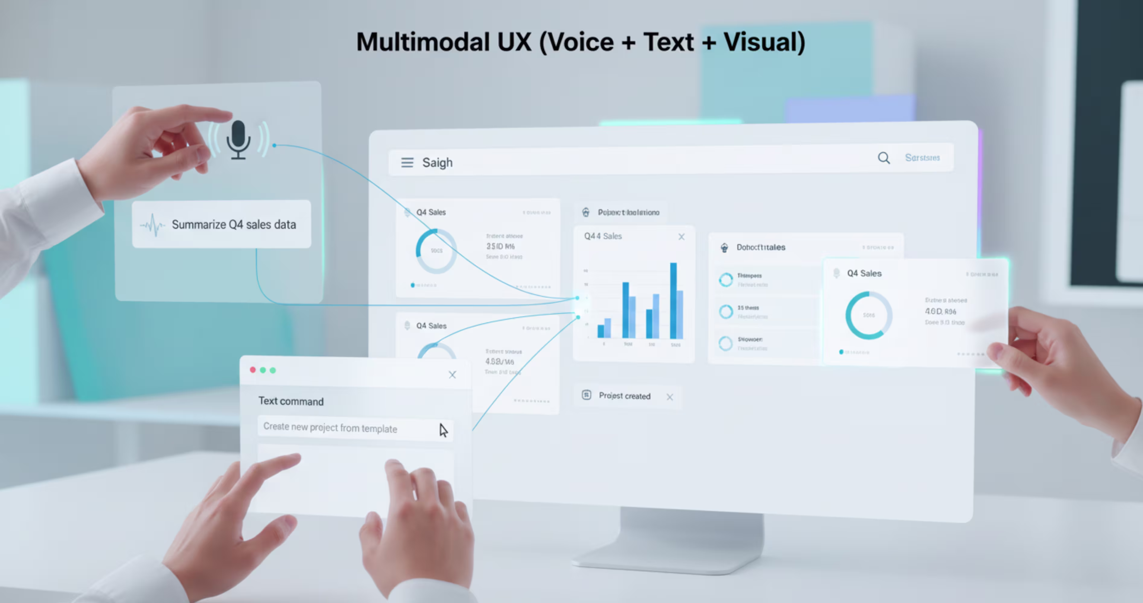
Instead of interacting with a product just by clicking buttons, you can interact with multiple forms of input like voice, text or visual, and that’s what’s called multimodal methods.
The traditional SaaS products were designed around mouse and keyboard interactions in early days. There, the users have to go through menus, dashboards and buttons to complete a task .
With the multimodal method, a user can interact with the product through:
- Text commands
- Voice instructions
- Visual interactions
Below are three of them explained.
Voice Interaction
When the user speaks commands or requests directly to the system, it’s called voice interaction.
Instead of going through dashboards, the users can ask the product through voice to perform the actions for them .These actions can be anything from generating reports, retrieving information to updating product workflows.
You can also search, summarize, and automate actions easily just by speaking with the systems. Here’s an example of the voice interaction that helps users to recognize, and use the command.
Visual Interaction
Using the visual interactions system, you can drag, select or draw on elements directly from the screen .
This type of interaction is common for modern SaaS products. Instead of going through complex settings through forms, users can visually organize the elements inside their interface. Here are some examples, where the users use the visual interaction systems:
- Drag tasks between workflow stages
- Move cards inside dashboards
- Draw selections of data visualization
With all these interactions, the product becomes more intuitive, and interactive to use, especially for visual workflows.
Here’s an example of visual workflow, using different systems.
Using simple interaction, you can just like the image, drag and drop from one side to another easily.
Text Based Commands
Text based commands allow the users to type each instruction on the products, instead of going through multiple menus.
The SaaS products use the text based common features using slash command, or command pallets. So that, you can activate the text command just by using a slash, or using the command pallets.
Here’s an example of text-based commands and how they help users quickly perform actions inside the product.
Using this approach makes the interaction with products more smoother to experience, especially with the users who prefer keyboard-driven workflows.
8. Immersive Interfaces
Immersive interfaces are designed to make the users feel like they are directly interacting with the system or data, instead of just clicking through interfaces.
In the generic SaaS products, the interaction happens though flat dashboards, tables and menus for the dashboards.
But immersive interfaces change that mainly with experience. It introduces a more spatial way of interacting with the system. For example, instead of just reading numbers in the table, using immersive interfaces, users might:
- Go through visual sitemaps
- Explore data instead an interactive environment
- Rotate and zoom into 3d visualizations
- Interact with objects directly on the screen
With all these, the user gets a more engaging way to understand complex systems.
A good example of immersive data can be seen in the SaaS tools that visualize networks,infrastructures or large datasets. Instead of listing everything in rows and columns, the product displays relationships between elements in a visual layout.
This type of interface is mostly useful for SaaS products that deal with complex data, or interconnected systems.
9. Faster Onboarding & Product-Led UX
In SaaS, one of the most important trends is to help users experience value as quickly as possible. And this is where the faster onboarding comes into use.
Faster onboarding simply means helping new users reach their first meaningful success inside the product quickly and it's one of the most critical design decisions you can make.
Here's why: 75% of users churn in the very first week due to poor onboarding (Hotjar). Meanwhile, products with structured onboarding see 50% higher retention, 35% fewer support tickets, and 66% of B2B customers say they stopped purchasing after a bad onboarding experience (Onething Design).
This means when someone signs up for a SaaS product, they don’t have to go through multiple tutorials and documentation to complete their task. The faster onboarding system takes them to their first actions quickly, whether it’s creating a project, generating a report or inviting their teammates.
By going through the product interface quickly, users start to understand the product and its value. This moment is often called the “Aha moment” in product onboarding.
After understanding the product, it becomes easier for the users to continue using the product long-term.
SaaS Product Design Best Practices
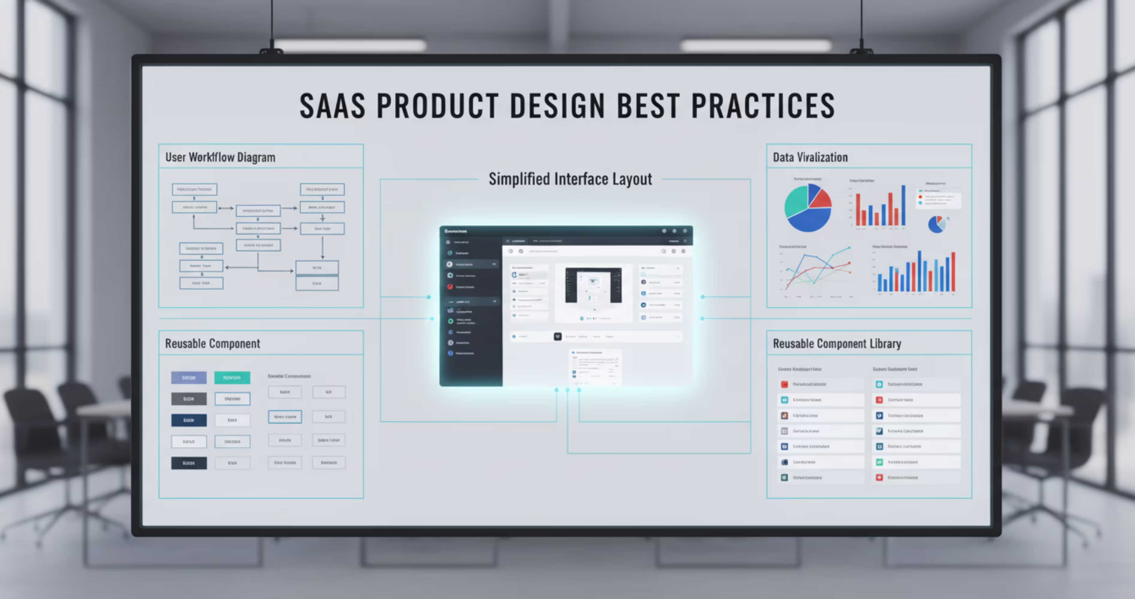
Designing a SaaS product is very different from designing a normal website. Many companies work with specialized teams that provide SaaS UI/UX design services to build scalable and user-centered product interfaces.
These teams follow some simple SaaS design best practices and the data confirms they work. Companies that invest in research-driven design processes are 1.9x more likely to report improved customer satisfaction (Maze, 2025).
Yet despite this, 51% of SaaS licenses still go unused, costing enterprises an average of $18 million per year (Zylo) - a direct result of poor UX decisions.
Here are some of the most important things that you should keep in mind while creating SaaS designs.
Design around user workflows: Users don’t think about features; they think about tasks. That’s why designing while keeping the customer’s perspective in mind helps.
Keep the interface simple: SaaS products naturally become complex over time. So try to keep the interface simple by using clear layouts, minimal distractions, and strong visual hierarchy.
Use clear visualization: Most SaaS products involve data analysis or performance tracking. Instead of showing raw numbers, present results using charts, graphs, and visual dashboards.
Design for scalability: SaaS products grow over time, and as the product grows, you need a design system that uses reusable components to maintain a consistent interface.
Provide user feedback: Users should always know what’s happening in the system. When a user saves a change, the interface should clearly confirm that the action was successful.
Final Thoughts
SaaS products are moving toward smarter and more adaptive interfaces that are easier to use. For a long time, SaaS products relied on complex dashboards, multiple menus, and manual workflows that were time-consuming, and not easy for the users.
But, things have changed, and now the product is moving toward a more user-led approach for interaction. So, the users are now able to go through different data as they want to. Initially designing these elements are making the product more intelligent, personalized and provocative over time.
Frequently Asked Questions
What are the most important SaaS product design trends in 2026?
The top trends are AI-native interfaces, hyper-personalized UX, conversational UI, modular design systems, and product-led onboarding. These aren't just visual trends; they directly impact retention, activation, and revenue. With the SaaS market hitting $375.57 billion in 2026 (Fortune Business Insights), design is now a growth strategy, not a nice-to-have.
Why does UX design matter for SaaS retention?
Bad UX kills revenue fast. 75% of users churn in the first week due to poor onboarding (Hotjar). On the flip side, every $1 invested in UX returns $100 (Forrester). Good design isn't an expense, it's your highest ROI investment.
What is AI-native interface design?
It means AI is built into the core workflow not just added as a chatbot button. Instead of clicking through menus, users simply describe what they want and the system does it. By 2026, 80% of companies will deploy AI-enabled apps (Gartner). The ones that embed AI natively will win user loyalty.
How does onboarding design affect SaaS revenue?
Directly. 66% of B2B customers stop purchasing after a bad onboarding experience. Products with structured onboarding see 50% higher retention and 35% fewer support tickets (Hotjar). Getting users to their first "win" fast is the most important design decision you'll make.
What is a modular design system and do I need one?
It's a shared library of reusable UI components buttons, cards, forms built once and used everywhere. Without one, your team rebuilds the same elements repeatedly, creates inconsistency, and slows down shipping. In 2026, teams without a design system simply move slower.
Is dark mode still relevant in 2026?
Yes. Power users in SaaS tools work 4–8 hours daily, dark mode reduces eye strain and signals product quality. Tools like Notion, Linear, and Figma offer it by default because their users demand it. 720 people/month search "dark mode SaaS design" before they even sign up.
How do micro-interactions improve conversions?
Small animations hover effects, success states, progress bars build trust and guide users. A well-designed UI increases conversions by up to 200% (Forrester). Micro-interactions feel minor but they're what separates a product that feels "alive" from one that feels broken.
Ready to future-proof your SaaS design?
.avif)


.avif)
