Table of Contents
- Why Some SaaS Pricing Pages Make Choosing Easier
- The Building Blocks of a Great Pricing Page
- 8 SaaS Pricing Page Designs We Can Learn From
- 1. Slack: Guiding Users Toward One Clear Choice
- 2. Notion: Making Complex Pricing Feel Simple
- 3. HubSpot: Helping Different Customers Find the Right Plan
- 4. Webflow: Organizing Complex Pricing Without Overwhelming Users
- 5. Airtable: Making Feature Comparisons Easier
- 6. Figma: Making Upgrades Feel Like the Next Step
- 7. Salesforce: Selling Without Asking Users to Buy
- 8. Basecamp: Winning by Keeping Things Simple
- Which Pricing Page Style Is Right for You?
- 5 Pricing Page Mistakes to Avoid
- Frequently Asked Questions
- Final Thoughts
- Most people decide which plan they want before they've read half the pricing page.
- Users don't buy from the page with the most information - they buy from the page that's easiest to understand.
- A highlighted plan, better hierarchy, or simpler comparison table can influence conversions more than adding new features.
- Great pricing pages guide decisions. Poor pricing pages force users to do the work themselves

A great SaaS pricing page does more than list plans and features. It helps users understand their options, and choose the one that's right for them.
That's why companies like Slack, Notion, HubSpot, and Webflow invest heavily in pricing page design. Small decisions - like how plans are organized, highlighted, and compared - can have a big impact on conversions.
In this guide, we'll analyze 8 SaaS pricing page design examples, break down the design patterns behind them, and explain why they work. You'll learn what makes users choose one plan over another, and how to create a pricing page that's more likely to convert.
Why Some SaaS Pricing Pages Make Choosing Easier
When users land on a pricing page, they usually aren't looking to read every feature, compare every detail, or analyze every plan. Most people simply want to answer one question: Which option is right for me?
That's why the best SaaS pricing pages focus on making decisions easier. Instead of overwhelming users with information, they help them compare options quickly and move forward with confidence.
Research on decision-making shows that too many choices can create confusion and slow people down. When users have to compare dozens of features across multiple plans, choosing becomes harder. In many cases, they postpone the decision or leave the page altogether.
Successful SaaS companies understand this. Rather than displaying everything at once, they simplify the experience through clear plan structures, visual hierarchy, and focused comparisons.
Take Basecamp as an example. Instead of offering several pricing tiers, Basecamp keeps its pricing simple with a straightforward structure. Users spend less time comparing plans and more time evaluating whether the product meets their needs.
The Building Blocks of a Great Pricing Page
Most successful SaaS pricing pages look different on the surface, but they tend to use the same core building blocks. Whether you're looking at Slack, HubSpot, or Airtable, you'll notice a similar structure designed to help users understand their options and make a decision quickly.
Let's look at the key elements that appear on most high-performing pricing pages.
Clear Headline
The headline is often the first thing visitors see. Its job is to explain what users are paying for and who the product is for.
A good pricing page headline removes uncertainty and helps users understand they're in the right place. Companies like HubSpot keep their messaging simple and focused on business growth rather than overwhelming visitors with technical details.
Easy-to-Compare Pricing Cards
Pricing cards organize plans into clear sections, making it easier to compare options side by side.
Most SaaS companies use three or four pricing cards because they provide enough choice without creating confusion. Some companies also highlight a recommended plan to help users focus on the option that fits most customers.
Slack is a great example of this approach. Its pricing page uses visual emphasis to draw attention to a preferred plan without forcing users into a decision.
Monthly vs. Yearly Billing Switch
Some SaaS products offer both monthly and annual billing. A pricing toggle lets users switch between the two and instantly see the difference.
This simple feature can make pricing easier to understand while also encouraging annual subscriptions by clearly showing potential savings.
Simple Feature List
Features help users understand what they get with each plan, but the goal isn't to list everything.
The best pricing pages focus on the features that matter most and make differences between plans easy to spot. Airtable does this particularly well by grouping features in a way that's easy to scan and compare.
Social Proof
When people are unsure which product to choose, they often look for reassurance from others.
That's why many SaaS pricing pages include customer logos, testimonials, ratings, or customer counts. These trust signals help reduce uncertainty and build confidence before someone commits to a plan.
FAQ Section
Questions are one of the biggest reasons users hesitate before purchasing. When you have a well-written FAQ section answers common concerns about billing, upgrades, cancellations, and plan differences before users need to contact support.
Enterprise Option
Not every customer fits neatly into a standard pricing plan. For larger organizations, many SaaS companies provide a separate enterprise option with custom pricing, advanced security, or dedicated support.
This gives high-value customers a clear next step without overcrowding the main pricing plans.
Clear Call-to-Action Buttons
Every pricing page should make the next step obvious. Whether it's "Start Free Trial," "Get Started," or "Contact Sales," CTA buttons should be easy to find and clearly connected to each pricing plan. If users have to search for what to do next, the pricing page is creating unnecessary friction.
8 SaaS Pricing Page Designs We Can Learn From
Now that we've covered the key elements of a great pricing page, let's see how successful SaaS companies put them into practice.
The examples below aren't just visually appealing. Each one uses specific design choices to help users compare plans, reduce confusion, and make decisions faster. By understanding what these companies do well, you can apply the same principles to your own pricing page.
1. Slack: Guiding Users Toward One Clear Choice
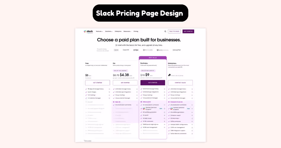
One of the most effective things Slack does on its pricing page is reduce decision fatigue.
[show video of the website here using this site: https://www.howdygo.com/free-tools/scrolling-website-video-generator]
Instead of treating every plan equally, Slack visually highlights a recommended option. This creates a natural focal point and gives users a starting point when comparing plans. Rather than evaluating every feature across every tier, visitors can quickly focus on the plan Slack believes will fit most teams.
This approach works because most users aren't looking for the perfect plan - they're looking for a safe and reasonable choice. By emphasizing a single option through visual hierarchy, spacing, and stronger call-to-action buttons, Slack helps users make a decision faster.
Slack also keeps plan comparisons easy to scan. Key features are grouped logically, pricing information is clear, and users can quickly understand what they gain by moving to a higher tier.
The result is a pricing page that feels less overwhelming, even though it contains a large amount of information.
What we can learn from Slack:
- Highlight one plan to create a clear starting point.
- Use visual hierarchy to guide attention.
- Make differences between plans easy to compare.
- Help users choose faster instead of forcing them to evaluate everything equally.
2. Notion: Making Complex Pricing Feel Simple
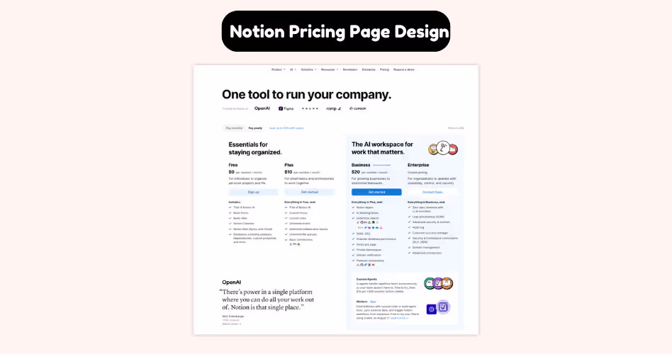
Notion is a powerful product used by individuals, startups, growing teams, and large organizations. With such a broad audience, its pricing page could easily become overwhelming. But it doesn't.
One of the first things you'll notice about Notion's pricing page is how simple it feels. The layout is clean, the plans are easy to scan, and the information is presented in a logical order. Instead of throwing every feature at visitors immediately, Notion helps users understand the big picture first.
This matters because most people don't visit a pricing page looking to compare dozens of features. They're trying to answer a much simpler question: Which plan is right for me?
Notion designs its pricing page around that question. Users can quickly identify the plans, understand who they're for, and compare key differences without feeling overloaded.
More detailed information is available when needed. But it never gets in the way of the decision-making process.
The result is a pricing page that feels easy to navigate, even though the product itself offers a wide range of capabilities.
What We Can Learn From Notion
- Make it easy for users to identify where they fit.
- Prioritize the most important information first.
- Reduce visual clutter wherever possible.
- Reveal details gradually instead of showing everything at once.
- Design for clarity, not complexity.
3. HubSpot: Helping Different Customers Find the Right Plan
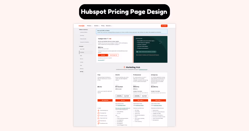
Imagine two people landing on the same pricing page. The first is a small startup looking for basic marketing tools. The second is a large company managing multiple teams and thousands of customers.
Should they be looking at the same plan? Probably not. That's the challenge HubSpot's pricing page solves.
Instead of focusing only on features and pricing, HubSpot helps visitors understand which plan fits their stage of growth.
As users explore the page, they can quickly identify the option that matches their business size, goals, and needs.
This changes how people evaluate pricing. Rather than comparing every feature line by line, users start by finding where they belong. Once they've identified the right category, comparing plans becomes much easier.
HubSpot also creates a natural growth path. Users can clearly see how moving to a higher-tier plan unlocks additional tools and capabilities as their business expands. This makes upgrades feel logical instead of forced.
What We Can Learn From HubSpot
- Group plans around customer needs, not just features.
- Help users quickly identify where they fit.
- Create a clear path from beginner to advanced plans.
- Make upgrades feel like a natural next step.
- Focus on solving customer problems, not showcasing every feature.
4. Webflow: Organizing Complex Pricing Without Overwhelming Users
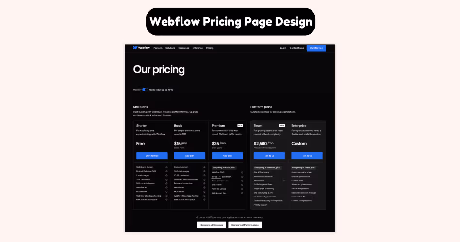
Most SaaS companies offer a handful of pricing plans. Webflow is different. Depending on what you're trying to do, you may need a site plan, a workspace plan, an ecommerce plan, or a solution designed for freelancers and agencies.
That's a lot of information to organize on a single pricing page. Yet Webflow manages to make it feel surprisingly manageable.
Instead of presenting every option at once, Webflow separates pricing into clear categories. Users are first asked to identify what they're trying to accomplish, and then they're shown the plans that are most relevant to that goal.
This is an important design choice. Imagine landing on a pricing page that displayed every Webflow plan at the same time. The page would be overwhelming, and most users wouldn't know where to start.
By organizing plans into logical groups, Webflow reduces the amount of information users need to process at any given moment. Rather than comparing 10 different options, visitors can focus on a smaller set of choices that actually apply to them.
Another smart decision is the use of tabs, filters, and clear navigation. These elements help users move between pricing categories without feeling lost. The complexity still exists, but it's presented in a way that's easier to explore.
What We Can Learn From Webflow
- Group plans based on user goals or use cases.
- Avoid showing every option at the same time.
- Break complex pricing into smaller, easier-to-understand sections.
- Use navigation, tabs, or categories to organize information.
- Help users find the right starting point before comparing plans.
5. Airtable: Making Feature Comparisons Easier
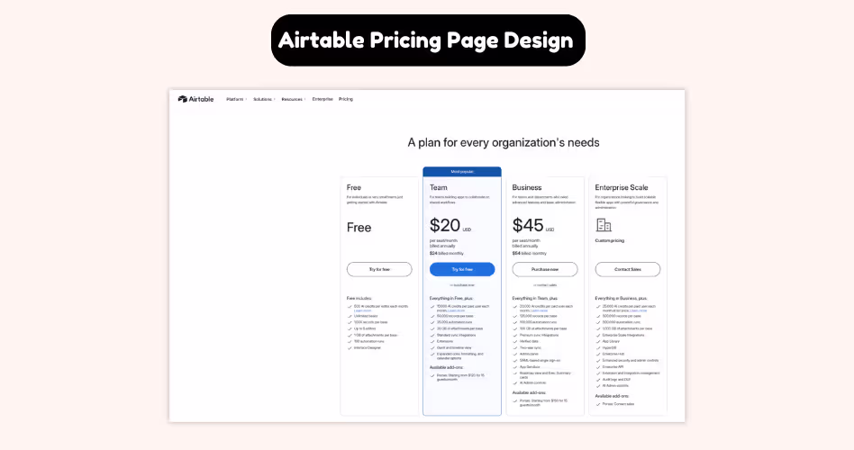
Feature comparison tables have a bad reputation. They're often long, overwhelming, and packed with information that most users never read. By the time someone reaches the bottom, they've forgotten what they were comparing in the first place.
Airtable takes a different approach. Instead of treating the comparison table as a giant checklist, Airtable uses it as a decision-making tool. Users can quickly scan the information that matters most while ignoring the details that don't apply to them.
This is important because people rarely compare every feature on a pricing page. Think about your own behavior. When evaluating a product, you're usually looking for answers to a few specific questions:
- Can this plan handle my team size?
- Does it include the features I need?
- What do I gain if I upgrade?
That's exactly how Airtable structures its comparisons in the pricing page. Features are grouped into logical categories, making the table easier to navigate.
Rather than presenting dozens of unrelated items in one long list, Airtable organizes information in a way that helps users focus on the areas they care about most.
The page also makes plan differences easy to spot. Instead of forcing visitors to hunt for changes, Airtable highlights what each tier unlocks as users move up the pricing ladder.
As a result, users spend less time searching for information and more time evaluating whether a plan meets their needs.
What We Can Learn From Airtable
- Group features into logical categories.
- Make differences between plans easy to spot.
- Design comparison tables for scanning, not reading.
- Highlight what users gain when upgrading.
- Help users answer key questions quickly.
6. Figma: Making Upgrades Feel Like the Next Step
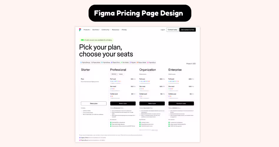
Think about how people usually start using Figma. A designer might begin working alone. Later, they join a small team.
As projects become larger and more collaborative, new challenges appear - shared libraries, team management, advanced permissions, and organization-wide workflows.
Figma's pricing page reflects that journey. Instead of presenting plans as completely separate options, it shows how each plan supports a different stage of growth.
Users can quickly understand what works for them today while also seeing what becomes available as their needs evolve.
This is what makes Figma's pricing page so effective. The focus isn't on convincing users to buy the most expensive plan. It's on helping them understand when an upgrade becomes valuable.
As users compare plans, they can clearly see how additional features solve new problems that emerge as teams grow.
For example, an individual designer may not care about advanced team controls. But once multiple people start working together, those features suddenly become much more important. Figma makes these transitions easy to understand.
What We Can Learn From Figma
- Design plans around customer growth.
- Show how needs change over time.
- Explain why someone would upgrade, not just what they get.
- Create a clear progression between plans.
- Make higher-tier plans feel relevant instead of promotional.
7. Salesforce: Selling Without Asking Users to Buy
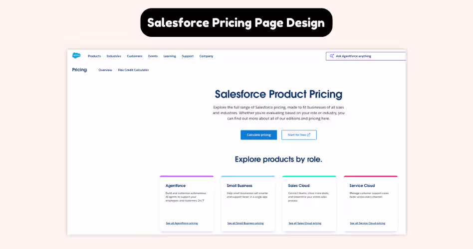
Imagine you're responsible for purchasing software for a company with thousands of employees. Would you choose a solution after reading a pricing table for five minutes? Probably not.
Large companies have different buying processes. They often need custom pricing, security reviews, compliance checks, stakeholder approvals, and tailored implementations before making a decision.
Salesforce understands this. That's why its pricing page isn't designed to help visitors immediately buy a plan. Instead, it's designed to help potential customers take the next step in the sales process.
As you explore the page, you'll notice that Salesforce focuses heavily on explaining value, use cases, and business outcomes. Pricing is important, but it's only one piece of a much larger conversation.
This approach reflects how enterprise software is actually purchased. Rather than comparing features and clicking "Buy Now," decision-makers are often evaluating whether a platform can support their organization for years to come. They need confidence, not just pricing information.
That's also why the Salesforce pricing page places so much emphasis on demos, consultations, and sales conversations. The goal isn't to close the sale on the pricing page. The goal is to generate enough interest and trust for the conversation to continue.
What We Can Learn From Salesforce
- Design pricing pages around your sales process.
- Understand that different customers make decisions differently.
- Focus on business outcomes, not just features.
- Use demos and consultations when purchases require more discussion.
- Match your pricing page to the complexity of your product.
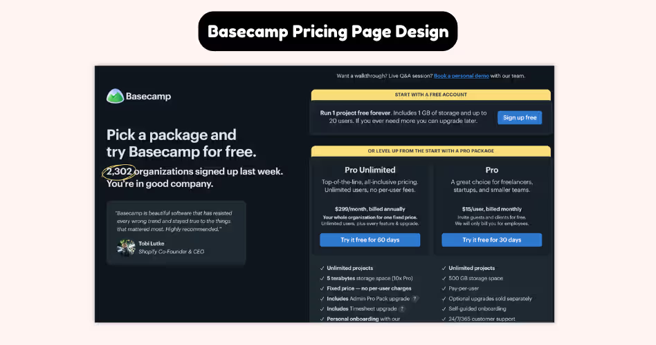
8. Basecamp: Winning by Keeping Things Simple
By this point, you've probably noticed a common pattern across most SaaS pricing pages:
- Multiple plans
- Feature comparisons
- Upgrade paths
- Enterprise options
Basecamp takes a different approach. Instead of offering several pricing tiers, Basecamp keeps its pricing page remarkably simple. Visitors don't need to compare three or four plans or spend time deciding which option fits best.
In many cases, there's only one clear choice. That might sound risky. After all, conventional pricing advice often suggests creating multiple plans to appeal to different customer segments. But Basecamp proves that simplicity can be a competitive advantage.
The reason it works is because Basecamp removes one of the biggest sources of friction: decision-making.
When users don't have to compare plans, they can focus on a more important question:
Is this the right product for my team? That's a very different conversation.
Instead of evaluating which tier to buy, visitors evaluate whether the product solves their problem. The pricing page shifts attention away from plan comparisons and toward product value.
This approach won't work for every SaaS company. Products with diverse customer segments often need multiple plans and more flexibility. But for the right product, simplicity can dramatically improve the buying experience.
What We Can Learn From Basecamp
- Remove unnecessary choices whenever possible.
- Focus attention on product value, not plan comparisons.
- Reduce decision fatigue for users.
- Keep pricing easy to understand.
- Remember that simplicity can be a competitive advantage.
Which Pricing Page Style Is Right for You?
After reviewing these examples, it should be clear that there isn't a single "best" SaaS pricing page.
The right pricing structure depends on your product, target audience, and how customers buy from you. A startup selling a simple tool won't need the same pricing page as an enterprise software company serving large organizations.
Let's look at the most common pricing page styles and when they work best.
Tiered Pricing
Tiered pricing is the most common SaaS pricing model. It typically includes three or four plans designed for different customer segments.
This approach works because it gives users options without overwhelming them. It also creates a natural upgrade path as customer needs grow.
Best for:
- B2B SaaS products
- Project management tools
- Marketing software
- Collaboration platforms
Example: HubSpot uses tiered pricing to serve businesses at different stages of growth, from small teams to larger organizations.
Freemium Pricing
Freemium pricing gives users access to a free version of the product while reserving advanced features for paid plans.
This model lowers the barrier to entry and allows users to experience the product before making a purchase decision.
Best for:
- Product-led growth (PLG) companies
- Collaboration tools
- Design software
- Productivity apps
Example: Figma's free plan helps users get started quickly while making the benefits of paid plans easy to understand as teams grow.
Usage-Based Pricing
Usage-based pricing charges customers based on how much they use the product. Instead of paying for a fixed plan, customers pay according to metrics such as users, storage, API requests, or consumption.
Best for:
- AI tools
- API platforms
- Cloud infrastructure products
- Data platforms
This model aligns pricing with value because customers pay for what they actually use.
Enterprise Pricing
Enterprise pricing focuses on custom plans rather than self-service purchases. Pricing may vary depending on team size, implementation requirements, support needs, or security requirements.
That's why many enterprise companies encourage users to contact sales rather than purchase directly.
Best for:
- Enterprise software
- CRM platforms
- Complex SaaS products
- High-ticket solutions
Example: Salesforce uses its pricing page to start conversations with large organizations rather than push immediate purchases.
Hybrid Pricing
Many SaaS companies combine multiple pricing models. For example, a company might offer a free plan, several tiered plans, and a custom enterprise option.
This approach allows businesses to serve different customer segments while maintaining flexibility.
Best for:
- Growing SaaS companies
- Products serving multiple audiences
- Businesses with both self-service and sales-led customers
Examples: Figma and HubSpot both companies combine elements of freemium, tiered, and enterprise pricing to support customers at different stages of growth.
5 Pricing Page Mistakes to Avoid
A great pricing page doesn't just help users choose the right plan - it removes the obstacles that make choosing difficult.
Unfortunately, many SaaS companies create friction without realizing it. They add more plans, more features, and more information, believing it will help users make a better decision.
In reality, these choices often make the buying process harder. Here are 5 common pricing page mistakes to avoid.
Offering Too Many Plans
More options don't always lead to more conversions. When users are presented with too many plans, they have more information to process and more decisions to make. Instead of choosing confidently, they often hesitate or leave without taking action.
Most successful SaaS companies keep things simple by offering a small number of clearly differentiated plans. This gives users enough choice without creating decision fatigue.
If visitors need several minutes just to understand their options, you probably have too many plans.
Listing Too Many Features
A long feature list might look impressive, but it doesn't always help users make a decision.
Most visitors won't read every feature on your pricing page. They're scanning for the information that matters to them.
That's why companies like Airtable organize features into categories and make key differences easy to spot. Instead of trying to show everything, they help users find what they're looking for faster. Remember: clarity beats completeness.
Copying Competitor Pricing Pages
It's tempting to look at companies like Slack, HubSpot, or Figma and assume their pricing structure will work for your business too.
But their pricing pages were designed around their products, customers, and sales processes.
A startup serving small businesses has different needs than an enterprise platform serving Fortune 500 companies. What works for Salesforce may not work for your SaaS product.
Use competitors for inspiration, not imitation. The goal isn't to copy someone else's pricing page. It's to build one that fits your customers.
Ignoring Visual Hierarchy
Users don't read pricing pages from top to bottom. They scan. That's why visual hierarchy plays such an important role in pricing page design.
Elements like spacing, contrast, typography, colors, and plan highlighting help guide attention toward the most important information.
Without a clear hierarchy, every plan and every feature competes for attention at the same time. When everything stands out, nothing stands out.
Making Users Work Too Hard
This is the mistake that sits behind all the others. If users have to search for pricing, compare dozens of features, decode complicated plan names, or guess which option fits their needs, your pricing page is creating unnecessary work.
The best pricing pages do the opposite. They simplify choices, answer common questions, highlight key differences, and guide users toward the next step.
Think about companies like Notion, Basecamp, and HubSpot. Each uses a different pricing strategy, but they all share one goal: Make choosing easier.
That's ultimately what a pricing page is supposed to do.
Frequently Asked Questions
Why do some SaaS pricing pages convert better than others?
The best pricing pages make decisions easier. They reduce confusion, highlight important information, and help users quickly identify the plan that's right for them.
Is three pricing plans better than five?
In many cases, yes. Offering fewer plans can reduce decision fatigue and make comparisons easier. However, the ideal number depends on your product and audience.
When does it make sense to hide pricing?
Hiding pricing typically works best for enterprise products with custom requirements. For most SaaS products, transparent pricing helps users evaluate options faster and builds trust.
What's the biggest mistake companies make on pricing pages?
One of the most common mistakes is overwhelming users with too many plans, features, or choices. More information doesn't always lead to better decisions.
Why do so many SaaS companies highlight one pricing plan?
A highlighted plan acts as a recommendation. It gives users a starting point and makes the comparison process easier, which can improve conversions.
Do users actually read pricing page feature lists?
Usually not. Most visitors scan pricing pages looking for key differences between plans. That's why clear organization and visual hierarchy are so important.
How do I know if my pricing page needs improvement?
Ask yourself one simple question: Can users quickly understand their options and choose a plan? If the answer is no, your pricing page likely has opportunities for improvement.
Final Thoughts
There's no single formula for designing a great SaaS pricing page. Slack guides users toward a decision, Notion simplifies complexity, and HubSpot helps customers find where they fit.
While their approaches are different, they all share the same goal: helping users understand their options and choose with confidence.
As you review your own pricing page, ask yourself one simple question: Does this help users choose faster? If the answer is no, look for ways to simplify the experience.
.avif)