


AI Travel Booking

.svg)
AI Travel Booking App is a mobile platform designed to act as a personal travel companion.
Our task was to design an interface that makes interacting with AI feel natural and helpful for travelers. Users needed an easy way to input their preferences, view AI-generated itineraries, and compare booking options without feeling overwhelmed by massive amounts of travel data.
Where Travel Started Feeling Mess
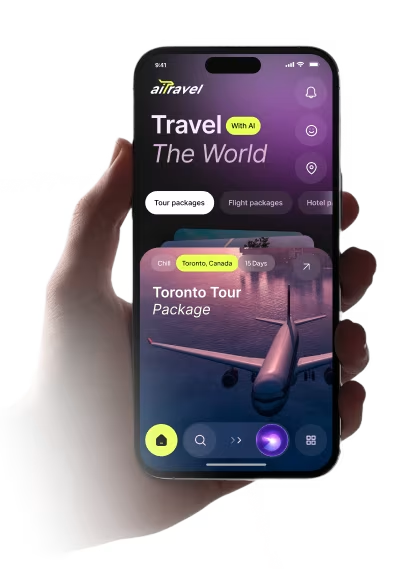
Travel planning should feel exciting, but in this app it likely felt spread out and a little hard to follow. The main issue was helping people move from browsing to booking without getting lost in too many steps or too much information.
- Too many steps: People had to jump between inspiration, trip details, and booking instead of moving through one clear flow.
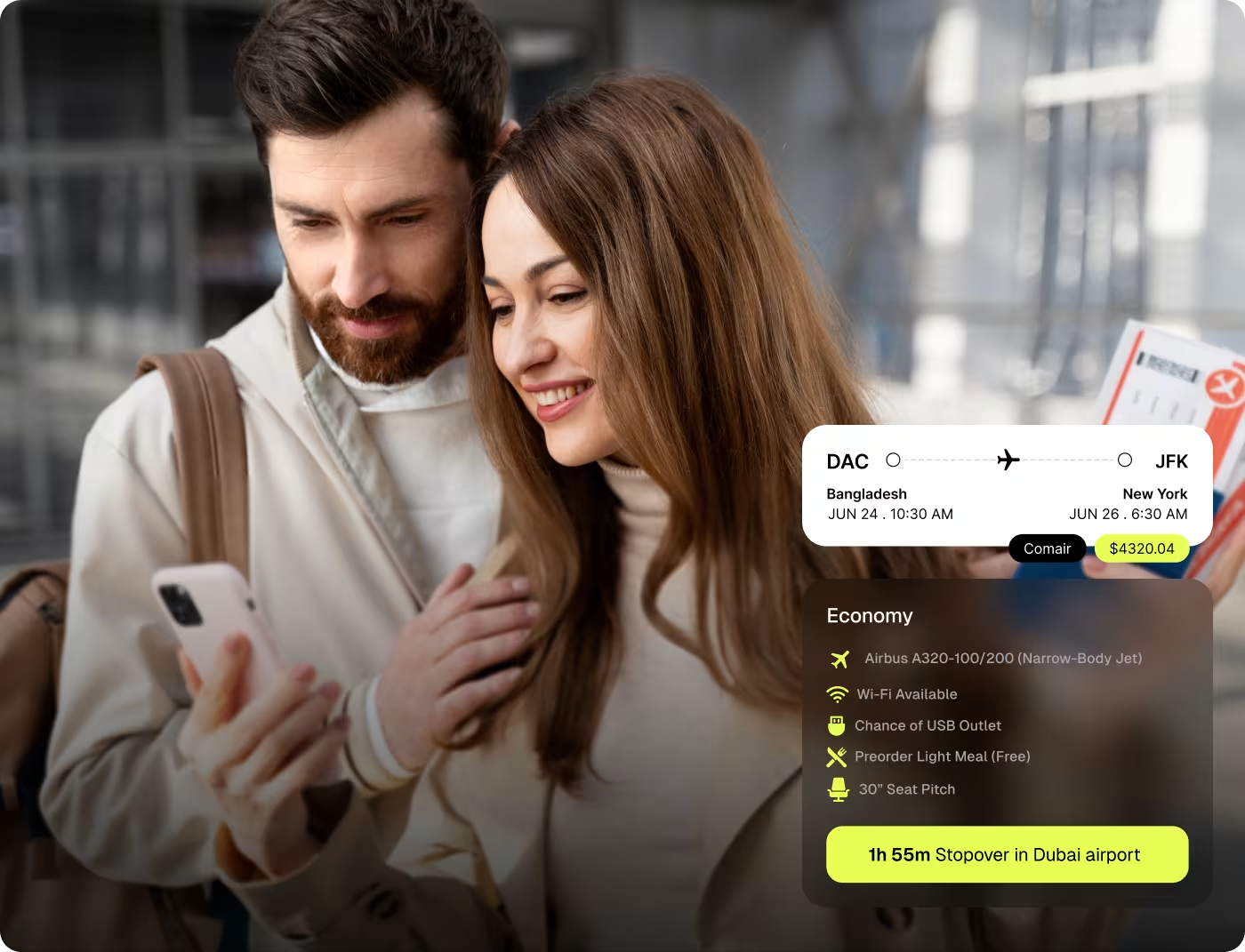
- Hard to compare options: Flight and package choices needed to feel easier to scan without making the screen feel crowded.
- Weak sense of direction: The experience needed clearer cues so users always knew what to do next.
- Travel felt more complex than it should: The app had to simplify planning without losing the fun, premium feel of booking a trip.
A Simpler Path From Search to Booking
We shaped the app around a cleaner travel flow, so people could move through discovery, trip details, and booking without feeling lost. The goal was to keep it easy to use, easy to scan, and still feel exciting to explore.
- Clearer travel flow made it easier to move from inspiration to booking without extra confusion.
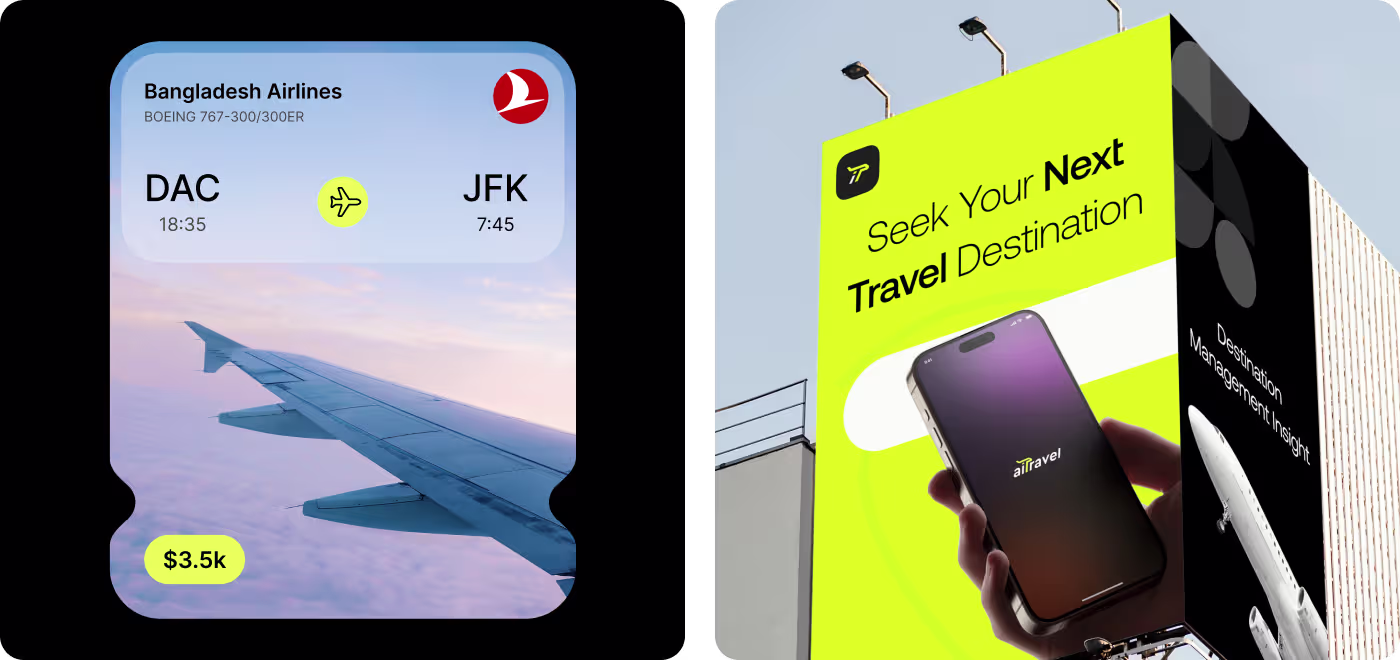
- Simplified screens kept the most important details visible without crowding the layout.
- Stronger visual hierarchy helped users know what to look at first and what action to take next.
- Consistent UI patterns made the app feel more polished, easier to follow, and more trustworthy.
Shaping a Clearer Travel Flow
- Travel behavior
- Pain point mapping
- Feature focus
- Design direction
- Flow mapping
- Content grouping
- Booking clarity
- Step reduction
- Mobile-first layout
- Strong visuals
- Clear actions
- Simple interactions
- Spacing adjustments
- Visual consistency
- Interaction polish
- Final presentation
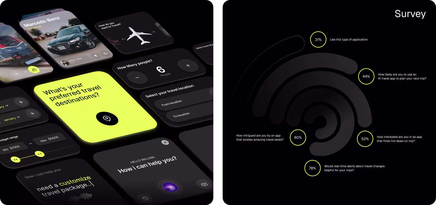
Understanding How People Actually Plan Travel
Before designing anything, we looked at how people search for trips, compare options, and decide what feels worth booking. That helped us see where the experience needed to feel simpler, clearer, and more helpful.
- Too many choices: People usually had a lot to look through before they could narrow anything down.
- Not enough clarity: Trip details needed to be easier to understand without digging around.
- Booking needed confidence: The flow had to feel more reassuring before someone chose to move forward.
- The path felt scattered: Discovery, comparison, and booking needed to feel more connected in one flow.
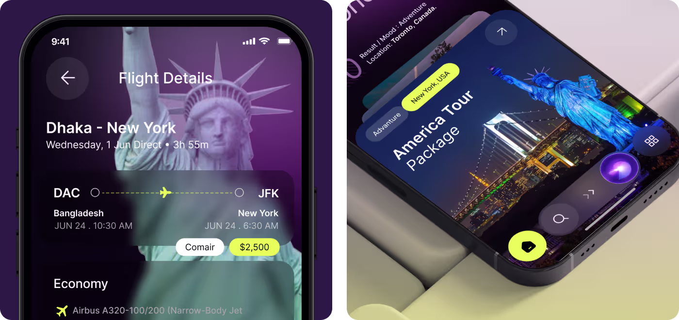
Making the Booking Flow Easier
This part focused on the structure behind the app. The goal was to make travel planning feel less scattered by organizing the flow in a way that felt clear from the first screen to the last.
Instead of forcing people to jump around, the experience was shaped to guide them step by step. Search, trip details, and booking all had to feel connected, so the app would be easier to follow and faster to use.
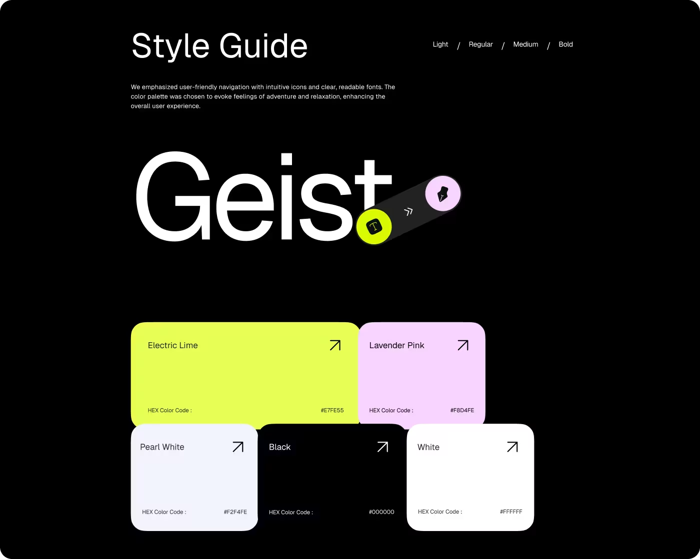
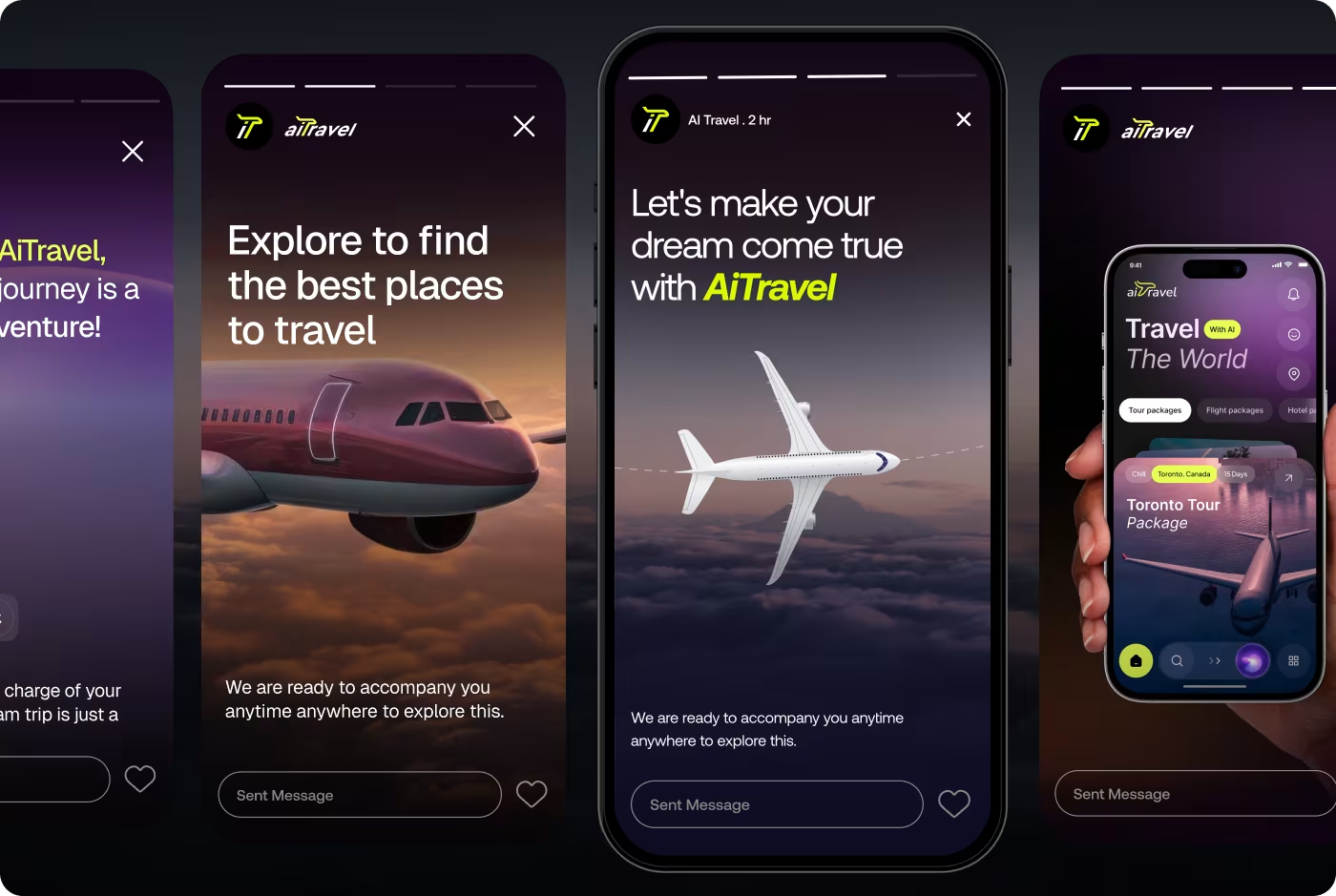
Giving AiTravel its own look
This part focused on the visual side of the product. The app needed a style that felt modern and travel-focused, but still clean enough to keep the content easy to read.
The design choices helped give AiTravel a stronger identity through color, imagery, spacing, and type. The goal was to make the app feel premium and memorable without overcomplicating the screens.
A Clearer Travel App Experience
After shaping the app around a simpler travel flow, the experience became easier to understand and more natural to move through. The screens felt more connected, the booking path felt less messy, and the product looked more polished overall.
- Faster browsing: People could move through travel options with less hesitation.
- Clearer booking path: The steps from discovery to booking felt easier to follow.
- Stronger visual feel: The app looked more modern, bold, and travel-focused.
- Better overall flow: The screens worked together more smoothly as one experience.
Got a project in mind? Let's build it
.avif)


.svg)


.svg)

.svg)


.avif)
