


Relax Tour Painting Art


.svg)
Orbix Studio launched a creative project to define the visual identity for a modern bike tour experience.
Our task was to develop a complete visual language for a bike tour concept. We needed to create engaging hero illustrations, define a color palette that reflects the outdoors, and integrate these artworks into a functional landing page design that invites users to explore the journey.
Flat pictures usually fail to capture the real feeling of a road trip
When people think of a bike tour, they usually just picture tires and pavement. But a real trip is all about the campfire nights, hanging out with new friends, and the fresh air. The original branding concepts were missing that warm, lifestyle feeling and felt too cold.
- Stiff Movement: The drawings felt completely frozen instead of showing the true speed and freedom of riding down an open road.
- Messy Crowds: Trying to show a whole bunch of riders connecting and talking quickly made the scene look cluttered and chaotic.
- Drowned Characters: Heavy background scenery filled with mountains and giant trees kept stealing the focus away from the actual people.
- Bad Scaling: The raw artwork didn't resize cleanly, making it tough to use across mobile layouts and giant outdoor advertisements.

Warm lifestyle scenes and perfectly balanced layouts
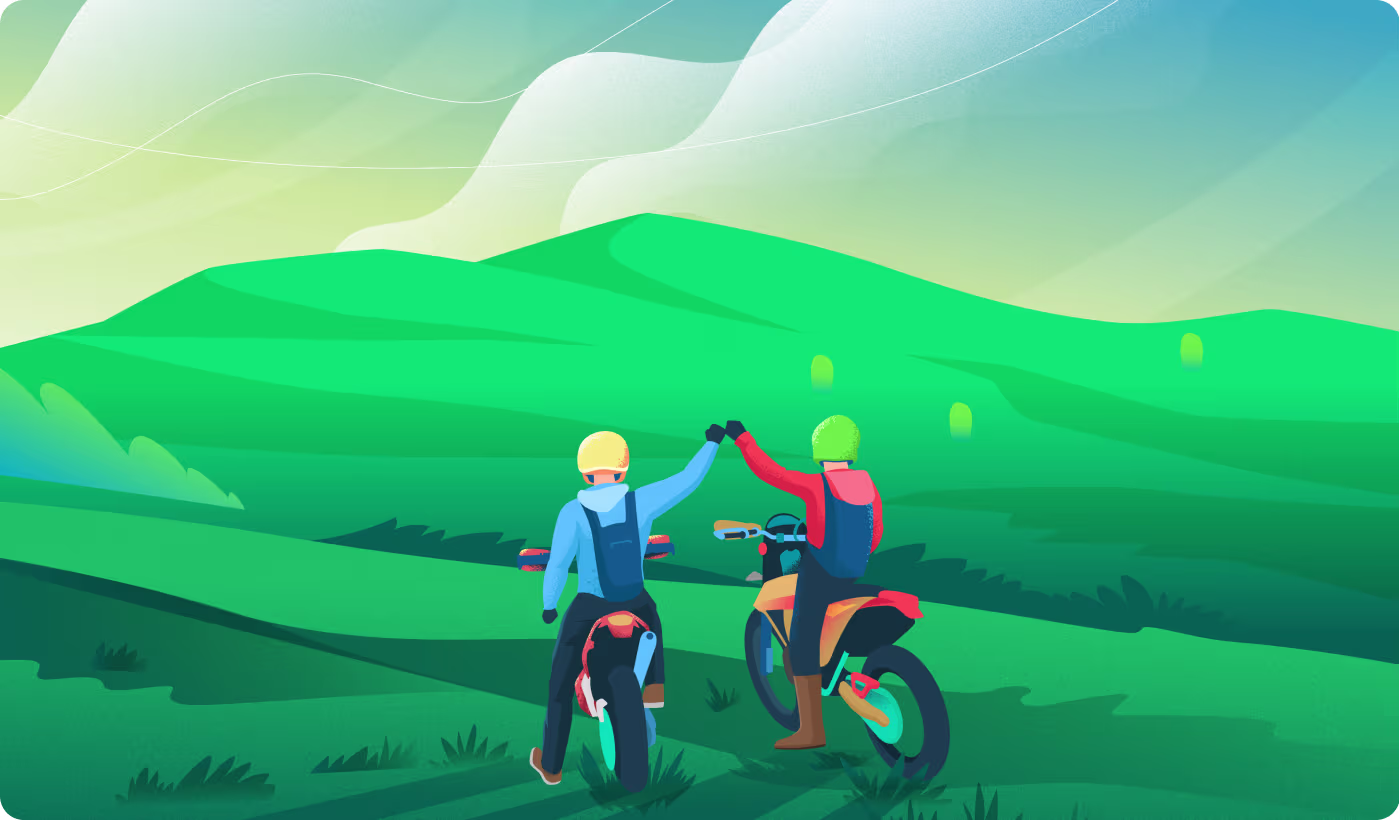
We built a matching set of drawings with bright, nature-friendly colors. We focused heavily on the fun, human moments - like chatting over coffee or high-fiving on a hill, while keeping the backgrounds simple so the characters stand out instantly.
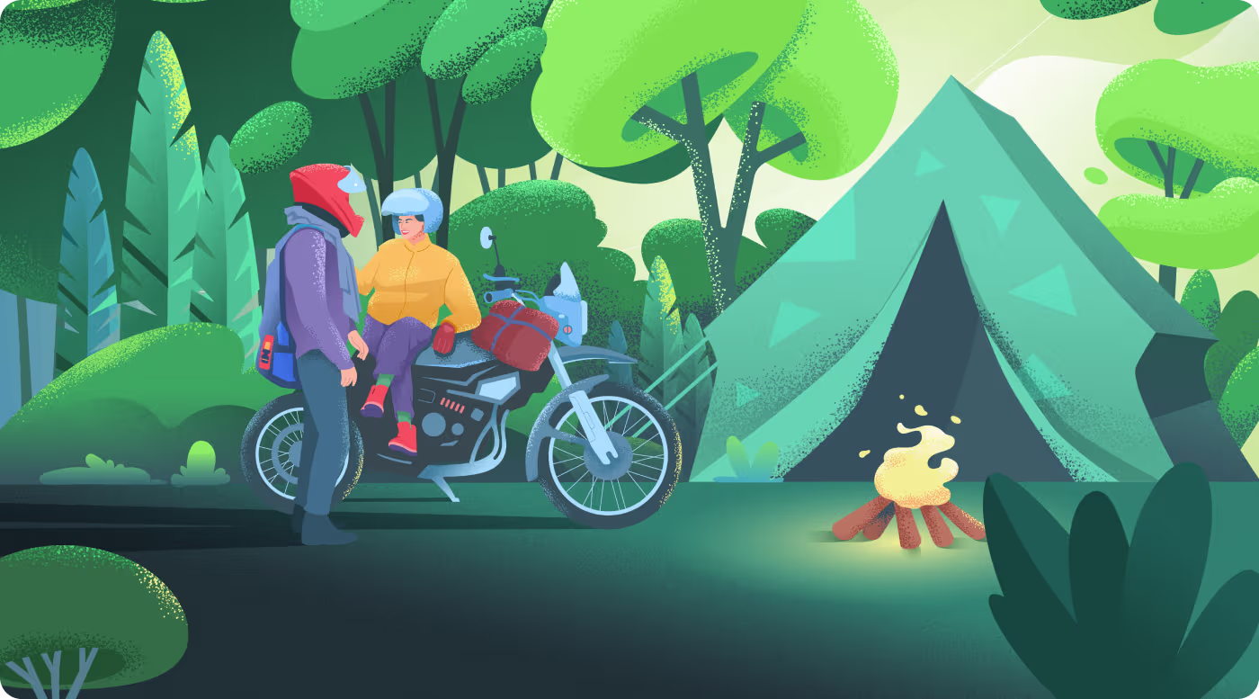
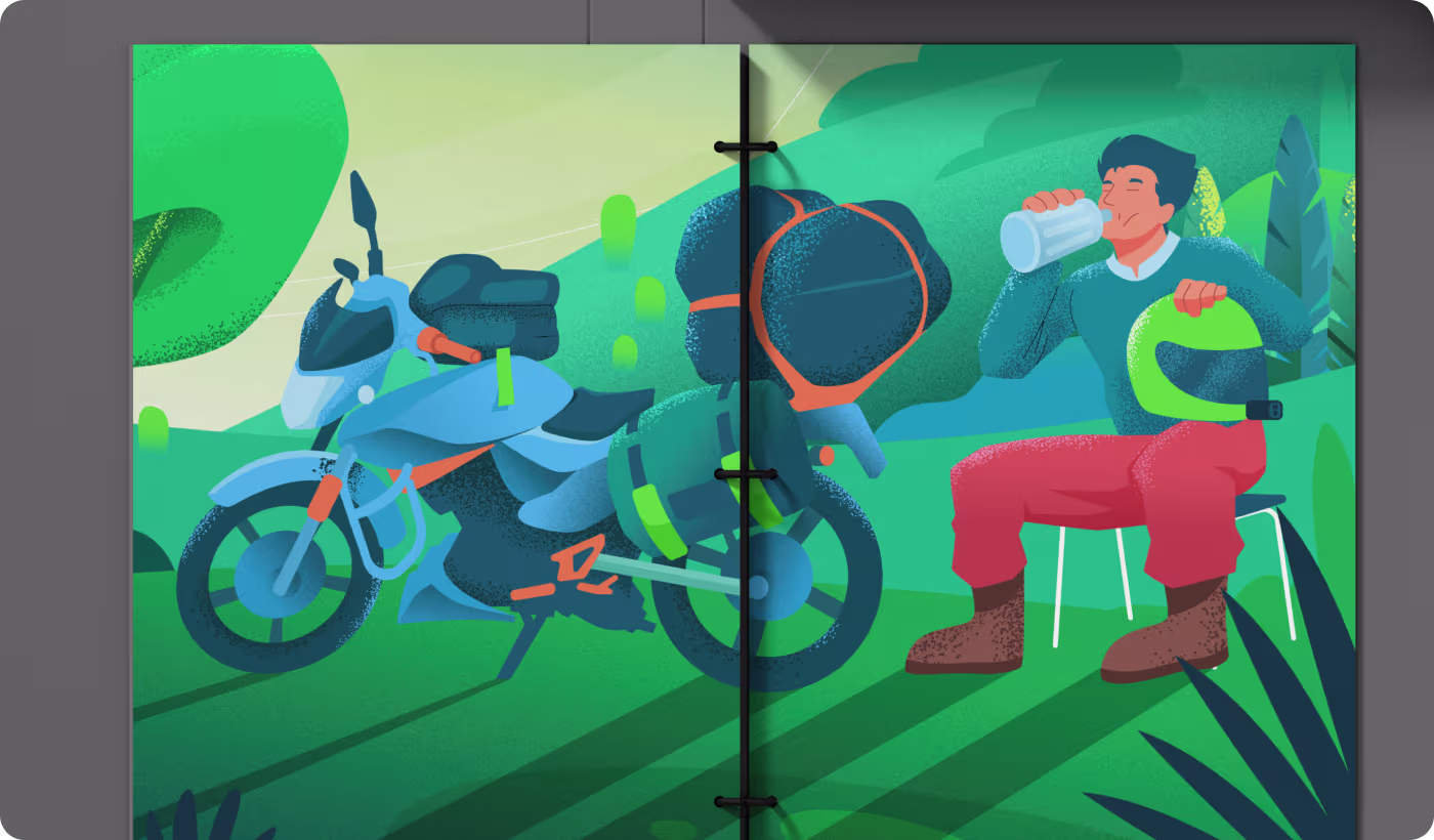
- Real Connections: Showed riders doing natural things like fist-bumping on trails, drinking water, or singing around a blazing campfire.
- Breathable Scenery: Simplified the trees and hills into clean shapes to give the website text and buttons plenty of room to sit.
- Nature Color Codes: Picked a strict color palette of forest greens, sky blues, and sunny yellows to make everything feel like the outdoors.
- Multi-Scale Layouts: Structured the vector files cleanly so they stretch perfectly from tiny phone apps to massive public print displays.
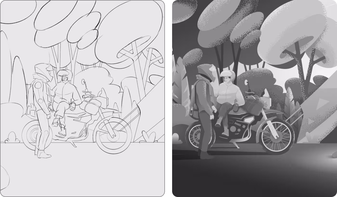
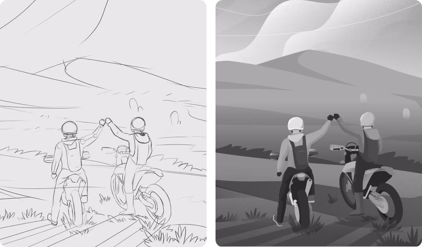
A clean pipeline from paper to product
- Doodling natural body language
- Checking bike and gear placement
- Balancing the rider sizes
- Fixing stiff character poses
- Testing dark and light shadows
- Making focal points stand out
- Removing background clutter early
- Softening the overall scene light
- Applying forest green and sky blue rules
- Adding soft grain textures
- Unifying the lighting across scenes
- Making characters pop off the canvas
- Structuring responsive website frames
- Testing small-scale mobile mockups
- Formatting files for print spreads
- Validating giant billboard scales
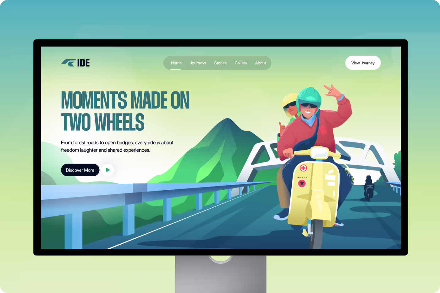
Guiding the eye with natural paths We looked closely at how people scroll through travel websites. When a web page has too many tiny text boxes or random decorations, your brain gets overwhelmed and you want to look away. We discovered that human eyes naturally want to follow long, continuous lines first.
That is why on the desktop landing, we put the main "Discover More" action button directly in the middle of the illustrated road. The curve of the bridge and the highway acts like a physical slide, pointing your eyes straight to the button so finding your way around feels completely natural.
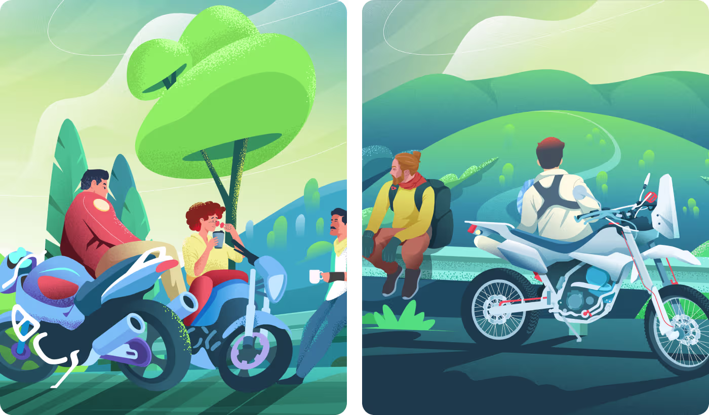
Illustration & Art Direction
Creating an outdoor brand world We built a beautiful library of custom vector art to make the bike tour feel friendly, human, and full of adventure. Everything shares the same look so the brand feels connected across every touchpoint.
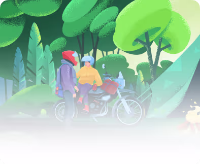
- The Travel Set: We created a matching library of characters, tents, bikes, and campfires using a soft green and yellow style.
- Lifestyle Scenes: We illustrated deep, meaningful moments like friends sitting on a guardrail enjoying hot coffee.
UI & Product Design
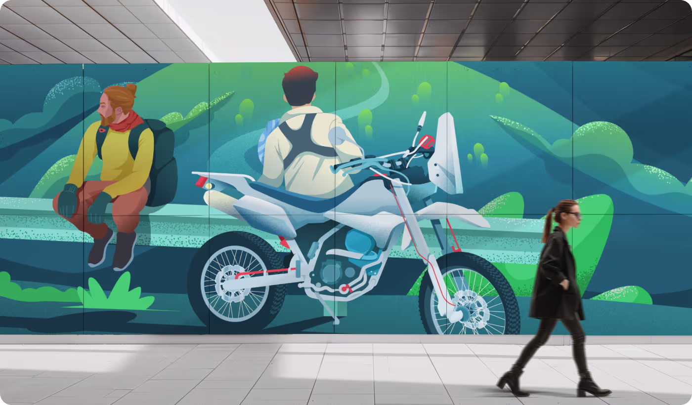
Multi-scale branding layouts We formatted and scaled our entire art library so it works smoothly on real-world websites, mobile apps, and massive public advertisements.
- Clean Landing Pages: You can see how our art fits beautifully onto a desktop screen, leaving lots of white space so the main headlines are easy to read.
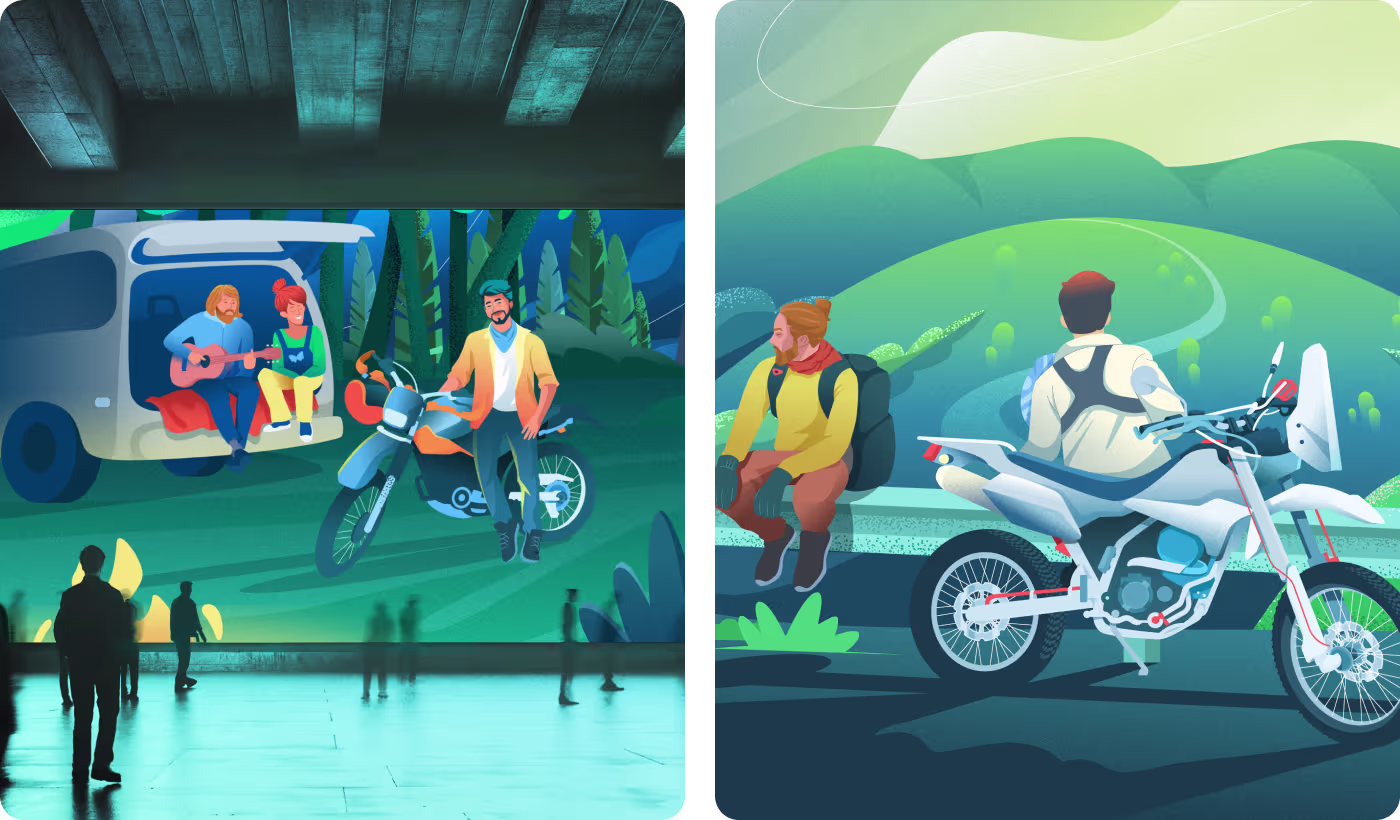
- City Advertisements: The layout grid highlights how the exact same artwork effortlessly scales up onto giant street posters and underground subway wall murals without losing quality.
A premium visual identity featured on Behance Our clean, lifestyle-focused illustration style turned a simple bike tour concept into an award-winning brand identity.
- Behance Winner: The project was highly praised and won an official "Featured in Best of Behance" ribbon, visible right on the main project header.
- Zero Overcrowding: Swept away all the unnecessary visual noise, keeping the backgrounds supportive so the focus stays on the riders.
- 100% Matching System: Every single motorcycle, tree, and campsite element shares an identical, cohesive visual voice.
- Real-World Success: Built a highly adaptive asset system that easily shifts from a digital screen to a printed booklet template.
Got a project in mind? Let's build it
.avif)
.avif)


.svg)


.svg)

.svg)


